Skip to content

Tag: covers

Book Covers of Note September 2014

It’s hard to believe it is already September, but here we are… time for another round of book covers!

If you’re new to this feature, each month I collect together new and recent covers that have caught my eye in the previous few weeks. Although the focus is on books released in the current month, the posts also include covers I’ve missed earlier in the year. You can find the previous month’s posts here.

Thanks (as always) to my local bookstores — Type Books on Queen West, Book City on the Danforth, and Indigo Bay & Bloor — for fighting the good fight (and their wonderful displays!).

9781568987262_cfl
Abbott Miller: Design and Content; design by Pentagram (Princeton Architectural Press / September 2014)

Polygraphe_Samuel Archibald
Arvida by Samuel Archibald; design by Catherine D’Amours / Pointbarre (Le Quartanier / August 2014)
Polygraphe_Samuel Archibald_mech
(this is an obvious miss from last month’s post about maps. Sorry Catherine!)

assassination-of-margaret-thatcher
The Assassination of Margaret Thatcher by Hilary Mantel; design by Rodrigo Corral Design; photograph Demurez/Glasshouse (Henry Holt / September 2014)

9780374169046
The City Under the Skin by Geoff Nicholson; design by Oliver Munday; photograph by George Baier IV (FSG / June 2014)

(Another one that should have been in the maps post. And yes, that really is someone’s back apparently)

9781846147197
The Establishment by Owen Jones; design by Richard Green (Allen Lane / September 2014)

forensic-songs
Forensic Songs by Mike McCormack; design by Jason Booher (SOHO / July 2014)

god-telling-a-joke
God Telling a Joke by David Margoshes; design by David Drummond (Oolichan Books / May 2014)

Hack-Attack
Hack Attack by Nick Davies; design by David Drummond (Faber & Faber / August 2014)

herodotus
The Histories by Herodotus; design by Coralie Bickford-Smith (Penguin Classics / September 2014)

9780241970560
Invisible Man by Ralph Ellison; design by JP King (Penguin / August 2014)

lippy-booher
Lippy by Bush Moukarzel; design by Jason Booher (Oberon Books / August 2014)

most-dangerous-animal
The Most Dangerous Animal of All by Gary L. Stewart with Susan Mustafa; design by Jarrod Taylor (HarperCollins / June 2014)

(I’m not endorsing the content of this book at all, but the red acetate cover does need to be seen in person to be fully appreciated)

smoke-gets-in
Smoke Gets in Your Eyes by Caitlin Doughty; design by David High / High Design (W. W. Norton / September 2014)

transcriptionist
The Transcriptionist by Amy Rowland; design by Keith Hayes (Algonquin Books / May 2014)

9780374292089
Wolf in White Van by John Darnielle; design by Timothy Goodman (FSG / September 2014)

wittgenstein-jr
Wittgenstein Jr by Lars Iyers; design by Christopher Brian King (Melville House / September 2014)

you
You by Zoran Drvenkar; design by Kelly Blair (Knopf / August 2014)

2 Comments

BUONA LA PRIMA! An Exhibition of the Best Italian Book Design

Jean-Cayrol-Notte-e-nebbia-Nonostante-edizioni

Italian design journalist Stefano Salis has kindly let me know about BUONA LA PRIMA!, an exhibition he has curated for the Artelibro Festival in Bologna later this month. For the exhibition, a committee of 15 professionals in the field of editorial graphics has selected the best Italian books covers published published in the past year. All 45 finalists (three for each judge) can be viewed on the Artelibro website, and visitors can vote for their favourite.

Paolo-Ventura-The-Napoleonic-Soldier-and-Other-Stories-Un-sedicesimo-34-rivista-libro-Corraini-Edizioni

In addition to the prize assigned by popular vote, the jury of experts will also award a ‘Critics Prize’ to the best cover, in conjunction with the votes expressed by Ricardo Franco Levi, President of Artelibro, Romano Montroni, President of the Italian Center for the Book, and Giovanni Gregoletto, bibliophile and owner of Cantine Gregoletto that sponsor the exhibition.

The two winners will be announced on Sunday, September 21 at 12:30, with a toast at Palazzo Re Enzo.
COPERTINA BAUMAN DEFINITIVO
Niccolò-Machiavelli-Il-principe-Utet
BUONA LA PRIMA! opens Friday, September 12th at 6pm, in the Biblioteca d’Arte e di Storia di San Giorgio in Poggiale.

Comments closed

Lost in the Plot: Maps on Book Covers

maps

Who doesn’t like a good map? From sophisticated charts to intricate, idiosyncratic drawings to directions drawn on the back of napkin, maps explain the world two-dimensionally. They are flights of imagination anchored in our knowledge of the world — much like books themselves.

This post is a collection of book covers which use maps as parts of their design. I started this working on it months ago (my earlier post collecting arrows on books covers was originally an offshoot of this one), but it turned out to be surprisingly difficult to find enough interesting covers. I think I’ve finally got there — even if I had to cheat a little to include a couple of floor plans! I hope you agree…

abolitionist-geographies
Abolitionist Geographies by Martha Schoolman; design by David Drummond (University of Minnesota Press / October 2014)

MapA
AOTM
All Over the Map by Michael Sorkin; design by Dan Mogford (Verso / July 2011)

american-smoke-hc
sinclair-americansmoke-map
American Smoke Iain Sinclair; design by Nathan Burton (Hamish Hamilton / November 2013)

Astray
Astray by Emma Donoghue; design by Keith Hayes (Little Brown & Co. / October 2012)

bleeding-london
Bleeding London by Geoff Nicholson; design by Jamie Keenan (Harbour Books / September 2014)

boy-bear-boat
A Boy and a Bear in a Boat by Dave Shelton; design by Dave Shelton (David Fickling Books / January 2012)

akerman-cartographies
Cartographies of Travel and Navigation edited by James R. Akerman design by Isaac Tobin (University of Chicago Press / October 2006)

coat-route
The Coat Route by Meg Lukens Noonan; design by Allison Colpoys (Scribe / January 2014)

A Darker Shade final for Irene
A Darker Shade of Magic by V. E. Schwab; design by Will Staehle (Tor / February 2015)

(This unused comp is even mappier!)

delmore-schwartz
Delmore Schwartz: A Critical Reassessment by Alex Runchman; design by Palgrave Design Team (Palgrave Macmillan / May 2014)

dogfish-memory
Dogfish Memory by Joseph A. Dane; design by Jason Ramirez (Countryman Press / June 2011)

eat-the-city
Eat the City by Robin Shulman; cover art by Christopher Silas Neal (Crown / July 2012)

fatal-strain-isaac-tobin
The Fatal Strain by Alan Sipress; design by Isaac Tobin (Penguin / September 2011)

from-here-to-there
From Here to There by Kris Harzinski; design by Deb Wood (Princeton Architectural Press / September 2010)

1493
1493 by Charles C. Mann; design by Darren Wall (Granta / September 2011)

ghost-map
The Ghost Map by Steve Johnson; design by Ben Gibson (Riverhead / November 2007)

Gun-Machine
Gun Machine by Warren Ellis; design by Oliver Munday (Little Brown & Co / January 2013)

Hackney-front Hackney-full
Hackney, That Rose-Red Empire by Iain Sinclair; design by Nathan Burton; map by David Atkinson (Hamish Hamilton / February 2009)

9781847084576
Harlem is Nowhere by Sharifa Rhodes-Pitt; design Friederike Huber (Granta / August 2011)

Attachment-1
The Hobbit by J. R. R. Tolkien; design Adam Busby / Buzz Studios (unused / February 2013) 1

the-imperial-map
The Imperial Map edited by James R. Akerman; design by Isaac Tobin (University of Chicago Press / March 2009)

Infidelities
infidelities_Final
Infidelities by Kirsty Gunn; design by Darren Wall (Faber & Faber / November 2014)


La Isla del Tesoro (Treasure Island) by Robert Louis Stevenson; design by Raúl Arias (Bolchiro February 2013)

KCP_B paperback
Kimberly’s Capital Punishment by Richard Milward; design by Luke Bird (Faber & Faber / August 2013)

9781846144172
London Underground by Design by Mark Ovenden; design by Matthew Young (Particular Books / June 2013)

Project1:Layout 5
Project1:Layout 5
Map of the Invisible World by Tash Aw; design by Anna Morrison (Fourth Estate / April 2009)

map-thief
Map Thief by Michael Blanding; design by Stephen Brayda (Gotham Books / July 2014)

9781616890339_cfl
Maps by Paula Scher; design by Pentagram; cover art Paula Scher (Princeton Architectural Press / October 2011)

(these Paula Scher Maps mini-journals are also rather nice)

dig-fly-go-isaac-tobin
No Dig, No Fly, No Go by Mark Monmonier; design by Isaac Tobin (University of Chicago Press / May 2010)

norfolk-mystery
The Norfolk Mystery by Ian Samson; design by Jo Walker (Fourth Estate / June 2014)

n-w
N-W by Zadie Smith; design by Gray318 (Hamish Hamilton / September 2012)

on-the-map
On the Map by Simon Garfield; design by Roberto de Vicq de Cumptich (Gotham Books / December 2012)

on-the-map
On the Map by Simon Garfield; design by Nathan Burton (Profile Books / October 2012)

9780374533298
Portrait of the Mother as a Young Woman by Friedrich Christian Delius; design by Charlotte Strick (FSG / January 2012)

rats
Rats by Robert Sullivan; design by Whitney Cookman; cover art by Peter Sis (Bloomsbury / April 2004)

rivers-of-london
Rivers of London by Ben Aaronovitch; design by Patrick Knowles; cover illustration Stephen Walter (Gollancz / January 2011)

ring-of-steel
Ring of Steel by Alexander Watson; design by Antonio Colaco (Allen Lane / August 2014)

second-world-war
The Second World War by Antony Beevor; design by Steve Marking (Little Brown & Co / June 2012)

seen-reading
Seen Reading by Julie Wilson; design by Natalie Olsen / Kisscut Design (Freehand Books / April 2012)

9781846270642
The Snow Tourist by Charlie English; cover art by Mike Topping / Despotica (Portobello Books / November 2008)

untitled
Thick as Thieves by Peter Spiegelman; design by Nathan Burton (Quercus/September 2011)

Transnationalism
Transnationalism edited by Michael D. Behiels and Reginald C. Stuart; design by Michel Vrana (McGill-Queens University Press / October 2010)

treasure-island
Treasure Island by Robert Louis Stevenson; design by Coralie Bickford-Smith, cover illustration by Mick Brownfield (Penguin / May 2008)

villages-britain
Villages of Britain by Clive Aslet; design by Sarah Greeno (Bloomsbury / October 2010)

wilderness-of-error
A Wilderness of Error by Errol Morris; design by Pentagram (Penguin / September 2012)

zone-marvellous
Zone of the Marvellous by Martin Edmond; design by Keely O’Shannessy (Auckland University Press / September 2009)

And I don’t think we can end this post without mentioning the amazing Book Map print by Manchester-based studio Dorothy:

dorothy-book-map
The map — loosely based on a turn of the century map of London — is made up from the titles of over 600 books from the history of English Literature. Buy it here.

12 Comments

Book Cover Design is a Fine Art

globe-book-covers

It used to be enough for a book to idly stand out in a bookstore. Nowadays, however, new books must jostle for attention with everything. Thousands of distractions are just a click away. Is it any wonder that book-cover design is more important than ever?

In today’s Globe and Mail, I talks about recent trends in book cover design and pick a few of my favourite covers from the year so far. If you live in Canada you can find a lovely-looking print version of the article in the Arts pages.

Comments closed

Book Covers by Moker Ontwerp

de_onbekenden
I do like these book covers by Dutch design studio Moker Ontwerp:

de_onverbiddelijke_tijd
You can see more of their handiwork here.

(via Theo Inglis)

Comments closed

A Book on a Book on a Book

Booher_History

The brilliant Jason Booher, whose cover for A History of Histories featured in my previous post, kindly just sent me his original design for the book. I think this could be the meta-cover to end all meta-covers. Sadly, the editor decided it might be a little too much of a good thing.

Comments closed

Books on Book Covers

9781594203367B (1)
It started, innocently enough, with a tweet from my friend Steven Beattie, book review editor of Canada’s Quill & Quire magazine, about the cover of The Most Dangerous Book, Kevin Birmingham’s new ‘biography’ of Ulysses by James Joyce, designed by Ben Wiseman (Penguin June 2014).

steven-tweet

That sparked a conversation with designer David Gee and Joseph Sullivan of The Book Design Review about books on book covers. Joe wrote a  a post on the subject in 2009 on the subject, and I rather naïvely thought it would be easy (EASY!) to post a few contemporary examples of the trend, completely underestimating what an undertaking such a project would become.

What follows is an attempt to showcase some of different ways designers incorporate books into their cover designs. Along side covers from the past five years, I’ve included some earlier examples from Joe’s post, and this post about ‘meta-covers’ from HTML Giant. Many of the images of the older titles are small (and some are just not very good), but where I have been able to source a larger image, I’ve included it at full (or close to full) size. I’m indebted to the Book Cover Archive, which is still an invaluable resources after all this time, Ferran Lopez‘s (also mothballed) Jacket Museum, and all the designers and book folk who sent me cover images, and helped me in numerous other ways. Thank you. This isn’t comprehensive survey but, to be honest, I had to stop somewhere…

Front and Center

seven-hundred-penguins-full

Seven Hundred Penguins; design David Pearson / illustration Clare Skeats (Penguin Sept 2007)

cover

Cover by Peter Mendelsund; design by Peter Mendelsund (powerHouse Books August 2014)

Kapitalismus und Hautkrankheiten by Jasmin Ramadan; design by Books We Made (Klett-Cotta Verlag April 2014)

The Knowledge

The Knowledge by Lewis Dartnell; design by Kris Potter (Penguin April 2014)
priceless
Priceless by William Poundstone; design by Jennifer Carrow (Hill & Wang January 2010)

publish-your-photography-book

Publish Your Photography Book by Darius D. Himes & Mary Virginia Swanson; design by David Chickey & Masumi Shibata (Princeton Architectural Press March 2011)

yarn-whisperer

The Yarn Whisperer by Clara Parkes; design by John Gall (Abrams September 2013)

Cut, Torn, Ripped or Otherwise Defaced or Damaged

The Arsonist by Sue Miller; design by Greg Heinimann (Bloomsbury June 2014)

BNP-Cover-Hi-Res-770x1024

Best New Poets 2013, guest editor Brenda Shaughnessy; design by Atomicdust (Meridian January 2014)

9780312426323

Christine Falls by Benjamin Black; series design by Keith Hayes (Picador January 2008)

Half World by Scott O’Connor; design by Christopher Lin (Simon & Schuster February 2014)

9780887849565_HR
Heaven is Small by Emily Schultz; design by Ingrid Paulson (House of Anansi )

(And if your not Canadian, you may not know that this is a riff on Ingrid’s design for the hardcover of Heaven is Small, featured in this list.)

keep-egan

The Keep by Jennifer Egan; design by John Gall (Knopf August 2006)

Last-Winter-of-Dani-Lancing-US-front-cover
The Last Winter of Dani Lancing by P. D. Viner; design by Oliver Munday (Crown October 2013)

9781846144479
Mess; series art and design by Keri Smith (Penguin September 2010)

The Psychopath Test by Jon Ronson; design by Matt Dorfman (Riverhead December 2011)

deBotton-RFA-JACKET
Religion for Atheists by Alain de Botton; design by Matt Dorfman (Pantheon June 2012)

(This is what the cover looks like under the jacket if you’re curious)

9781476744834
Salinger by David Shields and Shane Salerno; design by Christopher Lin (Simon & Schuster September 2013)

9780765331939


What Makes This Book So Great by Jo Walton; design by Jamie Stafford-Hill (Tor January 2014)

Three-Quarters, or a Bit on the Side

81PiOD3q5aL
 The Eyre Affair by Jasper Fforde; cover art by Thomas Allen, series design by Jaya Miceli (Penguin 2011)

And those of you with a good memory will remember Chip Kidd used also art by Thomas Allen for a series of James Ellroy titles publisher by Vintage in the US:

fahrenheit-451
Fahrenheit 451 by Ray Bradbury; design by Matt Owen (Simon & Schuster January 2012)

9781594486173
Fiction Ruined My Family by Jeanne Darst; design by Alex Merto (Riverhead September 2011)

most-dangerous-book-UK

The Most Dangerous Book by Kevin Birmingham; adapted from the US cover with additional design by Jessie Price (Head of Zeus June 2014)

proust
Marcel Proust’s Search for Lost Time by Patrick Alexander; design by Jamie Keenan (Vintage March 2010)

ECW-Real Made Up 2007
The Real Made Up by Stephen Brockwell; design by David A. Gee (ECW October 2007)

Stoner (paperback) Stoner by John Williams; design by Julia Connolly (Vintage July 2012)

9780802122148 An Unnecessary Woman by Rabih Alameddine; design by Roberto de Vicq de Cumptich (Grove April 2014)

And while it’s not an actual book, let’s give Tom Davie of studiotwentysix2 a round of applause for his famous novel redesign print (which you can buy here).

Open Books and Page Turners

book-was-there

Book Was There by Andrew Piper; design by Andrea Guinn (University of Chicago Press November 2012)

4271789674_c18e499686_o

Erotic Poems by E. E. Cummings; design by Gabriele Wilson (Liveright February 2010)

9781770892484
How Should a Person Be? by Sheila Heti; design by Rebecca Seltzer (Henry Holt & Co. June 2012)

journey-with-two-maps

A Journey with Two Maps by Eavan Boland; design by Chin-Yee Lai (W. W. Norton October 2011)

john-dies-at-the-end

John Dies at the End by David Wong; design by Rob Grom (Thomas Dunne October 2009)

A-Life-In-Books
A Life in Books by Warren Lehrer; cover art by Warren Lehrer in collaboration with Jonathan Rosen (Goff Books October 2013)

medium-is-the-massage

The Medium is the Massage by Marshall McLuhan & Quentin Fiore; design by Yes Studio (Penguin September 2008)

dangerous-book

A Most Dangerous Book by Christopher B. Krebs; design by Mark Melnick (W. W. Norton June 2011)

the-novel

The Novel: A Biography by Michael Schmidt; design by Graciela Galup (Belknap Press April 2014)

9780691145648
Philology by James Turner; design by Kara Davison / Faceout Studio (Princeton University Press, May 2014)

pox-and-the-covenant

The Pox and the Covenant by Tony Wilson; design by Jason Gabbert (Sourcebooks April 2010)

what-to-look-for

What to Look For in Winter by Candia McWilliam; design by Richard Ljoenes (Harper March 2012)

Where I'm Reading From (1)
Where I’m Reading From by Tim Parks; design by James Paul Jones (Harvill Secker November 2014)

The_World

The World by Bill Gaston; design by Kathleen Lynch / Black Kat Design (Penguin August 2013)

9780452298460
Writers Between the Covers by Shannon McKenna Schmidt and Joni Rendon; design by Lucy Kim (Plume October 2013)

Shelves, Sides, Spines, and Stacks

Penguin by Design by Phil Baines; design by David Pearson (Penguin May 2005)

worm-holes

Wormholes by John Fowles; design by Carin Goldberg (Little, Brown & Co. 1997)

bad-teeth
Bad Teeth by Dustin Long; design by Rex Bonomelli (New Harvest May 2014)

BIL-Full
The Broadview Introduction to Literature; series design by Michel Vrana (Broadview August 2013)

BIL-Split
First Novel - Nicholas Royle

First Novel by Nicholas Royle; design by Suzanne Dean (Jonathan Cape February 2014)

how-to-be-a-heroine
How To Be A Heroine by Samantha Ellis; designed by James Paul Jones (Chatto & Windus January 2014)

how-to-read-literature


How to Read Literature by Terry Eagleton; design uncredited  (Yale University Press Jun 2013)

1

junior-officers-club
The Junior Officers’ Reading Club by Patrick Hennessey; design by David Wardle (Penguin June 2009)

ajax-penumbra-1969

Ajax Penumbra 1969 by Robin Sloan; design by Irene Pineda (Atlantic Books June 2014)

rise-and-fall
The Rise & Fall of the Great Powers by Tom Rachman; design by Roberto de Vicq de Cumptich (Dial June 2014)

Stoner (hardback)
Stoner by John Williams; design by Julia Connolly (Vintage November 2013)

9781623568719

Vagina by Emma L. E. Rees; design by Alice Marwick (Bloomsbury August 2013)

why-i-read

Why I Read by Wendy Lesser; design by Rodrigo Corral (Farrar, Straus & Giroux (January 2014)

year-of-henry-james
The Year of Henry James by David Lodge; design by Nathan Burton (Vintage May 2014)

year-of-reading-dangerously
The Year of Reading Dangerously by Andy Miller; design by Jo Walker (Fourth Estate May 2014)

And then there’s this…

The FUTURE

you-are-not-a-gadget

You Are Not a Gadget by Jaron Lanier; design by Olly Moss (Penguin January 2010)

Comments closed

Gil Scott-Heron Redesigns by Stuart Bache

Born in Chicago, April 1, 1949, poet and musician Gil Scott-Heron is perhaps best known for the politically infused bluesy soul and proto-hip-hop he created with Brian Jackson in the early 1970’s.

Although recently troubled by drug addiction and in and out of prison for drug possession, an apparently resurgent Scott-Heron released his first studio album in 16 years, I’m New Here (XL Recordings), in February, and two of his novels — The Vulture (1970) and The Nigger Factory (1972) — were reissued (for a second time) by Canongate Books with new cover designs by talented UK designer Stuart Bache.

I recently talked to Stuart about Gil Scott-Heron and the redesign…

How did you get into book design?

I fell upon book cover design by shear luck. In late 2005, after a stint of travelling, I decided it was time to think about my career. I found, applied and was surprised (and ecstatic) to be given the job of Junior at Hodder & Stoughton and moved to London.

When did you discover the work of Gil Scott-Heron?

I first discovered Gil Scott-Heron way back in school. We had been reading and discussing To Kill a Mocking Bird in English Class and I remember taking a real interest in the subject, which my teacher at the time picked up on and loaned me both The Vulture and The Nigger Factory.

How did you come to design the covers of his books?

It was a great pleasure to be asked to design the covers for the reissues. I had already been doing some work for Canongate and so when the Art Director asked if I had time to come up with ideas for the reissues I jumped at the chance. It was a fairly short deadline, but I believe those to be the best kind, great for creativity (and a few extra grey hairs).

Could you describe your design process for the covers?

The brief asked for them to be fresh, streetwise, graphic and contemporary. I designed a few covers for each title, with different images and branding styles, which were then passed on to Canongate for their prefered direction.

The final The Vulture cover centred around John Lee (the young lad who is murdered) and the title cried out to be used in some sort of graphic function. The Nigger Factory relied heavily on an image that both showed and did justice to that moment in US history. It also needed a graphic so I added the stripes to represent the flag, but the use of red paint strokes shows the heat and anger involved too.

What is the typeface?

The typeface I used is Futura, probably light. I have a thing about Futura, Century Gothic and the like. It’s the perfect circles of the ‘O’ and ‘C’.

Are they a departure from your usual design work?

These covers stand out for me, especially compared to my usual style. I take a lot of pride in my work but I’m never usually proud of it — I always see something I could have done better. But the Gil Scott-Heron’s showed I could do something completely different…and in a short timescale too.

What are you working on currently?

At the moment I’m working on another title for Canongate called Super Cooperators and Aline Templeton’s new thriller Cradle to Grave for Hodder & Stoughton. This time of year tends to be quiet, too quiet really, but these are nice titles to be getting along with. Cradle to Grave gives me the opportunity to play with my homemade textures and brushes in Photoshop, and Super Cooperators is, once again, going to be something very different from the rest of portfolio.

Where do look for inspiration and who are some of your design heroes?

Ever since I’ve been freelance I have had a renewed enthusiasm for design, I notice everything and I’m hardly out of bookshops — I see books all the time that I think ‘I wish I’d designed that’. It really keeps you on your toes and gives you the incentive and the push to do better.

I owe a lot to Hodder & Stoughton, their Art Department has some of the best designers in the industry and I learned an awful lot during my time there — and if they had never given me the chance I wouldn’t be writing this now.

Thanks Stuart!

Comments closed

Q & A with Ferran López, Random House Mondadori

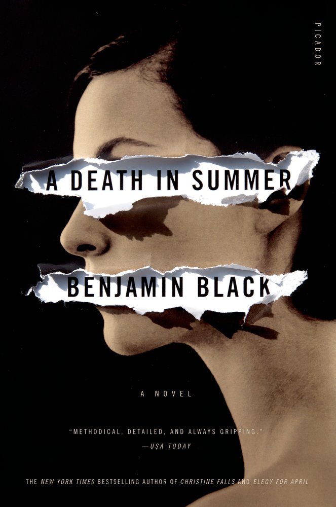
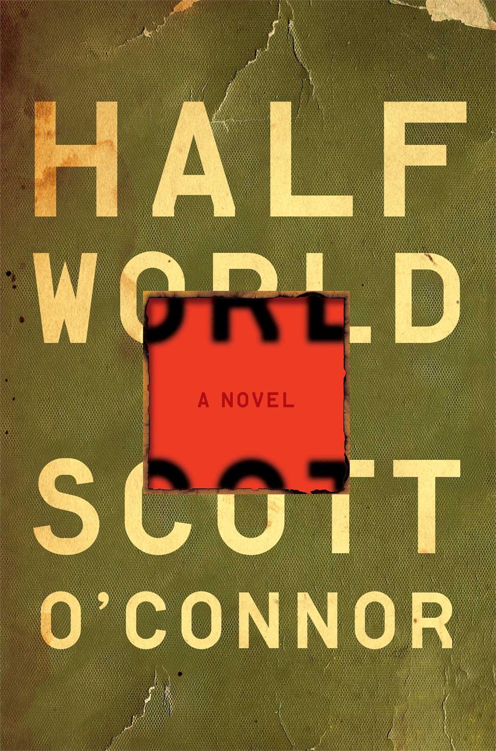
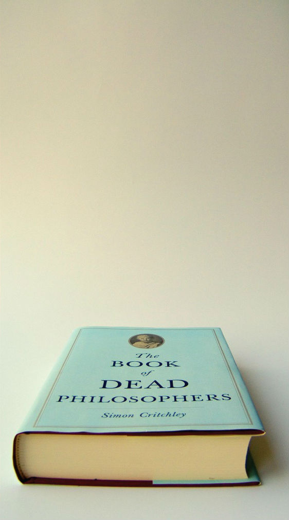
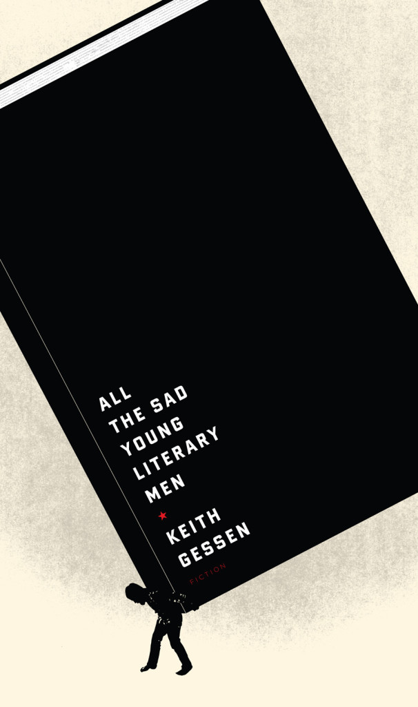
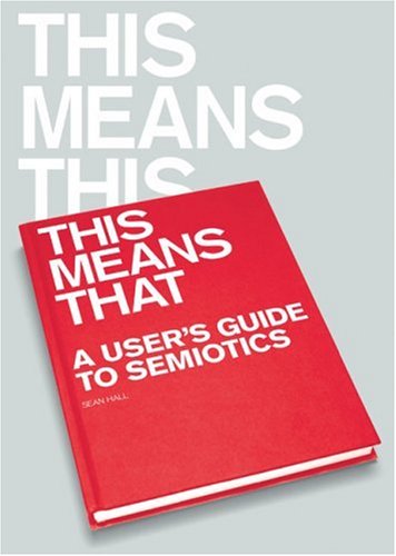
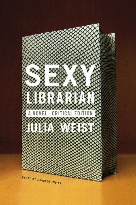
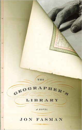
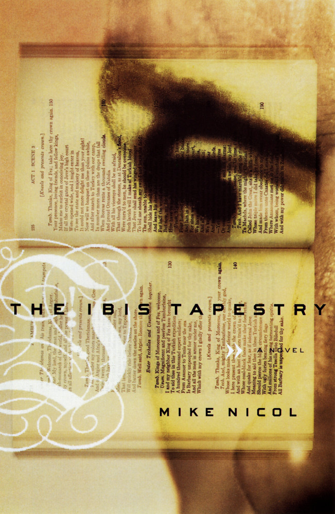
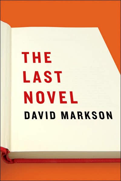
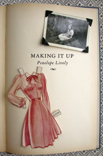
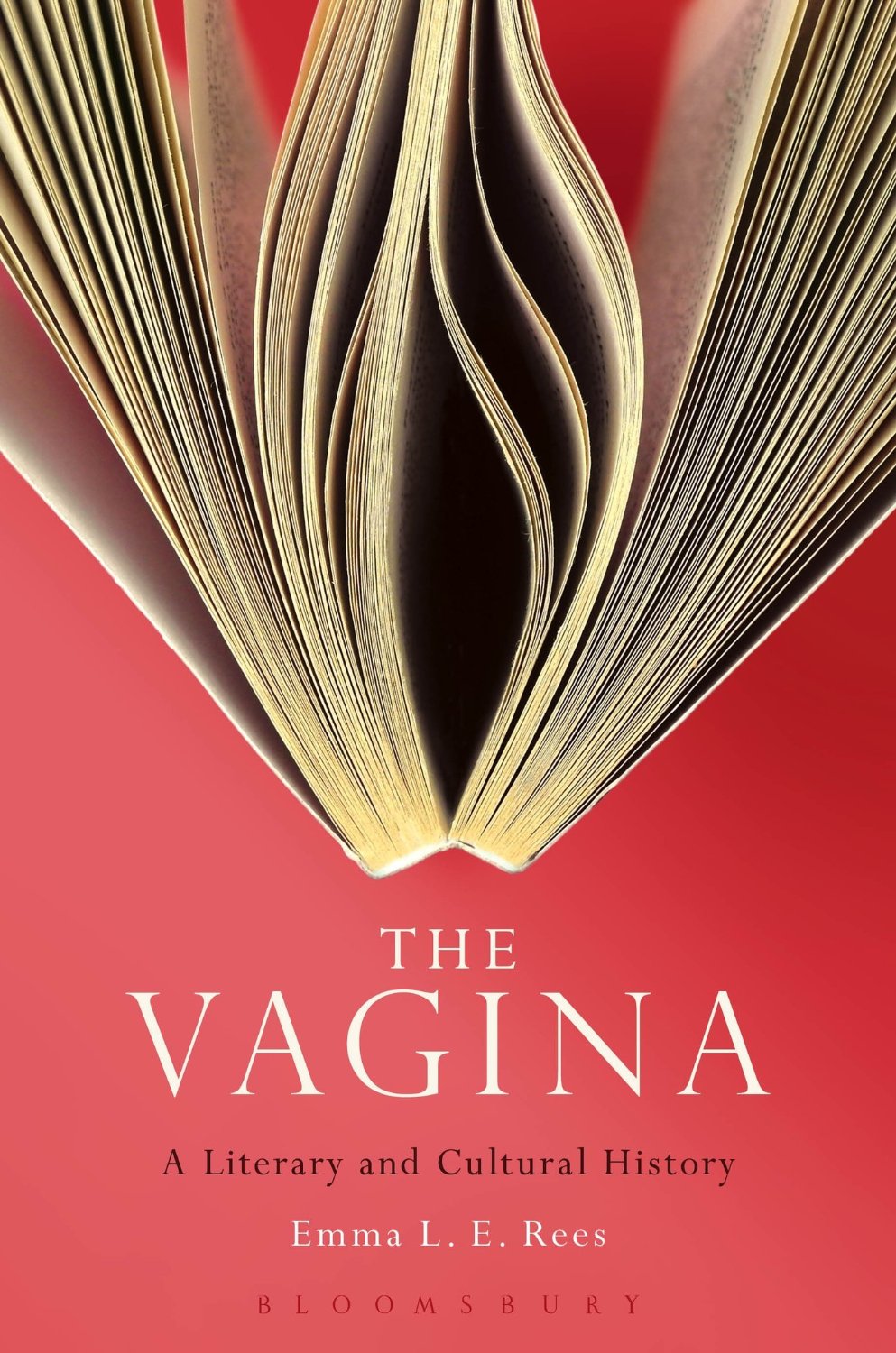
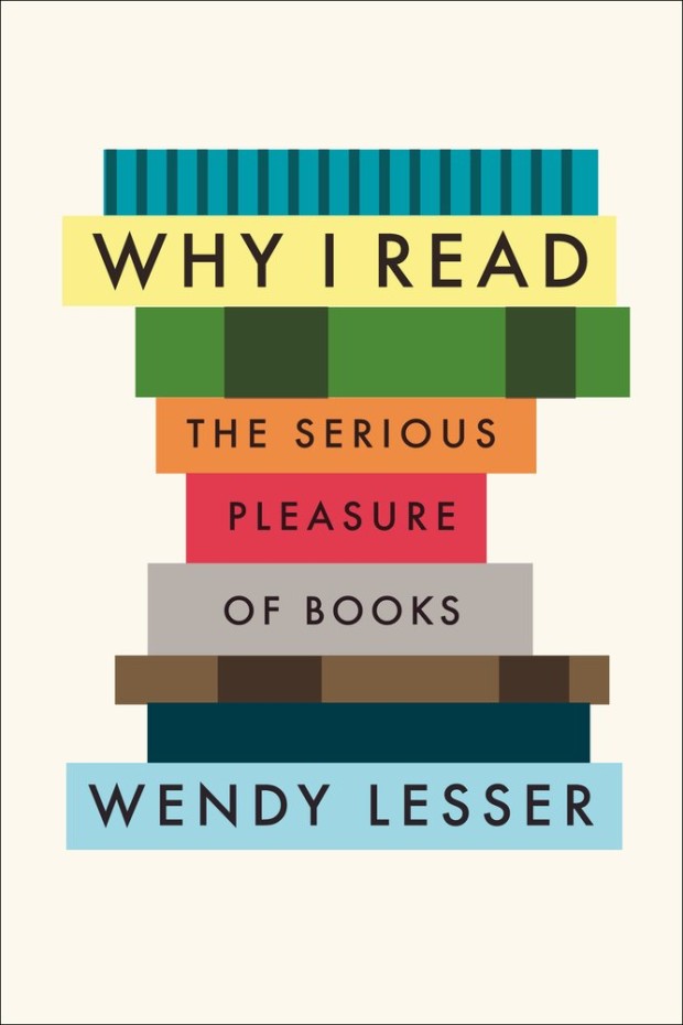
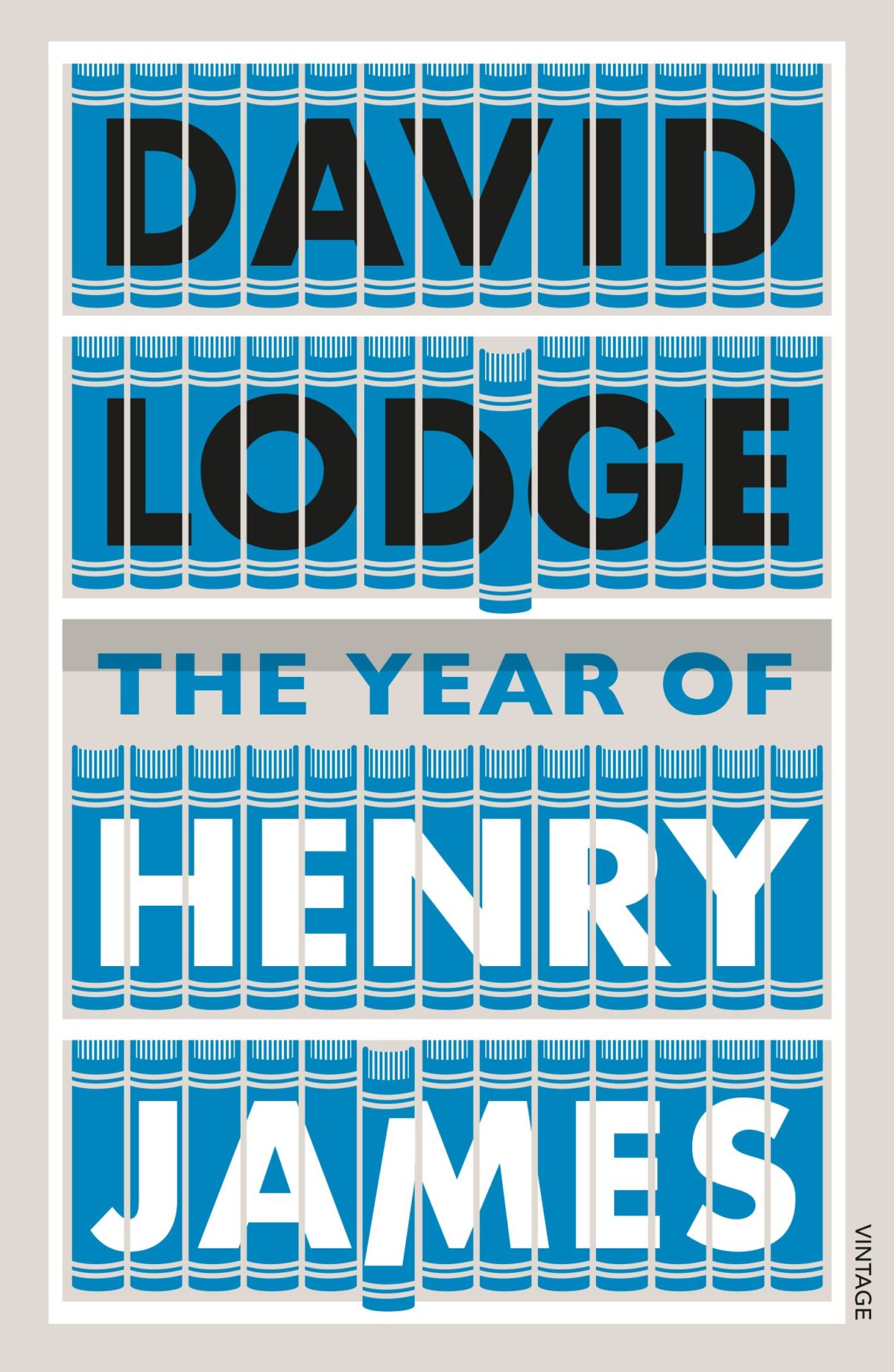
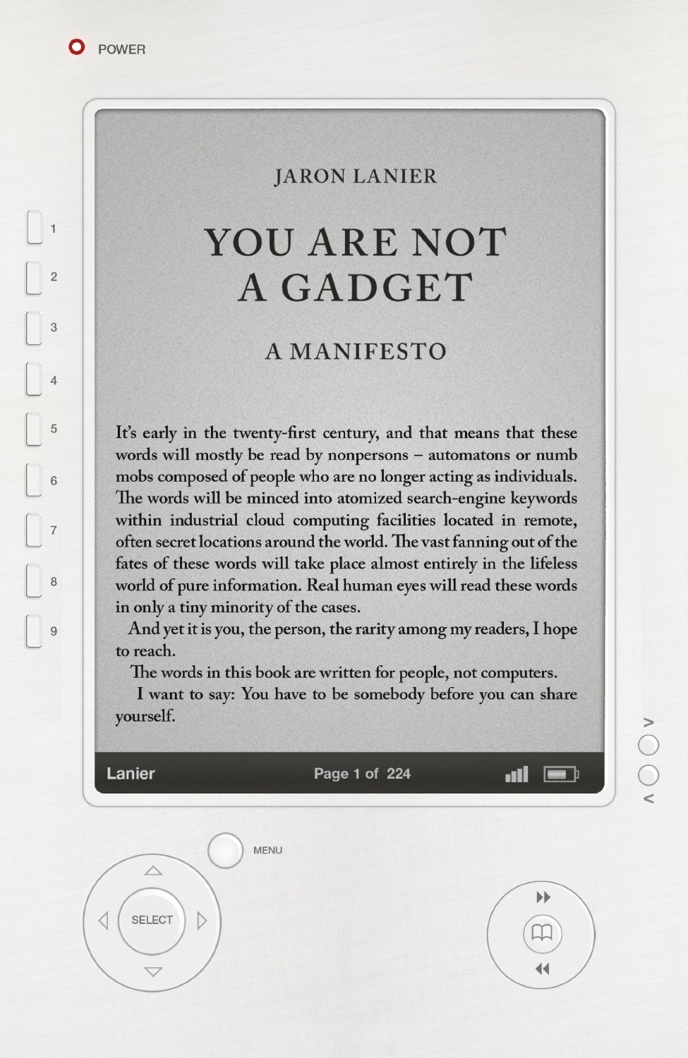
I came across the work of graphic designer Ferran López after stumbling on his wonderful book cover blog The Jacket Museum.

Based in Barcelona, and currently working at Random House Mondadori — the Spanish-language joint publishing and distribution venture between Random House and Italian publisher Mondadori — Ferran’s eye for typography and background in photography is evident in his sharp book cover designs.

Although I want to interview more designers who work outside of Canada, UK and US at The Casual Optimist, the opportunity doesn’t often present itself because of my almost total inability to speak any other languages. But when I noticed that Ferran publishes his blog in both English and Spanish, there was absolutely no excuse not to speak to him!

I’m really happy to be able to include Ferran’s answers in both English and Spanish in this interview, but I have also posted all the questions and answers in just Spanish for those who would prefer to read it that way.

And I do want to say a big thank you to Ferran for both his patience and for providing the translation…

How did you get into book design?

Merely by chance. Although my training is photography and I was a photographer for many years, more and more my jobs were getting closer to the world of graphic design. At the end of the year 2000 I was working as a freelance designer and moonlighting doing digital photography manipulation and retouching. Around this time I met Marta Borrell, the Art Director at Random House in Spain (before the joint-venture with Mondadori). She was looking for a graphic designer to work in-house on trade book cover design. Even though I had never tried book design, I was enthusiastic about the idea because I love books. Marta liked my portfolio and my enthusiasm. She took a chance on me and (I like to think) it turned out all right! We have been working together for a decade now.

Casi por casualidad. Mi formé como fotógrafo, aunque desde hace muchos años mi trabajo, por vocación, fue acercándose cada vez más al diseño gráfico. A finales de 2000 trabajaba como diseñador free-lance y en manipulación digital de fotografía. Fue entonces cuando conocí a Marta Borrell, la directora de arte de Random House en España (por aquel tiempo previo a la joint-venture con Mondadori) que estaba buscando un diseñador para la división de libros Trade. A pesar que nunca había trabajado con libros estaba entusiasmado con la idea, ¡me encantan los libros!. A Marta le gustó mi portfolio y mi entusiasmo.  Apostó por mi y creo que la cosa resultó bien. Llevamos ya una década trabajando juntos.

Briefly, could you tell me about working at Random House Mondadori?

It reminds me of a sequence from Billy Wilder‘s “One, Two, Three”. The pace is frantic and the procedures are complex at times, but, although it sounds like a cliché, it is impossible to think of a team of better professionals. Almost everyone in the workplace is young (even the CEO is younger than me!) and this translates into passion. There are 13 of us In the Art Department and sometimes we seem like family or better yet a clan. We suffer a lot, but always together! Just kidding! But at times, when someone is under a lot of pressure or creatively blocked, there is always someone to lend a hand, or at least have a coffee break with.

Se parece mucho a una secuencia de «Uno, Dos, Tres» de Billy Wilder. El ritmo es frenético, los procesos a menudo complicados pero, aunque suene a cliché, es imposible imaginar un equipo de mejores profesionales. Es una empresa joven (¡Hasta la Consejera Delegada es más joven que yo!) y creo que eso se traduce en entusiasmo.

En el departamento de diseño somos 13 personas, a veces parecemos una familia o incluso un clan. Sufrimos mucho, pero siempre juntos. Es broma; pero a veces cuando alguno de nosotros está bajo mucha presión o bloqueado siempre hay alguien con quien compartir el proceso, consultar o al menos con quien tomar un café.

What is your current role there?

At the moment, I am responsible for the Design of the Trade Commercial and the Paperback divisions. In the Paperback Division my job is basically coordination and support. As a designer, my job is mainly centered in book covers for Commercial Trade, bestsellers, novels and mass-market non-fiction for the “Plaza & Janés” and “Grijalbo” imprints.

Also, since its establishment in 2004, I’m also in charge of the “Caballo de Troya” imprint, an experiment: a small independent publisher within a huge publishing company.

Actualmente soy responsable de Diseño de las divisones Trade Comercial y Bolsillo. En la división de bolsillo mi función principalmente es estratégica y de apoyo. Como diseñador mi trabajo se centra en las cubiertas de los libros de Trade Comercial: best-seller, novelas y no ficción de carácter masivo, en los sellos Plaza & Janés y Grijalbo.

También, desde su fundación en 2004 me encargo de Caballo de Troya, casi un experimento: un pequeño sello independiente que vive dentro de un gran grupo editorial.

Approximately how many covers do you work on a season?

About 100 new books a year.

Unas cien novedades al año.

Could you describe your design process?

I don’t follow the same procedure with every book. Some times, I read the briefing and I start visualizing the cover, the message, the photo or the illustration that seems to fit the book. Other times, I need to read, comment, draw, write, web-surf, look out the window and make several trips to the coffee machine to obtain what I want to transmit visually. At times, nothing seems to work and then I begin creating an idea by a typographical approach to unblock myself.

No sigo el mismo proceso con todos los libros. A veces, tal como leo el briefing, empiezo a visualizar la portada, el mensaje, la fotografía o la ilustración que a mi parecer encaja. Otras veces necesito leer, comentar, dibujar, escribir, navegar, mirar por la ventana y hacer varios viajes a la cafetera para conseguir saber lo que quiero que visualmente transmita. En algunas ocasiones ningún método parece funcionar y entonces para desbloquear empiezo a creando la imagen desde la aplicación tipográfica.

What are your favourite books to work on?

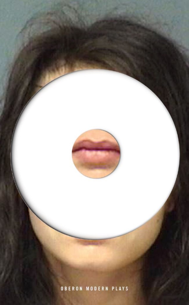
Novels where I can’t help getting infatuated with one of its characters. Also books where I can give the cover a hidden meaning or a wicked twist. And finally, those low stream books with a small print-run where I can use daring images.

Aquellas novelas en los que me enamoro perdidamente de alguno de sus protagonistas (a veces es inevitable), los libros en los que se puede esconder una segunda lectura o un giro perverso en la portada y finalmente aquellos libros minoritarios con un corto tiraje que permiten utilizar imágenes más arriesgadas.

What are the most challenging?

Books with complex plots and/or multiple sub-plots. Those where the parties involved in the process of approval (editors, marketing staff, sales, etc.) have diverse ideas of what should the cover reflect. And off course, those books which the sales expectations are extremely high…The pressure is on!

Los libros con tramas laberínticas o con múltiples mensajes y subtramas. Aquellos en los que las distintas partes implicadas en el proceso de aprobación tienen visiones muy distintas de lo que debe comunicar la portada. Y por supuesto aquellos en los que las expectativas de venta son muy altas: The pressure is on!

When you’re working on translated books, do you look at the US or UK covers, or do you try to avoid them?

We always take the original cover into consideration. When a new book comes up, we review the original cover with its editor and the marketing department to see if it would work in Spain. With some authors, for instance, Stephen King or Terry Pratchett, we don’t even consider changing it — their fans would never forgive us. In any case, whether we use the original covers or not, they always help us as guide to which way we want to go.

German and Italian cover versions are always good reference.

An interesting example is the case of Ken Follet’s “World Without End”. We had both US and UK editions and I designed an adaptation combining the best elements of both. Now, we have the best of them all!

Siempre tenemos en cuenta la portada original. Cuando se presenta el libro valoramos en conjunto con edición y marketing si la portada puede funcionar o no en nuestro mercado. Con algunos autores, como Stephen King o Terry Pratchett ni siquiera nos planteamos el cambio, sus seguidores no nos lo perdonarían. En cualquier caso, utilicemos la portada original o no, siempre nos sirven de guía. Las ediciones alemanas e italianas también son dos buenos referentes.

Como caso curioso, para la edición española de «El mundo sin fin»  de Ken Follet compramos la portada estadounidense y la británica e hice una adaptación combinando lo mejor de ambas. ¡Ahora nuestra portada es la mejor!

Where do you look for inspiration and who are some of your design heroes?

Design books, movie and TV series imagery. Supermarket shelves and flea markets. Second hand book shops and record stores. Obviously on the Web (piece of cake!). Besides book cover design blogs, Ffffound!, But Does it Float, Grain Edit and Some Random Dude are among my favourites.

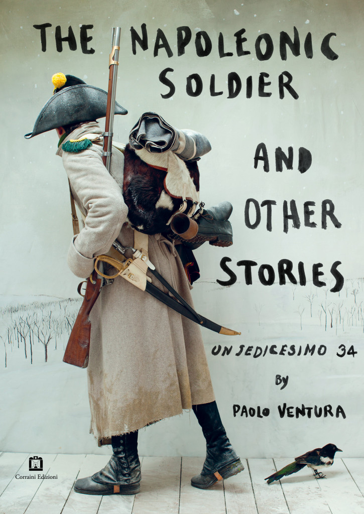
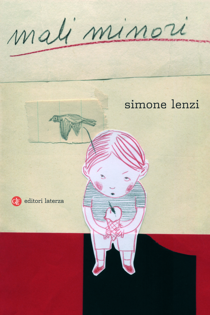
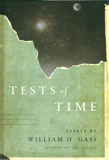
Spain’s very own Daniel Gil is perhaps responsible that I am working in this field. When it comes to contemporary designers there is a bunch of good ones: Rodrigo Corral, Henry Sene Yee, David Wardle, John Gall, Juan Pablo Cambariere, Peter Mendelsund, Darren Haggar…My list goes on…

En los libros, en el cine y en las series de televisión. En las estanterías del supermercado y en los mercadillos. En las tiendas de discos y libros de segunda mano. En Internet (¡es tan fácil!); además de los blogs de diseño editorial, Ffffound!, But Does it Float, Grain Edit y Some Random Dude son mis sitios favoritos.

El español Daniel Gil es quizás el principal responsable de que ahora mismo yo esté haciendo esto. En cuanto a los contemporáneos hay un buen grupo de excelentes diseñadores: Rodrigo Corral, Henry Sene Yee, David Wardle, John Gall, Juan Pablo Cambariere, Peter Mendelsund, Darren Haggar… Es imposible no dejarse alguno…

What does the future hold for book cover design?

Obviously, things in this field are going to change, but I cannot imagine how. It is completely unforeseeable. In any case, I think covers will always be a great vehicle to sell books, no matter what the medium is. We will just have to wait and see how it will affect our way of working, our tools and our approach.

Las cosas van a cambiar, de eso no me cabe duda, pero me cuesta imaginar como. Es imprevisible.

En cualquier caso creo que las portadas seguirán siendo un argumento excelente para vender libros, sea cual sea el soporte. Si esto es así habrá que ver como afectará a nuestra manera de trabajar, nuestras herramientas y nuestros procesos.

Thanks (gracias!) Ferran!

8 Comments

Q & A with Ferran López, Random House Mondadori (Spanish)

This is the Spanish language version of The Casual Optimist interview with Ferran López, designer at Random House Mondadori and curator of book cover blog The Jacket Museum.

¿Cómo llegaste a ser diseñador de libros?

Casi por casualidad. Mi formé como fotógrafo, aunque desde hace muchos años mi trabajo, por vocación, fue acercándose cada vez más al diseño gráfico. A finales de 2000 trabajaba como diseñador free-lance y en manipulación digital de fotografía. Fue entonces cuando conocí a Marta Borrell, la directora de arte de Random House en España (por aquel tiempo previo a la joint-venture con Mondadori) que estaba buscando un diseñador para la división de libros Trade. A pesar que nunca había trabajado con libros estaba entusiasmado con la idea, ¡me encantan los libros!. A Marta le gustó mi portfolio y mi entusiasmo.  Apostó por mi y creo que la cosa resultó bien. Llevamos ya una década trabajando juntos.

¿Puedes describir brevemente cómo es un día de trabajo en Random House Mondadori?

Se parece mucho a una secuencia de «Uno, Dos, Tres» de Billy Wilder. El ritmo es frenético, los procesos a menudo complicados pero, aunque suene a cliché, es imposible imaginar un equipo de mejores profesionales. Es una empresa joven (¡Hasta la Consejera Delegada es más joven que yo!) y creo que eso se traduce en entusiasmo.

En el departamento de diseño somos 13 personas, a veces parecemos una familia o incluso un clan. Sufrimos mucho, pero siempre juntos. Es broma; pero a veces cuando alguno de nosotros está bajo mucha presión o bloqueado siempre hay alguien con quien compartir el proceso, consultar o al menos con quien tomar un café.

¿Cuál es tu función allí?

Actualmente soy responsable de Diseño de las divisones Trade Comercial y Bolsillo. En la división de bolsillo mi función principalmente es estratégica y de apoyo. Como diseñador mi trabajo se centra en las cubiertas de los libros de Trade Comercial: best-seller, novelas y no ficción de carácter masivo, en los sellos Plaza & Janés y Grijalbo.

También, desde su fundación en 2004 me encargo de Caballo de Troya, casi un experimento: un pequeño sello independiente que vive dentro de un gran grupo editorial.

Aproximadamente, ¿En cuantas portadas trabajas en una temporada?

Unas cien novedades al año.

¿Podrías describir tu proceso al diseñar?

No sigo el mismo proceso con todos los libros. A veces, tal como leo el briefing, empiezo a visualizar la portada, el mensaje, la fotografía o la ilustración que a mi parecer encaja. Otras veces necesito leer, comentar, dibujar, escribir, navegar, mirar por la ventana y hacer varios viajes a la cafetera para conseguir saber lo que quiero que visualmente transmita. En algunas ocasiones ningún método parece funcionar y entonces para desbloquear empiezo a creando la imagen desde la aplicación tipográfica.

¿Que libros son tus favoritos para trabajar?

Aquellas novelas en los que me enamoro perdidamente de alguno de sus protagonistas (a veces es inevitable), los libros en los que se puede esconder una segunda lectura o un giro perverso en la portada y finalmente aquellos libros minoritarios con un corto tiraje que permiten utilizar imágenes más arriesgadas.

¿Cuales son los que plantean un reto mayor?

Los libros con tramas laberínticas o con múltiples mensajes y subtramas. Aquellos en los que las distintas partes implicadas en el proceso de aprobación tienen visiones muy distintas de lo que debe comunicar la portada. Y por supuesto aquellos en los que las expectativas de venta son muy altas: The pressure is on!

Cúando trabajas en libros extranjeros, ¿Miras la portada original o prefieres evitarla?

Siempre tenemos en cuenta la portada original. Cuando se presenta el libro valoramos en conjunto con edición y marketing si la portada puede funcionar o no en nuestro mercado. Con algunos autores, como Stephen King o Terry Pratchett ni siquiera nos planteamos el cambio, sus seguidores no nos lo perdonarían. En cualquier caso, utilicemos la portada original o no, siempre nos sirven de guía. Las ediciones alemanas e italianas también son dos buenos referentes.

Como caso curioso, para la edición española de «El mundo sin fin»  de Ken Follet compramos la portada estadounidense y la británica e hice una adaptación combinando lo mejor de ambas. ¡Ahora nuestra portada es la mejor!

¿Dónde buscas inspiración y cuales son tus «Héroes del diseño»?

En los libros, en el cine y en las series de televisión. En las estanterías del supermercado y en los mercadillos. En las tiendas de discos y libros de segunda mano. En Internet (¡es tan fácil!); además de los blogs de diseño editorial, Ffffound!, But Does it Float, Grain Edit y Some Random Dude son mis sitios favoritos.

El español Daniel Gil es quizás el principal responsable de que ahora mismo yo esté haciendo esto. En cuanto a los contemporáneos hay un buen grupo de excelentes diseñadores: Rodrigo Corral, Henry Sene Yee, David Wardle, John Gall, Juan Pablo Cambariere, Peter Mendelsund, Darren Haggar… Es imposible no dejarse alguno…

¿Qué crees que reserva el futuro para el diseño editorial?

Las cosas van a cambiar, de eso no me cabe duda, pero me cuesta imaginar como. Es imprevisible.

En cualquier caso creo que las portadas seguirán siendo un argumento excelente para vender libros, sea cual sea el soporte. Si esto es así habrá que ver como afectará a nuestra manera de trabajar, nuestras herramientas y nuestros procesos.

Thanks (gracias!) Ferran!

Comments closed

Midweek Miscellany, March 11th, 2009

Rare (and not so rare)Joel Kral‘s fabulous collection of book covers on  Flickr (via Monoscope):

These are some of the rare (and not so rare) books that I have collected over the past 13 years. They range from graphic design, architecture, art, typography, illustration, skateboarding, graffiti, etc.

Literary Fibs“Miserable writerist” Charlie Brooker responds  to the claim that 65% of us lie about the novels we’ve read in a bid to impress people:

The… irony is that while people lie about having read highbrow novels in order to impress each other, a massive percentage of highbrow novels aren’t worth reading anyway because the authors are too busy trying to impress the reader (who, we now know, probably hasn’t bothered turning up)

Shelved Books — “A blog dedicated to the cover that never happened” by designer Kimberly Glyder.

Day to Day Batman — Chip Kidd, the self-described “Indiana Jones of Forgotten Japanese Batman Comics”,  talks about Bat-Manga! on NPR (pictured above).

Isn’t that enough?Jeff Gordiner, Editor-at-Large at Details magazine and author of X Saves the World, interviewed at The Raleigh Quarterly (via@RonHogan):

Other than Philip Roth, though, almost everybody’s writing too much. Blogs, chat rooms, Twitter, Facebook status updates —there’s a wordy data glut going on, and it’s made me more reverent than ever of strategic silence. I’m fond of the J.D. Salinger approach — just evaporating from public view. Is it wrong that Salinger hasn’t left us with 30 or 40 books?

Snooty British traditions and  New York brashness — the National Post talks to Nicole Winstanley about Penguin Canada’s new imprint Hamish Hamilton Canada. This is the 4th installment of the Post‘s  ‘The Ecology of Books’ series. Part one is about literary agents, part two looks at literary journals, part three is a fascinating profile of McClelland & Stewart’s Ellen Seligman.

The Periodic Table of Typefaces —  (pictured above)

And finally, Alan Taylor has launched  ‘meta-blog’ Big Picture Notes to accompany the Boston Globe‘s brilliant photo blog The Big Picture.  Great stuff.

Comments closed

Midweek Miscellany Feb 18th, 2009


Typographic Trees — I saw pictures of the latest collaboration between artist Gordon Young and design studio why not associates a while back, but a mention in the latest issue of Creative Review is the perfect excuse to post a couple of images of these lovely sculptures for Crawley Library in West Sussex. It’s probably worth mentioning that (unsurprisingly) why not also do a nice line book design.

An interview with Allan Kornblum, publisher at nonprofit literary publisher Coffee House Press, is the latest installment in Scott Esposito’s How to Publish in a Recession series  at Conversational Reading:

Now with Borders on the brink, and former readers becoming would-be writers and self-publishing books instead of reading books, a major shake-up was inevitable… The recession isn’t the only factor driving changes in writing and publishing. Writers on the one hand, and book and magazine publishers on the other, are both trying to figure out what the changes in information technology will mean. Will books get shorter, so they can be read on a cell phone? Will nonfiction migrate to ebooks, while literature stays on the printed page? Will backlist titles become downloadable PDFs? Will future desktop printers include binding equipment?

Funeral in Berlin — Possibly the most badass cover ever (pictured above) and part of the amazing collection in the Penguin Paperback Spotters’ Guild Flickr pool (first seen at FFFFound). And funnily enough it is apparently Len Deighton’s 80th Birthday.

30 Novels Worth Buying for the Cover Alone — “A book must stand out on the bookstore bookshelf yet cover designers rarely receive the recognition that authors do.” And  in “appreciation of these unsung artists”, Beth Carswell chooses her 30 favourite fiction covers for AbeBooks.

MinuteMen — a retro-Nintendo-style-arcade-kung-fu-kick-punch-jump-game promoting the new Watchmen movie. Smartass viral marketing if you like that kind of thing. And if you listen closely, that sound you hear is Alan Moore’s teeth grinding away in Northampton. Buy the book.  (via GalleyCat).

How do you define good design? Gary Hustwit, director of Helvetica, interviewed about his new film Objectified at the Dwell Magazine blog:

If it didn’t exist, would anyone really miss it? Would it leave a hole in anyone’s life?

If we asked ourselves this question in publishing more often, how many books would actually get published? And would publishers be in the mess they’re in now? Answers on a postcard please.

And finally, Spy Vibe — a blog dedicated to 1960’s spy style! This is so cool I can’t even be bothered to find a tenuous link to books or publishing (although there surely is one)…

2 Comments