Skip to content

Tag: collage

Book Covers of Note, January 2020

A very quick post this month as it is almost next month (again)…

Agency by William Gibson; design by Gray318 (Berkley / January 2020)

Jon also designed the new cover for the Berkley reprint edition Gibson’s previous novel The Peripheral.

The cover of the UK edition of Agency, published by Viking this month, was designed by Chris Bentham:

The Art of War by Sun Tzu; design by Jaya Miceli (W. W. Norton / January 2020)

A Beautiful Crime by Christopher Bolen; design by Milan Bozic (HarperCollins / January 2020)

Cleanness by Garth Greenwell; design by Thomas Colligan; photograph by Jack Davison (Farrar, Straus & Giroux / January 2020)

As I mentioned in my 2019 round-up, the cover of the UK edition, published by Picador this month, was designed by Ami Smithson and features black and white photograph by Mark McKnight.

Dark Mother Earth by Kristian Novak; design by Kimberly Glyder (Amazon Crossing / January 2020)

Follow Me To Ground by Sue Rainsford; design by Jaya Miceli; collage by Toon Joosen (Scribner / January 2019)

The cover of the UK edition, published by Transworld last year, was designed by Beci Kelly.

The Hand on the Wall by Maureen Johnson; design by Leo Nickolls (Katherine Tegen Books / January 2020)

Leo also designed the covers to the previous books in the series…

Long Bright River by Liz Moore; design by Gregg Kulick (Riverhead / January 2020)

Oligarchy by Scarlett Thomas; design by Kelly Winton (Counterpoint / January 2020)

The cover of the UK edition, published by Canongate this month, was design by Gray318:

Small Days and Nights by Tishani Doshi; design by Sarahmay Wilkinson (W. W. Norton / January 2020)

Threshold by Rob Doyle; design by Greg Heinimann (Bloomsbury / January 2020)

Greg also designed the covers for This is the Ritual and Here Are the Young Men by Rob Doyle:

Uncanny Valley by Anna Wiener; design by Rodrigo Corral (MCD / January 2020)

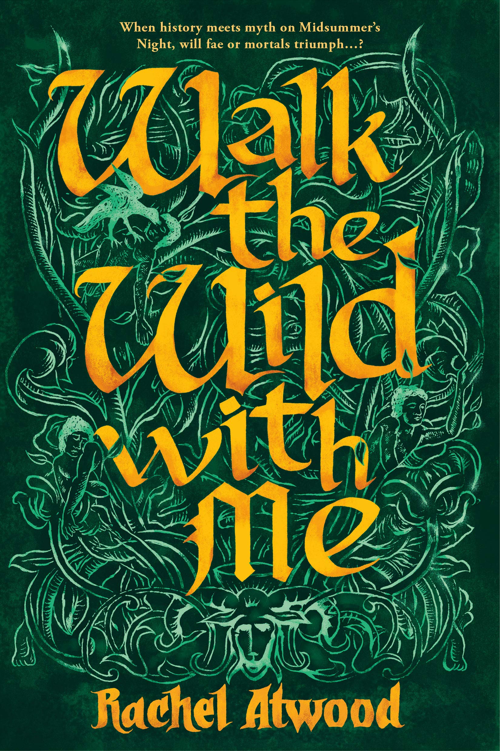
Walk the Wild With Me by Rachel Atwood; design by Leo Nickolls (DAW / December 2019)

The Yearling by Marjorie Kinnan Rawlings; design by Kimberly Glyder (Scribner / January 2020)

Comments closed

Robert Rauschenberg and the Subversive Language of Junk

Rauschenberg’s ‘muse wall’, a collection of objects and images that inspired him, in his print shop, Captiva, Florida, around 1979. Photograph: Emil Fray/Robert Rauschenberg Foundation

With a major Robert Rauschenberg retrospective opening at Tate Modern in December, Alex Needham, writing for The Guardian, visits the late artist’s island home of Captiva, Florida:

Rauschenberg started visiting in 1962, before moving to Captiva nine years later, describing it as “the foundation of my life and my work… the source and reserve of my energies”. His work by then had become ambitious and complicated; Captiva forced a return to simplicity, and the first things he produced were a selection of wall sculptures made from battered cardboard boxes.

For the world beyond Captiva’s white sands, however, a reacquaintance with Robert Rauschenberg is long overdue. In Britain, there has been no major retrospective of his work since 1981, while the last big US survey, at the Guggenheim in New York, took place in 1997. That will change next month, when Tate Modern opens a London retrospective; it will then move to Moma in New York next May, and after that to the San Francisco Museum of Modern Art.

Rauschenberg left a bold and indelible mark on the 20th century. His combines, which integrated the flotsam and trash of everyday life, including the artist’s own duvet in Bed (1955), were neither painting nor sculpture, and proved that anything could be the material of art. At Tate Modern, pride of place will be given to Monogram 1955–59, a horizontal canvas on which perches a stuffed goat with a tyre around its midriff; the work thrilled and scandalised when it was first shown at Castelli’s gallery in New York, and rapidly became synonymous with the artist’s iconoclasm. Since then, his relevance has only increased, says Leah Dickerman, co-curator of the new retrospective: “When you open a gallery and see the art that’s made out of the stuff of the real world, that’s coming off the walls, that’s interdisciplinary in its approach, all that is the legacy of Rauschenberg.”


Detail from Rauschenberg’s Mirthday Man (1997)

Also at writing for The Guardian, Olivia Laing, author of The Lonely City and The Trip to Echo Spring, looks back over Rauschenberg’s career:    

Making the combines, Rauschenberg felt he was cracking “the secret language of junk”. They could be composed of anything: a goat corseted by a tire; a stuffed bald eagle. One of the very first, Untitled (Man with White Shoes), contained – deep breath – fabric, newspaper, a photograph of Jasper Johns, a handwritten letter from Rauschenberg’s son, a drawing by Twombly, glass, mirror, tin, cork, a pair of the artist’s socks and painted leather shoes, dried grass and a taxidermied Plymouth Rock hen.

All the same, there’s a limit to how much world you can cram into a sculpture, and as Rauschenberg’s success grew he became increasingly fascinated by replication. Back in 1952, he’d experimented with transfer drawing, and in 1958 he embarked on a grand project of illustrating Dante’s Inferno using lighter fluid to transfer images on to paper. In 1962, Andy Warhol introduced him to a far more sophisticated technique: the wizardry of using photographic images on silkscreen canvases.

Now he could reuse and resize his own photos and those he snipped from newspapers and magazines, giving him an unprecedented power of composition. Anything could be incorporated: John F Kennedy; a water tower; Bonnie and Clyde. As he gleefully observed of the silkscreen paintings: “It’s as much like Christmas to me as using objects I pick up on the street.” He was giddy for them, until in 1964 he was awarded the Golden Lion at the Venice Biennale. Terrified of stasis, the next day he called his New York studio and asked his assistant to burn all the screens.

See also: Hal Foster on Rauschenberg retrospective for the London Review of Books,  

Comments closed

Willem Sandberg: From Type to Image

Sandberg1

Writing for The Guardian, Simon Garfield (Just My Type), visits the first UK retrospective Dutch designer and curator Willem Sandberg:

“This is printed on wallpaper, very asymmetric … an amazing thing really,” Fraser Muggeridge, the curator, says as he shows me his collection of Sandberg ephemera in his studio in London’s Smithfield. It is a space Sandberg would have admired, with its display of promotional work for emerging artists and galleries crowding in from the walls. “I don’t think he was trying to make the most perfect work, but it was always free-spirited and arresting.” His letters were highly sculptural, revealing negative space; at first glance a torn “T” becomes a sideways “E”. They speak of his obsession not only with making intricate objects by hand, but also with solid branding: his graphics for the Stedelijk created a look and mood for a museum that today would require a huge budget and corporate pitching.

Astonishingly, most of Sandberg’s catalogues and posters were a sideline, designed in the evenings and at weekends. Sandberg was the director of the museum from 1945 to 1962, and his close relationship with the local state printer produced an identity that transformed the Stedelijk into one of Europe’s first truly modern galleries. He created what he liked to refer to as an “Anti-Museum”, rejecting the traditional dark and hushed rooms and creating something bright and accessible, a place of social interaction. He championed young artists, and he succeeded in attracting people who had barely set foot in a museum before. There was a shop, a learning centre and a cafe, all brave innovations in the middle of the century. As was Sandberg’s scheme to get the Stedelijk a little more noticed in the city: he painted the entire building white.

sandberg4

Willem Sandberg: From Type to Image‘ is at the De La Warr Pavilion, Bexhill-on-Sea, UK until 4 September.

Comments closed

Robert Hughes on Robert Rauschenberg

9781400044450

The New York Review Books has an excerpt from the late Robert Hughes’s unfinished memoir — to be published for the first time this month by Knopf in The Spectacle of Skill: Selected Writings of Robert Hughes — on artist Robert Rauschenberg:

Rauschenberg’s references to other media aren’t just tricks. They’re an integral part of the way he connects the language of his images to that of a wider world. Collagists had always done this, ever since the invention of collage. Braque and Picasso brought newspaper clippings and headlines into their images, though these had to be scaled to the actual size of the printed page—you couldn’t effectively do a cubist collage six feet high, it would need too many elements.

The same was true of Kurt Schwitters, with his bus tickets and cigarette wrappers and bits of wood or rusty iron. But around 1962, Rauschenberg began to use not things but the images of things. He gathered photos and enlarged them into silk screens, so that they could be printed directly on the canvas. This had two main effects. First, it enormously increased his image bank, because just about everything in the world, from mountains to beetles, from spermatozoa to Thor-Agena rockets, has been photographed. And second, by reusing silk-screened images from one painting to the next, it let him use repetition and counterpoint across a series of works in a way that wasn’t possible, or not easily possible, if he had been using things themselves. In doing this, he was adapting to the great central fact of American communication, its takeover by the imagery of television.

Comments closed

Samplerman

samplerman-01

Thanks to David Gee (and others), who alerted me to the extraordinary Samplerman comics this week.

You can read an interview from earlier this year with Yvan Guillo, the French cartoonist and designer behind Samplerman, at It’s Nice That:

I’ve always downloaded tonnes of scans of American comics, from the golden age to the bronze age. I could scan the ones I have but I’ve done it only once or twice. I don’t really read the stories, but I love how they look: the cheap paper, the bright primary colours, the screen-tone, the drawings, the conventional representation of landscapes, the simplicity of the lines. I have to make a choice among this mountain of graphic elements. I pick what I like: face, hand, clothes, tree, car, text balloon etc. and start to (digitally) cut them out. At the same time I start to place the elements on one or several pages made of blank comic panels. Some elements are duplicated, rotated, arbitrarily cut in half, reduplicated and mirrored. It’s a mix of kaleidoscope and collage; I add, I move, I replace until I feel it’s done. At the end it has to remain visually surprising and dynamic.

samplerman-03

Bonkers.

1 Comment

The Great Discontent: John Gall

john-gall-ryan-essmaker-lg

Just fantastic interview with book designer and art director John Gall at The Great Discontent:

I find it hard to think about design in terms of changing the world, but it’s important to think about design in terms of the decisions you make about what you make. Ask yourself: “What am I putting out into the world? Am I helping sell Big Macs or deodorant or iPhones or whatever?” I have nothing against any of those, but at some point in my life, I decided to focus on books. Books are intrinsically good: even the worst book—with some notable exceptions—isn’t truly bad. If people are reading, it is good. As designers, we’re attached to the selling of something; no matter what we’re making there is a selling component. In that sense, the decision to work with books was very much about the larger picture of what I was helping to usher into the world.

I talked to John about his collages waaaaaay back in 2011.

Comments closed

Penguin Modern Classics The Cut-Up Trilogy by William Burroughs

Following on from yesterday’s post on Penguin’s pocket hardback classics, Penguin Modern Classics are also reissuing William Burroughs’ cut-up trilogy with menacingly dark collage cover art by Julian House:

9780141396064

9780141189789

9780141189772

Comments closed

Midweek Miscellany

Tell Me a Story From Before I Can Remember — A silkscreen poster of an ideal bookshelf of 100 books designed by Athens-based design studio KEIK Bureau.

Going Back to Bed — Jonathan Jones on the art of Robert Rauschenberg, for The Guardian:

Bed belongs to what is arguably the greatest series of works of art ever made in America. It is said to have been Johns who came up with the word “combines” to describe the works Rauschenberg started to assemble in 1954, putting together found photographs, newspaper clippings, fabrics, furniture, tyres and stuffed animals in intense configuations, all soaked and veiled in abstract expressionist paint. Thinking about them, I find myself struggling to find any match for what Rauschenberg achieved, not just in visual art, but in other arts, such as fiction. For what he created in these complex, tantalising, epic works was that elusive cultural totem, the “great American novel”.

Airstrip 1 — David Aaronovitch on George Orwell’s vision of a totalitarian future, for the BBC Magazine:

I was brought up in a house full of books, none of them by George Orwell.

Simone de Beauvoir was there, as was Sartre and Aldous Huxley and even Lenin. The last is actually a clue as to the absence of the first.

My parents were Communists. To them Orwell was on the other side of politics – someone whose principal writings were hostile to them and what they wanted to achieve….

Comments closed

Something for the Weekend

Rubbish — Rachel Cooke on the artist Kurt Schwitters at The Guardian:

Merz doesn’t mean anything: it is a nonsense word (it comes from Commerzbank, an ad for which appears in one of his earliest collages). But after 1918 everything Schwitters made was Merz, whether it was periodical, painting or poem. He was a one-man movement. “The word denotes essentially the combination of all conceivable materials for artistic purposes,” he said. “And technically the principle of equal evaluation of the individual materials… A perambulator wheel, wire-netting, string and cotton wool are factors having equal rights with paint.” In other words, art could be made from the things most people regarded as rubbish. Almost overnight, he became a collagist.

There is a slide-show of Schwitters’ collages here.

Also: Merzman: The Art of Kurt Schwitters, is a fascinating 30-minute BBC Radio 4 documentary about the artist and his work in Britain.

The exhibition Kurt Schwitters in Britain opens at the Tate January 30, 2013.

Going Underground — The iconic London Underground typeface, designed by Edward Johnston in 1913, turns 100:

“Underground” — later known as “Johnston” — was circulated as a lettering guide for sign-painters and also made into wood and metal type for posters, signs, and other publicity materials used throughout London’s transport network.

Johnston himself only drew one weight of the typeface. He based its weight and proportions on seven diamond-shaped strokes of a pen stacked in a row. This gesture even shows up in the typeface itself, with the characteristic diamond used as the tittle of the “i” and “j”. He felt so strongly about the weight of the design that when another student of his agreed to create an accompanying set of bold capitals, Johnston wouldn’t speak to him for decades afterward.

And finally…

Fire Hose — James Gleick on the Library of Congress collecting and storage of Twitter messages, for the New York Review of Books:

This is an ocean of ephemera. A library of Babel. No one is under any illusions about the likely quality—seriousness, veracity, originality, wisdom—of any one tweet. The library will take the bad with the good: the rumors and lies, the prattle, puns, hoots, jeers, bluster, invective, bawdy probes, vile gossip, epigrams, anagrams, quips and jibes, hearsay and tittle-tattle, pleading, chicanery, jabbering, quibbling, block writing and ASCII art, self-promotion and humblebragging, grandiloquence and stultiloquence. New news every millisecond. A vast confusion of vows, wishes, actions, edicts, petitions, lawsuits, pleas, laws, proclamations, complaints, grievances. Now comical then tragical matters.

Call it what you will, the Twitter corpus now forms a piece of “the creative record of America” and therefore falls squarely within the library’s mission…


Comments closed

TateShots: Kurt Schwitters ‘Merz Barn’

I didn’t know that influential German artist Kurt Schwitters spent the last years of his life in exile in England’s Lake District creating something called the ‘Merz Barn’. Did you?

Schwitters started constructing the original ‘Merzbau’ (pictured above) inside his Hannover studio in the 1920’s and continued to work on it until he fled Nazi Germany in 1937. The Merzbau itself was later destroyed in an Allied bombing raid in World War II.

The uncompleted ‘Merz Barn’ that Schwitters began building near Elterwater in the Lake District is much less well-known. The latest TateShots video visits this only surviving example of Schwitters’ Merz environment:

(I’m not entirely sure how or why radio presenter Tom Ravenscroft (son of the late John Peel) is involved, but if you don’t listen to his weekly music show on BBC, you should probably take a listen… if you like that sort of thing.)

1 Comment

Midweek Miscellany

An interview with award-winning Toronto-based illustrator Gary Taxali at GrainEdit.

How Disappointing — Book designer Peter Mendelsund on what we picture in our minds when we read literary works:

“Call me Ishmael.” What happens when you read this line? You are being addressed, but by whom? Chances are you hear the line (in your mind’s ear) before you picture the speaker. I can hear Ishmael’s words more clearly than I can see his face. (Audition requires different neurological processes than vision, or smell. And I would submit that we hear more when we read than we see). Picturing Ishmael requires a strong resolve.

But if you indeed took the trouble to summon an image of Ishmael what did you come up with? A sea-faring man of some sort? Is this a picture or a category? Do you picture Richard Basehart, the actor in the John Huston adaptation? How disappointing.

(All I can say is that the follow-up essay had better be about comic books, Peter!)

The Secret Detectives — An interview with Patti Smith in The Telegraph:

“When I was young I knew William Burroughs really well. And William’s secret desire, which he never quite did, was to write a straightforward detective novel. How good would that have been! And I used to say, ‘you have to do it William!’ And he’d say” – Smith gives a passable impersonation of the Burroughsian growl – “‘Oh, I don’t know, one of these days.’ William was like the embodiment of a detective, I just loved him so much.”

Our Greatest Creation — Jonathan Glancey, The Guardian‘s former architecture and design correspondent, reviews City: A Guidebook for the Urban Age by P.D. Smith:

The stuff of lofty intentions and grubby backstreet life, the city represents much of our restless and contradictory natures. “In this dynamic, cosmopolitan space,” Smith writes, “lies the wellspring of our creativity as a species. The greatest cities nurture and stimulate ideas in science and the arts that are the very heart of human civilisation. For this reason, sustainable, humane and well-governed cities are our best hope for the future.”

Amen.

Hiding in Plain Sight — Type designer Ramiro Espinoza on ‘Amsterdamse Krulletter’, the curly lettering painted on the windows of traditional pubs in Amsterdam, and his only typographic revival Krul:

The fact that such gorgeous and original letters have largely been ignored in a country with such a rich type- and letter-making tradition reminds me of the plot of Edgar Allan Poe’s famous story “The Purloined Letter”. In the story, an important document cannot be found because it is lying in plain sight. Sometimes things can become invisible to us because of their very familiarity.

Avant Garde — Adrian Shaughnessy on life and work of designer Herb Lubalin at Imprint:

I have a pet theory about why Lubalin is currently popular: In the eyes of many designers, he offers a way of designing—and of communicating—that doesn’t require expensive art direction, over-manicured photography, or grandiose presentation. Lubalin proved that to be effective, all you need is a typeface and a good idea. In other words, he is a designer for the age of austerity.

Unit Editions’ forthcoming limited edition monograph, Herb Lubalin: American Graphic Designer, 1918–81, will be available in August.

And finally (and also at Imprint)…

An interview with designer and collage artist Graham Moore, who incorporates mid-century modern ephemera and fragments from billboard posters into his work.

Comments closed

All That Remains

From its abstract roots in Cubism to the political and counter culture movements of Dada and Punk, collage has always been a product of its environment. With the rise of 24 hour media cycles, social networks and search engines, contemporary culture has effectively rendered print media obsolete, creating a virtual boom in discarded paper ephemera for collage artists to examine and reinvent. Through these discarded remnants collage artists have become the archivists and activists of this post modern age, paralleling the frenetic pace in which we live while exposing the voyeuristic and often disjointed nature of popular culture.

If you’re going to be in New York at the end of this month, you might want to check out All That Remains, an exhibition of international collage at the Ugly Art Room in Brooklyn. Among the exhibitors is one John Gall, art director at Vintage/Anchor Books. You can read my interview with John about his collage here.

UGLY ART ROOM PRESENTS: ALL THAT REMAINS

October 21st – November 19th, 2011
Ugly Art Room (via Picture Farm)
338 Wythe Ave, Brooklyn, NY 11211

Opening Reception: 7-9pm, Friday, October 21st, 2011

Comments closed