Skip to content

Tag: clare skeats

Book Covers of Note, June 2019

Apparently it is June already. I’m pretty sure it’s a terrible mistake. 

Here are your book covers of note.


Aug 9 —  Fog by Kathryn Scanlan; design by Na Kim (Farrar Straus & Giroux MCD / June 2019)


Cogito by Victor Dixen; design by Jim Tierney (Collection R / May 2019)

This reminded me of something. I’m not sure exactly what. The best I could up with was Nicole Caputo‘s stripey op-art cover for Liveblog by Megan Boyle, but that’s not it at all… 


The Girl at the Door by Veronica Raimo; design by Julian Humphries (Fourth Estate / June 2019)


The Grand Dark by Richard Kadrey; design by Will Staehle (Harper Voyager / June 2019)


Lie With Me by Philippe Besson; design by Na Kim (Scribner / April 2019)


The Last Love Poem I Will Ever Write by Gregory Orr; design by Jared Oriel (W.W. Norton / June 2019)


Malina by Ingeborg Bachman; design by Peter Mendelsund (New Directions / June 2019)


Norco ’80 by Peter Houlahan; design by Jaya Miceli (Counterpoint / June 2019)


November by Jorge Galán; design by Steve Leard (Little, Brown / June 2019)

I’m starting to detect a colour scheme at work here, Steve… ;-) 


On Earth We’re Briefly Gorgeous by Ocean Vuong; design by Darren Haggar; photograph by Sam Contis (Penguin Press / June 2019)

Are we seeing a trend for close cropped photographs of… arms? (Don’t get me wrong, these are both beautiful photographs / covers.)

Also of note in a compare-and-contrast sort of way, the cover of the UK edition of On Earth We’re Briefly Gorgeous published by Jonathan Cape was designed by Suzanne Dean:


Open Me by Lisa Locascio; design by Kelly Winton; collage by Katrien de Blauwer (Grove / June 2019)


Patsy by Nicole Dennis-Benn; design by Steve Attardo; handlettering by Sarahmay Wilkinson (Liveright / June 2019)


Silver in the Wood by Emily Tesh; design by David Curtis (Tor / June 2019)


The Social Photo by Nathan Jurgenson; design by Pablo Delcan (Verso / May 2019)


The Sun On My Head by Geovani Martins; design by Clare Skeats (Faber & Faber / June 2019)


The Ungrateful Refugee by Dina Nayeri; design by Christopher Gale (Canongate / May 2019)


The White Death by Gabriel Urza; design by Joan Wong (Nouvella / June 2019)

This reminds me (a little bit) of the Penguin English Library covers art directed by Coralie Bickford-Smith a few years ago:


William S. Burroughs and the Cult of Rock ‘n’ Roll by Casey Rae; design by Matt Avery (University of Texas Press / June 2019)

3 Comments

Book Covers of Note, April 2019

Well, if the sun’s turned cold and the sky’s got black, it must be April!1 Here are this month’s book cover selections… 


The Affairs of the Falcóns by Melissa Rivero; design Allison Saltzman; lettering Boyoun Kim (Ecco / April 2019)


All Ships Follow Me by Mieke Eerkens; design Henry Sene Yee (Picador USA / April 2019)

Another cover for the Lydian file. (I posted a link to this on Twitter, but I don’t think I’ve mentioned it here — Kaitlyn Tiffany recently wrote a piece on the Lydian phenomenon for Vox if you want to read a bit more about it) 


Feast Your Eyes by Myla Goldberg; design Lauren Peters-Collaer (Scribner / April 2019)


The Flip by Jeffery J. Kripal; design by Tree Abraham (Bellevue Literary Press / March 2019)


Four Words for Friend by Marek Kohn; design by Clare Skeats (Yale University Press / April 2019)

Some lovely type there… Can anyone tell me what the title typeface is please? It seems like a good alternative for our old friend Lydian there…

The Lady from the Black Lagoon by Mallory O’Meara; design by Erin Craig; art by Matt Buck (Hanover Square / March 2019)

Is this the first Harlequin book cover to feature on the site? Possibly… 


Never a Lovely So Real by Colin Asher; design by Jonathan Bush (W. W. Norton / April 2019)

A couple of bold design decisions here — neither the author name or the subtitle (“The Life and Work of Nelson Algren”) are on the front cover.


The New Me by Halle Butler; design by Rachel Willey (Penguin / March 2019)


Notes from a Young Black Chef by Kwame Onwuachi with Joshua David Stein; design by Stephanie Ross; photograph Matt McClain (Knopf / April 2019)


The Other Americans by Laila Lalami; design by Janet Hansen (Pantheon Books / March 2019)


The Mountain that Eats Men by Ander Izagirre; design by Steve Leard (Zed Books / April 2019)


Swift by David Baker; design by Sarahmay Wilkinson (W.W. Norton / April 2019)


The Volunteer by Salvatore Scibona; design by Rachel Willey (Penguin / March 2019)


What Doesn’t Kill You Makes You Blacker by Damon Young; design by Sarah Huny Young (Ecco / April 2019)


You Are What You Read by Jodie Jackson; design by Steve Leard (Unbound / April 2019)

Comments closed

Today in Micro-Trends: Cassette Tape Book Covers

This is another one of those posts that started out on Twitter — a flippant tweet from me sparking a conversation about books with cassette tapes and vinyl records on their covers. It turns out that putting a record on a cover has become quite popular. Unfortunately the composition of many of these covers is often strikingly similar, even if the tone/intent is different.

The combination of clunky retro-future technology of cassettes and the DIY aesthetic of mix tapes, on the other hand, provides a richer vein of inspiration…

Art Behind the Mixtape design UnderConsideration
The Art Behind the Tape by Marshall “DJ Mars” Thomas, Djibril Ndiaye, Maurice Garland, and Tai Saint-Louis; design UnderConsideration (2015)

Big Rewind design Regina Starace
The Big Rewind by Libby Cudmore; design by design Regina Starace (William Morrrow / February 2016)

Counter Narratives Palgrave Macmillan
The Counter-narratives of Radical Theology and Popular Music edited by Michael Grimshaw; design Palgrave Macmillan Design (Palgrave Macmillan / May 2014)

don't-you-forget-about-me
Don’t You Forget About Me by Jancee Dunn; design by Catherine Casalino (Villard Books / July 2008)

9781846146459
Earthbound by Paul Morley; design by Jim Stoddart (Penguin / August 2013)

he died with his eyes open design Christopher King
He Died with His Eyes Open by Derek Raymond; design by Christopher Brian King (Melville House / October 2011)

Iron Rose design W H Chong
An Iron Rose by Peter Temple; design by W. H. Chong (Text / June 2016)

Kill Your Friends design Glenn ONeill photo colin thomas
Kill Your Friends by John Niven; design by Glenn ONeill; Photograph Colin Thomas (Cornerstone / July 2014)

Landscapes of the Metropolis of Death design Jim Stoddart
Landscapes of the Metropolis of Death by Otto Dov Kulka; design by Jim Stoddart (Penguin / March 2014)

UMN28 Walsh Bootlegs D1.indd
Bar Yarns and Manic Depressive Mix Tapes by Jim Walsh; design by Michel Vrana; lettering by Robert Lawson (University of Minnesota Press / NYP)

New Sorrows design Clare Skeats
The New Sorrows of the Young W. by Ulrich Plenzdorf; design Clare Skeats; cover art by Joel Penkman; series design David Pearson (Pushkin Press / September 2015)


Signal to Noise by Silvia Moreno-Garcia; design by Erik Mohr (Solaris / October 2015)

Tape
Tape by Steven Camden; cover art by Keri Smith (HarperCollins Children’s Books / January 2014)

Tsar of Love and Techno design Christopher Brand Photography Bobby Doherty
Tsar of Love and Techno by Anthony Marra; design Christopher Brand; photography Bobby Doherty (Hogarth / October 2015)

(I also rather like this tape-related killed cover by designer Na Kim)

So there you have it — cassette tape book covers are a thing. But please let’s not get started on VHS tape book covers…

Comments closed

ABCD Award Winners 2016

Congratulations to all the winners and shortlisted covers at the third annual Academy of British Cover Design Awards! Make sure you read Daniel Benneworth-Gray‘s report on last night’s “shindig” at the Creative Review, but in the meantime, all the winning designs are below:

Children’s
fox and the star

The Fox and the Star, written, illustrated and designed by Coralie Bickford-Smith (Particular Books / August 2015)

Young Adult

Asking For It design Kate Gaughran
Asking For It by Louise O’Neill; design by Kate Gaughran (Quercus / September 2015)

Sci-Fi / Fantasy

a-man-lies-summer
A Man Lies Dreaming by Lavie Tidhar; design by Ben Summers (Hodder / March 2015)

Mass Market

hausfrau-UK
Hausfrau by Jill Alexander Essbaum; design by Jo Thompson; illustration by Maricor/Maricar (Mantle / March 2015)

Literary Fiction

Memoirs of a Dipper design by Gray318
Memoirs of a Dipper by Nell Leyshon; design by Gray318 (Fig Tree / June 2015)

Crime / Thriller

9780241972762
Whisky Tango Foxtrot by David Shafer; design by Richard Bravery (Penguin / June 2015)

Nonfiction

egg design by Clare Skeats
Egg by Blanche Vaughan; design by Clare Skeats (Wiedenfeld & Nicolson / March 2015)

Series Design

Great Northern design James Paul Jones
Great Northern? by Arthur Ransome; design James Paul Jones; illustration by Pietari Posti (Vintage / March 2015)

Classics / Reissue

Far From the Madding Crowd design Sinem Erkas
Far From the Madding Crowd by Thomas Hardy; design by Sinem Erkas (Orion / September 2015)

Women’s Fiction

I Love Dick design by Peter Dyer
I Love Dick by Chris Kraus; design by Peter Dyer (Profile Books / November 2015)

You can see all last year’s winners here.

Comments closed

Book Covers of Note July 2015

It’s finally summer, and because July is traditionally something of a quiet month in publishing, I’m taking the opportunity to catch up on a few covers that I missed earlier in the year…

Act of God design Janet Hansen

Act of God by Jill Ciment; design by Janet Hansen (Pantheon / March 2015 )

All My Puny Sorrows design Sunra Thompson

All My Puny Sorrows by Miriam Toews; design and illustration by Sunra Thompson (McSweeney’s / June 2015)

Print
Armada by Ernest Cline; design by Will Staehle (Crown / July 2015)

Asylum design Spencer Kimble
The Asylum by Simon Doonan; design by Spencer Kimble (Blue Rider Press / February 2015 )

Book of Numbers design Suzanne Dean cover illustration Carnovsky

Book of Numbers by Joshua Cohen; design by design Suzanne Dean; illustration Carnovsky (Harvill Secker / June 2015)

Book of Numbers design Oliver Munday

Book of Numbers by Joshua Cohen; design by Oliver Munday (Random House / June 2015)

Chasing Rumer illustration by Andrew Holder

Chasing Rumor by Cameron Chambers; design by Haruna Madono; illustration by Andrew Holder (Patagonia / June 2015)

Earth design by Alex Merto
Earth by Hubert Krivine; design by Alex Merto (Verso Books / April 2015)

Economics After Capitalism design David Gee

Economics After Capitalism by Derek Wall; design by David A. Gee (Pluto Press / July 2015)

egg design by Clare Skeats

Egg by Blanche Vaughan; design by Clare Skeats (Wiedenfeld & Nicolson / March 2015)

Here You Are design by Alban Fischer

Here You Are by Jared Joseph & Sara Peck; design by Alban Fischer (Horse Less Press / March 2015)

Krautrock design by Adly Elewa

Future Days by David Stubbs; design by Adly Elewa (Melville House / July 2015)

Lord Fear design by Kelly Blair

Lord Fear by Lucas Mann; design by Kelly Blair (Pantheon / May 2015)

Modern Romance design by Jay Shaw photograph by ruvan wijesooriya
Modern Romance by Aziz Ansari; design by Jay Shaw; photograph by Ruvan Wijesooriya (Penguin / June 2015)

Pretty Is design by Lucy Kim

Pretty Is by Maggie Mitchell; design by Lucy Kim (Henry Holt / July 2015)

Seed Collectors design by Gray318

The Seed Collectors by Scarlett Thomas; design by Gray318 (Canongate / July 2015)

Stammered Songbook design Clare Skeats

Stammered Songbook by Erwin Mortier; design by Clare Skeats (Pushkin Press / March 2015)

thrown design gray318

Thrown by Kerry Howley; design by Gray318 (Hamish Hamilton / May 2015)

Trust Me design Jamie Keenan
Trust Me, PR is Dead by Robert Phillips; design by Jamie Keenan (Unbound / June 2015)

Unibrow design Zoe Norvell

Unabrow by Una Lamarche; design by Zoe Norvell (Plume / March 2015)

9780241972762
Whisky Tango Foxtrot by David Shafer; design by Richard Bravery (Penguin / June 2015)

World on a Plate design Nick Misani

World on a Plate by Mina Holland; design by Nick Misani (Penguin / May 2015)

Comments closed

Triangles, Quadrangles, Shards, and Fragments

This is my last post on book covers and triangles — for the time being at least. I hope you’ve enjoyed this three-sided, three-post design diversion (you can see the previous posts here and here):

Adjacent
The Adjacent by Christopher Priest; design by Martin Stiff, Amazing15 (Titan Books April 2014) 1

book-of-heaven
The Book of Heaven by Patricia Storace; design by Linda Huang (Pantheon February 2014)

book-of-my-lives
The Books of My Lives by Aleksandar Hemon; design by Jonathan Pelham (Picador February 2014)

box-of-birds
A Box of Birds by Charles Fernyhough; design by Dan Mogford (Unbound May 2013)

close-to-the-machine
Close to the Machine by Ellen Ullman; design by Clare Skeats (Pushkin Press March 2013)

9780241951873
Connectome by Sebastian Seung; design by Matthew Young (Penguin June 2013)

9780226652924
Contradance by John Peck; design by Natalie F. Smith (University of Chicago Press October 2011)

Dostoevsky_Demons
Demons by Fyodor Dostoevsky; design by Peter Mendelsund (Vintage August 2004)

9780393062946_GunDealersDaughter_JKT.indd

Gun Dealers’ Daughter by Gina Apostol; design by Jaya Miceli (W. W. Norton August 2012)

9780374534707

November 1916 by Aleksandr Solzhenitsyn (Farrar, Straus & Giroux August 2014)

August 1914 by Aleksandr Solzhenitsyn (Farrar, Straus & Giroux August 2014)

Stories and Prose Poems by Aleksandr Solzhenitsyn (Farrar, Straus & Giroux November 2014)

Design by Oliver Munday

9780141393346
The Scandal of Father Brown by G. K. Chesterton; design by Matthew Young (Penguin

snowdrops
Snowdrops by A. D. Miller; design by Emily Mahon (Doubleday February 2011)

time-machine
The Time Machine by H. G. Wells; design by Coralie Bickford-Smith (Penguin May 2012)

we-the-animals-800
We Are Animals by Justin Torres; design by Gray318 (Granta March 2012)

your-face-mine
Your Face in Mine by Jess Row; design by Oliver Munday (Riverhead August 2014)

This slideshow requires JavaScript.


3 Comments

Triangles Are My Favourite Shape

Let’s tessellate…

I’ve been thinking a lot about triangle patterns recently (that’s just how my mind works — don’t ask) and collecting together a few book covers (and related matter) that use them in their designs. I thought I’d share some of the things I’ve come across here…

MythOfSis
The Myth of Sisyphus by Albert Camus; design by Helen Yentus (Vintage Books 2007) harvard-review-35-full

Harvard Review #35 (Fall 2008), #39 (Fall 2010) and #41 (Winter 2011); design by Alex Camlin

cuttingedges cutting-edges-gestalten

cutting-edges-jelle-martens
Cutting Edges: Contemporary Collage edited by Robert Klanten, Hendrik Hellige and J. Gallagher (Gestalten February 2011) — collages by Jelle Martens

traveller-of-the-century
Traveller of the Century by Andrés Neuman; design by Clare Skeats (Pushkin Press, January 2013)

LaBoîteAuxLettresDuCimetière_1000

LaSolutionEsquimauAW

la-troisieme-balle

La Boîte aux lettres du cimetière by Serge Pey (Éditions Zulma February 2014)

Notre quelque part by Nii Ayikwei Parkes (Éditions Zulma February 2014)

Dictionnaire du parfait cynique by Roland Jaccard (Éditions Zulma March 2007)

La Troisième Balle by Leo Parutz (Éditions Zulma October 2014)

Design by David Pearson

(I also rather like the cover for Le Goût âpre des kakis by Zoyâ Pirzâd as well)

sounds good
Sounds Good 101 Poems to be Heard edited by Christopher Reid; design by Eleanor Crow (Faber & Faber, March 2012)

Herbert Scarf’s Contributions to Economics, Game Theory and Operations Research Volumes 1-3 by Edited by Zaifu Yang (Palgrave Macmillan, September 2013)

The Here And Now
The Here and Now by Ann Brashares; design by Natalie Sousa (Delacorte Press, April 2014)

cataract-city
Cataract City by Craig Davidson; design by Kapo Ng (Graywolf, July 2014)


The Last Days by Laurent Seksik; design by David Pearson (Pushkin Press, Nov 2013)


juxtapoz-psychedelic
Juxtapoz Psychedelic by Hannah Stouffer (Gingko Press February 2014)

( Unfortunately I’m not sure the image quite does justice to this cover…

Update:

A excellent addition to the list from UK designer Stuart Bache:

astonish-me

Astonish Me by Maggie Shipstead; design by Stuart Bache (Blue Door May 2014)

4 Comments

Recent Covers of Note March 2014

9781408857229
The Arsonist by Sue Miller; design by Greg Heinimann

barcelona-shadows
Barcelona Shadows by Marc Pastor; design by Clare Skeats

beauty
Beauty by Frederick Dillen; design by Christopher Lin

Mabey Dreams
Dreams of the Good Life by Richard Mabey; illustration by Millie Marotta; design Samantha Johnson / Coralie Bickford-Smith

fantomes_fument_c1
Les fantômes fument en cachette by Miléna Babin; design by David Drummond

frog music
Frog Music by Emma Donoghue; design by Katie Tooke; illustration Emma Farrarons

give-me-everything-you-have
Give Me Everything You Have by James Lasdun; design by Julia Connolly

9780374175344
The Improbability Principle by David J. Hand; design by Oliver Munday

metamorphosis
Metamorphosis by Franz Kafka; design by Jamie Keenan

13068415704_287b75914a_b
The New New Thing by Michael Lewis; design by Darren Haggar

on-the-reproduction-of-capitalism
On the Reproduction of Capitalism by Louis Althusser; design by Neil Donnelly

9780374209148-gabriele-wilson
The Orchard of Lost Souls by Nadifa Mohamed; design by Gabriele Wilson

swan-gondola-9781780744902
The Swan Gondola by Timothy Schaffert; design by Alex Merto

9781250039569
The Trip to Echo Spring by Oliva Laing; design by Henry Sene Yee

why-we-took-the-car-design-allison-colpoys
Why We Took the Car by Wolfgang Herrndorf; design by Allison Colpoys

This slideshow requires JavaScript.

3 Comments

The Academy of British Cover Design Winners

The Academy of British Cover Design held its inaugural awards ceremony last night. The competition was open to any cover produced for a book published between January 1 and December 31 2013 by a designers based in the UK. Here are the winning cover designs in each of the 10 categories:

Children’s

charm-and-strange
Charm and Strange by Stephanie Kuehn; design by Sharon King-Chai

Young Adult

Tinder
Tinder by Sally Gardner; design by Laura Brett

Sci-Fi / Fantasy

i-robot
I, Robot by Isaac Asimov; design by Clare Skeats

Mass Market

scent-of-death
The Scent of Death by Andrew Taylor; design by Emma Rogers

Literary Fiction


Tampa by Alissa Nutting; design by Gray318

Crime / Thriller

81V5+2E42cL._SL1500_
Tequila Sunset by Sam Hawken; design by Tony Lyons at Estuary English

Non-fiction

football-type
Football Type; design by Rick Banks at Face37

Series Design

tender-is-the-night
 F. Scott Fitzgerald paperbacks; design by Sinem Erkas (pictured: Tender is the Night)

Classics / Reissue


1984 by George Orwell; design by David Pearson

Women’s Fiction

instructions-for-a-heatwave
Instructions for a Heatwave by Maggie O’Farrell; design by Yeti McCaldin

2 Comments

Stories from the Fold


If you are going to be in London on September 25th, Stories from the Fold, a mini-conference about book design at the St. Bride Library looks terribly interesting. Curated by designer Becky Chilcott, speakers include Jon Gray (AKA Gray318), Clare Skeats, and host of others.

Sounds like a great way to spend an evening to me.

Tickets are £25.00 (£20.00 for students).

Comments closed

Q & A with Clare Skeats

Hugo Wilcken’s Colony (published in 2007 and mentioned previously here) is almost certainly the novel I’ve talked up most this year. The cover, something like a jaunty vintage travel poster to a malarial Heart of Darkness (nauseously appropriate for a postmodern novel about a French penal colony), was designed by London-based print designer Clare Skeats.

Specializing in book design and art direction, Clare has a a great eye for partnering distinctive typography with bold creative imagery. Her covers often seem to use elements from the past, but always feel dynamically contemporary.

I’m really happy to have had the opportunity talk to Clare about her work. We corresponded by email.

How did you get into book design?

After graduating in 97, I tried, and failed to get a job as a junior designer at Penguin. They did offer me work experience though — so I moved to London to do that, and basically never left.

Have you always run your own studio? Where were you previously?

No. I stayed at Penguin for 4 years (they did eventually employ me!), then during a brief period at Random House, an opportunity arose to work for UK clothing designer Margaret Howell. It was great to step away from books for a bit and be part of a completely different industry. I was involved in virtually all aspects of the company; from designing Fashion Week press invites to drawing up manufacturing specification manuals. During my time there I was also working freelance — so after two very busy years, I left Margaret Howell to become full-time freelance, which is where I am now.

Could you describe your design process?

I’m lucky in that a lot of my clients allow me to just read and then make all the suggestions. I work in a number of ways; completely independently, or collaboratively with an illustrator or photographer. If I decide that illustration is the most appropriate response, I spend time identifying the right style and finding relevant practitioners. I’ve worked with Kazuko Nomoto (aka Nomoco) a great deal, and I found her initially as I had Andy Warhol’s Vogue illustrations in my head for Lolita. I’ll suggest say 3 or 4 illustrators to the client, along with a rough idea of the brief and composition. I then refine the brief and collaborate with the chosen illustrator.

Whether I’m working on my own, or collaboratively, I spend a lot of time researching — it’s a process I’ve always loved. For Somebody to Love I had to research embalming as the book is about a transsexual mortician who falls in love with one of her, um… clients. I wanted the cover to reflect the surgical and beautifying themes so I started to research embalming tools which lead me to those 18th-Century engravings of surgical instruments. Also used to great effect on this Simian Mobile Disco record cover designed by Kate Moross:

I needed to commission illustrations of modern instruments but retain the engraving reference and I initially proposed a wood engraver to the client, but the idea scared them. So I had to find a vector illustrator who could approximate an engraving style. I found Fred van Deelen who did a brilliant job. What I loved about Kate’s record cover was the way the central black circle (or maybe its a die-cut?) was working as a device to hold the type. So I shamelessly adapted it to my own needs for my cover.

When I started working on Potty!, I read the author’s autobiography which lead to a fun afternoon poking around the posh country outfitters shops of St. James and Saville Row — I took lots of photos and produced a mood board which helped me to get the sample spreads and art direction approved. I teach on the foundation course at Central St Martins and I’m always banging on about research — mostly because I can’t understand why a student wouldn’t want to do it!

My client for Potty!, wanted an illustrative component to the design and I was wary at first as I think illustration can often look like a whimsical add-on in some cookbooks, which wouldn’t be appropriate at all with Clarissa. The book is about one pot cookery so I decided to make the pots the stars and commissioned scraper-board maestro Joe McLaren to produce them — there are 24 in total and this is my absolute favourite:

Do you prefer to use unconventional typography and hand-drawn lettering than more classic typefaces?

Not particularly — the enjoyment comes from finding the right type style for the job, and that could be making lettering out of cake decorations, or typesetting a whole book — each offers their own sense of fulfillment. Working with the wildly varying content of books offers wonderful opportunities to work with typefaces that wouldn’t normally get considered for most commercial print jobs. I hate snobbery in design — if Dom Casual is right for a job, go with it!

Do you ever create the type or letters yourself ?

I wouldn’t have the confidence to create digital type from scratch, its such a skill in itself — adapting existing fonts is about as far as I go. I’ve hand-drawn lettering quite a bit though — I like to use a dip pen and drawing ink which creates a really nice line. I used this for Lolita, Tom Bedlam and Just in Case, to name a few. Another Meg Rossoff cover I had rejected features lettering that I drew on damp paper to create a cloud-like effect when reversed-out of the sky.

I can’t walk past an art supply shop. The ‘STEINBECK’ stamp in Of Mice and Men comes courtesy of something called Fabfoam, which you’ll find next to the sequins and glitter in the ‘hobby craft’ section.

How do you approach designing a series of covers?

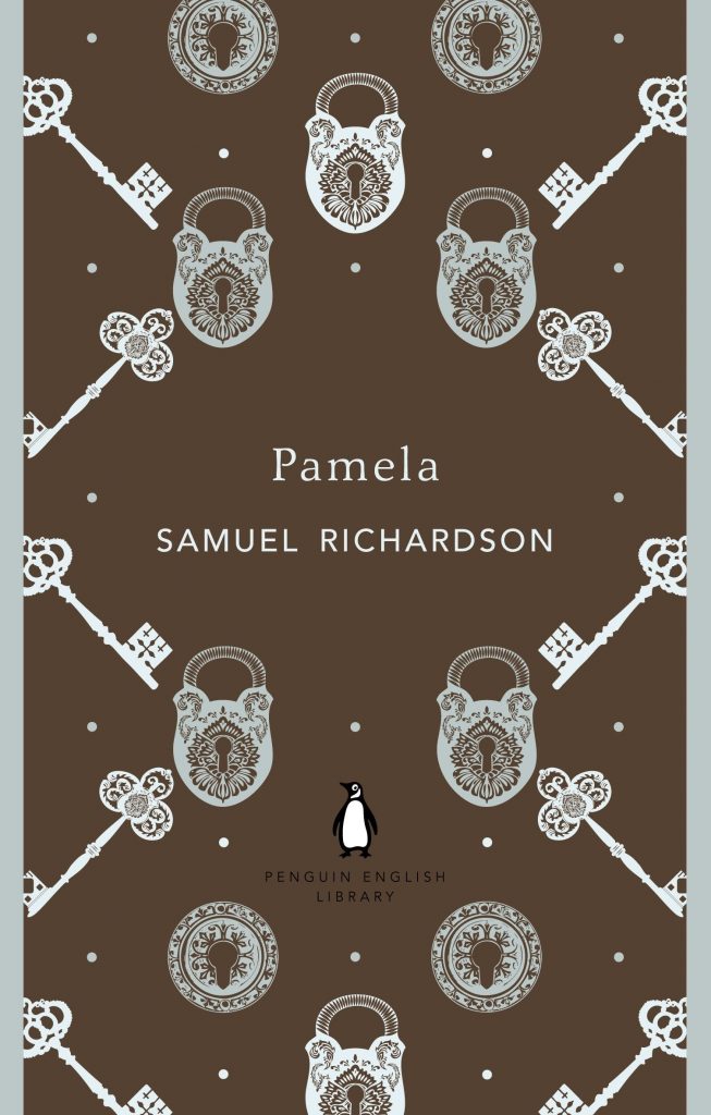
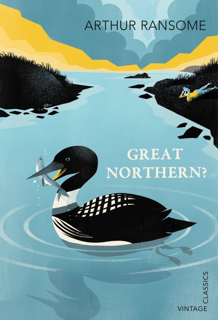
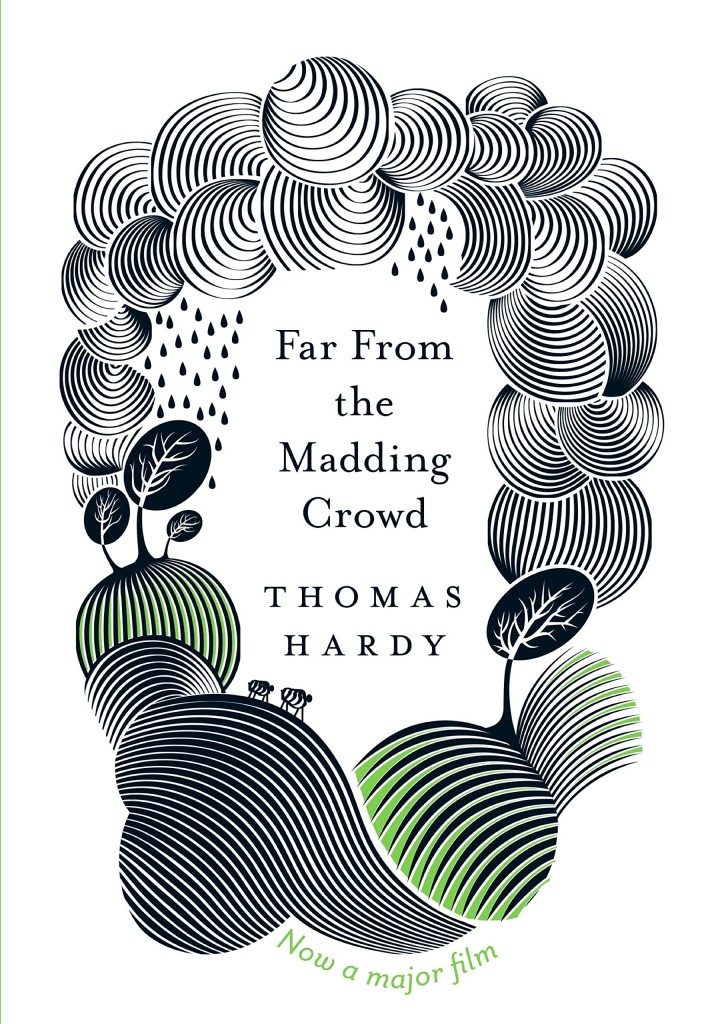
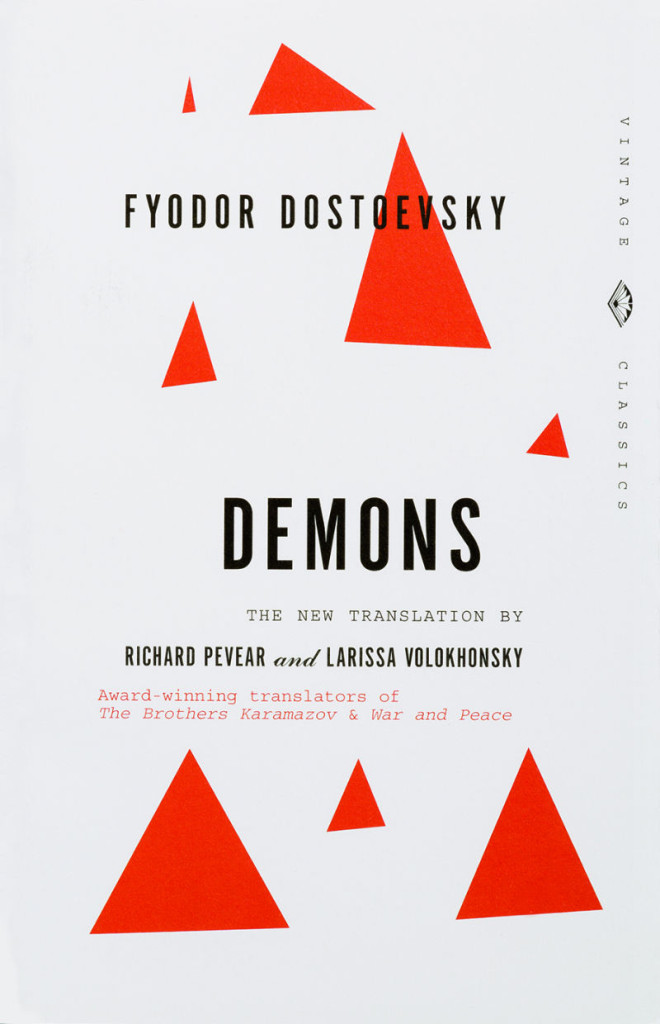
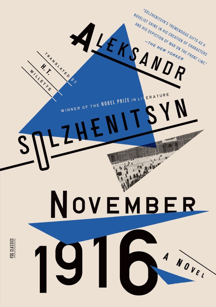
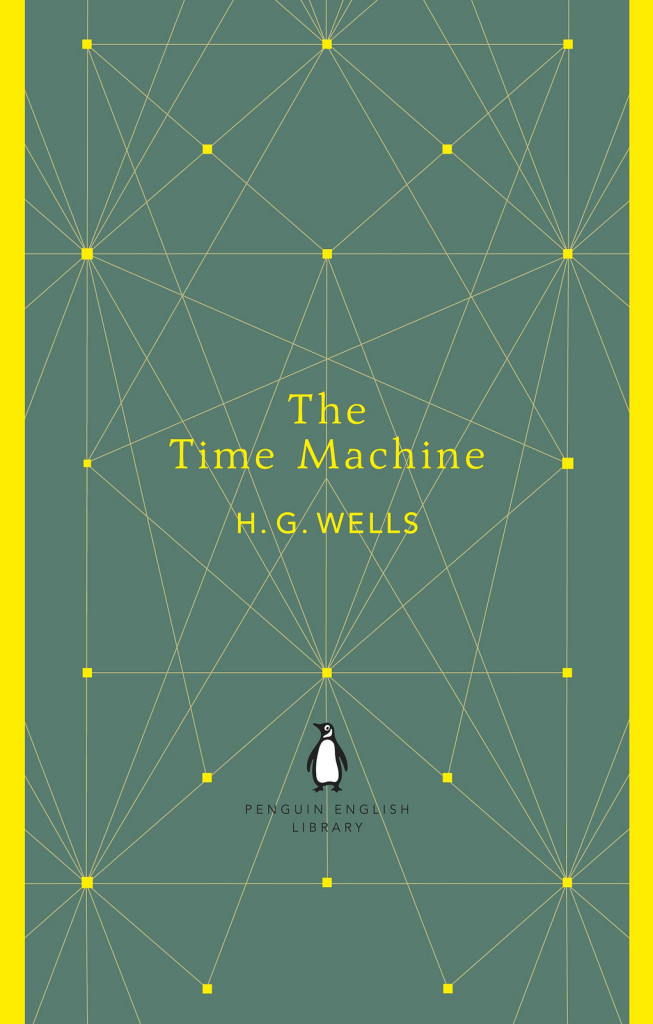
Find the longest combination of title and author, and then work backwards from there! If your design can accommodate One Day in the Life of Ivan Denisovich by Alexander Solzhenitsyn then you know you’re on to a good thing. I think a successful series style has enough consistency and rigour to be easily recognised but has enough flexibility within it to future-proof against unforeseen issues. If there are too many variables within a series style, it lacks identity — and if there are not enough, it looks dry and undynamic. The nice thing about designing the Vintage Classics series design was that I knew the images would be really diverse so I could make the rest of the cover quite restrained and structured.

What are your favourite books to work on?

Its always a thrill to get asked to do a classic. I did Animal Farm very early in my career at Penguin and I’ve always regarded it as a huge privilege — especially as I was so junior at the time. I recently had to re-do the artwork to fit the new Modern Classics grid, so I’m really honoured that it survived a series re-design!

I also like first-time authors (as there’s no baggage), and books about really odd subjects: invisible dogs, menopause, suicide, unicorns … bring it on. I’d like to do more books for young adults, but they usually get rejected!

What are the most challenging?

Without a doubt, it’s the BIG book. The one the publisher has paid huge sums for at Frankfurt as it’s ‘going to be the next … (insert name here)’. The amount of emphasis placed on the role that the jacket is expected to perform is enormous and yet if the book becomes a bestseller its widely regarded as being down to good writing and good reviews. But if it fails, its regarded as being the fault of the jacket. Its this widely-held belief that allows high street booksellers and supermarkets to assert so much influence on the design — so what should be an exciting job can turn into a fairly unrewarding experience for the designer.

Do you prefer working with illustrators or photographers? Or does it depend on the project?

I do enjoy the camaraderie on shoots — the Potty! shoot was great fun — but publishing cover budgets are usually such a feeble match for photographer’s fees that I find I’m constantly looking at ways to cut costs which just becomes a bit boring after a while. The preponderance of headless women on book covers is testament to the fact that there’s rarely budget for a model, hair or make-up. And yet, interestingly, the expectation from the publisher for a Merchant Ivory film still remains pretty high — even if the budget doesn’t.

I love the spontaneity of working with an illustrator — of making the most of their skills and seeing how they interpret a brief. When I saw the physical object that I commissioned from Helen Musselwhite on The Still Point, I gasped (in a good way)! Being able to hand-pick such talented people to work with is a huge privilege — it’s a part of my job that I will always love.

Do you see any recent trends in British book design?

Yes, I think production specs (particularly on hardbacks), have been steadily increasing in a bid to get the public excited about the physical objects again, so we’ve had a glut of cloth-and-foil, sprayed edges etc. There’s been a lot of patterns and a return to traditional typographic sensibilities, and a rediscovery of our British design heritage. Mid-century modern references are still enjoying a bit of a moment…

Where do you look for inspiration and who are some of your design heroes?

My earliest design hero was Charles Schultz. I was obsessed with Peanuts when I was a kid and copied the way that the characters wrote — I loved the way their handwriting appeared above their heads, I thought it was genius!

I was also a huge Roald Dahl fan and consequently grew up with the scratchy inky gorgeousness of Quentin Blake‘s illustrations.

No surprises here, but I greatly admire the work of designers like Saul Bass, Abram Games, Alan Fletcher, Alvin Lustig and Paul Rand — the wit and brevity of their work is so impressive. Slightly more decorative demi-gods include Eric Ravillious, Edward Bawden and Osbert Lancaster. Sorry for the lack of anyone female — or indeed, alive.

What does the future hold for book cover design?

Hopefully the impact of ebooks will be a positive; there’s a lot of books out there that really don’t deserve to see a printing press.

Thanks Clare!

4 Comments