
Hey, I hope you are good. It’s a stressful time and everyone is super busy trying to hold it together, but here we are at the end of October with another post that is both rushed and yet wordier than ever! As usual, I won’t be doing a covers round-up in November. I have to start working on the massive end of year post so I can get it done in something resembling a timely and relevant manner. I am open to last minute submissions if you think I have missed a cover, or you have something coming out between now and December. I can’t promise to include everything, but it would be especially great to hear from you if you’ve done something cool for a university press or an independent publisher this year. The only requirement is that the book was published and on shelves in 2024. If it was published in a non-English speaking part of the world, be sure to include a link to where people can find out more about the book (and ideally buy it) that isn’t Amazon.
On a related note, I have compiled an annual post of YA covers for, I don’t know, years now (10 maybe?). I don’t read a lot of YA, and it’s not a category I am very involved in professionally, so the posts take quite a long time to compile and I usually end up publishing them early in the New Year, which is less than ideal. So I guess my question is: do you still want a YA round-up? Folks used to ask for them, and now they don’t, which just be general fatigue and the fragmented nature of things at the moment, but the posts don’t attract submissions or much feedback, and interest seems to be waning. Obviously I don’t think I do a great job (if that wasn’t abundantly clear already!), but I haven’t really seen anyone else do one either, so I’ve kept doing it. I don’t know… I’m not a big a believer in clicks or engagement metrics as a measurement of anything useful, so I happy to do it if even just a couple of you say it’s still valuable. Or maybe it is just time to call it quits? Let me know what you think…
And with that, onto this month’s selections…

Absolution by Jeff VanderMeer; design by Pablo Delcan (MCD / October 2024)
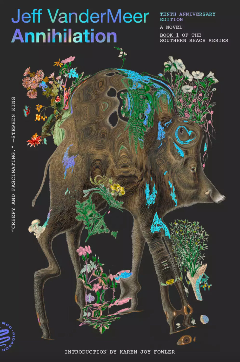
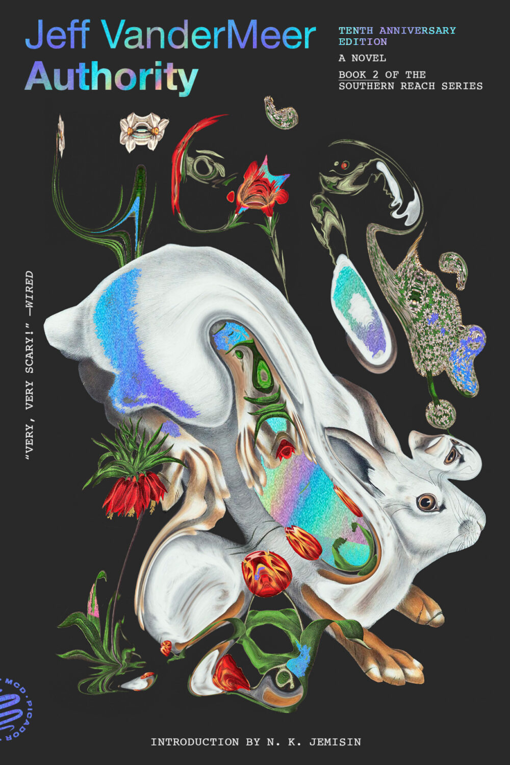
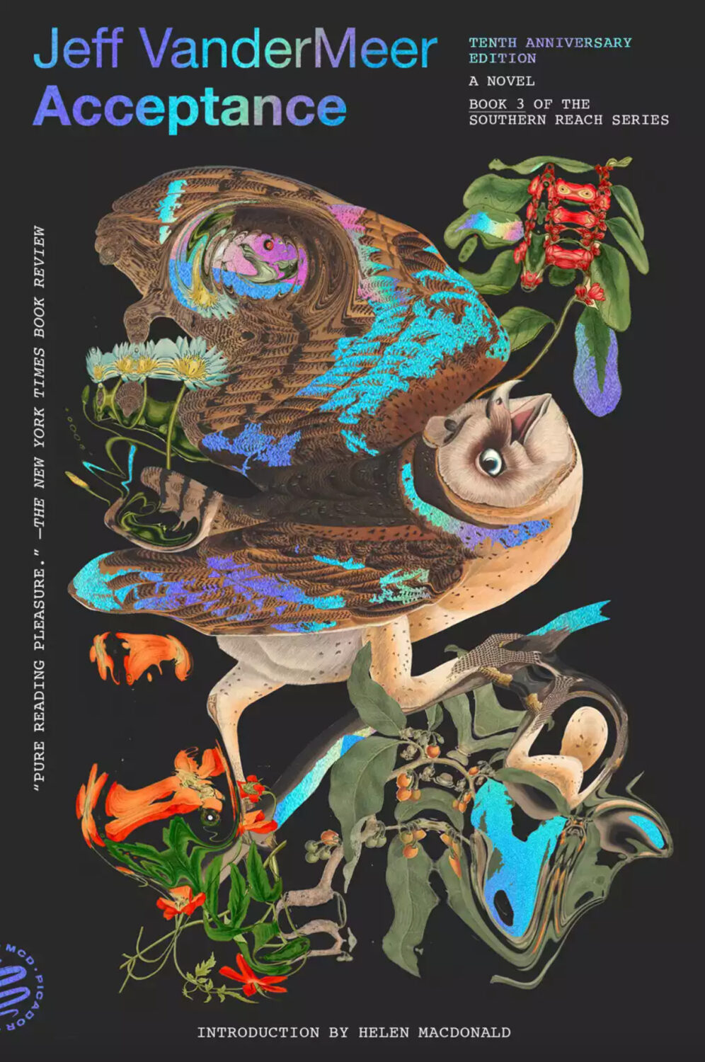
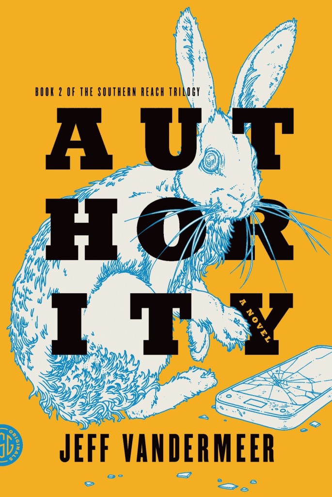
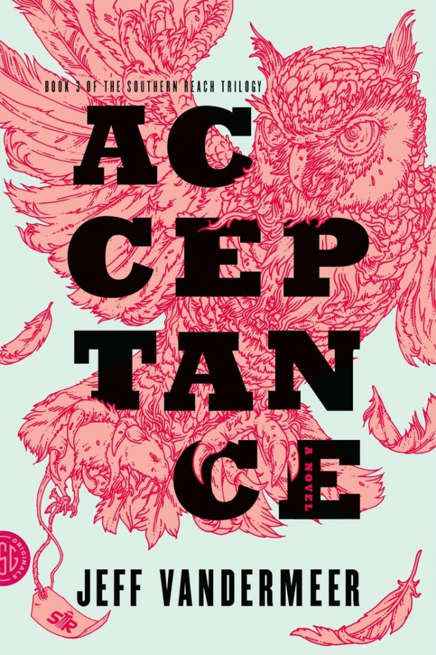
Pablo Delcan also designed the covers of the 10th anniversary editions of the previous books in the Southern Reach series, Annihilation, Authority, and Acceptance, published by Picador earlier this year.
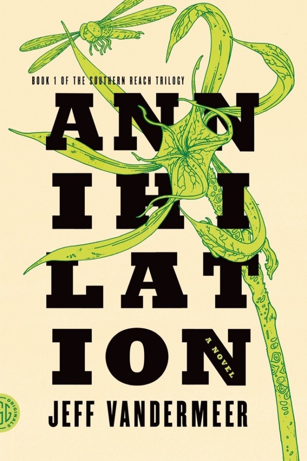
I’m still quite partial to the original US covers the trilogy (as was) designed by Charlotte Strick with illustrations by Eric Nyquist. The cover of Annihilation reminds me of The Day of the Triffids, which coincidentally has has an introduction by Jeff VanderMeer if you have the Modern Library edition. (The slightly bonkers cover of the Modern Library edition was designed by Cassie Gonzales with an illustration by comic book artist and illustrator Anders Nilson). Anyway, I’m a little sad that I can’t get the prequel to match the rest of my existing set.

Between This World and the Next by Praveen Herat; design by Jamie Keenan; illustration by Sukutangan (Restless Books / June 2024)
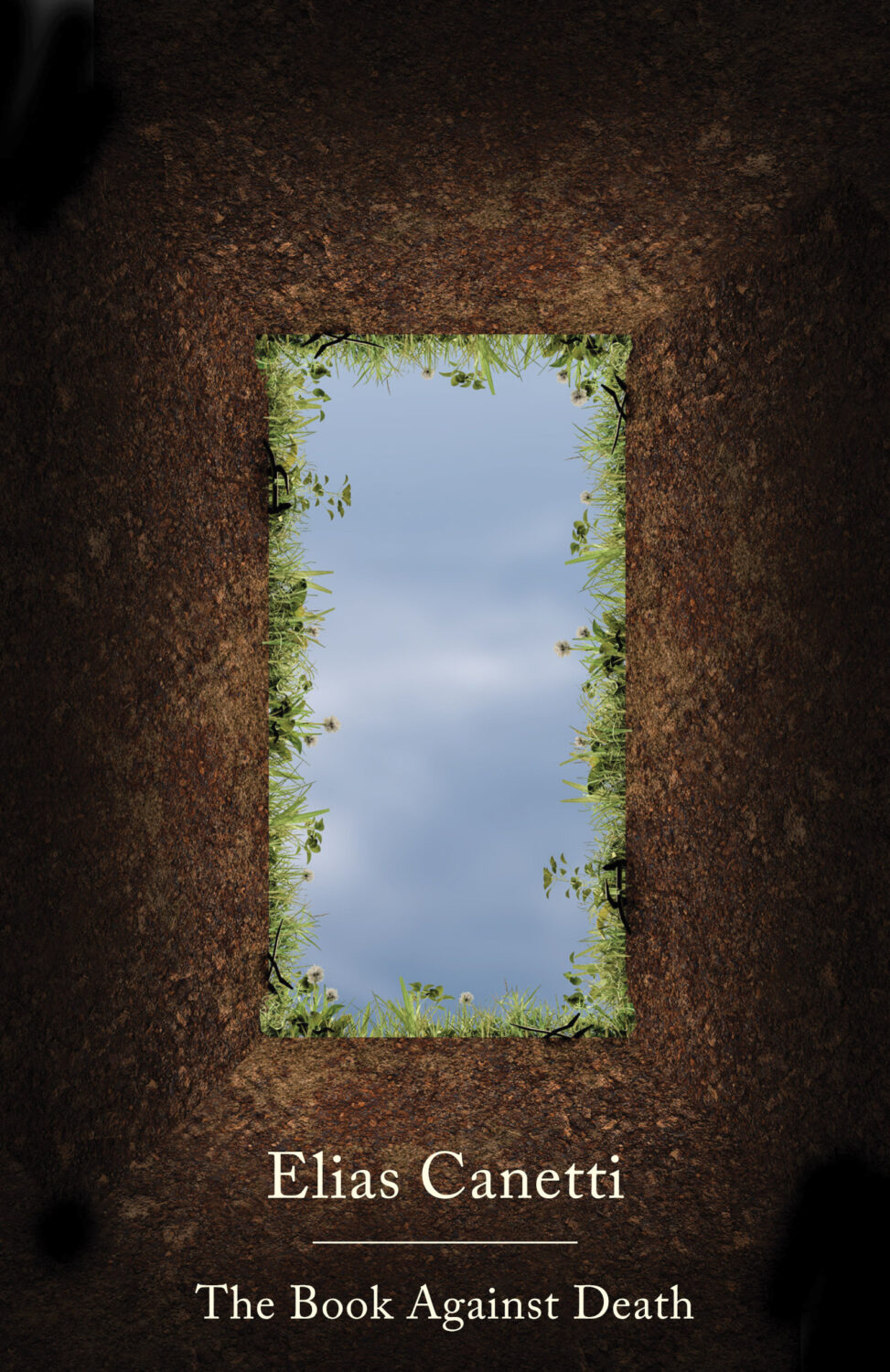
The Book Against Death by Elias Canetti; design by Jamie Keenan (New Directions / November 2024)
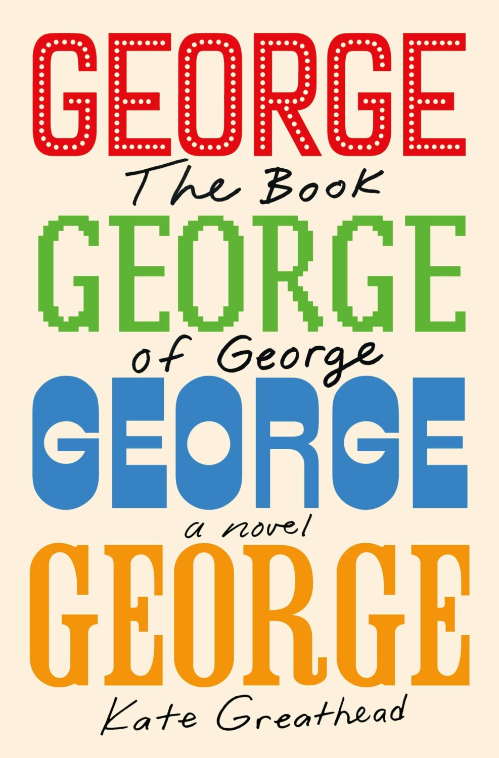
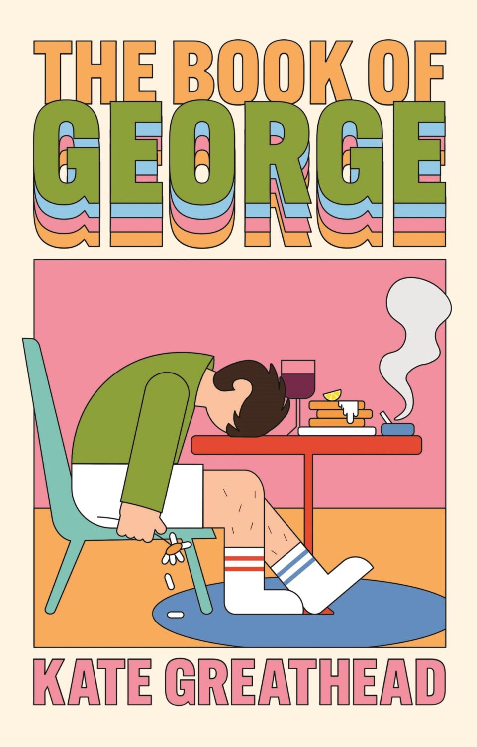
The Book of George by Kate Greathead; design by Nicole Seeback Ruggiero (Henry Holt / October 2024)
The cover of the UK edition of The Book of George, available from Atlantic Books in January 2025, was designed by Holly Battle.

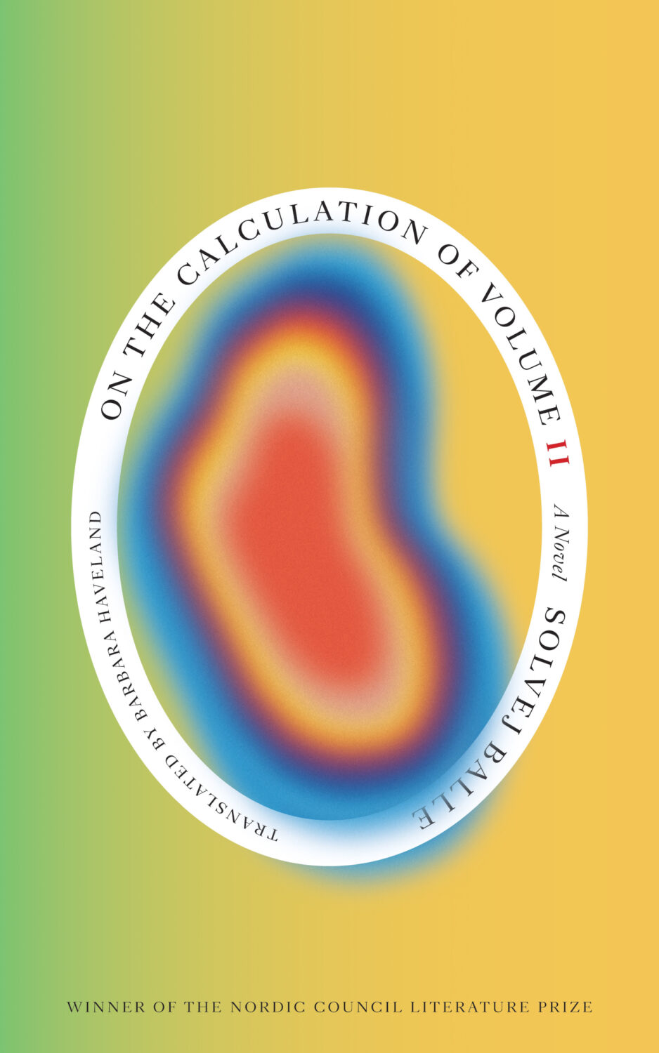
On the Calculation of Volume Book I and Book II by Solvej Balle; design by Matt Dorfman (New Directions / November 2024)
The Coiled Serpent by Camilla Grudova; design by Jaya Nicely (Unnamed Press / October 2024)
The cover of the UK edition, published in November 2023 by Atlantic Books, was also designed by Holly Battle.

The Driving Machine by Witold Rybczynski; design by Jared Bartman (W.W. Norton / October 2024)
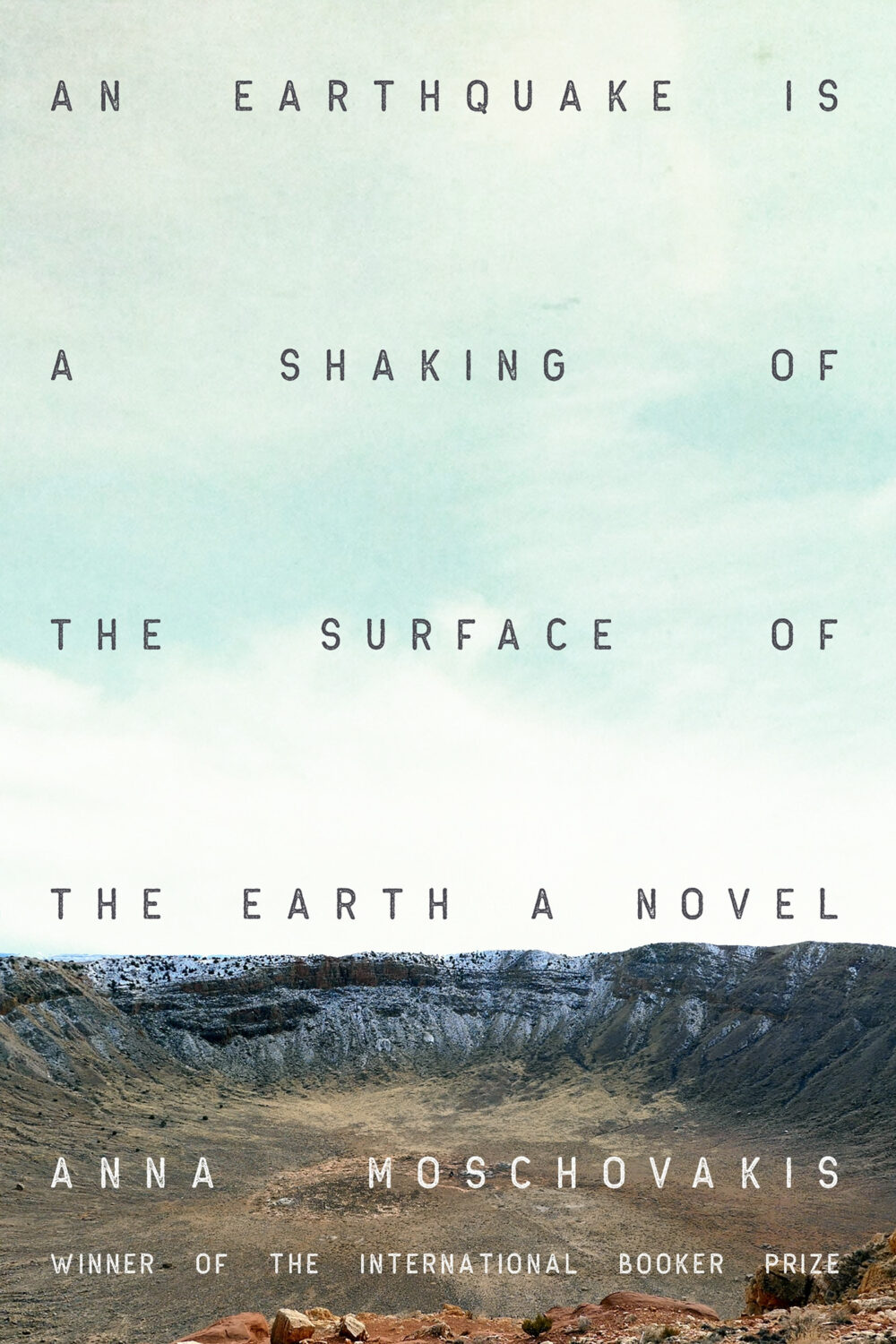
An Earthquake is a Shaking of the Surface of the Earth by Anna Moschovakis; design by Gregg Kulick (Soft Skull / November 2024)
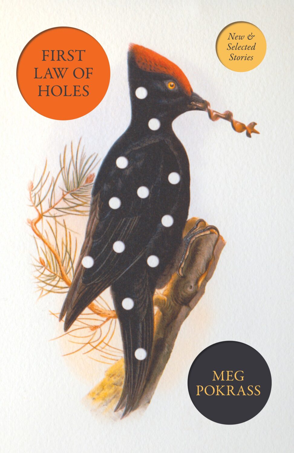
First Law of Holes by Meg Pokrass; design by Steven Seighman (Dzanc / September 2024)
Sorry I missed this last month when I was complaining about not having enough covers from independent publishers (sigh). But also birds + polka dots…
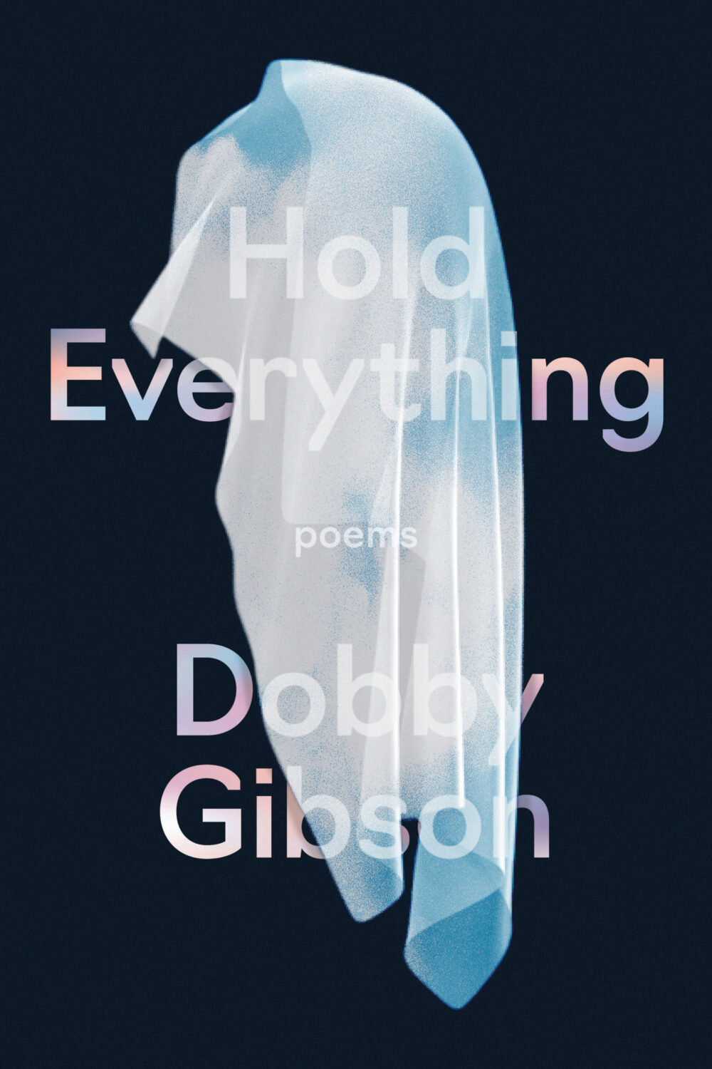
Hold Everything by Dobby Gibson; design by Alban Fischer (Graywolf / October 2024)

Invisible Kitties by Yu Yoyo; design by Steven Brayda; art by Yu Yoyo (HarperVia / October 2024)
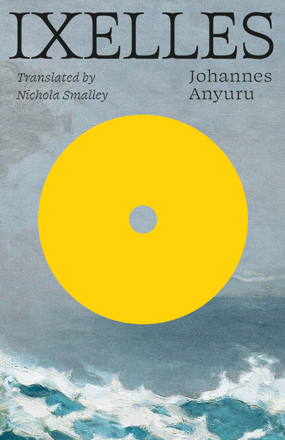
Ixelles by Johannes Anyuru; design by Jonathan Pelham (Two Lines Press / October 2024)
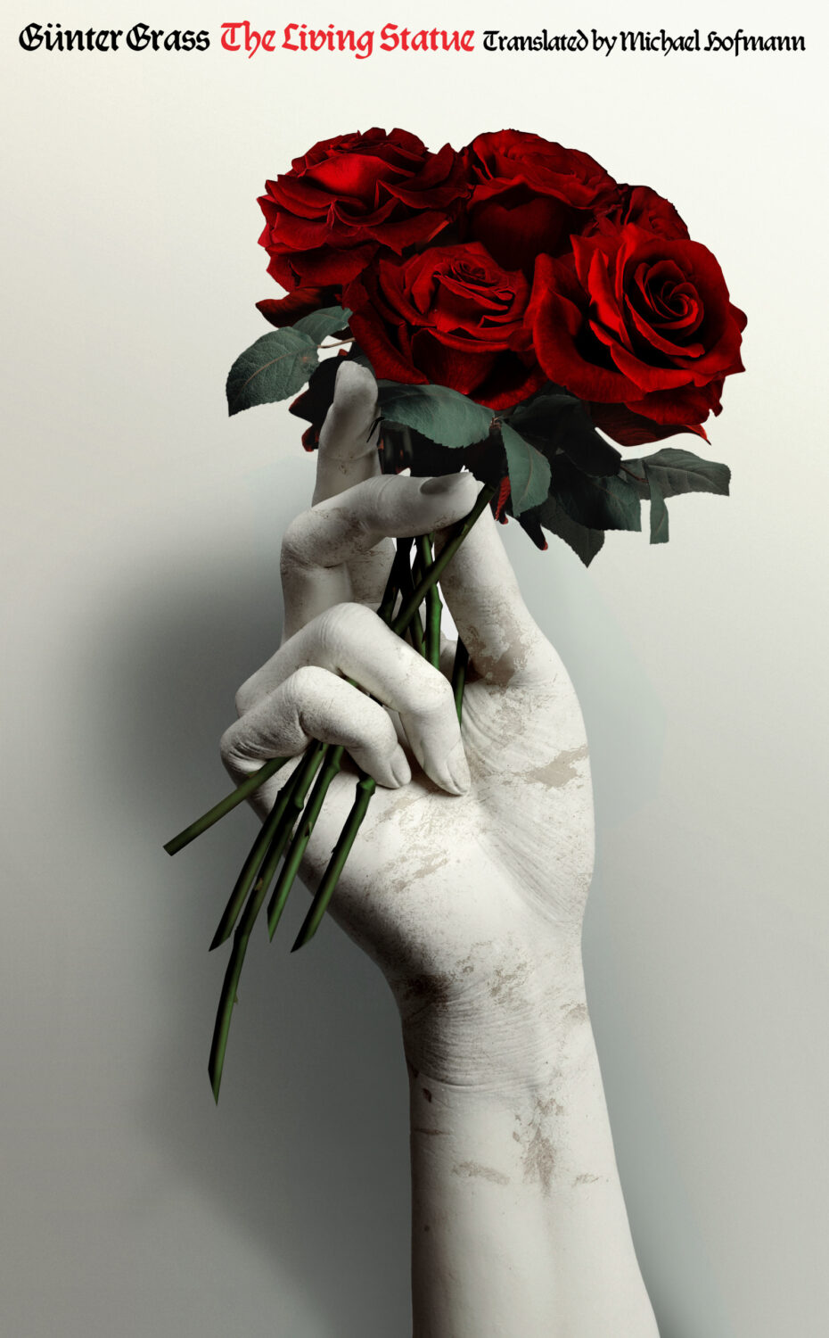
The Living Statue by Günter Grass; design by Pablo Delcan (New Directions / October 2024)
This feels very familiar, but I can’t put my finger on why. The best I’ve got is that it looks like a poster for a theatre production. It feels very European. The austerity of it gives late 1980s-90s vibes. I don’t know. I think it’s great.

Mojave Ghost by Forrest Gander; design by Giacomo Girardi / Rodrigo Corral; lettering by Adriana Tonello (New Directions / October 2024)

Music and Joy by Daniel K. L. Chua; design by Sarah Schulte (Yale University Press / August 2024)
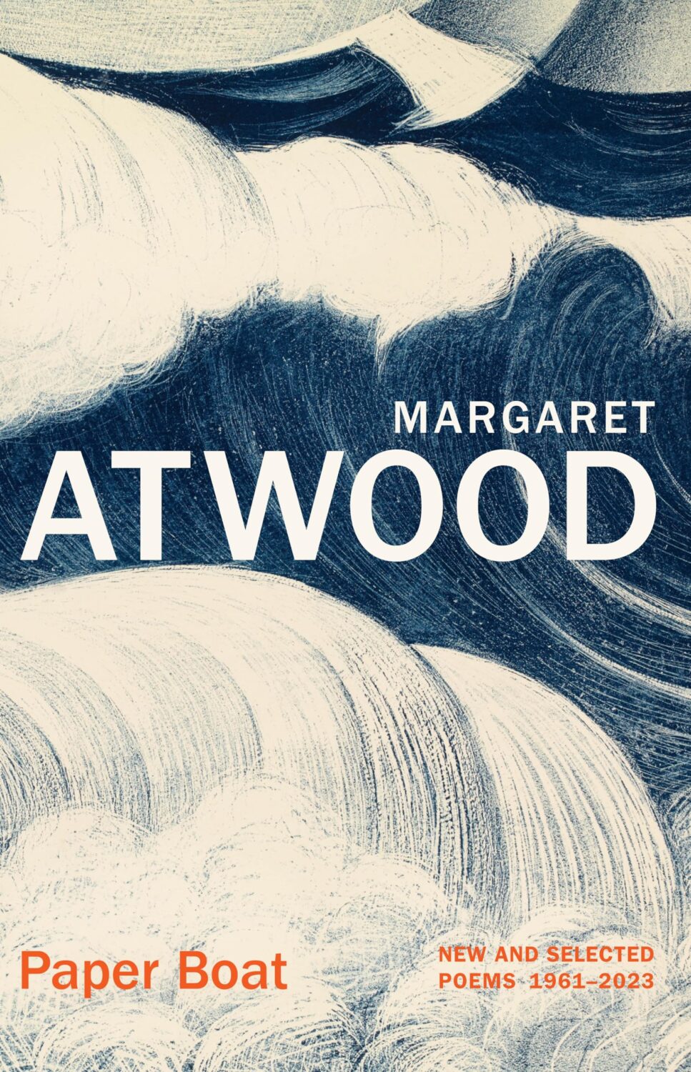
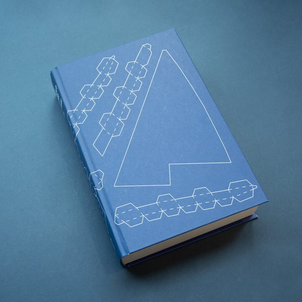
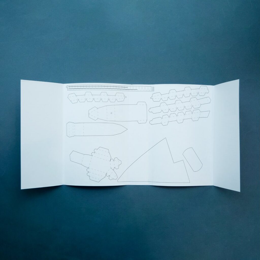
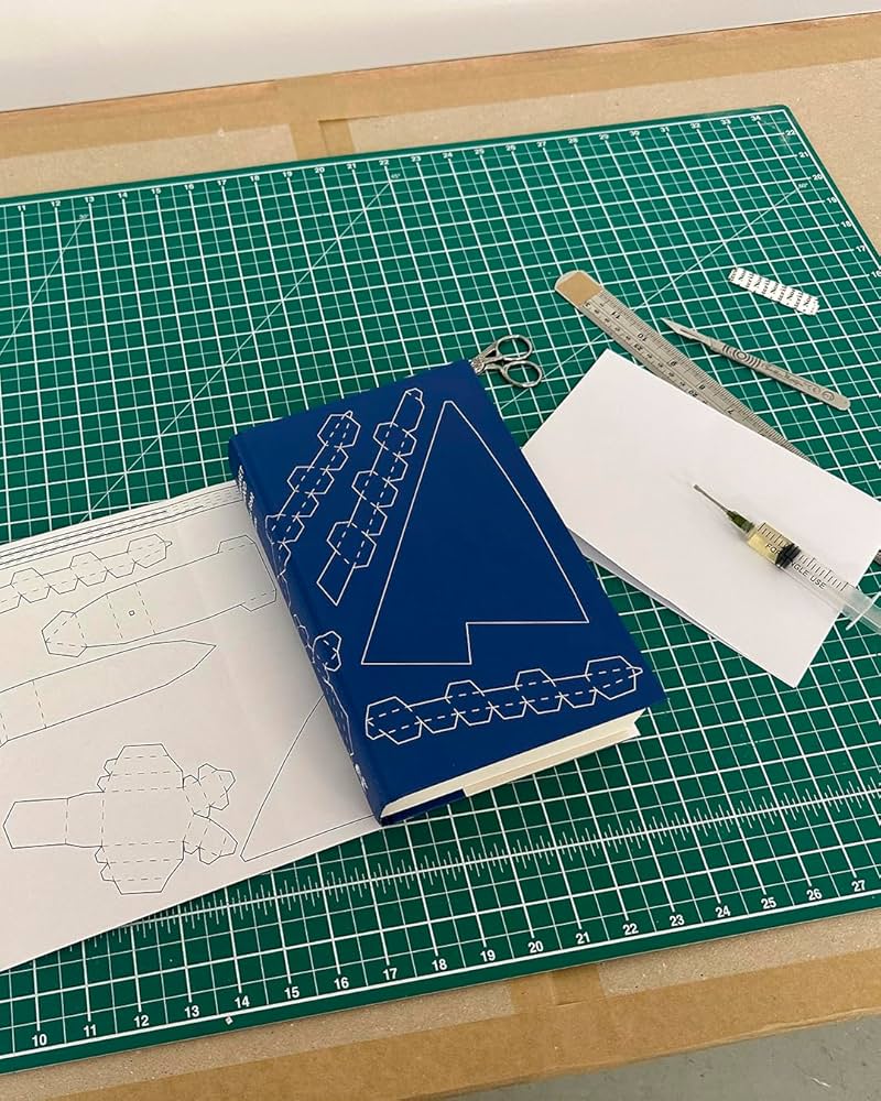
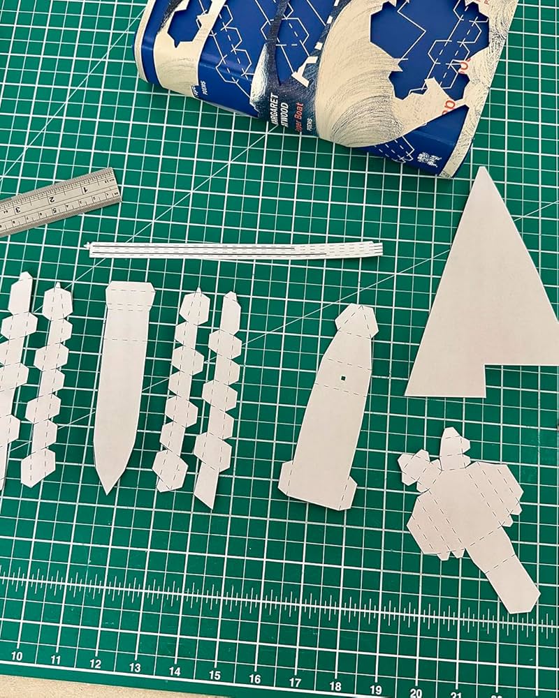
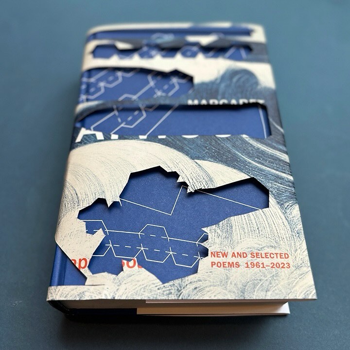
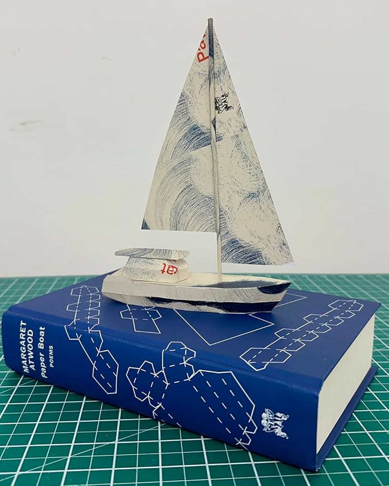
Paper Boat by Margaret Atwood; design by Suzanne Dean; paper art by Nathan Ward (Chatto & Windus / October 2024)
Remarkably, the design incorporates a template for paper boat that can be cut from the dust jacket and stuck together.
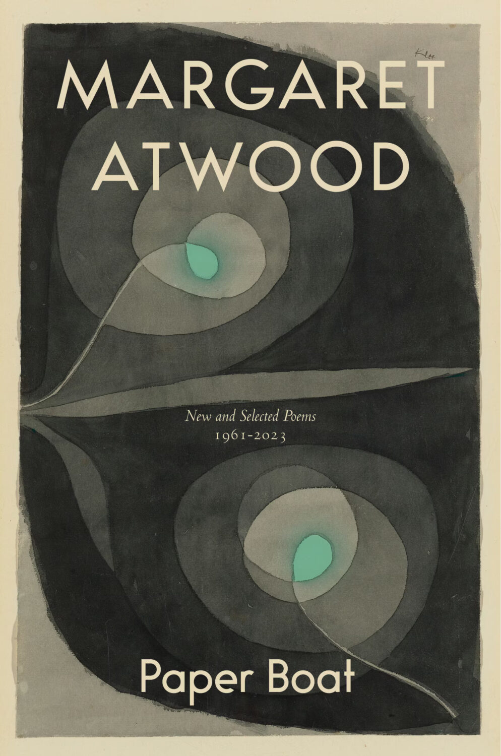
The cover of the Canadian edition of Paper Boat, published by McClelland & Stewart, was designed by Kelly Hill using art by Paul Klee. The cover for the US edition published by Knopf was designed by Janet Hansen. The photograph is by Ruven Afanador. It’s interesting to me that it was the US decided to use a portrait on the cover. I mean it’s a beautiful photograph and Margaret Atwood is very distinctive looking, but I would imagine she would be more recognizable to Canadians than to Americans? Anyway, it’s not often you see three entirely different approaches in the UK, US and Canada for a poetry collection.

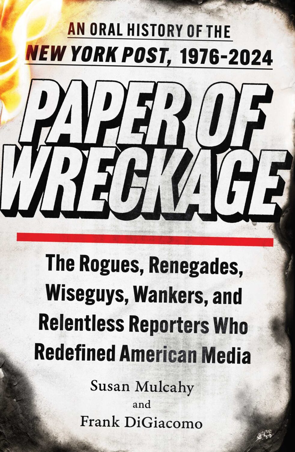
Paper of Wreckage by Susan Mulcahy and Frank DiGiacomo; design by Claire Sullivan (Atria Books / October 2024)
It’s quite something that they got “Wanker” into the subtitle.

Perris, California by Rachel Stark; design by Holly Macdonald (New River Books / September 2024)
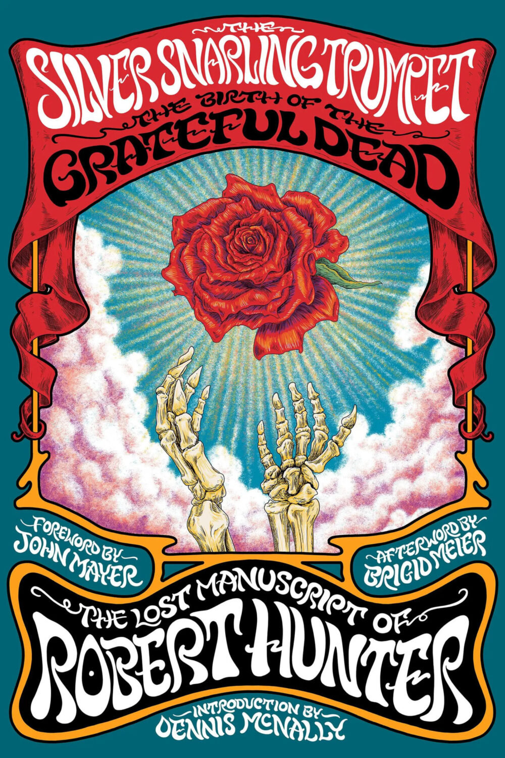
The Silver Snarling Trumpet by Robert Hunter; design and illustration by Nathaniel Deas (Hachette / October 2024)
Tell Me Something, Tell Me Anything, Even It It’s a Lie by Steve Wasserman; design by David Drummond (Heyday Books / October 2024)
I knew exactly who designed this cover the moment I saw it!

The Unfinished Harauld Hughes by Richard Ayoade; portrait by James Lloyd (Faber / October 2024)
If anyone can tell me who the designer is on this, I’d greatly appreciate it.
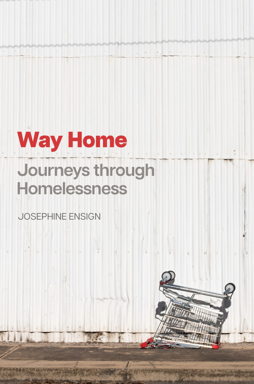
Way Home by Josephine Ensign; design by Tobias Design (John Hopkins University Press / November 2024)

We All Shine On by Elliot Mintz; Design by Vi-An Nguyen; photography by Nishi F. Saimaru (Dutton / October 2024)

Women’s Hotel by Daniel M. Lavery; design by Stephen Brayda; illustration by Thibaud Herem (Harpervia / October 2024)
Comments closed
 For Sur
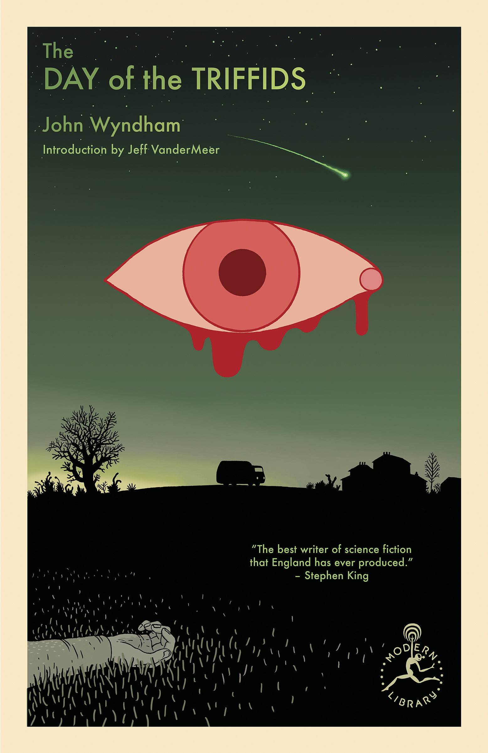