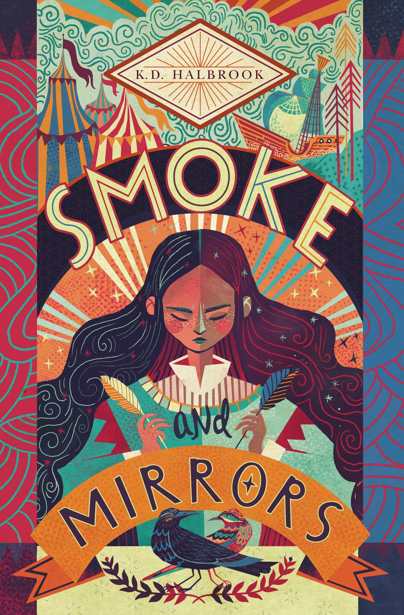
Another cover for the Lydian file. (I posted a link to this on Twitter, but I don’t think I’ve mentioned it here — Kaitlyn Tiffany recently wrote a piece on the Lydian phenomenon for Vox if you want to read a bit more about it)
Some lovely type there… Can anyone tell me what the title typeface is please? It seems like a good alternative for our old friend Lydian there… The Lady from the Black Lagoon by Mallory O’Meara; design by Erin Craig; art by Matt Buck (Hanover Square / March 2019)
Is this the first Harlequin book cover to feature on the site? Possibly…
Munich ’72. The Visual Output of Otl Aicher’s Dept. XI, a book about the design team for the 1972 Olympic Games in Munich, is currently on Kickstarter. The project is the result of three of years of research and it needs a little help to get it over the finish line, so maybe go take a look?
To mark the 100th birthday of J.D. Salinger, Amsterdam-based design studio Moker Ontwerp were asked by Dutch publisher De Bezige Bij to design brand new covers for four of Salinger’s most famous books.
There are longstanding requirements for J.D. Salinger covers. No photographs or illustrations can be used, and the title should always be above the author’s name and set in bigger type. To break the rigidity of these rules and bring more expressiveness to the design, the studio decided to write all the titles with a brush instead of using a font, while setting the author’s name “as seriously as possible” in stately Roman Capitals.
The results, I think, speak for themselves…
Thanks to Henk van het Nederend at Moker Ontwerp for letting me know about this project.
Here are this month’s book covers of note. Better late than never I suppose! (And so much for that New Year’s Resolution to better at blogging in 2019!). I’ll be starting on February’s post next week…
Cusp by Josephine Wilson; design by Alissa Dinallo (UWA Publishing / August 2018)
Starting my first 2019 covers post with a book from 2018 is not ideal, is it? Ah well… Take a look at some of the rejected covers on Alissa’s Instagram.
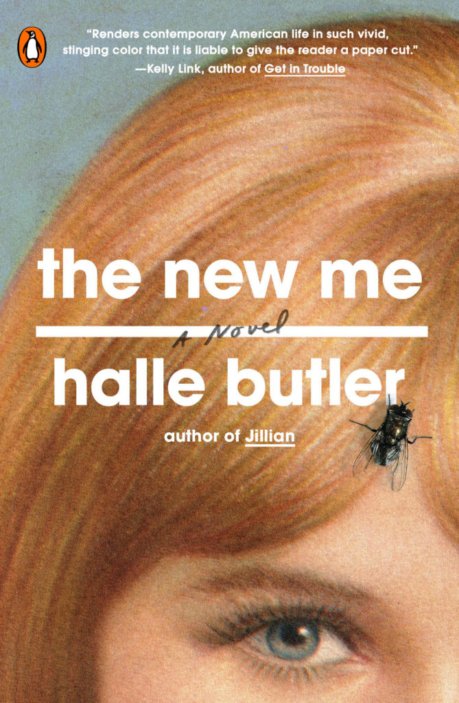
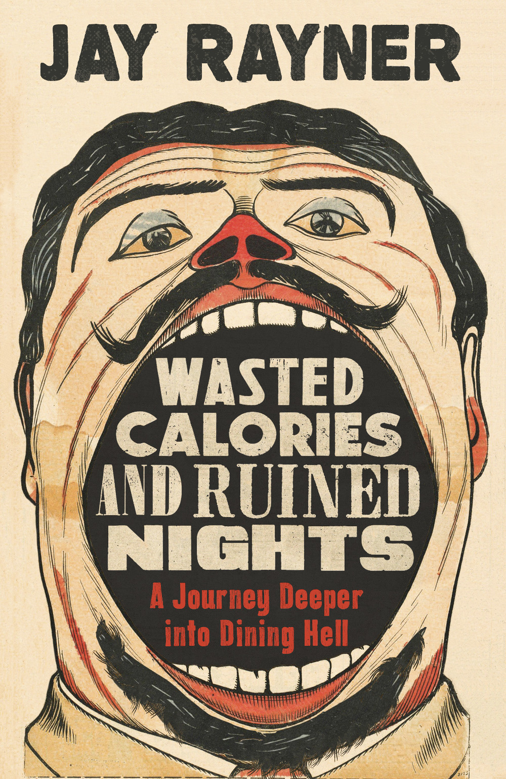
I saw this in a bookstore on a recent visit to the UK. It stood out in a display of new nonfiction. I think it was the doodle-like looseness of the approach that initially caught my eye, but I also like that it feels like a parody of the contemporary nonfiction cover template.
Before we move on to new books for 2019, here are some of the better end-of-year lists that looked back at book cover design in 2018…
Paste were out of the gate early with a list of the 18 best book covers of 2018.
The Pisces by Melissa Broder; design by Rachel Willey (Bloomsbury / May 2018)
Impossible Owls by Brian Phillips; design Jamie Keenan (FSG / October 2018)
The folks at Spine left it until right before Christmas to post their 2018 Book Covers We Loved, but they did do a nice video with designer Holly Dunn, highlighting a few of their favourites from the list:
In the most eagerly awaited list, Matt Dorfman chose his 12 covers of the year for the New York Times (although whoever wrote the “We think you can judge a year by its book covers” subhed owes Matt an apology).
My Year of Rest and Relaxation by Ottessa Moshfegh; design Darren Haggar (Penguin Press)
Playing Changes by by Nate Chinen; design by Kelly Blair (Pantheon)
The Literary Hub asked 27 designers to share their favorite book covers of the year and came up with a list of 75 “covers of note” (where have I heard that before?), including a couple of covers I didn’t see anywhere else, which is always a pleasant surprise.
The Blue Flowers by Raymond Queneau; design by Peter Mendelsund (New Directions)
Sexographies by Gabriela Weiner; design by Na Kim (Restless Books)
Vulture posted a list of their 10 favourite covers with commentary from the designers.
The Friend by Sigrid Nunez; design by Nicolas Ortega (Riverhead)
My Sister the Serial Killer by Oyinkan Braithwaite ; design by Michael Windsor (Doubleday)
And, drawing on the lists from LitHub and Paste (and some other guy), Jason Kottke posted a short but sweet list of book covers for the year that included a couple of my favourites, Cherry designed by Janet Hansen and Circe designed by Will Staehle.
Cherry by Nico Walker; design by Janet Hansen (Knopf / August 2018)
Circe by Madeline Miller; design by Will Staehle (Little Brown & Co / April 2018)
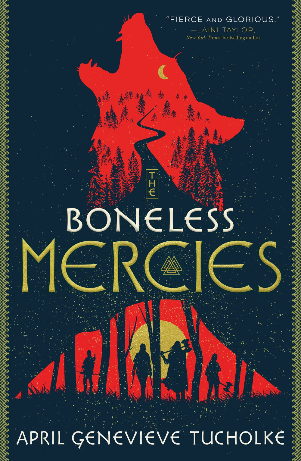
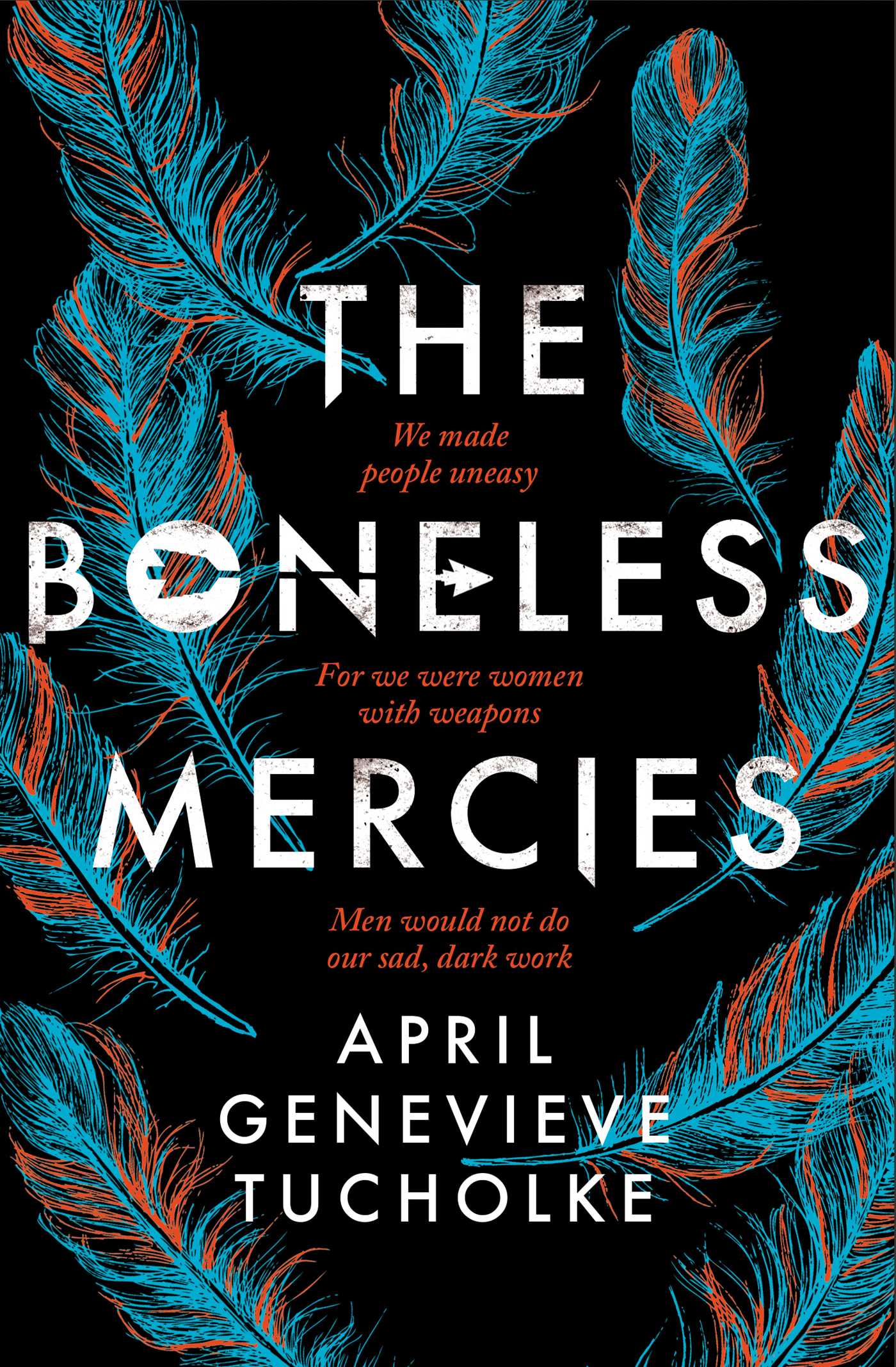
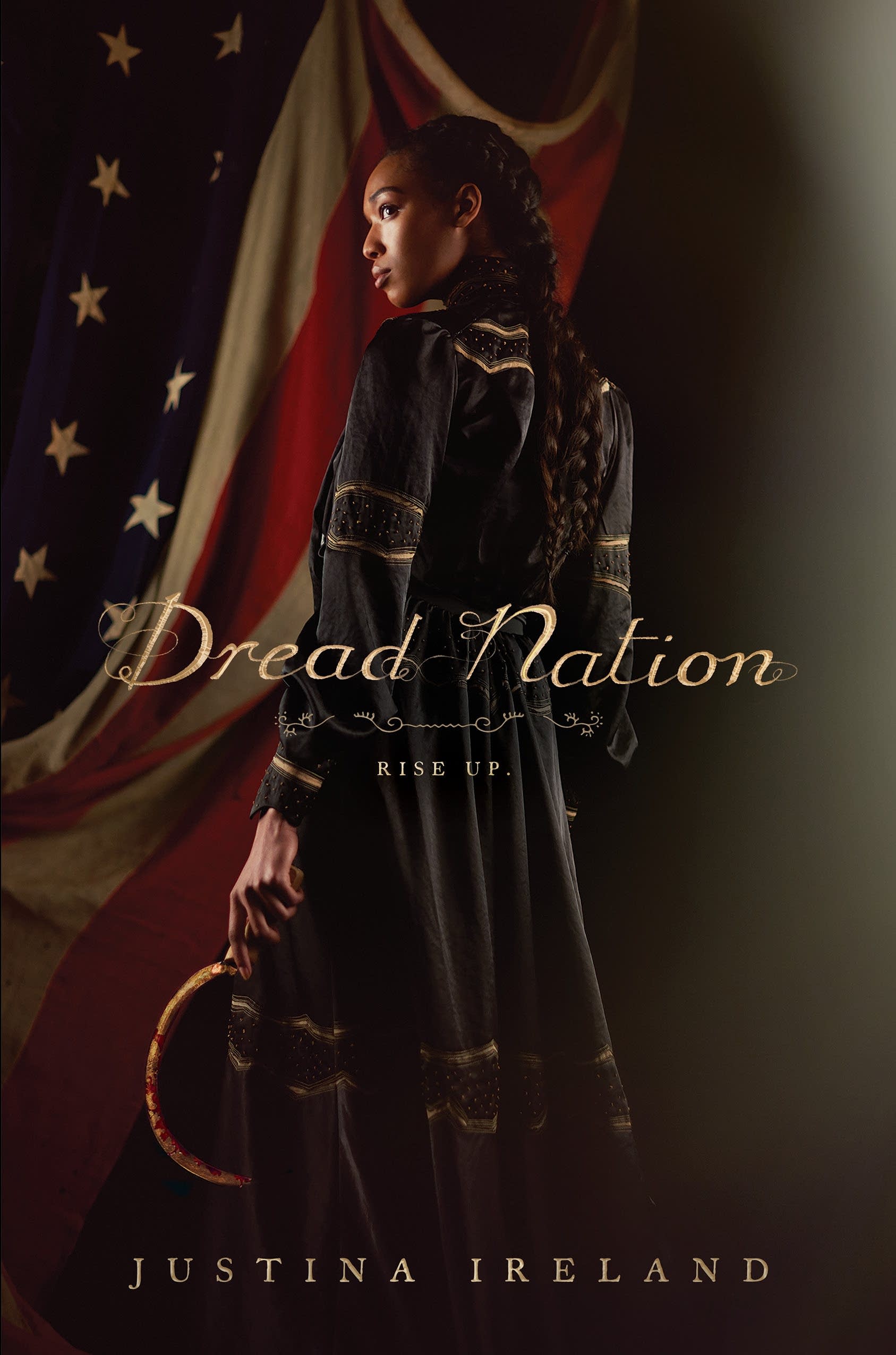
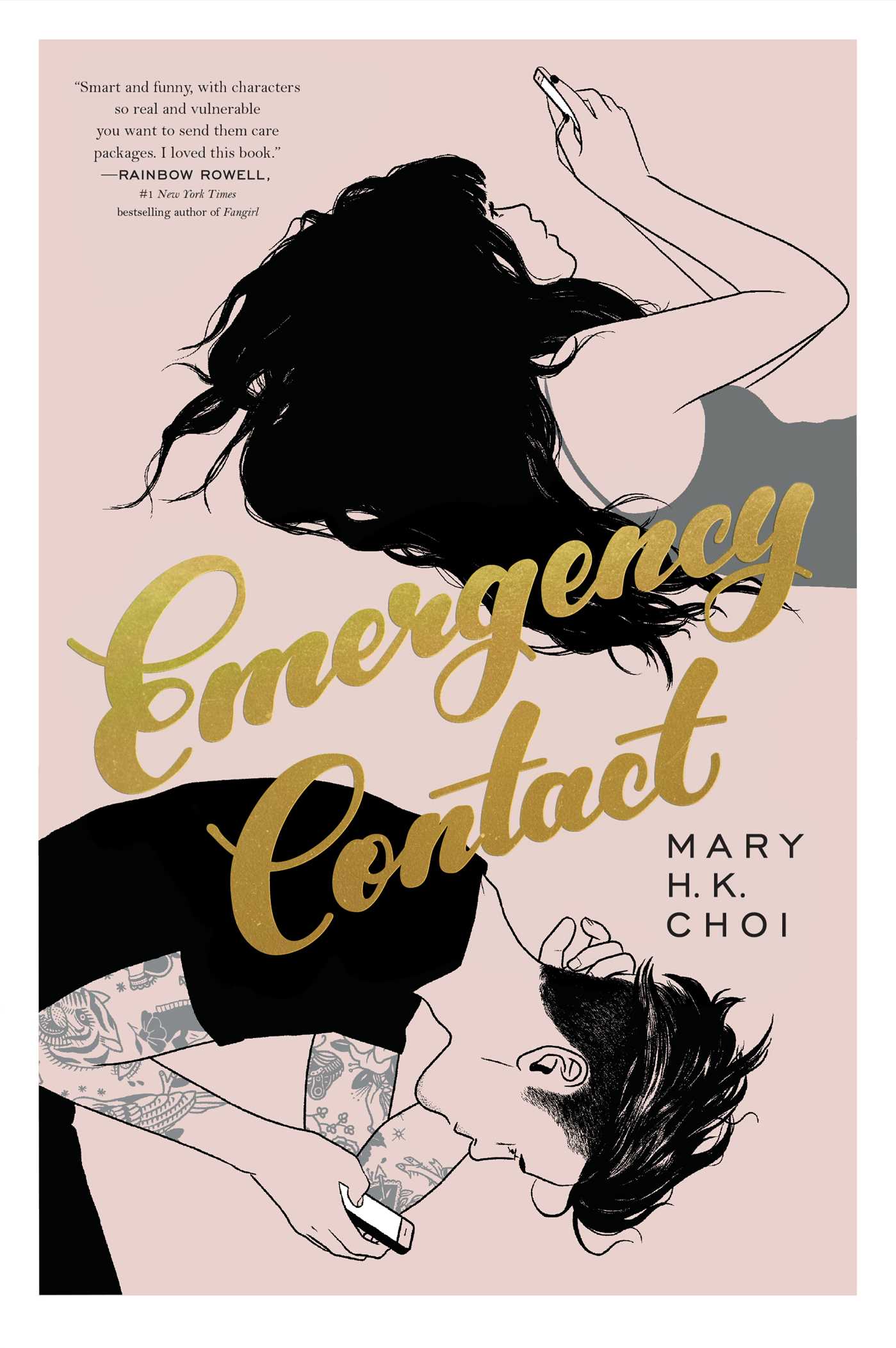
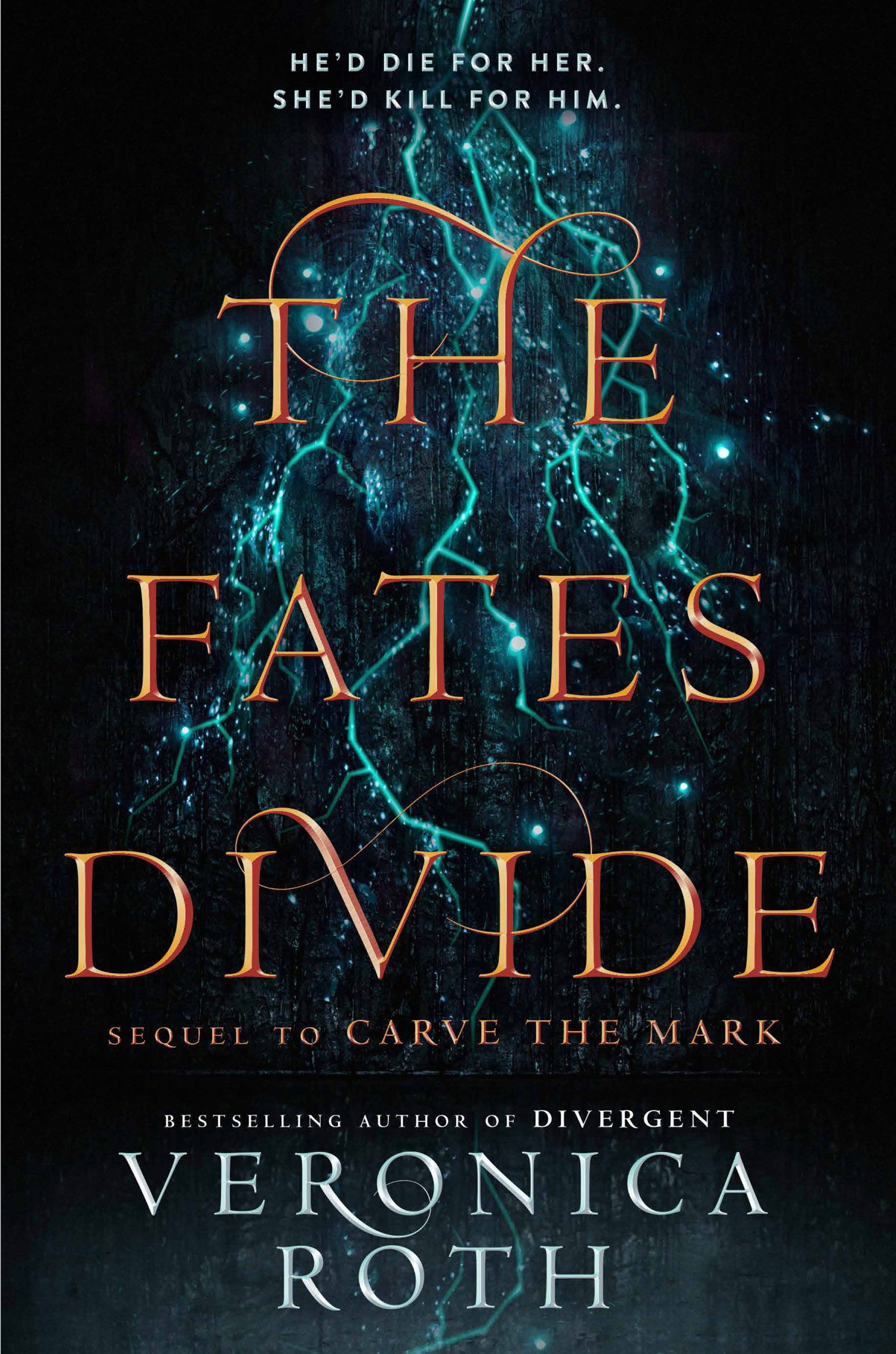
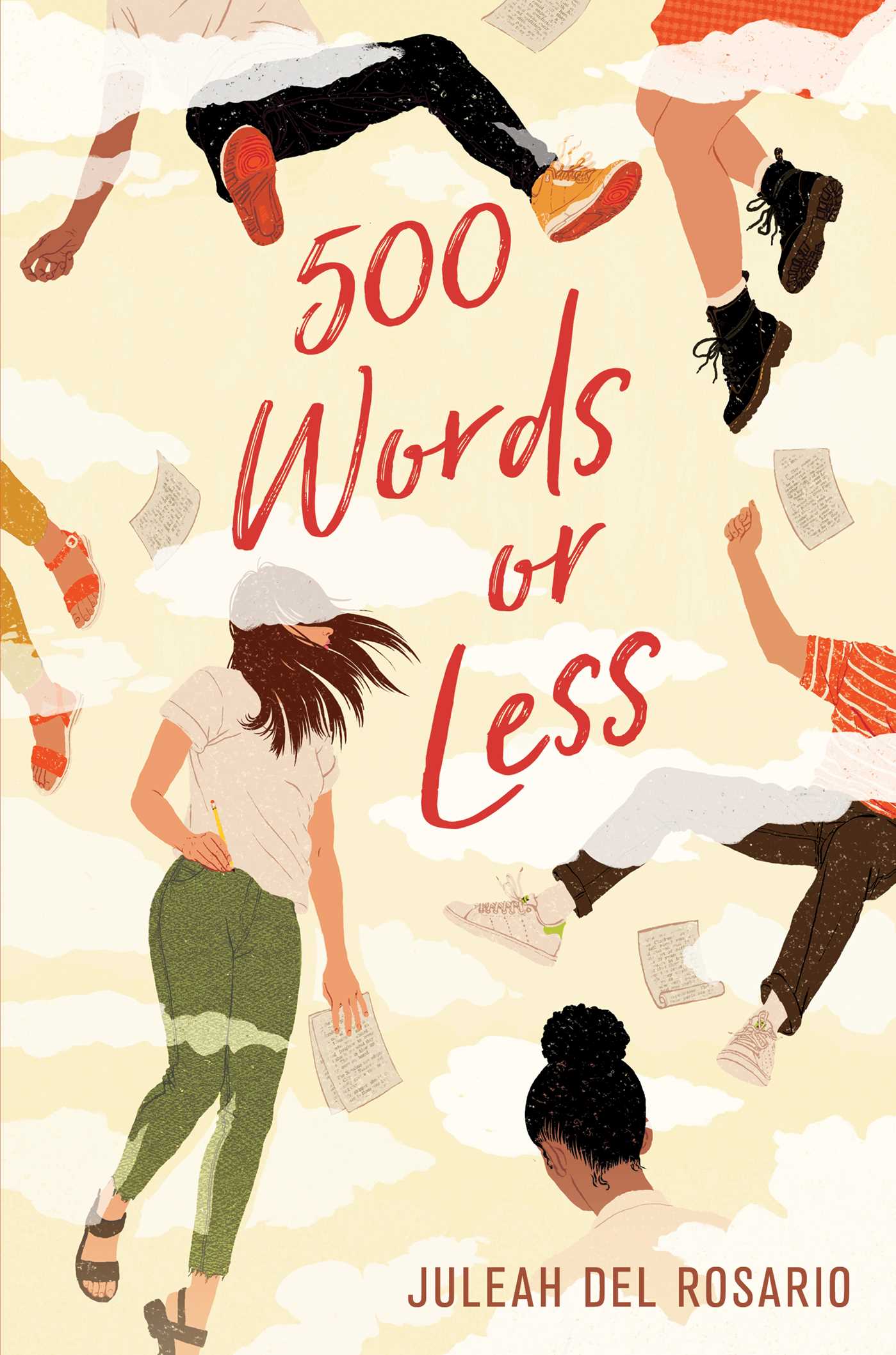
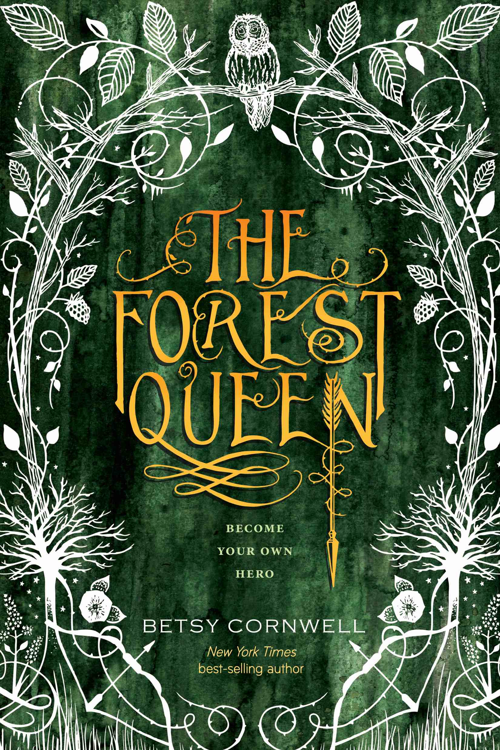
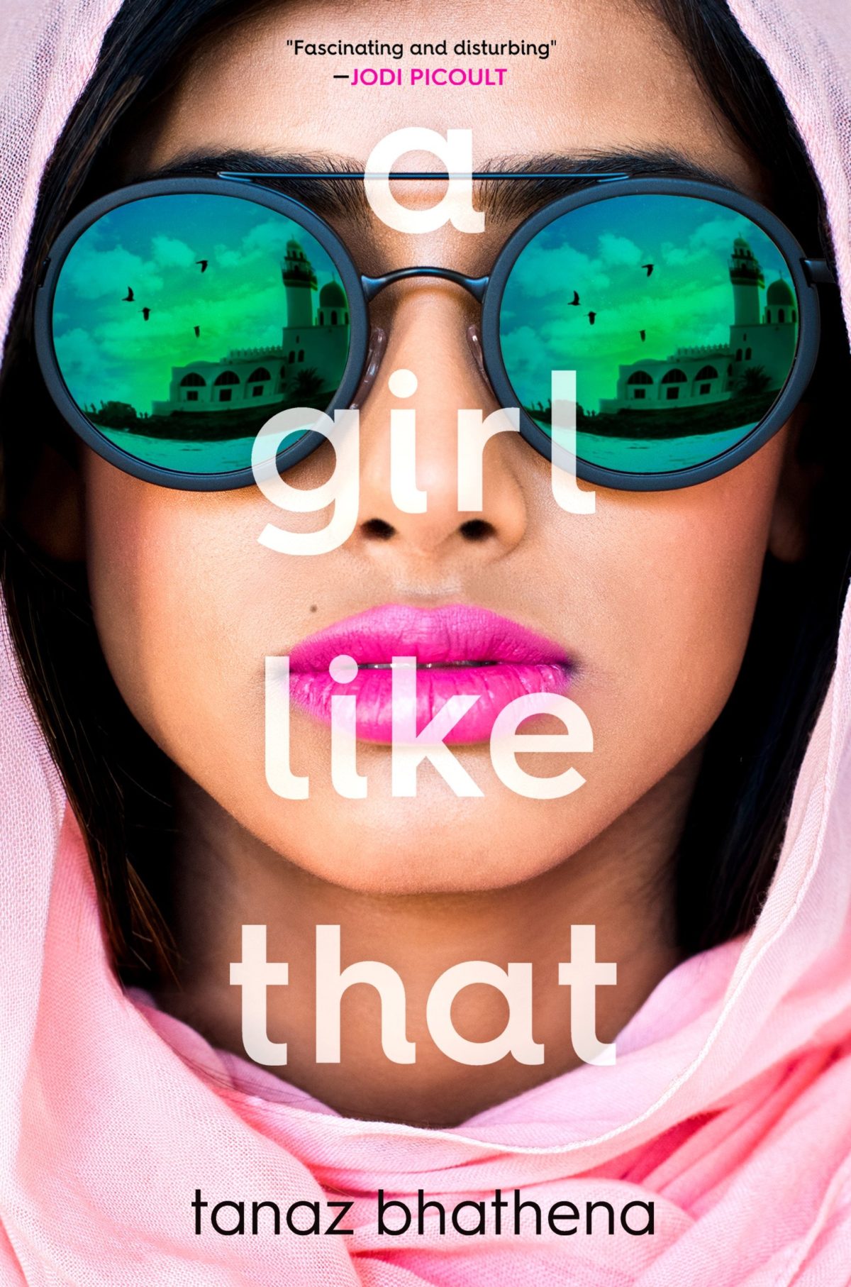
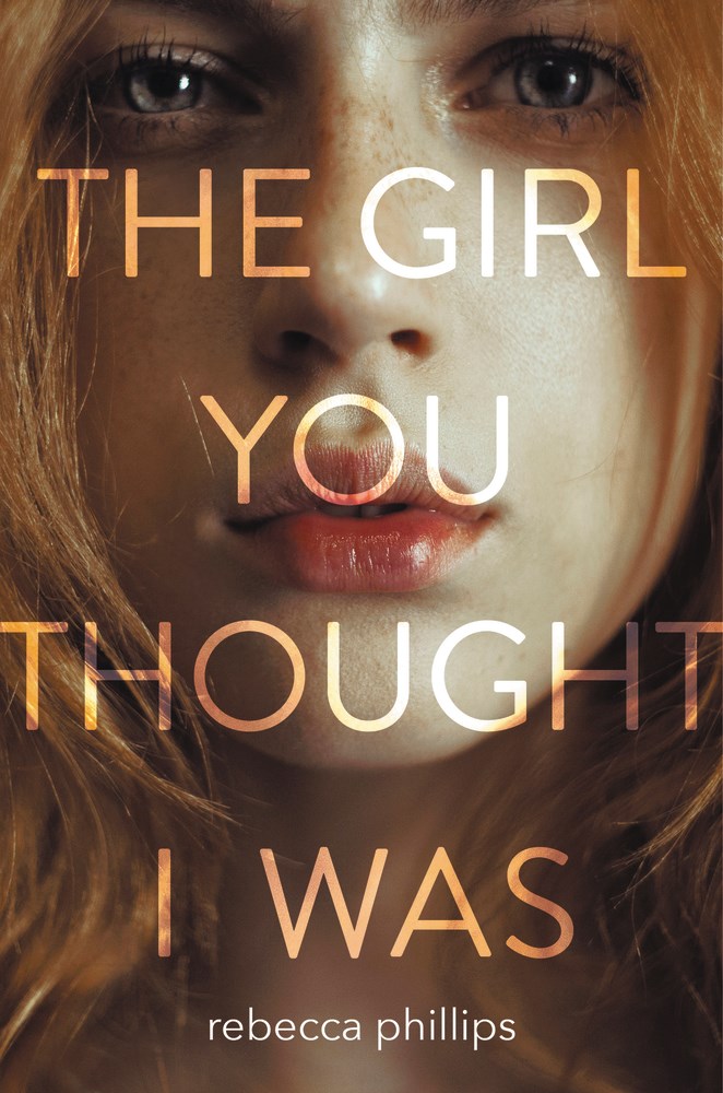
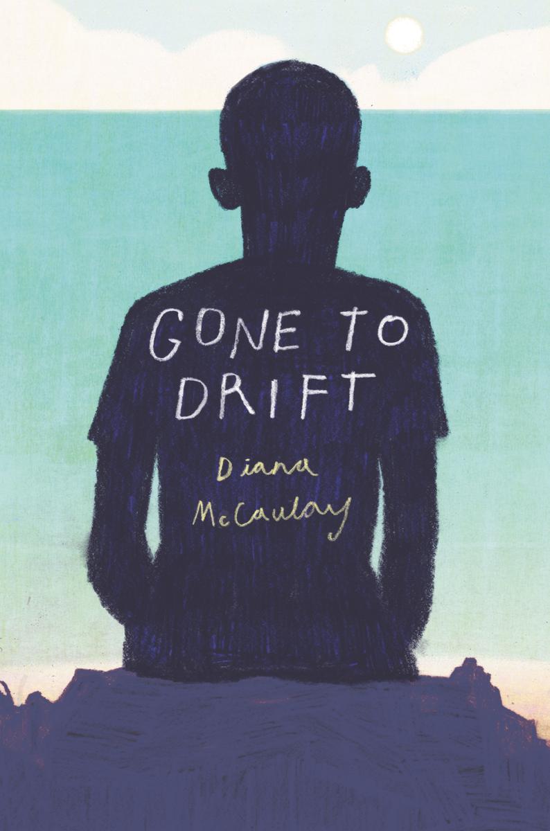
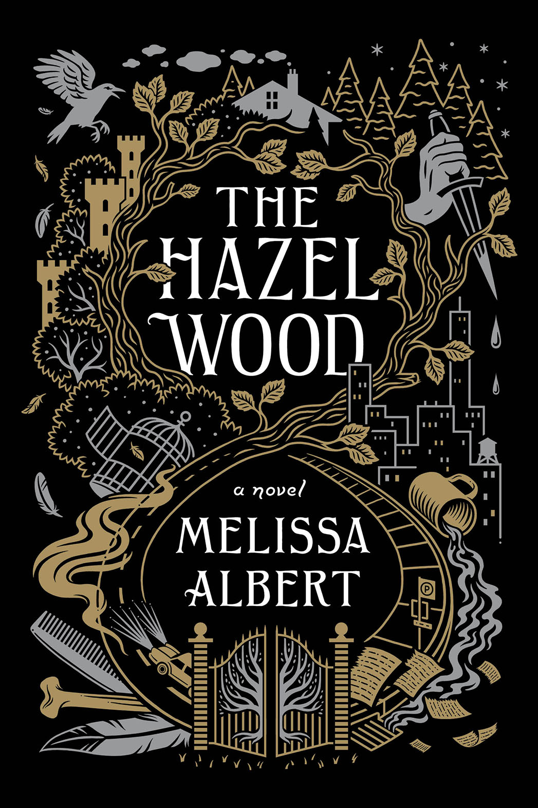
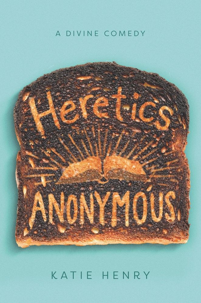
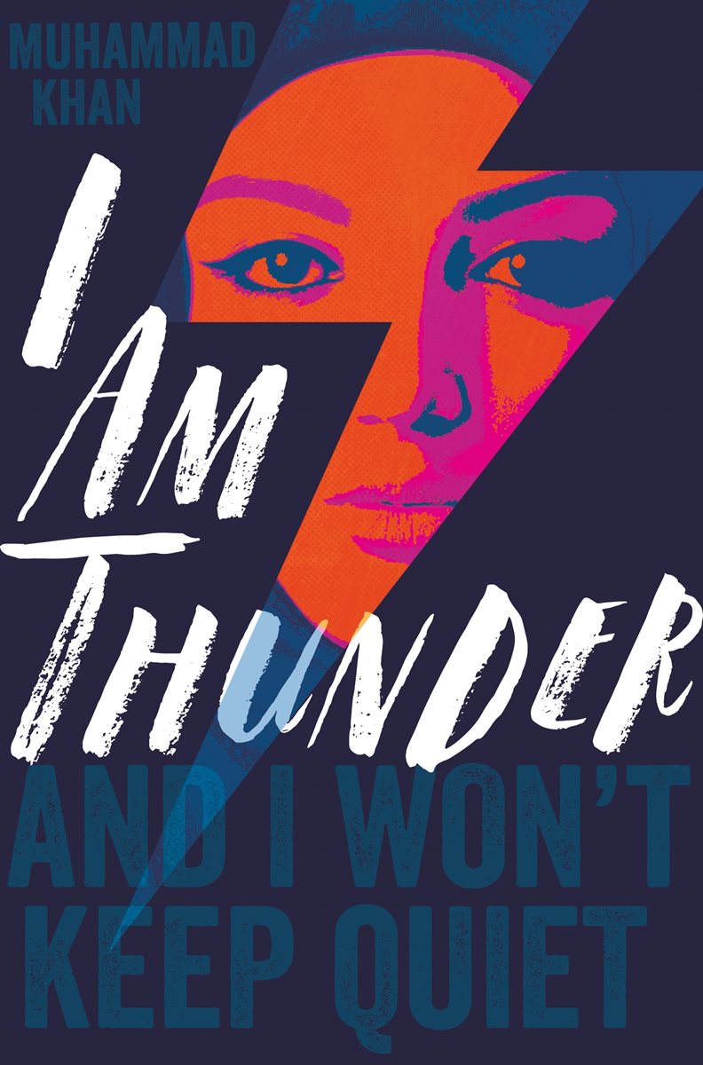
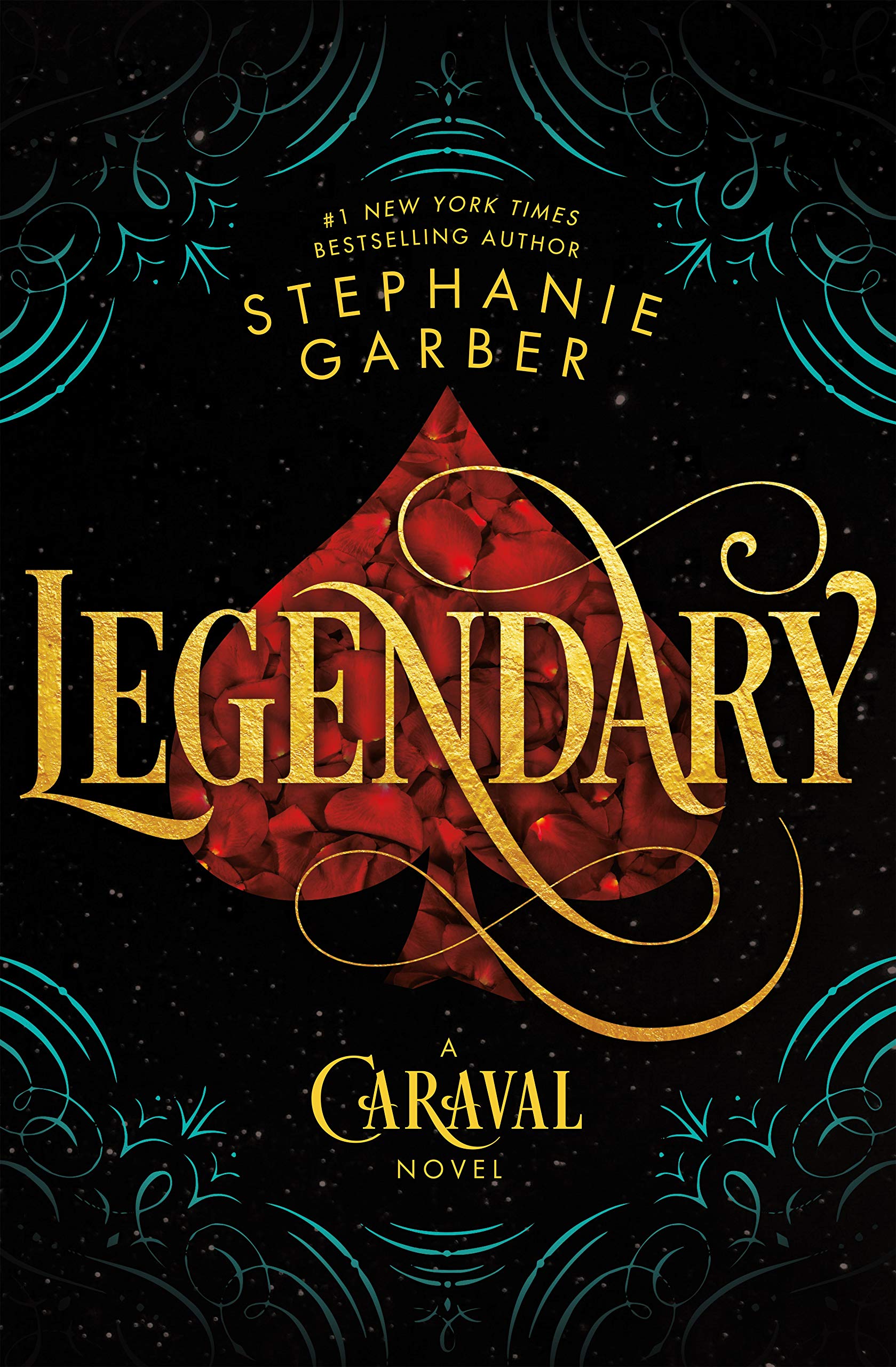
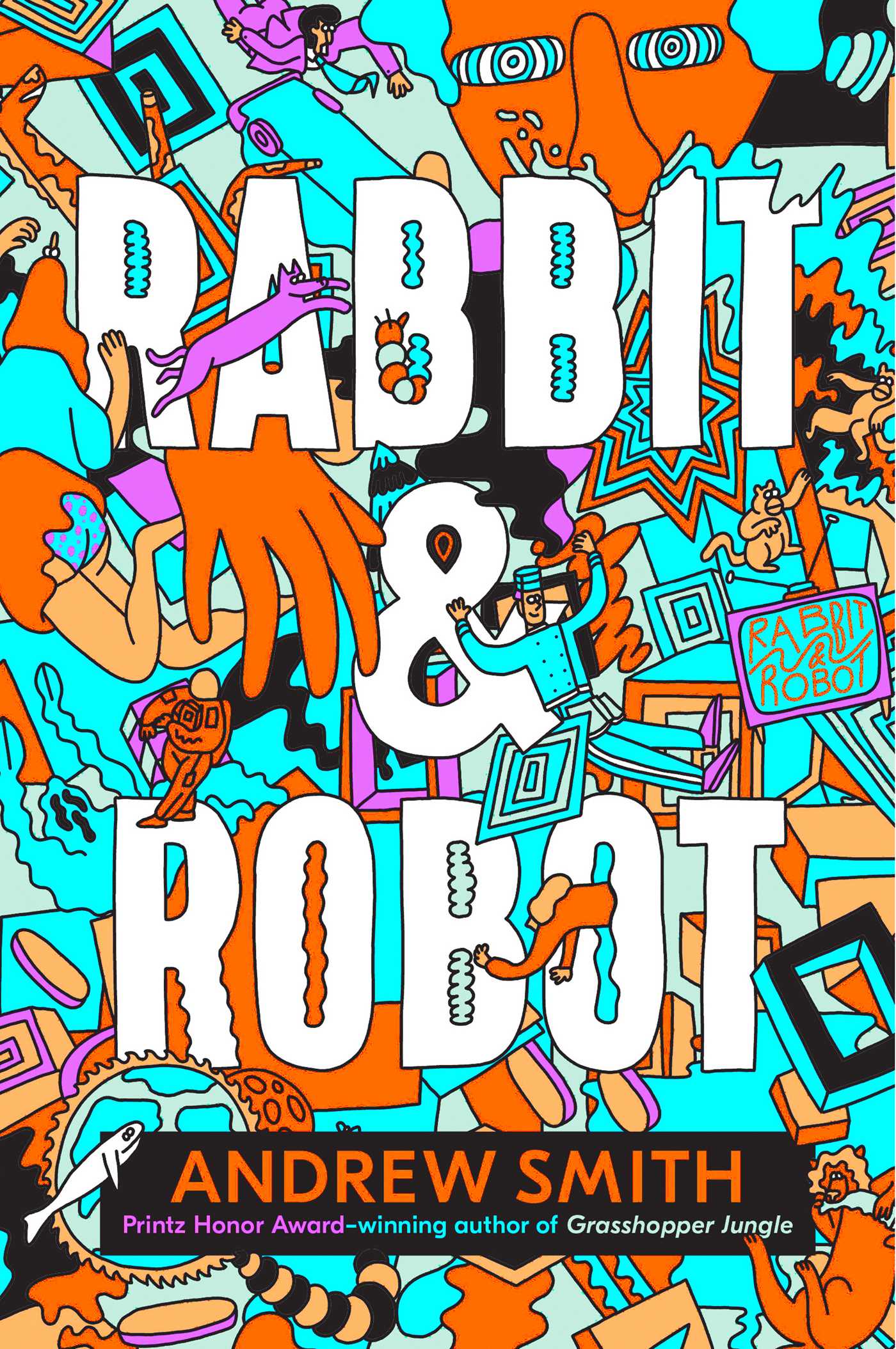
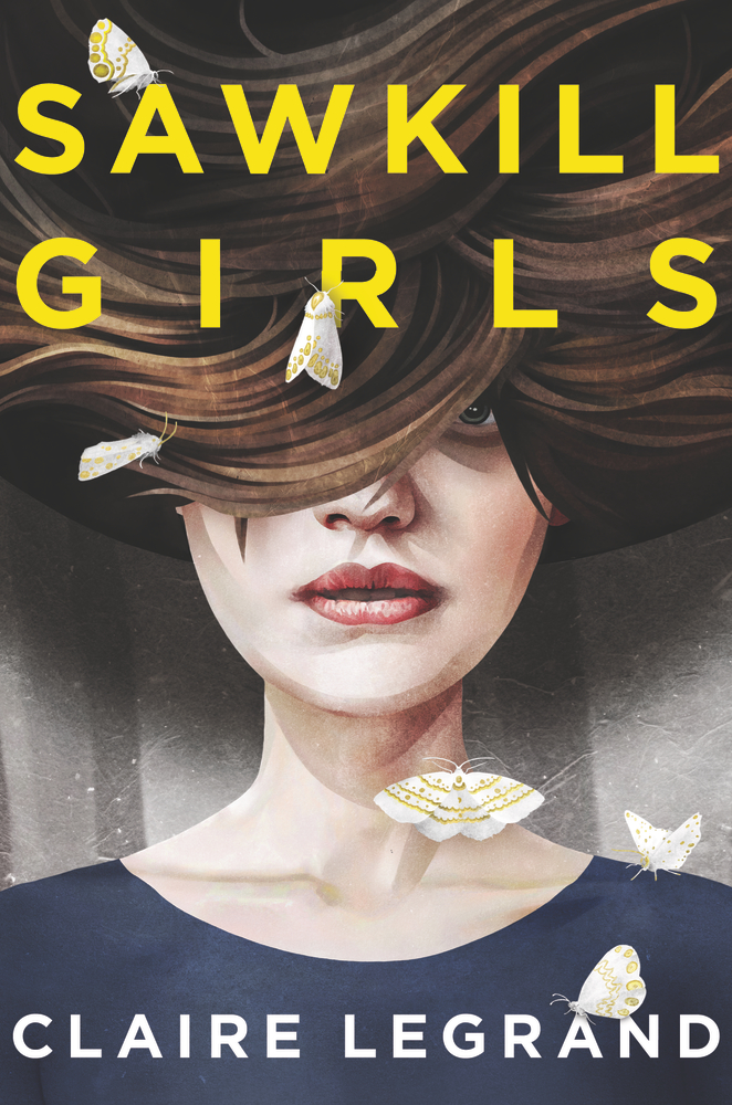
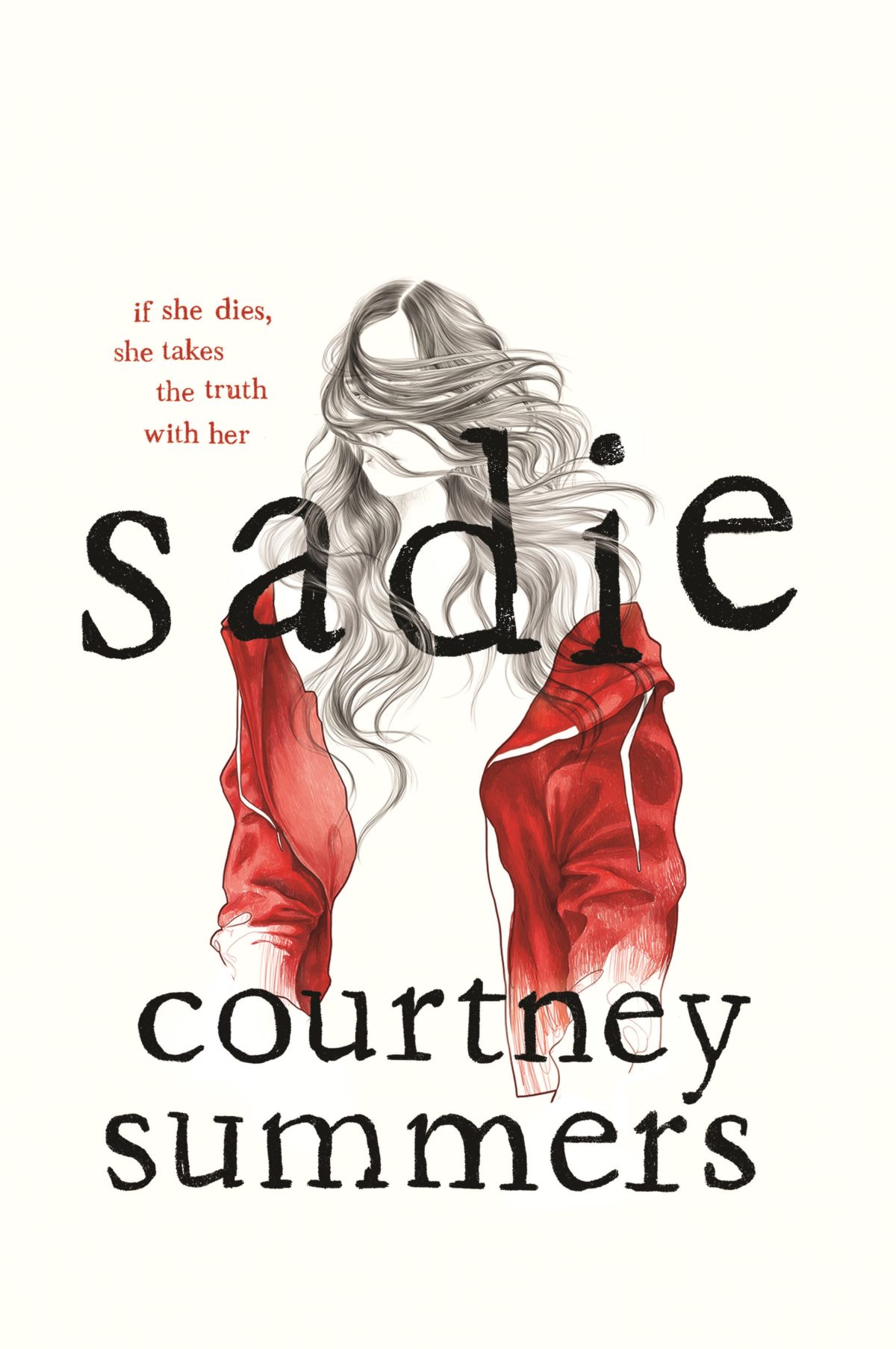
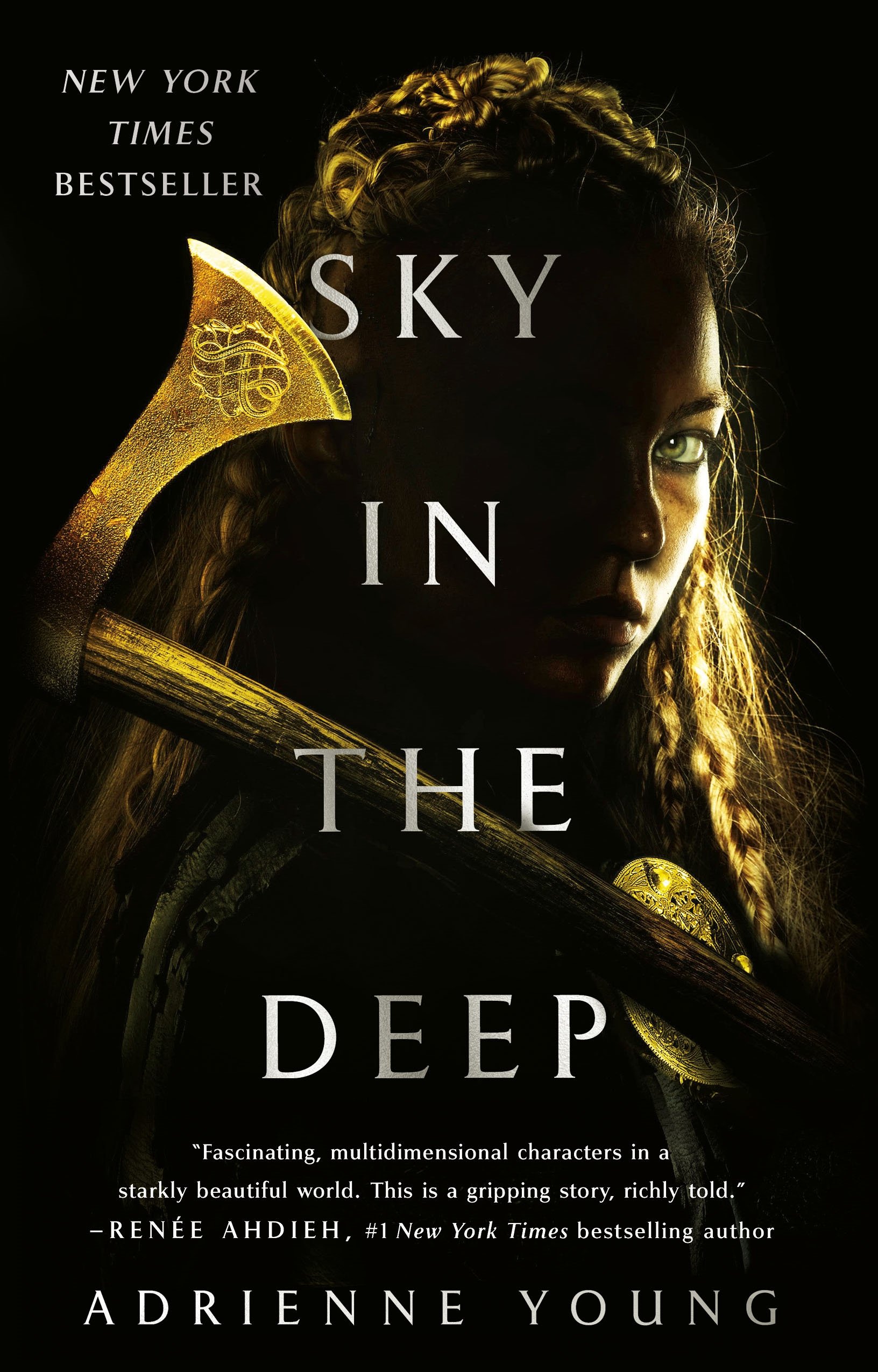
I have to apologize even more than usual for this year’s YA post. I’ve been rushing to get it done before the holidays and I have finally run out of time. But even though this list is far from definitive, there are still lots of great young adult (and one or two middle-grade) covers for you to peruse. Enjoy!
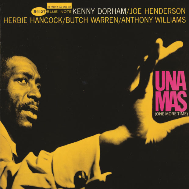
In the latest episode of Vox’s Earworm video series, producer Estelle Caswell takes a look at the classic record covers of the jazz label Blue Note designed by Reid Miles and frequently featuring the photographs of Francis Woolf:
This is my last monthly round-up for 2018. Next month I’ll post my round-up for the year. I have to confess that I have not given the blog 100% of my attention of late, so if you think that there are covers I might’ve overlooked this year please feel to send them my way for consideration.
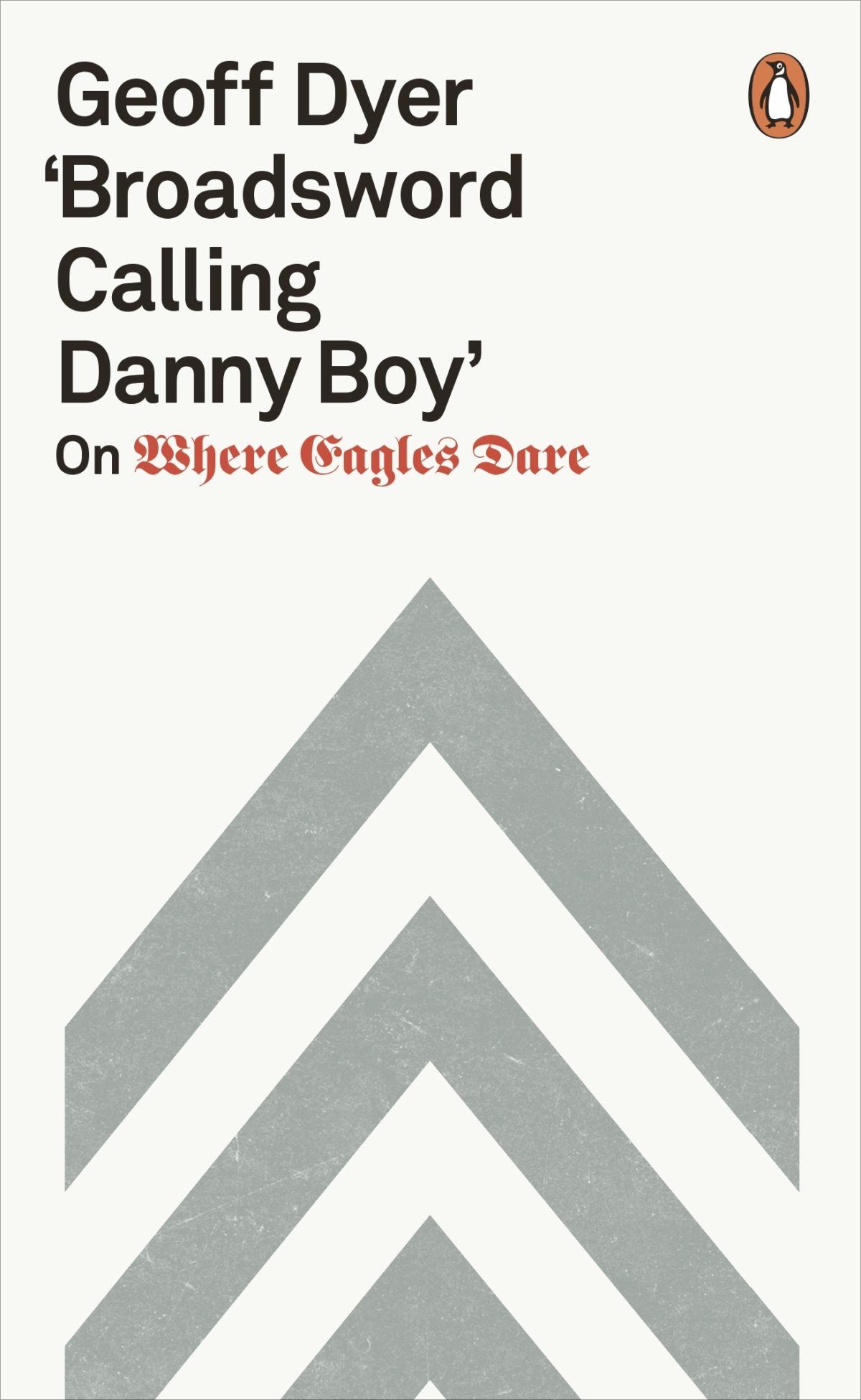
The blackletter is similar, I believe, to the type used for the movie title / credits, and the chevrons are a nice reference to a design that appears in the movie. The Guardian reviewed the book last month if you are curious. (And someone in the UK needs to buy it for me as a Christmas present!)
Usually I’m a bit reluctant to post the covers of celebrity books, but this is pretty great.
Celebrity book covers are often look beautiful — the recent memoirs by Sally Fields and Michelle Obama come to mind — but often that’s because of a glamourous photograph. The designer’s job is just to get out of the way. That makes sense from a marketing point of view, it’s just not terribly interesting from a design perspective. This feels like it has a bit more to it somehow. Or maybe it’s just more fun…
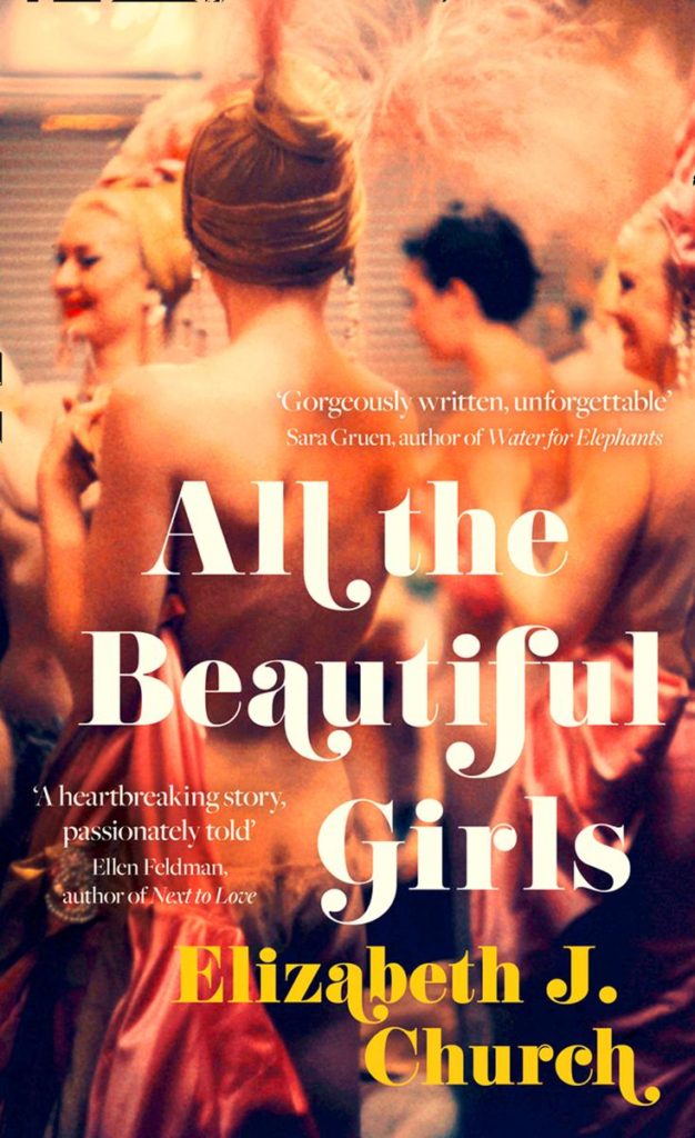
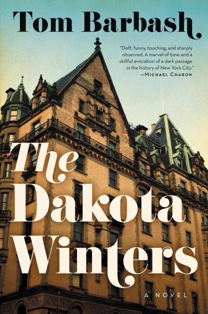
That all said, I have started to see this kind of swashy retro type pop-up more frequently of late. A couple of recent examples that come to mind are the covers of All the Beautiful Girls by Elizabeth J. Church, designed by Anna Morrison (Fourth Estate), and The Dakota Winters by Tom Barbash designed by Allison Saltzman (Ecco):
I would guess the fonts are Bodoni or variants thereof, but no doubt someone with a better eye for type will be able to tell us for sure.
UPDATE: Anna Morrison tells me the font she used for All the Beautiful Girls is Cabernet, which just goes to show what I know. According to the ever-useful Fonts in Use, Cabernet is “an uncredited revival of Benguiat Caslon, a 1970s Photo-Lettering typeface by Ed Benguiat.” I’m pretty sure Benguiat Caslon was used for the iconic Philip Roth covers in the 1970s so I probably should’ve recognized it…
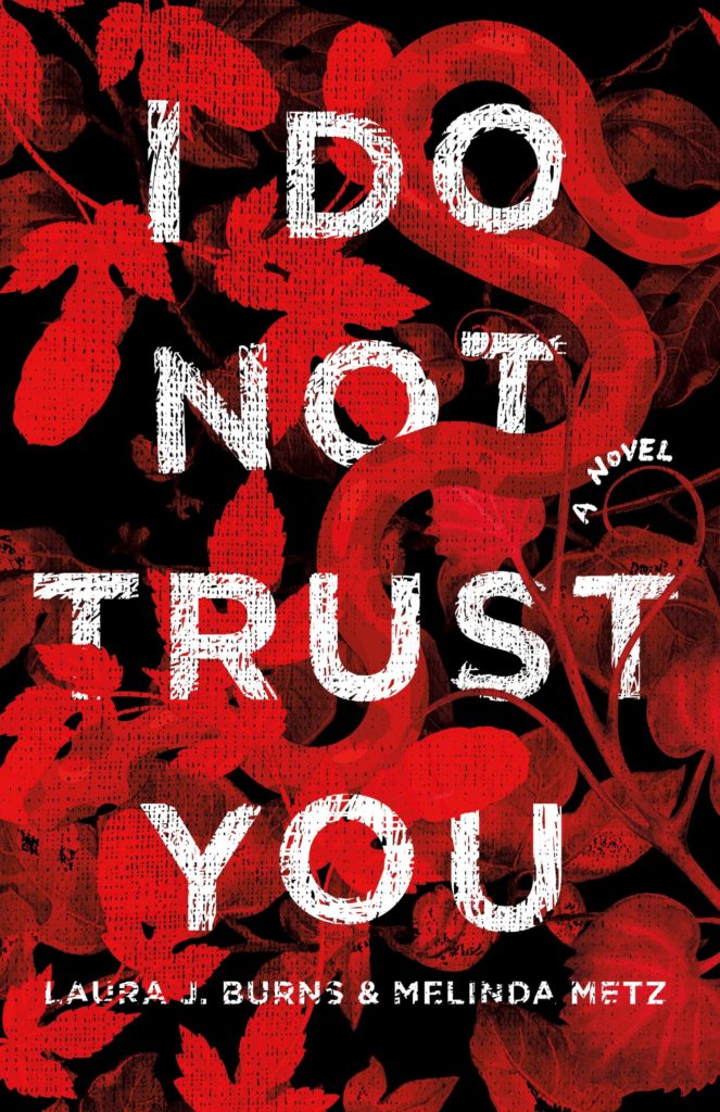
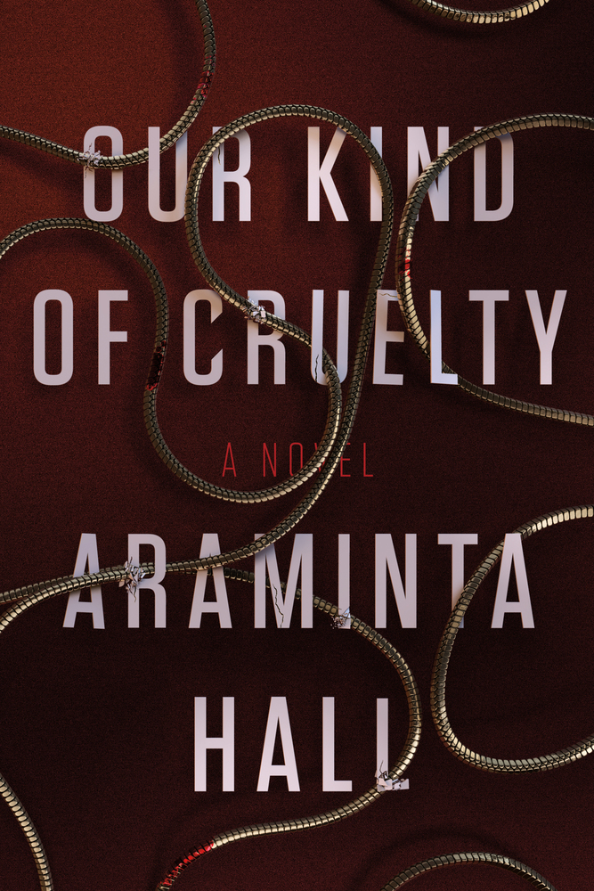
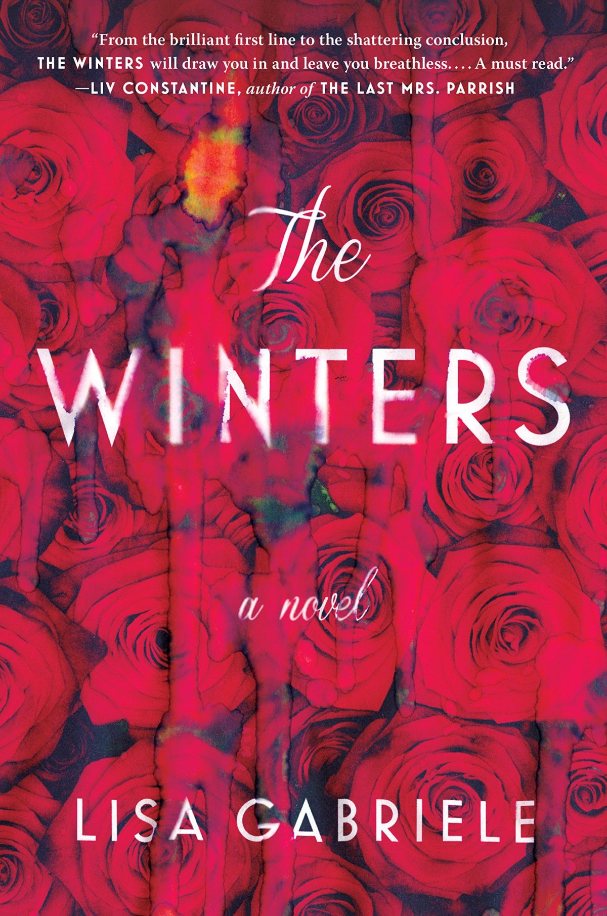
I had it in my mind that snaky red covers with big white type were very “in” for thrillers right now, but the only other example I could think of was the US cover for Our Kind of Cruelty by Araminta Hall designed by Alex Merto, which is really not that similar…
I’ve been thinking about covers that feature one form of redacted text or another for a while, but this post has been sitting in my drafts folder gestating for far too long so I’m publishing now, as-is, because otherwise it is unlikely to ever see the light of day!
The covers of Censoring an IranianLove Story, designed by Peter Mendelsund, and Nineteen Eighty-Four, designed by David Pearson, are classics of the genre:
Censoring an Iranian Love Story by Shahriar Mandanipour; design Peter Mendelsund (Knopf / May 2009)
Nineteen Eighty-Four by George Orwell; design by David Pearson (Penguin / January 2013)
I thought that this kind of bar redaction (is there a technical term for it?) might be a relatively new — post-The 9-11 Commission Report — phenomena, but (friend of the blog) Richard Weston, AKA Acejet170, recently posted this 1974 Penguin cover for Academic Freedom by Anthony Arblaster, designed by Omnific, on Instagram:
In a lovely design touch, the redacted words appear on the back cover:
Related to bar redaction is the strike-through. One of my favourite examples is Barnbrook‘s cover design for How to Run a Government by Michael Barber, published by Allen Lane.
How to Run a Government by Michael Barber; design by Barnbrook (Allen Lane / March 2015)
I’ve been seeing the straight strike-through used a lot recently. It does a neat job of doing two things at once. It allows you to not say something, while also emphasizing that you are pointedly not saying it.
That Perfectly Useless Concentration by Alan Shapiro; design by Isaac Tobin
Ten Myths About Israel by Ilan Pappe; design Isaac Tobin
I’ve seen it mostly used for nonfiction (as above), but Janet Hansen recently used the strike for the cover of Amitava Kumar’s novel Immigrant, Montana:
Immigrant, Montana by Amitava Kumar; design Janet Hansen (Knopf / July 2018)
Black text on a white background with a red strike-through is its own sub-genre:
The Courage of Hopelessness by Slavoj Zizek; design by Richard Green (Allen Lane / May 2017)
Now You See It by Michael Bierut; design by
In fact, using red — be it more artistic blocks, strikeouts or scribbles — is a popular way to highlight what is being crossed out:
Trust Me, PR is Dead by Robert Phillips; design by Jamie Keenan (Unbound / June 2015)
Silence Once Begun by Jesse Ball; design by Peter Mendelsund (Pantheon / 2014)
A Book of Untruths by Miranda Doyle; design by Donna Payne (Faber & Faber / June 2017)
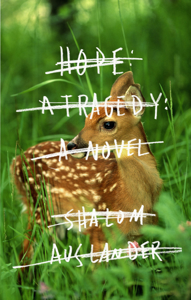
And generally the hand-drawn strike-through or scribble seems to be the most popular way to cross something out …
Hope A Tragedy by Shalom Auslander; design by John Gall (Riverhead Books / January 2012)
Everything I Know About Love by Dolly Alderton; design Helen Crawford White (Fig Tree / March 2018)
Tell Me Lies by Carola Lovering; design Donna Cheng (Simon & Schuster / July 2018)
All Our Names by Dinaw Mengestu; design by Isabel Urbina Peña (Knopf / March 2014)
The Only Story by Julian Barnes; design by Suzanne Dean (Jonathan Cape / February 2018)
One Day We’ll All Be Dead and None of This Will Matter by Scaachi Koul; design by C.S. Richardson (Doubleday Canada / March 2017)
If you have (constructive) thoughts on the matter, and/or other examples, please leave them in the comments.
The Last Word by Hanif Kureishi; design by Jaya Miceli (Scribner / March 2015)
I feel like I should at least try to collect some of the best political covers from the past year or so together into a post at some point. On the other hand, I really don’t want to…
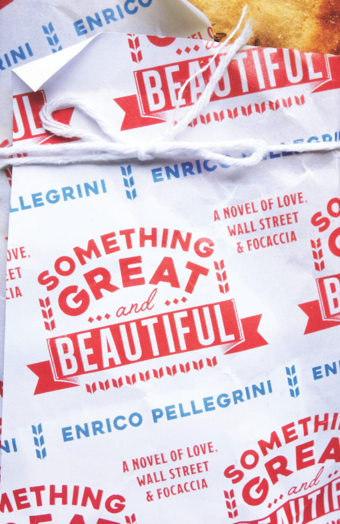
I’m not entirely sure why, but cover of Something Great and Beautiful brought to mind the 2014 cover of the UK edition of The Empathy Exams by Leslie Jamison, designed by Tom Darracott for Granta. They’re really not that similar, and yet…
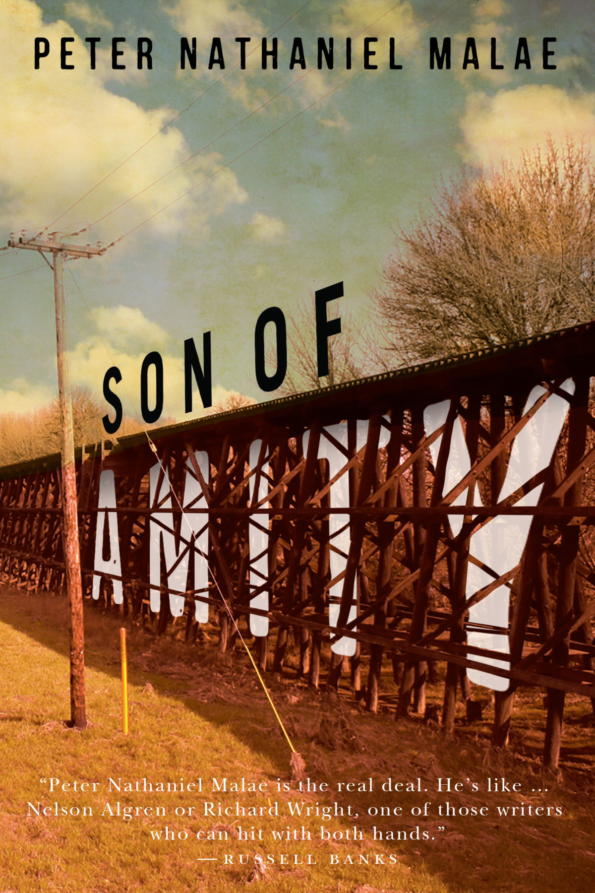
Son of Amity by Peter Nathaniel Malae; design by David Drummond (Oregon State University Press / October 2018)


