Skip to content

Tag: Design

High-Rez Himes

After my slightly snarky comment yesterday about publishers and designers making hi-res cover images readily available, Michael Fusco emailed me with said images for his fantastic Chester Himes covers for Pegasus.

Here they are in their full typographic glory:

Worth the wait I think…

You can see more of Michael’s work at his website and design:related portfolio.

3 Comments

Something for Weekend, May 29th, 2009

Hard-boiled — New designs for Ross MacDonald’s Lew Archer books by Joe Montgomery seen at FaceOut Books. I know I link to FaceOut just about every other week, but it’s an awesome site and the juxaposition of images in this series are great (as are some of the unused comps).

The Concierge and the BouncerPublishers Weekly report on Richard Nash (formerly of Soft Skull) and Dedi Felmen (formerly of Simon & Schuster) and their plans to “push back against the outmoded idea of publisher as cultural gatekeeper” with their new venture Round Table (announced at BEA this week):

The key is a shift from a caretaker mentality to a service mentality, from a linear supply-chain model to the idea of a free-floating, non-hierarchical “ecosystem” of readers, writers and authors… Nash and Felman’s idea of Publishing 2.0 could make a semi-professional reader, writer, editor and critic out of anyone with the desire.

Reading in a Digital World — A killer line in an otherwise blah article for Wired by Clive Thompson:

“We need to stop thinking about the future of publishing and think instead about the future of reading.”

Book Distribution in Canada — A Canadian Heritage study on book distribution in English Language Canada produced by Turner-Riggs dropped this week.

Can Editors Change Their Spots — David Hepworth’s thoughts on Robert G. Picard’s CS Monitor article ‘why journalists deserve low pay’,  and what “the new dispensation” means for  editors:

Magazine editors spend most of their time deciding what they’re *not* going to do and trying to arrive at a mix that the majority of people will like. They then find that whatever they’ve arrived at is too much for some people and not enough for others. This is made more difficult by the fact that their readers, being the most engaged in their particular area, are the people most likely to tap into other sources themselves. The people who value your mix most are also the people who would feel most qualified to mix it themselves.

The italics are mine.

Cover to Cover —  Steven Heller reviews newly released  ‘visual books’ in the New York Times with a nice accompanying  slide-show. (See image above, but hey NYT, when are you going to let people embed your slide-shows? When?).

Comments closed

Something for the Weekend, May 15th, 2009

The Story of Goddesigner Arthur Cherry discusses his elegant design (which uses Marian Bantjes’ typeface Restraint to such brilliant effect) for the new edition of Michael Lodahlr’s book at FaceOut Books.

A Manifesto — Ted Genoways, the editor of Virginia Quarterly Review, on the future of university presses and journals:

University presidents need to see what articulate ambassadors they have in their journals and presses, what tangible, enduring records they present of the variety and vigor of their sponsoring institutions…[G]reat universities extend well beyond the edges of their campuses. They reach out to the larger world, they challenge and engage the public, and the most effective and enduring way of doing so remains the written word.

HarperCollins Wants to Be Your Friend — Leon Neyfakh looks at publishers and social media in the New York Observer. Ostensibly it’s about the ever so anodyne HarperStudio, but more interesting stuff comes from the other people interviewed:

“I don’t know if it’s a direct response to the fact that publishing is in a very uncertain period right now, or if it’s just an idea whose time has finally arrived, but people right now are really interested in experimenting,” said Ami Greko, a 29-year-old digital marketing manager at Macmillan. “There seems to be a real sense of, ‘Let’s get creative—nothing is set in stone yet, so let’s just try a whole bunch of stuff.’”

Das Buch vom Jazz — The German-language version of The Book of Jazz, illustrated by Cliff Roberts ,  found in a used-bookstore by Today’s Inspiration’s Leif Peng. The black and white illustrations are wonderful.

Moaning Eton-boys & Middle-Aged Hackettes — A great defense of blogging by Nina Power at Infinite Thøught  (via PD Smith on Twitter):

Print media suffers from a lack of space; certainly it is selective, but it is also exclusive — all the stories that don’t get told, the injustices that get covered-up. We may feel we can ‘trust’ print journalists more than bloggers… but the sheer quantity and variety of information online allows for the exposure and discussion of things that might otherwise get ignored.

And finally…

The Tyranny of Data — The New York Times on Douglas Bowman‘s decision to leave his position as top visual designer at Google, and the  limitations of crowd-sourcing design:

“Getting virtually real-time feedback from users is incredibly powerful,” said Debra Dunn, an associate professor at the Stanford Institute of Design. “But the feedback is not very rich in terms of the flavor, the texture and the nuance, which I think is a legitimate gripe among many designers.”

Adhering too rigidly to a design philosophy guided by “Web analytics,” Ms. Dunn said, “makes it very difficult to take bold leaps.”

1 Comment

Midweek Miscellany, May 6th, 2009

Vintage awesomeness — Hella Haase cover seen at the Vintage Paperbacks (Non-Penguin) Flickr Pool.

Make it Good — Jacket copy matters according to a Publishing Trends survey:

Flap copy is especially important for fiction. And title and cover impact are closely related to the impact of jacket copy. If the flap copy defies the expectation created by the cover and title—if, for instance, the cover of the book leads the reader to expect a thriller but the flap copy identifies it as horror—readers are less likely to buy it.

The Common Addiction to MediocrityGuy Kawasaki talks to Hartmut Esslinger, founder of frog design and professor at the University for Applied Arts in Vienna (lessons here for the book industry for sure):

Excellent products require more then just a good designer or a good design agency—they require humanistic and cultural vision, courage and discipline in execution.

Which leads quite nicely to Nora Young‘s podcast great conversation with filmmaker Gary Hustwit, director of Objectified and Helvetica, on CBC Radio’s Spark.

Thrift-Store Philosophy — some nice vintage book cover design finds at the always excellent Ward-O-Matic.

Instant Gratification — An interesting Q&A with Patrick Brown of Vroman’s bookstore in Pasadena (PW‘s Bookseller of the Year in 2008) on The Big Bad Book Blog:

People greatly underestimate how important browsing is for physical purchases, largely, I think, because it’s lacking in the online world. People come to an ecommerce site already knowing what they want to buy (for the most part). This isn’t so in our store, where people frequently come in for one book and end up leaving with a book that caught their eye on the way to the section or waiting in line at the register. The other thing we provide that I think is invaluable is a physical place for literary culture to happen.

Well-Aimed Typewriter Keys — After 70 years, Little, Brown and Co. have unveiled a new logo  designed by  Lance Hidy.

The Book Depository — who have a great range of books and offer free shipping world wide (and have this great live map), has launched an affiliate program. Can I humbly request someone develop a wordpress widget for it please?

And lastly, The New Yorker‘s The Book Bench blog has a sneak preview of the new Dan Clowes book.

Comments closed

Midweek Miscellany, April 15th, 2009

The #amazonfail shitstorm — from Amazon’s awful “ham-fisted”  glitch (a phrase so dirty it’s probably de-listed from their own searches) to the seething self-righteous indignation on Twitter — has been enough to make me want turn off the internet and go back to bed. But if you need  an overview of the whole sorry story, business reporter Andrea James has done a very thorough job following it for Amazon’s local newspaper the Seattle Post-Intelligencer, and summaries, shivering with schadenfreude, can be found in the New York Times, The Guardian, Wall Street Journal, and the National Post.  No doubt the other major dailies were all over it too…

Former PW editor Sara Nelson at The Daily Beast , Evgeny Morozov at Foreign Policy, and the Vromans Bookstore Blog offer some alternative perspectives.

But I’ve got to say I agree with Jessa Crispin at BookSlut: “I’m bored with this.”

(UPDATE: Clay Shirky has written perhaps the most thoughtful post on #amazonfail I’ve read to date: The Failure of #amazonfail)

Lets. Move. On…

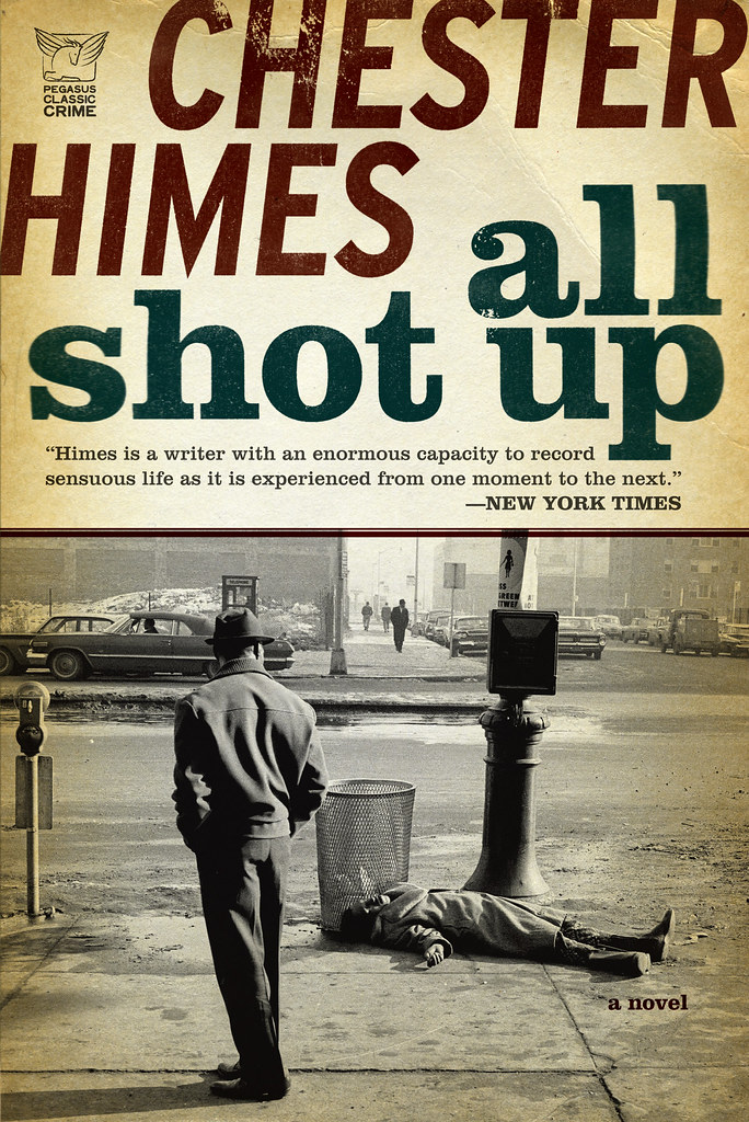
Straight Up — Knopf designer Peter Mendelsund who moonlights as art director of Vertical Press and blogs at Jacket Mechanical,  interviewed at the always ace FaceOut Books (Smell Man by Munenori Harada, designed by Peter Mendelsund pictured above).


Contact — Filmmaker and writer Adam Harrison Levy on William Klein’s recent appearance in New York and the importance book-signings (William Klein: Buicks, 2 tiered, New York, 1955, Howard Greenberg Gallery, pictured above):

A book signing is a manifestation of an urge to recover something that we, as a culture, fear losing — namely the hand of the artist in the age of mechanical (and digital) reproduction. Now more than ever it seems that we want to get close to creativity: to hear the voice and see the skin and experience the physical presence of the person who made something that we deem to be meaningful. Is this because so much of our lives now is mediated through a screen?

What Went Wrong? — An interesting article (and something of a mea culpa) in the Boston Globe about the mistakes and missed opportunities made by newspapers underestimating the impact of the web.

In Perpetua — MyFonts strike up a ‘dialogue’ with Eric Gill (1882 – 1940), stonecarver, graphic artist, type designer and writer:

If we insist on the ornamental we are not making the best of our system of manufacture, we are not getting the things that system makes best. The process by which a railway locomotive has become the beautiful thing it now is, this process must be welcomed in all other departments of manufacture. … And ornamental typography is to be avoided no less than ornamental architecture in an industrial civilization.

We Love Typography —  “FFFFound for all things type, typography, lettering, & signage” created by I Love Typography in collaboration with Kari Pätilä.

And finally, I would like to pass on my condolences to the friends and family of Derek Weiler, editor of the Quill & Quire, who died at the weekend, aged 40.

Comments closed

Monday Miscellany, April 6th, 2009

Gregg Kulick‘s design for Being and Time (pictured above) seen at The BDR (of course). You can see more of Gregg’s work on his website.

Try before you buy — Matthew Baldacci, VP of of marketing and publishing operations at St Martin’s Press, talks to Book Business about ‘Read-it-First’, a free email service that allows subscribers to sample books before they decide to buy them (via Joe Wikert).

Can ‘Curation’ Save Media? — Steve Rosenbaum at The Business Insider:

Curation is the new role of media professionals.

Separating the wheat from the chaff, assigning editorial weight, and — most importantly — giving folks who don’t want to spend their lives looking for an editorial needle in a haystack a high-quality collection of content that is contextual and coherent. It’s what we always expected from our media, and now they’ve got the tools to do it better.

City of Juxtapostions — a short Q & A with Portuguese designer and illustrator Cristiana Couceiro (mentioned previously here for her New York Times Book Review cover illustration) at Untrendy Graphics:

Lisbon is deliciously decadent, ripped in time, full of vintage elements. And I let myself get lost in those little details. In shops that closed down, but which still hold, intact, beautiful examples of typography and logotypes on the shop windows. On neighbourhood hair-dressers and groceries. Lisbon seems to fluctuate between the old and the new.

The Fox — A beautiful cover design  seen at Sci-Fi-O-Rama. Apparently the illustration was originally used for 1967 movie adaption of D.H. Lawrence’s novella (via The Ministry of Type).

Comments closed

Something For The Weekend, April 3rd, 2009

On a very wet and miserable day in Toronto, it only seems appropriate to start with a couple of books about the rain and then move on to some steaming hot coffee before all the usual book miscellany…

Stickers and Stuff lauds Helen Borten’s lovely illustrations for Franklyn M. Branley’s book Rain and Hail (pictured above). And  Andy Smith shares some of his illustrations for his silkscreen book The Rainy Season on his blog (pictured below).

And, while were on the subject of Andy Smith, he’s posted some of his book jacket work  on Flickr (via Beyond the Covers).

The Daily Grind — Benjamin Obler, author of Javascotia, on his 5 Favourite Cups of Coffee in a Day at the Penguin blog:

It’s so obvious, I know, but the morning cup — the first — morning cup — is like the pioneer. The self-sacrificer. Without it, there would be no others… Even on a regular day, it’s a workhorse.

Head On — Indie heartthrob Richard Nash talks to Interview Magazine (via Booksquare):

It is very complicated for an unknown writer to reach an audience of readers given the vast numbers of unknown writers out there. How do people find out about it? So I believe in the role of intermediaries. People always look to trusted friends who might be more expert or knowledgeable in a given area for advice about things… The question is, who are going to be those people. The model is going to shift from kind of a gatekeeper model to an advisor/service model.

Mr. Nash was also interviewed by BookSlut back in March.

I watch you read — Julie Wilson,  AKA Seen Reading and publicist for Canadian publisher Anansi,  is now blogging for Walrus magazine.

Atomized — Mark Coker, CEO of e-publishing service Smashwords, talks about e-books and iPhones with Maria Schneider at  Editor Unleashed.

Bite-Size Edits — The Book Oven launches “a tool that makes proofreading easy and might just be the most fun you’ve ever had spotting typos with your clothes on.” The Book Oven blog has more. (NB Bite-Size Edits is still in private alpha, but  I have a couple of invitations so email/DM me or leave a comment below if you would like to be involved).

And finally, Carny Kill as seen at Pop Sensation (words fail):

Comments closed

Something for the Weekend, March 27th 2009

Alternative MangaEric Skillman on designing a template for Top Shelf’s AX: Alternative Manga series at his blog Cozy Lummox.

FiledBy — a social network for authors and their readers, co-founded by Peter Clifton and Mike Shatzkin.

Extended Grey Skies — Henry Sene Yee on designing the cover of David Cullen’s  Columbine:

In the end, I didn’t want to say anything or felt the need to frame the book in any Point-of-View. What really needs to be said? The Publisher had already set the tone for me. As far as the cover copy, there was no author’s name, no descriptive subtitle, no high school, just the word COLUMBINE on the front cover. That said it all.

Router — Jeremy Mickel on the year-and-a-half process of designing his first typeface at I Love Typography:

Several designers have told me how important it is to have a specific use and point size in mind. The idea is that if you try and design a font that’s good for everything, it might not be REALLY good at anything. But if the font works really well for one specific use, then it can probably work well for lots of others.

In search of Chandler — Editorial Assistant Anna Kelly recounts her search for the original jackets of Raymond Chandler’s The Big Sleep, Farewell, My Lovely, The Little Sister, The Lady in the Lake, and The Long Good-bye for Hamish Hamilton’s new reissued editions. Chandler died 50 years ago this week.

And finally, I’ve mentioned Tom Gauld’s Flickr page previously but,  honestly, it’s so good who cares? Tom’s just uploaded some of his sketchbooks and needless to say they’re genius. You can see Tom’s books at Cabanon Press.

2 Comments

Midweek Miscellany, March 18th, 2009

The BombAlison Forner‘s cover design for Stephen M. Younger’s history of nuclear weapons (Ecco June 2009), seen at Book Covers Anonymous.


Has the computer democratised design? — Designer Peter Saville (perhaps best known for his iconic designs for Factory Records) at D&AD President’s Lecture earlier this month (above). More interesting snippets from the talk are available here (via The Strange Attractor).

Reminder — Writer Charlie Stross on why there isn’t a tipjar on his blog (via Times Emit):

If I put a Paypal tipjar on this blog to take conscience money from folks who’ve downloaded a (cough) unauthorized ebook or two, the money would come to me, not to the publisher. And without the publisher those books wouldn’t exist: wouldn’t have been commissioned, wouldn’t have been edited, wouldn’t have been corrected and marketed and sold in whatever form filtered onto the unauthorized ebook market. (Yes, they commission books, and pay authors for them up-front — a vital part of the process, because most of us can’t afford to take a year to write a book on spec and then hope somebody liked it enough to buy it…)

“We publish books and give them away – free” — Concord Free Press (via Scott Pack):

All 1,500 copies of our first free book, Give and Take, are circulating through the world—from New England to New Zealand, Soho to Slovakia. Our readers are making voluntary donations to charities or people in need. We ask them (nicely, of course) to give, then pass the book on, so that every time it changes hands, it generates more contributions.

Comments closed

C.S. Richardson on Book Design

BookLounge have posted three really interesting videos of  C.S. Richardson, VP, Creative Director at Random House of Canada, discussing the history and practice of book design (clip 1 above).

Link

2 Comments

From New Typography to Swiss Style

As the cover of Emil Ruder’s Typographie (pictured above) suggests, Felix Weidler’s vast collection of modernist book design in Germany and Switzerland 1925-1965+ is a remarkable archive. It not only includes covers, but interior photos, and notes. Brilliant. (via davidthedesigner).

Comments closed

Midweek Miscellany Feb 18th, 2009


Typographic Trees — I saw pictures of the latest collaboration between artist Gordon Young and design studio why not associates a while back, but a mention in the latest issue of Creative Review is the perfect excuse to post a couple of images of these lovely sculptures for Crawley Library in West Sussex. It’s probably worth mentioning that (unsurprisingly) why not also do a nice line book design.

An interview with Allan Kornblum, publisher at nonprofit literary publisher Coffee House Press, is the latest installment in Scott Esposito’s How to Publish in a Recession series  at Conversational Reading:

Now with Borders on the brink, and former readers becoming would-be writers and self-publishing books instead of reading books, a major shake-up was inevitable… The recession isn’t the only factor driving changes in writing and publishing. Writers on the one hand, and book and magazine publishers on the other, are both trying to figure out what the changes in information technology will mean. Will books get shorter, so they can be read on a cell phone? Will nonfiction migrate to ebooks, while literature stays on the printed page? Will backlist titles become downloadable PDFs? Will future desktop printers include binding equipment?

Funeral in Berlin — Possibly the most badass cover ever (pictured above) and part of the amazing collection in the Penguin Paperback Spotters’ Guild Flickr pool (first seen at FFFFound). And funnily enough it is apparently Len Deighton’s 80th Birthday.

30 Novels Worth Buying for the Cover Alone — “A book must stand out on the bookstore bookshelf yet cover designers rarely receive the recognition that authors do.” And  in “appreciation of these unsung artists”, Beth Carswell chooses her 30 favourite fiction covers for AbeBooks.

MinuteMen — a retro-Nintendo-style-arcade-kung-fu-kick-punch-jump-game promoting the new Watchmen movie. Smartass viral marketing if you like that kind of thing. And if you listen closely, that sound you hear is Alan Moore’s teeth grinding away in Northampton. Buy the book.  (via GalleyCat).

How do you define good design? Gary Hustwit, director of Helvetica, interviewed about his new film Objectified at the Dwell Magazine blog:

If it didn’t exist, would anyone really miss it? Would it leave a hole in anyone’s life?

If we asked ourselves this question in publishing more often, how many books would actually get published? And would publishers be in the mess they’re in now? Answers on a postcard please.

And finally, Spy Vibe — a blog dedicated to 1960’s spy style! This is so cool I can’t even be bothered to find a tenuous link to books or publishing (although there surely is one)…

2 Comments