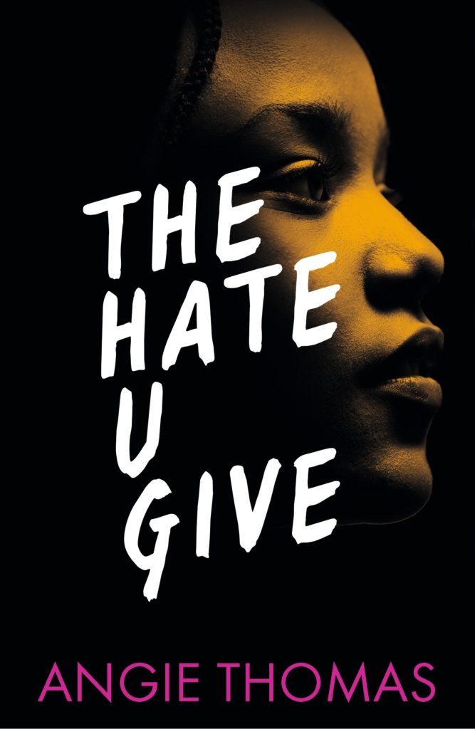
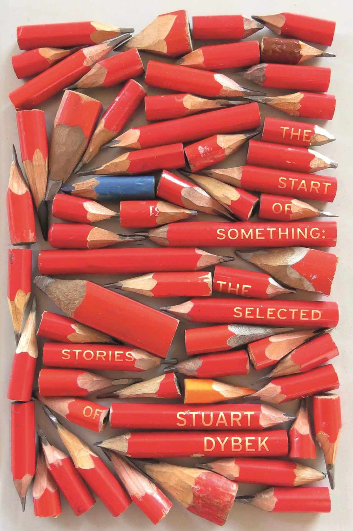
We are increasingly being urged to create objects of desire and the cover obviously plays a key role here, especially when a book is aiming for pride of place in a bookshop. Designers visit them regularly, to note the common visual language of related or competing titles. It can be a source of frustration then, when presenting a contrasting or conflicting design aimed at standing out, only to be asked to produce a copycat cover intended to hitch on the success of the latest best-seller. Booksellers often create themed displays dedicated to the latest hot trend, see Hygge for example. Publishers are all-too aware of this and often the pursuit of a like-for-like cover is their priority… Being allowed to use ‘just type’ will always be dependent on what books are blazing a commercial trail… Jon Gray’s cover for Swing Time and John Gall’s for Norwegian Wood, to take two current examples, prove to publishers that the mass market can handle bold, type-driven design and so this approach will be validated for a time.
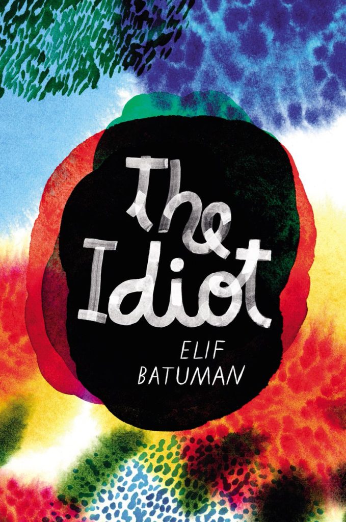
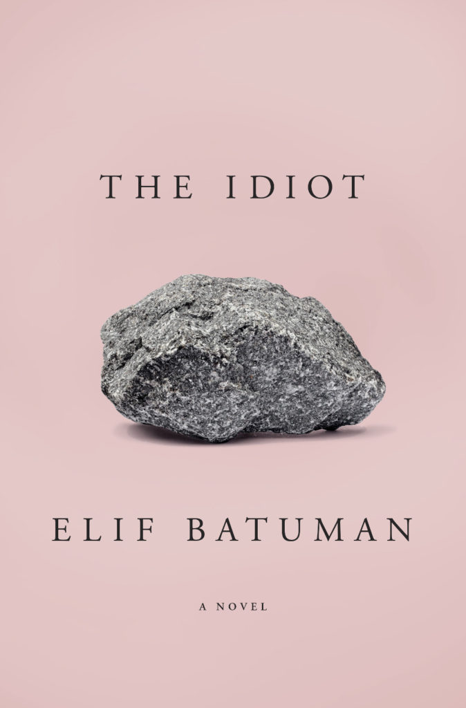
I always look forward 50 Books | 50 Covers announcement. It feels like the industry standard. It’s the cover design list that really seems to matter to book designers in North America, and it’s the one I always compare my own list to.
There are always great covers among the winners that are new to me, and this year is no exception. But here are a few random observations about this year’s the cover selections: there a lot of typographic/type-only covers; academic publishers are well represented; there are some surprising omissions (although the jury can only judge what is submitted); a couple of the selections are… well, a little problematic; it is a very male list.
I’m interested to hear what other people thought of this year’s winners.
Neil’s embossed metallic silver cover for Selfie by Will Storr (Picador / June 2017) is also kind of great (and hilarious), but impossible to show well online:
The Australian Book Design Association just announced their Shortlist (PDF) for the 65th Australian Book Design Awards. Happily (if somewhat implausibly), I was asked to be the international judge this year (you can read about the other, imminently more qualified judges, here).
As a sample of what you can expect from the shortlist, here are the covers in the Nonfiction category:
Design by Mary Callahan
Design W. H. Chong
Design by Allison Colpoys
Design Jenny Grigg
The winners of the awards will be announced on Friday 26 May at the Awards Party in Sydney. Tickets go on sale Thursday 20 April.
This edition of ‘book covers of note’ is brought to you entirely by Gray318 who designed the covers of all the books published this month. OK, that’s an exaggeration, but Jon did design FOUR of the covers on my list — all different, all brilliant. How no one has published a monograph of his work yet is beyond me. Anyway… This month’s post also includes covers by David Pearson, Erik Carter, Scott Richardson, Kimberly Glyder, Katie Tooke, Rachel Vale and more…
Black Moses by Alain Mabanckou; design by Gray318 (Serpent’s Tail / April 2017)
And, just FYI, after 6 years at Faber & Faber, Luke has decided to set up his own studio should you wish to hire him (and on the basis of this cover alone, why wouldn’t you?).
The Good People by Hannah Kent; design by Rachel Vale (Picador / February 2017)
The Handmaid’s Tale by Margaret Atwood; art direction by Christopher Moisan; illustration by Patrik Svensson (Houghton Mifflin Harcourt / April 2017)
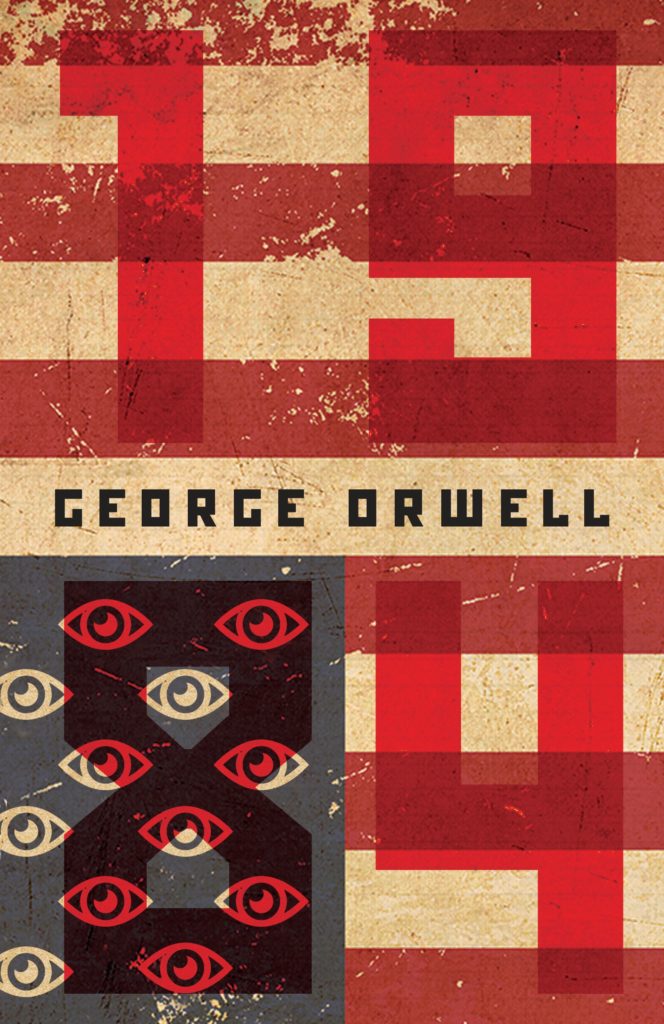
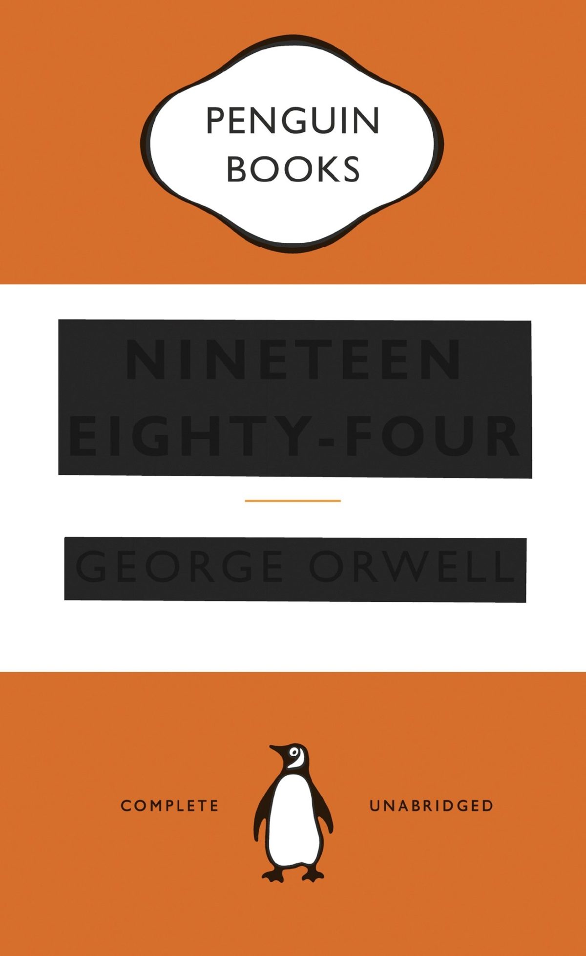
Nineteen Eighty-Four by George Orwell; design by C. S. Richardson (Penguin Canada / March 2017)
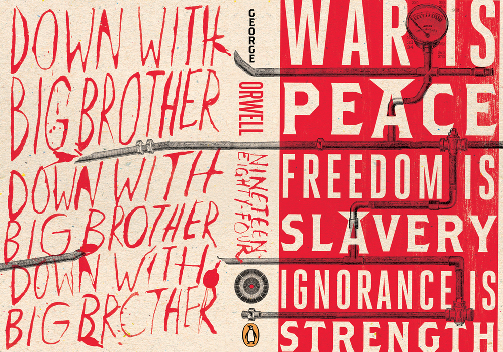
In the US, Houghton Mifflin Harcourt have also published a new edition of Nineteen Eighty-Four. The cover — which owes a wee debt to Peter Mendelsund’s eye motif covers for the Schocken editions of Kafka (in my very humble opinion) — was designed by Mark Robinson.
You can see a few other recent covers for Nineteen Eighty Fourhere.
The covers of the Anglo-American editions of Elena Ferrante’s novels published by Europa Editions have been… well, controversial to say the least (read an interview with the art director about their “kitsch” quality here). The Australian editions of Ferrante’s Neapolitan quartet, published by Text Publishing, have much more stylish, cinematic covers designed by W. H. Chong (you can read about his process here). But these illustrated covers designed by Angelo Bottino for Brazilian publisher Intrínseca for Um Amor Incômodo (Troubling Love) and A Filha Perdida (The Lost Daughter) are really rather lovely. I would love to see a complete set of Ferrante’s novels with covers designed by Bottino.
UPDATE: The cover illustrations for the Intrínseca editions of The Lost Daughter and Troubling Love are by Andy Bridge and Marian Trotter respectively. Thanks to Angelo Bottino for letting me know!
The winners of the annual Academy of British Cover Design (ABCD) Awards were announced at a glittering ceremony London in last night. The dashing Danny Arter has a posted a full report on the proceedings at The Bookseller. You can see all the winning covers below…
Dutch illustrator and designer Dick Bruna died last week, aged 89. Much of the coverage has focused on Miffy, the picture book rabbit he created in the 1950’s, but as The Guardianobituary notes, he was also well known as a book cover designer:
Bruna was born in Utrecht, the son of Johanna Erdbrink and Albert Bruna, and the intention was that he should join the family publishing firm, AW Bruna & Zoon. But Bruna, having been sent to Paris and London to learn about publishing and bookselling, including a brief spell working for WH Smith, opted instead to train as a graphic designer. He had been a keen artist throughout his childhood, especially during the second world war years, when his family lived in the Dutch countryside and he did not go to school, educating himself instead by studying the art of Rembrandt and Van Gogh.
He studied briefly at art school in Amsterdam for six months before leaving to join the family firm in 1951. There he worked as a designer and illustrator, creating more than 100 posters and 2,000 book jackets, including, most famously and distinctively, the covers for Georges Simenon’s Maigret titles in the 1960s, with a black pipe superimposed on a variety of backgrounds.
And as obituary in New York Timesmakes clear,the flat minimalism of Miffy and his design work is very much part of a graphic tradition in Dutch art and design:
Mr. Bruna never became the fine artist he had originally wanted to be, but his work has nevertheless been recognized as part of the Dutch canon of art and design.
“Bruna very much continues a Dutch tradition which we call the ‘klare lijn’ — you could translate it as the clear line, or you could just call it simplicity,” said Taco Dibbits, director of the Rijksmuseum in Amsterdam, which in 2015 organized an exhibition devoted to a half-century of Mr. Bruna’s art and graphic designs. “You see that’s he’s part of a tradition going from Pieter Saenredam through Vermeer to Mondrian.”
During his time in Paris, Mr. Bruna was influenced by the bold lines and two-dimensionality of Henri Matisse and Fernand Léger, Mr. Dibbits said. He also used primary colors and clear lines favored by members of the Dutch de Stijl movement, a pared-down, abstract aesthetic heralded by artists like Mondrian and the designer Gerrit Rietveld.
“He eliminates anything that’s not essential from the face of this little rabbit until it’s really reduced to the absolute minimum,” Mr. Dibbits said. “And he does the same for the text of his children’s books. He uses a language that’s not simple or stupid, but he reduces to the bare essentials.”
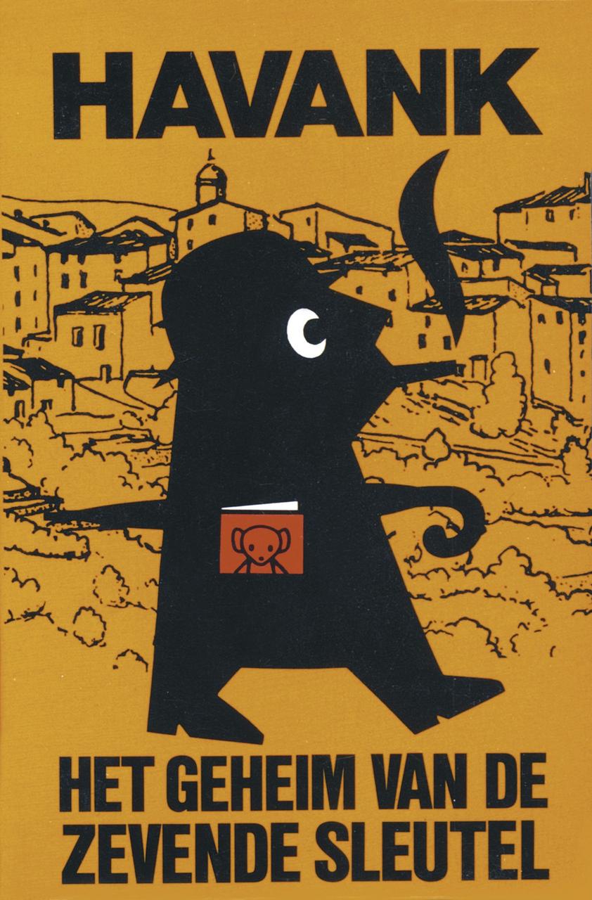
You can find an incredible collection of Bruna’s book covers (over 3,000 of them!) here (via Present & Correct). I’m particularly fond of his De Schaduw covers for Havank:
1984 by George Orwell; design by WH Chong (Text Publishing)
The dystopia described in George Orwell’s nearly 70-year-old novel “1984” suddenly feels all too familiar. A world in which Big Brother (or maybe the National Security Agency) is always listening in, and high-tech devices can eavesdrop in people’s homes. (Hey, Alexa, what’s up?) A world of endless war, where fear and hate are drummed up against foreigners, and movies show boatloads of refugees dying at sea. A world in which the government insists that reality is not “something objective, external, existing in its own right” — but rather, “whatever the Party holds to be truth is truth.”
“1984” shot to No. 1 on Amazon’s best-seller list this week, after Kellyanne Conway, an adviser to President Trump, described demonstrable falsehoods told by the White House press secretary Sean Spicer — regarding the size of inaugural crowds — as “alternative facts.” It was a phrase chillingly reminiscent, for many readers, of the Ministry of Truth’s efforts in “1984” at “reality control.” To Big Brother and the Party, Orwell wrote, “the very existence of external reality was tacitly denied by their philosophy. The heresy of heresies was common sense.” Regardless of the facts, “Big Brother is omnipotent” and “the Party is infallible.”


