This month’s post includes a few covers that I missed earlier in the year along side the new and recent releases. I’m starting to think about my annual recap so please let me know if you think I’ve overlooked any other particularly notable covers that stood out for you and/or seemed emblematic of wider trends in 2022.
And just a reminder with all the stuff going on with social media that if you’d prefer to get new posts auto-magically emailed to you, you can subscribe here. I have also re-opened comments on new posts after closing them for a few months if you want to politely share your thoughts below.
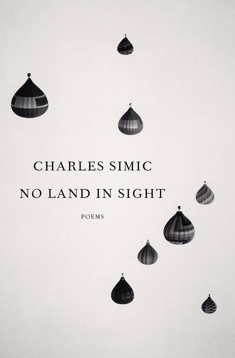
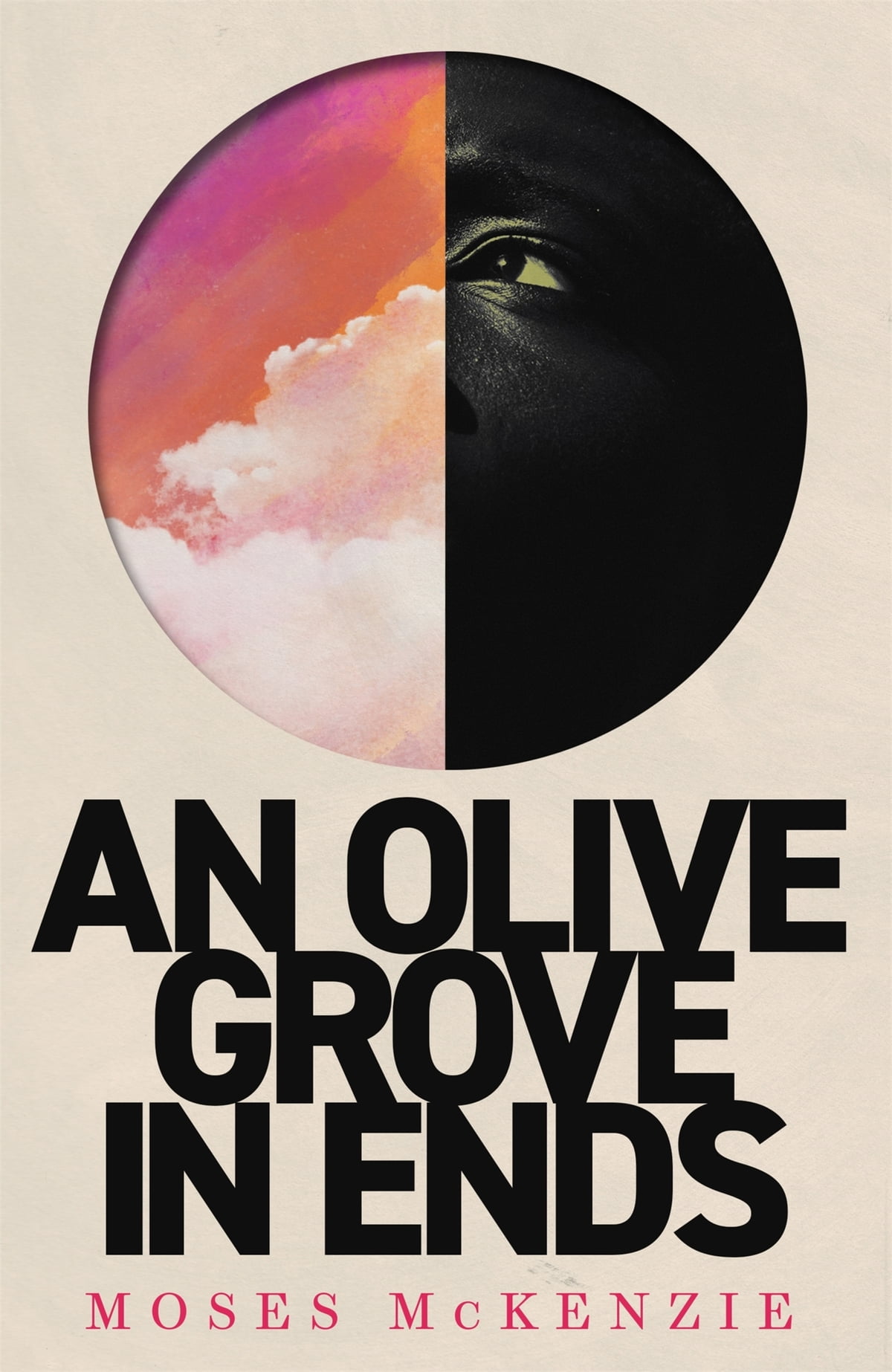
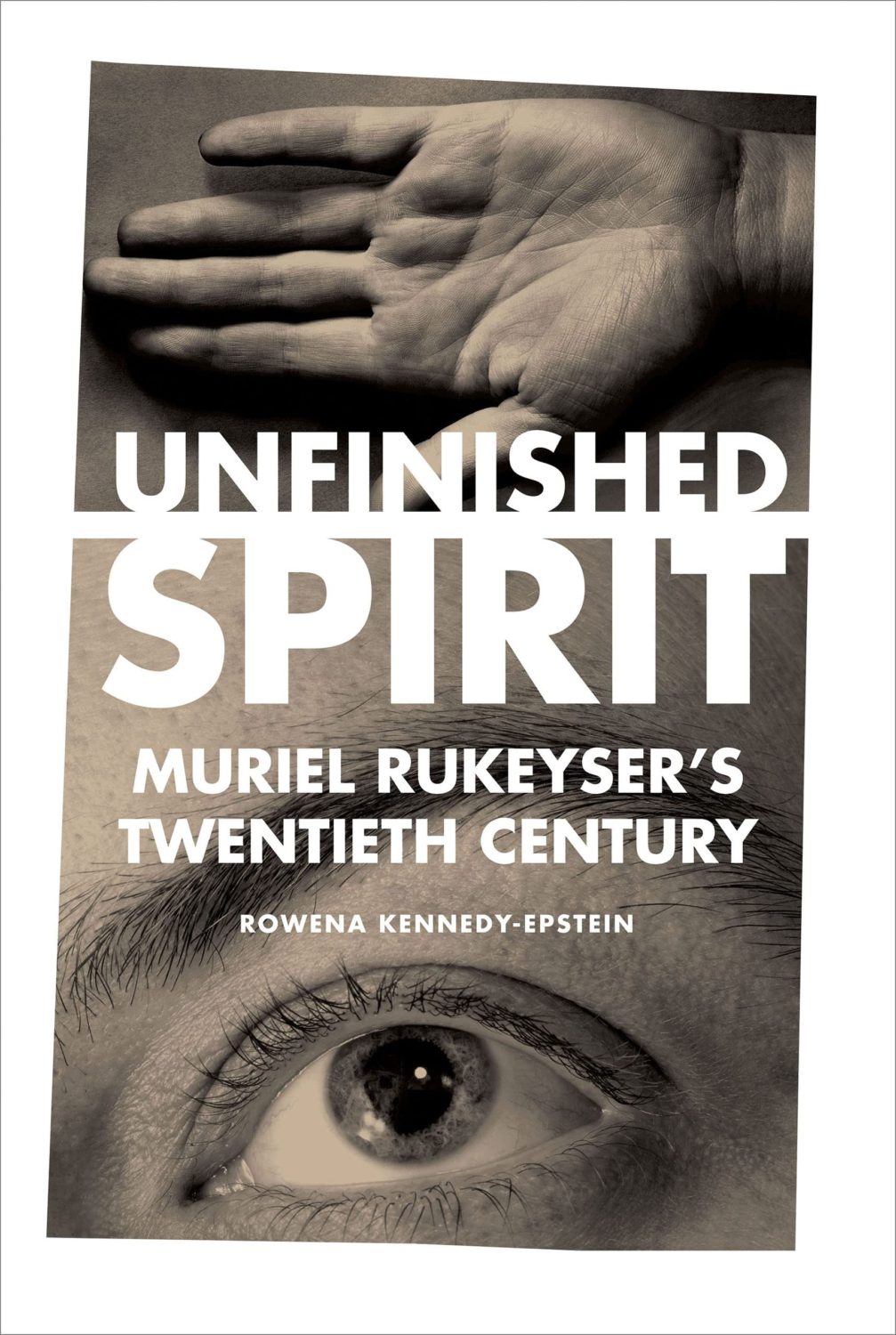
“Fuuuuuuuuuck….!” is the only way I can describe the mixture of awe and annoyance that I hadn’t thought of it I felt when I saw this cover. So simple and so clever.
This has a very similar ‘obscured face collage’ feel to Tristan Offit’s cover for Briefly, A Delicious Life by Nell Stevens, which I thought I had posted here earlier in the year but apparently did not (probably because I didn’t — and still don’t! — know who designed the cover of the UK edition (it was designed by Mel Four, photograph by Marta Bevacqua) and I wanted to post them together?).
Pacifique by Sarah L. Taggart; design by Natalie Olsen (Coach House Books / October 2022)
People Person by Candice Carty-Williams; design by Emma A. Van Deun (Scout Press / September 2022)
Mr. Keenan also designed the cover for the Liveright edition of The Waste Land itself a few years ago.
(The US edition of Matthew Hollis’s book, forthcoming from W. W. Norton, also has an interesting cover. If anyone from Norton would like to send me a hi-res image with the design credit, I’ll be happy to add it in!)
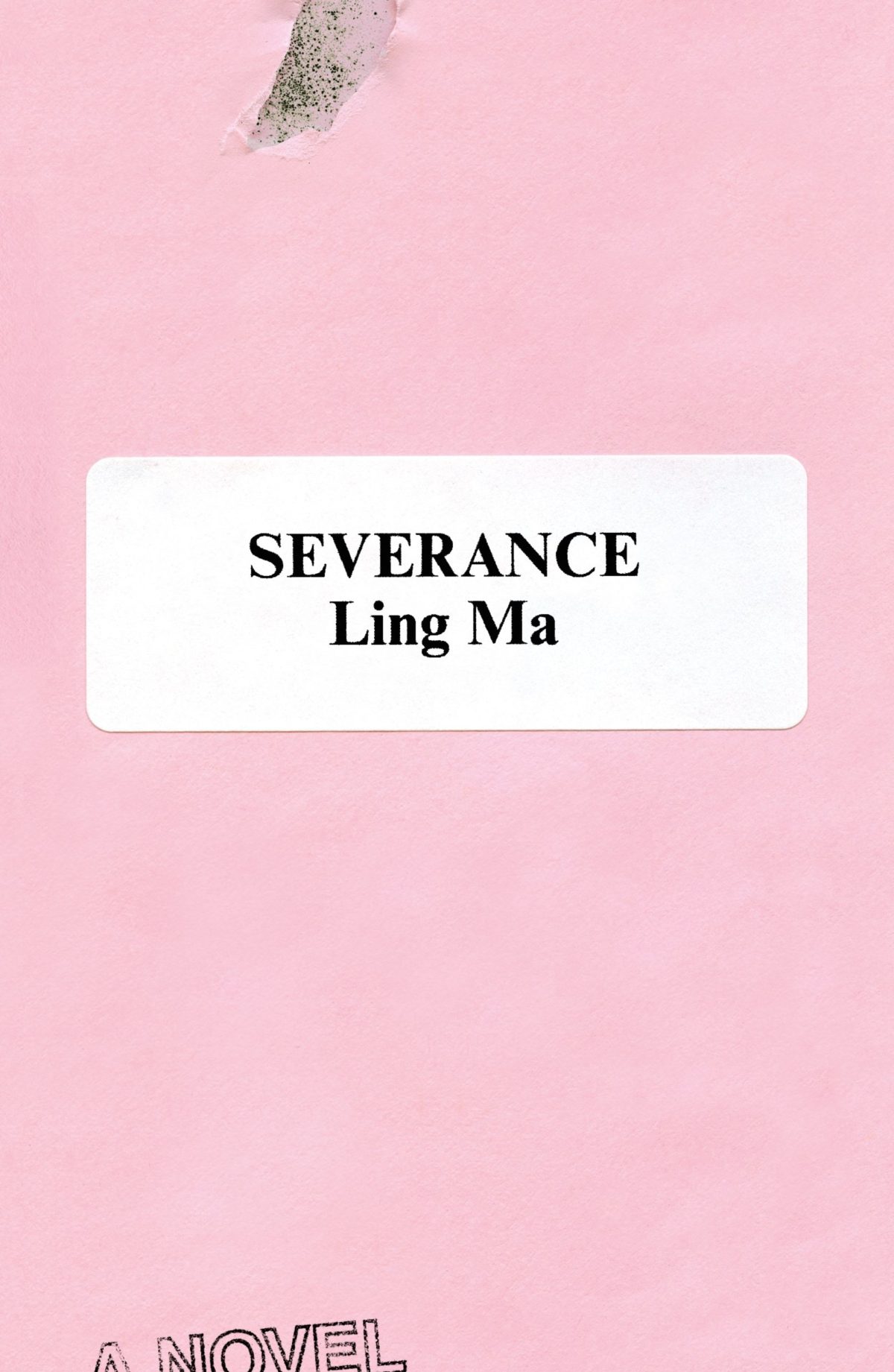
Rodrigo Corral also designed the cover of Ling Ma’s previous novel Severance.
Canción by Eduardo Halfon; design by Alban Fischer (Bellevue Literary Press / September 2022)
Drive by James Sallis; design by David Litman (Poisoned Pen Press / September 2022)
I was just talking about this book — how it is a near perfect thriller, but also great for dudes who don’t read a lot of fiction — so I was happy to see it’s been given a new lick of paint. And pink covers are, as I keep saying ad nauseam, a thing…
I’m including this because of the beautiful photo (with a colour palette remarkably on trend in 2022) and my inevitable teenage crush on indie style icon Miki from Lush.
Sacrificio by Ernesto Mestre-Reed; design by Dana Li (SoHo Press / September 2022)
This reminded me Peter Mendelsund‘s Amerika cover for Schocken back in the day. But, as is the norm around here, the two covers do not actually look that much alike side by side…
I’m doing my best to catch up a little bit this month, but there’s no such thing as a quiet month in publishing any more. Just rest assured nobody knows what they’re doing — we’re just here for the chaos and romance…
I’m even later than usual this month and everyoneelse posted their selections days ago, so you must really like book covers if you’re still jonesing for more! (And just a reminder: if you are in fact addicted to book covers and don’t want to miss any new posts, you can get them automatically sent to your inbox now. It’s not a newsletter, just magical RSS. But subscribing will confirm that you have a problem and should seek help!)
A bit of a Saul Bass / Hitchcock thing happening at the moment…? (The cover of the Faber edition of The Premonitions Bureau by Sam Knight was designed by Jack Smyth)
“Today is wretched and plain. And it is not the bottom, as many people may feel it is. It will get worse; we will go lower. As the Court’s dissent insists, correctly, ‘Closing our eyes to the suffering today’s decision will impose will not make that suffering disappear.‘
And so, with all this laid out, ugly and incontrovertible, the task for those who are stunned by the baldness of the horror, paralyzed by the bleakness of the view, is to figure out how to move forward anyway.
Because while it is incumbent on us to digest the scope and breadth of the badness, it is equally our responsibility not to despair.
These two tasks are not at odds. They are irrevocably twined. As Dahlia Lithwick wondered just a few weeks ago, after the massacre in Uvalde, another clear and awful day: ‘What does it mean, the opposing imperative of honoring the feeling of being shattered, while gathering up whatever is left to work harder?’
It means doing the thing that people have always done on the arduous path to greater justice: Find the way to hope, not as feel-good anesthetic but as tactical necessity.“
Rebecca Traister, ‘The Necessity of Hope’, The Cut
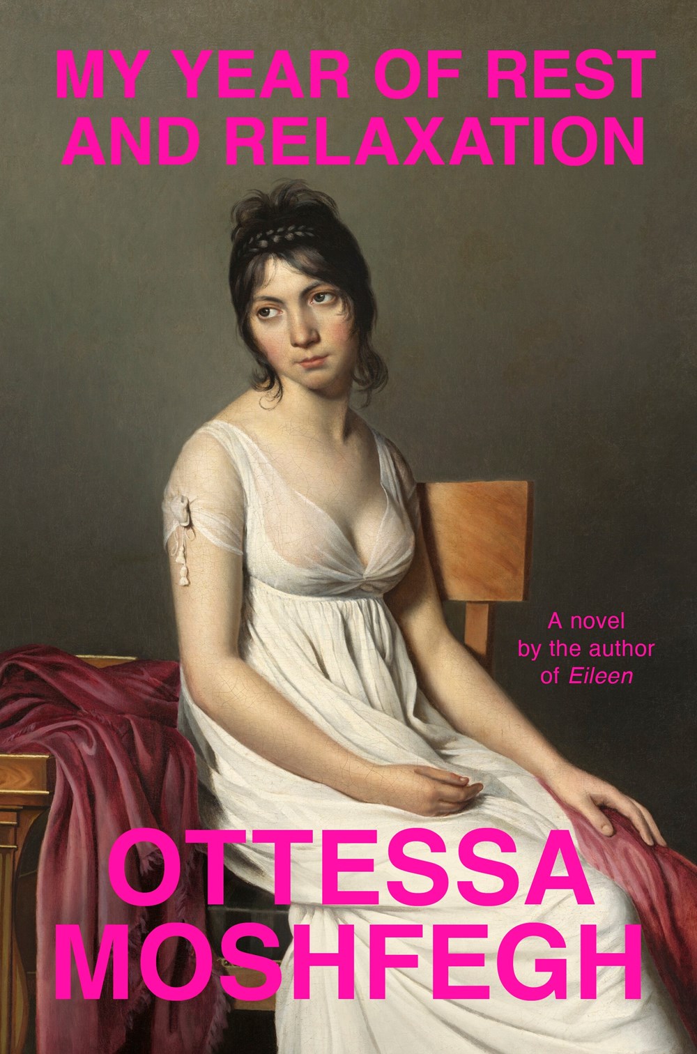
For my art history friends, I believe the painting is “Agnus Dei” by Spanish Baroque artist Francisco de Zurbarán.
IIRC the cover of Moshfegh’s novel My Year of Rest and Relaxation was designed by Darren Haggar. The painting is by French Neoclassical artist Jacques-Louis David.
I compile these posts over the month and then write this bit at the end if I have anything to say. I really don’t have the words at the moment. Posting about the most superficial of subjects feels faintly ridiculous at the end of yet another awful week. But here we are. I am just going to refer you to Wednesday’s Today in Tabs and say that there a lot of really nice covers this month if you are need of distraction…
Appliance by J. O. Morgan; design by the author (Jonathan Cape / May 2022)
I was reminded of Jon Gray‘s cover for Ilustrado by Miguel Syjuco from what seems like ages ago (2010)… Of course they look nothing alike. I had completely forgotten the pen was at jaunty angle.
The cover of the US edition was designed by Rachel Ake Kuech using a illustration by Grant Haffner. The difference between how Canada represents Canada and how the US represents Canada is…. interesting.
Big vertical light leaks might also be a thing… (Freedomland designed by Henry Sene Yee for Cornell University Press)
We’ve almost made it to the end of April, so that’s something. Thanks to Daniel Benneworth-Gray for the mention earlier this month. It surely means I’m about to disappoint a large number of people — if I have not, in fact, already done so — but I hope you find something you like here…
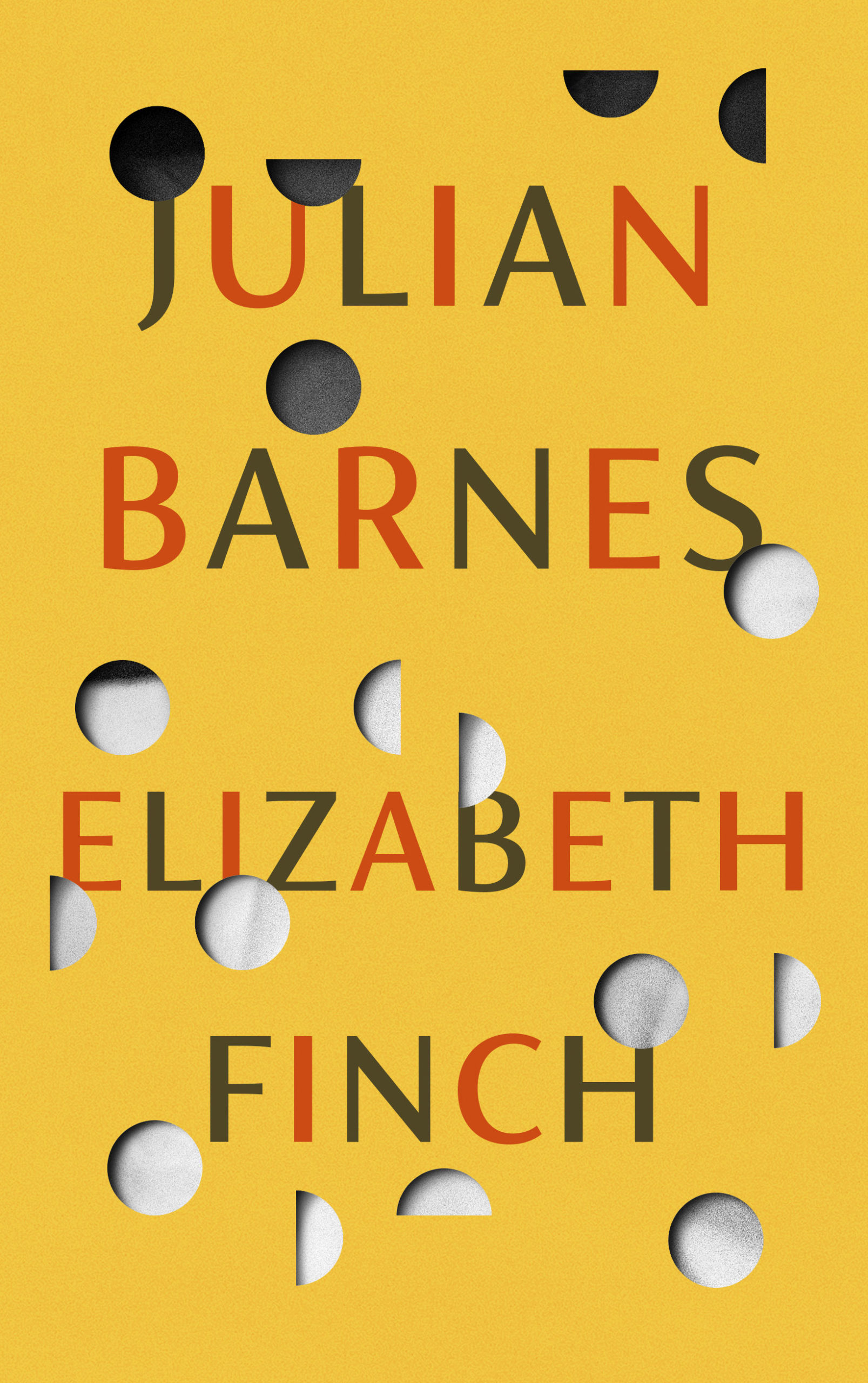
I believe the Elizabeth Finch cover also comes in yellow, but I wasn’t able to find a hi-res image. If anyone wants to send it over, I’ll be happy to add it.
The jacket also comes in yellow, which feels very on trend to me and the blue and yellow look lovely side by side. Thank you to Suzanne for taking the time to send over the image of the yellow version.
Suzanne also sent over an image of the boards for those of you curious to see what is under the jacket, peeking through the die-cuts. The gorgeous photograph is from René Groebli’s photoessay The Eye of Love.
This is the problem with seeing covers/jackets primarily online. You rarely get to appreciate these finer details. This must be a beautiful book to hold and unwrap.
And I have been trying to recall what both these covers remind me of. Possibly ‘Composition of Circles and Semicircles‘ by abstract artist Sophie Taeuber-Arp?
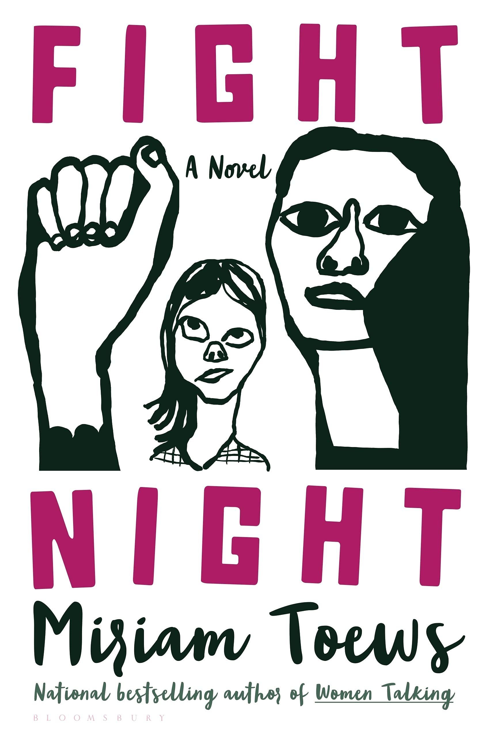
The black and white illustration and pink type reminded me of the US cover for Fight Night by Mirian Toews, designed by Patti Ratchford with an illustration by Christina Zimpel, from last year.
Boothby Karen Joy Fowler; design by Tal Goretsky (G.P. Putnam’s Sons / March 2022)
If you’d asked me to guess sight-unseen, I would’ve 100% said this was designed by someone else. It just goes to show that designers are talented, versatile people and I know nothing (NOTHING).
Malika Favre also designed and illustrated the cover of Playing with Matches by Michael Faudet, published by Andrews McMeel at the end of last year, and featured in this month’s ‘Book Covers We Love‘ post at Spine Magazine.
You know, I started 2022 with such good intentions and yet here we are again at the end of January on a paved road to hell. At least there are some lovely book covers to look at this month. Sigh.
Print Magazine did a piece last year on Amistad Books’ repackaging of Zora Neale Hurston’s work. I’ve featured a couple of the covers here in the past too.
These posts are such a last minute scramble I don’t usually offer much in the way of commentary. It is hard to ignore, however, how many of my selections this year are illustrated. This may be a reflection of my personal preferences. Certainly, it isn’t new. As I mentioned in my look back at the year’s adult covers, the trends in 2021 felt very much like a continuation of the previous couple of years. Even so, I was struck by the sophistication and the range of YA illustrations this year. There are some illustrators whose work appears here more than once, but I don’t get the sense that there is a dominant style across category. It seems to depend very much on the specifics of the genre and the age range of the readership. That said, there is, perhaps, a common theme of ornate detail and decoration.
I am also finding it harder to differentiate between covers for more mature YA readers and adult covers of the same genre these days. If the cover blurbs and other identifiers (“A Novel”) didn’t give it away, the combination of the typography, colour palette, and the apparent age of the protagonist depicted used to give me a clue. Now it seems to me that there is a blurring of the lines, and I’ve had to check a couple of times recently to be sure of the intended readership age. I’d be curious to know if this is intentional on the part of publishers.
Anyway, there are some fantastic covers this year. Buzzfeed has a really decent list with design and illustration credits too if you’re looking for a second opinion (not that they need any clicks from me!). You can find my 2020 list here if you are interested.
Drawn That Wayby Elissa Sussman; design by Sarah Creech; lettering and illustration by art lettering Francesca Protopapa (Simon & Schuster Books for Young Readers / September 2021)
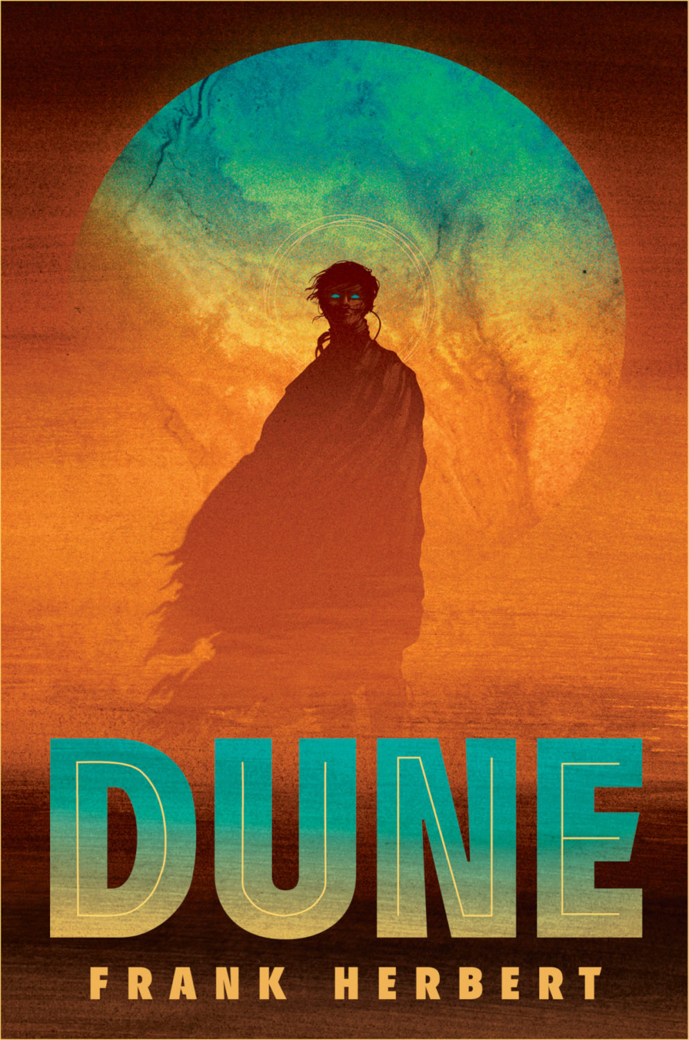
Aside from generally being a terrific SFF illustrator, I believe Matt Griffin illustrated the cover of Ace Books’ deluxe hardcover edition of Dune by Frank Herbert a couple of years ago, so he seems like an inspired choice here.
Love is for Losers by Wibke Brueggemann; design by Rachel Vale (Macmillan Children’s Books / January 2021)
The cover of the US edition, published by Farrar, Straus and Giroux (BYR) in February, was designed by Aurora Parlagreco with an illustration by Sally Nixon. I like it a lot too. It’s interesting to see the contrast between the UK and US markets.
Me (Moth) by Amber McBride; design and illustration by Richard Deas (Feiwel & Friends / August 2021)
(Another cover image with a roundel. Apologies. At least it is somewhat less obtrusive here.)
Yolk by Mary H. K. Choi; design Lizzy Bromley; cover art by gg (Simon & Schuster Books for Young Readers / March 2021)
The covers of Emergency Contact and Permanent Record by Mary H.K. Choi designed by Lizzy Bromley with art by gg have featured in previous year’s lists.
Earlier this year, a Canadian magazine asked me what the latest trends in book cover design were. I don’t think I had a very satisfactory answer. 2021 felt very much like a continuation of 2020, which itself felt like a year on hold.
The trends that came to mind were not exactly new. In no particular order: big faces (big sunglasses!); cropped faces; hands; mouths; postmodern typefaces;1 big skies; rainbows; gradients; the colour orange; psychedelia; collage; contemporary painting.
A lot was made of “blob” covers this year. I’m not sure that anything has really changed since Vulture published this article about “blocky” covers in 2019. They seemed like much the same thing.
Design is about the constraints and, as it turns out, the constraints around designing commercial literary fiction covers that have to work just as well online as in bookstores can lead to similar design solutions — large, legible type, and bright, abstract backgrounds. 2 The surprising thing is not that a few covers look the same when you squint; it’s that more of them don’t.
There were a lot of good covers (that didn’t look alike) in 2021. LitHub posted 101 of them. Still, it didn’t exactly feel like a vintage year.
Do I say that every December? Possibly.
A few years ago I worried that covers were moving in a more conservative direction, particularly at the big publishers. I’m not sure this has come to pass, at least not in the US. There are plenty of covers from the big, prestigious American literary imprints in this year’s list, as there were last year, and every year before that.
There are fewer covers from the UK in this year’s list than in previous years though, and I feel less confident about the situation there. From a distance, things seem a little sedate. I may be mistaken. It’s quite possible I haven’t see enough covers — or perhaps enough of the right ones — from British publishers to get a good sense of the overall picture.3
It would not be a surprise, however, if publishers were feeling a little risk-averse at the moment. We are two years into a global pandemic, experiencing a major supply chain issues, and living through a seemingly endless series of sociopolitical crises.
Nor would it be a surprise if designers were personally feeling the effects too — I’m not sure we are talking about this enough, and I’m not sure I know how to.
Thank you to everyone who has supported the blog in 2021. It means a lot. Here are this year’s book covers of note…
Na Kim talked to PRINT about her career and the designs for the Ditlevsen series in February. If, like me, you were wondering about typeface on the covers, it’s Prophet from Dinamo apparently.
If you’re wondering about the Super-Seventies Sally Rooney typeface, it is Ronda designed by Herb Lubalin and Tom Carnese (I only know because I asked).
Thank you to everyone who has supported the blog in 2021. It means a lot.
I am not convinced that the term “postmodern” quite captures what I mean here (and/or worse, implies something different in the context of typography), but it’s the best I’ve got. I’m not talking about the kind of experimental typography you might associate with the likes of Wim Crouwel or Emigre, or the aesthetic of someone like David Carson. What I am trying to get at is idiosyncratic type that purposely exaggerates or plays with letterforms, and doesn’t conform to function-first modernism. To my mind, this would include some typefaces from the 1960s and 70s, as well as some more contemporary type. In a sense what I am describing is display faces — and I think the eclectic, innovative use of type in Victorian advertising might be an inspiration to designers here — but I don’t think it is just about size. ↩