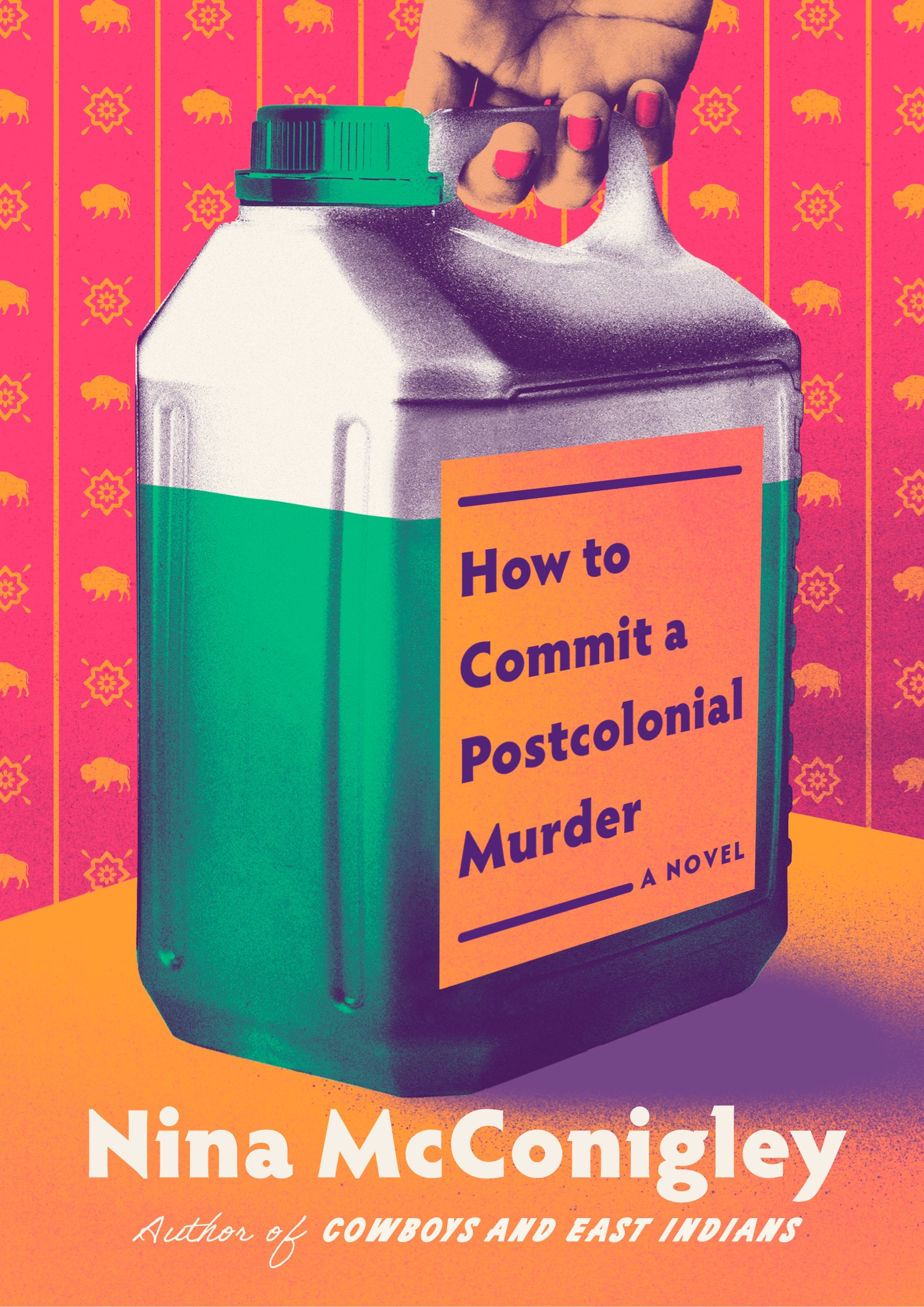
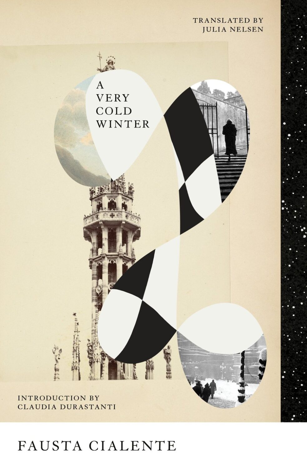
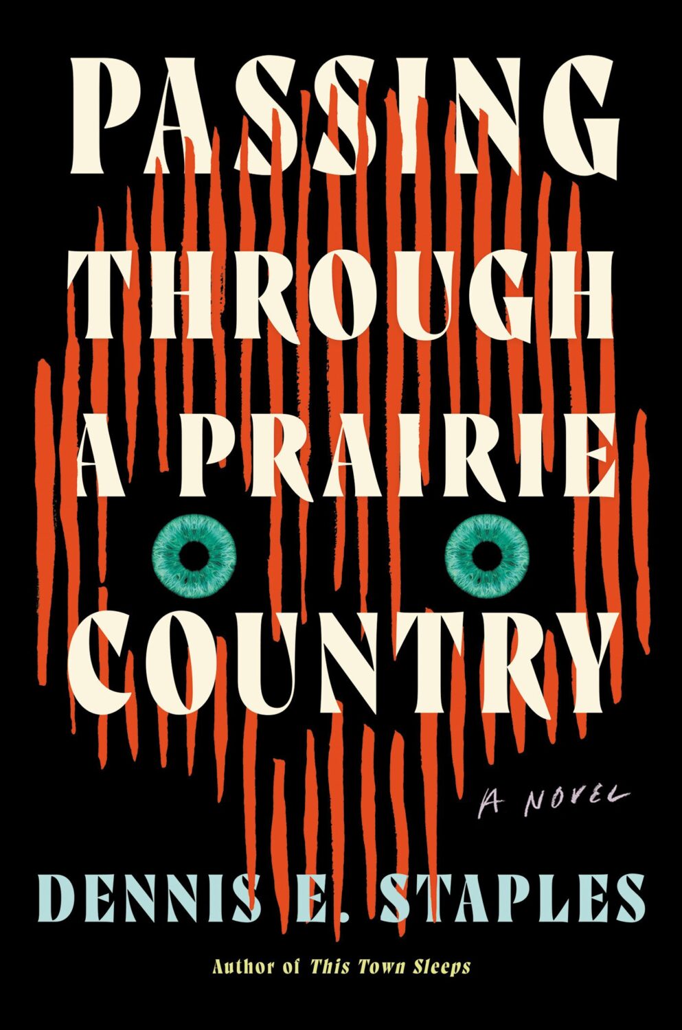
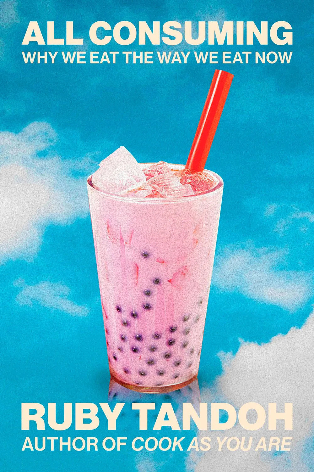
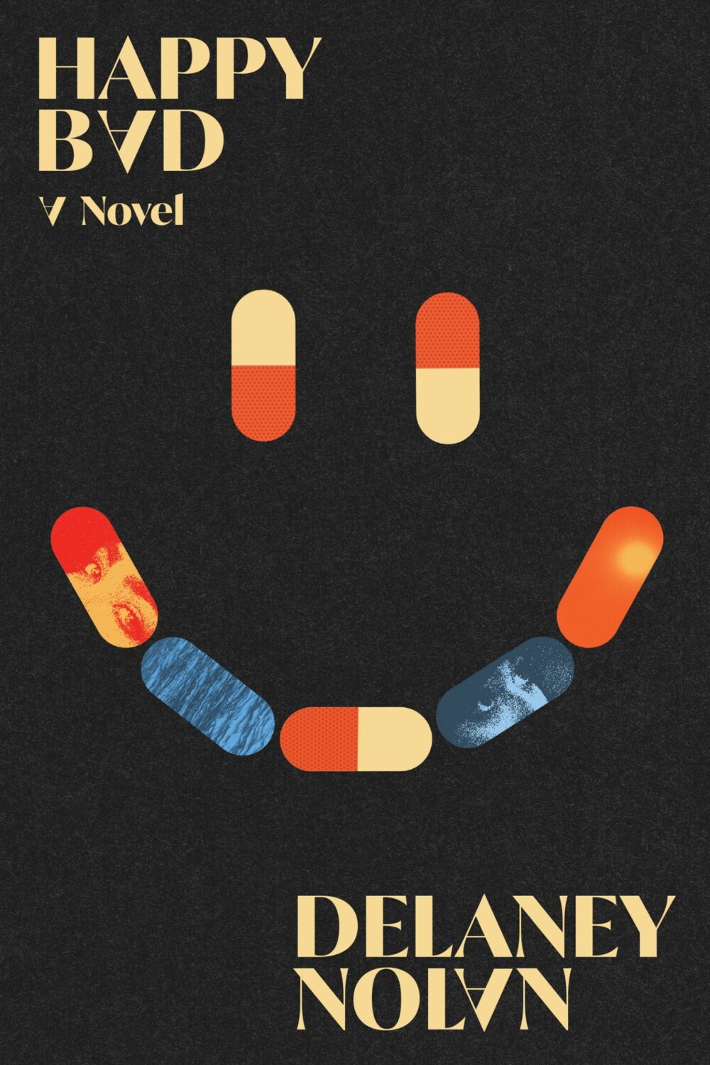
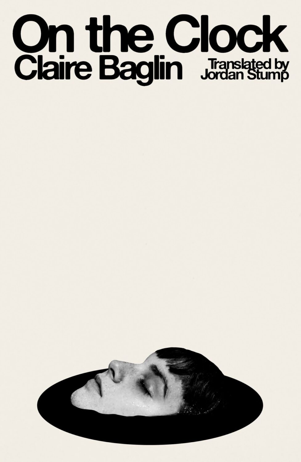
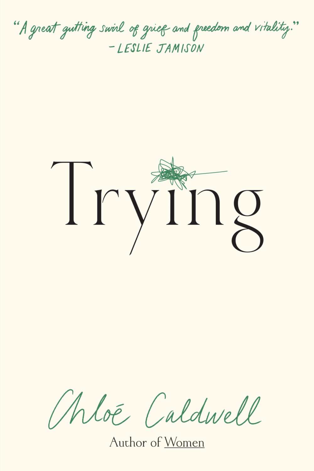
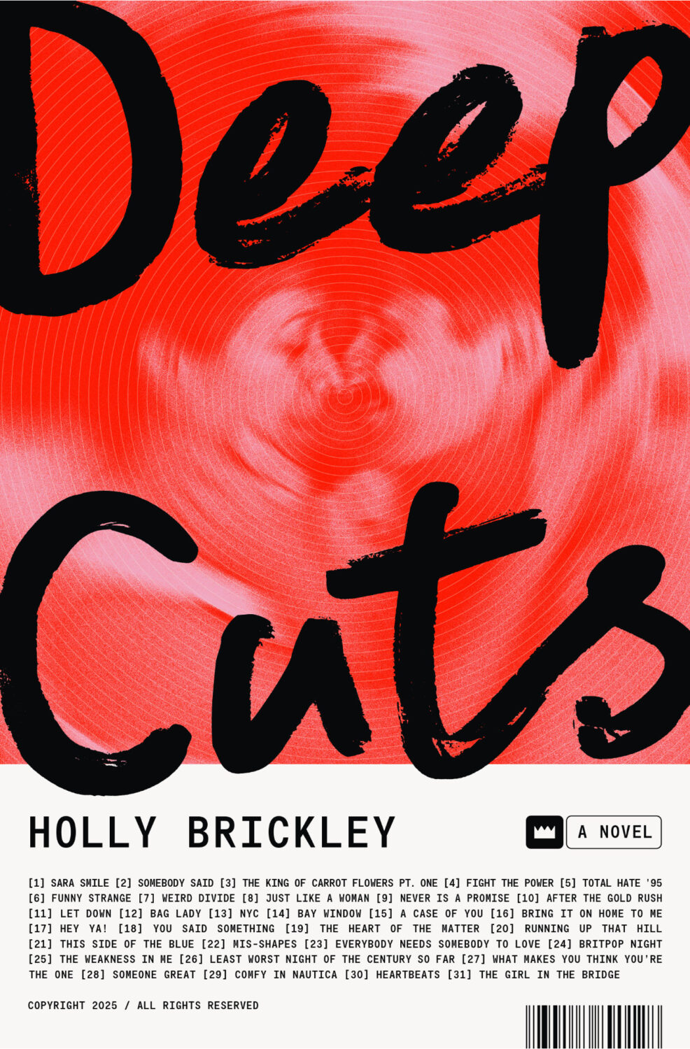
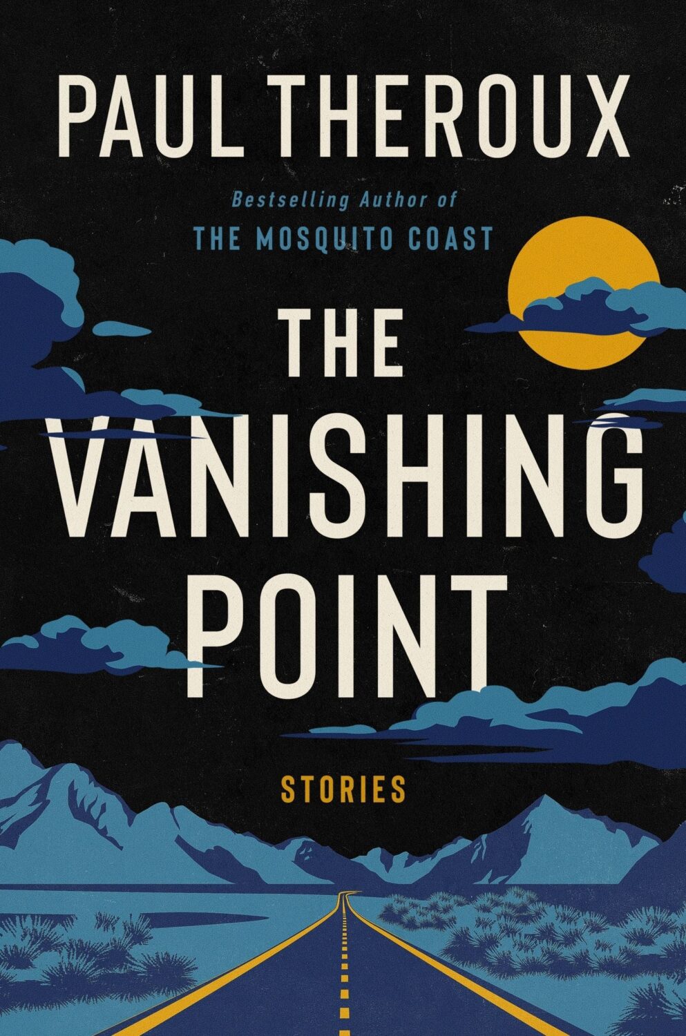
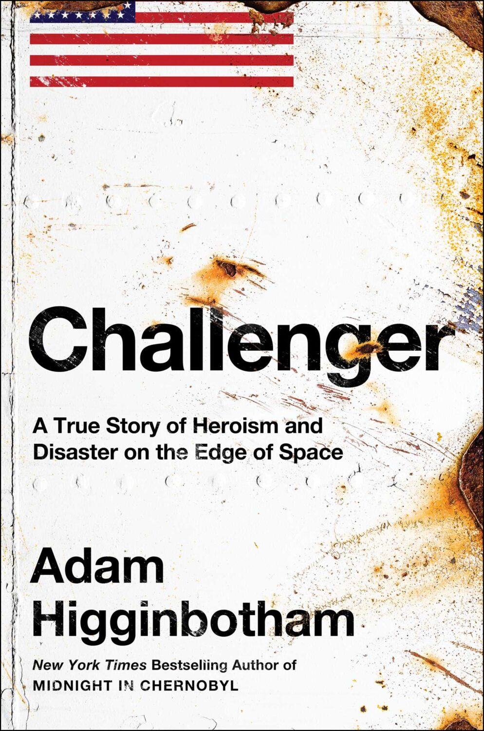
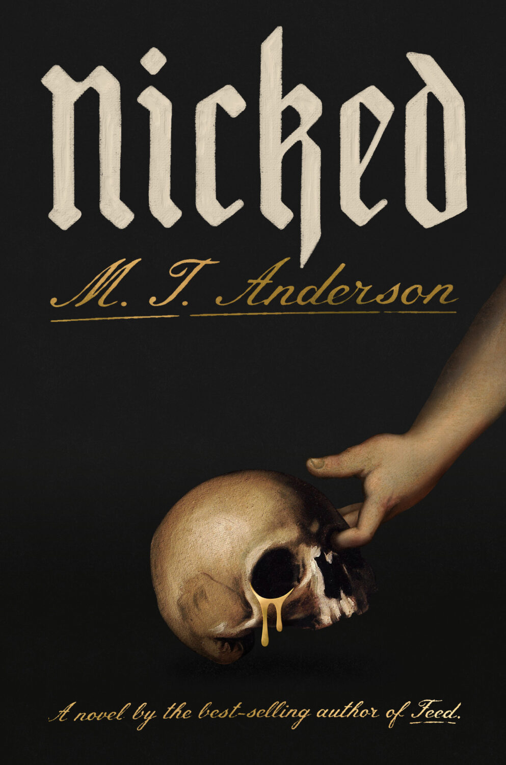
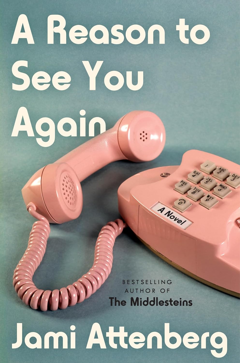
Well, it’s been a month. I hope you’re all keeping safe and well, especially my friends and publishing colleagues in Minnesota. Stay Strong.
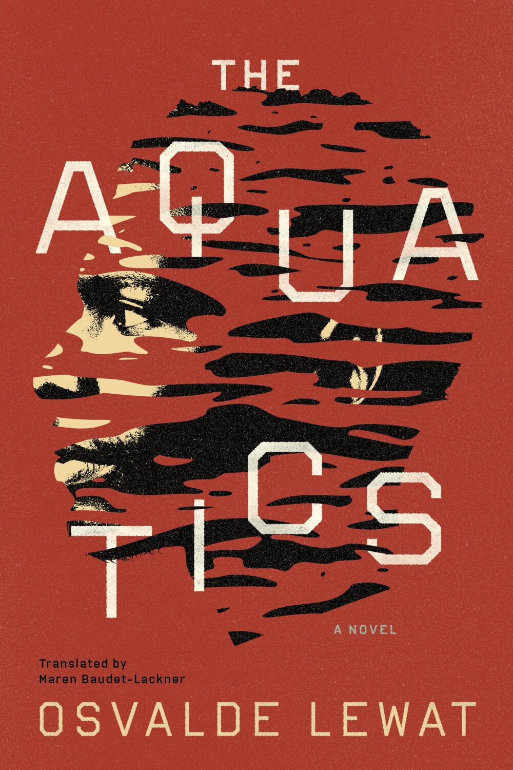
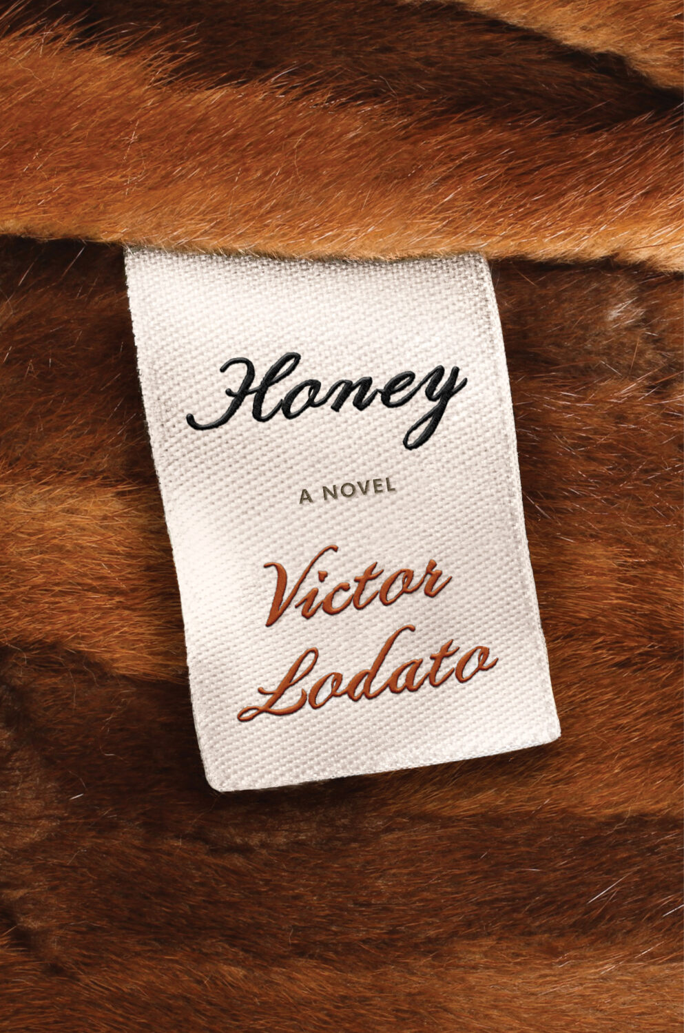
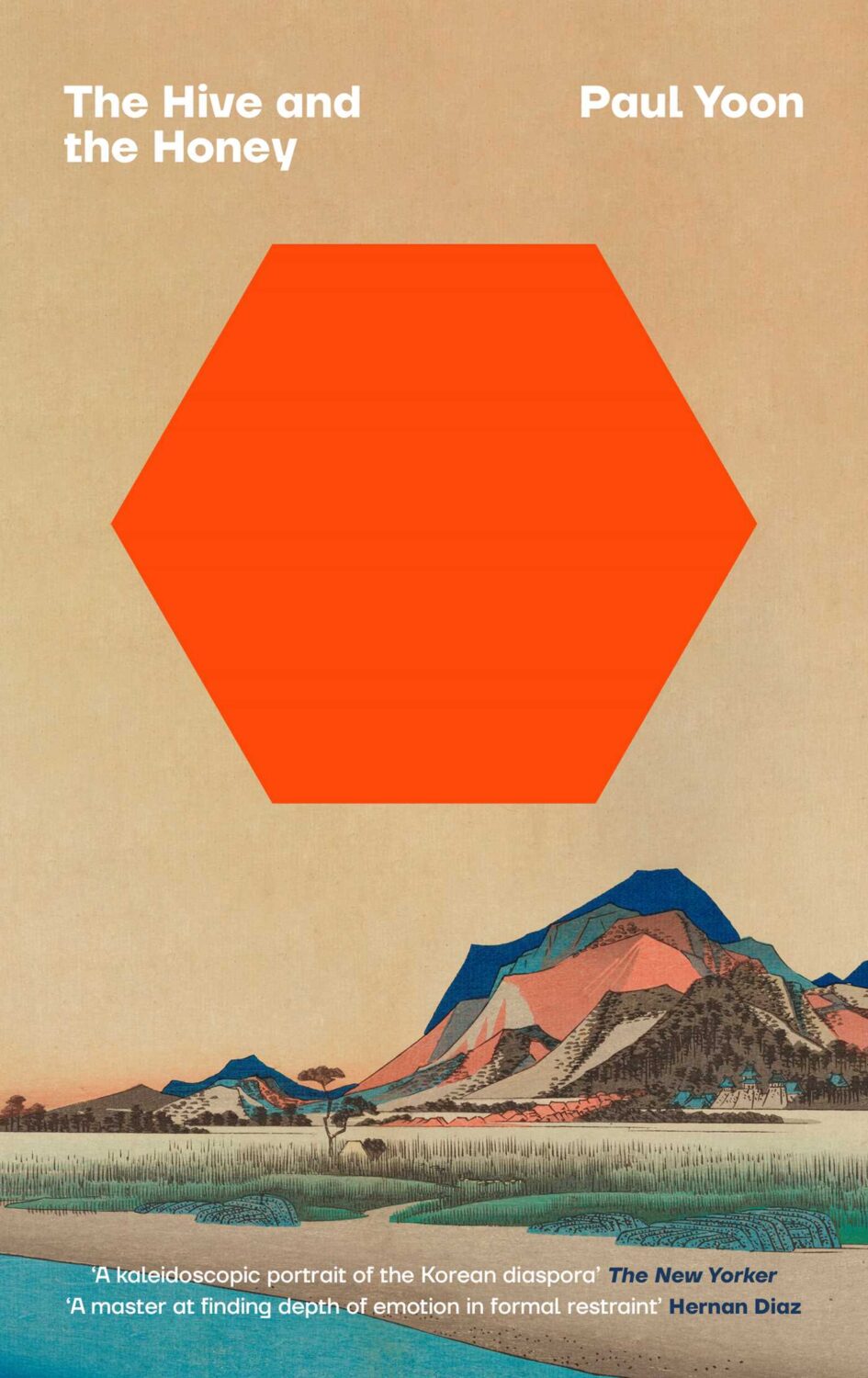
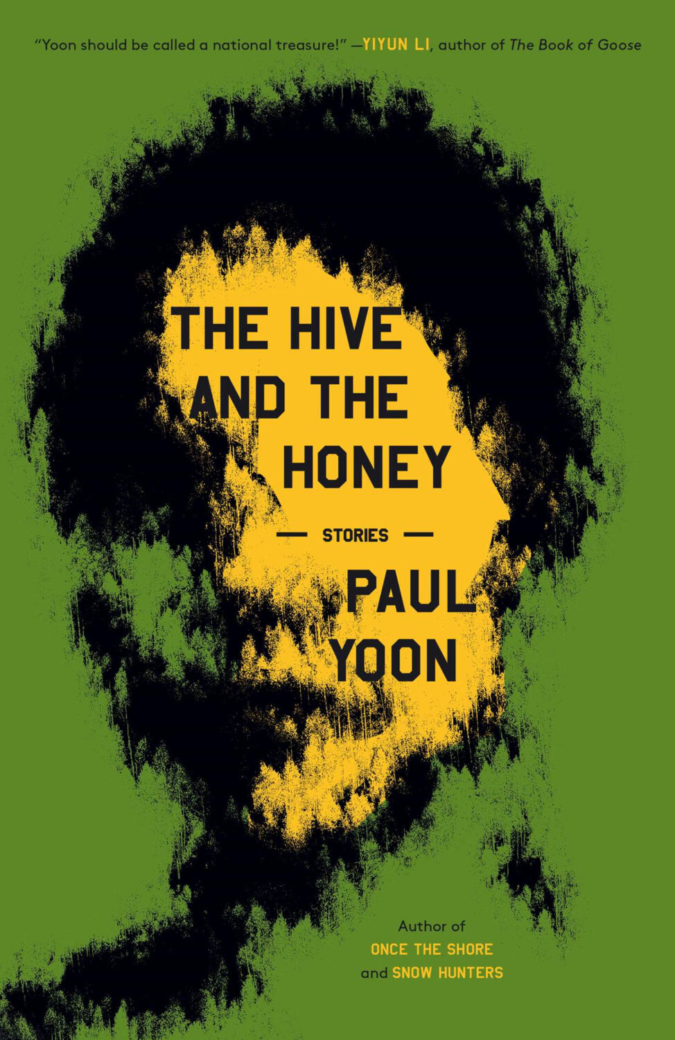
The Aquatics by Osvalde Lewat, translated by Maren Baudet-Lackner; design by Alban Fischer (Coffee House Press / December 2025)
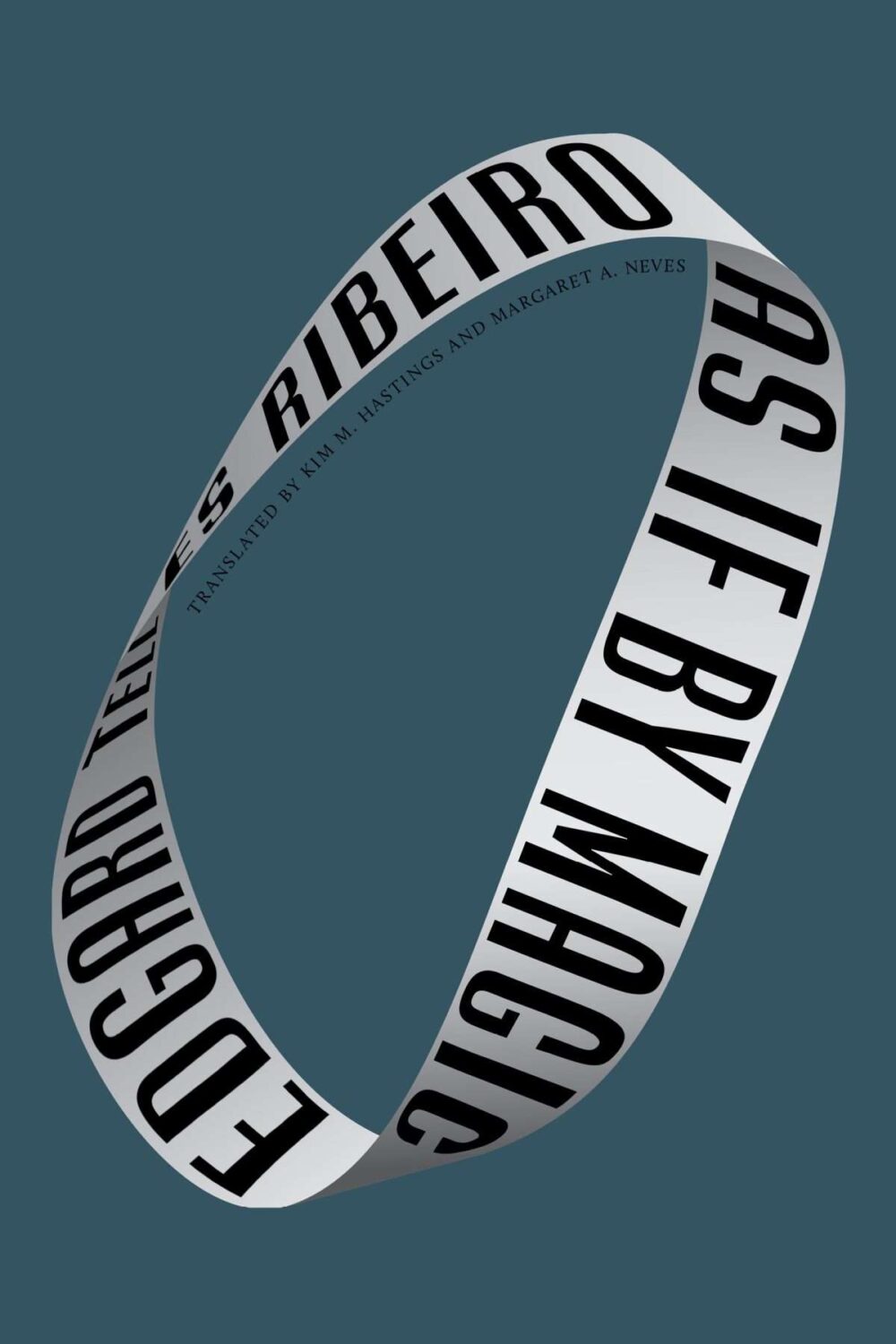
As If by Magic by Edgard Telles Ribeiro, translated by Kim M Hastings & Margaret A Neves; design by Alban Fischer (Bellevue Literary Press / January 2026)
Yes, starting off the year with two covers designed by Alban, but also two books from nonprofit publishers based in Minneapolis, Coffee House Press and Bellevue Literary Press.
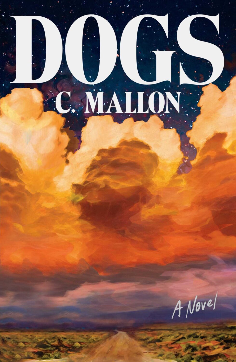
Crux by Gabriel Tallent; design by Jaya Miceli (Riverhead / January 2026)
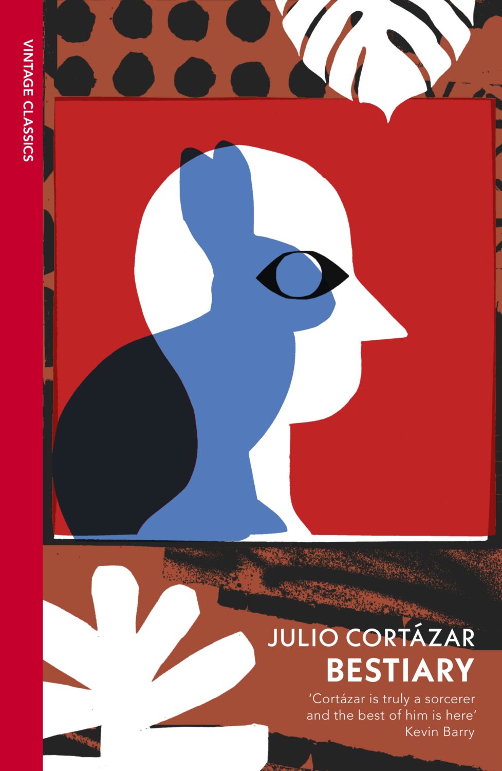
Some of my favourite covers this year were series designs. I loved the Julio Cortázar Vintage Classics editions with covers illustrated by Stephen Smith, AKA Neasden Control Centre. I was lucky enough to meet art director Suzanne Dean for coffee when she visited Toronto this summer, which was lovely. Her Haruki Murakami designs for Vintage Classics and Harvill are always a delight too.
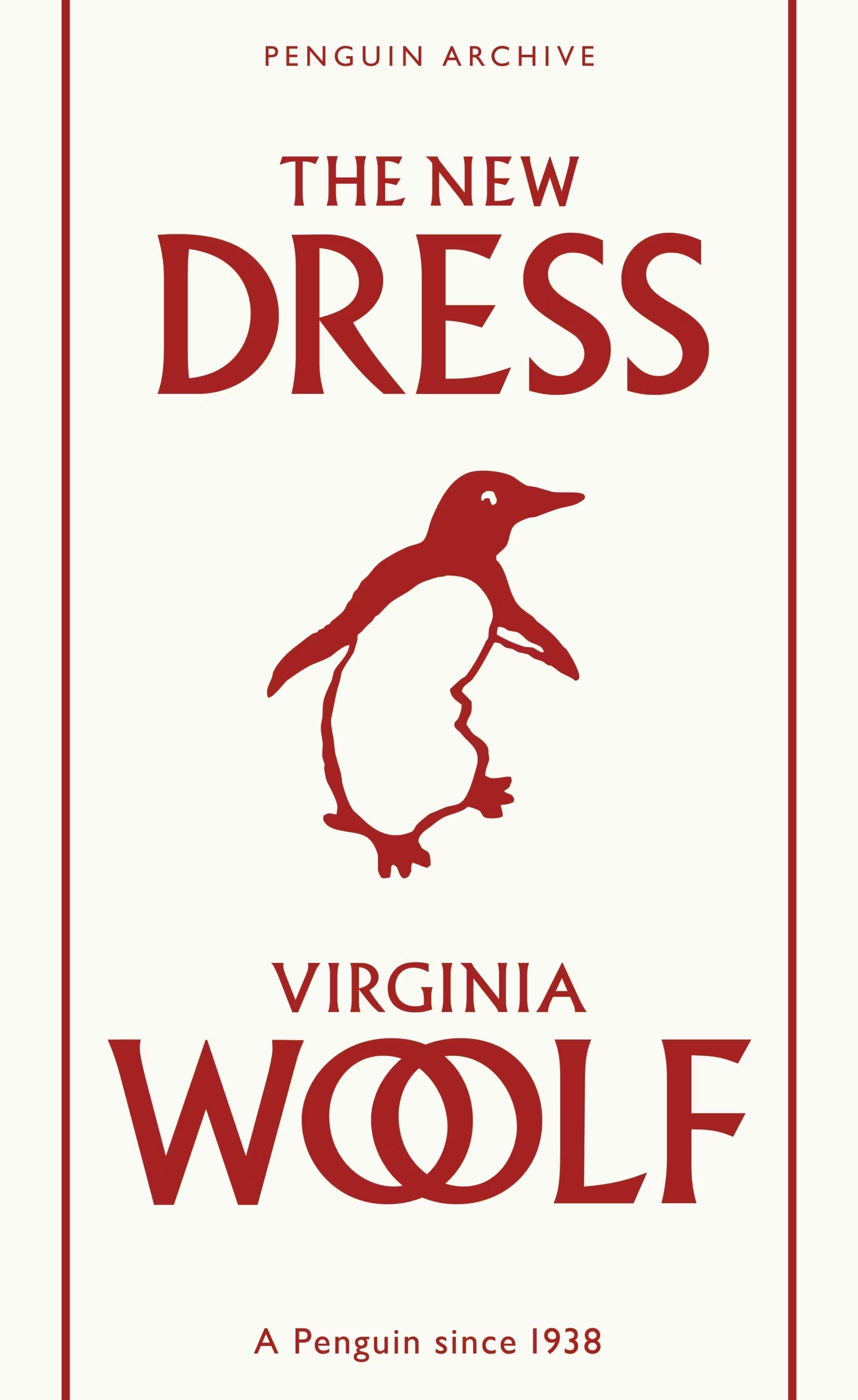
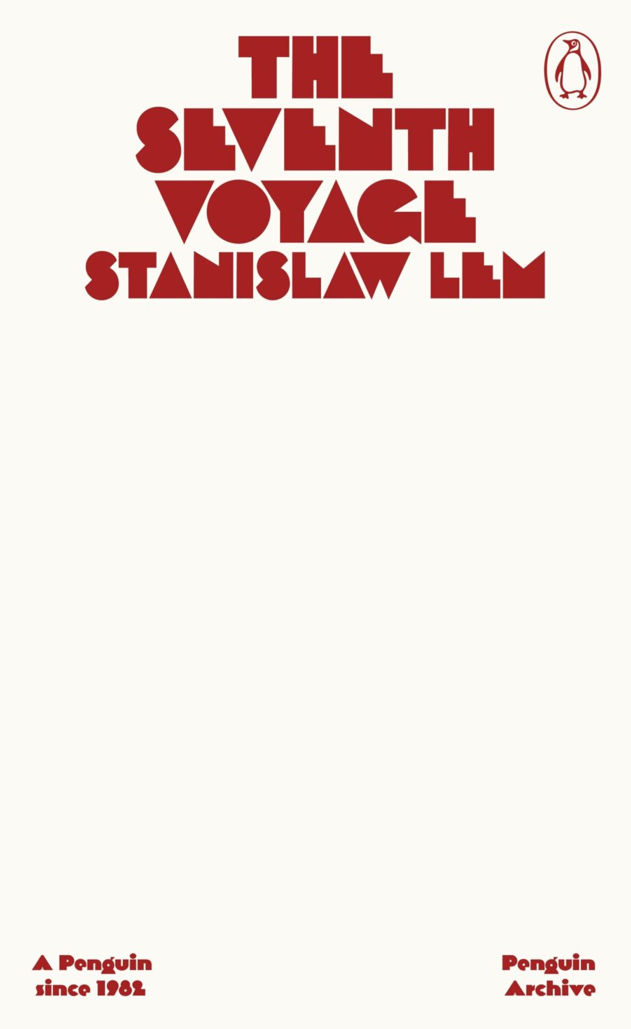
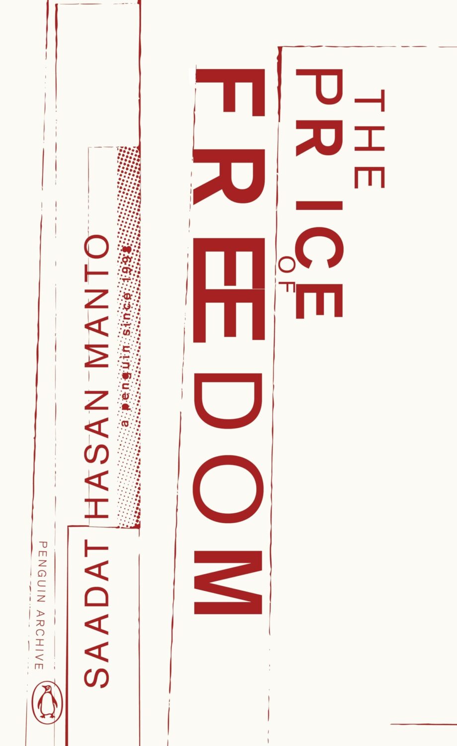
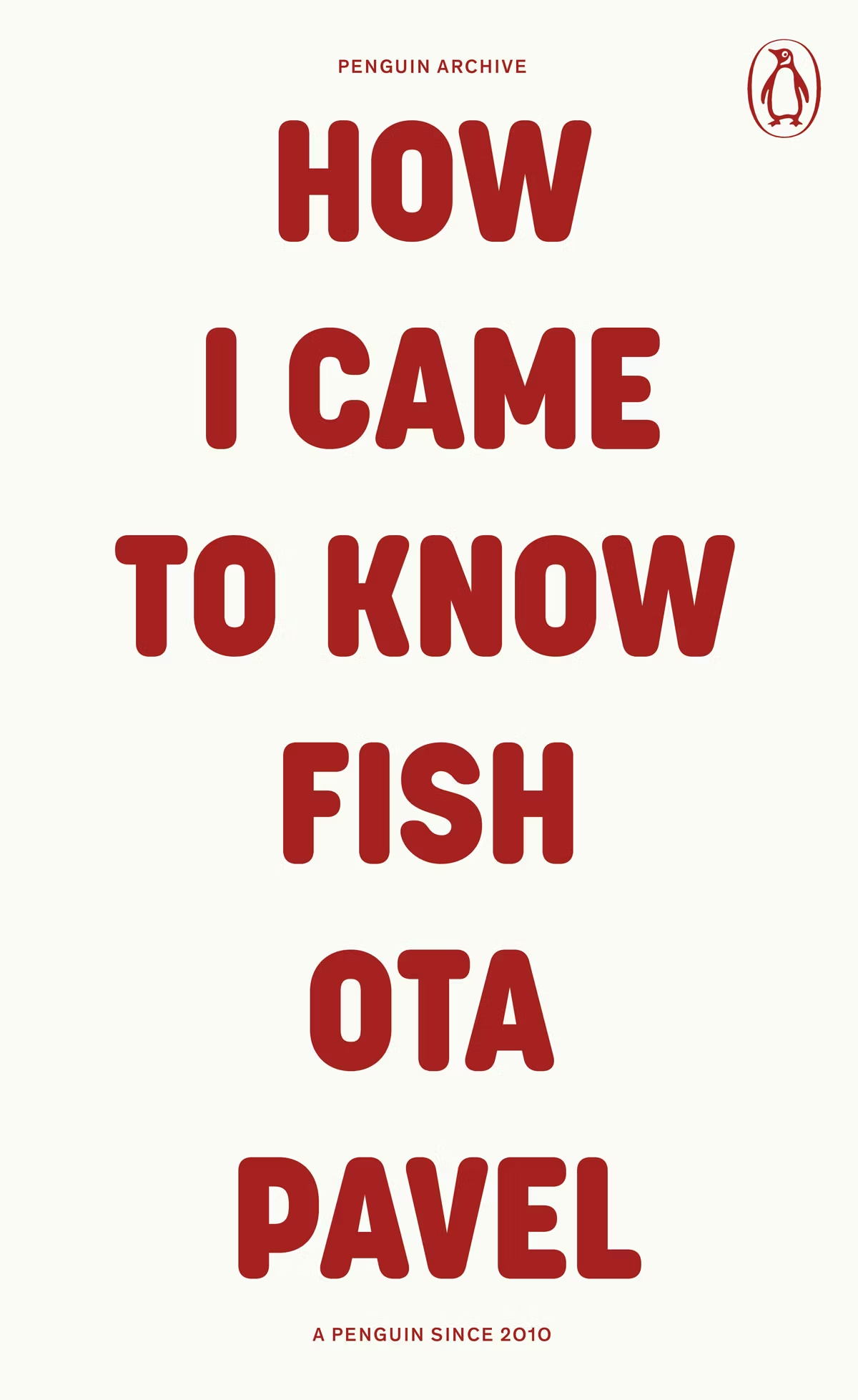
The typographic covers for the ‘Penguin Archive’ designed by Jim Stoddart triggered my curiosity. Published in April to celebrate 90 years of Penguin Books, the designs use typography to evoke the different eras of the publisher. You can read more about the series and the design process at Creative Review. But which historic Penguin covers inspired type choices in the first place?
There was some really nice series design from independent publishers this year too. I really liked Luísa Dias‘s covers for Wild Hunt Books’ Northern Weird Project. I wanted to feature them here when the final book of the series, Turbine 34 by Katherine Clements, came out last month, but time was not on my side. Fortunately, Zachary Petit talked to Luísa about the series for PRINT in April.
In Solvej Balle’s On the Calculation of Volume septology a women repeats the same day over and over again, and Matt Dorfman‘s covers for the New Direction editions are a really creative take on loops and repetition. The first two books came out last year and were featured in my October 2024 post so they’re not on this year’s list even though the third book was published in November. There are, however, two covers from a different Danish septology included below.
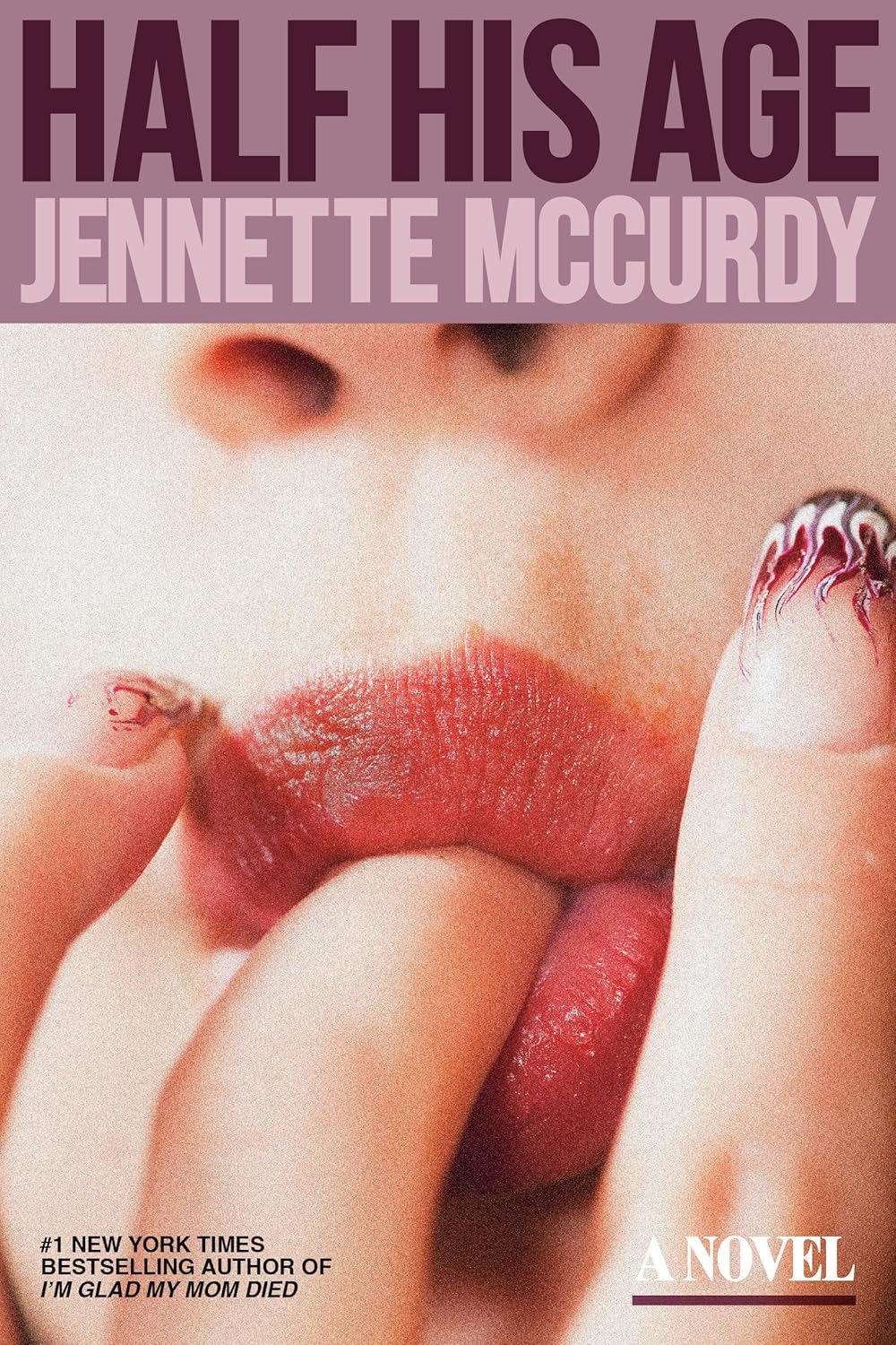
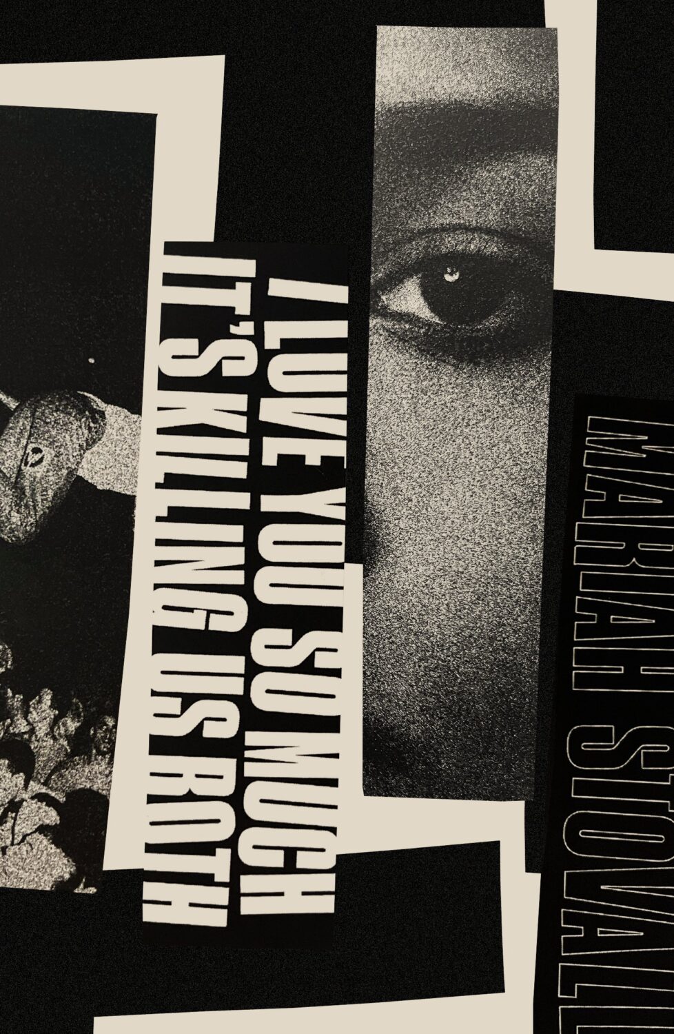
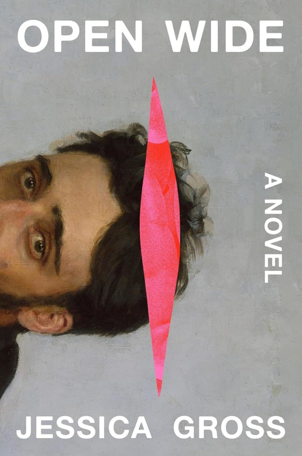
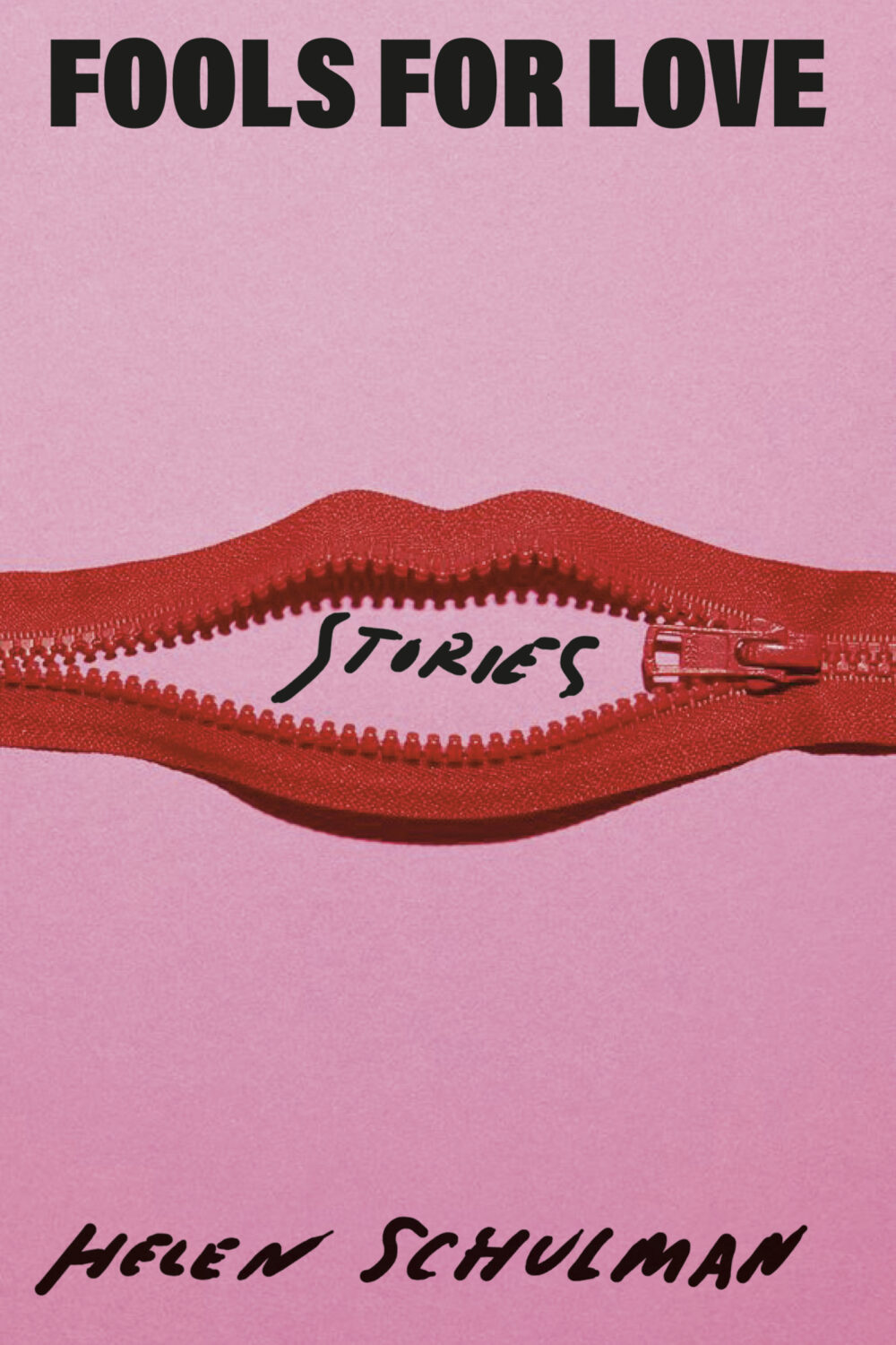
In terms of trends, Alban Fischer noticed that there have been a lot of close-ups of lips recently, something which I Need A Book Cover also picked up on.
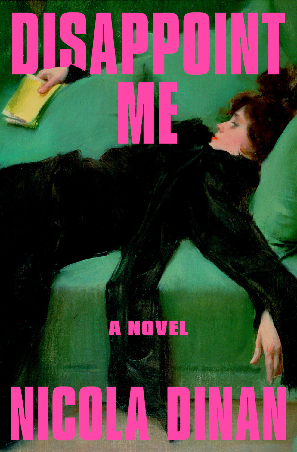
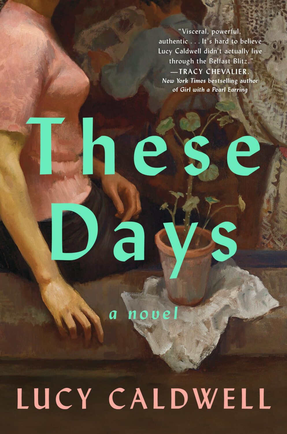
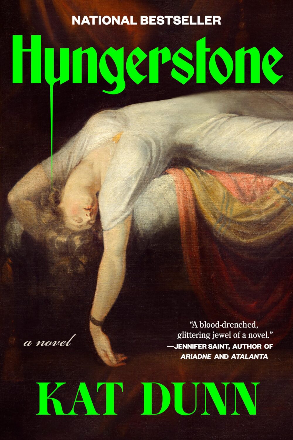
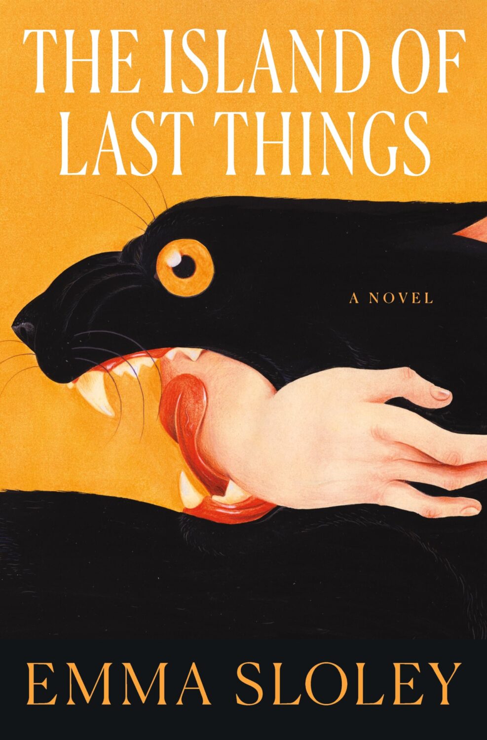
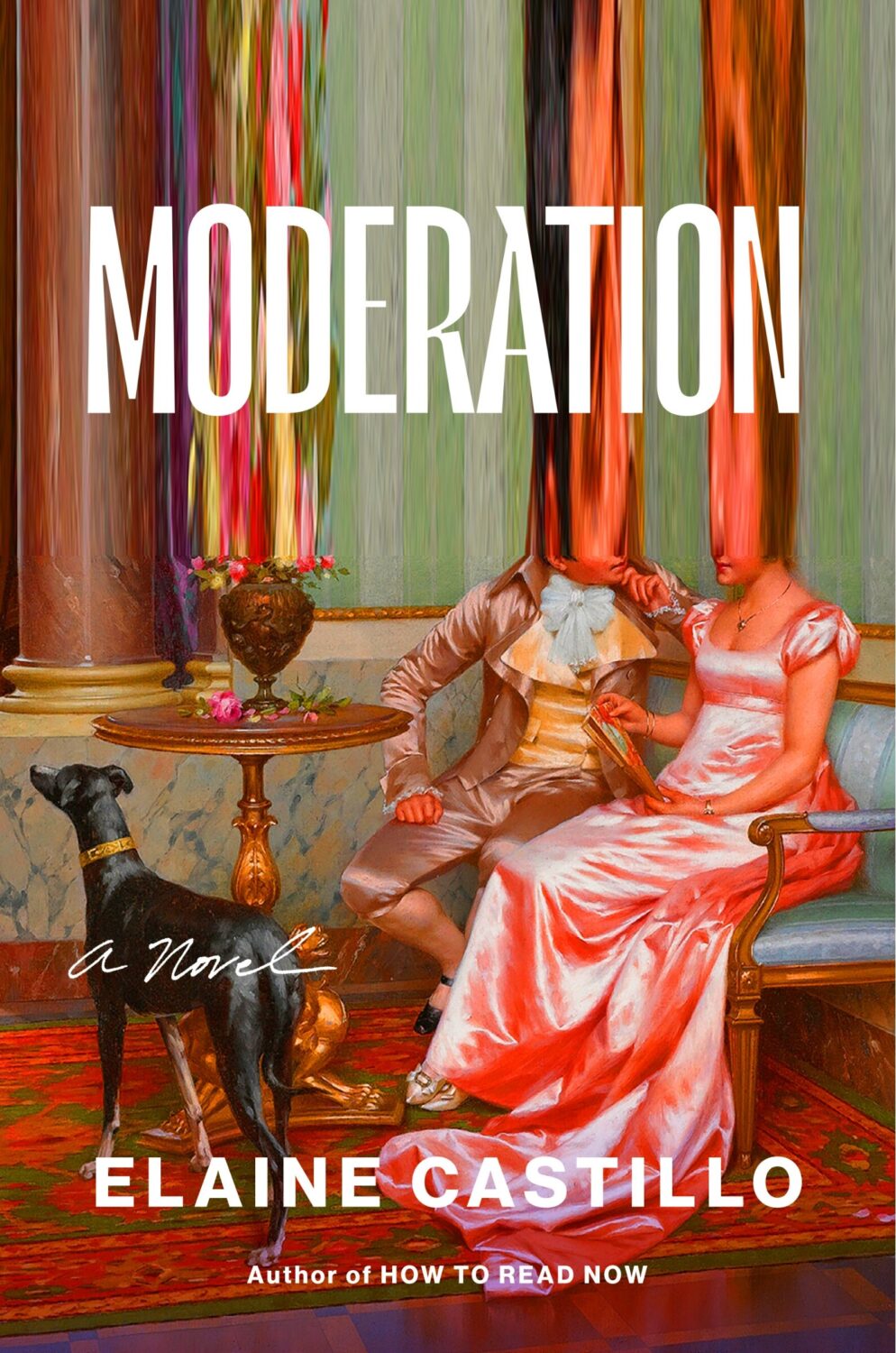
One strand of the ‘trend you’re seeing everywhere’ was paintings of women in various states of repose. There was a lot of elegant ennui and it almost felt like an art school version of well-dressed and distressed covers at times.
Disappoint Me by Nicola Dinan; design by Rachel Ake; art ‘After the Ball’ by Ramon Casas i Carbo (Dial Press / May 2025)What a Time to be Alive by Jenny Mustard; cover art by Shannon Cartier Lucy (Sceptre / April 2025)These Days by Lucy Caldwell; design by Ploy Siripant; art ‘Woman in the Window’, by Alberto Morrocco (SJP Lit / April 2025)Hungerstone by Kat Dunn; design by Alicia Tatone; art ‘The Nightmare’ by Henry Fuseli
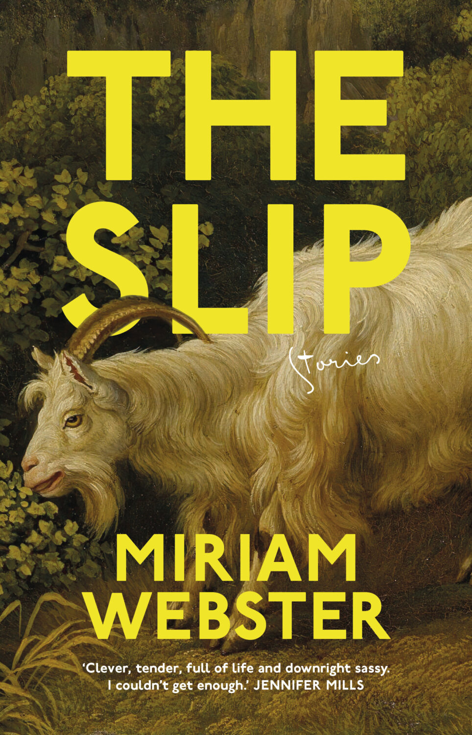
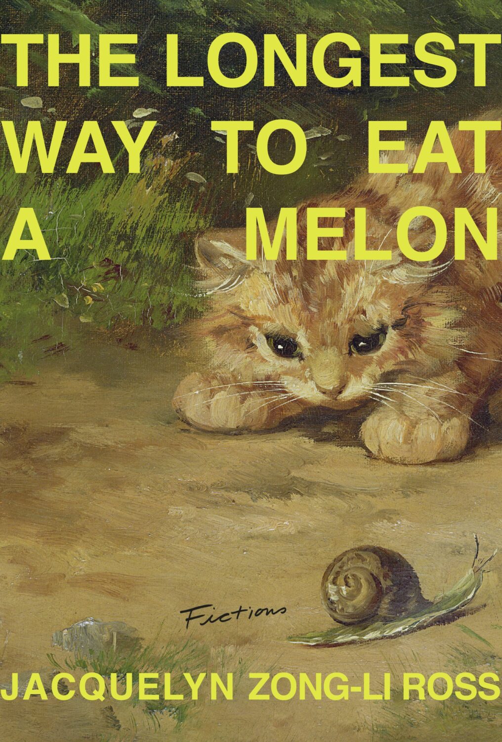
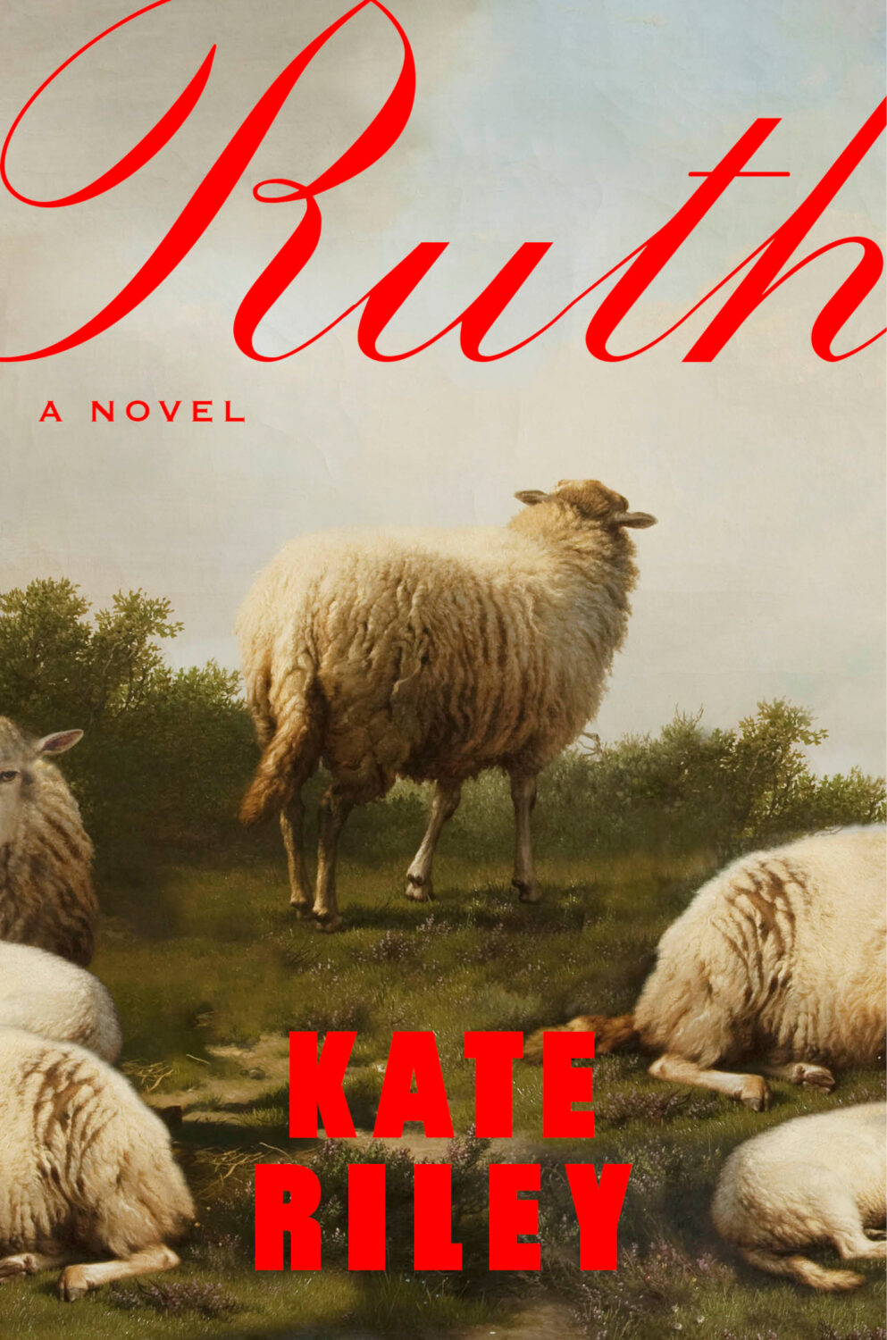
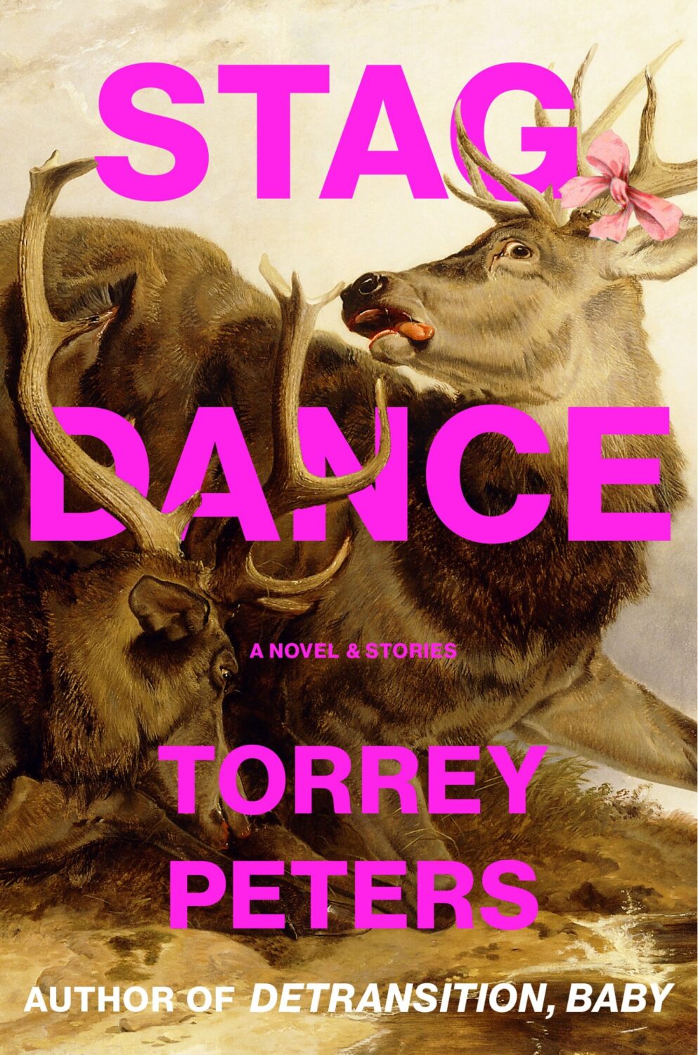
Another strand was historical paintings of animals, which fits with the “old-timey animals” covers Patrick Redford wrote about for Defector last year.
I think the success of these covers largely depends on the image selection and the cleverness of the crop. I’m sure we will see more of them going forward, but doing it well is probably harder than it looks.
I don’t have a good name for this next trend, but in my mind I’ve been referring to this as “corner type” because of the way the text seems to turn the corners the cover. I guess what it is really doing is framing the central image. I don’t know if this is new, but I noticed it a lot this year.
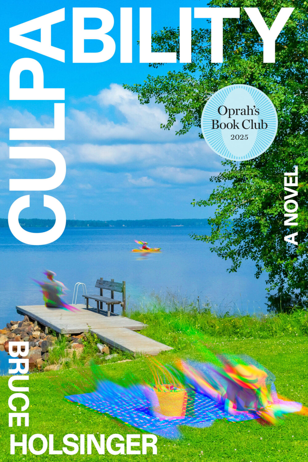
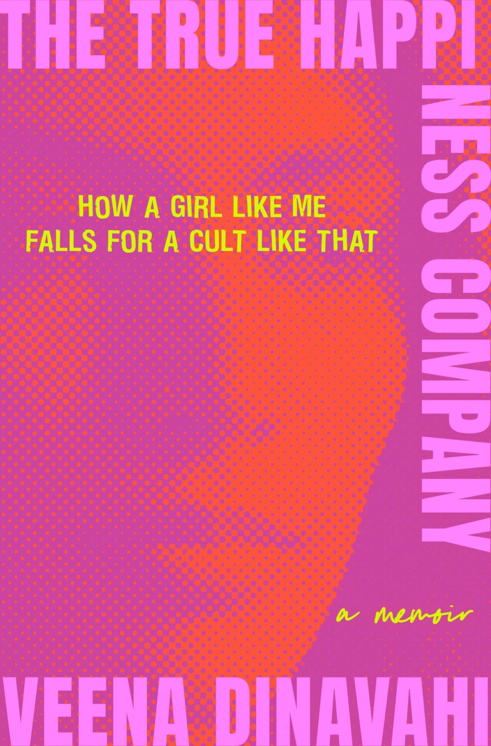
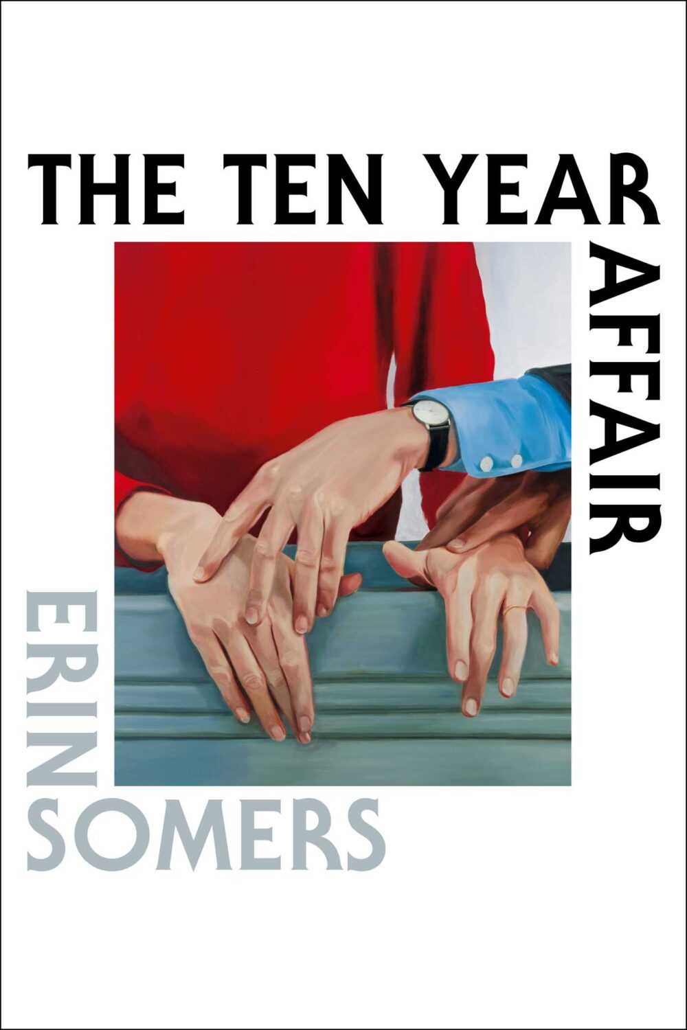
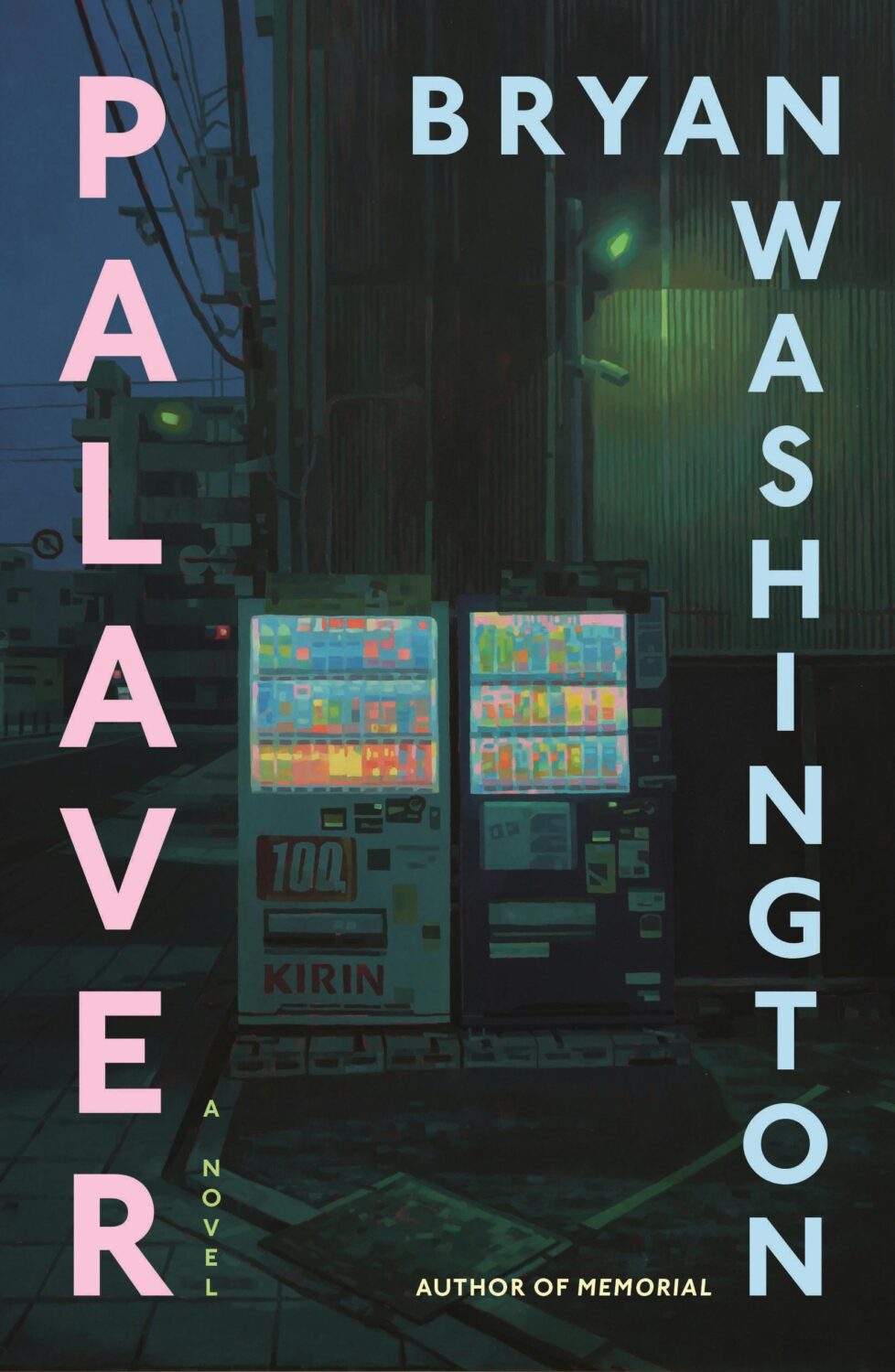
Culpability by Bruce Holsinger; design by Rodrigo Corral (Spiegal & Grau / July 2025)The True Happiness Company by Veena Dinavahi; design by Rachel Ake (Random House / May 2025)The Ten Year Affair; by Erin Somers; design by Emily Mahon; cover art by Shannon Cartier Lucy (Simon & Schuster / October 2025)Palaver by Bryan Washington; design by Na Kim; art by Keita Morimoto (Farrar, Straus & Giroux / November 2025)
I mentioned a wave of retro-nostalgic horror and suspense covers back in 2023 (I could’ve sworn it was last year until I checked!), but it feels like designers are still having fun with it as the genre as a whole gets more mainstream attention.
And speaking of nostalgia, I feel like covers inspired by 1980s advertising and airbrush art are suddenly a thing. There are a few examples from 2025, but it might be something we see more of next year as well.
Lastly, I just wanted to say thank you to everyone who supported the blog this year, especially the folks that helped out with cover images, credits, and corrections. I really appreciate you taking the time to reach out, and I’m sorry if you sent me a note and didn’t hear back. I try my best to read and reply to everything, but this is a one man show and sometimes life has other plans.
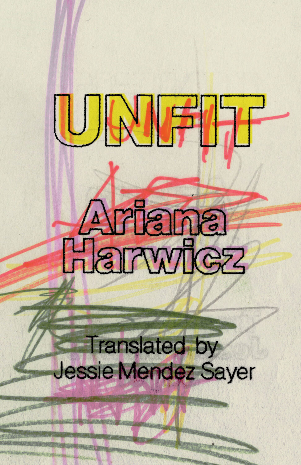
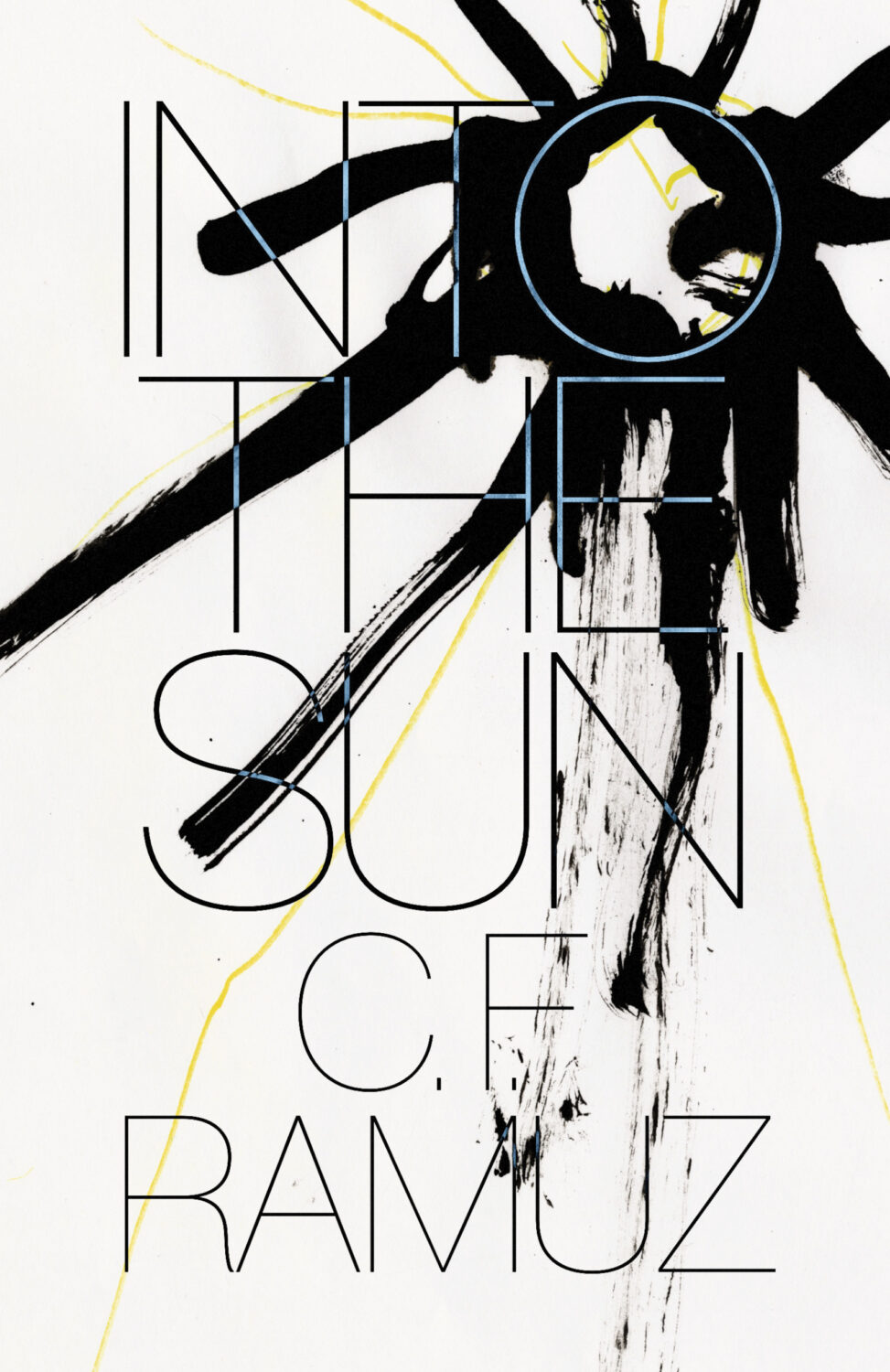
Unfit by Ariana Harwicz, translated by Jessie Mendez Sayer; design by Erik Carter (New Directions / October 2025)Into the Sun by C. F. Ramuz translated by Olivia Baes &, Emma Ramadan; design by Erik Carter (New Directions / August 2025)
Zone Rouge by Michael Jerome Plunkett; design by Jaya Nicely (Unnamed Press / September 2025)Open Up by Thomas Morris; design by Jaya Nicely (Unnamed Press / April 2025)
Hey, I hope you’re safe and well. This month’s post is a big one so I’m pretty much going to let you get on with it, but before I do, I just wanted to mention that I’ve included a gallery of all this month’s covers as the bottom of the post so you can click through them all. This is in response to a reader email about the size of the covers on screen. I think the gallery looks nice, but I am worried that it’s going to play absolute havoc with the RSS / email so apologies in advance if that’s case. Anyway, enjoy this month’s covers, and let me know what you think.
It is the time of year for lists and I should’ve been done weeks ago, but I am late and already well behind the pack. Apologies for that.
I admire Matt Dorfman‘s ability to whittle his list down to a dozen covers for the New York Times. I imagine it takes him a lot less time for one thing, but I’m sure Matt still agonizes over every cover. It requires a level of discipline and restraint that I do not possess to keep it that tight year after year.
PRINT’s list of best book covers of 2024, compiled by editor-at-large Zachary Petit, is also long. It’s a 100 covers. Last year it was 50.
I’m not trying to throw stones here. We are all seeing more covers than we used to. There are more books for one thing. But they’re not just something we just experience in print in anymore. You don’t have to go into a bookstore or read the newspaper or magazine to see them. They’ve become something we see and share all the time online. Designers are promoting their own work and (slowly) getting more credit for it (although there is a lot more to be done in that area. Publishers — credit your designers!). My monthly round-ups are now one of several you can choose from.
And it is not like my list is short. This year it features work by 48 designers — more than half of them women — and 86 covers (plus a couple of supplementary images).
The consensus seems to be that it was a decent year for covers, and it’s hard to argue with other people’s selections even if I don’t love them all.
It is telling though that 100 of LitHub’s selections were individual picks. There are covers on my list that are not on the anyone else’s despite their length. So while I think we agree there were lots of good covers, I’m less certain we entirely agree on which ones were actually the outstanding ones.
A recent article Spine argued that there is a battle between minimalism and maximalism going on (you can find Spine’s end of year list here by the way). I think that could be true. Different approaches work for different audiences. But I also think it’s messier than that. I get the sense that publishers are less sure of what they want and what sells (certain genres notwithstanding).
It has been a rough year for a lot of publishers, so there is undoubtedly a lot of uncertainty, and no small amount of anxiety. I could go on about why that it is (and the publishing’s self-inflicted wounds) but, in short, what I think we’re also seeing with book covers is more meddling and less direction.
Anyway, I don’t want to end this on a bleak note. This year was shit enough. Despite it all, there genuinely were a lot of good covers in 2024, and some that I did think we’re outstanding. A couple of them made me laugh, which was no small thing. It was a strong year for several individual designers in particular and, despite the pressures, many produced work that was recognizably theirs. I thought there were more interesting covers coming out of the UK and Ireland (that mercifully wasn’t just about the inks or the finishes!), and there were some fun Canadian covers too.
Thanks, as always, for reading, and I hope you’re all keeping safe and well. Happy Holidays!
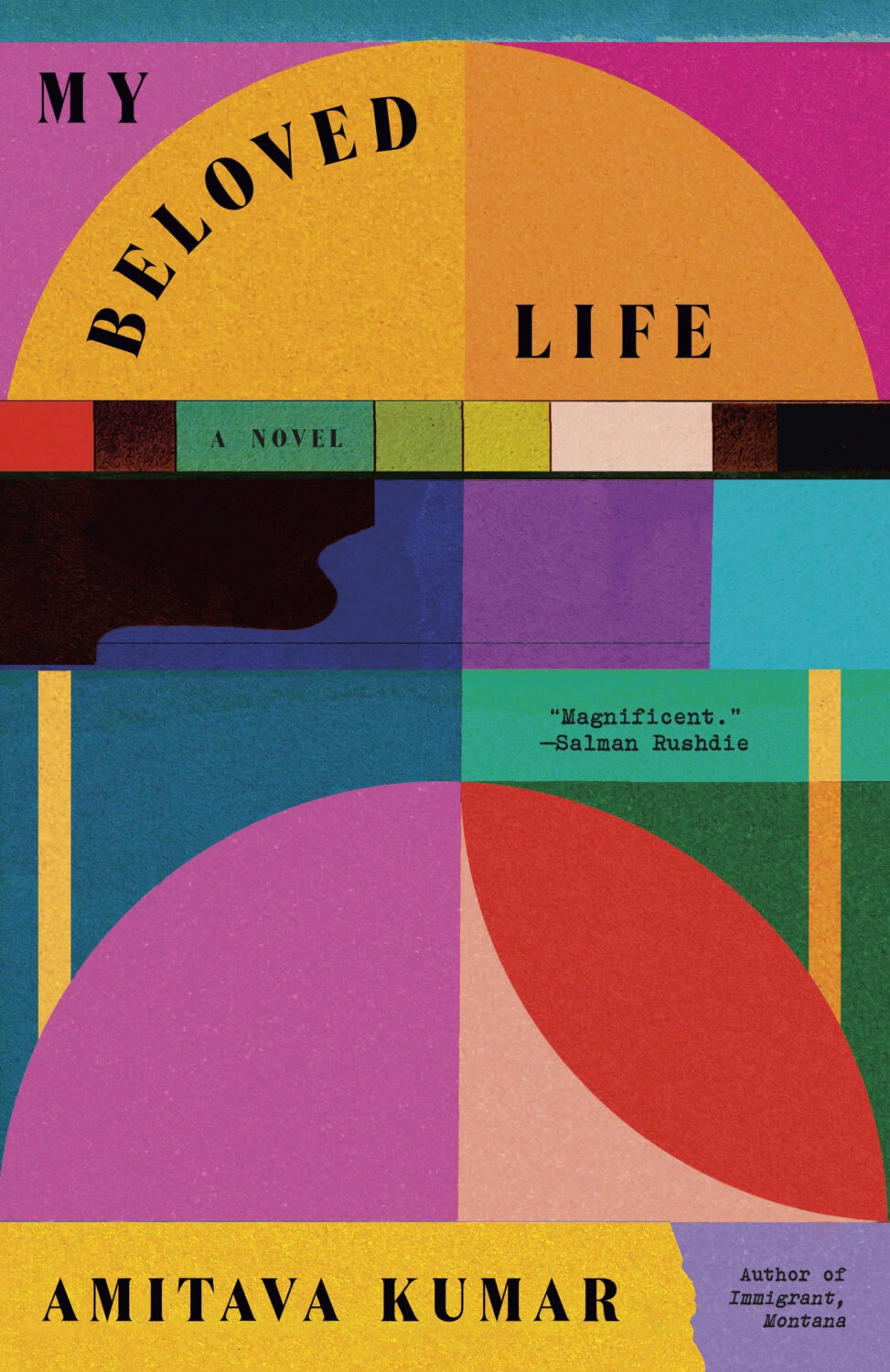
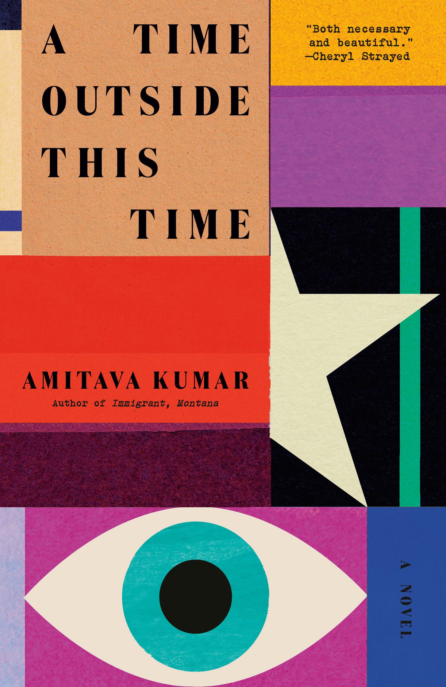
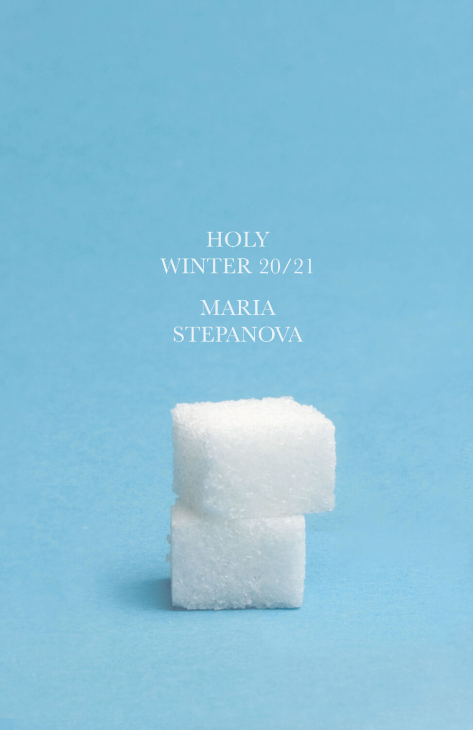
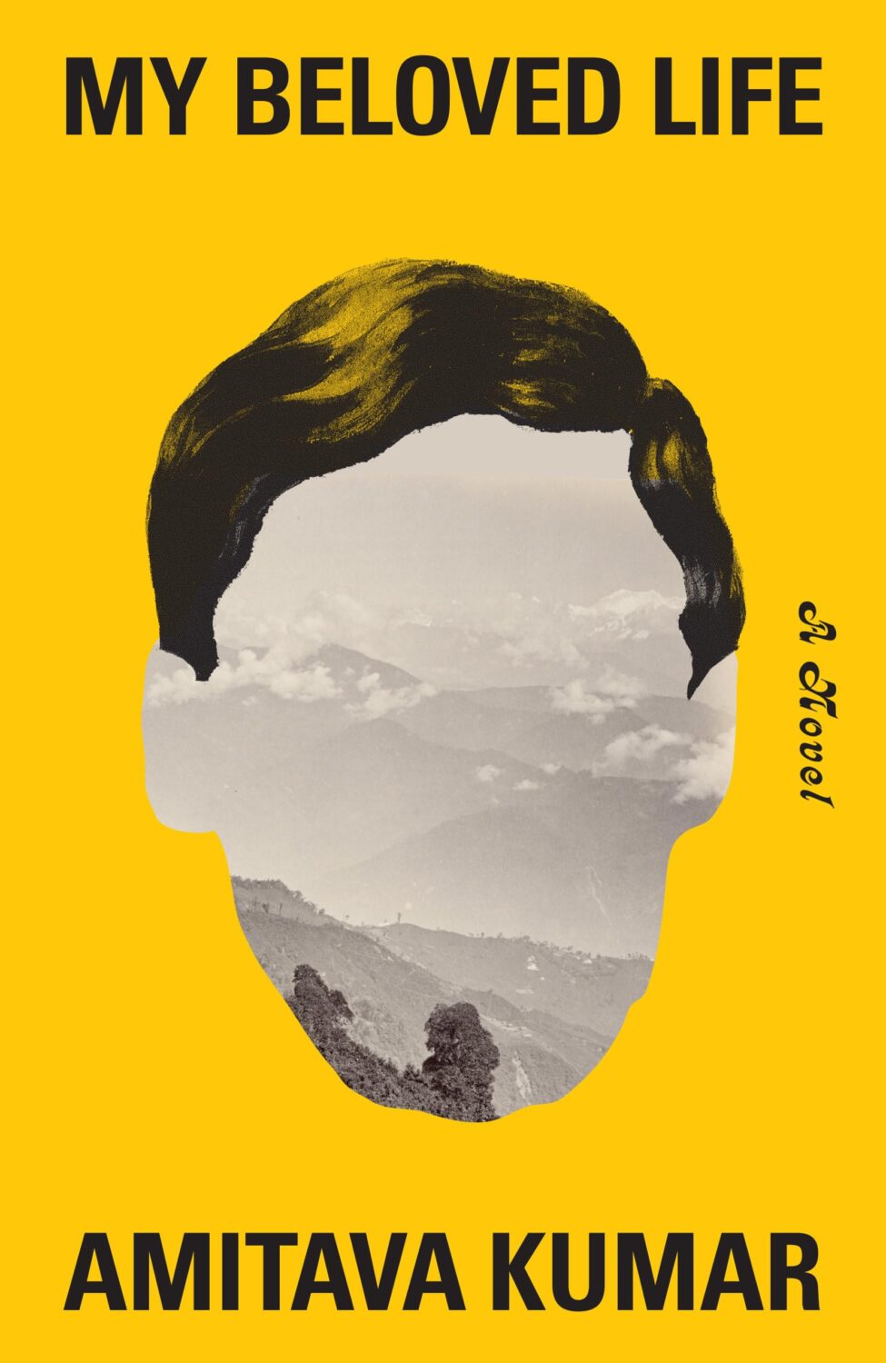
Holy Winter 20/21 by Maria Stepanova; design by Oliver Munday (New Directions / October 2024)My Beloved Life by Amitava Kumar; design by Oliver Munday (Knopf / February 2024)
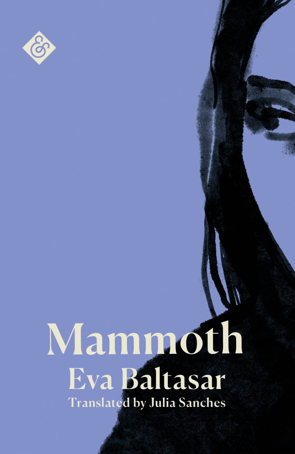
Mammoth by Eva Baltasar; design by Anna Morrison (And Other Stories / August 2025)
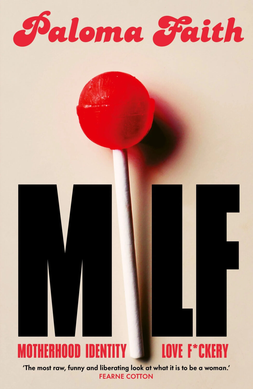
MILF by Paloma Faith; design by Jack Smyth (Ebury / June 2024)
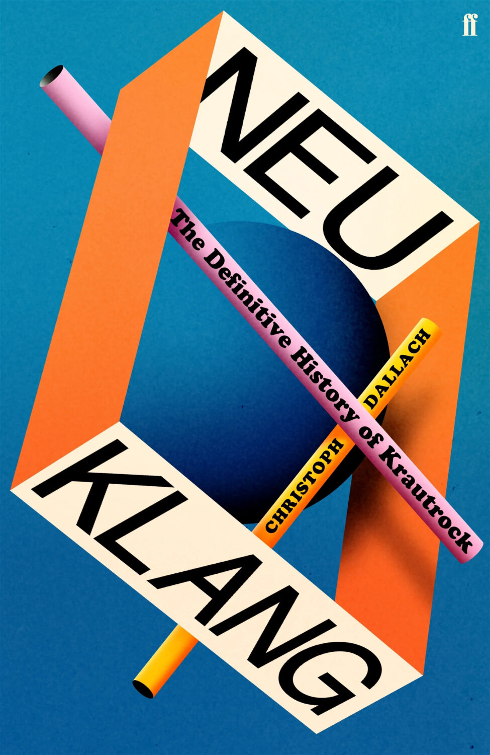
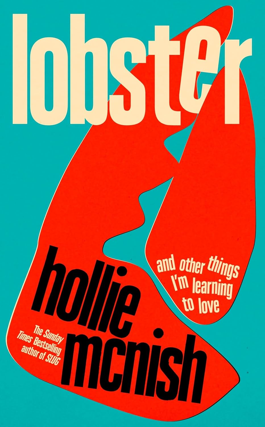
Also designed by Jack Smith:
Lobster by Hollie McNish; design by Jack Smyth (Little, Brown / March 2024)Neu Klang by Christoph Dallach; design by Jack Smyth (Faber & Faber / May 2024)
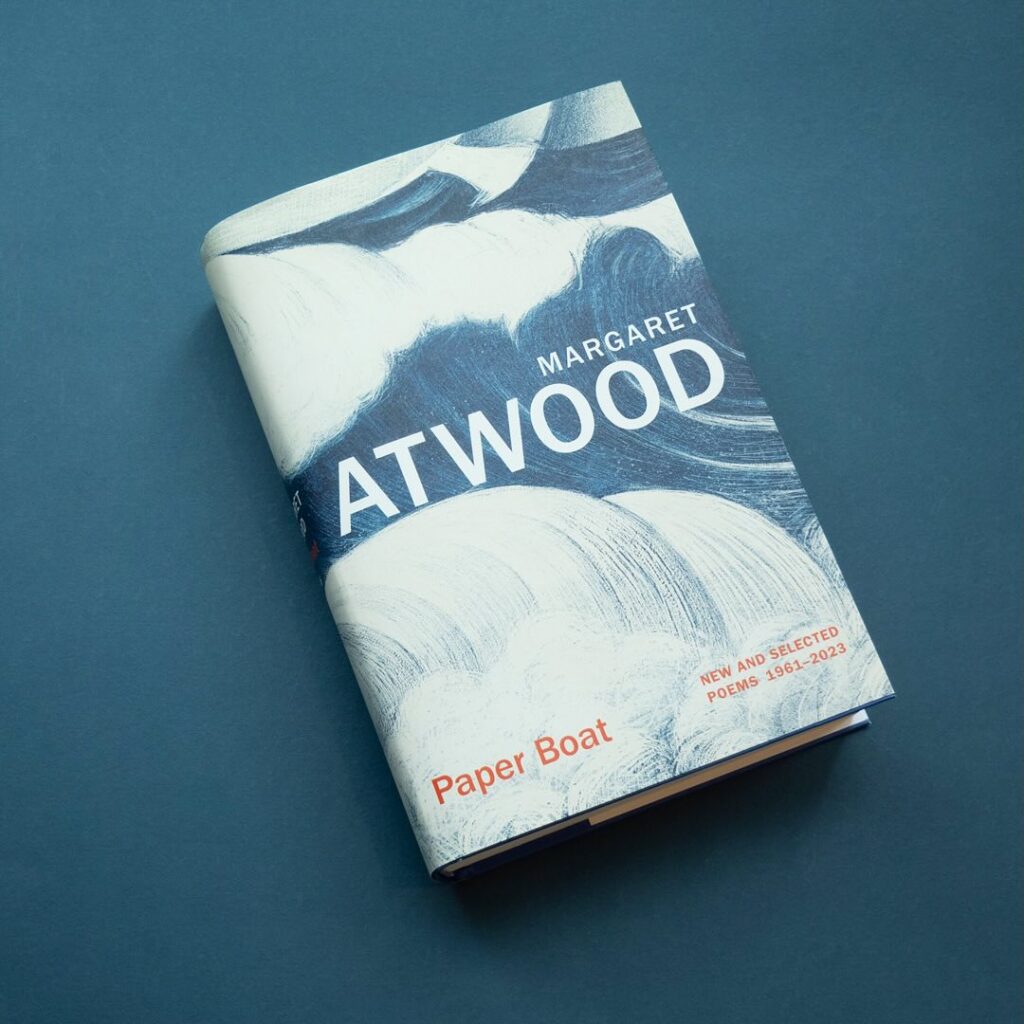
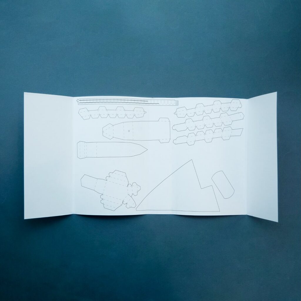
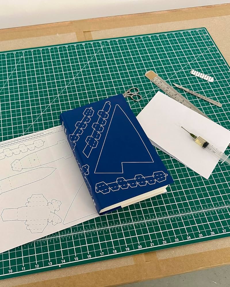
I also have to give a special shout out to the cover for Paper Boat by Margaret Atwood (Chatto & Windus / October 2024). Suzanne commissioned paper art by Nathan Ward to design a template for a paper boat that could be cut out from the dust jacket and stuck together.
Hello! I hope you’re safe and well wherever you are.
Before we get to the covers, a couple of brief admin things. First up, there have been a couple of behind-the-scenes changes at the CO this past month. They’ve solved a few tech issues for me and hopefully no one else has noticed. Secondly, I’ve been tinkering with the RSS. I’m not sure that’s quite right yet, so apologies if it’s not been working as expected. Let me know if you’re experiencing any weirdness.
I also wanted quickly mention that the deadline for the DPI mentorship scheme has been extended to April 12th. I’m not involved with the DPI, but some really great people are so if you are a designer from an under represented background living in the UK or Ireland, you should think about applying!
Anyway, it’s a really big post this month! The are lots of great covers with the UK, Australia and Canada all represented, as well as the usual folks from US. There are some compare-and-contrasts, a couple of covers from indie presses, a couple of covers for translations, and a couple of poetry covers too. There’s even a meandering digression in the middle (sorry). Enjoy!
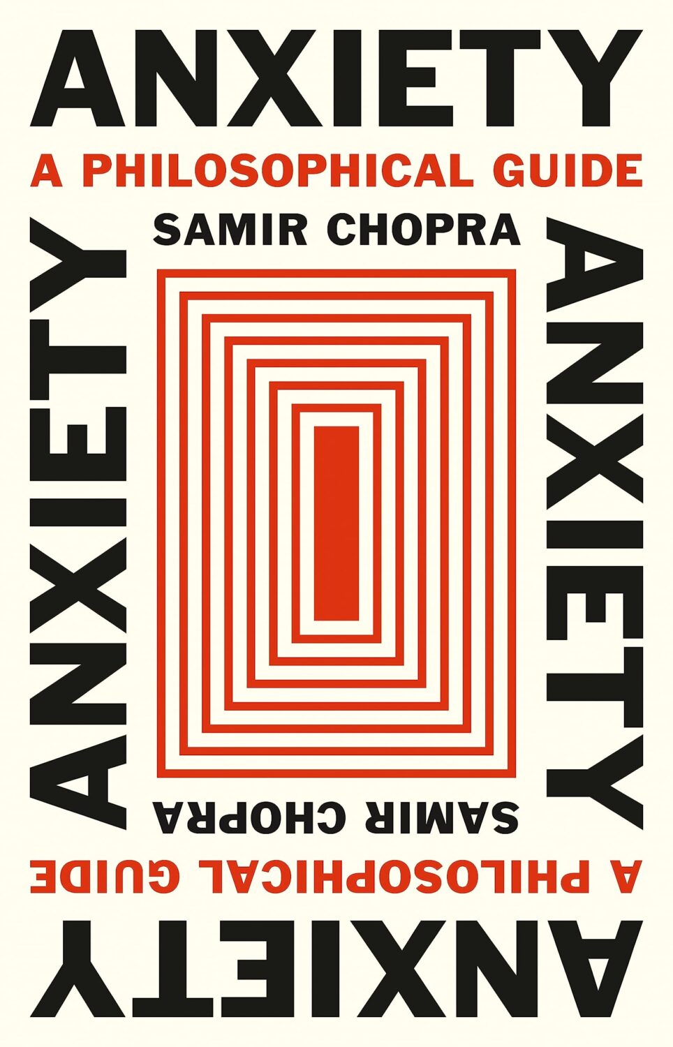
Anxiety by Samir Chopra; design by Karl Spurzem (Princeton University Press / March 2024)
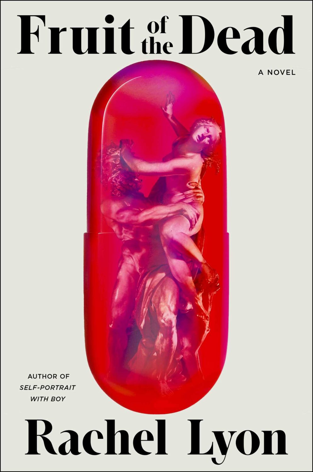
So this cover sent me down a bit of a rabbit hole. It reminded me of a cover design from a few years ago. It didn’t really look the same but, in my mind at least, this other cover featured a blue-red capsule shape (possibly a stretched illustration of a planet and its core) centred on a white background with black Swiss-style sans serif type. It was not exactly minimalist, but clean and precise. I think I saw it on Twitter back in the day. I thought it was maybe literary sci-fi or pop science, and published by one of the big American imprints. I was also pretty convinced that it was designed by Alex Merto or possibly John Gall. One of the dudes.
This is not the first time I have thought about this cover, and I can, or at least could, picture it quite clearly. The problem is that I can find no evidence of this cover ever existing, and the more I think about, the more the details shift and doubt creeps in. I don’t seem to have posted it anywhere, and I can’t find it in the usual places. It’s possible that I am getting some of the crucial details wrong, mentally combining a couple of covers into one, or it was something other than an actual book cover. But maybe this is some kind of Visual Mandela Effect thing, and this design that I’ve believed existed for years is actually a figment of my imagination.
My search has felt a bit like the online equivalent of walking into a bookstore and asking for the book with the blue cover. It has made realise that we have very few tools to find cover designs in a systematic way, especially since the Book Cover Archive stopped being a going concern. You just kind of have to browse and I hope you eventually look in the right place (or risk slowly lose your sanity).
Anyway, if this mystery cover is ringing any bells with you, please let me know and put me out of my misery. I have been going slightly crazy. (This sort of thing happens more than I care to admit by the way, but it is particularly bad this time! And, no, I do not have much of a life. Why do you ask?)
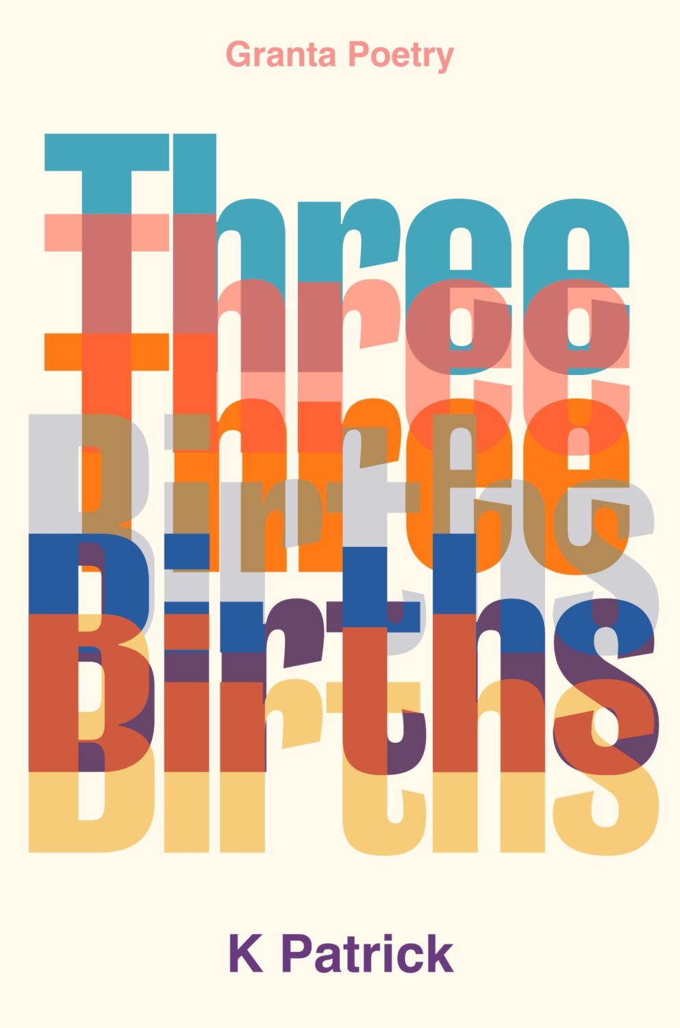
(Thanks to Jon Gray for helping me with the design credit for this and the other Granta title Three Births below. Publishers: post the design credits with your cover reveals!)
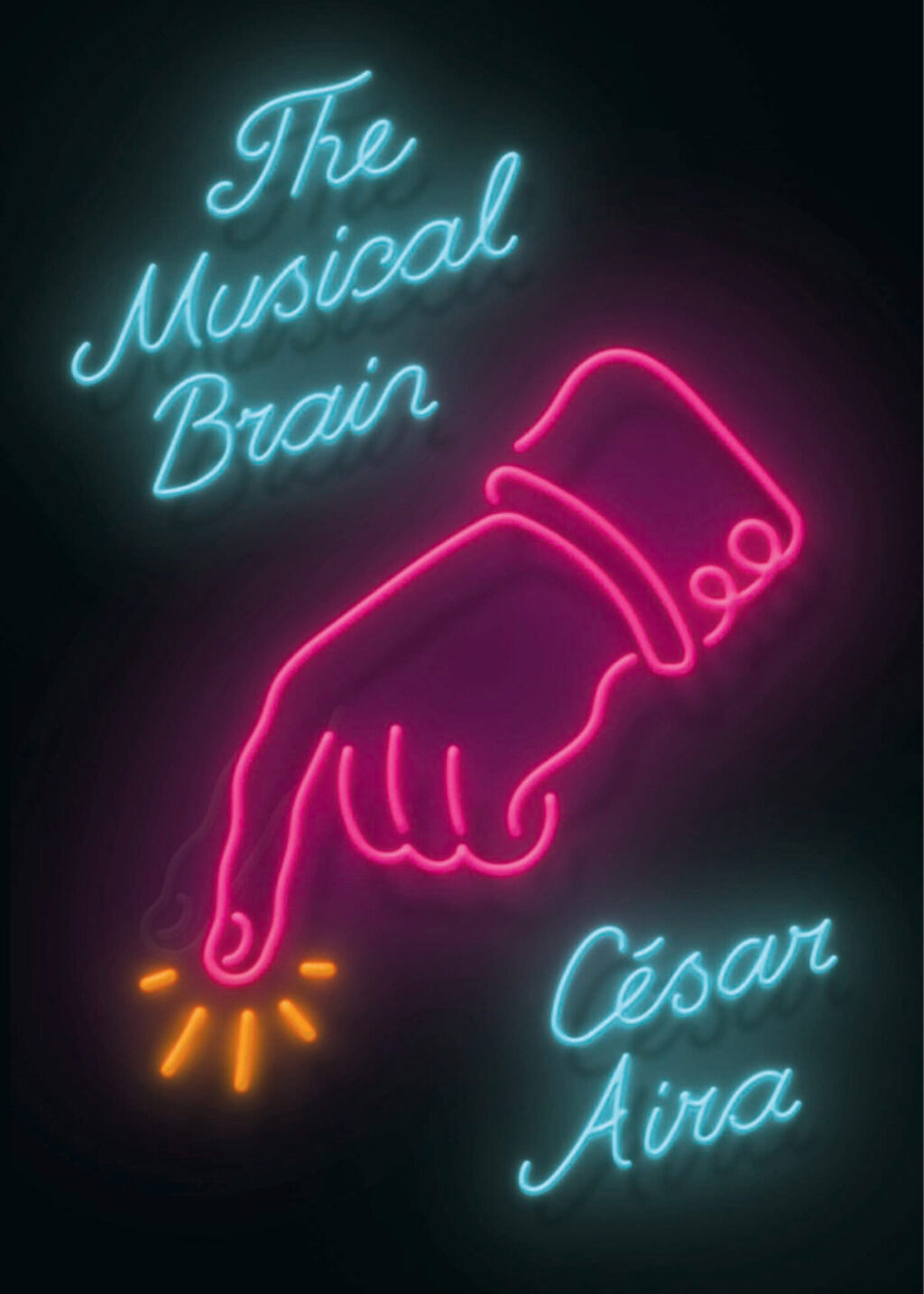
While looking for the other, possibly imaginary, book cover, I came across the cover for the New Directions edition of The Musical Brain by César Aira designed by Rodrigo Corral and Zak Tebbal a few times. It was on one or two best of 2015 lists, including mine.
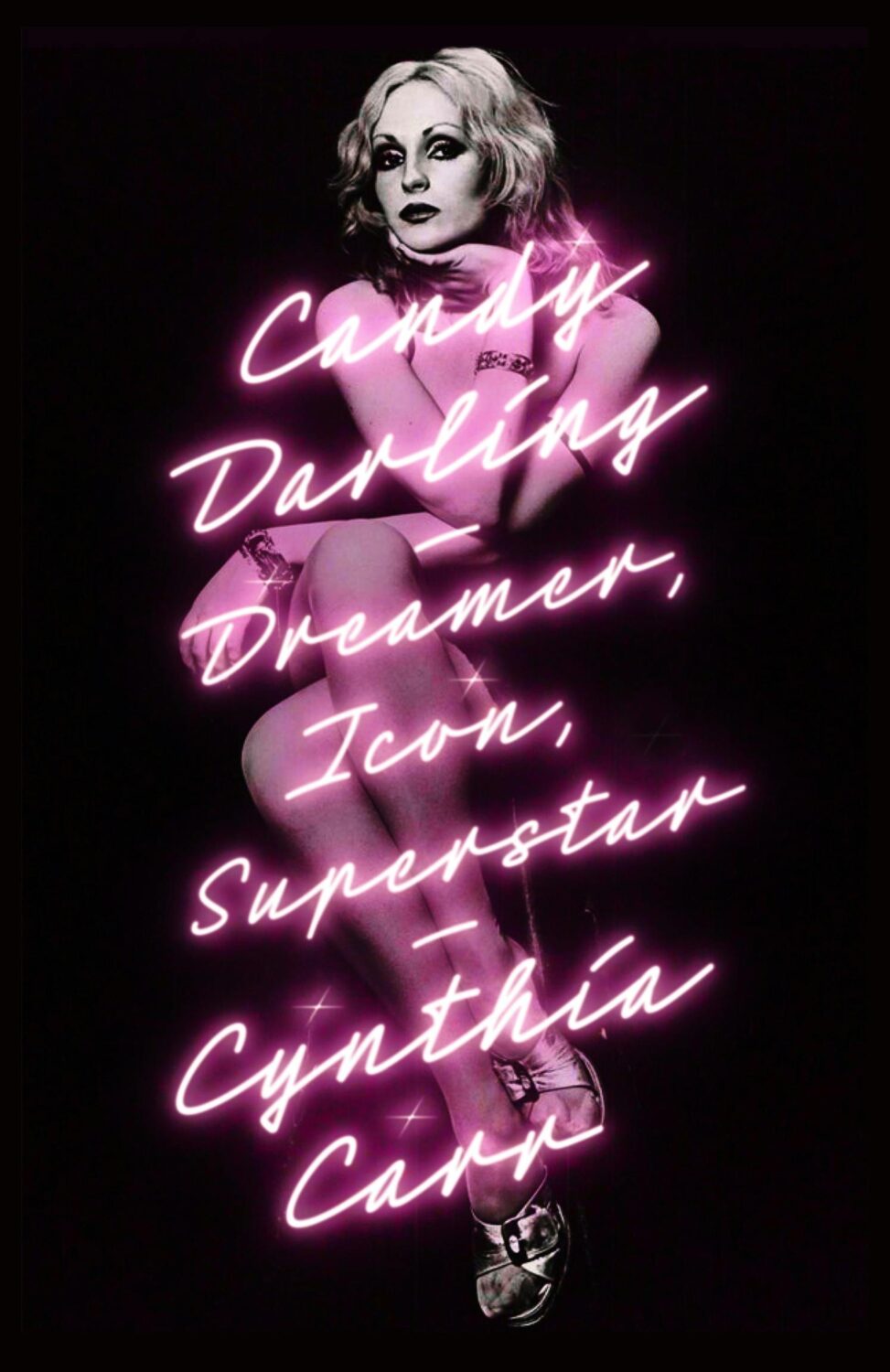
Is neon-style lettering on covers a bit of thing? (see also Candy Darling above)
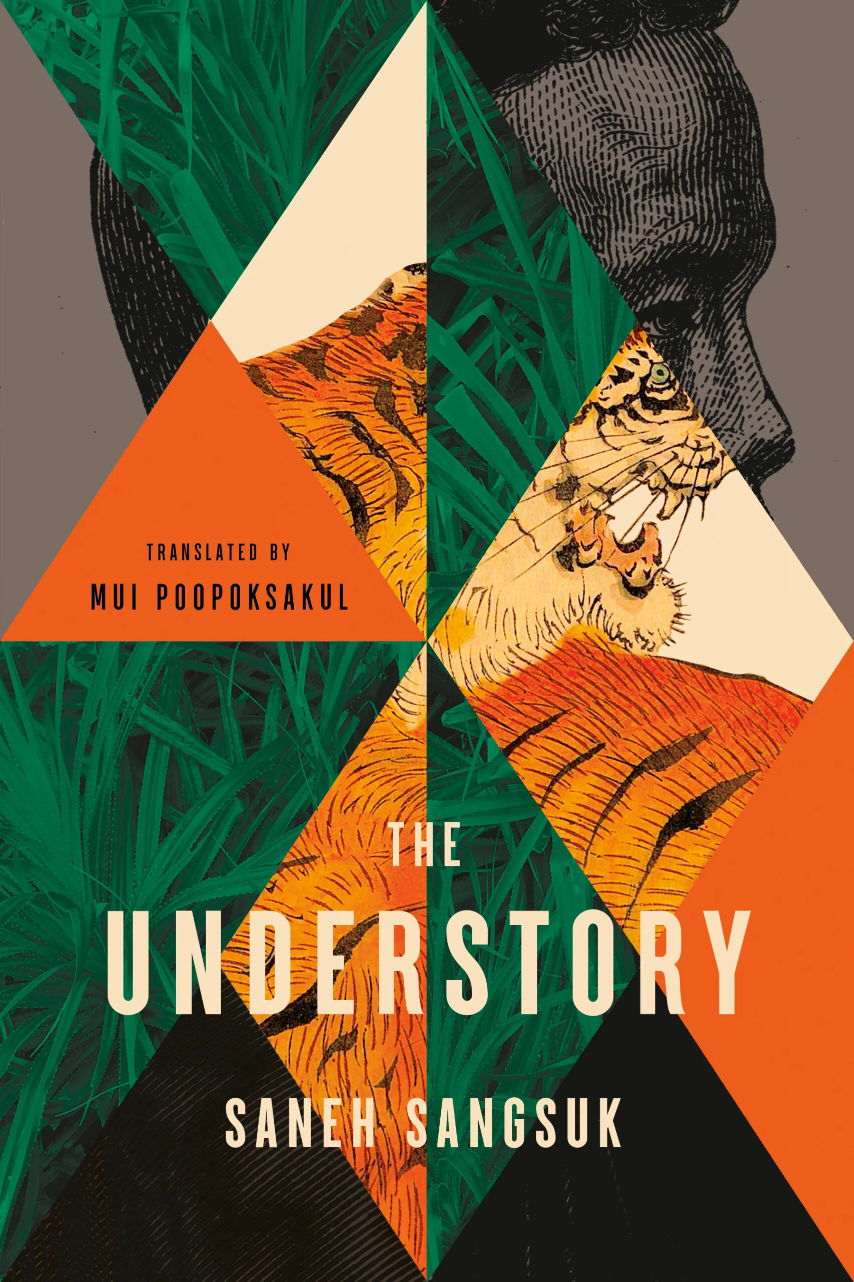
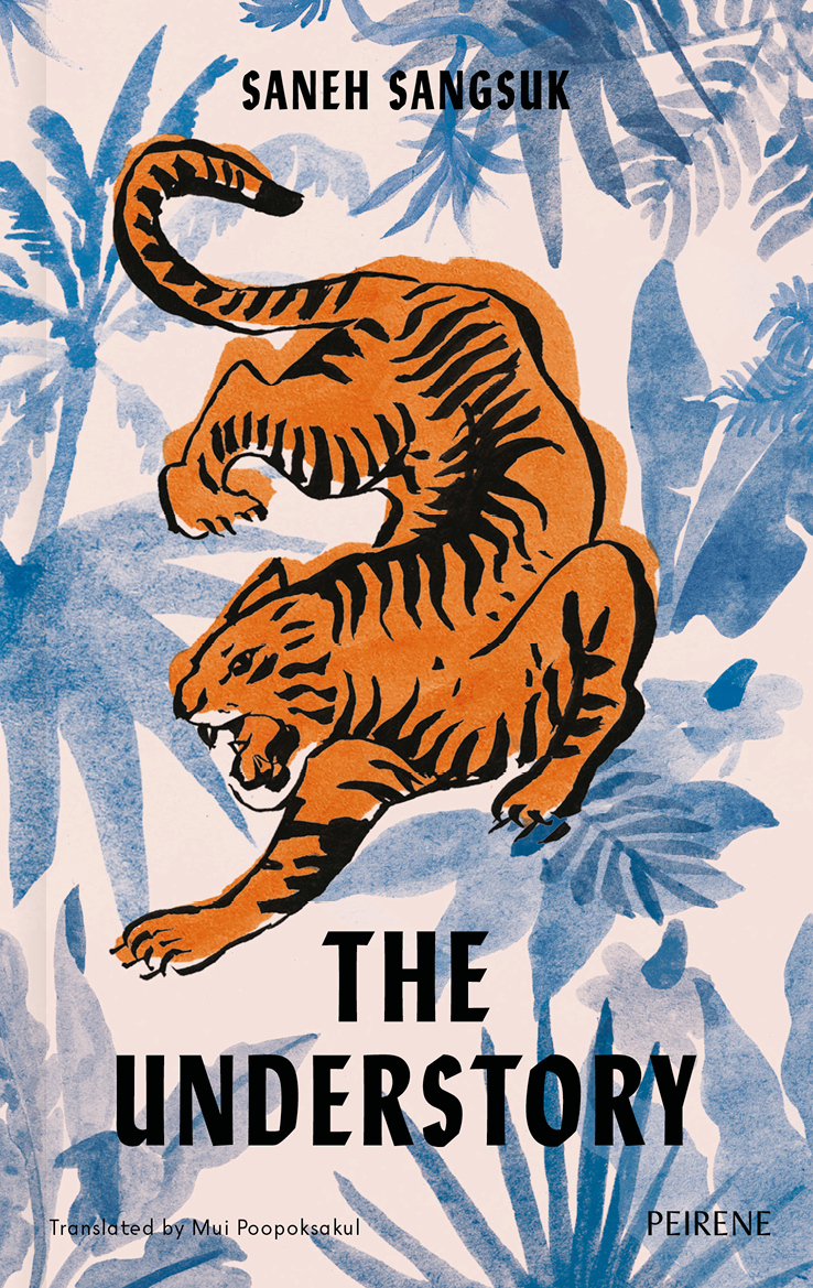
The cover of the UK edition of The Understory, published by Peirene Press in October last year, was designed by Orlando Lloyd. The illustration is by Miki Lowe.
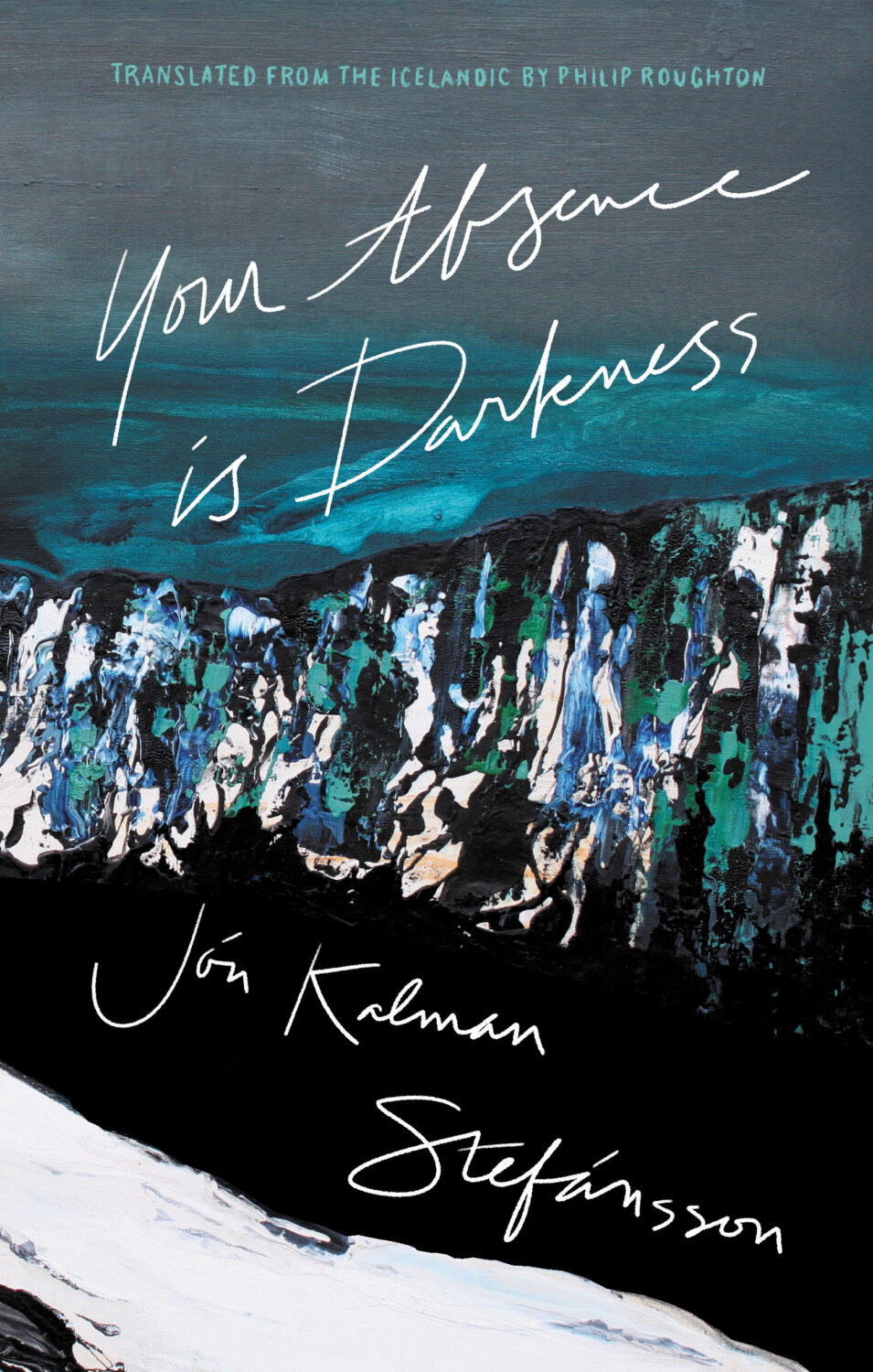
Your Absence is Darkness by Jón Kalman Stefánsson; design by Jason Arias (Biblioasis / March 2024)
At the turn of the year, writer and activist Cory Doctorow coined the term “enshitification.” Although he was specifically describing the process of online services getting worse for users, it was hard not to see it everywhere in 2023.
In his annual look at the year’s best book covers for the New York Times, art director Matt Dorfman recounts a friend describing 2023 as a “year of survival”, a year of “no growth, no withering, just getting by.”
This year saw a centuries-old business contending with rounds of buyouts and layoffs, alongside an endless news cycle involving two brutal wars from which no authors, friends, enemies or strangers were immune from accountability for any unrehearsed sentiment they might voice in passing. Add to this the ongoing concern about how artificial intelligence will affect a business historically dependent upon human creativity — yet through it all, there was still the matter of making books, and their covers, to get on with.
I read Matt’s piece the same day I read an article by Kyle Chayka in the New Yorkerabout his search foran epochal term to “evoke the panicky incoherence of our lives of late.” The suggestions range from the bland ‘Long 2016,’ to the incredibly ominous-sounding ‘Chthulucene,’ the Lovecraftian ‘New Dark Age,’ and the frankly terrifying and plausible ‘Jackpot’ from William Gibson’s 2014 novel The Peripheral.
This was the context of life and work in 2023.
Matt notes some designers found inspiration in the zeitgeist. He’s not wrong. But, ironically perhaps, I feel less optimistic about the overall picture than he does.
At the risk of repeating what I’ve written in the past couple of years, it’s like we’re stuck in a holding pattern, circling the same design ideas. Trends have stuck around. A lot of covers feel safe. Some of this was the books themselves. I’m not sure exactly how many celebrity memoirs is too many, but I’m pretty sure we reached that point and sailed right past it in 2023. No doubt some of it is sales and marketing departments sanding down all the edges and demanding the tried and true (see Zachary Petit’s alternative best of 2023 piece on killed covers for Fast Company). But I would not be surprised if it designers were just getting caught up in the churn — too many books, too many covers, and too much other stuff to worry about.
Or maybe it’s just me.
Rouge by Mona Awad; design by Oliver Munday (Simon & Schuster / September 2023)Silver Nitrate by Silvia Moreno-Garcia; design by Regina Flath (Del Rey Books / July 2023)Our Share of Night by Mariana Enriquez; design by Donna Cheng (Hogarth / September 2023)
One of the themes of the year was nostalgia, which I’m sure can also be put down to the present being pretty fucking awful. It was apparent across almost all genres, including literary fiction, but nowhere more so than in the resurgent supernatural suspense and horror categories. There were creative stylistic mashups with retro vibes, along side fastidious Stranger Things-like homages to the 1980s and Stephen King.
Looking Glass Sound by Catriona Ward; design by Katie Klimowicz (Tor / August 2023)The Only One Left by Riley Sager; design by Kaitlin Kall (Dutton / June 2023)Come Closer by Sara Gran; design by Caroline Johnson (Soho Press / September 2023)
One genuinely pleasant surprise was the number of interesting covers from Canadian publishers this year. They’ve been quietly risk-averse in recent years, so it was nice to see a few bolder design choices getting approved. I was happy to see a Canadian cover was one of the top picks on Literary Hub’s (very, very long) list of the best covers of 2023.
There were other things to cheer this year too.
The Lights by Ben Lerner; design by David Pearson (Granta / September 2023)Total Reset by Sinéad Brady; design Steve Leard (HarperCollins / March 2023)How to Build a Boat by Elaine Feeney; design by Zoe Norvell (Biblioasis / November 2023)
Spine continued to give space to designers to talk about their work in a way I’ve never been able to do consistently here. You can find their 2023 cover picks here.
David Pearson started the Book Cover Review, a website for short reviews of book covers.
Zoe Norvell’s I Need A Book Cover, a resource for book cover inspiration as well as place for authors and publishers to connect with designers, also went live.
Steve Leard launched Cover Meeting, a podcast series of in-depth interviews with cover designers (including David and Zoe among others). As Mark Sinclair notes in his piece on book cover design this year for Creative Review, Steve’s conversations shed light on wider concerns in the industry as well as each designer’s individual process. Have a listen if you haven’t already.
Berlin by Bea Setton; design by Emily Mahon; cover image by Nataša Denić (Penguin Books / May 2023)
Also designed by Emily Mahon:
Lost Believers by Irina Zhorov; design by Emily Mahon (Scribner / August 2023)Do Tell by Lindsay Lynch; design by Emily Mahon; illustration and lettering by Studio Martina Flor (Doubleday / July 2023)
B.F.F. by Christie Tate; design by Ben Wiseman (Avid Reader Press / February 2023)
The Illiterate by Ágota Kristóf; design by Oliver Munday (New Directions / April 2023)
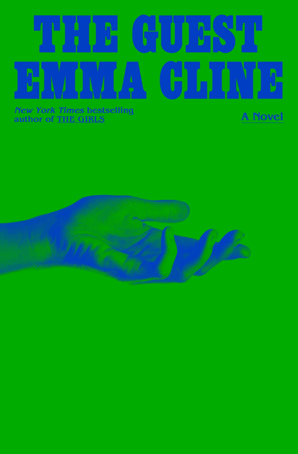
Also designed by Oliver Munday:
The Guest by Emma Cline; design by Oliver Munday (Random House / May 2023)Life on Delay by John Hendrikson; design by Oliver Munday (Knopf / January 2023)
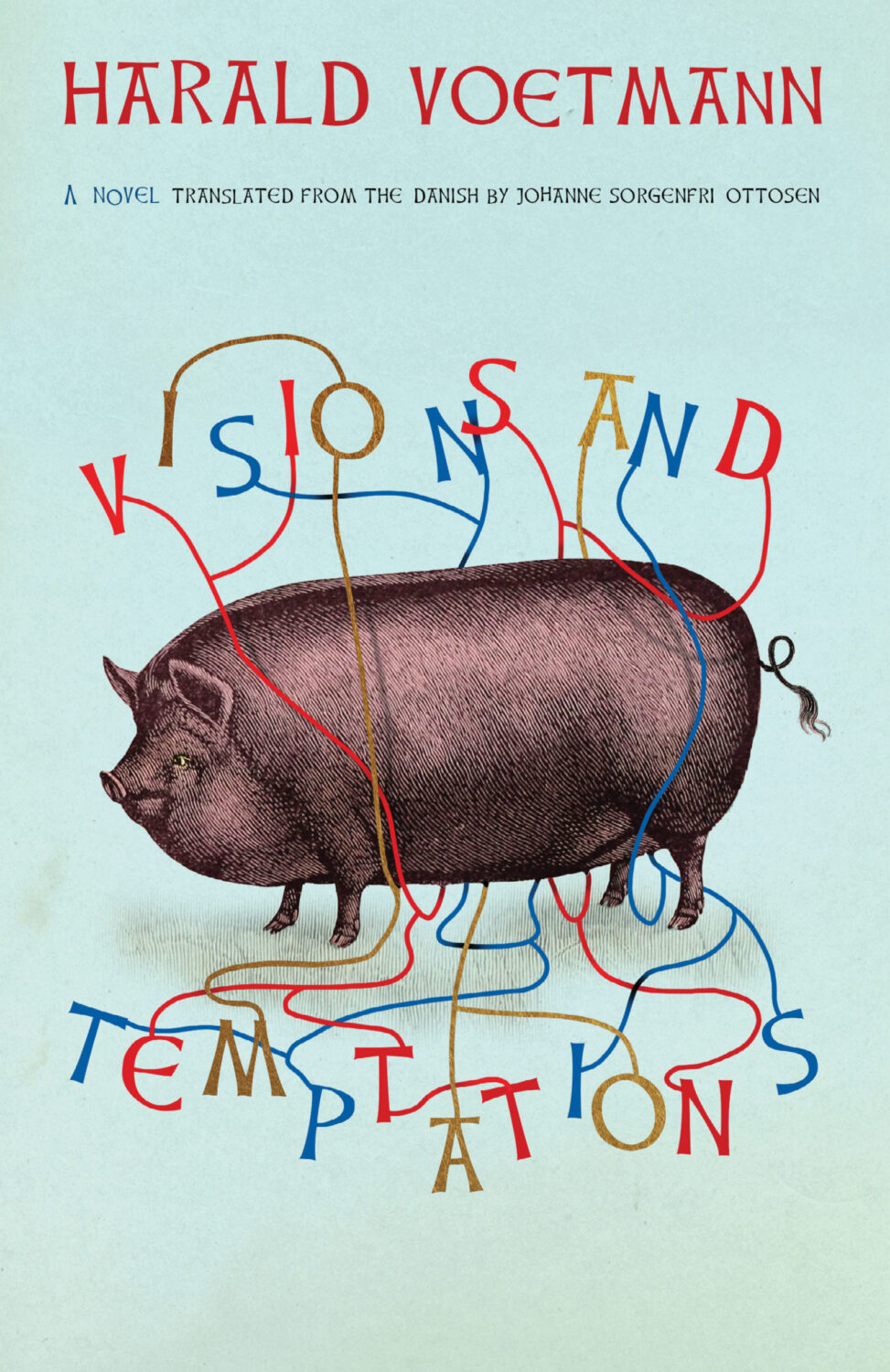
Sublunar by Harald Voetmann; design by Jamie Keenan (New Directions / August 2023)
Also designed by Jamie Keenan:
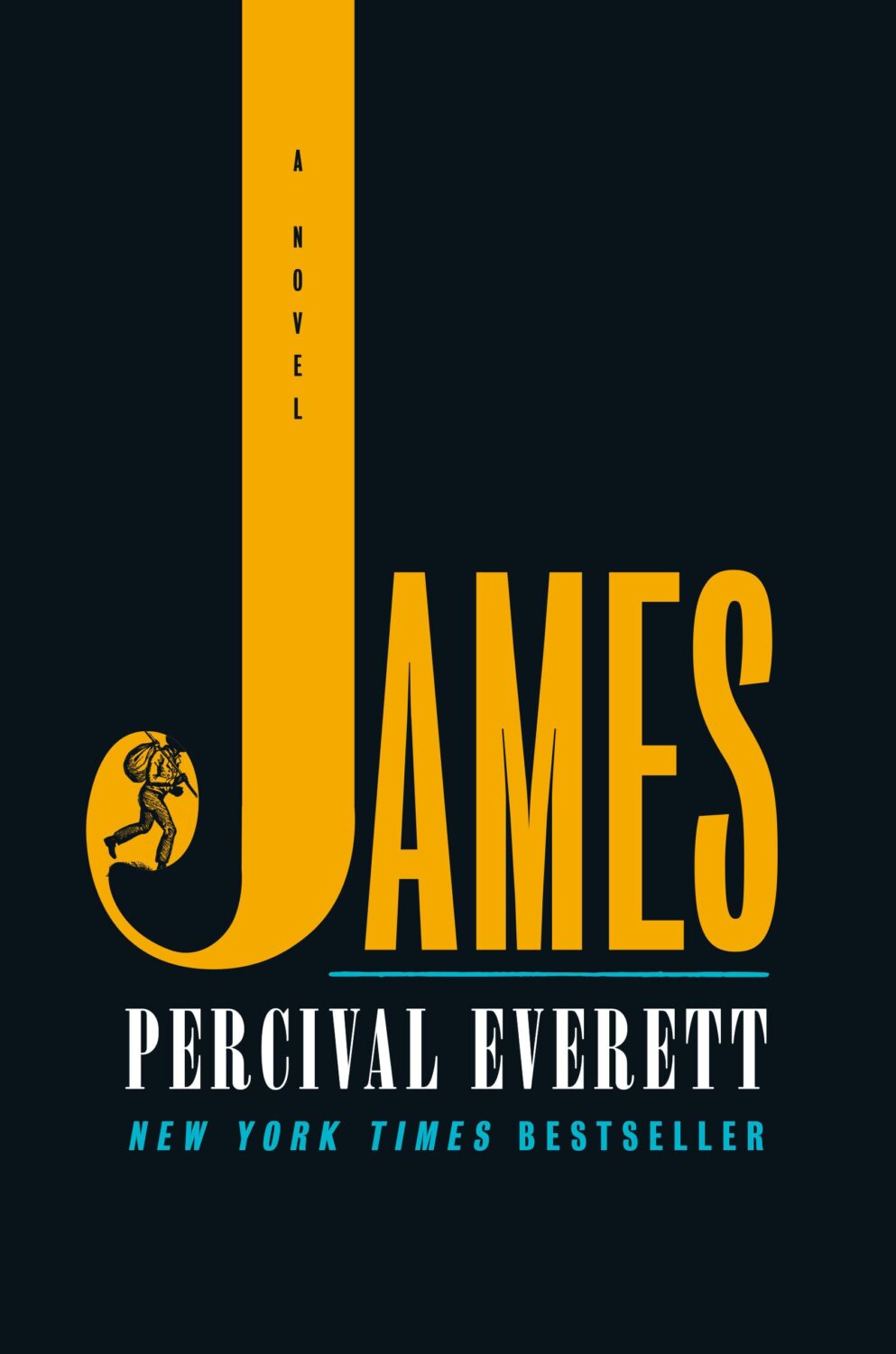
The Dimensions of a Cave by Greg Jackson; design by Jamie Keenan (Granta / October 2023)Dr. No by Percival Everett; design by Jamie Keenan (Influx Press / March 2023)
Even though it’s still just about July — a supposedly “quiet” month in publishing — I’m running late once again. Hopefully everyone is on vacation and won’t notice that it’s basically August already and I am here sliding in under the wire. There are some great covers this month though. A bit of collage, some really nice typography, and lots of pink and red. Enjoy!
The Absolutes by Molly Dektar; design by Yeon Kim (Mariner / July 2023)
I like this cover a lot, but I’m shamelessly stealing it from Lit Hub’s most recent book cover round-up (a benefit of being last to post!), so I hope the design credit is correct because I couldn’t verify it before posting!
I had this noted as down as July cover, but the book was actually released in June. The cover of the Two Lines Press edition of Running Through Beijing by Xu Zechen has also been re-designed to match.
This reminded me of the 2017 cover of Smoke by Dan Vyleta designed by Mark Abrams with an illustration by the late Colombian artist Alejandro García Restrepo who passed away last month.
Earlier this year, a Canadian magazine asked me what the latest trends in book cover design were. I don’t think I had a very satisfactory answer. 2021 felt very much like a continuation of 2020, which itself felt like a year on hold.
The trends that came to mind were not exactly new. In no particular order: big faces (big sunglasses!); cropped faces; hands; mouths; postmodern typefaces;1 big skies; rainbows; gradients; the colour orange; psychedelia; collage; contemporary painting.
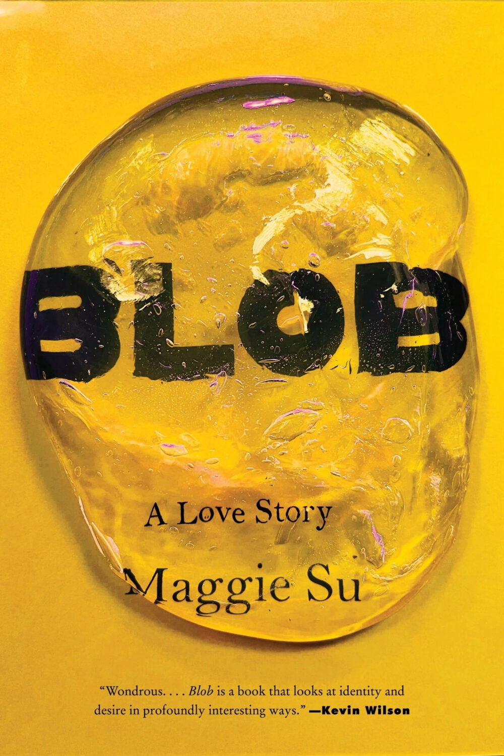
A lot was made of “blob” covers this year. I’m not sure that anything has really changed since Vulture published this article about “blocky” covers in 2019. They seemed like much the same thing.
Design is about the constraints and, as it turns out, the constraints around designing commercial literary fiction covers that have to work just as well online as in bookstores can lead to similar design solutions — large, legible type, and bright, abstract backgrounds. 2 The surprising thing is not that a few covers look the same when you squint; it’s that more of them don’t.
There were a lot of good covers (that didn’t look alike) in 2021. LitHub posted 101 of them. Still, it didn’t exactly feel like a vintage year.
Do I say that every December? Possibly.
A few years ago I worried that covers were moving in a more conservative direction, particularly at the big publishers. I’m not sure this has come to pass, at least not in the US. There are plenty of covers from the big, prestigious American literary imprints in this year’s list, as there were last year, and every year before that.
There are fewer covers from the UK in this year’s list than in previous years though, and I feel less confident about the situation there. From a distance, things seem a little sedate. I may be mistaken. It’s quite possible I haven’t see enough covers — or perhaps enough of the right ones — from British publishers to get a good sense of the overall picture.3
It would not be a surprise, however, if publishers were feeling a little risk-averse at the moment. We are two years into a global pandemic, experiencing a major supply chain issues, and living through a seemingly endless series of sociopolitical crises.
Nor would it be a surprise if designers were personally feeling the effects too — I’m not sure we are talking about this enough, and I’m not sure I know how to.
Thank you to everyone who has supported the blog in 2021. It means a lot. Here are this year’s book covers of note…
Na Kim talked to PRINT about her career and the designs for the Ditlevsen series in February. If, like me, you were wondering about typeface on the covers, it’s Prophet from Dinamo apparently.
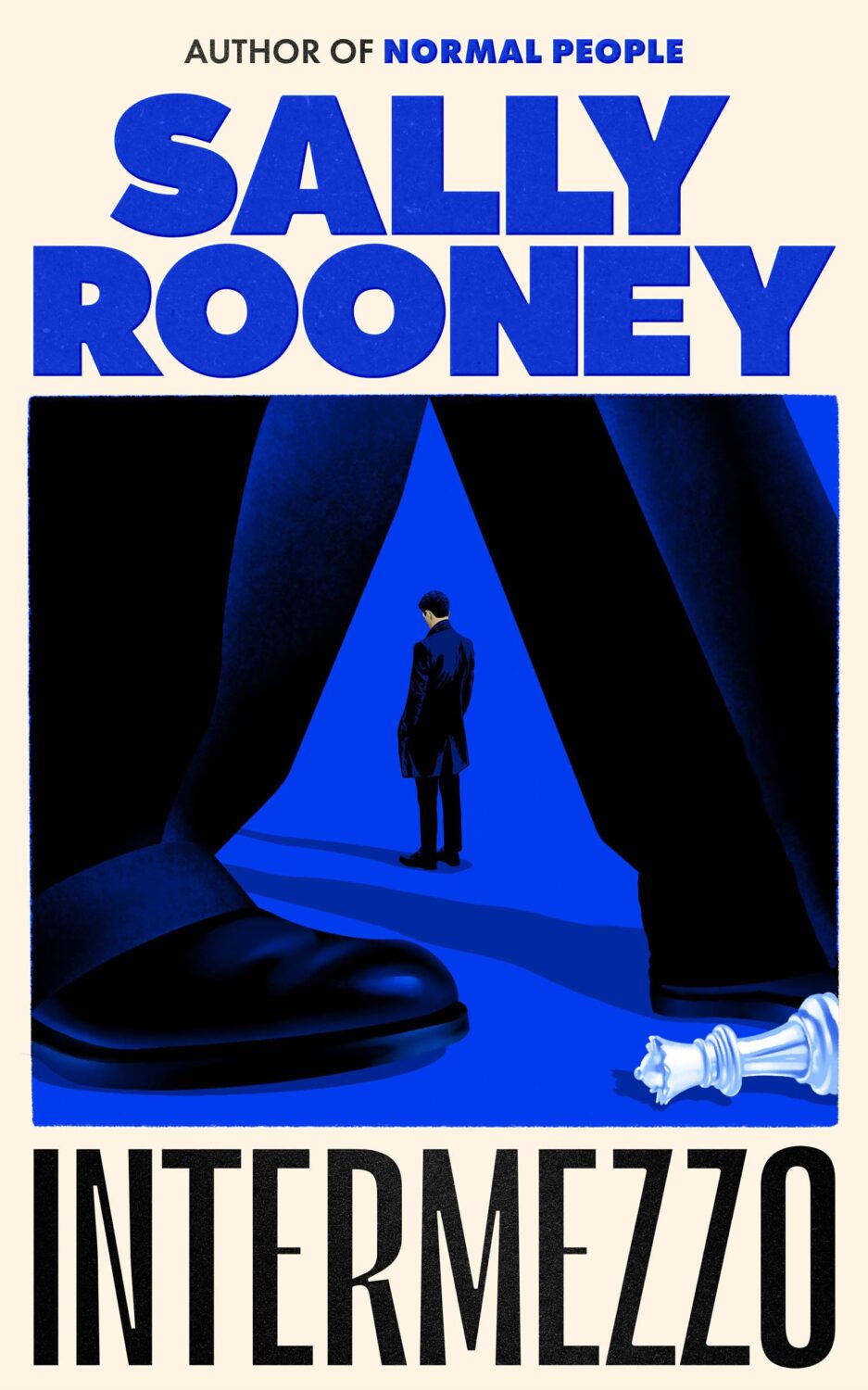
If you’re wondering about the Super-Seventies Sally Rooney typeface, it is Ronda designed by Herb Lubalin and Tom Carnese (I only know because I asked).
Thank you to everyone who has supported the blog in 2021. It means a lot.
I am not convinced that the term “postmodern” quite captures what I mean here (and/or worse, implies something different in the context of typography), but it’s the best I’ve got. I’m not talking about the kind of experimental typography you might associate with the likes of Wim Crouwel or Emigre, or the aesthetic of someone like David Carson. What I am trying to get at is idiosyncratic type that purposely exaggerates or plays with letterforms, and doesn’t conform to function-first modernism. To my mind, this would include some typefaces from the 1960s and 70s, as well as some more contemporary type. In a sense what I am describing is display faces — and I think the eclectic, innovative use of type in Victorian advertising might be an inspiration to designers here — but I don’t think it is just about size. ↩
The don’t look that similar side by side, by I was reminded of Will Staehle‘s 2018 cover for Circe by Madeline Miller, and the UK cover of the more recent Sistersong by Lucy Holland, designed by Melissa Four (I’m fairly sure I’ve seen an orange/red version of the Sistersong cover. Perhaps it was an ARC?).
Circe by Madeline Miller; design by Will Staehle (Little Brown & Co / April 2018)
When I first saw this cover I immediately thought there was some kind of link to Josef Albers ‘Homage a Square’ series, but nobody else seems to have mentioned it, so perhaps it is coincidental? Is that possible? I should probably pick up the book!


