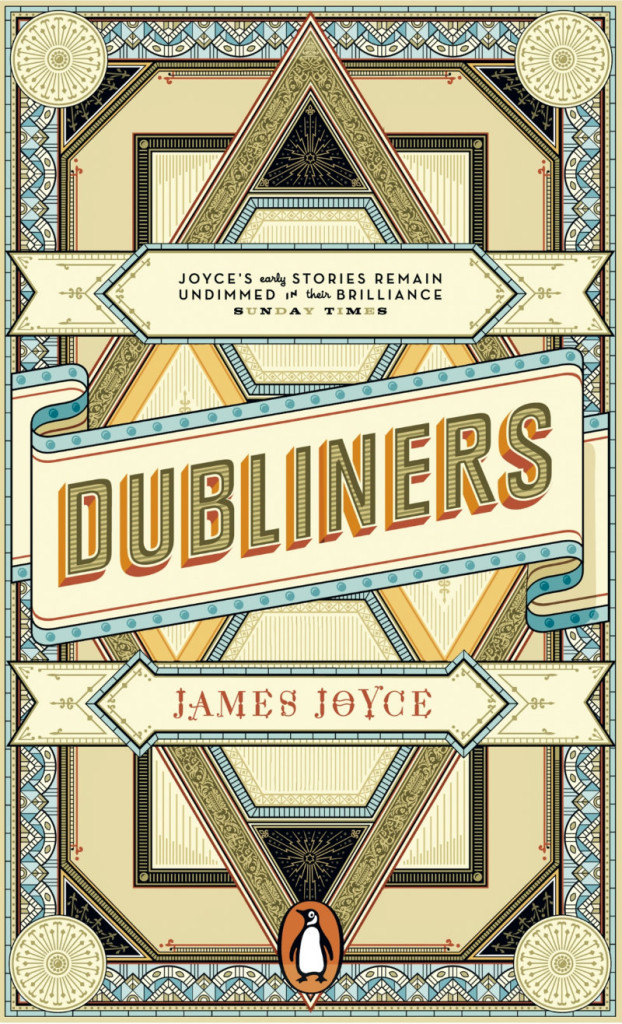
A stunning new cover for James Joyce’s The Dubliners by German designer Apfel Zet (which reminds me — in a good way — of Tony Meeuwissen’s Woodbine-inspired cover for Billy Liar published by Penguin in the 1970’s).
Consistent Forms of Hostility — With an exhibition opening in May at the Barbican in London, Rowan Moore looks at the enduring influence the Bauhaus school at The Guardian:
Not much united Walter Ulbricht, the Stalinist dictator of East Germany for two decades, and Tom Wolfe, celebrant of the splendours and follies of American capitalist excess. Not much, except a loathing of the Bauhaus and the style of design it inspired. Ulbricht called it “an expression of cosmopolitan building” that was “hostile to the people” and to “the national architectural heritage”. Wolfe called it “an architecture whose tenets prohibit every manifestation of exuberance, power, empire, grandeur or even high spirits and playfulness”.
For Ulbricht it was alien to Germany, for Wolfe it was alien to America. Both agreed that it was placeless, soulless and indifferent to ordinary people’s needs. And if the Bauhaus attracted such consistent forms of hostility, that is due to the power and coherence of the image it presented to the world, of disciplined and monochrome modernist simplicity, usually involving steel and glass.
Translators Jay Rubin and J. Philip Gabriel talk about translating Haruki Murakami into English at the SF Bay Guardian.
And finally…
A Very American Critic — Elaine Showalter on film critic Pauline Kael at the TLS:
Cosmopolitan in her reading, sophisticated about international cinema, and au courant with theories of the auteur, Kael was nonetheless a very American critic. She was forty-seven before she ever travelled to Europe, and from the very beginning, she used her reviews and essays to explore what it meant to write film criticism in the United States, where the movies were always a compromise between art and commerce. “The film critic in the United States”, she wrote in “Movies, the Desperate Art” (1959), “is in a curious position; the greater his interest in the film medium, the more enraged and negative he can sound”. American film critics risked the temptations of selling out to Hollywood, or expressing contempt for mass market films. Kael prided herself on both her knowledge of the film medium and her deep love for the movies, trashy and avant-garde alike. Movies, she wrote in “The Function of a Critic” (1966), “are one of the few arts (along with jazz and popular music) Americans can respond to without cultural anxieties”. She did not intend to condescend to her readers or tell them that their tastes were wrong.
Like this:
Like Loading...