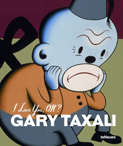
Toy Monkeys — Steven Heller interviews Canadian artist and illustrator Gary Taxali for Imprint:
Illustration is in rapid flux. How pictures are being used defies what we traditionally knew about illustration. Many artists are empowered by new digital media. Yet I sense a fear about the continued life of a still picture. People were talking about how illustrations needed to “move” two years ago. That’s not illustration, that’s animation. Most illustrators can’t animate. The timeless power of a still image will never leave the human psyche despite what new gadgets can accomplish.
(pictured above: I Love You, OK? by Gary Taxali, published by teNeues)

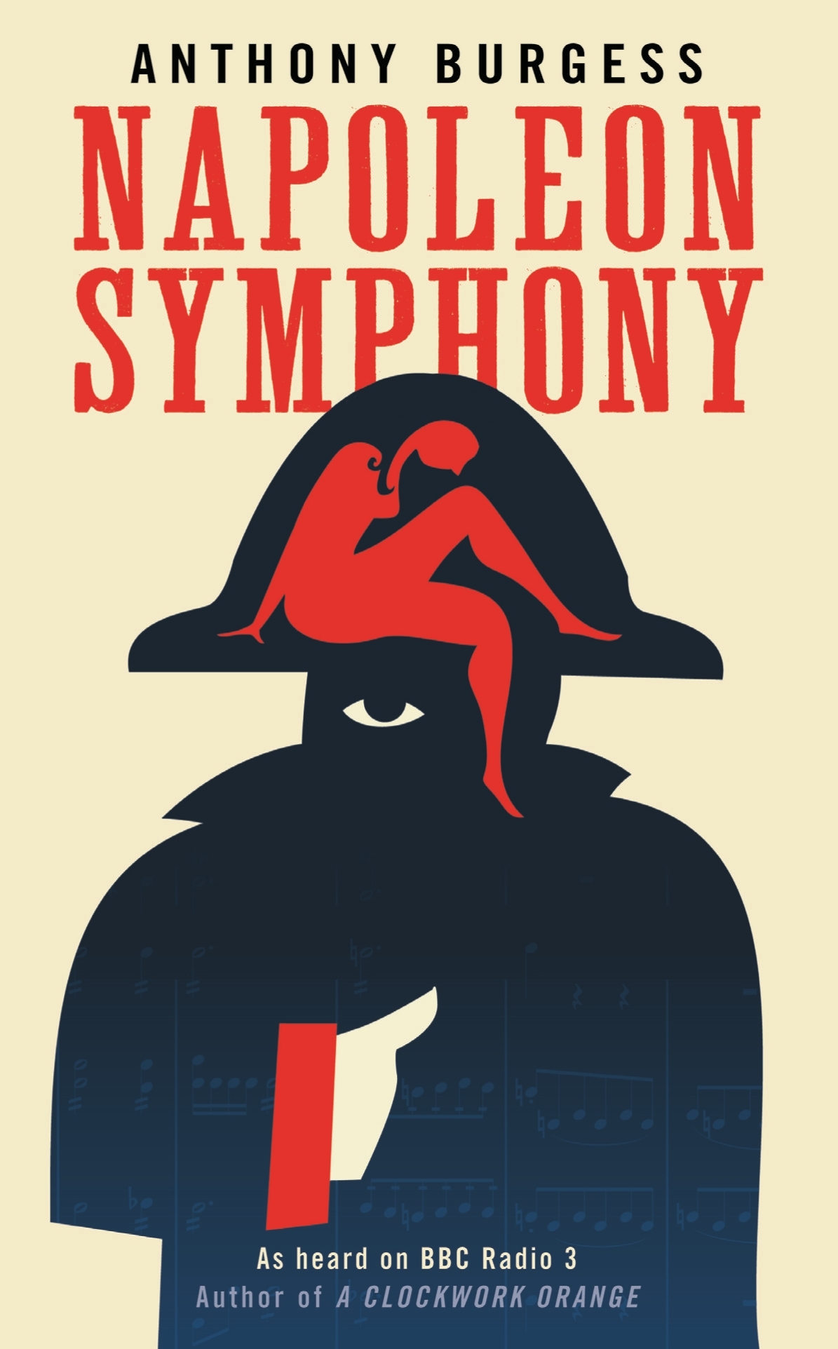
Stanley Kubrick’s 1972 rejection letter to Anthony Burgess, at Letters of Note:
I earnestly hope that our all too brief friendship will survive me telling you that the MS is not a work that can help me make a film about the life of Napoleon. Despite its considerable accomplishments, it does not, in my view, help solve either of the two major problems: that of considerably editing the events (and possibly restructuring the time sequence) so as to make a good story, without trivializing history or character, nor does it provide much realistic dialogue, unburdened with easily noticeable exposition or historical fact.
As Shaun Usher, editor of Letters of Note, points out: “Burgess was undeterred, and Napoleon Symphony was published as a novel in 1974. Kubrick’s movie, however, failed to materialise.”
Strange Places — Owen Hatherley reviews Museum without Walls by Jonathan Meades, for the London Review of Books:
What Meades does most often is praise things, especially things that are habitually ignored: he is surely our greatest exponent of what the Russian Formalists called ostranenie, ‘making-strange’. Architecture, as an art form, isn’t quite mundane enough to be made strange, and for that reason Meades would seldom recognise his writing as being about ‘architecture’ as such. Rather, it is about Place, somewhere architecture happens, at times in a very dramatic way, but doesn’t necessarily have the leading role. Architects take non-art, ‘the rich oddness of what we take for granted’, the mutability, detritus and accident that define truly worthwhile Place, and replace them with something static and unchangeable. However, unlike Iain Sinclair or the London ‘psychogeographers’… Meades does not fetishise the spaces between. ‘I have to admit to a fondness for pitted former rolling stock dumped in fields and for abandoned filling stations,’ he writes. ‘But man cannot live by oxidisation alone. It’s not a question of either atmospheric scrappiness or gleaming newbuild. It’s a question of both/and. It’s a question of the quality of the atmospheric scrappiness, the quality of the newbuild.’
And finally…
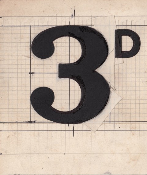
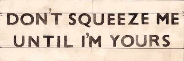
The best thing I’ve seen in ages… Roy Gardner’s designs for the sales tickets in his store Gardners’ Market Sundriesmen on Commercial St in Spitalfields, London:
No doubt knocking up these sales tickets was all in day’s work to Roy Gardner – just one of the myriad skills required by a Market Sundriesman – yet a close examination of his elegant graphic designs reveals he was also a discriminating and creative typographer.