Skip to content

Tag: Anansi

Dan Stiles Covers for Undermajordomo Minor

undermajordomo-uk

Next month sees the publication of Undermajordomo Minor, the new novel by award-winning Canadian author Patrick deWitt.

An “ink-black comedy of manners”, it apparently involves an Alpine castle, a mysterious Baron Von Aux, and a lot of bad behaviour — including, if the Quill and Quire‘s Steven W. Beattie is to be believed, “an extravagant act of Hieronymus Bosch-like grotesqueness… perpetrated upon a large rat.”

It sounds a little like a horror movie directed by Wes Anderson. Or Terence Fisher doing something nasty to Gilbert and Sullivan.

While the cover for the US edition (published by Ecco) was designed by the talented Sara Wood, the UK and Canadian editions of Undermajordomo Minor feature the distinctive artwork of Dan Stiles, the American illustrator and designer who designed the covers of deWitt’s previous novels The Sisters Brothers and (the reissued) Ablutions.

Although Stiles has created different designs for Granta, and House of Anansi, the UK and Canadian covers (both featuring that unfortunate rat) have strong echoes of those previous books. According to the Canadian art director Alysia Shewchuk, this was a deliberate decision. “Dan Stiles created a very a distinctive look for The Sisters Brothers — highly stylized, dark yet playful — and we wanted to pick up these threads in our cover for Undermajordomo Minor.”

undermajordomo-cdn

This is most apparent in the Anansi cover. Its bold geometric design is similar to Stiles’s theatrical cover for Granta, but its colour palette and texture bring it back to the The Sisters Brothers.

Interestingly, the focus of the Canadian cover is different too. “We’d seen early versions of the covers for both the US and the UK editions, and while we liked the different directions they’d each gone in, for our edition we thought it was important to feature the main character (Lucy Minor) and the castle where he lives and works,” says Shewchuk. “Dan understood exactly what we were looking for and he nailed it on the first go-around.”

Undermajordomo Minor will be published on September 3rd in the UK, September 5th in Canada, and September 15th in the US.

In the meantime, watch the slightly Monty Python-esque trailer made by artist Joanna Neborsky, with music by deWitt’s brother Nick deWitt, released today:


The same team made a similarly bizarre trailer for The Sisters Brothers. 

Correction: When first posted, I stated incorrectly that the US cover was also designed by Dan Stiles. The final design and illustration for the Ecco edition of Undermajordomo Minor is by Sara Wood. The post has been amended and updated to credit Sara for her work.

Comments closed

50 Canadian Book Cover Designs

Lists are always problematic, but CBC Books longlist of Canada’s Most Iconic Book Covers seems strangely underwhelming somehow. Setting aside what counts as ‘Canadian’ (some of the books on the list were not designed by Canadians for example), ‘iconic’ covers are inevitably those that have stuck around and we are most familiar with, not necessarily those that are well designed or particularly interesting to look at. Needless to say, the list says more about our fondness for certain books and authors than about the current state of Canadian book cover design. Perhaps it isn’t really fair to judge the CBC’s contest this way, but it makes the list less interesting than it might otherwise have been (to me, at least).

That said, I am terrible, no good Canadian. 10 years and one Canadian passport later, I still feel like the immigrant I am. It’s not that I feel particularly British any more (if I ever did), it’s more like I haven’t finished unpacking yet (which might literally be true come to think of it)! In nearly five years of blogging I haven’t dedicated a single post to Canadian book design. To remedy to that, below are 50 (FIFTY!) recent book covers designed in Canada. Some of them are well-known, some of them are award-winners, some of them were recommended, some I’ve posted before, and some are just personal favourites. I can’t say they’re ‘iconic’ but they are all great covers. Enjoy. (Pictured above: The Bedside Book of Beasts by Graeme Gibson; design by Scott Richardson; published by Doubleday Canada).

15 Comments

Something for the Weekend

The Many Lives of Donald Westlake — Michael Weinrab on the work of Donald Westlake, for Grantland:

The Outfit is 213 pages, which is actually somewhat long by the standards of the early Parker novels. There are 24 Parker titles in all, and most of the early ones are tight little symphonies of spare and rigid prose, split into four distinct movements; they somehow manage to adhere to a rough formula and still blow your hair back every time. Their tone is brutal and unsentimental, and their themes are Nietzschean to the extreme: People act, without adverbial accompaniment, and the whys and wherefores are utterly beside the point. The protagonist is a career criminal, a sociopathic utilitarian who despises small talk. When someone asks him if he had a good flight to his destination, he thinks, This wasn’t a sensible question. He is concerned entirely with the successful execution of crimes and with his own self-preservation amid this process. One memorable chapter ends with the line, “He buried him in the cellar in the hole the kid had dug himself.”

The Parker novels, written by Westlake under pseudonym Richard Stark, have been republished by the University of Chicago Press, with covers designed by David Drummond.

Simulations  — Tim Maughan on Extreme Metaphors, a new collection of interviews with J.G. Ballard, at Tor.com:

You can perhaps argue that Ballard missed the big change that was to come just years after his death—the apparent crisis of global capitalism, the shift of industrial and financial production towards the east, and the tightening pressure on the suburban middle classes that this would result in. But the kicking back against these pressures, in the form of the online rebellion and well mannered protest of Anonymous and the Occupy movement, seem to fit perfectly into this description. Both are, in many ways, more of a simulation of a protest than an actual protest themselves—one involves doing little more than clicking a mouse, the other seemingly owing more to music festivals and camping than to hard-fought political resistance.

Let It Bleed — An interview with cartoonist Yoshihiro Tatsumi at Hazlitt:

The parents were really up in arms about these bad books. Manga at that time was different than it is now. It was friendly manga, so little kids could read it too… On the page you have the same number of panels, the people move from left to right and they’re all the same size and it all looks the same on the page… There was no movement or anything like that. We took inspiration from movies, doing zoom shots or close-ups. Using the camera. We wanted to use these techniques in manga, really violent movement. We were trying to move the panels in a realistic kind of way, to make work without lies, true work.

Tatsumi, Eric Khoo’s 2011 film based on Tatsumi’s memoir A Drifting Life, is currently showing at the Lightbox in Toronto.

And finally…

The Names Change But… The conclusion to Mark Medley’s fascinating series on House of Anansi, ‘A Publisher’s Year’, at the National Post:

“The truth about publishing is that publishing houses change their names and identities all the time. It’s the nature of this perilous trade. When I started in the business there was a Collins, and there was a Harper & Row. I can’t even remember when it became HarperCollins. There was Doubleday Canada, and all of its imprints, and there was a Random House, and all of its imprints…”

Publishers fail and new publishers emerge to take their place.

Comments closed

Midweek Miscellany

This Precarious Balancing Act — Maud Newton talks to Alison Bechdel, author of (the astonishingly good) Fun Home, about her new graphic novel Are You My Mother?. Fascinating stuff:

I feel like cartooning for me has been like a way to be a crypto-writer. I couldn’t ever say I wanted to be a writer because my mother was a writer, and even now I’ve had to find this alternative way of expressing myself as a writer. I don’t want to diminish the drawing. I think it’s integral to what I do. But I’m kind of a secret writer… I’m very wordy for a cartoonist. I’m always struggling against that, because the more space your words take up the less room you have for pictures. So it’s always this precarious balancing act.

School Disco — Mark Medley’s latest National Post piece on House of Anansi Press follows the publisher to the London Book Fair:

The London Book Fair, now in its 41st year, is one of the biggest, and most important, in the world — though it is dwarfed by Frankfurt, which takes place in October. This year, the fair hosted more than 1,500 exhibitors from 57 countries and expected more than 25,000 attendees, almost half from overseas. During the festival’s three days, MacLachlan describes it variously as “a meeting of the tribe,” “highly social,” and “like [a] school dance. The cool kids are in one corner, the nerds are somewhere else.”

Confused By the eBook Lawsuit? So Is Everyone else” — Peter Osnos, founder of Public Affairs Books, writing at The Atlantic.

And finally…

With the Bauhaus: Art as Life exhibition opening at the Barbican tomorrow, author Fiona MacCarthy (William Morris: A Life for Our Time)  looks back at the revolutionary design school at The Guardian:

Gropius’s idea for the Bauhaus emerged from his experience of the first world war in which he served as a cavalry officer on the western front for almost the whole four years. His response to the devastating scenes he lived through was a stark determination to “start again from zero”. Only a new outlook on design and architecture could provide the means for a shattered civilisation literally to rebuild itself… Gropius’s vision was for the “unification of the arts under the wings of great architecture”. It was a democratic concept of art for the people, art for social betterment in which everyone would share. The Bauhaus aesthetic replaced bourgeois furbelows with a geometry of clarity, sharp angles and straight lines.

The Guardian’s art critic Adrian Searle reviews the show here.

2 Comments

Midweek Miscellany

Comics critic Paul Gravett profiles cartoonist and illustrator Luke Pearson. Coincidently, Pearson has created an amazing cover for a new Penguin edition of Lucky Jim by Kingsley Amis (pictured above).

Desirable Comparisons — Part three of Mark Medley’s series on House of Anansi for The National Post:

“We want it to appear as a very serious, big, ambitious book,” Bland says. “Which is hard to do in a way that doesn’t look like other big books.”

He shows [Pasha] Malla some text-heavy covers that bring to mind the likes of David Foster Wallace, Jonathan Franzen and Jonathan Lethem.

“For Pasha, for various reasons that aren’t mine to say, these are not desirable comparisons,” Bland says. “For us, they’re very desirable comparisons.”

Thousands of folk songs and interviews recorded by Alan Lomax are now available for free online.

See also: NPR ‘Alan Lomax’s Massive Archive Goes Online

Neue Haas Grotesk — Christian Schwartz has restored the classic Swiss sans serif typeface for the digital era. There’s a history of Neue Haas Grotesk / Helvetica here.

The Books in My Head — The Quill and Quire profile Canadian independent comics publisher Drawn & Quarterly:

Part of what sets D&Q apart is its focus on high-quality design, incorporating elements like glossy embossing on covers. “We want to treat the comic as the nicest object possible,” says [creative director Tom] Devlin.

While Devlin says he collaborates with authors on design, D&Q’s willingness to cede creative control has given the company a reputation as something of an artist’s haven. Seth says he prefers to work independently, providing the publisher with camera-ready artwork for computer production. “They almost never interfere with my design plans,” he says. “I would not be the designer I am today without D&Q allowing me to make the books I see in my head.”

(Full disclosure: As mentioned in the story, D+Q are distributed in Canada by my employer Raincoast Books)

And finally…

With a retrospective at the Oakland Museum of California and the publication of The Art of Daniel Clowes: Modern Cartoonist, Carol Kino profiles Daniel Clowes for The New York Times:

“I never thought of myself as a museum artist who’s doing work for the wall,” he said. “For me the book is the final result.” He assumes that most people who see his work at the museum won’t know who he is. “But if they have some connection to something they see,” he added, “and then they read the book, the more I’ll feel like the show was a success.”

1 Comment

Midweek Miscellany

The cover for Hope: A Tragedy by Shalom Auslander designed by John Gall.

The Invisible Man — Lee Konstantinou, author of Pop Apocalypse, reviews Art Spiegelman’s MetaMaus for the LA Review of Books:

[T]here is something obsessive about MetaMaus, which says as much about the price of success in the contemporary literary marketplace — and its attendant culture of celebrity authorship — as it does about its subject. When a book like Maus makes a big impact, we often condemn its creator never to move on to new projects. MetaMaus give evidence that Spiegelman has endured a fate not unlike that of Ralph Ellison after he published Invisible Man in 1952. Like Ellison, Spiegelman has rightly earned enormous praise, and, also like Ellison, he has become his own best interpreter. But just as Ellison produced no major work after Invisible Man other than the unfinished, posthumously published Juneteenth…, Spiegelman has yet to produce a work of comparable depth and sophistication to Maus.

The Road — Julie Bosman on the future of Barnes & Noble for The New York Times:

If something were to happen to Barnes & Noble, if it were merely to scale back its ambitions, Amazon could become even more powerful and — well, the very thought makes publishers queasy.

“It would be like ‘The Road,’ ” one publishing executive in New York said, half-jokingly, referring to the Cormac McCarthy novel. “The post-apocalyptic world of publishing, with publishers pushing shopping carts down Broadway.”

…Without Barnes & Noble, the publishers’ marketing proposition crumbles. The idea that publishers can spot, mold and publicize new talent, then get someone to buy books at prices that actually makes economic sense, suddenly seems a reach. Marketing books via Twitter, and relying on reviews, advertising and perhaps an appearance on the “Today” show doesn’t sound like a winning plan.

See also: B & N won’t sell books from Amazon Publishing and Amazon’s Revenue Slumps.

And finally…

The fascinating first article in a year-long series on the inner-workings of Canadian publisher House of Anansi Press by Mark Medley for the National Post:

A significant amount of time is spent discussing paperback editions of books that recently came out in hardcover. “Right now, we’re seeing the market is really and truly paperback and e-book,” [publisher] MacLachlan says. “So, we have some hardcovers that we thought would [sell] in the fall that haven’t gone as well as they should. And so, rather than wait a whole year to reintroduce the book into the marketplace, let’s do a paperback edition sooner than later.”

Comments closed

Q & A with Ingrid Paulson, Ingrid Paulson Design

Holding Still cover

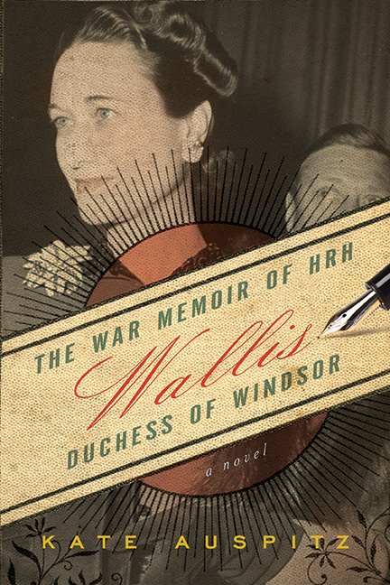
Before setting up her own design studio in Toronto, award-winning Canadian designer Ingrid Paulson was senior designer at McClelland & Stewart, and art director for Key Porter and Raincoast Books.

Although Ingrid worked at Raincoast, we didn’t actually meet until BookCamp Toronto earlier this year. We only had a brief a conversation, but it was just about long enough for me to blurt out that I wanted to interview her, and for the apparently unflappable Ingrid to say “OK” (and sound like she might mean it).

And so I do want to say a big thank you to Ingrid for coming through with such grace and patience, and for providing such wonderful answers to my not-so-wonderful questions.

Could you describe your design process for book covers?

In terms of workflow? The publisher gives me a title information sheet and/or a creative brief, plus (fingers crossed) either a few chapters or the entire manuscript for the book. I always ask to read the fiction, but for non-fiction I can manage well with a concise book description and perhaps the introduction. I submit a minimum of three cover concepts to my contact at the publishing house, and wait for feedback. Then I either redesign and resubmit, or, if I was ‘on to something,’ I tweak one of the concepts until we get it right.

In terms of creative process? Um. Well.

Some cover concepts appear in my head, fully formed, by the end of my first conversation with my publishing contact. Other get dragged out of me kicking and screaming, begging to stay in the dark void of my head. Sometimes I sketch out the covers — wee thumbnails in my moleskine — whereas other times I play a Google Images lotto search using various vague terms that would describe a feeling I want to associate with the book. Sometimes the font is the first thing chosen, or I envision the type at certain sizes and placed in specific places. Other times, the image is driving the cover and the type just has to play catch-up. I’ll envision a book as predominantly red, or dark, or punchy — and that all comes from what the author has written. I’ll respond to textured sentences with textured visuals (perhaps collage?) and bleak will meet bleak. (But not so bleak as to discourage someone picking it up. The bookbuyer is in my thoughts as well, as I try to envision them and their habits, quirks, and book needs.) Needless to say, my brain gets crowded.

And then there are the days when I just stare at a wall and hope against hope I’ll figure out something clever. I haunt a lot of bookstores.

wallis

What are your favourite projects to work on?

The ones I get right on the first try.

I love working on fiction, but it takes the most concentration and, because fiction is so subjective, so evocative of the human condition (both funny and sad), designing a fiction cover can drive me nuts. There is never one absolute visual solution for fiction. Nonfiction, on the other hand, can get formulaic, but I love the simplicity of thought — punchline design, in many ways. So, for sanity’s sake, I prefer to keep a balance of fiction and nonfiction going. Cookbooks can be a blast to design, but I (sheepishly) think that comes from the photo shoot where we all end up eating most of the props (the ones that have flavour, or haven’t been sprayed with any shellac). And then there are the special projects where I’m asked to work on the cover and interior, and I am part of the planning and layout process, where I get to research the images, discuss things with the editors on a page-by-page basis. Those projects are rare, but they keep me happy for a few years at a time.

What do you think makes a good cover design?

Being able to lure someone into picking up the book and reading the back, which takes about 1.5 seconds of their time. Job done. How to do that? If we in publishing knew, we’d also be able to predict bestsellers. The best I’ve figured out is to keep it a simple visual package — don’t let the type look out of place with the image, don’t use the same colours as everyone else is using that season, stay away from looking too much like any of the other books, but make it look like a book. I dunno. The cover should evoke an emotional pull from the bookbuyer, that moment of ‘yes, that’s interesting and looks like what I want to read.’ That solution changes from book to book.

What are some of the common mistakes publishers and designers make with covers?

For publishers, they’ll try to make their book look similar to someone else’s (bestselling) book, as if to catch the wave. This is not clever, it just means the publisher is out of ideas or is feeling the year-end coming and needs to hook on to a sales-winner. It’s the publisher that took a design chance on a different look — and came out the winner in terms of sales — that is the ultimate winner. The rest end up on the remainder table eventually. Daunting. They don’t call it a ‘gentleman’s profession’ for nothing. (Or ‘gentlewoman’s’. I’m just citing the old, old adage.)

For designers, it is not being able to pitch their cover effectively. If a designer can articulate the reasons for their choices of colour, type, and image, then they have a fighting chance of getting that design through. Otherwise they are leaving it to speculation. I’ve worked both sides of the table — inhouse art director, freelance designer — and I know that it is ten times harder for a freelancer to get that voice heard in the meetings. But inhouse staff can get asked to revise designs far more often than the freelancer, as the perceived economies behind a salaried staff versus a per-project contractor sometimes give the publisher too much leeway on revisions. I’ve been inhouse with a book cover that I simply didn’t ‘get,’ but there was no way to contract out the job, as, due to costs, the publisher refused. It was a painful, long design process for all involved (not just me), and they ended up with something inferior to what they would have gotten with a designer who understood the book. As an Art Director, I could’ve just handed it to a specialist designer and, with a few good notes, gotten something much more suitable for the book.

I guess that leads to a codicil: know when to walk away. Yes, we all want to try new book categories. Just know when to draw the line, so to speak.

British and American book design styles are often seen as quite distinct (with critics and proponents of both!). Is there a Canadian style of book design?

What there is known of Canadian book design is an amalgam of quiet, well-crafted literary press style — usually hand in hand with DIY letterpress style — smashed against a desperate need for full-bleed sepia landscapes (or sleeping sepia people) and egregiously large title type. We err on the side of poetic, which can look like a wash in the stores (or worse — too literary, which could alienate those poor readers still recovering from their English high school reading list). We avoid edgy.

There is some astonishing design coming out of the cracks across the nation — David Drummond comes to mind, as does the brain trust under Peter Cocking at Douglas & McIntyre — and I hope that will win out. Clear, slightly subversive, more in tune with our world-famous sense of humour. Intelligent is the word that comes to mind.

Do Canadian book designers have unique opportunities? Are they accompanied by particular challenges?

Figuring out new and exciting ways to design both hockey and ‘whither Canada’ books, which are a yearly staple on publishers’ lists. We are handy and imaginative with maple leaf imagery and the colour red.

You’re an artist as well as a book designer. Is there a tension between your artistic sensibility and the commercial design process?

Every day, and the design wins. I’ve tried to avoid overlaps, but words are images to me, so lately I’ve been working on art based around words. I try to keep it as three dimensional as possible (since my day work is two-dimensional), but then font choices become a factor and I run screaming. It helps to know that both Jenny Holzer and Barbara Kruger worked in designer/typesetter jobs early in their artistic careers.

The challenge lies in accepting and separating out design and art from their ultimate goals: design is created to communicate a product; art is created to communicate the world, in whatever form, or whatever scope, the artist chooses. There is no client in art.

How is designing book interiors different from designing their covers?

Interiors are, in many ways, a much more detailed exercise in communication. For a text-only book, I have to make sure that the reader never really sees the design, else it distract from their involvement with the text. For a picture book, the pictures stand tall, so the design should just assist the pictures. But a cover is a marketing tool, and the cover must try, in no uncertain terms, to woo the reader. It must stand out.

poster

Where do you look for inspiration?

Currently? Other designers (book and non-book), as well as music poster design. There is a great revival (when did it go away?) of one-off poster designs for gigs. They are all silkscreened or letterpressed limited-edition beauties. I used to look at rave fliers all the time (when raves were the thing). I look online. I remember stuff my mom — who was an antiquer in the 1970s — used to show me, old ads and magazines. I read a lot (beyond manuscripts), so I end up with this polymathic knowledge of, say, alchemical symbols and Greek demigods. We used to be such a visual culture, pre-literacy, and I think in many ways we’re heading back there. My job is to connect the shorthand symbols of the culture, both old and new. It can fascinate me for hours, why LOLCats is the thing (and then not the thing, but what did the visual say of us?), or looking at, say, a Dutch design student’s incredibly cool/obscure website.

Who else is doing interesting work right now?

I love designers with latitute — ones that aren’t just one-trick (or one-look). Who comes to mind? Coralie Bickford-Smith, Jason Gabbert, Terri Nimmo, David Gee, Gabriele Wilson, Peter Mendulsund… They all have style that can bend to the project. I could go on, but that’s today’s list. It will change and expand tomorrow.

You’re very active with your website, blog, and Twitter etc. Is it important for a designer to engage with people online?

You know, every time I blog (or answer nice questions like yours), I sit back afterward and fear that my opinion is going to lose me a client. There is this balance one must keep when designing, as the client is always right (or deserves the design they get, depending on the outcome), yet what designers put out there does contribute to our visual worldscape. So, I try to contribute.

But I work from home (or, in Toronto parlance, I have a ‘live/work situation’). Blogging keeps me from talking to the wall too much, or thinking that the cat cares when I’m sweating to find the right sans-serif. It has been fascinating to watch how many book designers have joined Twitter lately — we all seem to find each other, this odd subgenre of designers, and I think in the future, that will result in some mind-blowing design (or a great convention in Bend, Oregon). My purpose online is to build community, to share ideas, to groan when needed, and if other non-designers join the conversation, well, then it just becomes this great party.

With the growing popularity of e-books, what is next for book cover design?

Ack! I don’t know. I really don’t. We’ll see what happens. What I do know is that there will always be a role for design, but what that role takes is anyone’s guess.

Thanks Ingrid!

Comments closed