Congratulations to all the 2015 Australian Book Design Awards Winners!
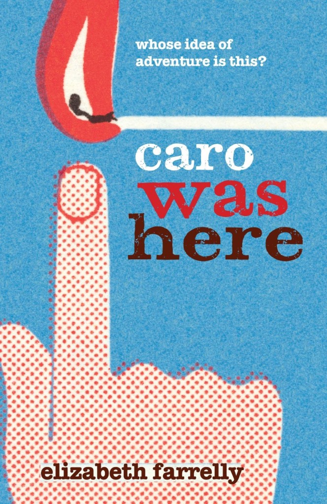
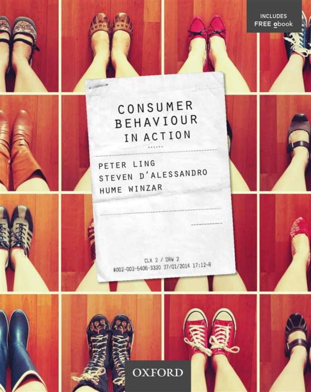
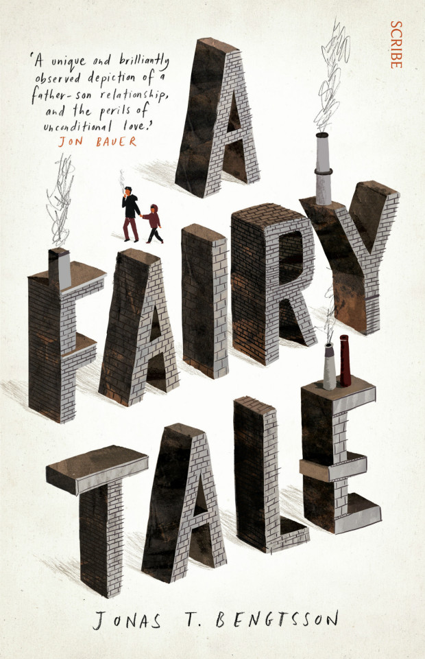
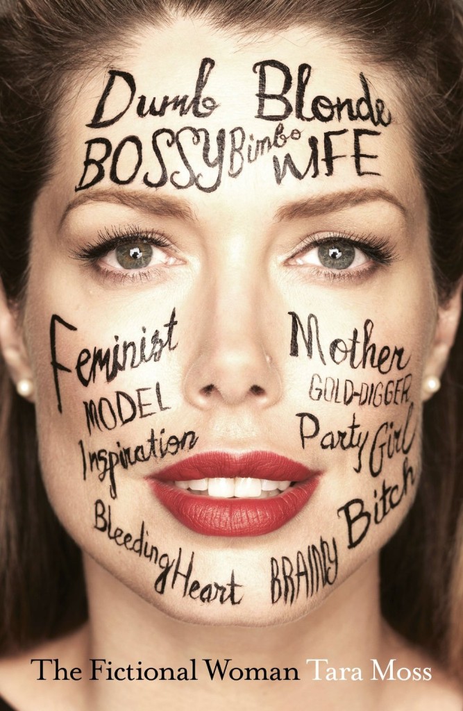
You can find all the winning designs on the Australian Book Designers Association website.
Comments closedBooks, Design and Culture
Congratulations to all the 2015 Australian Book Design Awards Winners!
You can find all the winning designs on the Australian Book Designers Association website.
Comments closed


I particularly like that they have an award for Young Designer of the Year. The designers shortlisted this year are Alissa Dinallo, Hazel Lam, and Imogen Stubbs:


The full list can be downloaded as a PDF from the ABDA blog. The winners will be announced Friday, May 22nd in Sydney.
Comments closed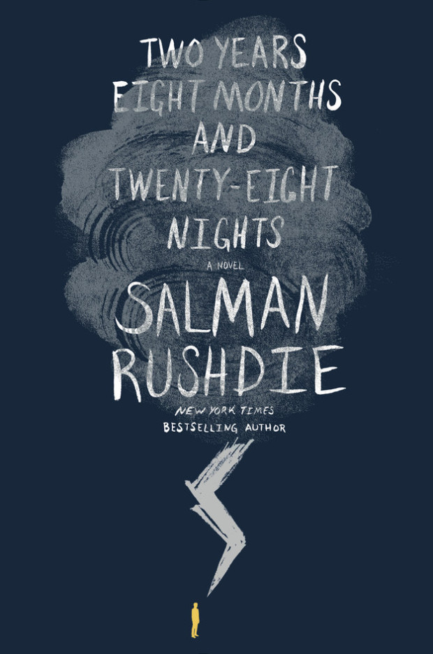
The cover of the US edition of Salman Rushdie’s first adult novel in seven years. Two Years Eight Months and Twenty-Eight Nights (Random House, September 2015), was revealed on Buzzfeed last week.1 While the cover itself is perfectly fine, the most remarkable thing about it is how much it looks like a novel for young adults.
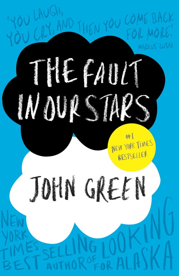
I was immediately reminded of the cover of The Fault in Our Stars by John Green, designed by Rodrigo Corral (Penguin 2012)…
…and the lovely hand-lettered YA covers of Australian designer and illustrator Allison Colpoys:


After some further thought, however, I realised that it is even more reminiscent of the cover for the novel Waiting for Doggo by Mark B. Mills, designed by Yeti Lambregts (Headline, November 2014), which made me wonder if, perhaps, we are starting to see more adult covers that look like YA?


Since the success of Harry Potter, publishers have known that adults read ‘children’s books’ for pleasure, and they will often try to appeal these to older readers with more mature covers. On Twitter last week, American YA cover designer Erin Fitzsimmons (interviewed on the blog here), identified this as ‘crossover appeal.’ But crossover appeal can go both ways, and it seems that adult covers are being designed to reach the widest possible audience too.
This trend is more pronounced in the UK where bright and whimsical illustrated covers are common for commercial fiction. The vibrant cover of the UK edition of Two Years Eight Months and Twenty-Eight Nights (and the accompanying backlist) — beautifully illustrated by Sroop Sunar and unveiled today — is a perfect example:
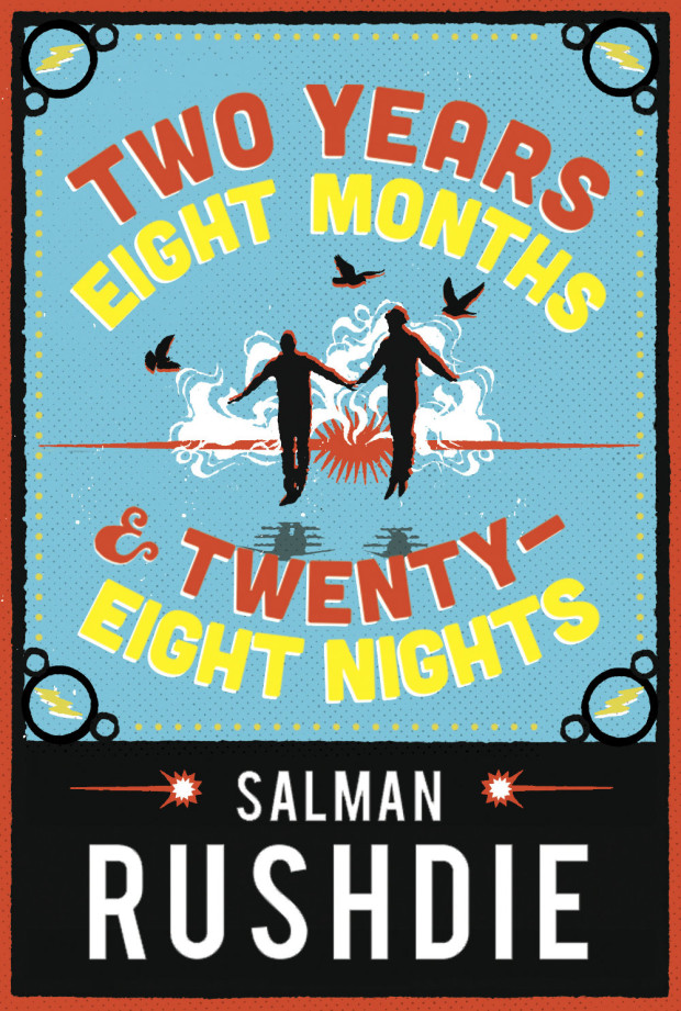
According to CMYK, the Vintage Books design blog, Sunar was inspired by printed ephemera found in India around the time of Independence, and the brightly coloured covers would work equally well for YA as for adult fiction:

US publishers have (I think) been slower to market adult fiction to younger readers in this way. Although hand-lettering has become very common on US covers for a while now, photographic images still dominate commercial fiction covers. Compare, for example, the UK cover of Station Eleven by Emily St. John Mandel, illustrated by Nathan Burton (left), with US edition designed by Abby Weintraub (on the right):


From my own experience, I can also think of at least one quirky illustrated cover — for an upcoming literary novel that the publisher has very high hopes for — that was killed at the last minute in favour of a more traditional photographic one. The original design could easily have been for a gothic Young Adult fantasy. The new cover, much less ambiguous, is clearly intended for adult book clubs.


Even so, Two Years Eight Months and Twenty-Eight Nights and a few other recent covers suggest that US publishers are willing to experiment, and as audiences for YA and adult fiction become harder to differentiate, we will only see more covers that blur those lines.
Comments closed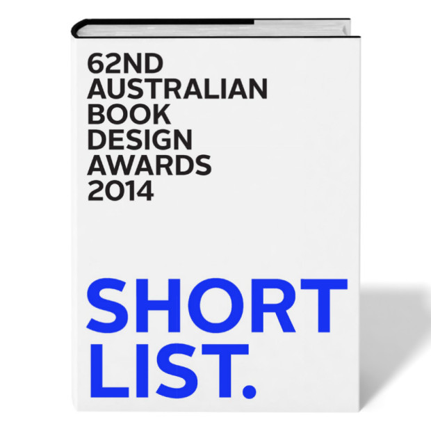
Peter Long, Senior Designer at Black Inc. Books, has kindly let me know that the shortlist for the Australian Book Design Awards has been announced.
The Book Design Awards are Australia’s longest running graphic design awards, but in 2013 the Australian Publishing Association decided to discontinue them. To keep the awards running for a 62nd consecutive year, a group of Australian designers formed the ABDA as an independent, non-profit entity in March 2014.
There is some lovely work up for this years awards, and you can download full a list of the nominees as a PDF. Here are a few of the book covers that caught my eye:

Letters to the End of Love by Yvette Walker; design by Allison Colpoys (UQP July 13, 2014)

The Luminaries by Eleanor Catton; design by Jenny Grigg (Granta September 2013)
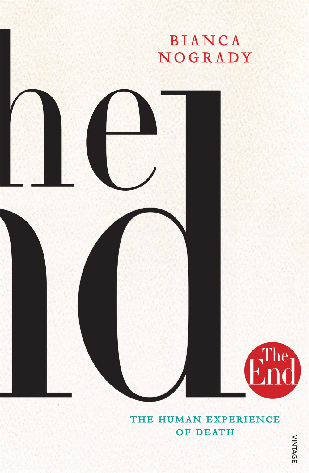
The End by Bianca Nogrady; design by Sandy Cull (Vintage May 2013)

Madness: A Memoir by Kate Richards; design by Allison Colpoys (Viking January 2013)

The Messenger by Markus Zusak; design by Sandy Cull (Pan Macmillan Novemeber 2013)

Zac & Mia by A. J. Betts; design by W. H. Chong (Text Publishing July 2013)
The winners of the Australian Book Design Awards will be announced in Melbourne on August 22nd, 2014.
1 Comment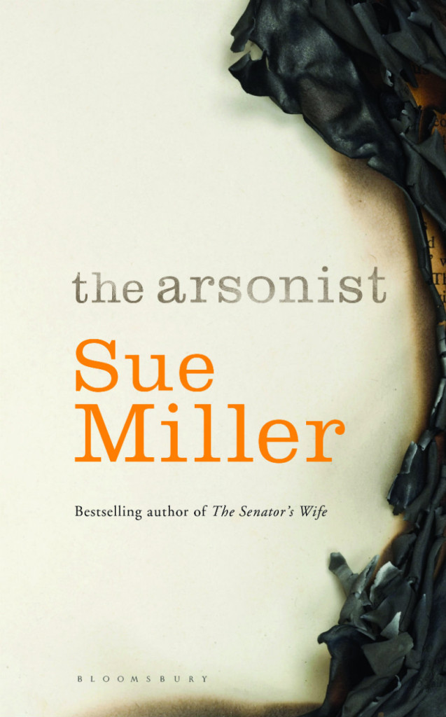
The Arsonist by Sue Miller; design by Greg Heinimann
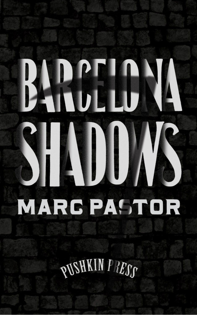
Barcelona Shadows by Marc Pastor; design by Clare Skeats
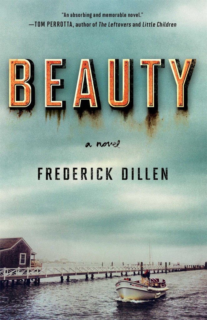
Beauty by Frederick Dillen; design by Christopher Lin
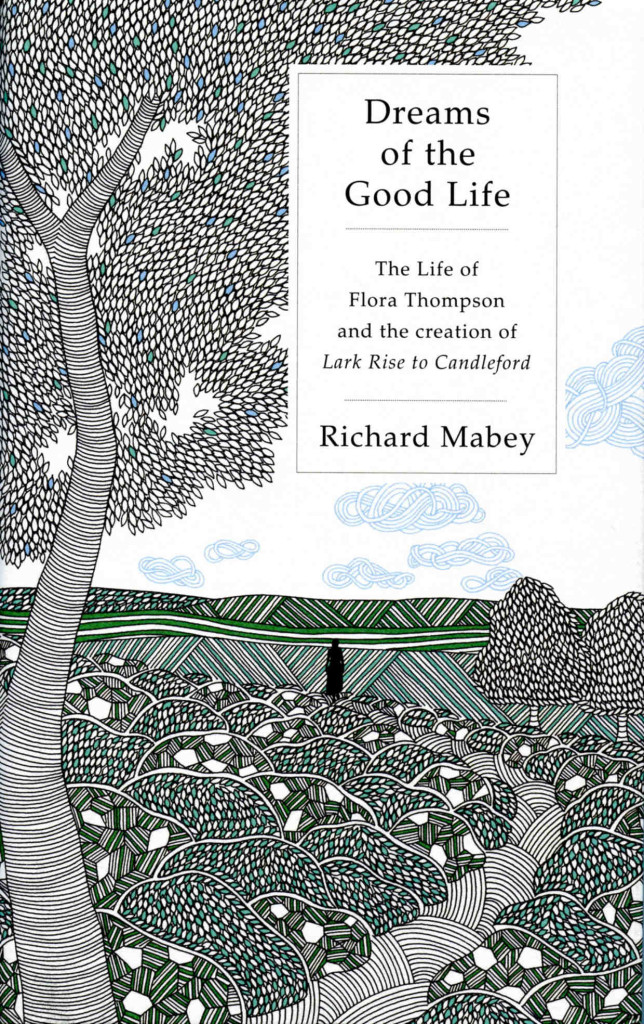
Dreams of the Good Life by Richard Mabey; illustration by Millie Marotta; design Samantha Johnson / Coralie Bickford-Smith
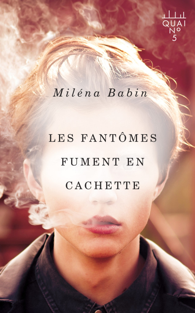
Les fantômes fument en cachette by Miléna Babin; design by David Drummond
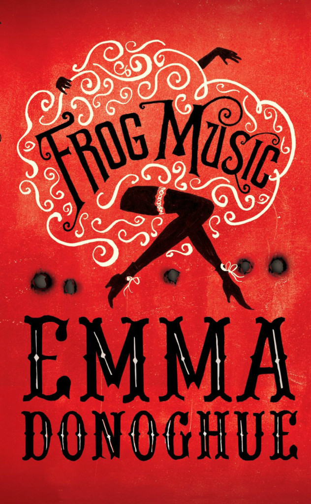
Frog Music by Emma Donoghue; design by Katie Tooke; illustration Emma Farrarons
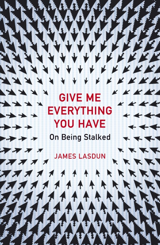
Give Me Everything You Have by James Lasdun; design by Julia Connolly
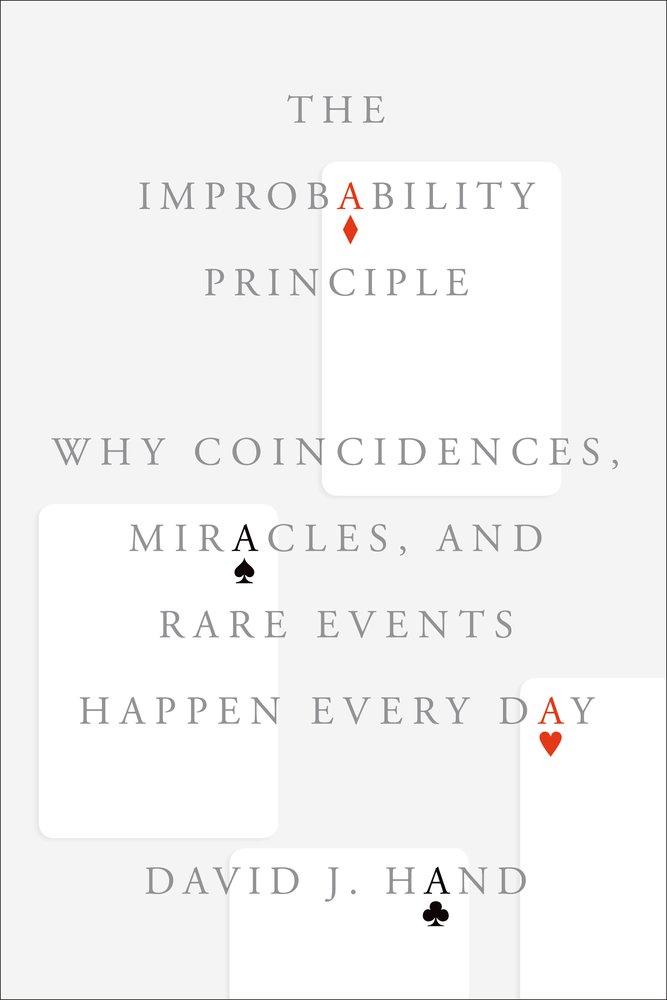
The Improbability Principle by David J. Hand; design by Oliver Munday
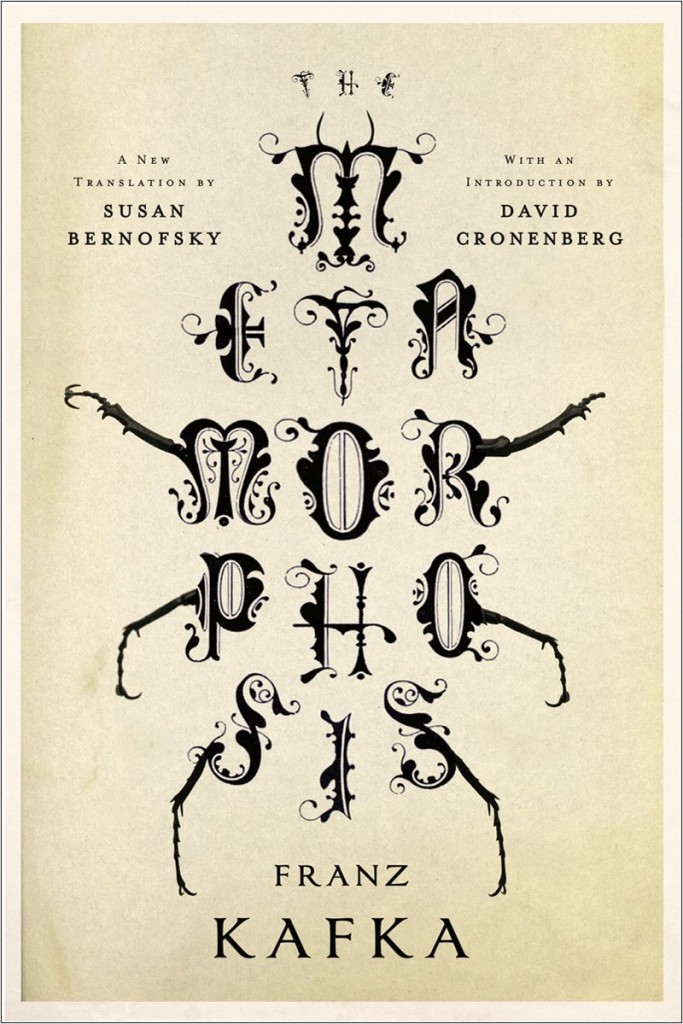
Metamorphosis by Franz Kafka; design by Jamie Keenan
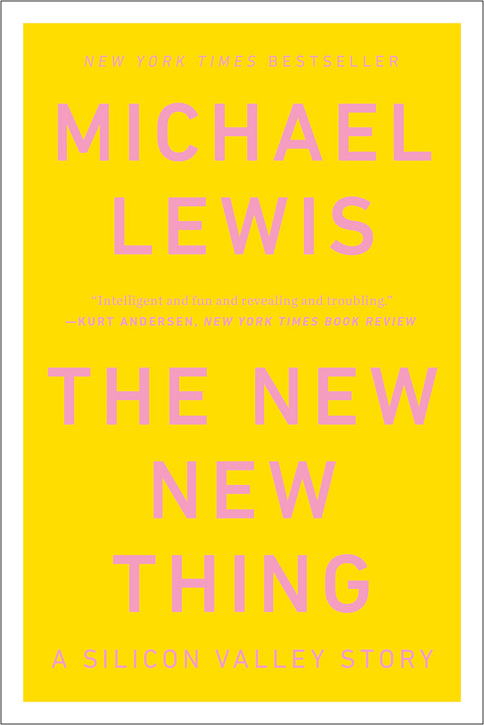
The New New Thing by Michael Lewis; design by Darren Haggar
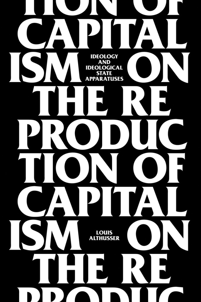
On the Reproduction of Capitalism by Louis Althusser; design by Neil Donnelly
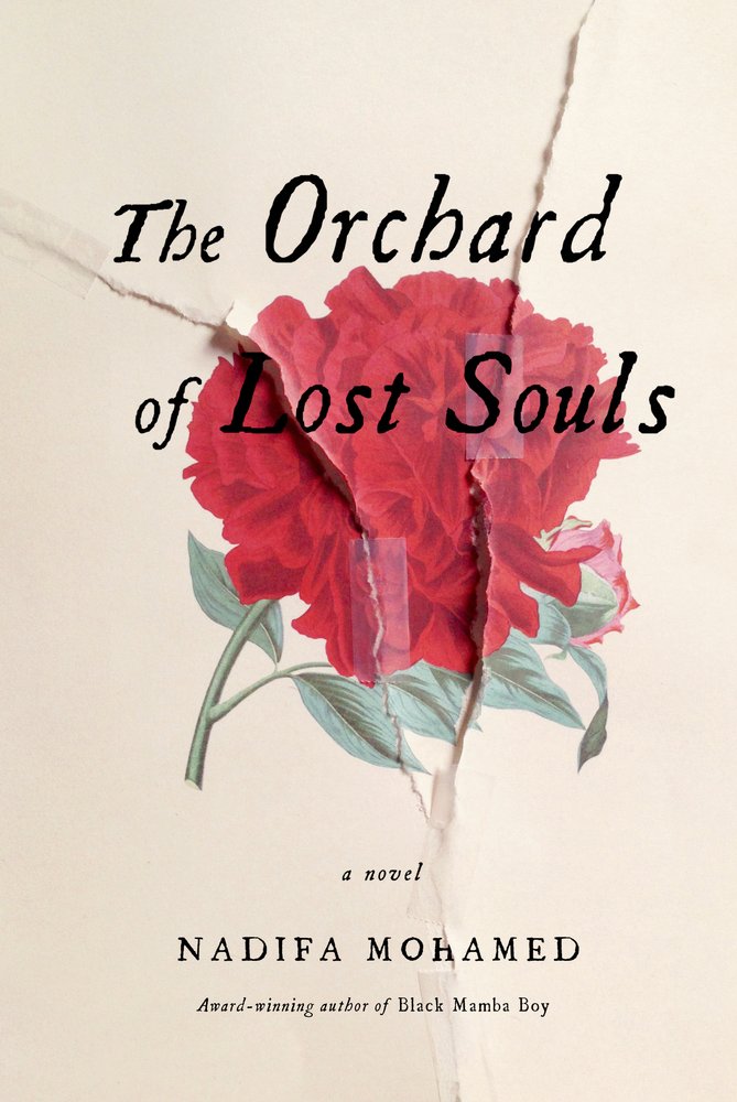
The Orchard of Lost Souls by Nadifa Mohamed; design by Gabriele Wilson
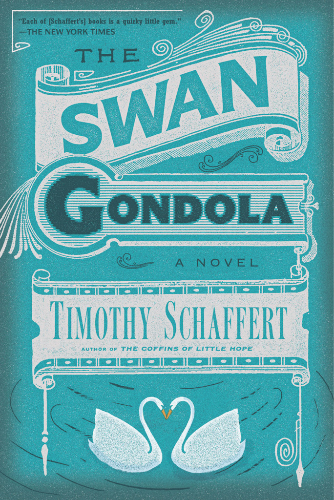
The Swan Gondola by Timothy Schaffert; design by Alex Merto
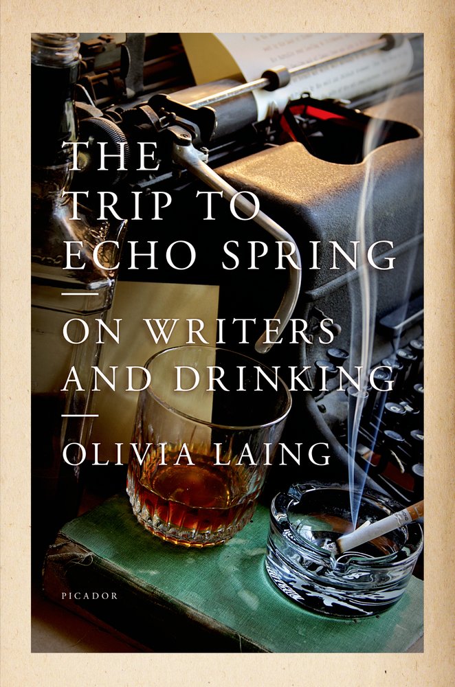
The Trip to Echo Spring by Oliva Laing; design by Henry Sene Yee
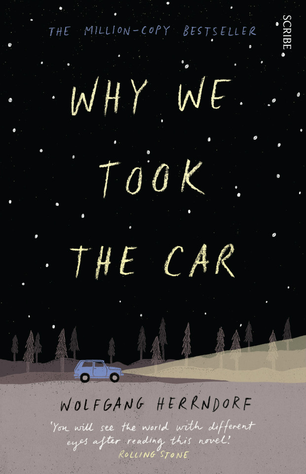
Why We Took the Car by Wolfgang Herrndorf; design by Allison Colpoys
 An interview with the talented Allison Colpoys, book designer at Penguin Books Australia, at The Design Files.
Particular Beasts — A brief interview with art director John Gall about teaching book design:
Each book is its own particular beast that has to be designed from the ground up. Every designer has their own way of looking at the problem and coming up with a solution. It can’t help but be personal on some level.

A Twist, Flourish or Quirk — Louise Fili and Steven Heller, authors of Scripts: Elegant Lettering from Design’s Golden Age, on script typefaces at Design Observer:
During the letterpress era [script typefaces] were in such great demand that many people “invented” them, and many others copied them. In some commercial printing shops, composing cases filled with scripts were stacked floor to ceiling to the exclusion of other type. Printers routinely amassed multiple styles of the heavy metal type fonts, each possessing a distinct twist, flourish or quirk, used to inject the hint of personality or dash of character to quotidian printed pieces… Scripts signaled propriety, suggested authority yet also exuded status and a bourgeois aesthetic. The wealthy classes couldn’t get enough fashionable scripts in their diet.
The Pilot Fish and The Whale — David Carr, media columnist at the New York Times, talks about the documentary Page One: Inside The New York Times with screenwriter Aaron Sorkin for Interview Magazine:
I think one of the things that Page One does an amazing job of demonstrating is the importance of editors. You can see our editor, Bruce Headlam, shaping, arguing, pushing back. Of course, that’s what you don’t have a lot of in the blogosphere. There is nobody pushing people to support what they’re saying, nobody arguing against the assumptions that are brought to the table…
Slow Journalism — An interview with cartoonist and journalist Joe Sacco (Footnotes in Gaza) for the A.V. Club:
[I]t’s one of the slowest art forms or media there is. You know, there’s fast food and there’s the slow food movement; I guess this is slow journalism. It just forces you into it. It’s difficult for me because I love being in the field, so to speak. I love that day-to-day thrill of being in places, and the great privilege of meeting people and going into their homes and seeing what their lives are like. I love that. But when you compare how much time is spent reporting to how much time is spent at a desk just writing and drawing, the reporting is a fraction. That’s just the way it is.
And finally…

Sing Out — Dorian Lynskey, author of 33 Revolutions per Minute, recommends five books about protest songs. The cover of 33 Revolutions per Minute was designed by Jacob Covey.