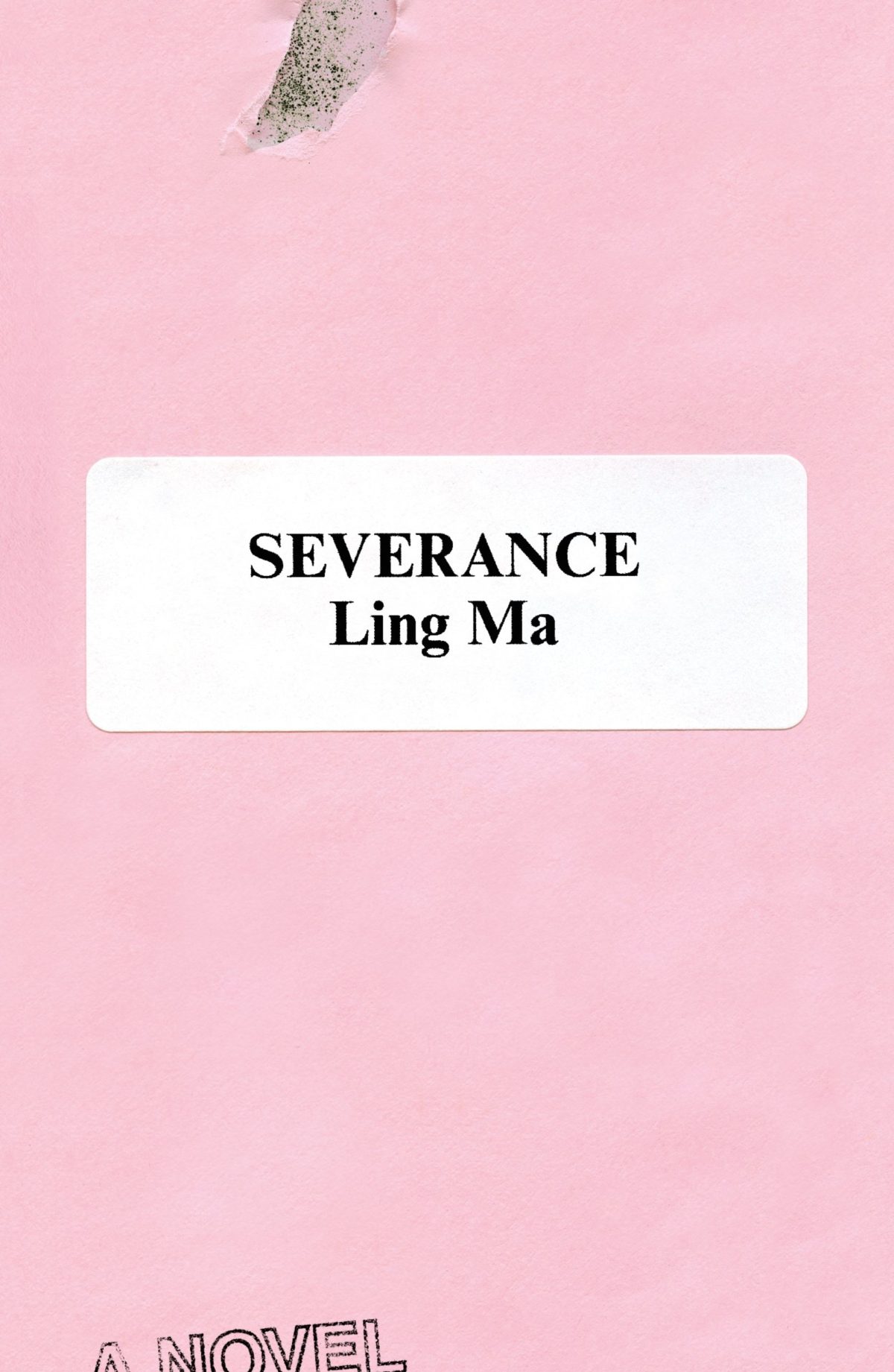
Rodrigo Corral also designed the cover of Ling Ma’s previous novel Severance.
Canción by Eduardo Halfon; design by Alban Fischer (Bellevue Literary Press / September 2022)
Drive by James Sallis; design by David Litman (Poisoned Pen Press / September 2022)
I was just talking about this book — how it is a near perfect thriller, but also great for dudes who don’t read a lot of fiction — so I was happy to see it’s been given a new lick of paint. And pink covers are, as I keep saying ad nauseam, a thing…
I’m including this because of the beautiful photo (with a colour palette remarkably on trend in 2022) and my inevitable teenage crush on indie style icon Miki from Lush.
Sacrificio by Ernesto Mestre-Reed; design by Dana Li (SoHo Press / September 2022)
This reminded me Peter Mendelsund‘s Amerika cover for Schocken back in the day. But, as is the norm around here, the two covers do not actually look that much alike side by side…
I’m doing my best to catch up a little bit this month, but there’s no such thing as a quiet month in publishing any more. Just rest assured nobody knows what they’re doing — we’re just here for the chaos and romance…
I’m even later than usual this month and everyoneelse posted their selections days ago, so you must really like book covers if you’re still jonesing for more! (And just a reminder: if you are in fact addicted to book covers and don’t want to miss any new posts, you can get them automatically sent to your inbox now. It’s not a newsletter, just magical RSS. But subscribing will confirm that you have a problem and should seek help!)
A bit of a Saul Bass / Hitchcock thing happening at the moment…? (The cover of the Faber edition of The Premonitions Bureau by Sam Knight was designed by Jack Smyth)
“Today is wretched and plain. And it is not the bottom, as many people may feel it is. It will get worse; we will go lower. As the Court’s dissent insists, correctly, ‘Closing our eyes to the suffering today’s decision will impose will not make that suffering disappear.‘
And so, with all this laid out, ugly and incontrovertible, the task for those who are stunned by the baldness of the horror, paralyzed by the bleakness of the view, is to figure out how to move forward anyway.
Because while it is incumbent on us to digest the scope and breadth of the badness, it is equally our responsibility not to despair.
These two tasks are not at odds. They are irrevocably twined. As Dahlia Lithwick wondered just a few weeks ago, after the massacre in Uvalde, another clear and awful day: ‘What does it mean, the opposing imperative of honoring the feeling of being shattered, while gathering up whatever is left to work harder?’
It means doing the thing that people have always done on the arduous path to greater justice: Find the way to hope, not as feel-good anesthetic but as tactical necessity.“
Rebecca Traister, ‘The Necessity of Hope’, The Cut
For my art history friends, I believe the painting is “Agnus Dei” by Spanish Baroque artist Francisco de Zurbarán.
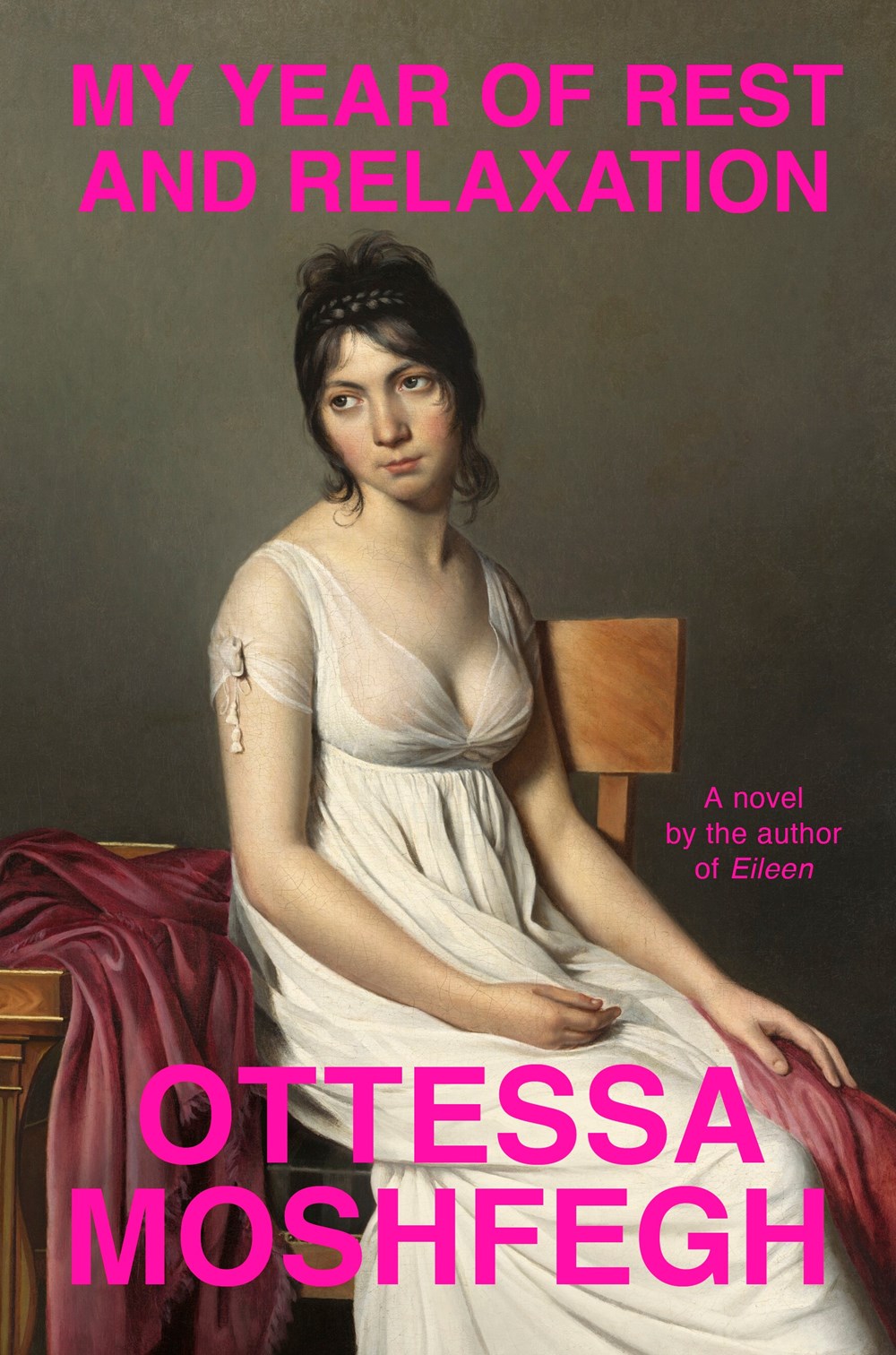
IIRC the cover of Moshfegh’s novel My Year of Rest and Relaxation was designed by Darren Haggar. The painting is by French Neoclassical artist Jacques-Louis David.
Malika Favre also designed and illustrated the cover of Playing with Matches by Michael Faudet, published by Andrews McMeel at the end of last year, and featured in this month’s ‘Book Covers We Love‘ post at Spine Magazine.
You know, I started 2022 with such good intentions and yet here we are again at the end of January on a paved road to hell. At least there are some lovely book covers to look at this month. Sigh.
Print Magazine did a piece last year on Amistad Books’ repackaging of Zora Neale Hurston’s work. I’ve featured a couple of the covers here in the past too.
Earlier this year, a Canadian magazine asked me what the latest trends in book cover design were. I don’t think I had a very satisfactory answer. 2021 felt very much like a continuation of 2020, which itself felt like a year on hold.
The trends that came to mind were not exactly new. In no particular order: big faces (big sunglasses!); cropped faces; hands; mouths; postmodern typefaces;1 big skies; rainbows; gradients; the colour orange; psychedelia; collage; contemporary painting.
A lot was made of “blob” covers this year. I’m not sure that anything has really changed since Vulture published this article about “blocky” covers in 2019. They seemed like much the same thing.
Design is about the constraints and, as it turns out, the constraints around designing commercial literary fiction covers that have to work just as well online as in bookstores can lead to similar design solutions — large, legible type, and bright, abstract backgrounds. 2 The surprising thing is not that a few covers look the same when you squint; it’s that more of them don’t.
There were a lot of good covers (that didn’t look alike) in 2021. LitHub posted 101 of them. Still, it didn’t exactly feel like a vintage year.
Do I say that every December? Possibly.
A few years ago I worried that covers were moving in a more conservative direction, particularly at the big publishers. I’m not sure this has come to pass, at least not in the US. There are plenty of covers from the big, prestigious American literary imprints in this year’s list, as there were last year, and every year before that.
There are fewer covers from the UK in this year’s list than in previous years though, and I feel less confident about the situation there. From a distance, things seem a little sedate. I may be mistaken. It’s quite possible I haven’t see enough covers — or perhaps enough of the right ones — from British publishers to get a good sense of the overall picture.3
It would not be a surprise, however, if publishers were feeling a little risk-averse at the moment. We are two years into a global pandemic, experiencing a major supply chain issues, and living through a seemingly endless series of sociopolitical crises.
Nor would it be a surprise if designers were personally feeling the effects too — I’m not sure we are talking about this enough, and I’m not sure I know how to.
Thank you to everyone who has supported the blog in 2021. It means a lot. Here are this year’s book covers of note…
Na Kim talked to PRINT about her career and the designs for the Ditlevsen series in February. If, like me, you were wondering about typeface on the covers, it’s Prophet from Dinamo apparently.
If you’re wondering about the Super-Seventies Sally Rooney typeface, it is Ronda designed by Herb Lubalin and Tom Carnese (I only know because I asked).
Thank you to everyone who has supported the blog in 2021. It means a lot.
I am not convinced that the term “postmodern” quite captures what I mean here (and/or worse, implies something different in the context of typography), but it’s the best I’ve got. I’m not talking about the kind of experimental typography you might associate with the likes of Wim Crouwel or Emigre, or the aesthetic of someone like David Carson. What I am trying to get at is idiosyncratic type that purposely exaggerates or plays with letterforms, and doesn’t conform to function-first modernism. To my mind, this would include some typefaces from the 1960s and 70s, as well as some more contemporary type. In a sense what I am describing is display faces — and I think the eclectic, innovative use of type in Victorian advertising might be an inspiration to designers here — but I don’t think it is just about size. ↩
A big, messy post this month as I catch up on the new releases and some of the covers I missed over the summer. I expect the next couple of month’s might be a bit like this as I work towards my round-up of the year, so feel free to let me know about stuff that you think I’ve overlooked in 2021.
For some reason, I was reminded of this saucy Jacob Covey cover, which I thought was killed in favour of something more (ahem) traditional, but it still exists on Amazon, so who knows? (Jacob probably knows; I do not).
I believe this cover was originally used in the UK last year for the Daunt Books edition, but I missed it. Open Letter are publishing the book in the US and Canada this month, so that’s as good as an excuse as any to post the cover now.
A bit of a bumper post this month with a ton great covers, lots of old friends, a couple of designers that are new to me, and maybe an early contender (or two) for the ‘best of the year’ list.
I haven’t posted enough of David’s covers lately. They are always fun. I was struggling to think what this one reminded me of. I’m wondering if it’s maybe Raymond Hawkey’s black and white cover designs for Len Deighton? Or something from Pelican / Penguin in the 1970s?
Come On Up by Jordi Nopca; design by Roman Muradov (Bellevue Literary Press / February 2021)
The cover of the UK edition, published this month by Bloomsbury, was designed by Greg Heinimann.
Rachel Willey’s design for Patricia Lockwood’s memoir Priestdaddy is still one of my favourite covers of recent years (hard to believe it is from 2017!).
O by Steven Carroll; design by Gray318 (HarperCollins Australia / February 2021)
What would you call this background colour? Light brown? Dark beige? Anyway, it seems to be a thing. We could probably include As You Were cover here too, although it doesn’t have the red-orange accent colour.
The Witch’s Heart by Genevieve Gornichec; design by Adam Auerbach (Ace Books / February 2021)
2019 has felt interminable. It has also felt like there are never enough hours in the day to keep up. You can’t talk to me about TV shows or movies. I haven’t seen any.
When it comes to books, I’m fortunate enough to work in the industry. But what hope do casual readers have of finding the good stuff when the same few titles dominate the conversation and there is so much else competing for their attention?
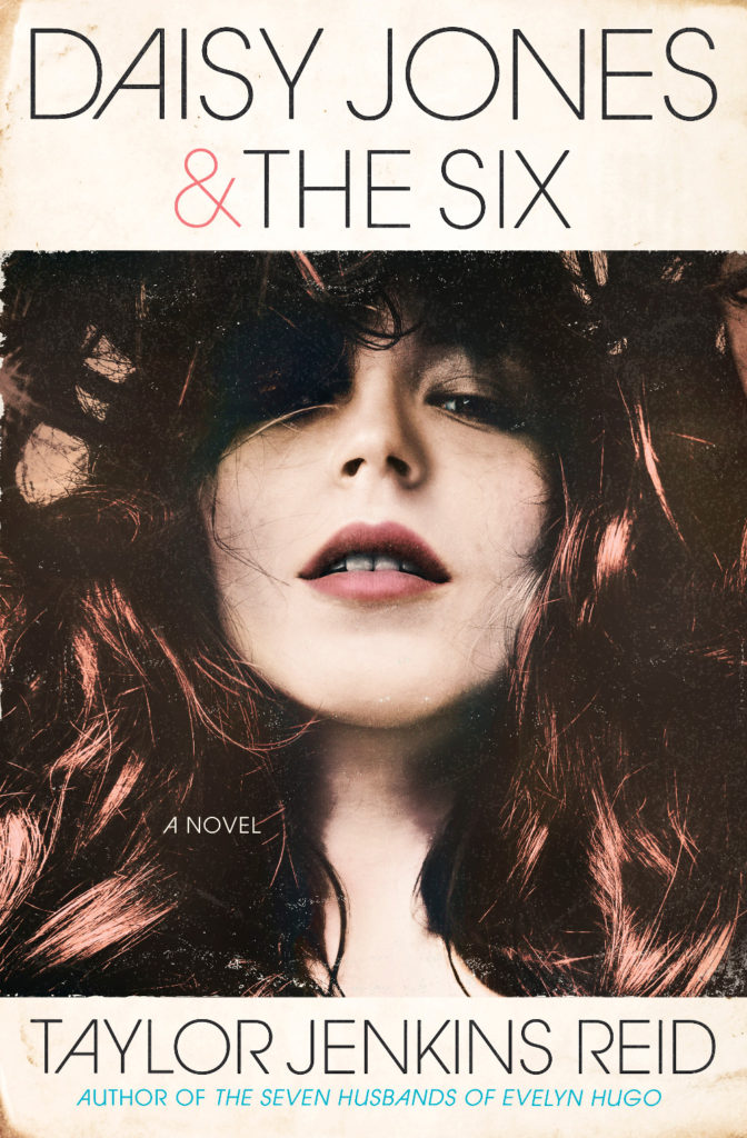
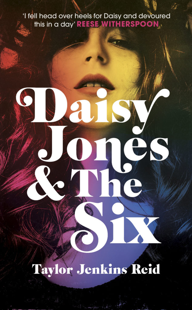
Daisy Jones and The Six by Taylor Jenkins Reid; design by Caroline Teagle Johnson (Ballantine / March 2019) Daisy Jones and The Six by Taylor Jenkins Reid; design by Lauren Wakefield (Hutchinson / March 2019)
Daisy Jones and the Six had a glamorous, louche 1970s look. The US and UK editions, designed by Caroline Teagle Johnson and Lauren Wakefield respectively, took slightly different directions with the type, but the photograph (a stock image apparently) felt ideally suited to social media.
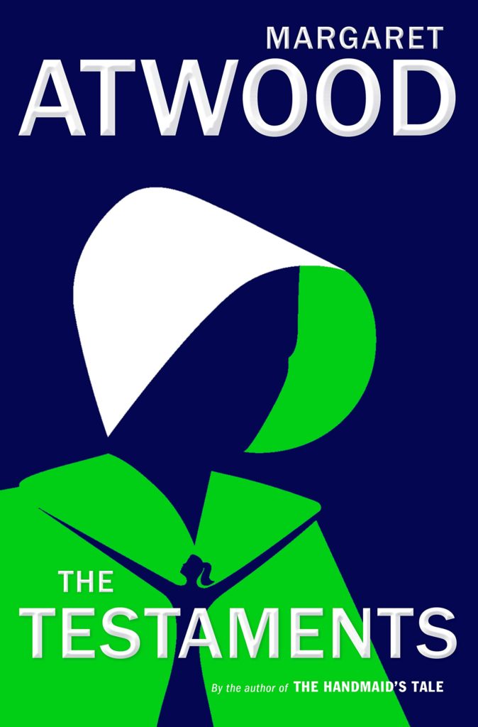
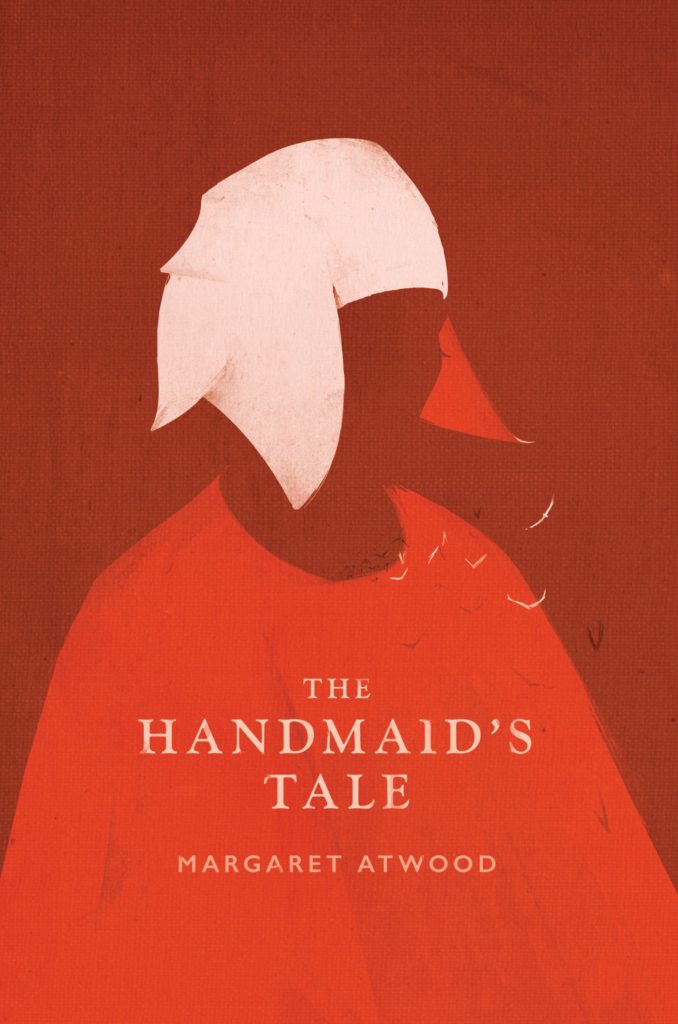
The Testaments by Margaret Atwood; design by Noma Bar (Chatto & Windus / September 2019)The Handmaid’s Tale by Margaret Atwood; art direction by Christopher Moisan; illustration by Patrik Svensson (Houghton Mifflin Harcourt / April 2017)
The Testaments was everywhere and, like the recent Vintage Classics reissue of The Handmaid’s Tale, the cover illustration was unmistakably by Noma Bar. We live in an age where every cult movie and TV show gets a ‘minimalist’ poster now, and I found that The Testaments looked too familiar for me to find it engaging. It didn’t help that the cover of the 2017 US reissue of the The Handmaid’s Tale by Swedish illustrator by Patrik Svenson had already featured a similar 3/4s silhouette. Nevertheless, it was perhaps a bolder cover choice than I’m giving it credit for. If nothing else, it showed that bright green on book covers — once cursed and reviled — is suddenly all the rage!
In terms of trends, 2019 felt more like a continuation of previous years rather than a break with the past. There was a kind of conservatism to a lot of the covers I saw. My sense was that highly polished designs that looked comfortingly familiar were being approved over riskier ones that stood out from the crowd. The most interesting covers often came from small publishers, especially New Directions who seem to be giving a bit more creative license to the designers they work with (some of whom have 9-5s at much bigger publishers!).
Big centred blocks of utilitarian white type over elaborate backgrounds continued to be a mainstay. It’s the book cover as poster, and it works at any size, so I don’t think it’s going away any time soon.
Handwriting and hand-lettering remained popular too, although my sense is that enthusiasm is starting to wane as publishers are opting for greater legibility and designers are turning back to vintage type styles to give a sense of authenticity and craft. (I’m willing to admit the evidence might not back me up on this, however!)
Fun, swishy 1970s-inspired serifs like Benguiat Caslon revival Cabernet are back. People keep trying to make ITC Avant Garde — another iconic 1970s typeface — happen again too. I don’t think it works for the most part, but I can see why designers think it’s cool in a coked-up New York way. Warren Chappell’s earnest calligraphic sans serif Lydian, originally released in 1938, continued its unlikely rise as a go-to literary typeface. It even got an explainer at Vox.
Black and white portrait photography has been the staple of biographies and classics for years, so it was interesting to see closely cropped black and white photographs used on the covers of a couple of new literary novels this year. This isn’t entirely new obviously. Black and white photography has long been used to signify that something is “art” (as opposed to, say, “pornography”). But I think the latest iteration of trend was started by Cardon Webb‘s 2015 cover for A Little Life by Hanya Yanagihara which used a black and white photograph by the late Peter Hujar.
Coincidentally the cover of the US edition of Garth Greenwell’s new novel Cleanness, publishing early 2020, was designed by Thomas Colligan and uses contemporary black and white photograph by Jack Davison. (The UK edition, designed by Ami Smithson fits this trend a little less neatly, but features black and white photograph by Mark McKnight)
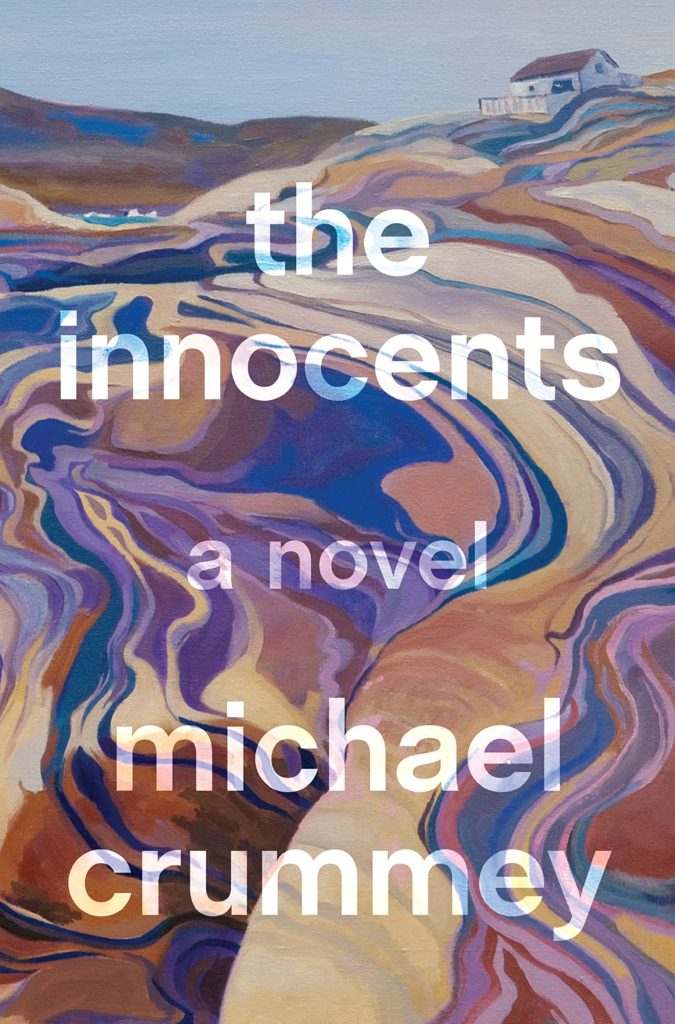
Something that I didn’t anticipate was the use of contemporary landscape and figure painting on the covers of some the big literary releases of the year. Like black and white photography, it felt almost pre-digital — a grasp at traditional values of craft. I don’t know if I would go as far as to say it is a rejection of post-modernism. But maybe it is? I don’t know. Discuss amongst yourselves.
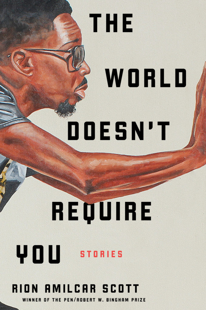
The Innocents by Michael Crummey; design by Emily Mahon; art by Diana Dabinett (Doubleday / August 2019)The World Doesn’t Require You by Rion Amilcar Scott; design by Laywan Kwan; art by Fahamu Pecou (Liveright / August 2019)Inland by Téa Obrecht; design by Jaya Miceli; art by Tamara Ruiz (Random House / August 2019)
Thank you to all the designers and art directors who’ve been in touch and helped me identify covers for my posts. I’m sorry if I haven’t replied to your message. It’s been a year.
Aug 9 — Fog by Kathryn Scanlan; design by Na Kim (Farrar Straus & Giroux MCD / June 2019)
Also designed by Na Kim:
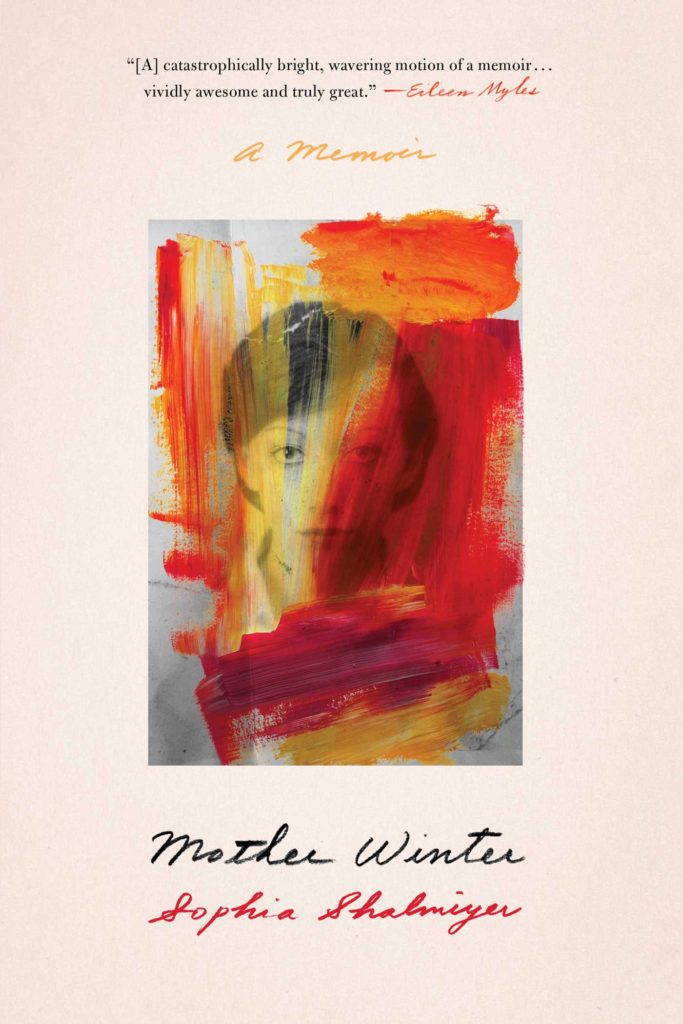
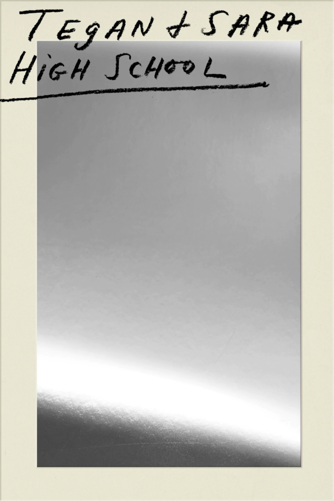
Lie With Me by Philippe Besson; design by Na Kim (Scribner / April 2019)Mother Winter by Sophia Shalmiyev; design by Na Kim (Simon & Schuster / February 2019) High School by Tegan & Sara; design by Na Kim (MCD / September 2019)
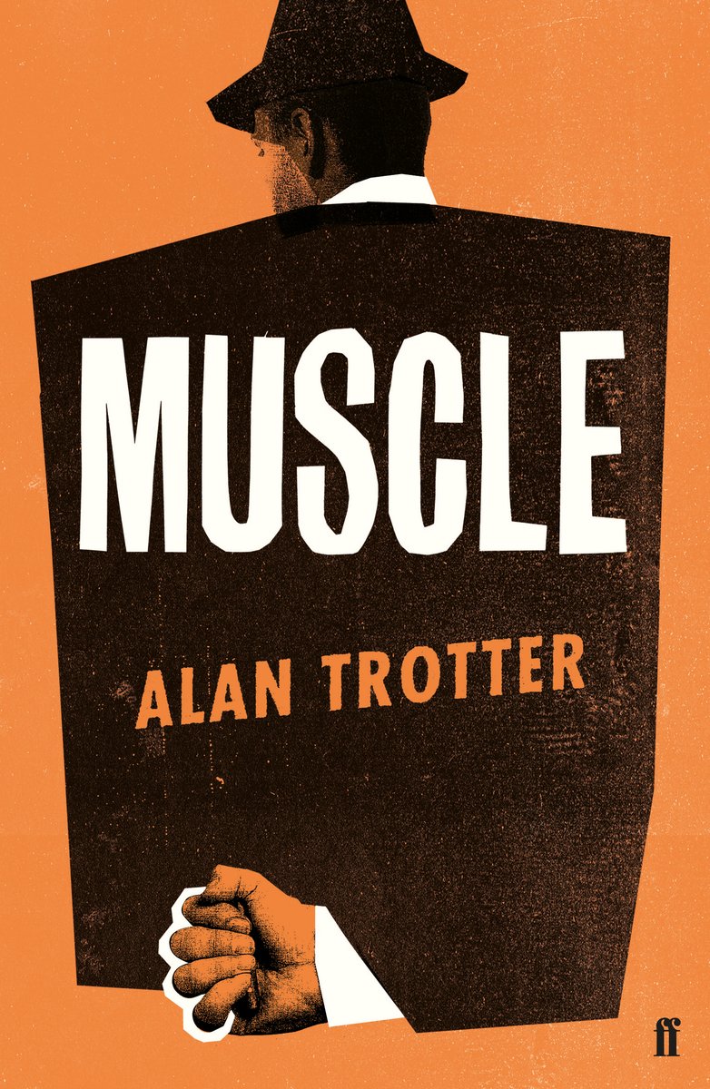
Muscle by Alan Trotter; design by Gray318 (Faber & Faber / February 2019)
Also designed by Gray318:
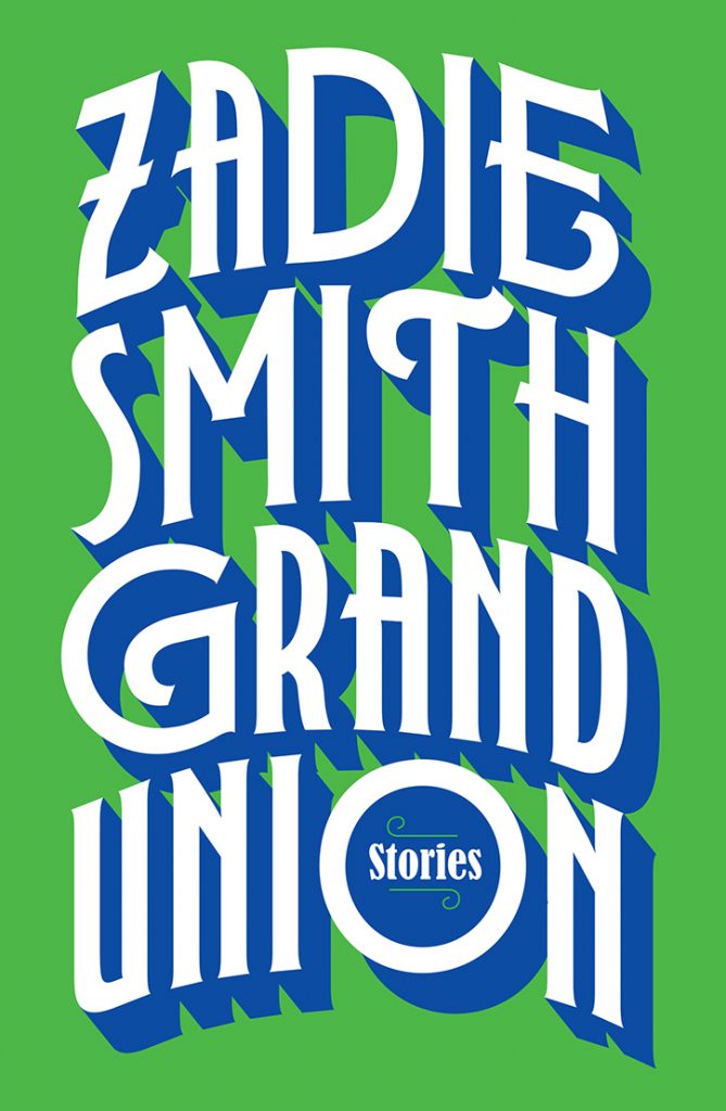
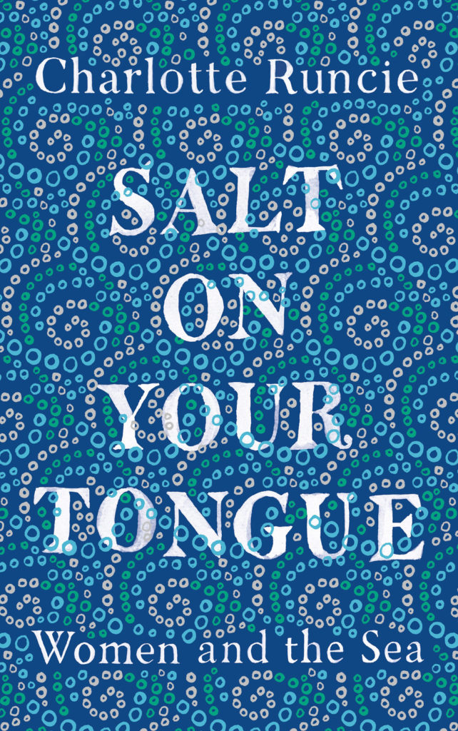
Quichotte by Salman Rushdie; design by Gray318 (Jonathan Cape / August 2019) Grand Union by Zadie Smith; design by Gray318 (Hamish Hamilton / October 2019)Salt On Your Tongue by Charlotte Runcie; design by Gray318 (Canongate / January 2019)
What We Really Do All Day by Jonathan Gershuny and Oriel Sullivan; design Matthew Young (Pelican / September 2019)Artificial Intelligence by Melanie Mithcell; design by Matthew Young (Pelican / October 2019)
One Day by Gene Weingarten; design by David Litman (Blue Rider / October 2019)
Oliver Munday wrote about designing the cover for New Directions at Literary Hub earlier this year.
He also designed a lot my favourite covers this year…
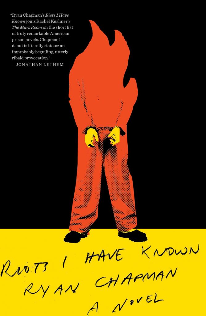
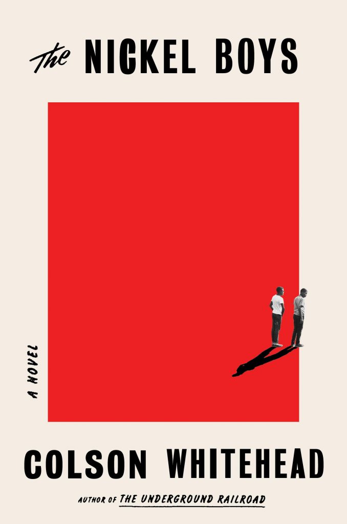
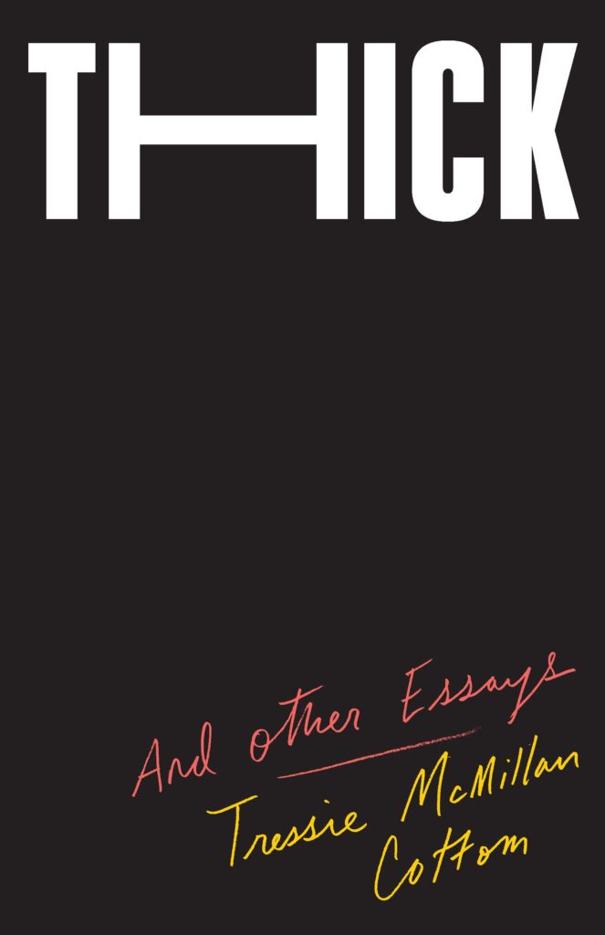
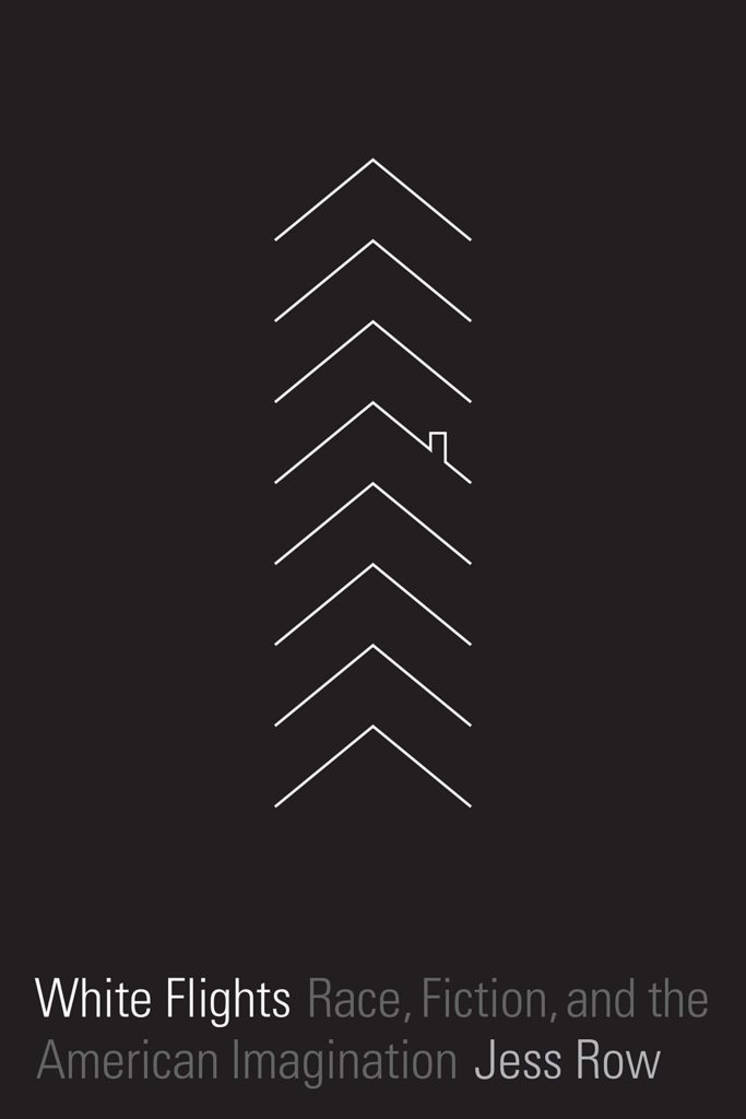
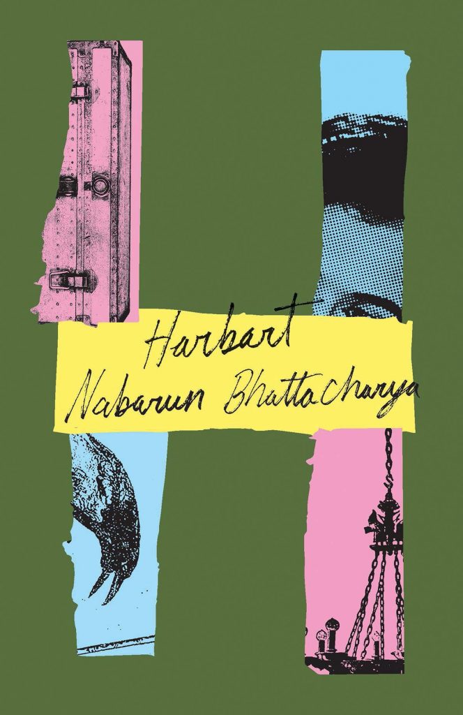
Riots I Have Known by Ryan Chapman; design by Oliver Munday (Simon & Schuster / May 2019)The Nickel Boys by Colson Whitehead; design by Oliver Munday (Doubleday / July 2019)Thick by Tressie McMillan Cotton; design by Oliver Munday (The New Press / January 2019)White Flights by Jess Row; design by Oliver Munday (Graywolf / August 2019) Harbart by Nabarun Bhattacharya; design by Oliver Munday (New Directions / June 2019)
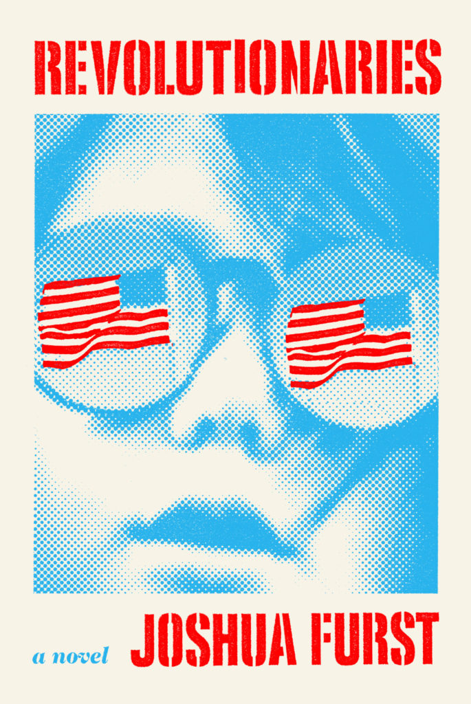
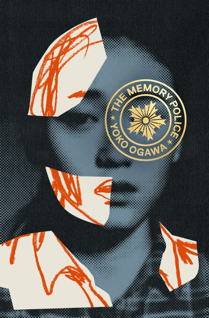
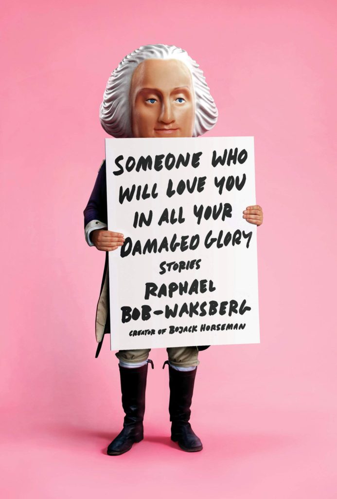
The Revolutionaries by Joshua Furst; design by Tyler Comrie (Knopf / April 2019)The Memory Police by Yoko Ogawa; design by Tyler Comrie (Pantheon / August 2019)Someone Who Will Love You in All Your Damaged Glory by Raphael Bob-Waksberg; design by Tyler Comrie; illustration Justin Metz (Knopf / June)
The Volunteer by Salvatore Scibona; design by Rachel Willey (Penguin / March 2019)
Also designed by Rachel Willey:
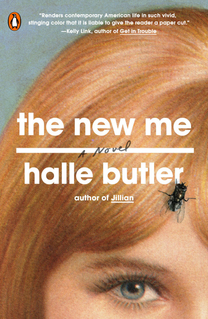
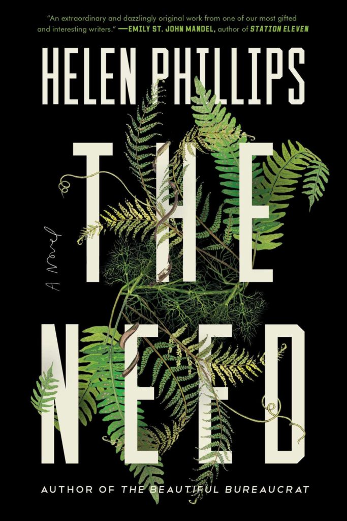
The New Me by Halle Butler; design by Rachel Willey (Penguin / March 2019) The Need by Helen Phillips; design Rachel Willey (Simon & Schuster / July 2019)


