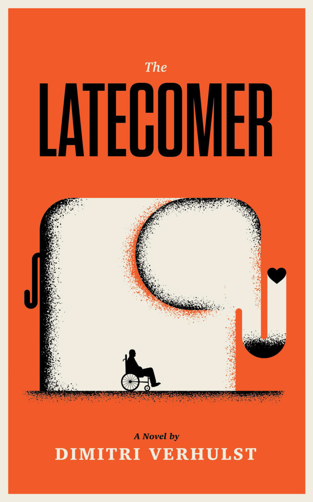
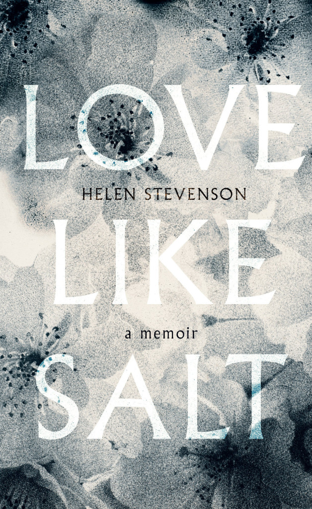
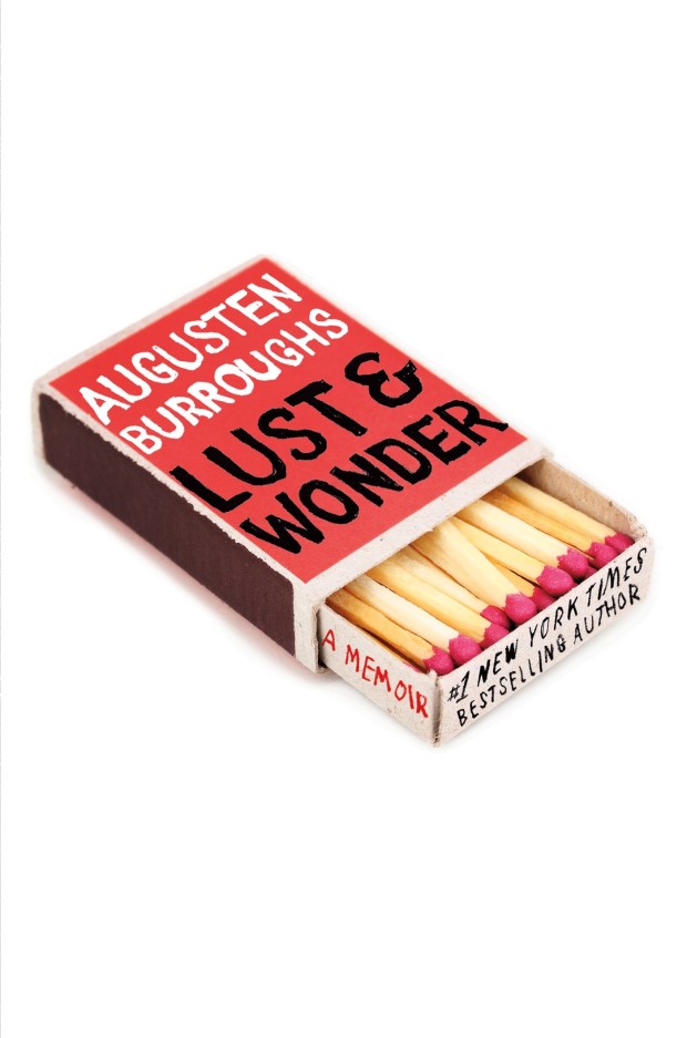
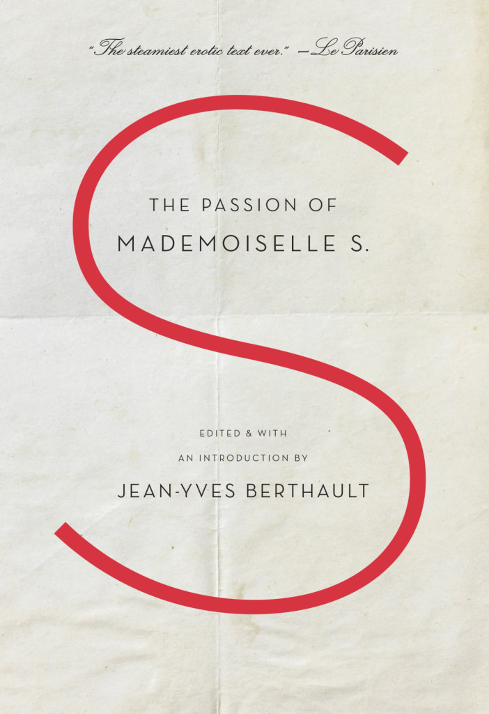
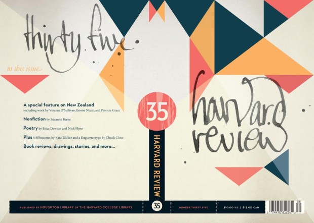
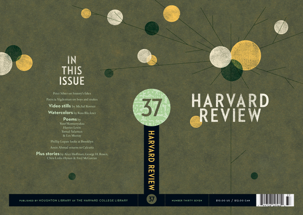
Even though I first noticed the chunky Eisner-esque cover design for Douglas Wolk’s Reading Comics at The Book Design Review, it wasn’t until much, much later — when Ben Pieratt posted about the elegant redesign of The Harvard Review at The Book Cover Archive blog back in June — that I registered that it was the work of designer Alex Camlin.
Both Reading Comics and The Harvard Review demonstrate Alex’s incredible attention to typography, his range of his influences, and the amazing diversity of his portfolio. Currently Creative Director for Da Capo Press, I caught with Alex via email earlier this month.
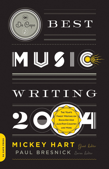
Briefly, could you tell me about Da Capo Press?
By most accounts, Da Capo started as a New York based trade paperback reprint house in 1975. At the time, many mid-to-large-sized publishers licensed paperback rights to reprint operations, rather than publishing their own paperbacks. In the beginning, Da Capo focused on licensing nonfiction, concentrating on music (jazz and blues/roots mostly), military history, and biographies. This continued through the late 90s, until Da Capo was purchased by the Perseus Books Group, who added the imprint to a growing portfolio that included Basic Books, Public Affairs and Running Press, among others. Da Capo was relocated to Cambridge, Massachusetts in 1999 to set up shop alongside another member of the Perseus group, the former trade division of Addison Wesley, renamed Perseus Publishing. Since then, Da Capo has evolved to publish its front list in hardcover and paperback originals, in many more categories. In the process, we managed to spin off a sister imprint—Lifelong Books—with a list focused on self help, childbirth, parenting, cooking, nutrition, and relationships. My first day on the job was also Da Capo’s first day in Cambridge, and we’ve been hacking away ever since on a shadowy fringe of the MIT campus. It will be 10 years in September!
How would you describe the role of Creative Director?
I’m basically just a glorified art director. My ‘staff’ has taken different forms over the years. Currently, it’s myself and one in-house art director who handle the entire list by either collaborating with freelance designers/photographers/illustrators, or engaging in some good old-fashioned DIY.

Approximately how many titles do you work on a season?
50-60 titles per season has been the norm for a while now. We publish two lists per year, Spring and Fall. Due to the changing market and current economic climate (stop me if you’ve heard this one before) our list is down-sizing a bit, and we will be closer to 90 titles per year by next Fall.

What are your favourites to work on?
I really enjoy working on books that are a bit off-beat or quirky. Recently, I’ve worked covers for a Karaoke memoir, a history of jetpacks, and a fake autobiography of Steve Jobs. I find that the books with moderate-to-low sales expectations (usually due to their niche subject matter) are the best to work on. Very few people bother to deconstruct what I’ve done, and the off-beat content usually leads to some interesting visuals.
What are the most challenging?
Believe it or not, it’s the parenting, pregnancy, and self-help books. Visually, these categories are so narrowly defined that it’s a real struggle to develop a unique look for a cover. Plus, the editors and authors who are publishing in these categories tend to favour literal interpretations, which can be quite limiting. So you will rarely ever see any of these in my portfolio, because the goal is usually to make them look the same as—but different than—all of the other books on the same subject. One up-side is that I’m intimately familiar with the range of pregnant-lady stock art that’s currently available, so if anyone out there needs some, just let me know!
How are final covers decided upon at Da Capo?
Initial comps are shown to and discussed by a ‘committee’ comprised of the publisher, marketing director, the book’s editor, and myself. We meet as needed, with greater frequency as the catalogue deadline approaches. I try to address all major concerns and present as many revisions as possible before the catalogue is printed. Covers are finalized somewhere between their appearance in the catalogue and their press date, after we field the reactions of the authors, our sales force and—in some cases—booksellers. Our overall process is probably a bit less formalized compared to other publishers.

Could you describe the design process for the Winnie and Wolf cover for Picador?
A.N. Wilson’s Winnie and Wolf is a historical fiction based on a relationship between Adolf Hitler and Winifred Wagner, the heiress of composer Richard Wagner. Their real-life friendship is well-documented, but the book builds on this to imagine a complicated love affair with Hitler’s rise to power and eventual demise as a backdrop. The themes of Wagner’s operas—primarily Parsifal—are referenced, and echo throughout the book. Picador wanted a new cover for their paperback edition, and I was hired by (the eminent and talented) Henry Yee to work on it. I knew immediately that the novel’s quirky-but-dark premise plus historical setting would offer a good range of possible imagery. I submitted four comps:
COMP 1: The first was my take on an interwar-era German poster, using a photograph of Winifred Wagner as the basis for the illustration. My only reasoning for this direction was that it sort of placed “Winnie” on a pedestal, which the narrator seems to do throughout the entire book. Mostly, it was just fun to create.
 A series of propaganda photographs, by Adolf Hitler’s personal photographer, of the German dictator meeting ordinary Germans in 1932 and 1933 – around the time he came to power. (Photo by Heinrich Hoffmann/Hulton Archive/Getty Images)
COMP 2: I was ambivalent about this direction, mostly because I really wanted to avoid using Hitler’s image on the cover. The beautiful ornamental border comes from the cover to a playbill for a performance of Wagner’s Parsifal. The photograph is a piece of Nazi propaganda which is somewhere between symbolic and metaphoric representation of the love affair (the normally fierce and confident Winnie is observed as being girlish and entranced in the presence of Hitler). It also doubles as a literal representation of a scene near the end of the book. Ultimately, this direction was chosen for the final cover. I made a few adjustments and re-drew the title type for the final version. The photo was a black-and-white image which I tinted using some hand-tinted photos from an old Nazi book as a color guide.
COMP 3: I loved this one, mostly because of the way the illustration (a detail from an interwar-era festival poster) worked with the title. Also, in the book, Hitler is known to the Wagner children as “Uncle Wolf”, and spends a lot of time telling fairy tales and staging puppet shows for them. With the design, I was shooting for the look of a German children’s book from the 30s. Both direction and comp #1 were influenced by posters and other design featured in a great exhibition I saw several years ago at the RISD museum: Graphic Design In Germany 1890-1945, curated by Jeremy Aynsley.
COMP 4: The art depicts a scene in Wagner’s The Twilight of the Gods from a group of fantastic children’s book illustrations by Arthur Rackham. I thought that several themes from the book could be interpreted in this.

In the end, I was happy with comp #2 being selected. I guess it has the best of both worlds: fanciful Wagnerian themes—that are true to the story, coupled with Nazis—that sell books.

How did you become involved in the redesign of the Harvard Review?
The Review’s editor, Christina Thompson, asked me to speak to a class she was teaching at Harvard back in 2000 or 2001. She had recently been appointed editor of the Review and was planning on repackaging it, and agreed to let me submit some ideas for the cover. I started designing the covers at that time, and we finally had the opportunity to reconsider the entire package (cover and text) last year, for issue #35. It was great timing, because #35 featured the work of Kara Walker and Chuck Close (in addition to the usual selection of great writers)—not bad company.


Do you see any recent trends in book design?
Blogs by book cover designers like David Drummond, Kimberly Glyder, Henry Yee and The Design Works Group offer insight into the thought processes and mechanics involved in cover design, and I think this sort of journal-keeping is really validating for the profession. As for visual trends, I’m really enjoying the resurgence of hand-lettering on covers that has been happening for a while now. There’s something very pure, expressive and organic in handmade letterforms that can somehow be infused with style and attitude, but also timeless.

Who else do you think is doing interesting work right now?
Peter Mendelsund, Julia Hasting, Paul Buckley. Gray318 always does great work. Charlotte Strick’s design for FSG’s paperback edition of 2666 raises a bar (if not the bar)—other publishers should take note. One of the most inspiring covers I have seen lately is Carol Carson’s design for My Father’s Tears by John Updike. Peter Mendelsund discusses it here. It is deceptively simple, beautiful and timeless. Carson seems to have made a point of designing all-type jackets recently, which I totally admire. There is a purist inside of me that believes ALL covers should be all-type.
Where do look for inspiration and who are some of your design heroes?
I read eye and baseline magazines regularly. The Book Cover Archive is also a great resource, it’s been fun watching it grow as a sort of visual database. As for design heroes: W. A. Dwiggins, Jan Tschichold, Alvin Lustig, Massin, Sister Corita Kent, Alexey Brodovitch, Virginia Lee Burton, Wim Crouwel, Buckminster Fuller, Karl Gerstner, Josef Albers, my mom…the list goes on, but that’s a good cross-section.
What does the future hold for book cover design?
I don’t know. For the most part, people have stopped asking me to “make sure the title can be read in that thumbnail image on Amazon”—probably because someone told them that a 3-D, 3G full-color latte-brewing Kindle is going to be the next big thing. Sadly, too many trade publishers—under pressure from mega-store retailers—are focused on ‘packaging’, and are largely concerned with making covers that fit a certain category, rather than those that offer true insight or interpretation of what’s between the covers. On the other hand, the industry is saturated with brilliant designers who flocked to publishing because of people like Chip Kidd, Louise Fili, John Gall, Paul Bacon, etc. This keeps the practice of cover design highly competitive, and we are all better because of the current standard. When you look at some of the amazing stuff that actually makes it to press in spite of the modern publishing process, it’s encouraging and quite inspirational and hints at a future full of possibilities.
Thanks Alex!
Next week: Coralie Bickford-Smith, Penguin Press