2019 has felt interminable. It has also felt like there are never enough hours in the day to keep up. You can’t talk to me about TV shows or movies. I haven’t seen any.
When it comes to books, I’m fortunate enough to work in the industry. But what hope do casual readers have of finding the good stuff when the same few titles dominate the conversation and there is so much else competing for their attention?
The Testaments by Margaret Atwood and Daisy Jones and the Six by Taylor Jenkins Reid were inescapable this year.
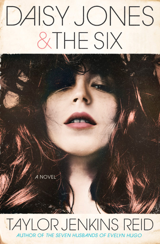
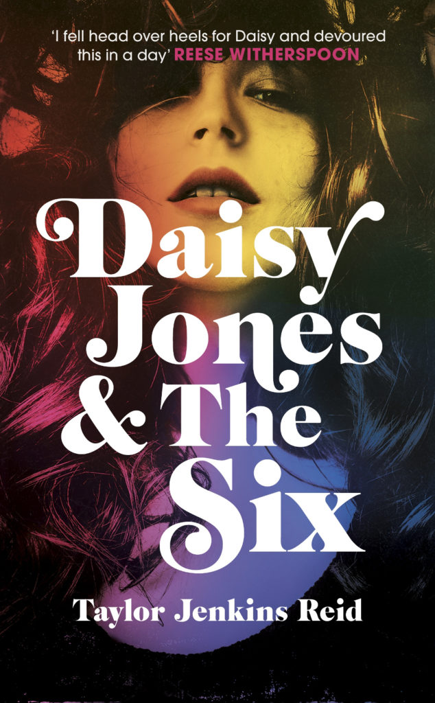
Daisy Jones and the Six had a glamorous, louche 1970s look. The US and UK editions, designed by Caroline Teagle Johnson and Lauren Wakefield respectively, took slightly different directions with the type, but the photograph (a stock image apparently) felt ideally suited to social media.
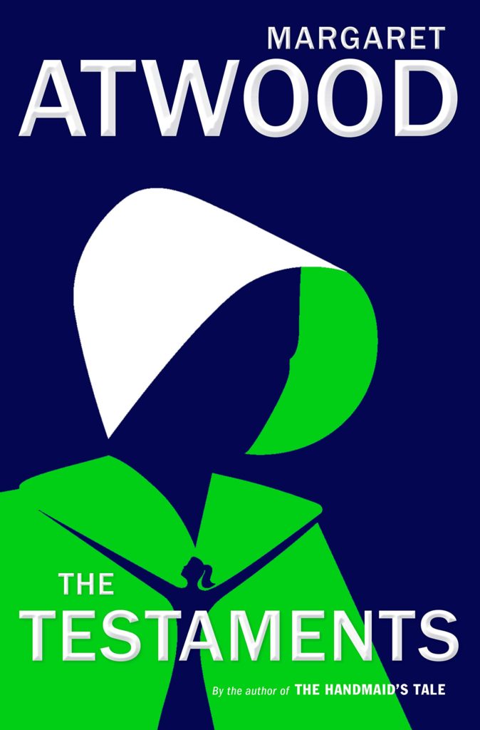
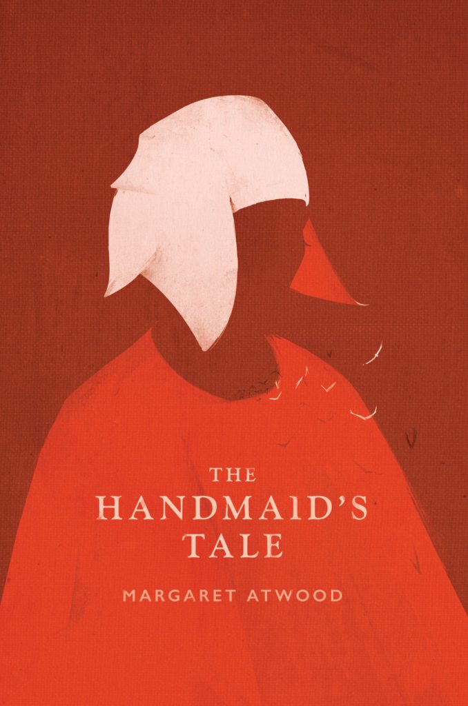
The Testaments was everywhere and, like the recent Vintage Classics reissue of The Handmaid’s Tale, the cover illustration was unmistakably by Noma Bar. We live in an age where every cult movie and TV show gets a ‘minimalist’ poster now, and I found that The Testaments looked too familiar for me to find it engaging. It didn’t help that the cover of the 2017 US reissue of the The Handmaid’s Tale by Swedish illustrator by Patrik Svenson had already featured a similar 3/4s silhouette. Nevertheless, it was perhaps a bolder cover choice than I’m giving it credit for. If nothing else, it showed that bright green on book covers — once cursed and reviled — is suddenly all the rage!
In terms of trends, 2019 felt more like a continuation of previous years rather than a break with the past. There was a kind of conservatism to a lot of the covers I saw. My sense was that highly polished designs that looked comfortingly familiar were being approved over riskier ones that stood out from the crowd. The most interesting covers often came from small publishers, especially New Directions who seem to be giving a bit more creative license to the designers they work with (some of whom have 9-5s at much bigger publishers!).
Big centred blocks of utilitarian white type over elaborate backgrounds continued to be a mainstay. It’s the book cover as poster, and it works at any size, so I don’t think it’s going away any time soon.
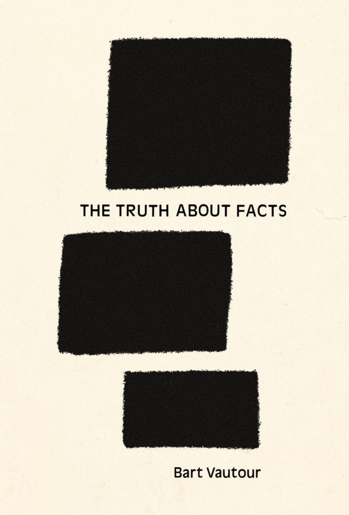
Handwriting and hand-lettering remained popular too, although my sense is that enthusiasm is starting to wane as publishers are opting for greater legibility and designers are turning back to vintage type styles to give a sense of authenticity and craft. (I’m willing to admit the evidence might not back me up on this, however!)
Fun, swishy 1970s-inspired serifs like Benguiat Caslon revival Cabernet are back. People keep trying to make ITC Avant Garde — another iconic 1970s typeface — happen again too. I don’t think it works for the most part, but I can see why designers think it’s cool in a coked-up New York way. Warren Chappell’s earnest calligraphic sans serif Lydian, originally released in 1938, continued its unlikely rise as a go-to literary typeface. It even got an explainer at Vox.


Black and white portrait photography has been the staple of biographies and classics for years, so it was interesting to see closely cropped black and white photographs used on the covers of a couple of new literary novels this year. This isn’t entirely new obviously. Black and white photography has long been used to signify that something is “art” (as opposed to, say, “pornography”). But I think the latest iteration of trend was started by Cardon Webb‘s 2015 cover for A Little Life by Hanya Yanagihara which used a black and white photograph by the late Peter Hujar.
Coincidentally the cover of the US edition of Garth Greenwell’s new novel Cleanness, publishing early 2020, was designed by Thomas Colligan and uses contemporary black and white photograph by Jack Davison. (The UK edition, designed by Ami Smithson fits this trend a little less neatly, but features black and white photograph by Mark McKnight)
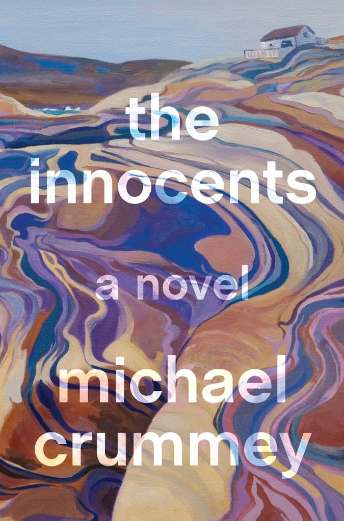
Something that I didn’t anticipate was the use of contemporary landscape and figure painting on the covers of some the big literary releases of the year. Like black and white photography, it felt almost pre-digital — a grasp at traditional values of craft. I don’t know if I would go as far as to say it is a rejection of post-modernism. But maybe it is? I don’t know. Discuss amongst yourselves.

Thank you to all the designers and art directors who’ve been in touch and helped me identify covers for my posts. I’m sorry if I haven’t replied to your message. It’s been a year.

The Affairs of the Falcóns by Melissa Rivero; design Allison Saltzman; lettering Boyoun Kim (Ecco / April 2019)
Also designed by Allison Saltzman:

All the Lives We Ever Lived by Katharine Smyth; design by Michael Morris (Crown / January 2019)

Aug 9 — Fog by Kathryn Scanlan; design by Na Kim (Farrar Straus & Giroux MCD / June 2019)
Also designed by Na Kim:

Baron Wenkheim’s Homecoming by László Krasznahorkai ; design by Paul Sahre (New Directions / September 2019)

Berta Isla by Javier Marías; design by Kelly Blair (Knopf / August 2019)
Also designed by Kelly Blair:

Big Bang by David Bowman; design by Jamie Keenan (Corsair / August 2019)

Black Leopard Red Wolf by Marlon James; design Helen Yentus; art by Pablo Gerardo Camacho (Riverhead / February 2019)

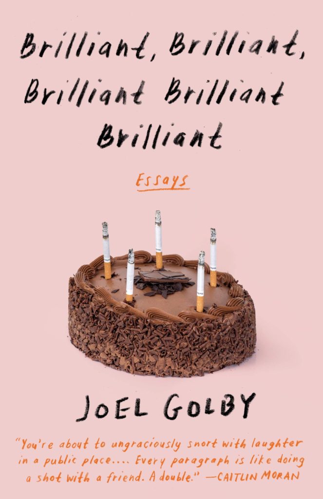
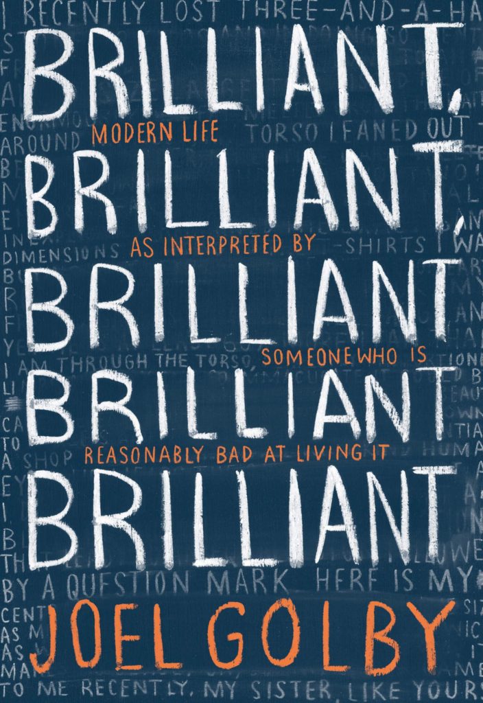
Brilliant, Brilliant, Brilliant Brilliant Brilliant by Joel Golby; design by Linda Huang (Anchor / March 2019)
The cover of the UK edition, published by HarperCollins imprint Mudlark in February, was designed by Bill Bragg and is also very good:

The Case Against Reality by Donald Hoffman; design by Sarahmay Wilkinson (W. W. Norton / August 2019)
Also designed by Sarahmay Wilkinson:

Categorically Famous by Guy Davidson; design by Michel Vrana (Stanford University Press / June 2019)
Also designed by Michel Vrana:

The Colonel’s Wife by Rosa Liksom; design by Kimberly Glyder (Graywolf / December 2019)
Also designed by Kimberly Glyder:

Dead Astronauts by Jeff Vandermeer; design Rodrigo Corral (MCD / December 2019)
Also designed by Rodrigo Corral:

Doxology by Nell Zink; design Jack Smyth (Fourth Estate / August 2019)

Drive Your Plow Over the Bones of the Dead by Olga Tokarczuk; design by Alex Merto (Riverhead / August 2019)

Driving in Cars with Homeless Men by Kate Wisel; design Catherine Casalino (University of Pittsburgh Press / October 2019)
Also designed by Catherine Casalino:

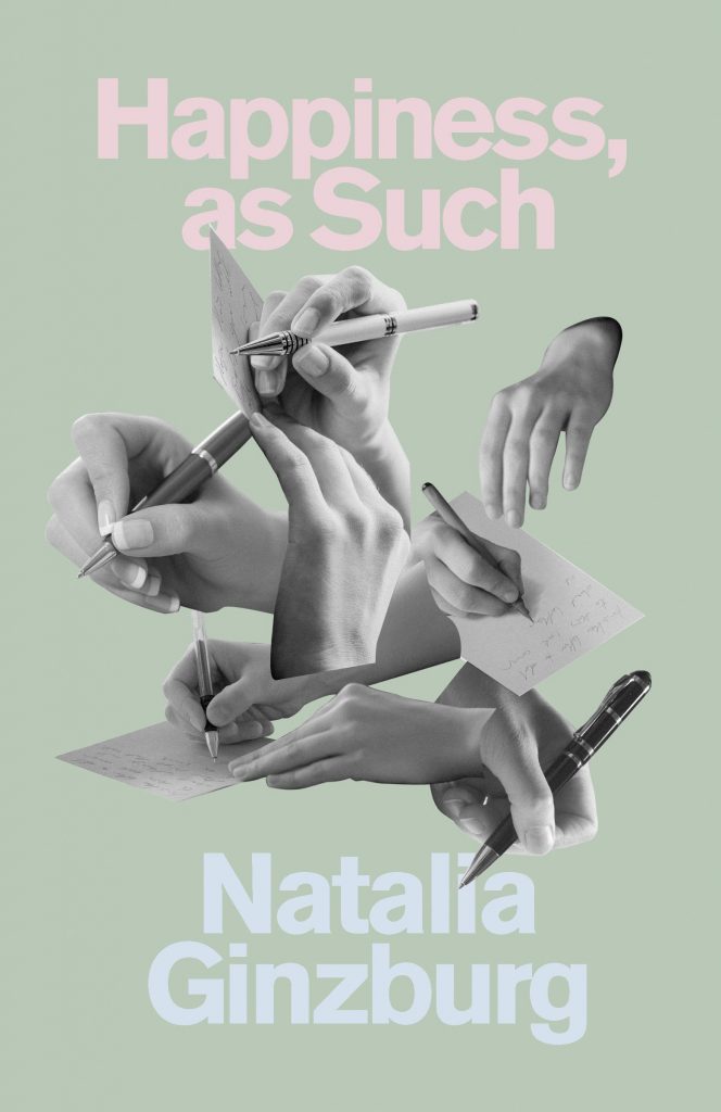
The Dry Heart by Natalia Ginzburg; design by Pablo Delcan (New Directions / July 2019)
Also designed by Pablo Delcan:
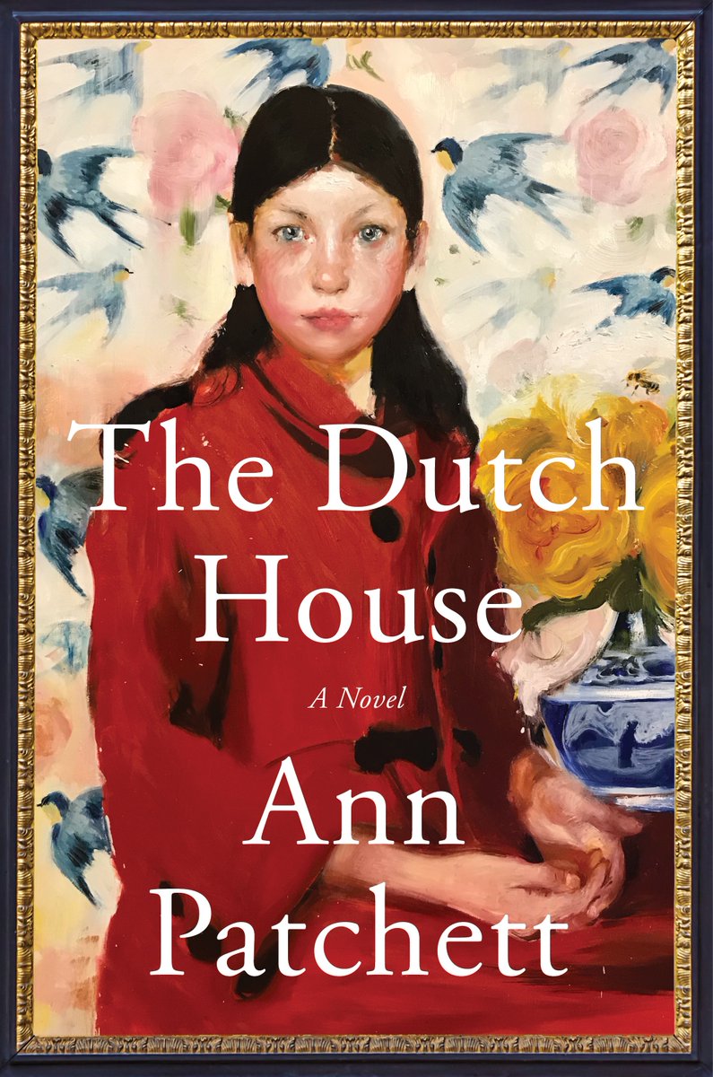
The Dutch House by Ann Patchet; design by Robin Bilardello; painting by Noah Saterstrom (HarperCollins / September 2019)

Even That Wildest Hope by Seyward Goodhand; design by Megan Fildes (Invisible Books / September 2019)

The Factory by Hiroko Oyamada; design by Janet Hansen; photography by Arthur Woodcroft (New Directions / October 2019)
Also designed by Janet Hansen:

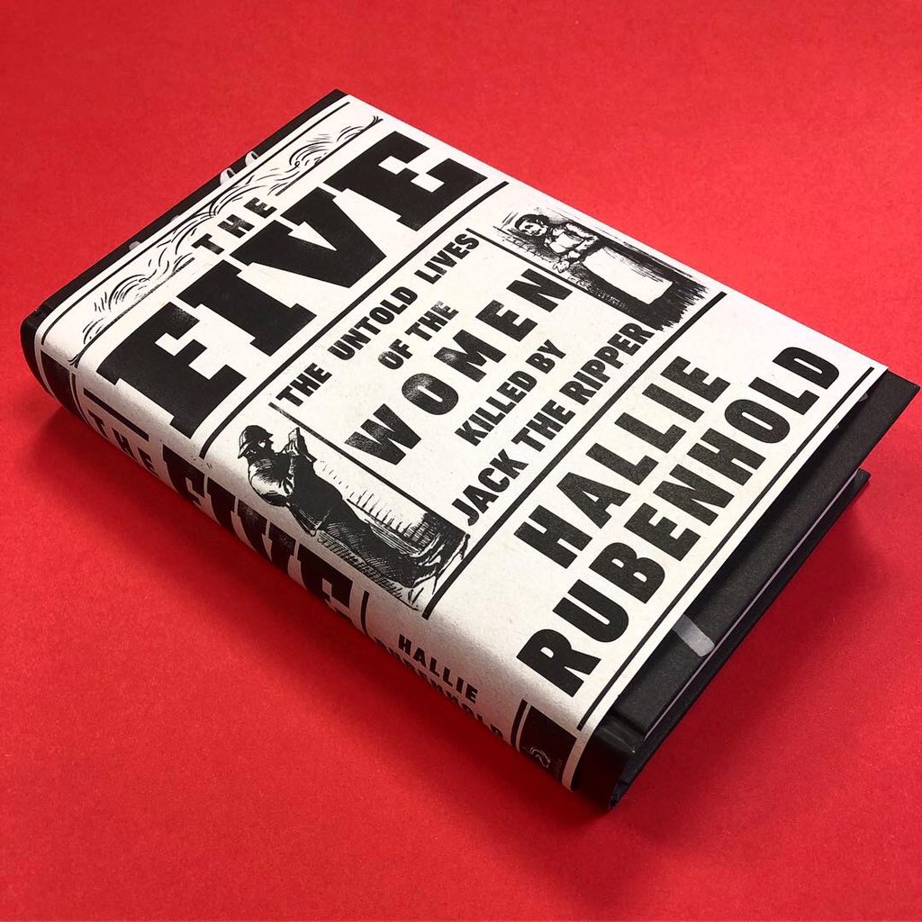
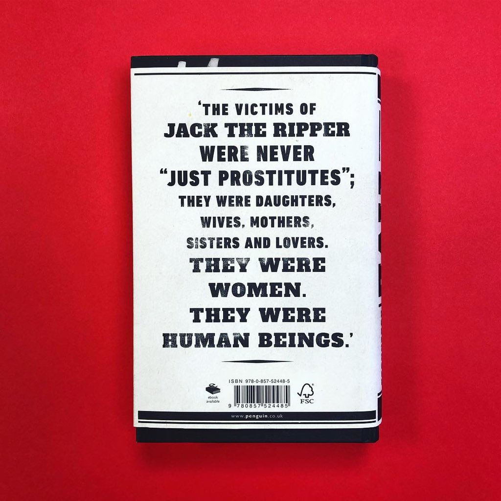
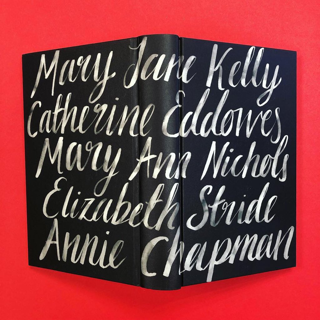
The Five by Hallie Rubenhold; design by Jo Thomson (Transworld / February 2019)

Follow Me To Ground by Sue Rainsford; design and illustration Beci Kelly (Transworld / August 2019)

Follow This Thread by Henry Eliot; design by Elena Giavaldi (Three Rivers Press / March 2019)

Holy Lands by Amanda Sthers; design by Tree Abraham (Bloomsbury / January 2019)
Also designed by Tree Abraham:

Humiliation by Paulina Flores; design by Nicole Caputo (Catapult / November 2019)
Also designed by Nicole Caputo:

Indelible in the Hippocampus by Shelly Oria; design by Sunra Thompson (MacSweeney’s / September 2019)

Lanny by Max Porter; design by Jonny Pelham (Faber & Faber / March 2019)

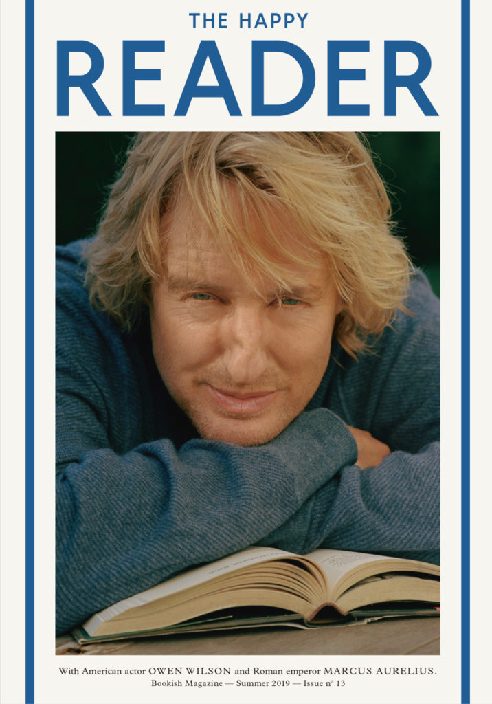
Learning from the Germans by Susan Neiman; design by Tom Etherington (Allen Lane / August 2019)
Tom Etherington is also the designer of Penguin magazine The Happy Reader:

Life Support by Julia Copus; design by Helen Crawford-White (Head of Zeus / April 2019)

The Light That Failed by Ivan Krastev and Stephen Holmes; design by Richard Green (Allen Lane / October 2019)

Malina by Ingeborg Bachman; design by Peter Mendelsund (New Directions / June 2019)

Mind Fixers by Anne Harrington; design by Matt Dorfman (W.W. Norton / April 2019)

Mothers by Chris Power; design by Grace Han (Farrar, Straus & Giroux / January 2019)
Also designed by Grace Han:

Mouthful of Birds by Samanta Schweblin; design by Stephen Brayda (Riverhead / January 2019)
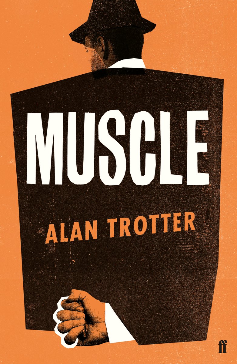
Muscle by Alan Trotter; design by Gray318 (Faber & Faber / February 2019)
Also designed by Gray318:

Never a Lovely So Real by Colin Asher; design by Jonathan Bush (W. W. Norton / April 2019)

Not Working by Josh Cohen; design by Matthew Young (Granta / January 2019)
Also designed by Matthew Young:


One Day by Gene Weingarten; design by David Litman (Blue Rider / October 2019)
Also designed by David Litman:

Our Women on the Ground edited by Zahra Hankir; design by Rosie Palmer; hand lettering by Lily Jones (Harvill Secker / August 2019)

Red at the Bone by Jacqueline Woodson; design by Jaya Miceli (Riverhead / September 2019)
Also designed by Jaya Miceli:

Safe Houses I Have Known by Steve Healey; design by Alban Fischer (Coffee House Press / September 2019)
Also designed by Alban Fischer:

Say Say Say by Lila Savage; design by Jennifer Carrow (Knopf / July 2019)

Sonnets to Orpheus by Rainer Maria Rilke; design by Anne Jordan & Mitch Goldstein (Open Letter Books / December 2019)

Sweet Days of Discipline by Fleur Jaeggy; design by Oliver Munday (New Directions / August 2019)
Oliver Munday wrote about designing the cover for New Directions at Literary Hub earlier this year.
He also designed a lot my favourite covers this year…


Turbulence by David Szalay; design by Lauren Peters-Collaer (Scribner / July 2019)

The Unwanted by Michael Dobbs; design by Tyler Comrie (Knopf / April 2019)
Also designed by Tyler Comrie:

The Volunteer by Salvatore Scibona; design by Rachel Willey (Penguin / March 2019)
Also designed by Rachel Willey:

The Water Dancer by Ta-Nehisi Coates; design Greg Mollica; art Calida Garcia Rawles (One World / September 2019)
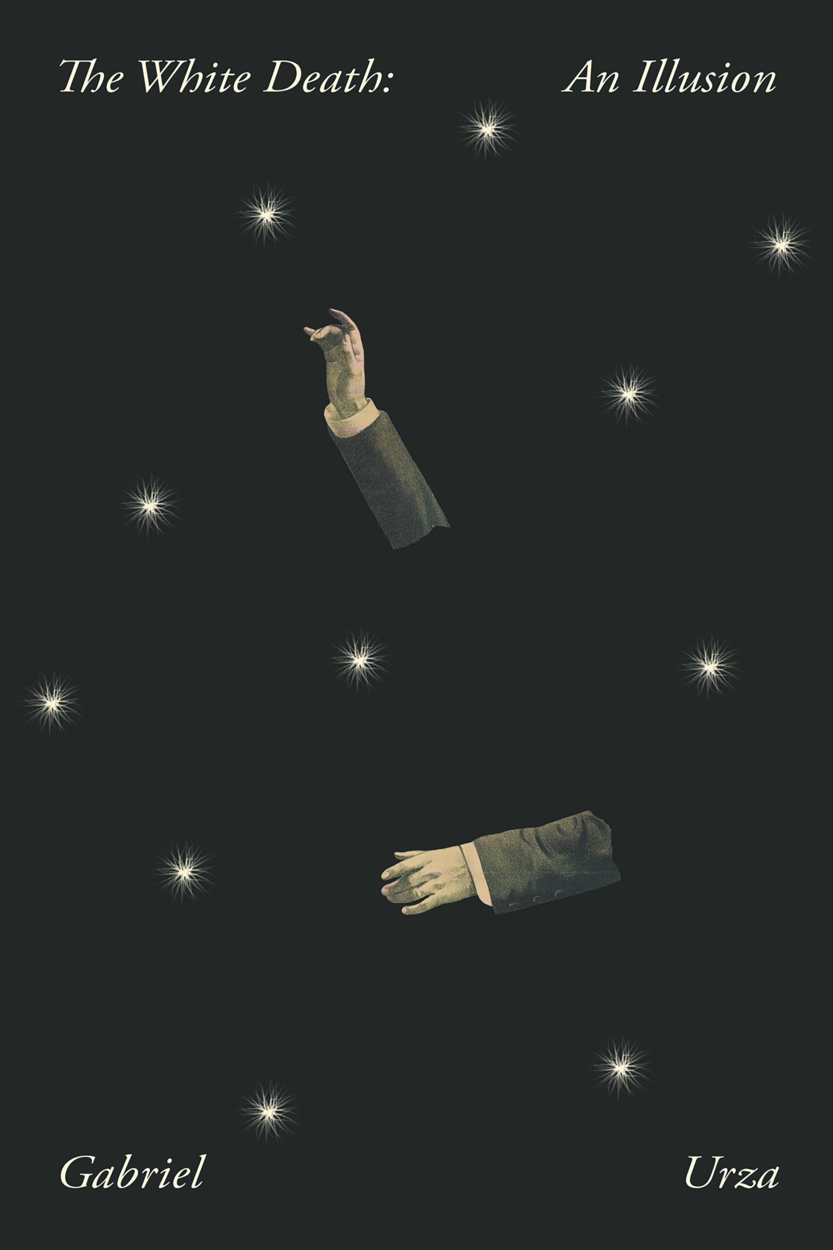
The White Death by Gabriel Urza; design by Joan Wong (Nouvella / June 2019)

A Year Without a Name by Cyrus Grace Dunham; design by Lucy Kim (Little Brown & Co. / October 2019)


