I don’t post a lot of fantasy covers here (less than I should, no doubt), but I rather like the look of these reissues of The Lord of the Rings trilogy available in the US from HMH this month. The covers were designed by Christopher Moisan with illustrations by Swedish illustrator Johan Egerkrans. There’s something about the cover of The Return of the King in particular that reminds me of classic pen and ink fairy tale illustrations by likes of Arthur Rackham and John Bauer.
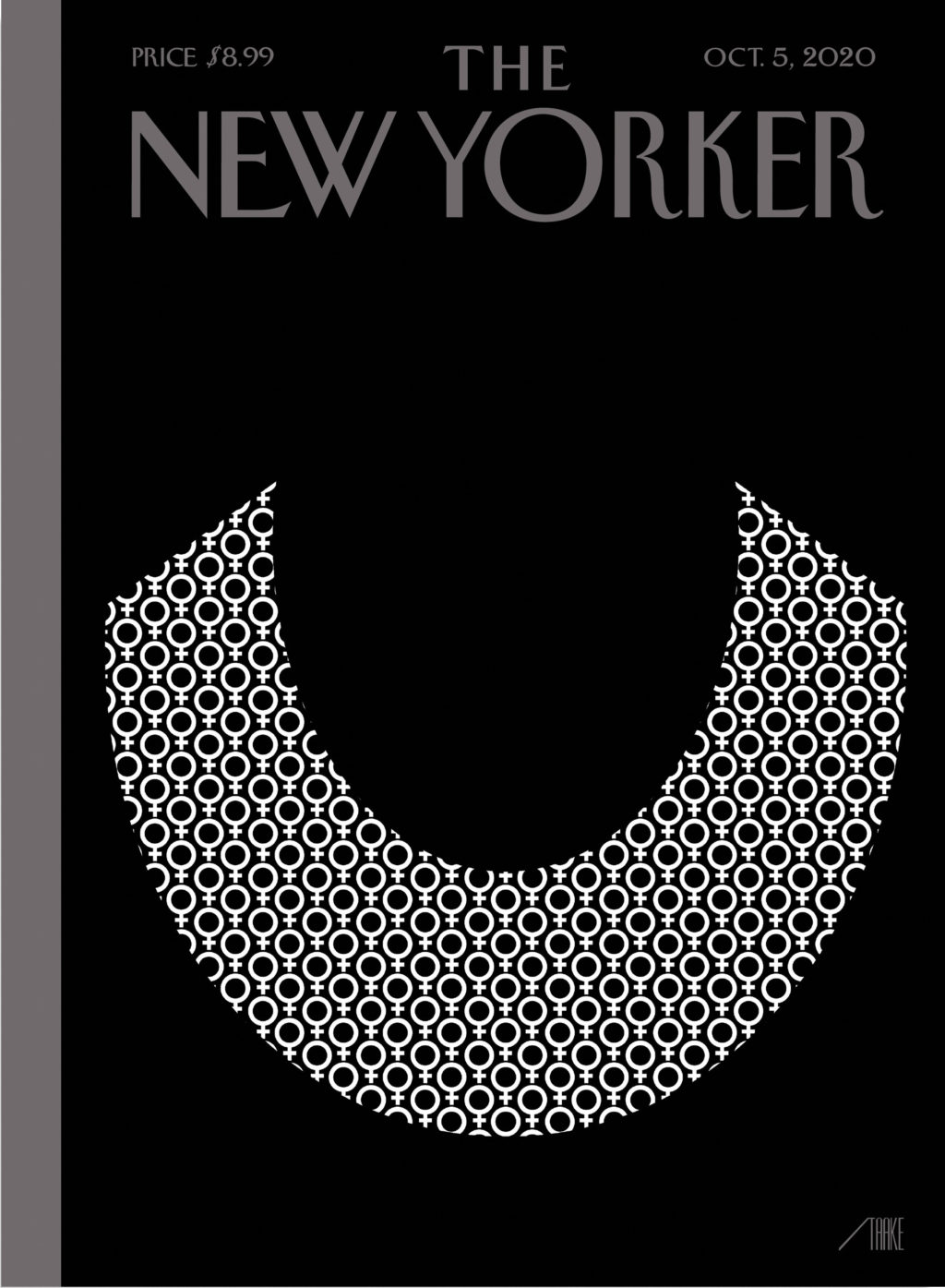
Bob Staake’s new cover for The New Yorker commemorates Ruth Bader Ginsburg, who died aged 87 last week.
It brought to mind Stephanie Ross’s cover for the 2018 biography of Ginsberg by Jane Sherron De Hart published by Knopf, which also focused on her lace collar.
Artist Stanley Donwood talks about his artwork for Radiohead, his collaboration with author Robert MacFarlane on Ness, and his own book Bad Island, published earlier this year by Hamish Hamilton (and slated to be published in the US by W.W. Norton this fall).
I love this illustration for the June 29 issue of The New Yorker magazine by Matt Willey. It accompanies ‘The Rescue Will Begin in Its Own Time‘, a series of short pieces by Franz Kafka that have not been published in English before, and that will appear this fall in the New Directions book The Lost Writings.
Inspired by Eugène Delacroix’s ‘Liberty Leading the People’, artist Kadir Nelson explains how he illustrated the July 2020 cover of Rolling Stone to accompany Jamil Smith’s cover story on Black Lives Matter.
“Having lived in Chicago for thirty years, I’ve only ever been a visitor to New York, but I love it like no other city. Teeming with unpredictable people and unimaginable places and unforeseeable moments, life there is measured not in hours but in densely packed minutes that can fill up a day with a year’s worth of life. Lately, however, closed up in our homes against a worldwide terror, time everywhere has seemed to slur, to become almost Groundhog Day-ish, forced into a sort of present-perfect tense—or, as my fellow New Yorker contributor Masha Gessen more precisely put it, ‘loopy, dotted, and sometimes perpendicular to itself.’ But disaster can also have a recalibrating quality. It reminds us that the real things of life (breakfast, grass, spouse) can, in normal times, become clotted over by anxieties and nonsense.”
Chris Ware has created another brilliant cover for The New Yorker to illustrate April 15th, 2020, “a kaleidoscopic account of a single day in New York” during the pandemic.
Its densely packed grid and the juxtaposition of mundane, ‘snapshots’ reminds me — perhaps more than some of his other covers for the magazine — of Ware’s comics.
After posting Chris Ware’s pandemic cover for The New Yorkerearlier this week, I remembered I had also meant to post Christoph Niemann’s “Critical Mass” cover from two weeks ago. It may not pull at your heart strings the way Ware’s cover does, but it’s a brilliant and prescient illustration of the pandemic.
I believe that the best concepts develop in the process of drawing. I don’t usually have ideas pop in my head fully formed when I’m not at my desk. Yet the genesis for this image, the idea of a sneezing domino standing on top of a globe packed with other domino pieces, came to me when I was lying in bed, trying to fall asleep… I got up again and sketched down the idea. Only the next day, when I sat down to turn the concept into a proper art work, did I realize that the globe and the pieces actually resemble a virus. In the end, it still proves my theory that all decent ideas come together when you actually draw them.
“As a procrastination tactic, I sometimes ask my fifteen-year-old daughter what the comic strip or drawing I’m working on should be about—not only because it gets me away from my drawing table but because, like most kids of her generation, she pays attention to the world. So, while sketching the cover of this Health Issue, I asked her.
“ ‘Make sure it’s about how most doctors have children and families of their own,’ she said.
I was reminded of his 2009(!) cover for the New Yorker‘s from Halloween edition in which parents all look at their phones while their kids trick-or-treat. It’s an interesting contrast…
I thought I read somewhere that Wes Anderson’s new film The French Dispatch was based on the Paris Review, but theNew Yorker is saying no, actually, it is all about them. IDK. ¯\_(ツ)_/¯
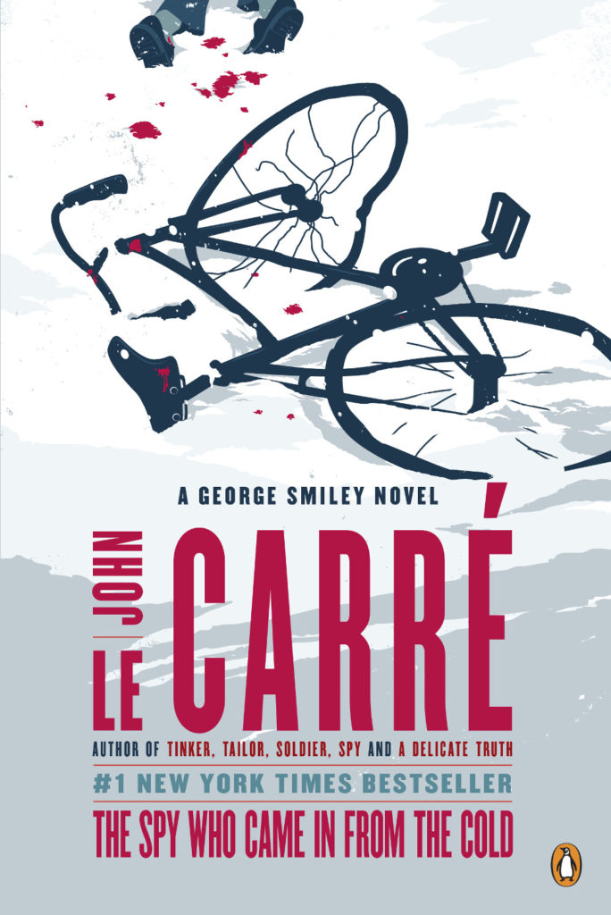
I’m obviously on a bit of a John le Carré kick at the moment as I am currently reading his latest book Agent Running in the Field1. The cover features art by Matt Taylor who has illustrated a quite number of le Carré covers for Penguin Random House and art director Paul Buckley over years. I’ve shared a few of them here before, but since I posted David Pearson’s recent redesign of the George Smiley novels, I thought it would be nice to pull Matt’s versions together too. I believe Gregg Kulick had a hand in the design and type.
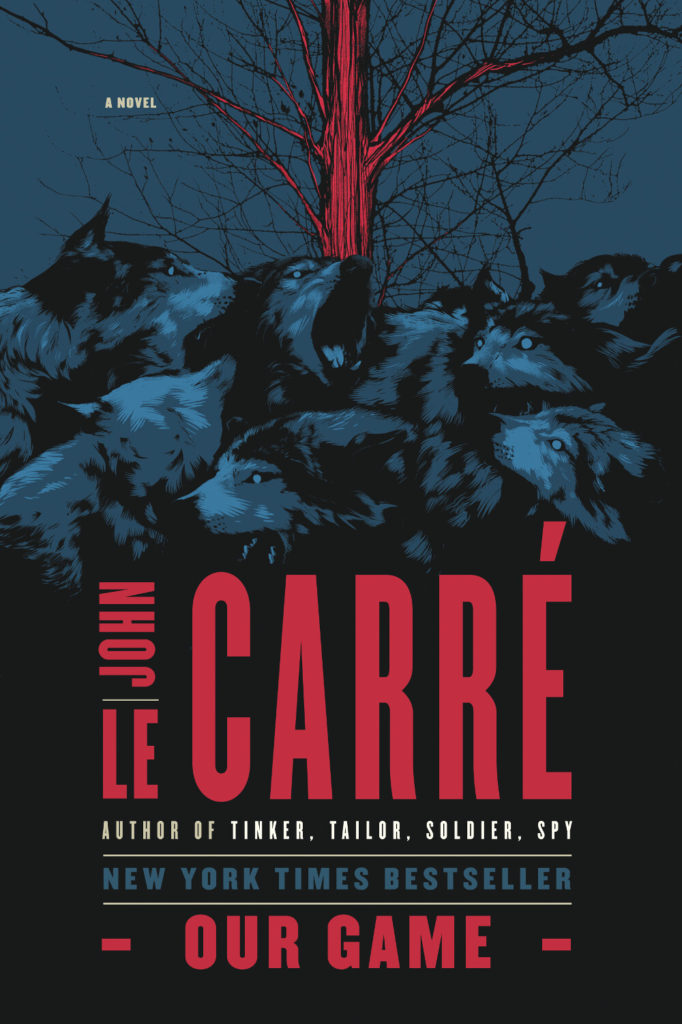
Matt has also illustrated the covers for le Carré’s non-Smiley novels too. There’s quite a lot of them!
A Delicate Truth illustration Matt Taylor
The Naive and Sentimental Lover illustration Matt Taylor
The Night Manager illustration Matt Taylor
Our Game illustration Matt Taylor
Our Kind of Traitor illustration Matt Taylor
A Perfect Spy illustration Matt Taylor
The Pigeon Tunnel illustration Matt Taylor
A Small Town in Germany illustration Matt Taylor
The Tailor of Panama illustration Matt Taylor
(Matt’s also did an illustration for The Russia House, but only the audio edition of the book appears to be available from Penguin Random House in the US. In the UK, Penguin uses the same illustration for their cover, although the type is in line with their other Modern Classic editions)


