Skip to content

Category: Books

Favourite New Books of 2010

Ducking in just under the wire, here is my list of favourite of new books of the year. It’s not meant to represent the “best” of 2010. Rather, it’s a completely unscientific, very subjective list of books (arranged in alphabetical order) that I enjoyed. As I mentioned in my previous post, I found compiling the list a bit of a challenge and yet, for all that, there’s an air of withering predictability about the selections. There are no surprises. But even if this wasn’t a particular stellar year for reading, there were still lots of books I was excited about and that can only be a good thing.

I should also mention, for the sake of disclosure and all that, the top 10 includes one book distributed by Raincoast Books in Canada, and the list of honourable mentions refers to a couple of other titles I have helped promote in some minor capacity. They’re included here because I actually like them, not for any nefarious marketing reasons, but I guess you’ll just have to take my word for that. In any case, all these titles are identified with an asterisk…

And with that out of the way, on to the list!

Born Modern: The Life and Work of Alvin Lustig*
Elaine Cohen Lustig & Steven Heller

Chronicle Books
ISBN 9780811861274
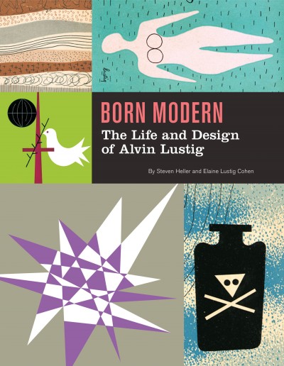
I am a little embarrassed to start this list with a title distributed by Raincoast, but it comes first alphabetically and, I can honestly say tat Born Modern was the book I was most looking forward to this year. And I was not the only person excited about the book. When I tweeted about it from the Raincoast sales conference, the response was immediate. Almost every North American book designer I’ve ever spoken to cites Lustig — who designed covers for New Directions Press in the 1950’s — as an influence. The book designer’s book designer, then… A must-have.

C
Tom McCarthy
Knopf
ISBN 9
780307593337

Tom McCarthy’s C was, as mentioned previously, one of the defining books of the year for me, standing — perhaps unfairly — opposite the ubiquitous Freedom. If I am honest though, I liked it less than McCarthy’s previous novel, the starkly compact Remainder (one of my favourite books of the last 10 years). At times, the sprawling, crawling C felt like it was held together with the sticky-tape of McCarthy’s singular intellect (a thought reaffirmed by seeing him in conversation with Douglas Coupland in Toronto). But somehow, in the end,  it still works in some sort of baffling, gorgeous way.

The book was also perfect excuse to finally talk to Knopf cover designer Peter Mendelsund for the blog. The Q & A with Peter and Tom about C is here.


The City and the City
China Miéville
Del Rey
ISBN 9780345497529

I am cheating a little by including The City and the City because it was first published in 2009. It was, however, published in paperback in 2010, and as that’s how a lot of us still buy our fiction, I’m bending the rules to include it.

The novel itself is essentially a detective story, but what lifts out of the ordinary is the imaginary space in which it takes place. Architecture, geography and maps are clearly important to Miéville, but where, for example, Perdido Street Station creates a fantastically baroque city of ghettos and towering alien architecture, The City and the City is only slightly off-kilter — familiar but unsettling — and the book is even better for it.

Joy Division
Kevin Cummins
Rizzoli

ISBN 9780847834815

This was my Christmas present (thank you Mrs C.O.!) and it is — pretty obviously I would think — for fans only. Still, I’m guessing there’s quite a few out there. In any case, the book is a collection of beautiful black and white photographs of Joy Division and the late Ian Curtis by Manchester-born photographer Kevin Cummins. It includes Cummins’ iconic pictures for the NME of the band standing on a snowy bridge in Hulme, Manchester, as well as photographs of live performances and the band back stage. The book was stylishly designed — with more than a whiff of Peter Saville — by London design agency Farrow.

Just Kids
Patti Smith
Ecco
ISBN 9
780060936228

Other than owing a copy of Horses,  I can’t say that I’m particularly familiar with the work of Patti Smith, or Robert Mapplethorpe for that matter (other than the sort of stuff must people know about his art, and that he was connected to Sam Wagstaff, no relation). But, it doesn’t really matter. Smith’s memoir about her relationship with Mapplethorpe is a touching and self-deprecating look at their early years together in New York and their adventures in the art/music scene of the late 1960’s and early 1970’s.

Memories of the Future
Sigizmund Krzhizhanovsky, translated by Joanne Turnbull
NYRB
ISBN 9781590173190

I am definitely cheating by including this in the list as it was published in 2009. That said, it was published late in 2009, I missed it, and it’s too good not to be in this year’s top 10.

The book itself  is a collection of seven short stories written between 1922 and Krzhizhanovsky’s death in 1950,  all of which were suppressed by Soviet censors. The stories are reminiscent of Gogol’s short fiction and Bulgakov’s novellas, and suffice to say, they’re all bonkers. But in a good way. I loved the story Quadraturin about the man who gets lost in his black, ever-expanding apartment, and the strange time travel title story which concludes the book.

Penguin 75: Designers, Authors, Commentary (the Good, the Bad…)
Paul Buckley

Penguin
ISBN 9780143117629

Seeing as I spend so much time talking about cover design, I would be remiss if I didn’t include Penguin 75 in my top 10. Released to celebrate Penguin’s 75th anniversary, it’s a surprisingly diverse and candid look at the recent cover designs from Penguin’s US outpost in New York.  I talked about Penguin 75 with art director Paul Buckley and book designer Christopher Brand here.

Parker: The Outfit
Darwyn Cooke

IDW
ISBN 9781600107627

The previous book in Darwyn Cooke’s Richard Stark adaptations, The Hunter, was on last year’s list, so perhaps it is hardly surprising that the sequel, which I think is better,  is in this year’s top 10 as well. In new book, the formidable Parker — now with a new face — turns the tables on ‘the Outfit’, who quickly wish that they’d let sleeping dogs lie. Cooke seems in more confident form with this adaptation and the result is a stylish and fast-paced noir that looks incredibly cool. My pithier Advent Book Blog pitch for The Outfit is here.

The Shallows
Nicholas Carr
W.W. Norton & Co.
ISBN 9780393072228

I had a frisson of recognition reading Carr’s description of internet affected attention spans and I doubt I was the only one who thought “oh god, that’s happening to me” while reading The Shallows. The book is too long — a shorter book would’ve been even more effective — but it is still compelling. Carr doesn’t say technology is wrong, but reminds us that for all its benefits, we should be mindful of the consequences and what we might be losing.

Werewolves of Montpelier
Jason
Fantagraphics

ISBN
9781606993590

I wrote about my love for Jason’s comics when Werewolves of Montpellier was about to be released earlier this year, and the book itself didn’t disappoint. Ostensibly the book is about a thief called Sven who disguises himself as werewolf to rob people’s apartments and incurs the wrath of the town’s actual werewolves. It is, however, as much about friendship, identity, loneliness, and, ultimately, Sven’s unrequited love for his neighbour Audrey. In a lovely one-page scene, Audrey stands behind Sven, hugging his shoulders.  “Do women come from another planet?” she asks. “Yes, women come from another planet,” Sven replies. The whole book is achingly brief, but Werewolves of Montpellier is possibly my favourite Jason book to date.

Honourable Mentions

American Trademarks edited by Eric Baker and Tyler Blick*
Footnotes In Gaza by Joe Sacco (December 2009)
I.O.U.: Why Everyone Owes Everyone and No One Can Pay by John Lanchester (published in the UK as Whoops!)
KENK by Richard Poplak and Nick Marinkovich*
Large Scale: Fabricating Sculpture in the 1960’s and 1970’s by Jonathan Lippincott*
The Lost Rolling Stones Photographs: The Bob Bonis Archive, 1964-1966 by Larry Marrion
The Rocketeer: The Complete Collection by Dave Stevens (December 2009)
Shirley Craven and Hull Traders: Revolutionary Fabrics and Furniture 1957-1980 by Lesley Jackson (October 2009)

So there you go. If  this hasn’t met your requirements, Largehearted Boy is aggregating every online “best of 2010” book list he can find, and Fimoculous is aggregating all of the lists related to 2010 in categories ranging from ‘Advertising’ through to ‘Words’. That should keep you busy…

Happy New Year!

aggregates all of the lists related to 2010aggregated all of the lists related to 2010)
Comments closed

A Year in Reading 2010

2010 was a year of losing battles and one of the first casualties was time for personal reading. The moments I did have were snatched on the subway and, if I could keep my eyes open, last thing at night. I often found myself unwittingly rereading chapters I had read the previous day, or worse, that very morning. The difficulty this week of compiling a list of my favourite books of the year — and the predictability of that list (to be posted soon) — made it very clear that not only did I read less than previous years, I rarely strayed off the beaten path.

The year was thus defined, for better or worse, by two big novels that were in some senses polar opposites: C by Tom McCarthy and Freedom by Jonathan Franzen. If C was modern experimental novel masquerading as an early 20th century bildungsroman, Freedom was a Victorian drama in modern dress. It felt like “Two Paths for the Novel” all over again.

Someone cleverer than me observed C “was surrounded by the sort of buzz and static which it contained and described.” But while the buzz amplified C to the Booker shortlist, the hype around Freedom and Franzen seemed to diminish the book. It was so ludicrously overpraised, and subsequently criticized and shunned, that it was almost impossible to evaluate fairly.

OTHER FICTION

Like just about everyone else, I started 2010 reading Stieg Larsson, but now, with 2011 just around the corner, The Girl Who Kicked the Hornet’s Nest remains unfinished, my bookmark at Chapter 6.

I loved the architecture and weird psycho-geography at the heart of the mysterious The City and the City (published in paperback this year) and went on to read China Miéville’s earlier, equally architectural, novel Perdido Street Station.

I was also happy to belatedly discover that Phillip Kerr had resurrected his Bernie Gunther Berlin Noir detective series. Better late than never…

Sadly neither The Imperfectionists by Tom Rachman nor Zero History by William Gibson really added up to more than the sum of their (occasionally really quite good) parts.

I simply abandoned Justin Cronin’s clunker The Passage.

Better was Canal, Lee Rourke’s L’Étranger in London. I wasn’t entirely convinced by it, but an off-beat novel about urban ennui and existential violence was a welcome change of pace. Rourke is no doubt an author to watch.

Canal had the added virtue of being short, something of  a rare and undervalued quality these days. In fact almost all of the fiction I enjoyed the most this year — the icily beautiful The True Deceiver by Tove Jansson, the bonkers Memories of the Future by Sigizmund Krzhizhanovsky, and the lyrical The Blue Fox by Sjon — were short. And not actually published in 2010.

Colony by Hugo Wilcken, also short and published in 2007, was unquestionably my favourite novel of the year. Drawing its title from Kafka’s The Penal Colony (and, in turn, Joy Division’s song Colony), the book seemed to me more like a post-modern Conrad, or perhaps Camus trying his hand at a Boy’s Own Adventure. Needless to say, I’m looking forward to Wilcken’s next novel…

NONFICTION

I waited too long to read Patti Smith’s wistful and self-depreciating memoir Just Kids, but I was charmed by it nonetheless. I was less enthralled with Bob Dylan in America by Sean Wilentz. I was not, I suspect, the target audience however…

Jared Lanier’s You Are Not a Gadget: A Manifesto and Nicholas Carr’s The Shallows both raised intelligent concerns about development of the internet. I was less convinced by Lanier’s polemic than Carr’s tweedier defense of long-form reading, but neither were as reactionary as they were sometimes characterized, and both offered interesting insights whether one agreed with them or not.

The subjective magazine-style reportage of War by Sebastian Junger and the gossipy Game Change by John Heilemann and Mark Halperin were both signals of what we can expect from nonfiction in future.  But both were troubling, especially War, which felt both narcissistic and yet, at the same time, voyeuristic and exploitative. Neither book properly addressed the complications of embedded insider journalism.

Both War and Game Change were, at least, entertaining. That cannot be said of Bob Woodward’s less than electrifying Obama’s Wars. There is something to be said for detailing events in chronological order, but that doesn’t make it any more readable. Worse, perhaps, I didn’t gain any greater insight into what had happened.

COMICS

Even though Dan Clowes is the godfather of the miserable asshole, it is now such a common trope in indie comics that despite his undeniable virtuosity I was somewhat disappointed by the uncompromising Wilson. It was, however, unfair of me to expect Clowes to be anyone other than Clowes, and just about everyone whose opinion I respect tells me I am wrong about this book, so don’t take my word for it.

KENK took up a lot of my professional time this year so I was glad to see it get such a positive critical response and I’m hopeful that it will finally see a US release in 2011.

Having a short attention span, I enjoyed the latest installment of Hellboy, and its gothic spin off Sir Edward Grey Witchfinder, but continued to be underwhelmed by Mignola’s plodding BPRD series.

Like just about every other nerd in Toronto I read the 6th and final installment of Bryan Lee O’Malley’s Scott Pilgrim series (now handily available as a box set). I also finally read Jeff Smith’s epic Bone from cover to cover and revisited The Rocketeer stories by the late Dave Stevens, which were collected, at long last, in a slim hardcover edition at the end of last year.

I loved The Outfit, the latest installment of Darwyn Cooke’s adaptations of Richard Stark’s Parker stories (my Advent Book Blog recommendation this year), and Jason’s strange and delightful Werewolves of Montpelier.

Footnotes In Gaza (published late in 2009) left me depressed, but thoroughly in awe of Joe Sacco.

THE ONES I DIDN’T GET TO (BUT MEANT TO)

The list of new books that I had every intention of reading this year but didn’t is far, far, too long. Here, however, are a few of the books (in no particular order) that I intend to get to sooner rather than later: Matterhorn by Karl Marlantes, Our Tragic Universe by Scarlett Thomas, Super Sad True Love Story by Gary Sheyngart, A Visit From the Goon Squad by Jennifer Egan, Every Man Dies Alone by Hans Fallada,  Boxer, Beetle by Ned Beauman, Kraken by China Miéville, What Ever Happened to Modernism? by Gabriel Josipovici, The Hare With Amber Eyes by Edmund Dewaal, A History of the World in 100 Objects by Neil MacGregor, Just My Type: A Book About Fonts by Simon Garfield, Set to Sea by Drew Weing and H.P. Lovecraft’s At the Mountains of Madness adapted by Ian Culbard. There are no doubt many, many more… I would love to hear what you read and enjoyed this year and what I should add to the list of books for 2011…

2 Comments

Q & A with The Heads of State

Jason Kernevich (left) and Dustin Summers (right), known together as award-winning design shop The Heads of State, met in the design program at Tyler School of Art, Philadelphia. Shortly after graduating, the duo began producing screen-print posters for the local independent music scene. The simple, bold graphic style of their work quickly garnered international attention and acclaim, and their clients now include the likes of R.E.M., Wilco, The National, The New York Times and The Guardian, as well as publishers Penguin, HarperCollins, and Random House.

If that wasn’t enough, the duo recently released a new letterpress print inspired by F. Scott Fitzgerald’s novel The Great Gatsby . The 4-colour, limited edition print (on 140 lb. French Poptone Sweet Tooth paper) shows the business cards and personal stationery of the Jazz Age VIPs that attend Gatsby’s parties in the summer of 1922. Complete with lovely touches such vintage typography and the characters’ professions and street addresses, the print is a beautiful tribute to a 2oth Century classic.

Jason, Dustin and I corresponded by Twitter and email about the Gatsby print and their unique design collaboration.

How did this project come about?

We’d been kicking around the idea of doing something with the novel for a long time. Chapter Four breaks from the plot for a moment and the narrator begins reminiscing about the folks who came to the parties that summer. The names by themselves are just incredible. There is some detail given about the characters’ background but not much. We had to make a lot of it up. But there were hints at a profession or an address here and there and that led to the idea to do business cards.

What’s the enduring appeal of The Great Gatsby for you?

Like most people, we first came across this book in high school and hated it. Rediscovering it later in life has been a joy. The time period holds endless allure. It was between the wars. The reputation of the roaring twenties and its decadence and flamboyance allows the reader to imagine so much more than what’s on the page. And there’s plenty on the page! It’s all the more poignant because of the crash that followed.

Do you think the story has particular contemporary relevance?

The lead-up to the Great Depression holds a contemporary economic relevance for sure. But it’s also a hell of a break-up story in a way with it’s jealousy, conspiracy, and doomed aspirations. That is certainly a side of the novel not fully grasped in the 9th grade.

Your work often seems inspired by New Deal era WPA illustration and mid-century modern design. Are you also inspired by the Jazz Age?

We hadn’t really looked to it for much inspiration in the past, but through our research we found that a lot of the documents of that era were much more practical and less decorative than we anticipated, which connected more with our aesthetic.

How did you recreate the vintage type?

A lot of it came from books that we scanned as well as classic typefaces that predate the era or modern decorative faces that reference it. There was also some hand lettering done.

Did you research 1920’s typefaces? Were you trying to be totally accurate?

We weren’t trying to be 100% accurate. Capturing the spirit was the most important thing. We had a few historical references for inspiration. The credits and titles for the original King Kong conveyed a sense of glamour and of old New York that was appropriate for some cards despite the film being from 1933. We found a few business cards from the early twenties for doctors, furriers, jewelers, etc. They were surprisingly modest and utilitarian. Which makes sense due to printing and lettering limitations. So we aimed for somewhere in the middle.

Do you have a favourite ‘card’ on the poster?

It changes. The “Films Par Excellence” card is a favorite. But Jordan Baker’s gets our pick. She is the only main character we did a card for and we wanted to sneak it in as a payoff to fans of the book. We like to say that her card was inspired not just by her profession (golf champion) but by her eyelashes.

What’s the appeal of manual printing processes like letterpress and silkscreen?

It a tactile, sensual thing that you feel connected to as a viewer. It’s great to be able to interact with a piece of design in that way. It also added a disguise of authenticity and age to this project. Oh, the irony.

Could you describe your creative process? How does your collaboration work?

Over the years we’ve developed quite a shorthand with one another. Our process is sometimes as simple as a conversation while sketching. We’ve hit on some of our best ideas in a matter of few minutes by just talking through the problem at hand. Sometimes it’s more labored over. In those instances we hit the books, research, sketch, and let the best and most clear idea win. We are both always in pursuit of the best idea and that helps move things along.

Who are your design heroes?

We have so many. Plenty of usual suspects from the 1950’s and 1960’s and from our early days of making silkscreen posters. We love the travel posters of David Klein. Book designers like John Gall and Paul Sahre. Leanne Shapton is a personal favorite. A lot of our artist friends never cease to amaze us with the work they churn out. Jessica Hische. Tim Gough. Matt Curtius and Gina Triplett. Martha Rich. Josh Cochran and Chris Neal and everybody else at the Pencil Factory in Brooklyn.

What’s next for The Heads of State? Will we be seeing more book covers from you soon?

We’ve got some book covers in the works. We’re also working on more self-initiated projects and products as well as a few branding projects we’ll be unveiling in the next few months that we’re pretty psyched about.

Thanks!

How did this project come about?

We’d been kicking around the idea of doing something with the novel for a long time. Chapter Four breaks from the plot for a moment and the narrator begins reminiscing about the folks who came to the parties that summer. The names by themselves are just incredible. There is some detail given about the characters background but not much. We had to make a lot of it up. But there were hints at a profession or an address here and there and that led to the idea to do business cards.

What’s the enduring appeal of The Great Gatsby for you?

Like most people, we first came across this book in high school and hated it. Rediscovering it later in life has been a joy. The time period holds endless allure. It was between the wars. The reputation of the roaring twenties and its decadence and flamboyance allows the reader to imagine so much more than what’s on the page. And there’s plenty on the page! It’s all the more poignant because of the crash that followed.

Do you think the story has particular contemporary relevance?

The lead-up to the Great Depression holds a contemporary economic relevance for sure. But it’s also a hell of a break-up story in a way with it’s jealousy, conspiracy, and doomed aspirations. That is certainly a side of the novel not fully grasped in the 9th grade.

Your work often seems inspired by New Deal era WPA illustration and mid-century modern design. Are you also inspired by the Jazz Age?

We hadn’t really looked to it for much inspiration in the past, but through our research we found that a lot of the documents of that era were much more practical and less decorative than we anticipated, which connected more with our aesthetic.

How did you recreate the vintage type?

A lot of it came from books that we scanned as well as classic typefaces that predate the era or modern decorative faces that reference it. There was also some hand lettering done.

Did you research 1920’s typefaces? Were you trying to be totally accurate?

We weren’t trying to be 100% accurate. Capturing the spirit was the most important thing. We had a few historical references for inspiration. The credits and titles for the original King Kong conveyed a sense of glamour and of old New York that was appropriate for some cards despite the film being from 1933. We found a few business cards from the early twenties for doctors, furriers, jewelers, etc. They were surprisingly modest and utilitarian. Which makes sense due to printing and lettering limitations. So we aimed for somewhere in the middle.

Do you have a favourite ‘card’ on the poster?

It changes. The Films Par Excellence card is a favorite. But Jordan Baker’s gets our pick. She is the only main character we did a card for and we wanted to sneak it in as a payoff to fans of the book. We like to say that her card was inspired not just by her profession (golf champion) but by her eyelashes.

What’s the appeal of manual printing processes like letterpress and silkscreen?

It a tactile, sensual thing that you feel connected to as a viewer. It’s great to be able to interact with a piece of design in that way. It also added a disguise of authenticity and age to this project. Oh, the irony.

Could you describe your creative process? 10. How does your collaboration work?

Over the years we’ve developed quite a shorthand with one another. Our process is sometimes as simple as a conversation while sketching. We’ve hit on some of our best ideas in a matter of few minutes by just talking through the problem at hand. Sometimes it’s more labored over. In those instances we hit the books, research, sketch, and let the best and most clear idea win. We are both always in pursuit of the best idea and that helps move things along.

Who are your design heroes?

We have so many. Plenty of usual suspects from the 1950’s and 1960’s and from our early days of making silkscreen posters. We love the travel posters of David Klein. Book designers like John Gall and Paul Sahre. Leanne Shapton is a personal favorite. A lot of our artist friends never cease to amaze us with the work they churn out. Jessica Hische. Tim Gough. Matt Curtius and Gina Triplett. Martha Rich. Josh Cochran and Chris Neal and everybody else at the Pencil Factory in Brooklyn.

What’s next for The Heads of State? Will be seeing more book covers from you soon?

We’ve got some book covers in the works. We’re also working on more self-initiated projects and products as well as a few branding projects we’ll be unveiling in the next few months that we’re pretty psyched about.
Thanks!  Dan

5 Comments

Pigskin Over Wood

CBS News looks at the past, present, and future of book covers, and talk to Knopf’s Associate Art Director Peter Mendelsund and some guy called Chip Kidd:

Comments closed

Bring the Noise: Alex Ross Talks to Paul Morley

Paul Morley interviews fellow music critic Alex Ross, author of The Rest is Noise and Listen to This,  for The Guardian:

Morley’s post about critics, and meeting Alex Ross, is also worth reading:

I’ve always liked a critic who doesn’t think like anyone else. Someone who takes me so much by surprise with their opinions, approach and rigour that they themselves become a kind of artist. I like a critic who demonstrates that they deserve to evaluate and document the work and art of others by writing in such a way that the work makes more sense, sometimes only makes sense, because of what they write and why they write it. I loved critics, whether it was Kenneth Tynan, Susan Sontag, Tom Wolfe, Richard Meltzer, John Updike, Roland Barthes, Pauline Kael, Angela Carter or Lester Bangs, for the way they made it clear, with such evangelical poise, precision and purpose, that without the great critic, the world, and the worlds of those that made up the world, was never properly finished off.

Comments closed

Gary Shteyngart, Paid in Cheese

Gary Shteyngart, author of Absurdistan and Super Sad True Love Story, interviewed by Eleanor Wachtel for CBC Radio’s Writers & Company:

Writers & Co Interview with Gary Shteyngart Mp3

Comments closed

Jonathan Franzen, Writers & Co.

The J-Franz, author of Freedom, talks to Eleanor Wachtel for CBC Radio’s Writers & Company:

Writers & Co Jonathan Franzen Mp3

Comments closed

Patti Smith and Jonathan Lethem in Conversation

Artist Patti Smith, author of Just Kids, in conversation with Jonathan Lethem, author of Chronic City, earlier this year:

(via MobyLives)

Comments closed

Tom McCarthy, Writers & Co.

Tom McCarthy, author of C, interviewed by Eleanor Wachtel for CBC Radio’s Writers & Company:

Writers & Co Interview with Tom McCarthy Mp3

Comments closed

The Story of Eames Furniture

Marilyn Neuhart, author of The Story of Eames Furniture, and her husband John both worked in close proximity to Charles and Ray Eames and key members of the Eames Office for almost 30 years. In this fascinating video interview with GestaltenTV, the couple talk about the people behind the iconic Eames designs:

The Story of Eames Furniture is published by Gestalten.

Comments closed

Q & A with Clare Skeats

Hugo Wilcken’s Colony (published in 2007 and mentioned previously here) is almost certainly the novel I’ve talked up most this year. The cover, something like a jaunty vintage travel poster to a malarial Heart of Darkness (nauseously appropriate for a postmodern novel about a French penal colony), was designed by London-based print designer Clare Skeats.

Specializing in book design and art direction, Clare has a a great eye for partnering distinctive typography with bold creative imagery. Her covers often seem to use elements from the past, but always feel dynamically contemporary.

I’m really happy to have had the opportunity talk to Clare about her work. We corresponded by email.

How did you get into book design?

After graduating in 97, I tried, and failed to get a job as a junior designer at Penguin. They did offer me work experience though — so I moved to London to do that, and basically never left.

Have you always run your own studio? Where were you previously?

No. I stayed at Penguin for 4 years (they did eventually employ me!), then during a brief period at Random House, an opportunity arose to work for UK clothing designer Margaret Howell. It was great to step away from books for a bit and be part of a completely different industry. I was involved in virtually all aspects of the company; from designing Fashion Week press invites to drawing up manufacturing specification manuals. During my time there I was also working freelance — so after two very busy years, I left Margaret Howell to become full-time freelance, which is where I am now.

Could you describe your design process?

I’m lucky in that a lot of my clients allow me to just read and then make all the suggestions. I work in a number of ways; completely independently, or collaboratively with an illustrator or photographer. If I decide that illustration is the most appropriate response, I spend time identifying the right style and finding relevant practitioners. I’ve worked with Kazuko Nomoto (aka Nomoco) a great deal, and I found her initially as I had Andy Warhol’s Vogue illustrations in my head for Lolita. I’ll suggest say 3 or 4 illustrators to the client, along with a rough idea of the brief and composition. I then refine the brief and collaborate with the chosen illustrator.

Whether I’m working on my own, or collaboratively, I spend a lot of time researching — it’s a process I’ve always loved. For Somebody to Love I had to research embalming as the book is about a transsexual mortician who falls in love with one of her, um… clients. I wanted the cover to reflect the surgical and beautifying themes so I started to research embalming tools which lead me to those 18th-Century engravings of surgical instruments. Also used to great effect on this Simian Mobile Disco record cover designed by Kate Moross:

I needed to commission illustrations of modern instruments but retain the engraving reference and I initially proposed a wood engraver to the client, but the idea scared them. So I had to find a vector illustrator who could approximate an engraving style. I found Fred van Deelen who did a brilliant job. What I loved about Kate’s record cover was the way the central black circle (or maybe its a die-cut?) was working as a device to hold the type. So I shamelessly adapted it to my own needs for my cover.

When I started working on Potty!, I read the author’s autobiography which lead to a fun afternoon poking around the posh country outfitters shops of St. James and Saville Row — I took lots of photos and produced a mood board which helped me to get the sample spreads and art direction approved. I teach on the foundation course at Central St Martins and I’m always banging on about research — mostly because I can’t understand why a student wouldn’t want to do it!

My client for Potty!, wanted an illustrative component to the design and I was wary at first as I think illustration can often look like a whimsical add-on in some cookbooks, which wouldn’t be appropriate at all with Clarissa. The book is about one pot cookery so I decided to make the pots the stars and commissioned scraper-board maestro Joe McLaren to produce them — there are 24 in total and this is my absolute favourite:

Do you prefer to use unconventional typography and hand-drawn lettering than more classic typefaces?

Not particularly — the enjoyment comes from finding the right type style for the job, and that could be making lettering out of cake decorations, or typesetting a whole book — each offers their own sense of fulfillment. Working with the wildly varying content of books offers wonderful opportunities to work with typefaces that wouldn’t normally get considered for most commercial print jobs. I hate snobbery in design — if Dom Casual is right for a job, go with it!

Do you ever create the type or letters yourself ?

I wouldn’t have the confidence to create digital type from scratch, its such a skill in itself — adapting existing fonts is about as far as I go. I’ve hand-drawn lettering quite a bit though — I like to use a dip pen and drawing ink which creates a really nice line. I used this for Lolita, Tom Bedlam and Just in Case, to name a few. Another Meg Rossoff cover I had rejected features lettering that I drew on damp paper to create a cloud-like effect when reversed-out of the sky.

I can’t walk past an art supply shop. The ‘STEINBECK’ stamp in Of Mice and Men comes courtesy of something called Fabfoam, which you’ll find next to the sequins and glitter in the ‘hobby craft’ section.

How do you approach designing a series of covers?

Find the longest combination of title and author, and then work backwards from there! If your design can accommodate One Day in the Life of Ivan Denisovich by Alexander Solzhenitsyn then you know you’re on to a good thing. I think a successful series style has enough consistency and rigour to be easily recognised but has enough flexibility within it to future-proof against unforeseen issues. If there are too many variables within a series style, it lacks identity — and if there are not enough, it looks dry and undynamic. The nice thing about designing the Vintage Classics series design was that I knew the images would be really diverse so I could make the rest of the cover quite restrained and structured.

What are your favourite books to work on?

Its always a thrill to get asked to do a classic. I did Animal Farm very early in my career at Penguin and I’ve always regarded it as a huge privilege — especially as I was so junior at the time. I recently had to re-do the artwork to fit the new Modern Classics grid, so I’m really honoured that it survived a series re-design!

I also like first-time authors (as there’s no baggage), and books about really odd subjects: invisible dogs, menopause, suicide, unicorns … bring it on. I’d like to do more books for young adults, but they usually get rejected!

What are the most challenging?

Without a doubt, it’s the BIG book. The one the publisher has paid huge sums for at Frankfurt as it’s ‘going to be the next … (insert name here)’. The amount of emphasis placed on the role that the jacket is expected to perform is enormous and yet if the book becomes a bestseller its widely regarded as being down to good writing and good reviews. But if it fails, its regarded as being the fault of the jacket. Its this widely-held belief that allows high street booksellers and supermarkets to assert so much influence on the design — so what should be an exciting job can turn into a fairly unrewarding experience for the designer.

Do you prefer working with illustrators or photographers? Or does it depend on the project?

I do enjoy the camaraderie on shoots — the Potty! shoot was great fun — but publishing cover budgets are usually such a feeble match for photographer’s fees that I find I’m constantly looking at ways to cut costs which just becomes a bit boring after a while. The preponderance of headless women on book covers is testament to the fact that there’s rarely budget for a model, hair or make-up. And yet, interestingly, the expectation from the publisher for a Merchant Ivory film still remains pretty high — even if the budget doesn’t.

I love the spontaneity of working with an illustrator — of making the most of their skills and seeing how they interpret a brief. When I saw the physical object that I commissioned from Helen Musselwhite on The Still Point, I gasped (in a good way)! Being able to hand-pick such talented people to work with is a huge privilege — it’s a part of my job that I will always love.

Do you see any recent trends in British book design?

Yes, I think production specs (particularly on hardbacks), have been steadily increasing in a bid to get the public excited about the physical objects again, so we’ve had a glut of cloth-and-foil, sprayed edges etc. There’s been a lot of patterns and a return to traditional typographic sensibilities, and a rediscovery of our British design heritage. Mid-century modern references are still enjoying a bit of a moment…

Where do you look for inspiration and who are some of your design heroes?

My earliest design hero was Charles Schultz. I was obsessed with Peanuts when I was a kid and copied the way that the characters wrote — I loved the way their handwriting appeared above their heads, I thought it was genius!

I was also a huge Roald Dahl fan and consequently grew up with the scratchy inky gorgeousness of Quentin Blake‘s illustrations.

No surprises here, but I greatly admire the work of designers like Saul Bass, Abram Games, Alan Fletcher, Alvin Lustig and Paul Rand — the wit and brevity of their work is so impressive. Slightly more decorative demi-gods include Eric Ravillious, Edward Bawden and Osbert Lancaster. Sorry for the lack of anyone female — or indeed, alive.

What does the future hold for book cover design?

Hopefully the impact of ebooks will be a positive; there’s a lot of books out there that really don’t deserve to see a printing press.

Thanks Clare!

4 Comments

Thomas Allen AV

An AV introduction to the work of artist Thomas Allen who takes vintage paperbacks and cuts, creases, and crimps them into incredible pulp pop-ups:

(thx Jacob)

(And Small World of Happy Coincidences:  The remix of Sarah Vaughan that accompanies the video is by Max Sedgley an old pal from university)

2 Comments