Skip to content

Category: Books

James Gallager | Cutting Edges

Here’s an interview with the New York-based artist James Gallagher, curator of an exhibition of contemporary collage called Cutters (currently on display at the West Cork Arts Centre in Ireland, February 7th-March 12th) and co-editor of the book  Cutting Edges published by Gestalten:

The book include collages by John Gall, Art Director at Vintage and Anchor Books, who actually mentioned the work of James Gallagher in our recent Q & A.

1 Comment

Edmund de Waal | Writers and Company

The Hare with Amber Eyes: A Hidden Inheritance, Edmund de Waal’s memoir about his extraordinary Jewish family and an inherited collection of ornamental Japanese carvings called netsuke, was on many of last year’s “best-of” lists and is high on my current ‘to-read’ list. The author talks about the book with Eleanor Wachtel on CBC Radio’s Writers & Company:

CBC Radio Writer’s & Co: Edmund de Waal Mp3

Edmund de Waal, who is also a successful ceramicist, is also profiled in The Guardian:

De Waal and his netsuke have been much discussed over the past seven or eight months, but even now he is “completely taken aback” by the success of a book which is an “odd matrix of personal obsessions”. (We talk in the upstairs room of his south London studio – downstairs are three kilns, his wheel and a bag of clay, ready for him to get to work in the afternoon.) Yet that it is so personal and springs from these obsessions (Japan, objects, memory), drawing on his expertise as a potter, is surely a clue to its enormous appeal. How things are made and handled, he writes, and what happens to them “has been central to my life for more than 30 years”.

Comments closed

Something for the Weekend

Steven Heller, editor of I Heart Design and author/editor of countless other books about design, at 10 Answers.

And Steven Heller is one of the designers featured in BBC Radio documentary I Heart Milton Glaser about the iconic I (Heart) NY logo and the designer who created it (go listen now because it’s only available for a few more days).

Print and the City –a fascinating look at whether movable type printing presses were the drivers of economic growth in cities by Jeremiah Dittmar (via The Browser):

[C]ities in which printing presses were established 1450-1500 had no prior growth advantage, but subsequently grew far faster than similar cities without printing presses… Cities that adopted print media benefitted from positive spillovers in human capital accumulation and technological change broadly defined. These spillovers exerted an upward pressure on the returns to labour, made cities culturally dynamic, and attracted migrants.

In the pre-industrial era, commerce was a more important source of urban wealth and income than tradable industrial production. Print media played a key role in the development of skills that were valuable to merchants. Following the invention printing, European presses produced a stream of math textbooks used by students preparing for careers in business.

The Savage Marketplace — A really interesting and thoughtful survey of the current state of book editing in the UK by Alex Clark , with contributions from Diana Athill, Blake Morrison, Jeannette Winterson and others, for The Guardian:

[W]hat saps the spirit are the manuscripts that leave you with the question: why did no one sit down with the writer and point out where this isn’t working? Why didn’t a red pen mark the hackneyed phrase, or the stock character, or the creaky dialogue? And, sometimes, why didn’t someone deliver the unfortunate verdict: this simply isn’t ready yet, and may never be?

And finally, if you’re in London… Kemistry Gallery have an exhibition of film posters by Saul Bass from the BFI archive, February 17th to March 17th:

SOME GOOD NEWS FROM THE WORLD OF BOOKS.

Comments closed

Le Carré | Stuart Bache

I’m a big fan John Le Carré’s spy stories, so I was really pleased to see these wonderfully stark redesigns for Sceptre by British designer Stuart Bache, who I interviewed last year about his cover designs for the Canongate editions of Gil Scott-Heron.

You can see all 14 covers in the series here.

Comments closed

Too Much Information

That the reality of machines can outpace the imagination of magic, and in so short a time, does tend to lend weight to the claim that the technological shifts in communication we’re living with are unprecedented… The scale of the transformation is such that an ever-expanding literature has emerged to censure or celebrate it. A series of books explaining why books no longer matter is a paradox that Chesterton would have found implausible, yet there they are, and they come in the typical flavors: the eulogistic, the alarmed, the sober, and the gleeful.

The New Yorker‘s critic-at-large Adam Gopnik reviews the recent spate of books about the internet and our minds — including Cognitive Surplus by Clay Shirky, The Shallows by Nicholas Carr, and Hamlet’s Blackberry by William Powers — neatly dividing them into the categories “Never-Betters”, the “Better-Nevers”, and the “Ever-Wasers”:

The Never-Betters believe that we’re on the brink of a new utopia, where information will be free and democratic, news will be made from the bottom up, love will reign, and cookies will bake themselves. The Better-Nevers think that we would have been better off if the whole thing had never happened, that the world that is coming to an end is superior to the one that is taking its place, and that, at a minimum, books and magazines create private space for minds in ways that twenty-second bursts of information don’t. The Ever-Wasers insist that at any moment in modernity something like this is going on, and that a new way of organizing data and connecting users is always thrilling to some and chilling to others—that something like this is going on is exactly what makes it a modern moment. One’s hopes rest with the Never-Betters; one’s head with the Ever-Wasers; and one’s heart? Well, twenty or so books in, one’s heart tends to move toward the Better-Nevers, and then bounce back toward someplace that looks more like home.

It is an article unlikely to satisfy either the evangelists or doom-mongers, but it sounds about right to me in a smart-alecky sort of way…
Comments closed

Richard Ford | Writer’s & Co.

An interview with Richard Ford, recorded onstage at a special PEN benefit at the International Festival of Authors in Toronto, on CBC Radio’s Writers & Company:

CBC Radio Writer’s & Co. Richard Ford Mp3

Comments closed

Something for the Weekend

A two-part interview with Chris Ware, author of Jimmy Corrigan: The Smartest Kid on Earth,  in The Comics Journal:

I just wanted to make a comic book that had a bit of density to it, and build on the cartoonists whose work I really deeply admire. I could list hundreds of cartoonists whose work I’ve stolen from, and I try to acknowledge them all, so I just wanted to make a book that didn’t lie, as much as I could.

Part One | Part Two.

And, designer Eric Heiman on Chris Ware for Eye Magazine:

Ware’s aims are literary, not pragmatic. But his work is still a subtle reminder that no amount of order we – as designers or otherwise – impose on our lives can ever eliminate the unexpected twists and turns they take. Quantitative data, no matter how clearly and beautifully presented, is not always the know-all, end-all answer, even in this age of Google analytics.

The Literarian — The new online journal for The Center for Fiction.

Science Fiction Lesson – Author Ursula K. Leguin talks about writing and science fiction with Owen Bennett Jones for the BBC World Service.

Split Personality — Author John Banville on author Benjamin Black in The Boston Globe:

I do a Benjamin Black in the spring and early summer. I hate summer so this is a wonderful excuse to sit in my room and pound away at a crime book. I write those quickly on the computer, in three to four months. What I want from Benjamin Black is spontaneity; John Banville writes in longhand with a fountain pen. I can’t do them both at the same time. Banville was never much interested in character, dialogue, and plot, and Black is entirely character and dialogue and plot. With the crime novels, it’s delightful to have protagonists I can revisit in book after book. It’s like having a fictitious family.

And finally…

A neat animated trailer for the documentary Waiting for “Superman”:

Comments closed

Merchants of Culture | The Book Show

Another really interesting interview with John Thompson, author of Merchants of Culture, about the past, present, and future of the book business.  This time he talks with Ramona Koval for The Book Show on ABC Radio National:

ABC Radio National The Book Show: John Thompson Mp3

Comments closed

Q & A with Jason Ramirez, St. Martin’s Press

I recently mentioned to a friend that I was going to interview book cover designer Jason Ramirez. “Jason’s the best,” he said. “Any time I’m stuck on type, I try to imagine what Jason would do and work from there.”

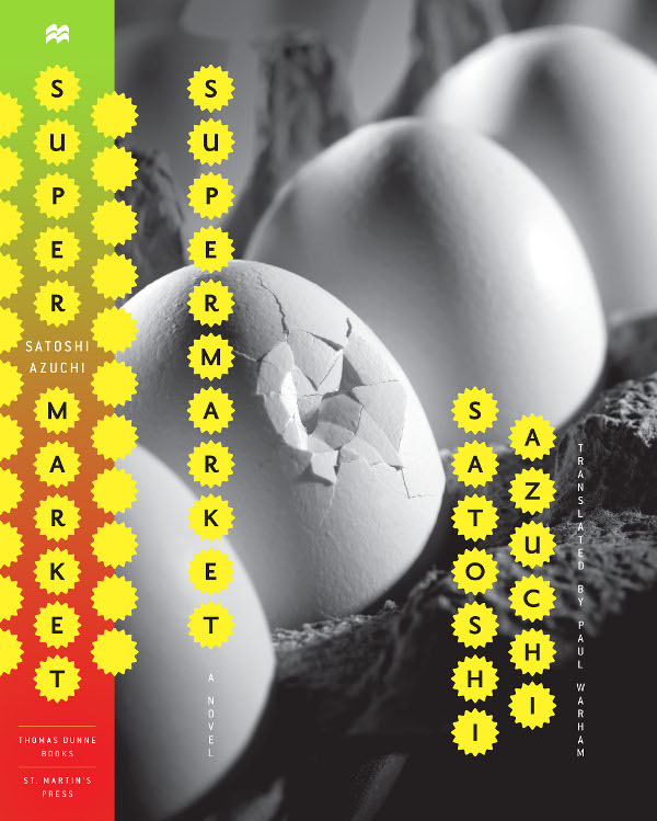
And when you look at Jason’s book covers you know what he means. A designer at New York’s St. Martin’s Press his typography is always beautiful. Each elegant letter is given room breath and perfectly compliments the design as a whole.

There is, in fact, an irresistible incisiveness and precision to Jason’s work that lend all his book covers an airy beauty. They feel spacious and uncluttered; direct without ever being blunt. I’m sure it won’t be too long before more designers ask, “what would Jason do?”

Jason and I corresponded by Twitter and email, and you can see more his portfolio on the Behance Network.
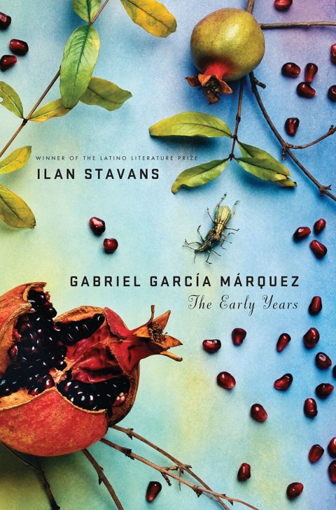
How did you get into book design?

I pretty much took a roundabout way into book design. I first went to college in upstate New York with the intention to eventually study medicine. Four years later, after a near-fatal rendezvous with organic chemistry, I graduated with a degree in comparative religious studies. I spent the next few years in San Francisco working for a real estate investment company, first in human resources and then in marketing and branding. It was during my stint in marketing and branding, which introduced me to the design world of San Francisco, that I began to daydream about a move to the city of New York to study design. Eventually I worked up the courage to make the move and was accepted to Parsons School of Design. During my last year at Parsons I had the good fortune of taking a book cover design course instructed by Gabriele Wilson. Pretty much from the onset of the class I was hooked. Shortly after graduating again, I began working with Rodrigo Corral and continued for a bit over a year before landing at St. Martin’s Press.
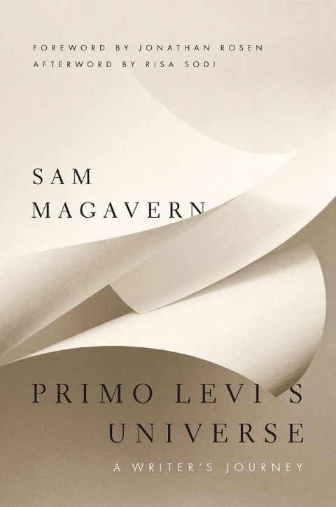
How long have you been at St Martin’s?

I’ve been with St. Martin’s Press since November 2007.

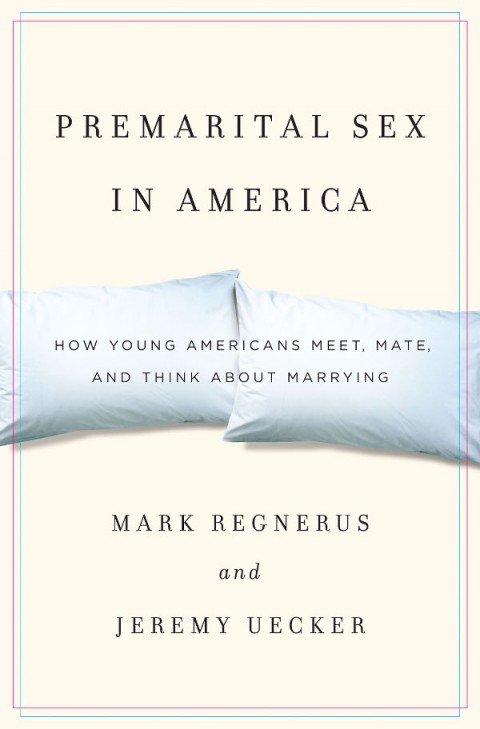
Approximately how many titles do you work on a season at St Martin’s?

I work on anywhere from ten to fifteen new titles each season, across four different imprints: St. Martin’s Press (trade hardcover), St. Martin’s Griffin (trade paperback), Minotaur (mystery) and Palgrave-Macmillan (which is actually an academic and trade publishing company; a close cousin to St. Martin’s).
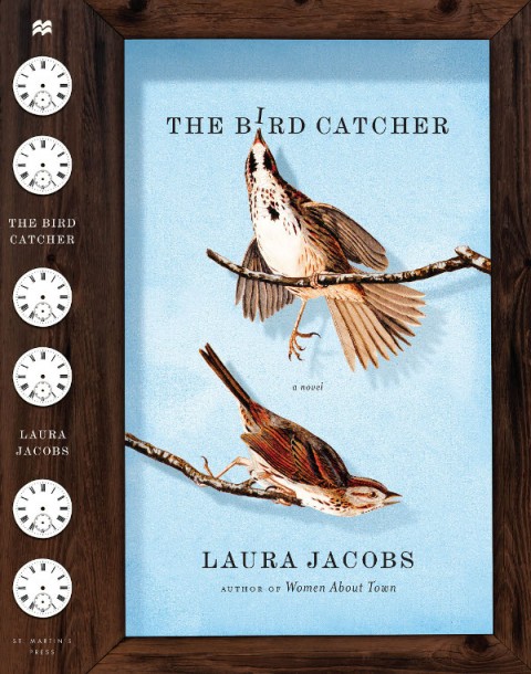
Is there a house style?

No. One of the terrific things about working at St. Martin’s is the variety of titles published each season. Working across genres provides an opportunity to bring a fresh perspective to each project.

Do you also work freelance?

I’ve had the opportunity to work with a few publishers including, Atlas & Co., HarperCollins, Oxford University Press, The Countryman Press, W.W. Norton, and Vintage. I’ve also dabbled in a bit of interior book design with the talented design and publishing duo of Scott & Nix (Charles Nix and George Scott).

Could you describe your design process?

My process may vary depending on the project, but I always begin by reading. I try to read as much as possible of whatever materials are available, be it a manuscript, proposal, or synopsis. Depending on the subject matter, additional research might be needed. Not to mention that a bit of scouting for related imagery and typography can often inform and inspire. I tend to rely heavily on a sketchbook to record notes relating to the content and meaning of a book; ideas about imagery, typefaces and colors; and thumbnail sketches. And from this hopefully a clear, clever and attractive idea will prevail.

What are your favourite books to work on?

I appreciate the opportunity and challenge to work on various genres. Though I often tend to be drawn to non-fiction titles such as academic and business-oriented subjects. The conceptual challenge to visually simplify complex and comprehensive subject matter that might not be immediately accessible to a reader resonates with me.

What are the most challenging?

Any project has the potential to be challenging. Sometimes a project that I expect to be relatively easy to nail will prove to be the most time-consuming, requiring multiple rounds of revision. The challenge in this situation can be sustaining a fresh approach throughout multiple iterations, as well as mitigating your ideas with the opinions of others involved.
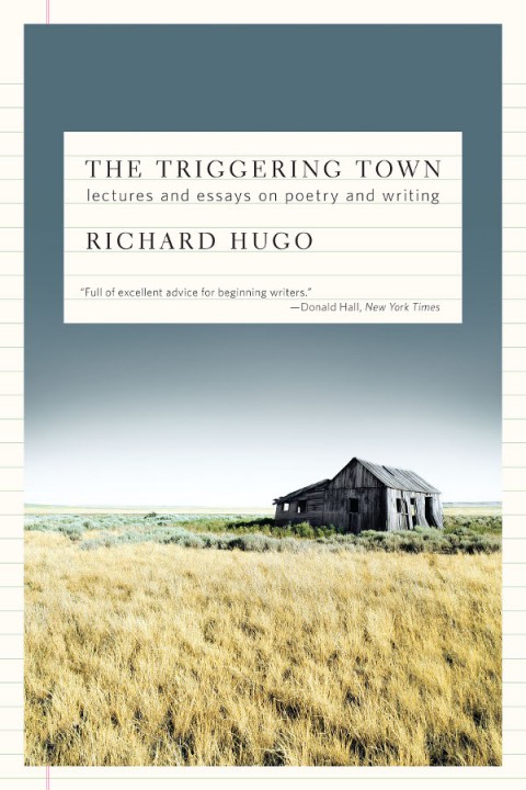
Do you have any recent favourites?

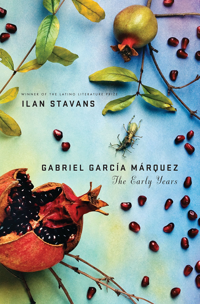
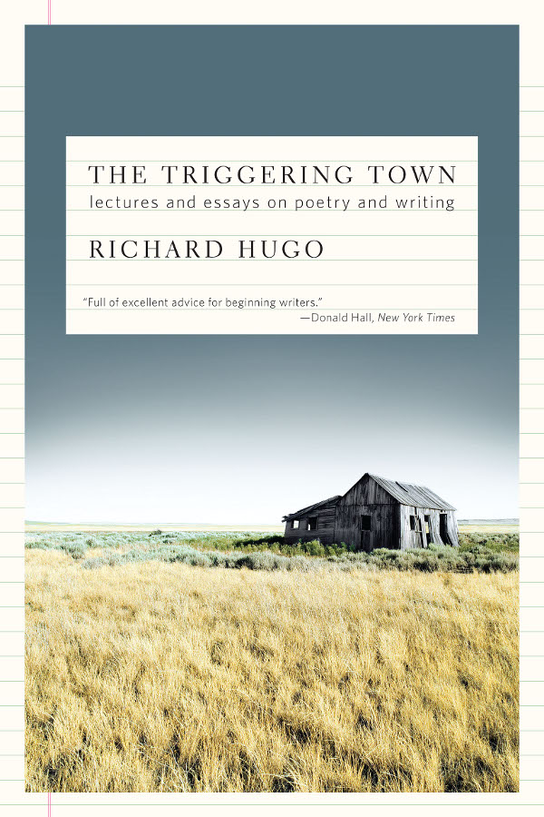
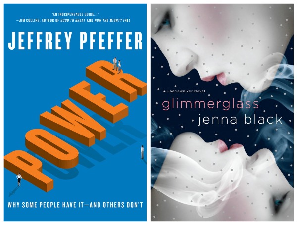
Two recent favorites include, Gabriel García Márquez: The Early Years, a biography that charts Márquez’s life leading up to the publication of his classic, One Hundred Years of Solitude; and Glimmerglass, my foray into the burgeoning young adult paranormal genre. I’m also quite fond of two relatively recent freelance projects: Power, a business management book about leadership and management success; and The Triggering Town, a collection of witty and inspirational essays on writing and poetry.

Where do you look for inspiration, and who are some of your design heroes?

I will take cues from popular culture, be it the daily headlines, magazines, music, television, movies, and the internet. On any given day, I might find inspiration in a post in my Twitter feed, from a thought-provoking illustration within the New York Times, by thumbing through a design or art book, or simply from a conversation had with a friend or colleague. And I’m almost always inspired when inside a book store.

I admire the work of Paul Rand, Alvin Lustig, Vaughan Oliver, Stefan Sagmeister, and Michael Bierut, to name a few. But the reality is that there so many visually creative people, both inside and outside of publishing, whose work I admire and find inspirational.
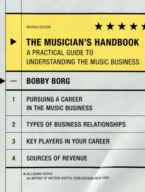
Who else do you think is doing interesting work right now?

There are many smart and talented designers working in publishing today who are consistently creating great jacket design such as Rodrigo Corral, Evan Gaffney, John Gall, Jamie Keenan, Peter Mendelsund, and Gabriele Wilson.

What are you reading currently?

Admittedly, at times I can be a bit lazy. So aside from finishing the lingering manuscript, scrolling through my Twitter feed, or browsing my Netflix queue, it’s not surprising that I’m reading an outdated issue of New York Magazine, inching closer to finishing The Glass Castle which I began last summer, and randomly reading excerpts from the Autobiography of Mark Twain.
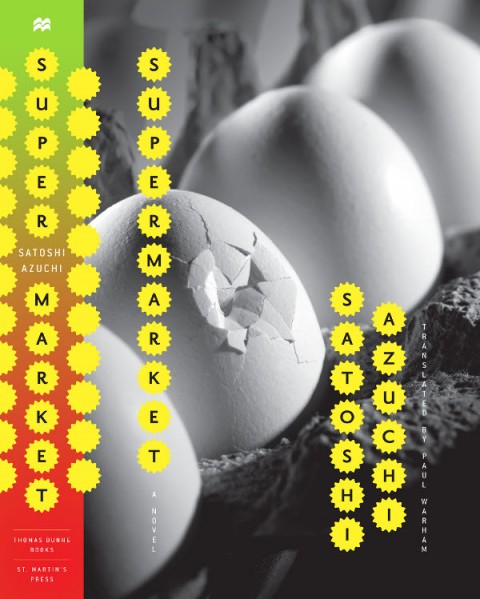
What does the future hold for book cover design?

This is the great unknown. I prefer to believe that the physical book will survive alongside the electronic book. That said, as technology evolves, additional possibilities may be created for book cover design in a digital form. In the long-term perhaps the digital book, both the content and the artwork used to package and identify it, will become multi-dimensional and interactive so that a reader might have the ability to navigate through multiple layers of storytelling. Or maybe I’ve seen one too many Harry Potter movies … I guess we’ll have to wait and see.

Thanks Jason!

1 Comment

Just My Type | The Book Show

Simon Garfield, author of Just My Type: A Book About Fonts, talks to Ramona Koval for The Book Show on ABC Radio National:

RN Book Show —  Simon Garfield: Just My Type Mp3

Comments closed

Peter Mendelsund and the Art of Metamorphosis

I posted about Peter Mendelsund’s reinterpretations of Kafka for Schocken Books rather breathlessly earlier this week, and I wanted to revisit them now I’ve had some time for greater reflection.

The covers are exceptional designs and surprising reinterpretations of Kafka. What particularly interested me, however, is that they are also a surprising direction for Mendelsund to go in.

As Peter himself notes in his original post, the natural impulse when designing Kafka is to draw on the avant-garde art movements of the early 20th Century. These movements — which smashed together fine art, design, typography, photography, montage, and film — burgeoned in Central and Eastern Europe in aftermath of the Russian Revolution and the First World War, a period when Kafka himself was writing (he died in Vienna in 1924).

Unsurprisingly, recent reinterpretations of Kafka (at least the ones that have eschewed the non-design of an author photograph) have incorporated elements taken from Surrealist photography, modernist posters, and silent film.

The influence of the avant-garde is often apparent in Mendelsund’s work. Covers such as The Idiot, Crime and Punishment and The Double and The Gambler by Fydor Dostoevsky, House of Meetings by Martin Amis, and K. by Roberto Calasso all incorporate elements of Suprematism, Constructivism, DADA and other stark European art movements of the early 20th Century. The new covers, however, which focus on the humour in Kafka’s writing, move in a new direction and incorporate elements from the optimistic age of American mid-century modern design.

Mendelsund’s use simple geometric shapes, flat colour backgrounds, and stripe patterns are typical of work by Paul Rand and Alvin Lustig.

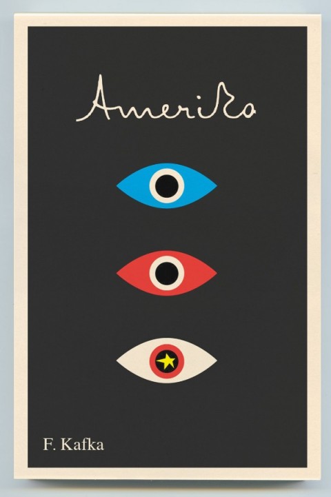
Hand-written lettering of the type we see in Mendelsund’s Kafkas is used to great effect in Lustig’s design for Kafka’s Amerika and is characteristic of several of Rand’s book covers.

As others have noted, the eye motif used by Mendelsund is also similar to Rand’s iconic IBM poster (and his unused logo for the AIGA). But in this instance at least, Rand is clearly not the only influence. His contemporary Rudolph de Harak used the same motif in his cover design for T.E. Lawrence By His Friends published by McGraw-Hill in 1963.

There are echoes too of an exhibition poster by American expatriate designer E. McKnight Kauffer who designed the cover for the Random House edition of James Joyce’s Ulysses published in 1949 (and who was reputedly an influence on Lustig), and a George Salter cover for a Robert Bloch novel, The Scarf, published by The Dial Press in 1947.

The eye motif also recalls Bill Golden’s CBS logo designed in 1951 (repeated in the British Associated Televison ATC logo), which was itself inspired by a Shaker ‘All Seeing Eye’ symbol Golden had seen. And it is perhaps no coincidence that Mendelsund’s design for The Castle (and McKnight Kauffer’s poster) is reminiscent of the masonic Eye of Providence (also known as the “all-seeing eye of God”) familiar from the US one dollar bill.

Of course, not all of these elements and influences are new to Mendelsund’s work (see his designs for The Millennium Trilogy boxed set), and the new covers draw on some of his more familiar inspirations such as Jean Arp, a founding member of the DADA movement (and likely an influence on Lustig), and post-war European design (see Germano Facetti’s design for George Orwell’s 1984 designed in the early 1960’s).

But compare the Kafka covers to Mendelsund’s recent designs for The Snowman by Jo Nesbø  or C by Tom McCarthy, and the difference is striking. To look at these macabre designs for Knopf — which seem to owe more to the cut-and-paste of DADA, the punk aesthetic of Barney Bubbles or, perhaps, the anti-design of David Carson’s Ray Gun —  is like looking at the work of a wholly different designer.

That Mendelsund is capable of reinterpreting and subverting mid-century modern and making it his own not only demonstrates his creative flexibility, but serves to reminds us that one of his greatest strengths as a designer is his ability to surprise and delight us.

8 Comments

Merchants of Culture | Beyond the Book

An interesting interview with John B. Thompson, author of Merchants of Culture: The Publishing Business in the Twenty-First Century, at Beyond the Book:

[R]eaders are going to be faced with a growing proliferation of possibilities in terms of the ways that they read and consume the written word, and people will make different choices about that. I think what we will see is some readers will migrate effortlessly into an electronic environment and will welcome the emergence of a variety of different ways to read texts online or in dedicated e-book readers or on iPads or other forms of device that will enable them to read in different ways and different contexts… Others will find it less attractive and will continue to value some aspects of the printed book that are important to them, because for many readers, books are not just reading devices. Books are cultural artifacts. They are social objects. They are indeed forms of art, which they like to own and possess and to put on a shelf and display and to share with others and to return to time and again and read on various occasions in the future. And they will continue to cherish that physical objective character of the printed book. And so, some will not choose to read in an online or an electronic form, because for them, the book matters as an object.

Beyond the Book John B. Thompson Mp3

(via MobyLives)

2 Comments