In this RSA Animate video, Evgeny Morozov, author of The Net Delusion, takes a critical look at the role of the internet in global politics:
(via Kirstin Butler)
Comments closedBooks, Design and Culture

Inspired by Brian Christian’s new book The Most Human Human, the chaps from Radiolab examine what talking to machines can tell us about being human. The show includes an interview with Jon Ronson, author of The Pyschopath Test, about an article he wrote for GQ on talking to robots.
Brian Christian was also interviewed about The Most Human Human recently by CBC Radio’s technology and culture show Spark.
Comments closed
As part of a series of interviews on WNYC about Brooke Gladstone’s new book The Influencing Machine, illustrator Josh Neufeld talks about working on the project with Brian Lehrer:
Also in this segment, Gladstone discusses science fiction and political bias in the media.
Comments closed The New Museum — Steven Heller profiles Will Schofield, the man behind the awesome 50 Watts blog, for The Atlantic:
For want of money, Schofield notes that he always bought cheap used copies and mass-market editions of the books he actually read. “So before I ever thought about design history, I had stacks of books from New Directions, Grove, Calder, Doubleday Anchor, Ace, and the Time Reading Program. Once I learned the names, I realized I had been long been admiring the work of designers like Paul Rand, Alvin Lustig, George Salter, Milton Glaser, Seymour Chwast, George Giusti, and Roy Kuhlman and illustrators like Edward Gorey and the Dillons.”
A Country Without Libraries — A stirring defence of public libraries by poet Charles Simic for the NYRB:
I don’t know of anything more disheartening than the sight of a shut down library. No matter how modest its building or its holdings, in many parts of this country a municipal library is often the only place where books in large number on every imaginable subject can be found, where both grownups and children are welcome to sit and read in peace, free of whatever distractions and aggravations await them outside. Like many other Americans of my generation, I owe much of my knowledge to thousands of books I withdrew from public libraries over a lifetime. I remember the sense of awe I felt as a teenager when I realized I could roam among the shelves, take down any book I wanted, examine it at my leisure at one of the library tables, and if it struck my fancy, bring it home. Not just some thriller or serious novel, but also big art books and recordings of everything from jazz to operas and symphonies.
See also: Why Libraries Still Matter by Laura Miller for Salon.
God Arrived by Train — An interesting article about the philosopher Ludwig Wittgenstein, and an exhibition on his life currently on display at Schwules Museum in Berlin, 60 years after his death:
Wittgenstein may have gained a reputation as a solitary, tormented and alienated philosopher, but the exhibition seeks to show the many social ties he had in England and Austria, which continued after he was no longer active in academia. Among others, he formed connections with prominent figures such as the philosophers of the “Vienna Circle” (whose school of logical positivism was deeply influenced by his thinking ) – architect Adolf Loos, writer and satirist Karl Kraus and economists Piero Sraffa and John Maynard Keynes. When Wittgenstein returned to Cambridge University in 1929, Keynes wrote to one of their friends: “Well, God has arrived. I met him on the 05:15 train.”
And finally…
 Slate has an excerpt from The Influencing Machine by Brooke Gladstone and illustrated by Josh Neufeld, mentioned earlier this week.

Here’s the neat animated short for the new nonfiction comic book The Influencing Machine by Brooke Gladstone, co-host of NPR’s weekly radio show On the Media, and illustrated by Josh Neufeld:
The book apparently looks at the history of the media and argues against the idea that media is external force outside of our control.
The Influencing Machine is published by W.W. Norton.
Comments closed
Last Thursday The New York Times hosted an exhibition of rejected book jacket designs called ‘Killed Covers’. Fortunately for those of us who don’t live in New York they’ve also posted a gallery of 20 covers from the show.
(Pictured above left: design by Roberto de Vicq, Wetlands. Right: design by John Gall and Leanne Shapton, Autograph Man)

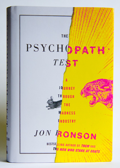
Half Crazy — Matt Dorfman on his great book cover design for The Psychopath Test by Jon Ronson, published by Riverhead Books:
Riverhead did not skimp on the production touches for this one. They sprung for a combination gritty matte finish (which covers the white paper portions of the jacket) and a shiny gloss for the yellow/magenta “crazy” half, thereby giving your sense of touch a noticeable edge if you find yourself blindly scanning your shelf for this book in a dark room (which I have done).
The Intimate Orwell — Simon Leys reviews Diaries by George Orwell, edited by Peter Davison, and George Orwell: A Life in Letters also edited and annotated by Davison, for the NYRB:
From the very start, literature was always Orwell’s first concern. This is constantly reflected in his correspondence: since early childhood “I always knew I wanted to write.” This statement is repeated in various forms, all through the years, till the end. But it took him a long time (and incredibly hard work) to discover what to write and how to write it. (His first literary attempt was a long poem, eventually discarded.) Writing novels became his dominant passion—and an accursed ordeal: “writing a novel is agony.” He finally concluded (some would say accurately), “I am not a real novelist.” And yet shortly before he died he was still excitedly announcing to his friend and publisher Fredric Warburg, “I have a stunning idea for a very short novel.”
Investigative Self-Repair — Author James Lasdun (It’s Beginning to Hurt) reviews Edward St. Aubyn’s latest semi-autobiographical Patrick Melrose novel At Last for The Guardian:
This act of investigative self-repair has all along been the underlying project of these extraordinary novels. It is the source of their urgent emotional intensity, and the determining principle of their construction. Not much gets into these books that doesn’t bear directly on Patrick’s predicament. Exposition is kept to a minimum; there are few descriptive passages, no digressions. For all their brilliant social satire, they are closer to the tight, ritualistic poetic drama of another era than the expansive comic fiction of our own.
And finally…

The General Specialist — Designer, illustrator, and letterer Jessica Hische talks to Method & Craft:
Comments closedI love learning about new things whether or not they directly connect to how I earn a living and I think that this desire to pay attention to related industries is one of the reasons why I’m a figure in the design community. It’s by learning about many things that you’re able to understand specialization—that design is broken into countless micro-industries. If you don’t understand the differences between them (or acknowledge that they exist), there is no way for you to find your own specialized niche with in it.

With the winter winds and driving rain, things naturally fall apart — twisted, gnarled, and eventually incapable of function. When something goes wrong, the solution is often improvised with whatever is available. This haphazard collage of old materials can make it feel as if the country is in a constant state of disrepair. The fences and gates, in particular, embody this with their bespoke supports. When one part collapses or a hole appears, the ubiquitous blue twine come out to bind everything together. Sometimes the original structure disappears altogether, and all that remains is the collection of parts propping it up. With this unspoken artistry, the unexpected is made.
— From the introduction to In the Wilds by Nigel Peake

One of the joys of working at Raincoast Books is receiving books from New York-based publisher Princeton Architectural Press in the mail. This week, a beautiful 6″ by 8″ hardcover called In the Wilds by artist Nigel Peake arrived.

Peake who has worked with the likes of Ninja Tune, The Believer, Blueprint, and Dwell Magazine, lives and works in the Irish countryside (the self-described “middle of nowhere”). In The Wilds collects together his obsessively detailed drawings and watercolors of this rural life — the trees, fields, lakes, and rolling hills, but also farm houses, tractors, fences, and telegraph poles.
It is simply lovely.


Is this the cover in the painting?
Certainly a lot of people seem to think so and some things do fit. Titus Groan is, of course, the first book in the Gormenghast trilogy by Mervyn Peake, and this particular Penguin Modern Classics edition was, I believe, first published in 1974. The drawing on the cover (by Mervyn Peake?) is also somewhat similar stylistically to the work of Balthus, mentioned in the title of the painting, so that would make sense I suppose.
However, the features of the faces do not look particularly alike — the features in the painting are more angular — and the hair/shadow to the left of the face on the book cover is notably absent on the cover in the painting. The mood of both seem quite different (to me at least). Can this simply down to artistic license or painterly technique on the part of Hagan?
Other compelling suggestions have been thin on the ground. T.E. Lawrence’s The Mint has been suggested, and there are some similarities to the cover of The Waves by Virginia Woolf, but neither seems quite right and they do not fit with the trilogy alluded to in the title.

There may never be a definitive answer — the artist, Frederick Hagan, died in 2003 — but please let me know if you have any further suggestions or thoughts.
Comments closed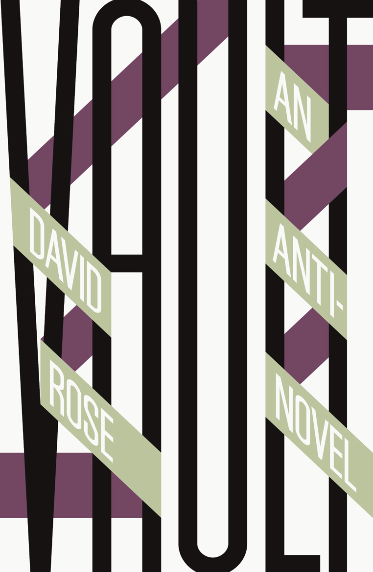
A distinctively typographic cover by David Pearson for Vault by David Rose, new from Salt Publishing.
Giving Up Irony — John Self reviews Edward St. Aubyn’s At Last:
The author’s background, like Patrick’s, is of inherited wealth; perhaps it is this which enables him to treat his characters mockingly and sympathetically at the same time. His brittle, witty prose evokes comparisons with Evelyn Waugh, whose snobbish attraction to the upper classes, looking in on them from without, contrasts with St Aubyn’s cool-eyed appraisal. The phrase “a handful of dust”, quietly slipped into At Last, could be an acknowledgement of the similarities and contrasts.
Patrick is like his creator, not just in his background, but in his stylistic weaknesses:
“It’s the hardest addiction of all. Forget heroin. Just try giving up irony, that deep down need to mean two things at once, to be in two places at once, not to be there for the catastrophe of a fixed meaning.”
The Architecture of the Secret Lair — Mark Lamster for Design Observer:
The Bin Laden compound makes an interesting contrast with the secret modern lairs created for Bond villains by the legendary production designer Ken Adam. These have routinely been described as unrealistic, insofar as they could never be built without drawing attention. It’s curious now, in retrospect, to think that it was fear that kept the local population from Dr. No’s island hideaway (which was just off British and American territory). Though Bond films make us think of visual extravagance, the most visually arresting set from the film was the rather raw interrogation room, with its cross-beam, ocular ceiling. What was in Osama’s basement?
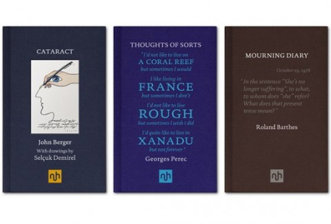 Notting Hill Editions, a new publishing imprint devoted to the essay, launches this month with books by from John Berger, Georges Perec and Roland Barthes among others. The typographic covers were designed by Garvin Hirst at Berlin-based design consultancy Flok.
And finally…
The Burden of Entertainment — Woody Allen discusses five books that still resonate with him:
The Catcher in the Rye has always had special meaning for me because I read it when I was young – eighteen or so. It resonated with my fantasies about Manhattan, the Upper East Side and New York City in general.
It was such a relief from the other books I was reading at the time, which all had a quality of homework to them. For me, reading Middlemarch or Sentimental Education was work, whereas reading The Catcher in the Rye was pure pleasure. The burden of entertainment is on the author. Salinger fulfils that obligation from the first sentence on.
Reading and pleasure didn’t go together for me when I was younger. Reading was something you did for school, something you did for obligation, something you did if you wanted to take out a certain kind of woman. It wasn’t something I did for fun. But Catcher in the Rye was different. It was amusing, it was in my vernacular, and the atmosphere held great emotional resonance for me. I reread it on a few occasions and I always get a kick out of it.

Do you recognise these books?
Plant, Trilogy and Balthus is going to be part of an exhibition on the work of Canadian painter Frederick Hagan (1918–2003) at the MacLaren Art Centre this summer and curator Ben Portis would like your helps identifying the Penguin paperbacks in the picture (click the image above for a closer look).
The only other clues we have are that the books form a trilogy and were published prior to 1982.
If you recognise the books or have any further thoughts or suggestions, please leave a comment below or drop me a line and I’ll pass them on to Ben.
Here are the full details of the painting:
Plant, Trilogy and Balthus, 1982
Frederick Hagan (Canadian, 1918–2003)
oil on hardboard
40.4 x 60.6 cm
Thanks!

A Taxonomy of Office Chairs by Jonathan Olivares and published by Phaidon is a visual overview of the evolution of the modern office chair and detailing the most innovative chairs designed and built from the 1840s to the present.
In this video, Olivares talks about the book and the importance of the office chair in design history:

(via Daily Icon)
Comments closed