Skip to content

Category: Books

A Dirge for a New World

Empire Design
Empire Design

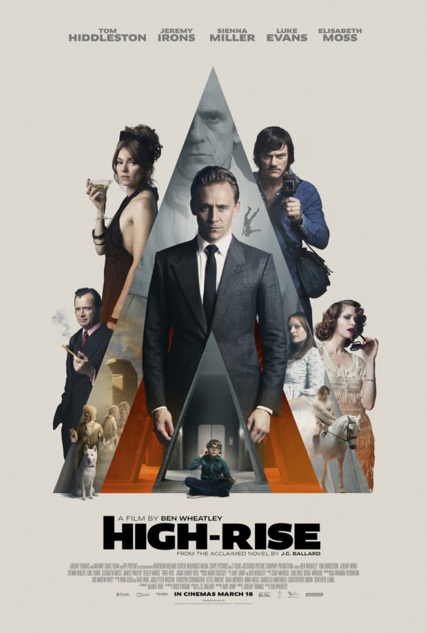
Andrew F. Sullivan, author of ultra-violent urban noir WASTE,1 reviews Ben Wheatley’s adaptation of High-Rise by J.G. Ballard for TIFF.Net:

Wheatley and Ballard point to a pattern—a dissolution of social order that cannot be prevented by technology or progress. Even the most unnatural setting seems to only drive humanity back to its base needs—food, water, shelter, flesh. The past, the basest parts of being human, carry more weight than any building, any new technological development. Elevators become new traps for the hunters. The supermarket on the seventh floor is one last place to forage. Even the soundtrack reimagines this future past for the audience, Portishead performing ABBA’s pop hit “S.O.S.” as a warning for the residents and viewers alike—a dirge for a new world.

Residents begin to harvest the building itself for what they need and reject the outside world. Wheatley’s design team has mimicked the 70s-era incredibly well, but everything is innovative. The products and designs on the shelves are made specifically for this brave new world. The future is behind us. The high-rise becomes a place unto itself—a slow motion horrorshow.

Much like his previous work, Wheatley refuses to provide a straight narrative for the audience and at times, the film descends into an anarchic blend of images without the rules to bind them—as it should. We scurry past a horse on a rooftop, a gang of TV presenters armed with baseball bats and chair legs, a dog drowned in the pool. Parties turn into rituals, sacrifices, religious ceremonies and then dissolve back into chaos once again. Wheatley’s camera starts out sleek and mannered, transitioning smoothly from one floor to the next. However, once the social order slides, the narrative structure breaks under the strain. Viewers slider from one party to another, the camera following bodies as they rise and fall. The film itself opens with an ending.


Edwin Turner has also written about High-Rise at Biblioklept. Ed’s opinion of the movie is less favourable than Andrew’s, but his post also pointed me to Tasha Robinson’s interesting review of the film at The Verge:

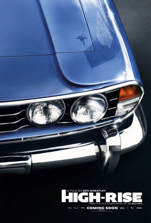
There’s a touch of Luis Buñuel’s ‘Exterminating Angel’ in the way everyone in the building seems to be stuck there, isolated from the outside by mutual consent, for no reason anyone cares to address. But Wheatley’s visual style never feels beholden to Buñuel. It’s more familiar from 1960s speculative-fiction films. The Brutalist architecture and cold sterility of the building suggests Jean-Luc Godard’s ‘Alphaville,’ and the polished futurism and stiffly remote characters are reminiscent of François Truffaut’s ‘Fahrenheit 451.’ The retro cars, suits, and architecture all put ‘High-Rise’ more in a quaint, remote past than a dystopian future. They also add to the sense of otherworldliness that hangs over the film.

And so does the sense that High-Rise is driven more by Wheatley’s poster-ready striking images —€” a suicide falling from a high balcony in ultra slow motion, Laing expressionless and spattered with paint — than by any sort of human drives. “Laing would surrender to a logic more powerful than reason,” Hiddleston narrates, hand-waving away any irrational behavior. No one in the film really operates on reason, they just represent emotional factions. Wilder becomes a feral, untrustworthy spirit of the denied and oppressed. Ann becomes an equally monstrous symbol of the selfish, out-of-touch aristocracy that actively enjoys spitting on everyone below them. Both sides are poisonous. Laing isn’t an innocent caught in the middle, he’s desperately looking for a place to fit in, and his narrative isn’t about saving anyone, not even himself.

Empire Design
Empire Design


2 Comments

Rogue Bibliophile

rogue bibliophile 2500AD Tom Gauld

Tom Gauld‘s cartoon on the future for book lovers for The Guardian this weekend.

Tom also did the cover and interior illustration in this weekend’s Guardian Review for an article on plot by John Mullan.

joy of plot tom gauld

Comments closed

Roy Kuhlman Archive

Early this week I posted about the Robert Brownjohn online archive created by his daughter, Eliza. Today, a new website dedicated to the work of the graphic designer Roy Kuhlman curated by his daughter, Arden Kuhlman Riordan, has gone live.

Kuhlman is best known, of course, for the brilliant mid-century modern book covers he designed for Grove Press. The site is not comprehensive — at least not yet — but given the number of covers  and other pieces Kuhlman must have designed over his career that is, perhaps, not surprising. Archiving his work must be a massive undertaking. Hopefully there is much more to come.

1 Comment

Australian Book Design Awards Winners 2016

Design by Laura Thomas (Scribe / 2016)

Congratulations to all the winners of the Australian Book Design Awards 2016 announced yesterday in Melbourne!

Lion-Attack design Allison Colpoys
Design Allison Colpoys
KingRich-design Darren Holt
Design Darren Holt


T2thebook-design Evi O
Design Evi O

See all the winning designs on the ABDA website.

Comments closed

Robert Brownjohn Archive

watching-cover

The work of influential designer Robert Brownjohn, best known for the title sequence for the 1964 James Bond film Goldfinger, has been archived online by his daughter Eliza.


If you’re unfamiliar with Brownjohn’s work, I would also recommend picking up a copy of Sex and Typography, Emily King’s book on the designer published by Princeton Architectural Press a few years back.

(via Creative Review)

Comments closed

Today in Micro-Trends: Cassette Tape Book Covers

This is another one of those posts that started out on Twitter — a flippant tweet from me sparking a conversation about books with cassette tapes and vinyl records on their covers. It turns out that putting a record on a cover has become quite popular. Unfortunately the composition of many of these covers is often strikingly similar, even if the tone/intent is different.

The combination of clunky retro-future technology of cassettes and the DIY aesthetic of mix tapes, on the other hand, provides a richer vein of inspiration…

Art Behind the Mixtape design UnderConsideration
The Art Behind the Tape by Marshall “DJ Mars” Thomas, Djibril Ndiaye, Maurice Garland, and Tai Saint-Louis; design UnderConsideration (2015)

Big Rewind design Regina Starace
The Big Rewind by Libby Cudmore; design by design Regina Starace (William Morrrow / February 2016)

Counter Narratives Palgrave Macmillan
The Counter-narratives of Radical Theology and Popular Music edited by Michael Grimshaw; design Palgrave Macmillan Design (Palgrave Macmillan / May 2014)

don't-you-forget-about-me
Don’t You Forget About Me by Jancee Dunn; design by Catherine Casalino (Villard Books / July 2008)

9781846146459
Earthbound by Paul Morley; design by Jim Stoddart (Penguin / August 2013)

he died with his eyes open design Christopher King
He Died with His Eyes Open by Derek Raymond; design by Christopher Brian King (Melville House / October 2011)

Iron Rose design W H Chong
An Iron Rose by Peter Temple; design by W. H. Chong (Text / June 2016)

Kill Your Friends design Glenn ONeill photo colin thomas
Kill Your Friends by John Niven; design by Glenn ONeill; Photograph Colin Thomas (Cornerstone / July 2014)

Landscapes of the Metropolis of Death design Jim Stoddart
Landscapes of the Metropolis of Death by Otto Dov Kulka; design by Jim Stoddart (Penguin / March 2014)

UMN28 Walsh Bootlegs D1.indd
Bar Yarns and Manic Depressive Mix Tapes by Jim Walsh; design by Michel Vrana; lettering by Robert Lawson (University of Minnesota Press / NYP)

New Sorrows design Clare Skeats
The New Sorrows of the Young W. by Ulrich Plenzdorf; design Clare Skeats; cover art by Joel Penkman; series design David Pearson (Pushkin Press / September 2015)


Signal to Noise by Silvia Moreno-Garcia; design by Erik Mohr (Solaris / October 2015)

Tape
Tape by Steven Camden; cover art by Keri Smith (HarperCollins Children’s Books / January 2014)

Tsar of Love and Techno design Christopher Brand Photography Bobby Doherty
Tsar of Love and Techno by Anthony Marra; design Christopher Brand; photography Bobby Doherty (Hogarth / October 2015)

(I also rather like this tape-related killed cover by designer Na Kim)

So there you have it — cassette tape book covers are a thing. But please let’s not get started on VHS tape book covers…

Comments closed

Author Health Hazards

Author Health Hazards Tom Gauld

Tom Gauld for The Guardian.

Comments closed

Book Covers of Note May 2016

It’s the first week of May (whaaaat?), so it must be time for some new book covers…

barren cove design Chelsea McGuckin
Barren Cove by Ariel S. Winter; design by Chelsea McGuckin (Atria / May 2016)

congratulations on everything design Gary Taxali
Congratulations on Everything by Nathan Whitlock; cover art by Gary Taxali (ECW / May 2016)

Even-the-Dead design David Shoemaker
Even the Dead by Benjamin Black; design by David Shoemaker (Henry Holt / January 2016)

9781594206863
The Ecliptic by Benjamin Wood; design Jamie Keenan (Penguin Press / May 2016)

Girls on Fire US design Robin Bilardello
Girls on Fire by Robin Wasserman; design by Robin Bilardello (Harper / May 2016)

Girls on Fire UK design Jack Smyth
Girls on Fire by Robin Wasserman; design by Jack Smyth (Little, Brown / May 2016)


The Haters by Jesse Andrews; design by Chad W. Beckerman and Will Staehle (Abrams / April 2016)

How Propaganda Works design Chris Ferrante
How Propaganda Works by Jason Stanley; design by Chris Ferrante (Princeton University Press / May 2016)

Industries of the Future design Jason Heuer
Industries of the Future by Alec Ross; design by Jason Heuer (Simon & Schuster / February 2016)

Imagine Me Gone design Keith Hayes
Imagine Me Gone by Adam Haslett; design by Keith Hayes (Little, Brown & Co. / May 2016)

Killing Bobbi Lomax design Alex Kirby
The Killing of Bobbi Lomax by Cal Moriarty; design by Alex Kirby (Faber & Faber / May 2016)

Leviathan Gaspereau
Leviathan by Carmine Starnino; design Andrew Steeves (Gaspereau / April 2016)

OBrien_TheLittleRedChairs_HC.indd
Little Red Chairs by Edna O’Brien; design by Keith Hayes (Little, Brown & Co. / April 2016)

Macroeconomics design David Drummond
Macroeconomics by Ben Fine and Ourania Dimakou; design by David Drummond (Pluto Press / May 2016)

Microeconomics design David Drummond
Microeconomics by Ben Fine; design by David Drummond (Pluto Press / May 2016)

Madonna in a Fur Coat design Coralie Bickford Smith
Madonna in a Fur Coat by Sabahattin Ali; design by Coralie Bickford-Smith (Penguin / May 2016)

Mother Robin Bilardello
The Mother by Yvvette Edwards; design by Robin Bilardello (Amistad / May 2016)

My Mad Fat Diary design Olga Grlic
My Mad Fat Diary by Rae Earl; design by Olga Grlic (St. Martin’s Griffin / April 2016)

Once and For All design Erik Carter
Once and for All by Delmore Schwartz; design Erik Carter (New Directions / May 2016)

The Outside Lands design Ami Smithson
The Outside Lands by Hannah Kohler; design by Ami Smithson / Cabin London (Picador / May 2016)

Saltzman_PerfectLife
A Perfect Life by Eileen Pollack; design by Allison Saltzman (Ecco / May 2016)

Prodigals design Rodrigo Corral
Prodigals by Greg Jackson; design by Rodrigo Corral (Farrar, Straus & Giroux / March 2016)

Sleeping Giants design Chas Brock

sleeping giants design chas brock
Sleeping Giants by Sylvain Neuvel; design by Charles Brock / Faceout Studio (Del Ray / April 2016)

where-the-bird-sings-best-design-Richard-Ljoenes
Where the Bird Sings Best by Alejandro Jodorowsky; design by Richard Ljoenes (Restless Books / April 2016)

why they run the way they do design Alison Forner
Why They Run the Way They Do by Susan Perabo; design Alison Forner (Simon & Schuster / February 2016)

Comments closed

Jason Booher Interviewed at The Perch

Last Magazine design Jason Booher

Jason Booher, designer and art director of Blue Rider Press and Plume, talks to Penguin Random House blog The Perch about the book cover design process:

A design can be thought of as a set of constraints or parameters. In book design, these consist of things like the conceptual literary content of the book, what makes the book unique in the context of other similar books or all books, how the author is (or is not) known, the expectations of the book from the point of view of the author/editor/sales force/readers, the context of book jacket in the contemporary moment, the context of book jackets in the last 10 (or even 20) years, visual pop culture. Or something that is obvious and not obvious is working with type is very difficult. And it perhaps the most specialized thing that graphic designers bring to that general problem solving into form.

Jason also describes how he approaches a book cover:

There’s a combination of reading the manuscript, and listening to the editor talk about the book. As an art director, I have to dip into almost all the of the books to see what they are like before deciding to whom to give each title. As a designer (if I’m working on that title’s jacket) it’s always different with every book. But as a general process I will read the book, and think and sketch, and sketch, and reread, work though a number of ideas, throw most of them out, stay with others, reread, take a walk (much harder when you are also the art director), try to come up with something new. Those are the first steps.

And how he works with other designers:

When I work with a freelancer (as well as with my in-house designers), I like to see what they come up with without any input from me. Not only are you more likely to get something special and surprising, something you couldn’t have thought of yourself (which is why art directors work with a variety of freelancers in addition to their in-house staff), but you are sending a signal of trust. If a designer knows what “kind” of design they are expected to deliver, they might not push very far or hard. But if they take ownership of being the first arbiters of what the package of the book might be, there is more of a chance for something brilliant. I’m just trying to maximize the talent I have working with me.

With my in house staff, it is similar but there might also be a concept that is floating that we will work with. Or occasionally I’ll work with one designer or my whole team to come up with  ideas together. That’s an exception though, and cover design is generally a sole enterprise in the initial stages. Then it becomes a collaboration when I see comps, and goes from there.

Read the whole interview here.

Comments closed

A Publishing House of Her Own

LadyWiththeBorzoi.indd

Joanna Scutts reviews The Lady with the Borzoi, Laura Claridge’s new biography of Blanche Knopf, for the New Republic:

When the house of Knopf launched in 1915, publishing was a gentleman’s pursuit—amateur, clubbish, WASP, and above all, male. Blanche and Alfred navigated this casually anti-Semitic world, holding themselves aloof from their alcoholic, philandering competitor, the “pushy Jew” Horace Liveright, founder of the Modern Library and publisher of T. S. Eliot’s The Waste Land. Over the years there would be female secretaries, copywriters, reviewers, and editors at Knopf. There would be women in charge of little magazines and the children’s-book divisions of big publishers. But there would be no other woman in the publishing industry with the status of Blanche Knopf—either in the 1920s, when she signed Langston Hughes and Willa Cather, or in the 1950s, when she celebrated Albert Camus’s Nobel prize and oversaw the translation of Simone de Beauvoir’s The Second Sex. And despite it all, although her husband swore he’d put her name on the masthead, he never did…

…For the Knopfs, marriage proved much more difficult than publishing. In Claridge’s hands Alfred Knopf takes his place in twentieth-century literature’s crowded pantheon of assholes—his great loves were the American Southwest, expensive wine, and the ritual humiliations of his friends, his family, and most of all, his wife. One after another, acquaintances and co-workers attest to a relationship that today we’d call toxic; a stew of jealousy, incompatibility, violence, and—just when it couldn’t get worse—yearning affection.

Comments closed

The Many Ways a Book Cover is Rejected

Is That Kafka design Erik Carter

In an excellent post for The Literary Hub, designer Erik Carter writes about designing the cover of Reiner Stach’s Is That Kafka? 99 Finds for New Directions, and the process of getting a book cover approved:

The actual process of designing a book jacket is more than just reading the book and making a beautiful image with your favorite font and slapping it on the front. A good cover should represent the spirit of the book and celebrate what makes that book unique. So then why do so many covers fall for the same visual clichés as so many other covers? Go on down to your local online book dealer and you’ll see bargain bin stock photos adorned with tiny endorsements about how this book is so, so much better than other one you’re about to click on. In order to get a book cover approved you have to get the sign off from the art director that you’re working for, the marketing department, the author, the editors, sometimes even the author’s spouse, their milkman, or their next door neighbor. It’s a nimble game of politics that you have to play to get the vision that you have for a cover into the bookstore. And it’s a game where design is often the loser. The publisher wants the book to sell, the designer wants the book to look good, and the author wants the cover to match their vision of what the cover of their book should be. And almost always, these three are at odds. There is a lack of definition for “what looks good” and a shaky science as to “what will sell” and authors are so close to their books it can be difficult to find out what it is that they actually want. The language of aesthetics and the aesthetics of language need to trust each other. It’s important for designers to be more acclimated with what it is that a publisher is looking for as to what will sell. Compromising that business by stretching your typefaces to the point of unreadability may not do you any favors. Ultimately it’s the author’s book, and they know it far better than you do, so really it’s their opinion that matters the most, even if they are not familiar with the fundamentals of good design.

Comments closed

Jane Eyre Uncovers Mister Rochester’s Secrets

Jane Eyre Tom Gauld

Tom Gauld for The Guardian.

Comments closed