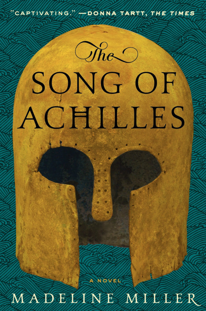
I am about a month late to this, but Oliver Laing (author of booksyou shouldread), wrote about Daphne Du Maurier, and the strangeness of her bestselling novel Rebecca, for The Guardian:
Rebecca has a disturbingly circular structure, a closed loop like James Joyce’s Finnegans Wake. It ends with Manderley in flames, but the first two chapters are also the conclusion. Husband and wife have been condemned to the hell of expatriation, in a hot, shadowless, unnamed country, staying like criminals in an anonymous hotel. It is apparent that they are revenants in a kind of afterlife, their only pleasure articles from old English magazines about fly fishing and cricket. The narrator attests to their hard-won happiness and freedom, while knowing it resides in a place accessible only by the uncertain routes of dream and memory, expelled from the Eden they never quite possessed.
Du Maurier was under no illusions as to the bleakness of what she had written. “It’s a bit on the gloomy side,” she told her publisher, Victor Gollancz, adding nervously “the ending is a bit brief and a bit grim”. But her predictions of poor sales were inaccurate. Rebecca was a bestseller; 80 years on it still shifts around 4,000 copies a month.
Virago have published a special hardcover edition of Rebecca to celebrate the novel’s 80th anniversary. The cover designed was by Hannah Wood whose artwork was embroidered by specialists Hand & Lock. You can read about the process here.
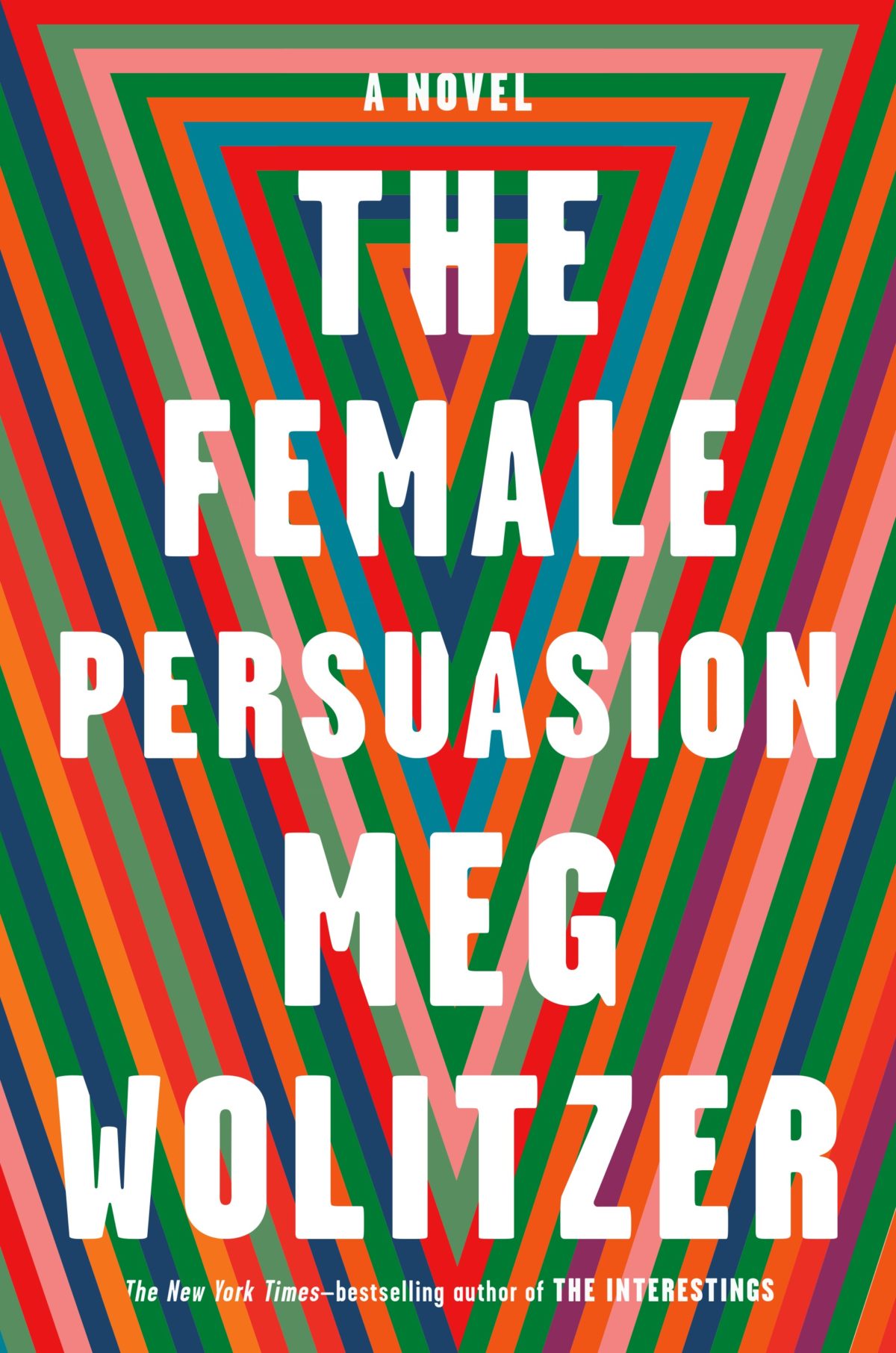
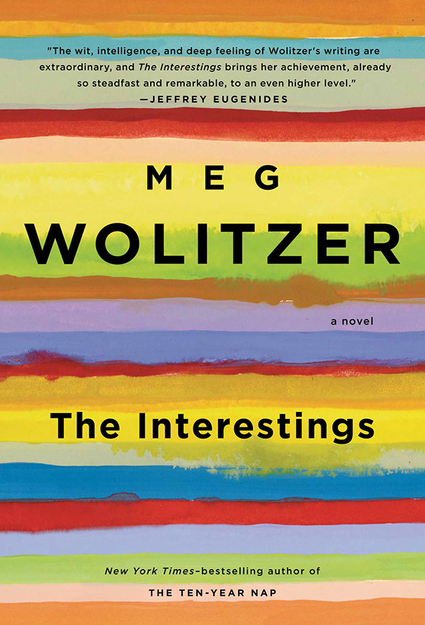
I like how the design for The Female Persuasion has bands of colour similar to those on Lynn Buckley’s cover design for The Interestings, but uses them in a completely different way…
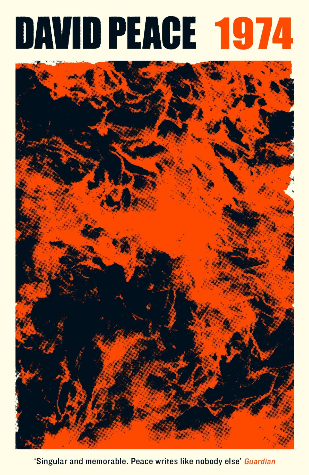
Patient X by David Peace; design by Luke Bird (Faber & Faber / April 2018)
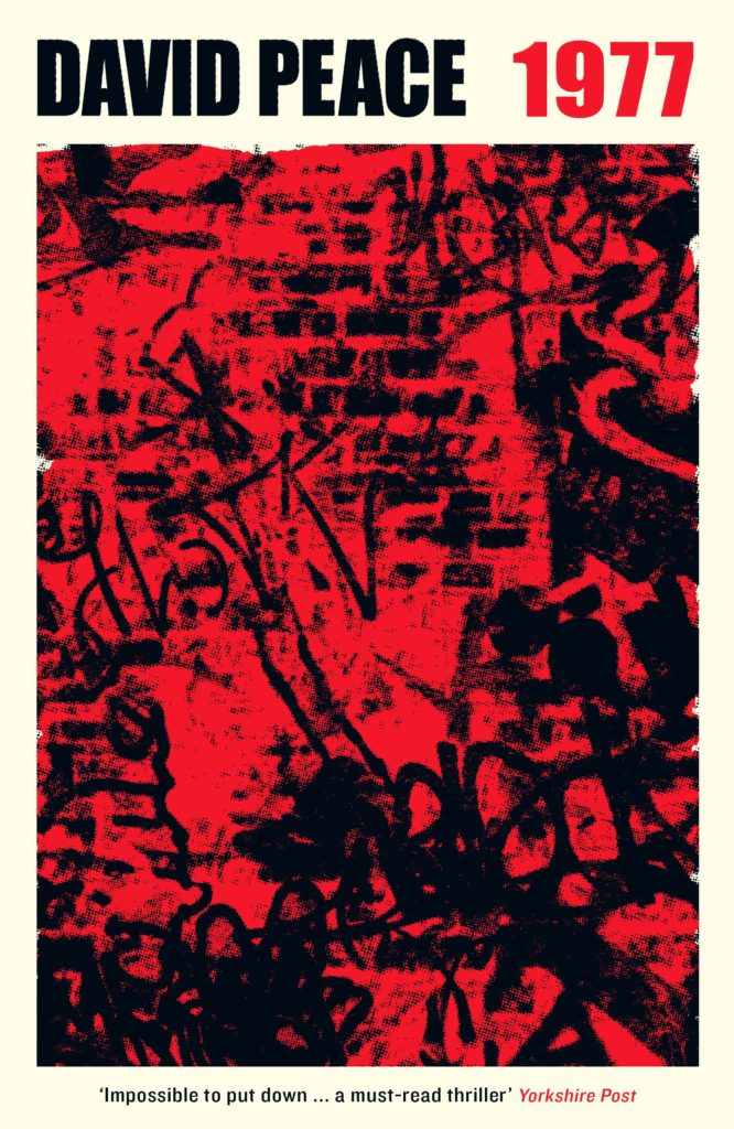
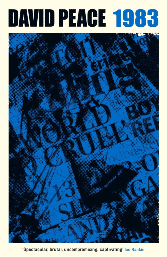
And on the subject of David Peace, Steve Panton has designed new covers for the Red Riding Quartet (1974, 1977, 1980 and 1983) published by Serpent’s Tail this month:
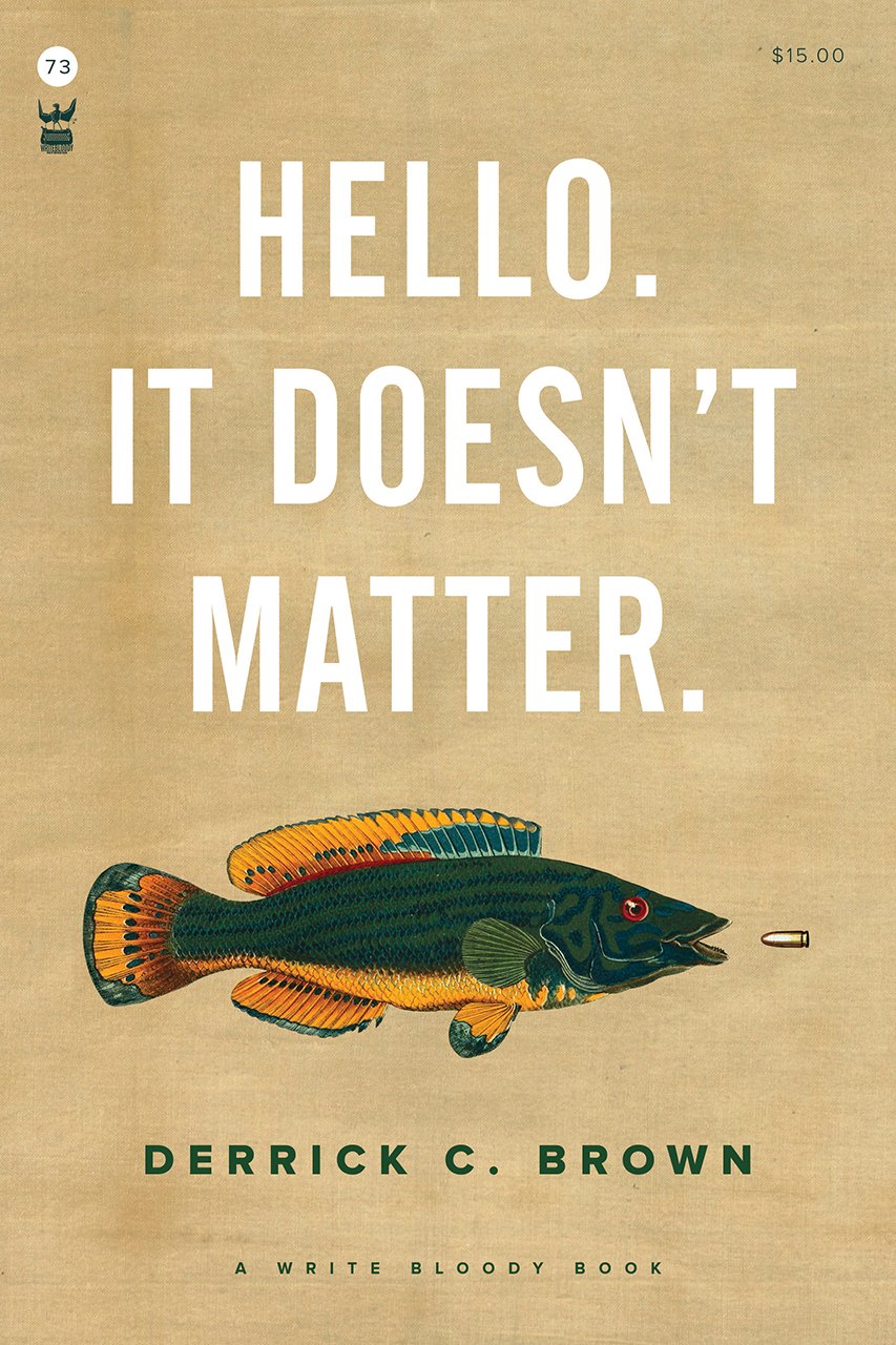
Funnily enough, I was just discussing the prevalence of big and centred white sans serif type on contemporary book covers on Twitter. While it’s common (see the covers of The Female Persuasion and Hello, It Doesn’t Matter above!), it’s also effective when it’s done well. That said I did think that David Pearson — a designer well known for his typographic covers — made a good general point about big type:
The idea that legibility is enhanced by big type is so flawed. Big type surrounded by busyness is often no more legible than small type surrounded by space. Perhaps it is the space that people are scared of. Our idiot eyes might look at the wrong part of the cover.
Today, comics are studied in colleges and reviewed in prominent magazines, but they are often discussed either as vessels for urgent, personal stories or as objects filled with beautiful, unusual graphics. They are rarely discussed or reviewed for their “cartooning,” the particular panel-to-panel magic, the arrangement of elements that mysteriously combines reading and looking, and distinguishes why a comic like Nancy is masterful and others are not. Beautiful cartooning affects a comic the way a well-chosen word, arriving at the right time in a sentence, makes for good writing, or the way a room composed with the right combination of things in the exact right places is good interior design.
I don’t think it’s any secret that I love Ernie Bushmiller’s Nancy. It is, as the review points out, a beautifully constructed comic strip. But it is more than that. It’s also genuinely warm, funny, and relatable. I see a bit of my kids in Nancy and Sluggo, I see a bit of myself too.
I that think Steven Heller kind of gets to it in this interview with co-author Paul Karasik:
Nancy reminded me of someone close to me. In fact, she reminded me of me in a deeply existential way that cannot be explained properly in this brief column… In any case, whenever a collection of strips emerged, I’d scarf them up. They were gags but poignant. They were comic but deep. And Sluggo. How can you not love Sluggo? This was the world of comics where kids were the wise ones, the keepers of wisdom and truth.
If you haven’t read any of the Nancy comic strips don’t start with How to Read Nancy (with all due respect to Karasik and Newgarden!), start with Nancy is Happy, the first volume of daily strips republished by Fantagraphics.
A novel is like a question – what happens when…? [UK publisher] Titan Books is focusing on what happen when a child goes missing. “There is nothing more terrifying than the loss of a child!” publisher Miranda Jewess says. Meanwhile, HarperCollins Canada publisher Iris Tupholme says, “Our focus in positioning the book is less on the missing child, though that is a key part of the story, and more on the tension and mystery for [the mother] Heike.”
The book was originally titled ‘I Remember You’ when it was sold to the publishers. But when de Mariaffi brought forward ‘Hysteria’ as an alternative, Tupholme loved it because it “suggests the book’s complexity … the story’s focus on women.” Jewess also considered the new title, but thought ‘Hysteria’ “sounded like a more gritty action thriller.”
Both covers do tap into deep-seated fear. But the different focus of those fears may speak more to a transatlantic literary divide, says Kate Pullinger, a Canadian novelist in Britain and professor of creative writing and digital media at Bath Spa University. She sees the two covers as responding to each market for fiction.
“In Canada, the popular writer can remain literary,” but in Britain, though there are exceptions, Pullinger says “literary fiction is increasingly devalued and invisible in the marketplace.” In her view, the British cover is trying to connect to the commercial market; it ties into the tabloid newspaper culture that screams for attention. “Scary Sad Crime Happened Here!”
I seem to spend a lot of time in my professional life trying to explain why titles and covers for Canada (and the US) sometimes need to be different from their counterparts in the UK. I even put together some examples for recent trip to London. So I don’t know that this is a ‘rare’ as Cameron supposes. But, in any case, enough people have expressed interest in this that I am trying to expand that original deck into a more coherent presentation for a few other clients. If I ever get it finished I will share a version of it here.
The show is the oldest continuous book design competition in the US, and I was lucky enough to join McSweeney’s designer Sunra Thompson in deciding this year’s cover selections. The book selections were made by designer Linda Secondari and writer Robert Bringhurst. You can see all the selected entries — books and covers — in this AUPresses slideshow:
I am unfashionably late to the party here, but the winners of the 2018 Academy of British Cover Design (ABCD) Awards were announced last week.
The ABCD Awards are always pleasantly surprising. Every year the shortlists include at least two or three covers I have never seen before, and I find it strangely reassuring that the winners picked on the night are not always the covers I would’ve chosen — somehow that makes it feel more democratic.
The awards have a brand new website (designed by Joseph Bisat Marshall) where you can find this year’s shortlists and archive of the previous awards, but you will find all the winning covers from last week below…
Lots to see this month, including several YA covers (which I know will please some regular readers), some ‘big’ literary fiction, and a couple of confrontational nonfiction covers to round it out. Enjoy!
Aetherial Worlds by Tatyana Tolstaya; design by Stephanie Ross (Knopf / March 2018)
Although it pains me a little to say it, I think Amazon’s ‘book club’ imprint Lake Union are doing an impressive job commissioning appealing covers for their intended market. I would be interested to hear about the process from designers who’ve worked with them.
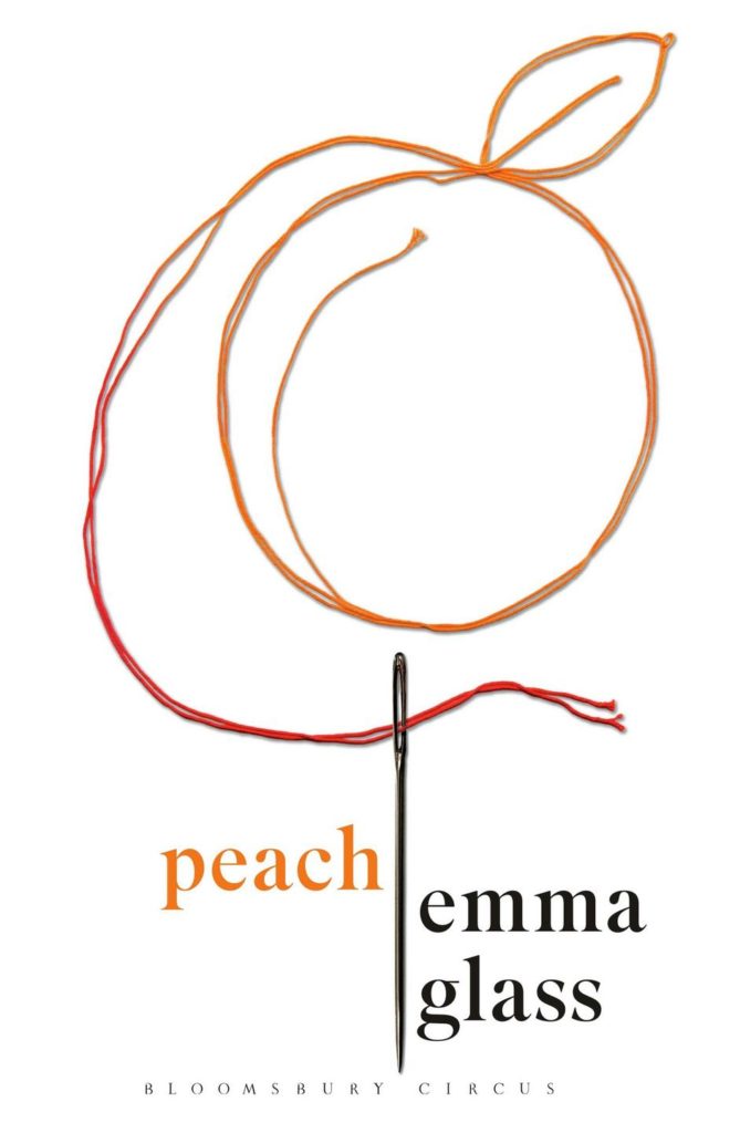
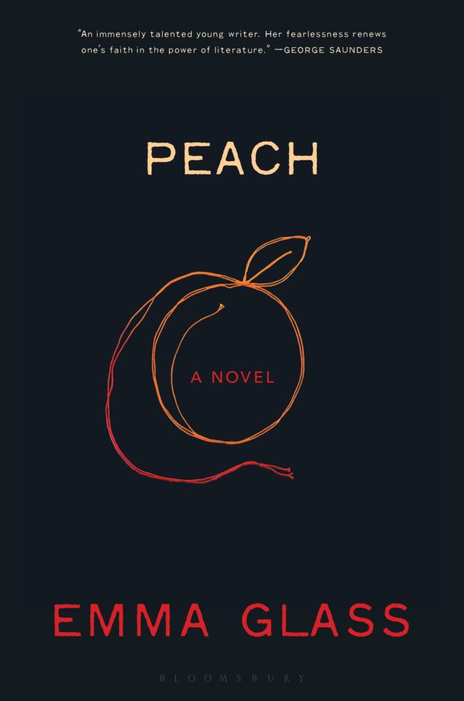
I like this cover very much–especially the type. The illustration and colour combination remind me of Matt Dorfman’s 2011 cover for The Pyschopath Test by Jon Ronson (Riverhead):
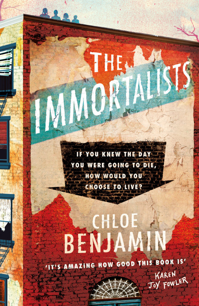
It’s interesting to see the UK publisher go in such a different direction from the US cover (designed and illustrated by Sandra Chiu) which, as I noted back in January, seems very on trend internationally to me.
I felt like this cover might be a little too much when I first saw it online, but I bet it will look absolutely stunning in print and piled up on tables.
For reference, I have a pinboard of contemporary covers that make use of Lydian, the typeface used here. It was designed for American Type Founders by Warren Chappell in 1938, and it’s very distinctive (those ‘R’s!), so it’s interesting to me that it suddenly has this kind of cult popularity.
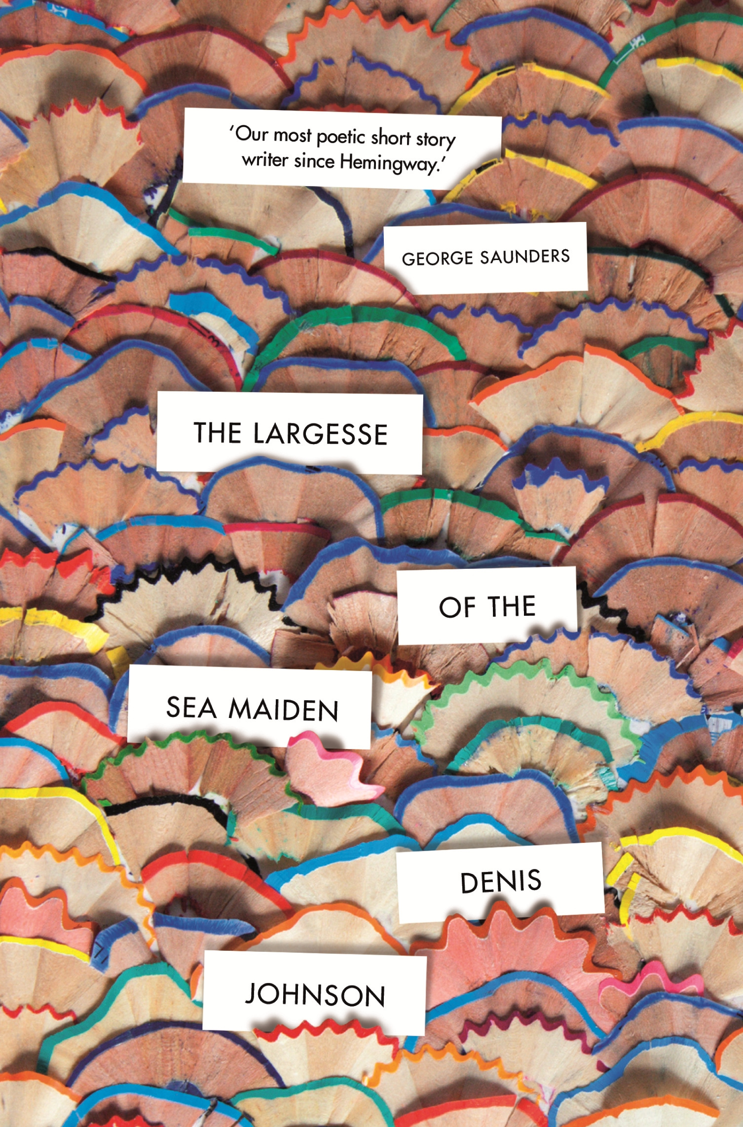
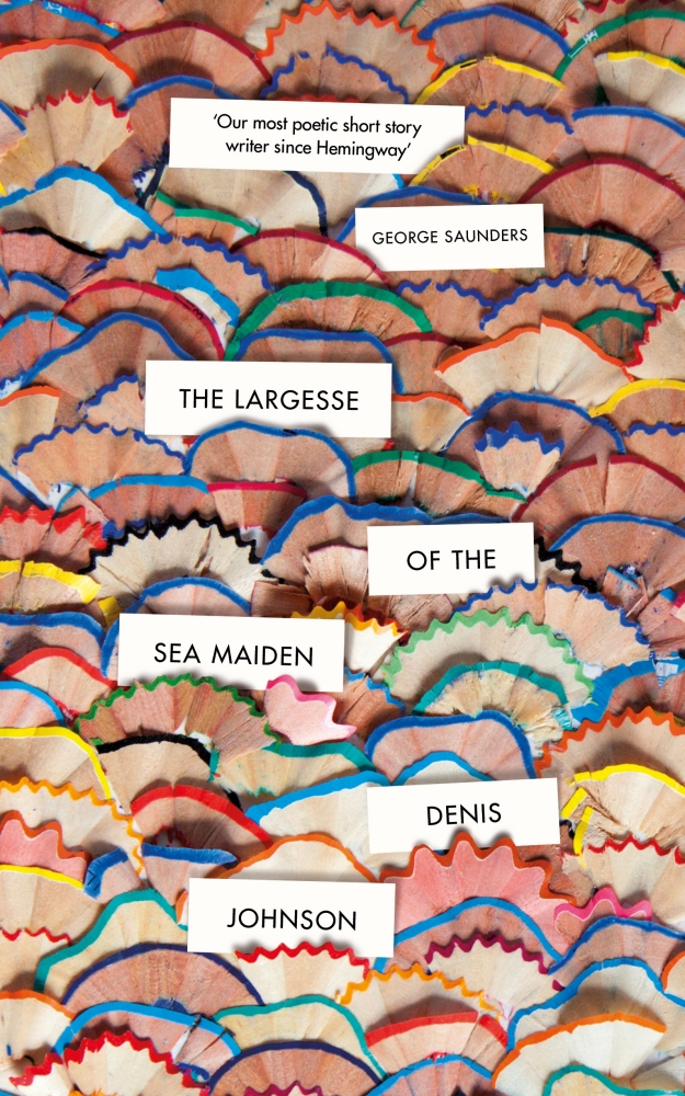
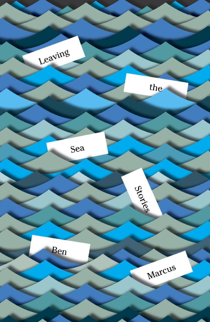
The pencil shavings are delightful of course, but I did immediately think of Peter Mendelsund‘s covers for Leaving the Sea (2014) and The Flame Alphabet (2012) by Ben Marcus.
Can anyone tell me if there is a term for this kind of semi dust jacket? It seems like more than just a belly band.
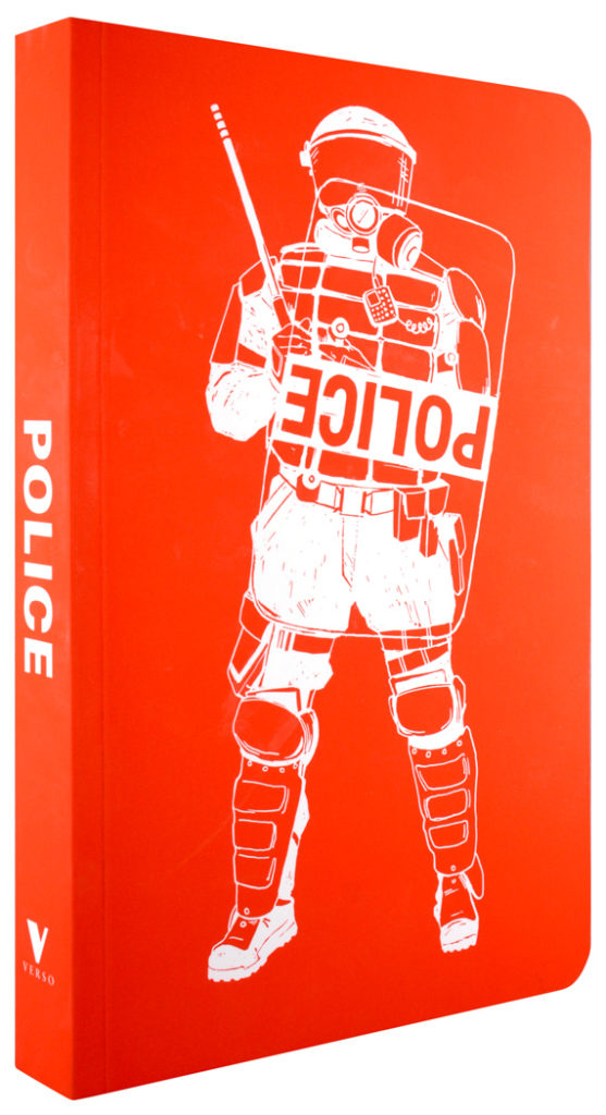
The upside-down ‘POLICE’ shield is an interesting decision. It gives the illustration a kind of authenticity (I assume it is based on an actual example), but it also subtly implies something about the contents of the book (as does the not so subtle decision to show a police officer in riot gear rather than more approachable attire!).
She Regrets Nothing by Andrea Dunlop; design by Rachel Willey (Washington Square Books / February 2018)
Sunburn by Laura Lippman; design by Elsie Lyons (William Morrow / February 2018)
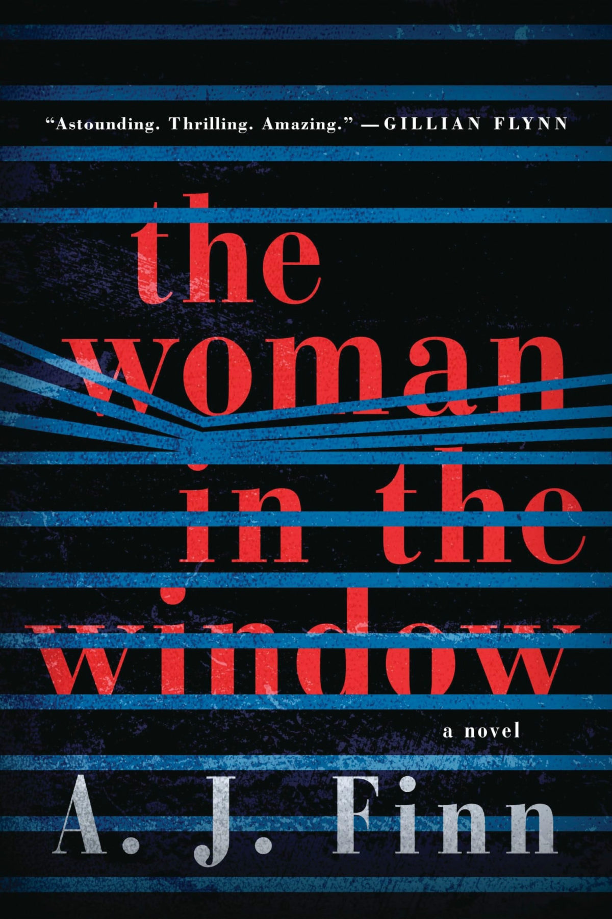
I included the cover of Sunburn and Elsie Lyons’s cover for The Woman in the Window by A.J. Finn (featured last month) in a recent presentation about the differences between US and UK cover design. UK editions of both books have a much more conventional genre covers. They signal very clearly to readers that they are thrillers.
The US covers on the other hand have a much more literary, sophisticated look. They both have a distinctive, individual appearance (although I suspect we may see covers copying the approach of The Woman in the Window very soon!) that suggest that these are not your average thrillers.
It is not that one approach is necessarily better than the other from a marketing perspective (although I can guess which designers might prefer!), but it is an interesting contrast.
I will admit it was the photo-realistic painting that first drew my eye to this cover, but I also like that the blocky typography echoes the cover of the author’s previous novel California.
Woman No. 17 by Edan Lepucki; design by Michael Morris; illustration by Oliver Wilson (Crown / February 2018)
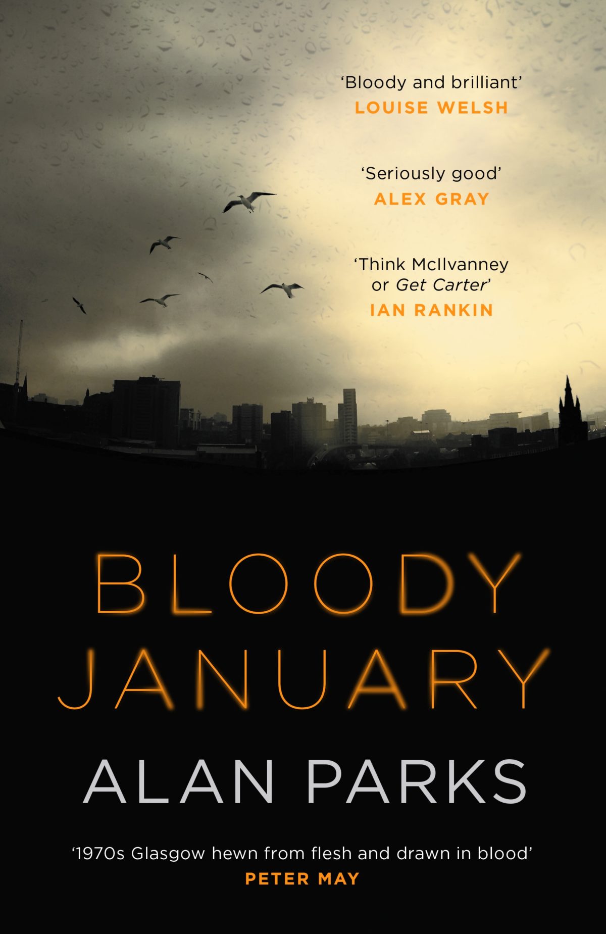
Bloody January by Alan Parks; design by Chris Gale (Canongate / December 2017)
(I’m including this partly because I spend a lot of my professional life trying to explain the difference between the cover needs of Canada/US and the UK. This is a rare genre cover that — it seems to me at least — does a decent job for both sides of the Atlantic)
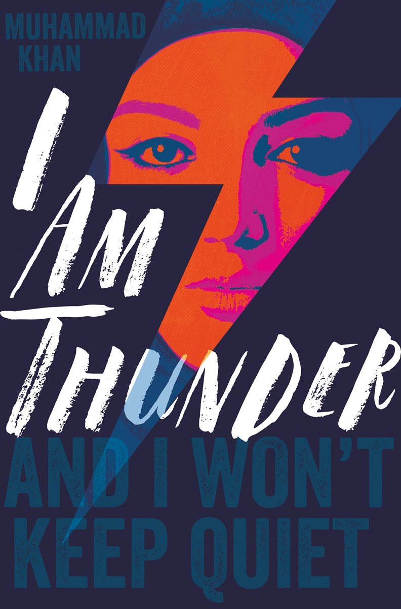
I Am Thunder by Muhammad Khan; design by Rachel Vale (Pan Macmillan / January 2018)
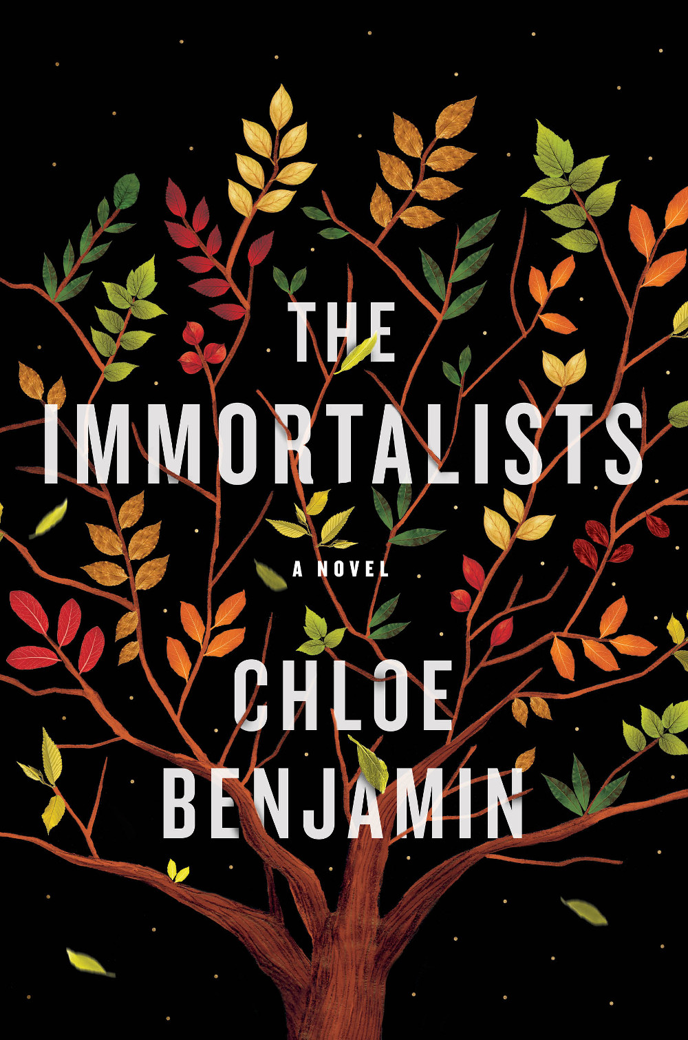
The Immortalists by Chloe Benjamin; design and illustration by Sandra Chiu (G.P. Putnam’s Sons / January 2018)
This cover seems rather on trend to me. It is very nicely done all the same.
(Something about the shape and colour of the leaves on black background also reminds me of the illustrations in Jon Klassen’s picture book This Is Not My Hat).