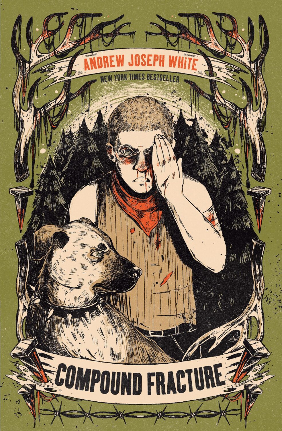
In recent years, I doubt there’s been a greater publishing success story than Young Adult — or ‘YA’ — fiction.
Sometimes mistakenly described as a genre, YA is actually an age-category roughly ascribed to books across a range of subjects and genres that are suitable for teenagers. Yet, confusingly, YA is not quite synonymous with ‘Teen Fiction.’ While Teen Fiction is assigned books appropriate for ages 12-17, YA is increasingly used to describe (albeit loosely) fiction intended specifically for older teens and even readers in their 20s and beyond.
In 2012, Publishers Weekly reported that “55% of buyers of works that publishers designate for kids aged 12 to 17… are 18 or older, with the largest segment aged 30 to 44, a group that alone accounted for 28% of YA sales.” If it wasn’t exactly news that grown-ups read books for teens, their willingness to do so openly, and the development of a passionate fan culture driven as much by these adults as teens, has seen a change in the way publishers think about YA and how they package it.
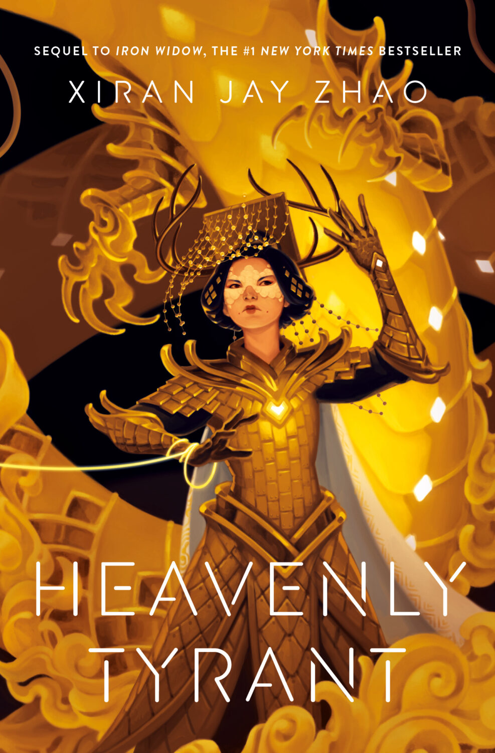
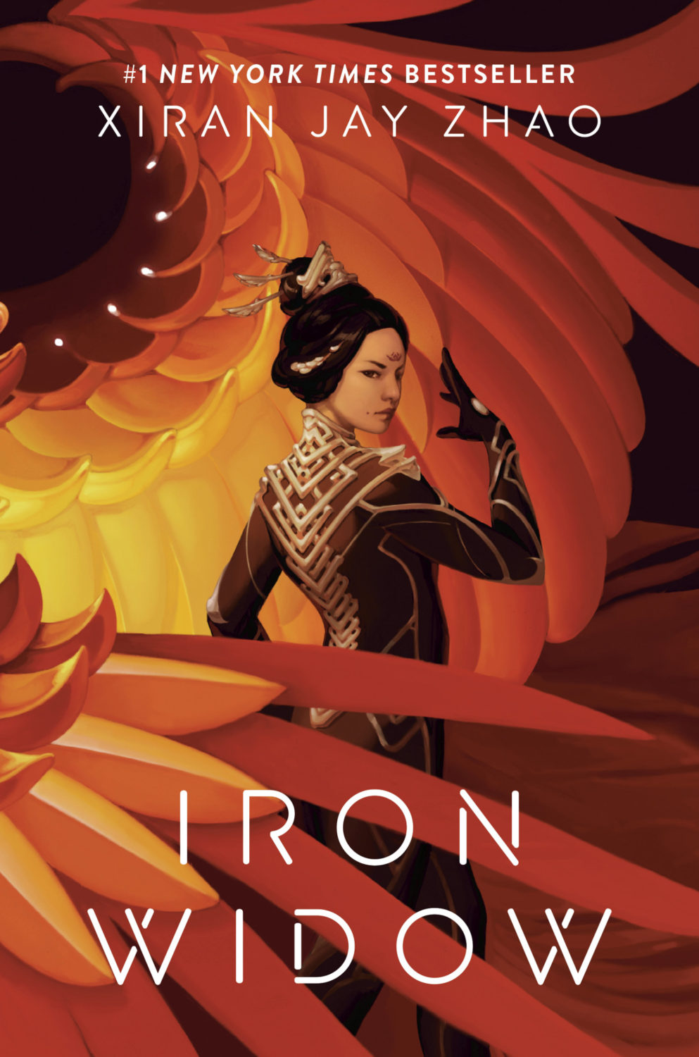
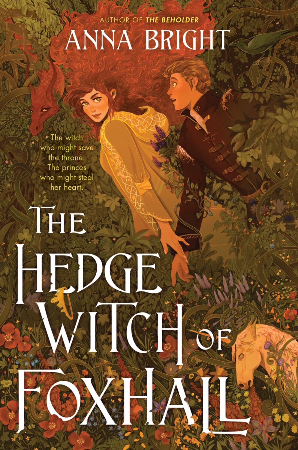
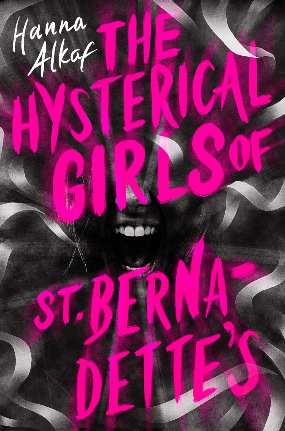
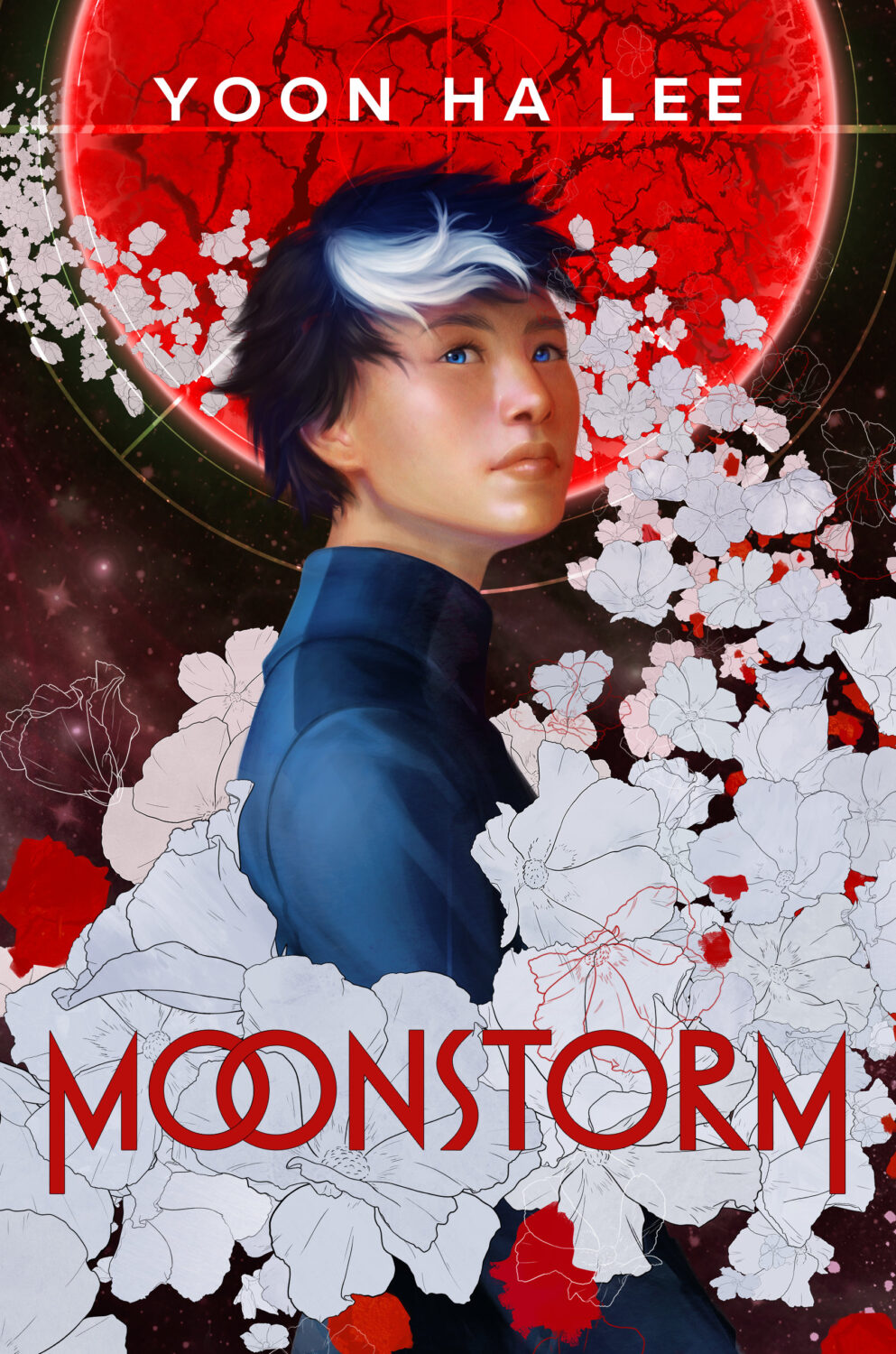
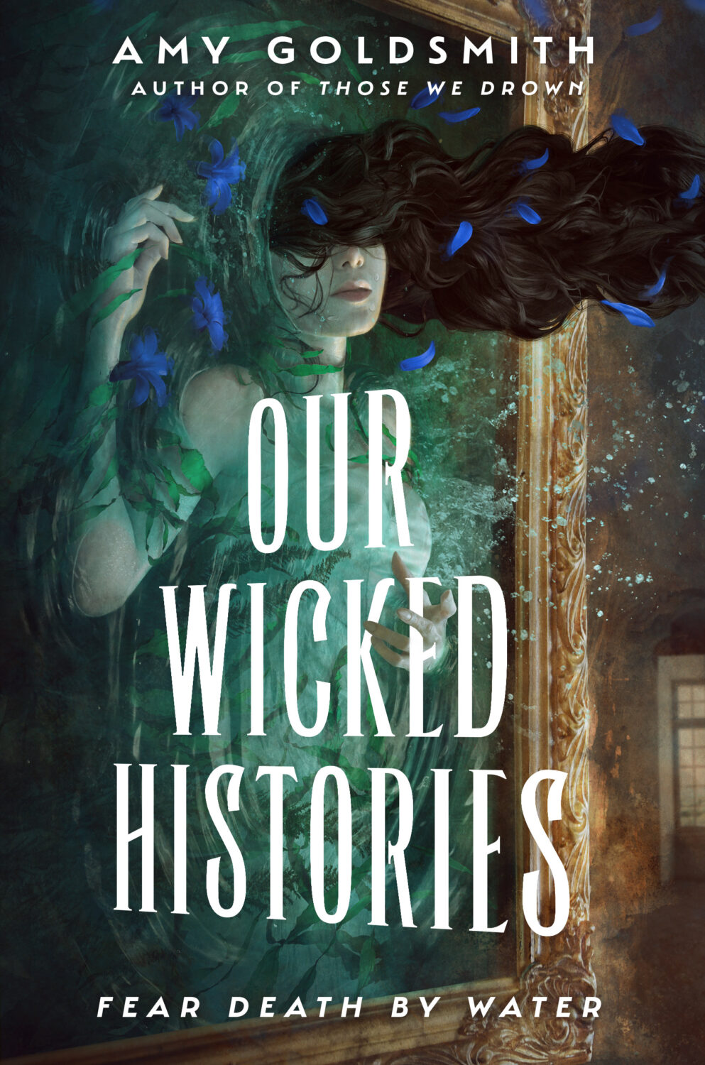
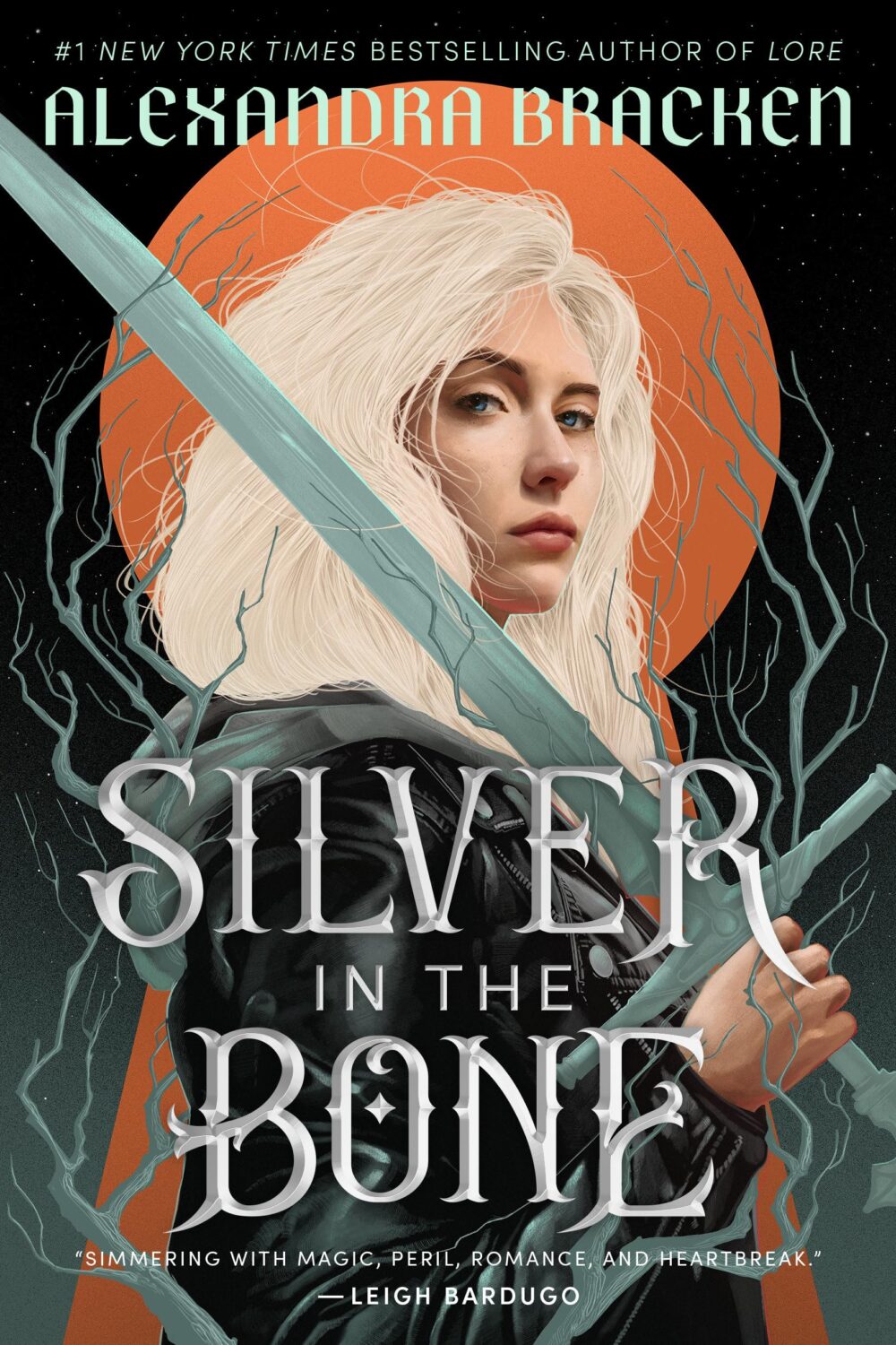
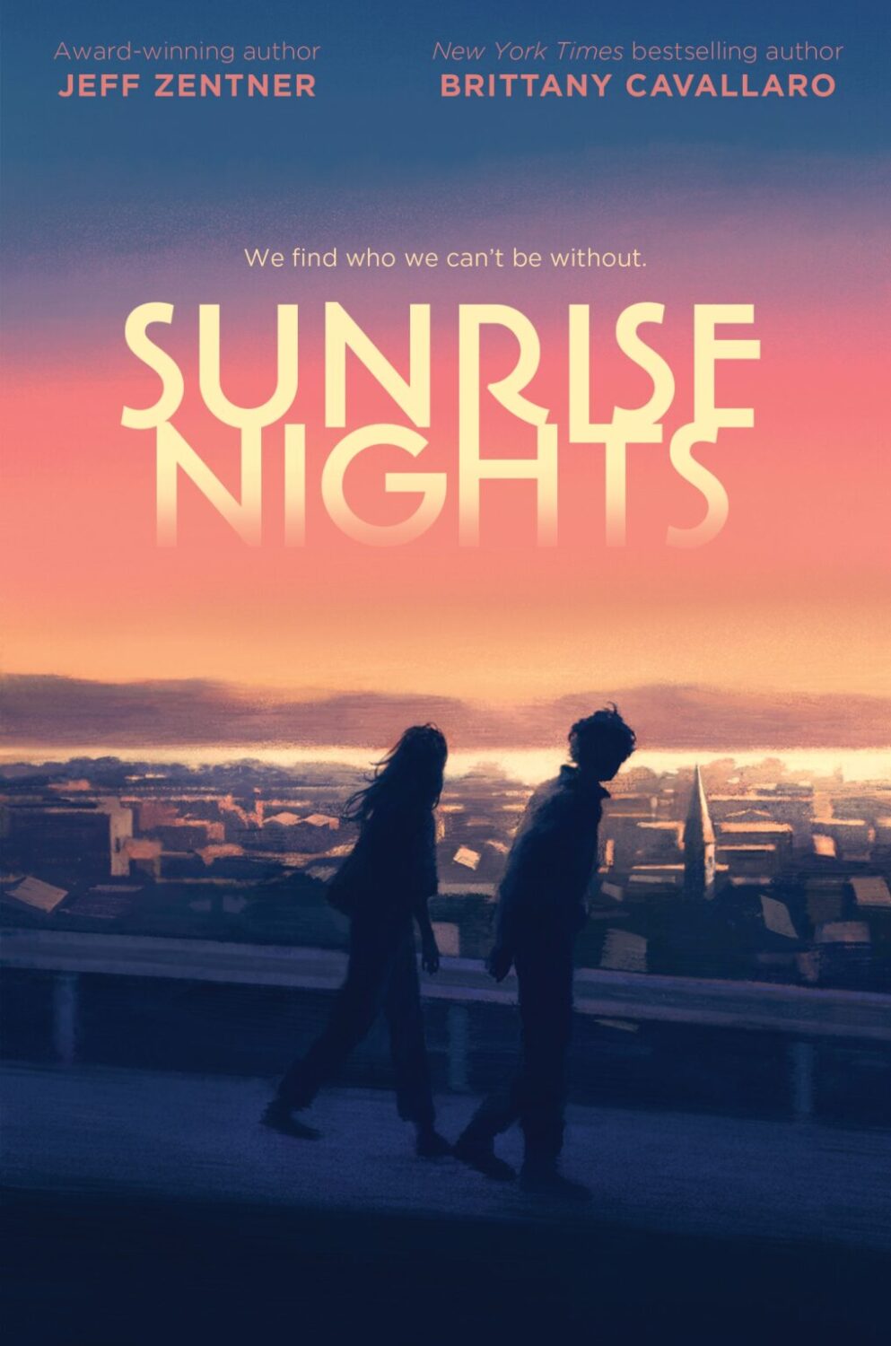
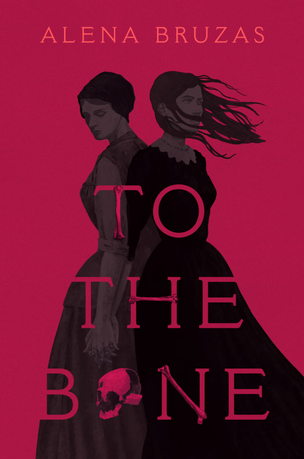
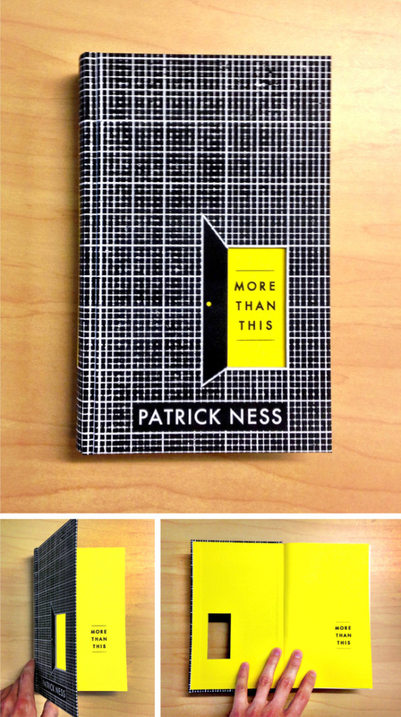
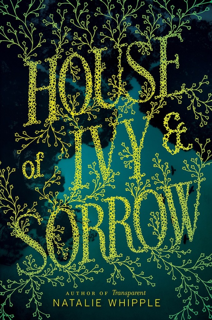
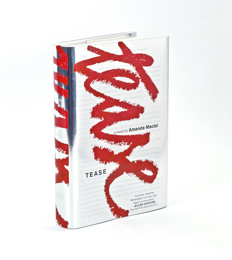
The growing sophistication of YA cover design can be seen in the work of Erin Fitzsimmons, associate art director for HarperTeen in New York. The attention to lettering and typography throughout Erin’s work, notably on the cover of House of Ivy and Sorrow by Natalie Whipple and Tease by Amanda Maciel (see below), convinced me that YA design is something that should be featured here and happily Erin agreed to talk about her work. We corresponded by email.
Did you read a lot of books growing up?
When I was very young, I memorized my favorite children’s book, We’re Going on a Bear Hunt, so I could “read” it to my little sister. When I was older, I was into all the big chapter and middle-grade series: Goosebumps, Boxcar Children, Sweet Valley High. I must’ve just missed the Harry Potter era. I’m reading them now and they’re incredible.
Do you remember your favourite book as a teenager?
It’s funny—I’ve read far more teen books now than I ever read growing up. As a high school student, you have to do so much required reading for school, I don’t remember reading many books for fun. The book I remember reading most vividly as a teen was Jurassic Park. I went through a Michael Crichton phase, and then skipped straight to John Grisham. I read pretty much his entire library in mass market paperbacks over the course of a few summers.
When did you first become interested in design?
About 7 years ago, I started working in publishing as a photo editor. I went to school for photojournalism, but it wasn’t for me. I was convinced that since I couldn’t hack it as a photographer, I was meant to be a photo editor. Indeed, I was much better at editing, but after a year or so, my Art Director offered me the chance to design a book cover. It was love at first design, and I haven’t looked back since.
Is anyone else in your family creative?
Fortunately, my entire immediate family is creative. Both of my parents went to art school, and are supremely more talented than I will ever be. My dad owns an art gallery and frame shop, and my mom is a floral designer. My little sisters are also involved in creative fields: one is an art therapist and the other works at a youth theater when not in college. Thanks to them, I feel very supported in what I do. Even better, I don’t ever have to explain what a book designer does to them! A slightly unfortunate side effect is that simple things like Easter egg dyeing and pumpkin carving can get very competitive in my house.
Did you study design at school?
I desperately wanted to go to art school for photography, but my sage parents suggested I broaden my studies. I was lucky enough to find the Gallatin School at NYU. Gallatin allows you to take classes in all of the undergrad schools at NYU, and there are no traditional majors. So while my concentration was photojournalism, I was able to study communication and jazz history and documentary filmmaking and so forth. The challenge of this type of education was to find the way it all related to storytelling, and I’ve continued that practice in my professional career. I see design as a logical extension of storytelling, as it’s often the method and means through which stories are told. Without my Gallatin education, I might not have been so open to recognizing those relationships and trying new fields. Still to this day I find myself wanting to constantly learn new things. At the moment, it is type design, lettering, and calligraphy, but who knows what’s next.
Have you always specialized in young adult books?
My first experience designing books was at Fairchild Books, a small publisher of fashion and interior design textbooks. Even though we published educational books, their designs had to be a bit more stylish than your average textbook. My experience there was very much trial by fire, as I learned everything I could about design and publishing. A few years later I transitioned to HarperCollins, where I started designing mostly Young Adult and Middle Grade/Tween titles.
Can you describe your process for designing a book cover?
It differs from project to project. The basic step-by-step is usually the same: read the book > take notes > sketch/comp ideas > find artists > present > refine > present > (repeat some more…) > finalize! But within there are so many variables. There are a ton of people to please when it comes to a book cover, so that can certainly affect the flow.
Sometimes you’ll have an idea at the very start of the process, and sometimes it won’t come until much later. I tend to work up too many ideas in the early stages, and truth be told, many of my best ideas develop by mistake (or at least from different intentions) so it’s important for me to explore even the crazy/weird/bad ones.
I often find if your concept is good enough from the start, it should survive the rounds and rounds and come out all polished and shiny at the end. I am just finishing up an incredible project where the image I had in my head while reading became a pencil sketch and is now a striking piece of artwork. They can’t all be like that, but it certainly makes up for the rest.

What are your favourite kinds of projects to work on?
I especially like working on stories that are out there and different. In the YA world, there tends to be a lot of repetition: Well, that worked, so let’s do it again, and again… So it’s truly exciting when you read something fresh. As a designer, you can really latch onto what makes the book unique, and focus on those differences to set the cover design apart.
What kinds of books present the greatest creative challenges?
There are a few genres in teen (Dystopian and Sci-Fi/Fantasy, for example) that have been tread upon so heavily that it can be difficult to come up with new and original ideas. Similarly, anything that can be considered trendy at the moment will be more of a challenge to break the mold of what’s been working for other publishers. We can try to resist the trend all we want, but too often in the end, commercial appeal will win out for the teen market. But we will still keep trying to push those boundaries.
Do you approach series differently from individual cover designs?
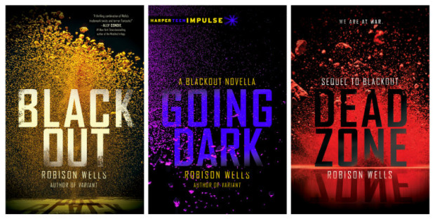
Absolutely. We live in the land of trilogies, so if your idea won’t work three times, it won’t work at all. We often are asked to concept more than one book in a series at once, just to prevent the inevitable frustration if your idea doesn’t carry through. For the upcoming Snow Like Ashes, we designed the entire series from the start. The third book in that series won’t publish until 2016, so it’s a bit crazy to think that far ahead. Blackout was another instance where I found a series of photographs I loved, but I had to be sure from the outset that we could make each cover feel special across a series. Lately they’ve been adding last minute “interstitial” e-novellas to our release in between hardcovers in our bigger series. It might as well be the book design equivalent of a knuckleball.
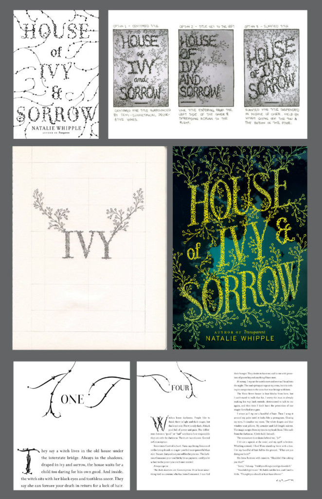
For the cover of House of Ivy and Sorrow by Natalie Whipple you used a custom typeface called Ivy Type. Do you like to experiment with type design and lettering in your work?
I do, and House of Ivy & Sorrow is one of my all-time favorite projects for this reason! I had been sketching ideas for the cover design for weeks, and it just wasn’t working (my lettering skills are still very much in development). Luckily, I was able to hire fellow CooperType grad Sasha Prood to letter and illustrate the final cover. She took it so much further than I ever could have on my own. I am so grateful to get to work with incredible artists like her that make my ideas better.
The upside was that since we design both the book covers and interiors, I was able to digitize my lettering and create a character set to use for the interior design drop caps, so all was not lost in the end. I’ve created a couple of custom faces for book interiors I’ve worked on, and lately I’ve been doing a lot more hand-lettering for covers. It’s definitely something I want to keep exploring and improving upon.
Is the popularity of teen fiction among adults allowing you to create more sophisticated designs? Or is there just more pressure now on designers to produce commercial covers?
It might be a bit of both, actually! I started in teen right as the Twilight phase was ending and Dystopian era was beginning, and so began the rise (and return) of more sophisticated subject matters. Realistic fiction has always been a staple of teen fiction, but the sheer popularity of authors like John Green and Rainbow Rowell has pushed it to the extreme in recent years. More adults are reading teen books, and therefore the covers have begun to mature along with their readers. There was also a time where sophisticated did not equal commercial. It’s wild how much that has shifted in just a few years. The lines are starting to blur and overlap, and I see it even in the adult section. It’s so fascinating to be a part of.
Cover designs are obviously important to YA readers, and ‘cover reveals’ have become common for big releases. But are YA covers still an under-appreciated art in the industry?
The cover reveal has taken on a life of its own. The popularity of Goodreads and the plethora of YA blogs has created the need for most authors to reveal their covers in advance of the catalog posting. It used to be only the lead titles were revealed, but now almost every cover ends up with the same fanfare. And with that fanfare comes scrutiny. There are entire blog posts dedicated to covers they like or don’t like. But between the reveals and the rising popularity of the teen genre, we’ve all been pushed to make better covers, and the results have been fantastic. YA covers used to be automatically looked down upon, but that is changing (slowly, but surely). And hopefully it continues to shift. I’d love to hire more adult designers to get their perspective on our genre. I also think a lot of people would be surprised at how much work goes into these covers. There are an ever growing number of talented folks working in teen design.
Who are some of your design heroes?
Paula Scher, Peter Mendelsund, Louise Fili, Marian Bantjes, Chip Kidd, John Gall, Barbara deWilde.
Who do you think is doing interesting work right now?
Book design: Ray Shappell, Jen Heuer, Lucy Ruth Cummins, Jaya Miceli, Helen Yentus, Jon Gray, Theresa Evangelista, Olga Grlic, Elena Giavaldi, Oliver Munday.
Type/lettering/design: Dan Cassaro, Sasha Prood, Sean Freeman, Craig Ward, Isabel Urbina, I Love Dust, Kellerhouse.
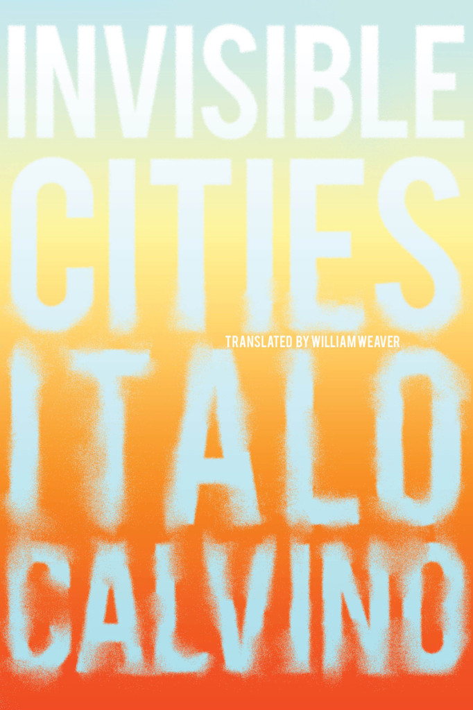
Is there a particular author or a book you’d like to design (or redesign!) a cover for?
Italo Calvino would be a dream, though I fear Peter Mendelsund might have dibs! Maybe the next repackage?
I designed a cover for Invisible Cities for an SVA Continuing Ed typography class that I still really like, but I’d love to take another swing at it, along with the rest of his work.
What‘s in your ‘to read’ pile?
I am halfway through two epic series: Harry Potter and Game of Thrones, Italo Calvino’s Letters, Wildwood by Colin Meloy and Carson Ellis, The Luminaries, Claire DeWitt and the Bohemian Highway.
Do you have system for organizing your books?
Most of our design and photography books are in the living room, but the rest of our (far too many) books are in the bedroom. We have a large white bookcase in there, and most of our décor is gray and white, so I spent way too long arranging the books in a rainbow spectrum. It’s not the most functional way, but it sure looks pretty and it’s forced me to pay a lot more attention to spine design.
Do you have a favourite book?
Invisible Cities. I read it first in college and have read it countless times since. There’s always something new to discover.
What does the future hold for book cover design?
Innovative and interactive packaging, a focus on book as object, and (hopefully) a continual blurring of the lines between adult and teen design.
Thank you, Erin!
Like this:
Like Loading...