Corpoetics — The text from the websites of “well-known brands and corporations” remixed and rearranged into strangely engaging and enigmatic poetry by Nick Asbury (photo above from Ace Jet 170). I rather like the one taken from Scottish Widows:
Here in an Edinburgh coffee house,
their futures became history.
Meet the latest widow.
Copies of Corpoetics available for £5 (plus p&p) from Nick Asbury’s website, and all proceeds go to the National Literacy Trust, an independent charity dedicated to changing lives through literacy.

A Q&A With Four Young Editors — Just a fantastic, fascinating conversation between Richard Nash (Soft Skull), Lee Boudreaux (Ecco), Alexis Gargagliano (Scribner), and Eric Chinski (FSG) in the latest issue of Poets & Writers. It’s long. Make some coffee, grab a snack and devote some time to it. Well worth it. Honestly.
In Defense of Readers — Mandy Brown, Creative Director at W. W. Norton & Company, on designing websites for readers:
Despite the ubiquity of reading on the web, readers remain a neglected audience… Readers flourish when they have space—some distance from the hubbub of the crowds—and as web designers, there is yet much we can do to help them carve out that space.
And last, but by no means least… Coralie in Conversation — The Caustic Cover Critic interviews Penguin’s super-talented book designer Coralie Bickford-Smith.
1 Comment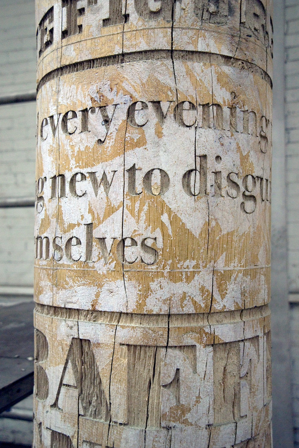


")


