I recently came across this short PBS Artbound documentary from 2021 on artist, educator, and social justice advocate Corita Kent (1918-1986), which is well worth 20 minutes of your time.
I don’t remember when I first came across Sister Corita’s work. It was probably not until I moved to Canada and became more interested in design and applying typography and lettering to art. Certainly, she was not someone I learnt about in school. It’s hard to know whether that is the result of a parochial British education, or more generalized misogyny and prejudice in art history, or a bit both. But, as the documentary makes clear, she remains a source of inspiration for artists, designers, and teachers 40 years after her death.
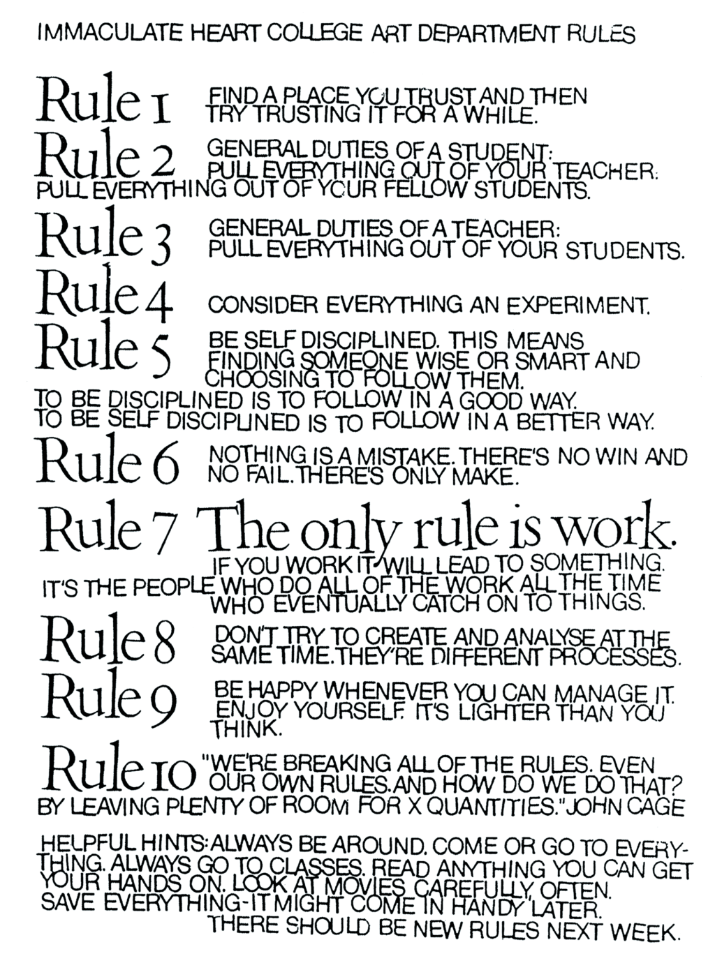
The ‘Ten Rules’ she helped create with the students of the Immaculate Heart College Art Department seem as relevant today as they must have at the time they were first written:
You can listen to former students, artists, community organizers, and others read and reflect on the Ten Rules here.
I love Tom Gauld‘s latest cover for the New Yorker so much. We just had sleet and freezing rain in Toronto so that part is accurate. But it’s not just the weather. Everything feels pretty bleak at the moment and, like many others, I have found myself seeking solace in art too.
(I also have a dog. I should post more dog cartoons)
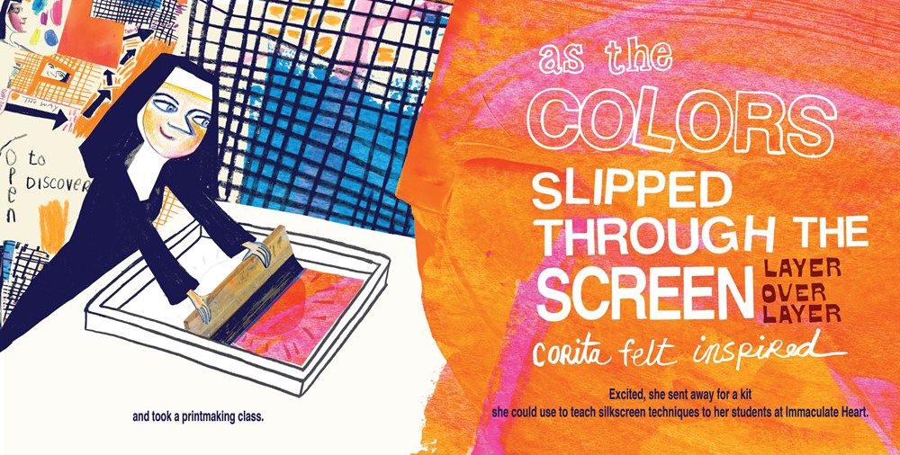
Available this month from Brooklyn-based independent children’s book publisher Enchanted Lion, Make Meatballs Sing by Matthew Burgess and illustrated by Kara Kramer is a new picture book about the life and work of the innovative and unconventional artist, educator and social justice advocate Corita Kent (1918–1986).
“She sees you seeing her. The hand on the hip is not passive, her gaze is not passive. She looks strong!…I wanted this image to stand as a piece of inspiration to keep fighting for justice for her. When I look at the dress, it…reminds me of Lady Justice.”
Artist Stanley Donwood talks about his artwork for Radiohead, his collaboration with author Robert MacFarlane on Ness, and his own book Bad Island, published earlier this year by Hamish Hamilton (and slated to be published in the US by W.W. Norton this fall).
In 1962, Kent saw work by Andy Warhol for the first time, and her aesthetic changed markedly, becoming bolder, flatter, more abstract and brighter, often with saturated, almost fluorescent, colors. Her new style was so successful that it became became known as “nun art,” and was often imitated. Her adherence to the Pop Art aesthetic was well suited to her joyous aims: Kent said she wanted her art to “give people a lift” and help them get “more fun out of life.”
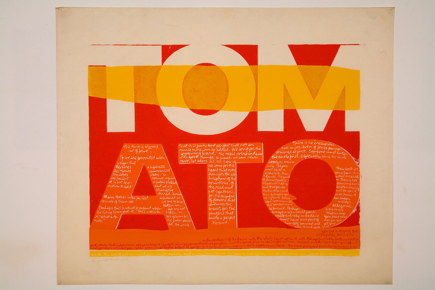
Pop Art’s celebration of the urban everyday also empowered Kent to introduce more quotidian sources into her text works. During the ’60s, she began to incorporate lyrics from pop songs, advertising slogans, and snippets of text seen on signs and packaging into her work, often pairing them with religious text. It was a move that elevated the ordinary to the spiritual, and became a frequent theme in Kent’s art and teaching. She found delight in the commonplace, and believed that the divine could be seen anywhere, even amidst the chaos of the modern city. Kent often took her students on urban expeditions—even day-long trips to gas stations and car lots—armed with cameras and viewfinders.
The largest ever exhibition of Corita Kent’s work in the UK, Corita Kent: Power Up, is currently on display at House of Illustration in King’s Cross until May 12.
There is a graphomaniac quality to almost all of Basquiat’s work. He liked to scribble, to amend, to footnote, to second-guess and to correct himself. Words jumped out at him, from the back of cereal boxes or subway ads, and he stayed alert to their subversive properties, their double and hidden meaning. His notebooks, recently published in an exquisite facsimile by Princeton, are full of stray phrases, odd combinations. When he began painting, working up to it by way of hand-coloured collaged postcards, it was objects he went for first, drawing and writing on refrigerators, clothes, cabinets and doors, regardless of whether they belonged to him or not…
…A Basquiat alphabet: alchemy, an evil cat, black soap, corpus, cotton, crime, crimée, crown, famous, hotel, king, left paw, liberty, loin, milk, negro, nothing to be gained here, Olympics, Parker, police, PRKR, sangre, soap, sugar, teeth.
These were words he used often, names he returned to turning language into a spell to repel ghosts. The evident use of codes and symbols inspires a sort of interpretation-mania on the part of curators. But surely part of the point of the crossed-out lines and erasing hurricanes of colour is that Basquiat is attesting to the mutability of language, the way it twists and turns according to the power status of the speaker. Crimée is not the same as criminal, negro alters in different mouths, cotton might stand literally for slavery but also for fixed hierarchies of meaning and the way people get caged inside them.
Rebecca Mead’s long profile of publisher Gerhard Steidl for The New Yorkeris a wonderful, fascinating read:
Each Steidl title is unique, printed with a bespoke combination of inks and papers. But to the informed eye, and the informed hand, a Steidl book is as distinctive as an Eggleston photograph. Unlike another German art publisher, Taschen—which is known for reproducing risqué images by the likes of Helmut Newton in enormous formats that would crush most coffee tables to splinters—Steidl produces books that invite holding and reading. Steidl dislikes the shiny paper that is often found in photography books, and prefers to use uncoated paper, even though it takes longer to dry and thus makes a printing cycle more expensive. He opts for understatement even with projects that would tempt other publishers to be ostentatious. “Exposed,” a collection of portraits of famous people by Bryan Adams, the rock star turned photographer, has no image on its cover. Bound in blue cloth, the book looks as if it might be found on a shelf in an academic library. Steidl wants his creations to satisfy all the senses. When he first opens a book, he holds it up close to his nose and smells it, like a sommelier assessing a glass of wine. High-quality papers and inks smell organic, he says, not chemical. To the uninitiated, a Steidl book smells rather like a just-opened box of children’s crayons.
I love this part about the attention to the detail:
Designing a book’s packaging is a process Steidl particularly relishes. “He wants to pick the cover, he wants to pick the endpapers,” [Robert] Polidori told me. “He treasures this limited one-on-one time with the artist. It’s almost a love act.” Sometimes Steidl indulges in a brightly colored ribbon for a bookmark, like statement socks worn with a formal suit. He pays attention to elements that barely register with most readers, such as the head and tail bands—colored silk placed where the pages attach to the spine. “It’s a tiny bit of fashion,” Steidl said. “With Karl [Lagerfeld], it is the buttons. With me, it is the head and tail bands.” For Gossage, he chose black bands and black endpaper, to contrast with the colored ink on the pages. The endpaper was made from cotton, and would cost thirty cents per book, as opposed to the seven cents it would cost if he used offset paper. “Using the cheaper one saves significant money for the shareholders,” he said. “But I am the only shareholder.”
The New York Review of Bookshas an essay by cartoonist Chris Ware on George Herriman the creator Krazy Kat, one of the most beautiful, poetic and inventive comic strips ever created:
Krazy Kat has been described as a parable of love, a metaphor for democracy, a “surrealistic” poem, unfolding over years and years. It is all of these, but so much more: it is a portrait of America, a self-portrait of Herriman, and, I believe, the first attempt to paint the full range of human consciousness in the language of the comic strip. Like the America it portrays, Herriman’s identity has been poised for a revision for many decades now. Michael Tisserand’s new biography Krazy does just that, clearing the shifting sands and shadows of Herriman’s ancestry, the discovery in the early 1970s of a birth certificate which described Herriman as “colored” sending up a flag among comics researchers and aficionados. Tisserand confirms what for years was hiding in plain sight in the tangled brush of Coconino County, Arizona, where Krazy Kat is supposedly set: Herriman, of mixed African-American ancestry, spent his entire adult life passing as white. He had been born in the African-American neighborhood of racially mixed, culturally polyglot 1880s New Orleans, but within a decade Herriman’s parents moved George and his three siblings to the small but growing town of Los Angeles to escape the increasing bigotry and racial animosity of postbellum Louisiana. The Herrimans melted into California life, and it was there that George, with brief professional spates in New York, would remain for the rest of his life.
But imagine knowing something about yourself that’s considered so damning, so dire, so disgusting, that you must, at all cost, never tell anyone. Imagine leaving behind a life to which you cannot claim allegiance or affection. Imagine suddenly gaining advantages and opportunity while you see others like you, who have not followed in the footsteps of your deception, suffering. Herriman, once he was considered white, didn’t even have a way of voicing this identity. Until he started drawing Krazy Kat.
Krazy, the new biography of Herriman by Michael Tisserand that Chris Ware mentions, was also recently reviewed for New York Times Book Review by Nelson George:
Though Herriman’s “Krazy Kat” comic strip was admired in his lifetime, it wasn’t until years after his death in 1944 that his vast influence received widespread critical respect. Herriman’s depiction of the tangled relationships among the black cat Krazy, his white mouse tormentor and sometime love interest Ignatz and the bulldog Officer Pupp, set against a desert backdrop in fictional Coconino County (taken from a real area of Arizona), inspired several generations of cartoonists. Charles M. Schulz’s “Peanuts,” Ralph Bakshi’s “Fritz the Cat” and Art Spiegelman’s “Maus” all owe a debt to Herriman’s draftsmanship and poetic sense.
Schulz got turned on to “Krazy Kat” right after World War II, he said, and it “did much to inspire me to create a feature that went beyond the mere actions of ordinary children.” Theodor Geisel (Dr. Seuss), whose animal characters strongly resemble Herriman’s, told a biographer, “At its best, the comic strip is an art form of such terrific wumpf! that I’d much rather spend any evening of any week rereading the beautifully insane sanities of George Herriman’s Krazy Kat than to sit myself down in some opera house to hear some smiling Irish tenor murdering Pagliacci.” The iconoclastic Robert Crumb called Herriman the “Leonardo da Vinci of comics,” while the ambitious Spiegelman argued that “Krazy Kat” “crossed all kinds of boundaries, between high and low, between vulgar and genteel.” All this alone would have made Herriman worth serious study.
But then in the early 1970s, a quarter-century after his death, a birth certificate was found stating that Herriman was born “colored” to Creole parents in that 19th-century hotbed of miscegenation, New Orleans. Clearly his work had to be re-examined. Not to question its genius, but to see how much of it dealt with hiding a huge part of himself in plain sight.
If you haven’t read any Krazy Kat, seek it out. The strange language, the small, inky art, and the repetitiousness of the strips — collected together into numerous, beautifully designed, paperbacks by Fantagraphics — can seem a little intimidating at first, but it really pays off if you stick with it.
Irma Boom pays careful attention to word choice. The Dutch designer, one of the world’s pre-eminent bookmakers, is loath to say “client” and refers to her projects as “commissions.” She also doesn’t call herself an artist.
Never mind that Ms. Boom, 56, was once in a group exhibition at the Pompidou Center, or that many of her books are in the Museum of Modern Art’s collection. Her belief that she is not an artist could be a matter of culture — a product of her “Dutch rigor,” as the architect Rem Koolhaas, a close friend and collaborator, said.
But there are many who would at least consider Ms. Boom’s books works of art. Among them were the jurors of the Johannes Vermeer Award, the Dutch state prize for the arts, which she won in 2014. “Her books transcend the level of mere information carriers,” the jury’s report stated. “They are small or larger objects to admire, tempting us to read them with close attention.” She received 100,000 euros to put toward a “special project,” as the prize stipulates. “I cannot simply go and shop at Prada,” Ms. Boom said.
So Ms. Boom has used the prize for the quixotic, endless undertaking of creating a library of what she called “only the books that are experimental.” Above her studio here, the recently opened library is made up almost entirely of books from the 1600s and 1700s, and the 1960s and ’70s.
Those eras are when bookmaking wasn’t held back by conventions, Ms. Boom said, and when books “breathed freedom” in content and form. (Many of today’s e-books, by contrast, represent a “provisional low point” in the art of bookmaking, writes Mr. Koolhaas in the catalog “Irma Boom: The Architecture of the Book.”) Her library includes poetry collections, as well as exhibition catalogs that experimented with form — a book bound with bolts, for example, or contained within what seems like a three-ring binder.
Rauschenberg’s ‘muse wall’, a collection of objects and images that inspired him, in his print shop, Captiva, Florida, around 1979. Photograph: Emil Fray/Robert Rauschenberg Foundation
With a major Robert Rauschenberg retrospective opening at Tate Modern in December, Alex Needham, writing for The Guardian, visits the late artist’s island home of Captiva, Florida:
Rauschenberg started visiting in 1962, before moving to Captiva nine years later, describing it as “the foundation of my life and my work… the source and reserve of my energies”. His work by then had become ambitious and complicated; Captiva forced a return to simplicity, and the first things he produced were a selection of wall sculptures made from battered cardboard boxes.
For the world beyond Captiva’s white sands, however, a reacquaintance with Robert Rauschenberg is long overdue. In Britain, there has been no major retrospective of his work since 1981, while the last big US survey, at the Guggenheim in New York, took place in 1997. That will change next month, when Tate Modern opens a London retrospective; it will then move to Moma in New York next May, and after that to the San Francisco Museum of Modern Art.
Rauschenberg left a bold and indelible mark on the 20th century. His combines, which integrated the flotsam and trash of everyday life, including the artist’s own duvet in Bed (1955), were neither painting nor sculpture, and proved that anything could be the material of art. At Tate Modern, pride of place will be given to Monogram 1955–59, a horizontal canvas on which perches a stuffed goat with a tyre around its midriff; the work thrilled and scandalised when it was first shown at Castelli’s gallery in New York, and rapidly became synonymous with the artist’s iconoclasm. Since then, his relevance has only increased, says Leah Dickerman, co-curator of the new retrospective: “When you open a gallery and see the art that’s made out of the stuff of the real world, that’s coming off the walls, that’s interdisciplinary in its approach, all that is the legacy of Rauschenberg.”
Making the combines, Rauschenberg felt he was cracking “the secret language of junk”. They could be composed of anything: a goat corseted by a tire; a stuffed bald eagle. One of the very first, Untitled (Man with White Shoes), contained – deep breath – fabric, newspaper, a photograph of Jasper Johns, a handwritten letter from Rauschenberg’s son, a drawing by Twombly, glass, mirror, tin, cork, a pair of the artist’s socks and painted leather shoes, dried grass and a taxidermied Plymouth Rock hen.
All the same, there’s a limit to how much world you can cram into a sculpture, and as Rauschenberg’s success grew he became increasingly fascinated by replication. Back in 1952, he’d experimented with transfer drawing, and in 1958 he embarked on a grand project of illustrating Dante’s Inferno using lighter fluid to transfer images on to paper. In 1962, Andy Warhol introduced him to a far more sophisticated technique: the wizardry of using photographic images on silkscreen canvases.
Now he could reuse and resize his own photos and those he snipped from newspapers and magazines, giving him an unprecedented power of composition. Anything could be incorporated: John F Kennedy; a water tower; Bonnie and Clyde. As he gleefully observed of the silkscreen paintings: “It’s as much like Christmas to me as using objects I pick up on the street.” He was giddy for them, until in 1964 he was awarded the Golden Lion at the Venice Biennale. Terrified of stasis, the next day he called his New York studio and asked his assistant to burn all the screens.