“Having lived in Chicago for thirty years, I’ve only ever been a visitor to New York, but I love it like no other city. Teeming with unpredictable people and unimaginable places and unforeseeable moments, life there is measured not in hours but in densely packed minutes that can fill up a day with a year’s worth of life. Lately, however, closed up in our homes against a worldwide terror, time everywhere has seemed to slur, to become almost Groundhog Day-ish, forced into a sort of present-perfect tense—or, as my fellow New Yorker contributor Masha Gessen more precisely put it, ‘loopy, dotted, and sometimes perpendicular to itself.’ But disaster can also have a recalibrating quality. It reminds us that the real things of life (breakfast, grass, spouse) can, in normal times, become clotted over by anxieties and nonsense.”
Chris Ware has created another brilliant cover for The New Yorker to illustrate April 15th, 2020, “a kaleidoscopic account of a single day in New York” during the pandemic.
Its densely packed grid and the juxtaposition of mundane, ‘snapshots’ reminds me — perhaps more than some of his other covers for the magazine — of Ware’s comics.
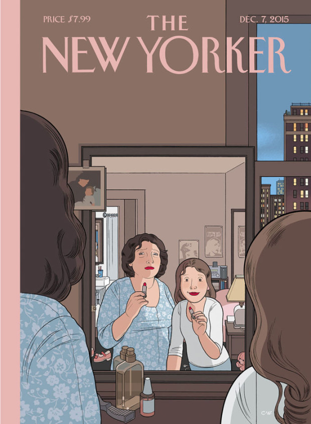
“As a procrastination tactic, I sometimes ask my fifteen-year-old daughter what the comic strip or drawing I’m working on should be about—not only because it gets me away from my drawing table but because, like most kids of her generation, she pays attention to the world. So, while sketching the cover of this Health Issue, I asked her.
“ ‘Make sure it’s about how most doctors have children and families of their own,’ she said.
I was reminded of his 2009(!) cover for the New Yorker‘s from Halloween edition in which parents all look at their phones while their kids trick-or-treat. It’s an interesting contrast…
The New York Review of Bookshas an essay by cartoonist Chris Ware on George Herriman the creator Krazy Kat, one of the most beautiful, poetic and inventive comic strips ever created:
Krazy Kat has been described as a parable of love, a metaphor for democracy, a “surrealistic” poem, unfolding over years and years. It is all of these, but so much more: it is a portrait of America, a self-portrait of Herriman, and, I believe, the first attempt to paint the full range of human consciousness in the language of the comic strip. Like the America it portrays, Herriman’s identity has been poised for a revision for many decades now. Michael Tisserand’s new biography Krazy does just that, clearing the shifting sands and shadows of Herriman’s ancestry, the discovery in the early 1970s of a birth certificate which described Herriman as “colored” sending up a flag among comics researchers and aficionados. Tisserand confirms what for years was hiding in plain sight in the tangled brush of Coconino County, Arizona, where Krazy Kat is supposedly set: Herriman, of mixed African-American ancestry, spent his entire adult life passing as white. He had been born in the African-American neighborhood of racially mixed, culturally polyglot 1880s New Orleans, but within a decade Herriman’s parents moved George and his three siblings to the small but growing town of Los Angeles to escape the increasing bigotry and racial animosity of postbellum Louisiana. The Herrimans melted into California life, and it was there that George, with brief professional spates in New York, would remain for the rest of his life.
But imagine knowing something about yourself that’s considered so damning, so dire, so disgusting, that you must, at all cost, never tell anyone. Imagine leaving behind a life to which you cannot claim allegiance or affection. Imagine suddenly gaining advantages and opportunity while you see others like you, who have not followed in the footsteps of your deception, suffering. Herriman, once he was considered white, didn’t even have a way of voicing this identity. Until he started drawing Krazy Kat.
Krazy, the new biography of Herriman by Michael Tisserand that Chris Ware mentions, was also recently reviewed for New York Times Book Review by Nelson George:
Though Herriman’s “Krazy Kat” comic strip was admired in his lifetime, it wasn’t until years after his death in 1944 that his vast influence received widespread critical respect. Herriman’s depiction of the tangled relationships among the black cat Krazy, his white mouse tormentor and sometime love interest Ignatz and the bulldog Officer Pupp, set against a desert backdrop in fictional Coconino County (taken from a real area of Arizona), inspired several generations of cartoonists. Charles M. Schulz’s “Peanuts,” Ralph Bakshi’s “Fritz the Cat” and Art Spiegelman’s “Maus” all owe a debt to Herriman’s draftsmanship and poetic sense.
Schulz got turned on to “Krazy Kat” right after World War II, he said, and it “did much to inspire me to create a feature that went beyond the mere actions of ordinary children.” Theodor Geisel (Dr. Seuss), whose animal characters strongly resemble Herriman’s, told a biographer, “At its best, the comic strip is an art form of such terrific wumpf! that I’d much rather spend any evening of any week rereading the beautifully insane sanities of George Herriman’s Krazy Kat than to sit myself down in some opera house to hear some smiling Irish tenor murdering Pagliacci.” The iconoclastic Robert Crumb called Herriman the “Leonardo da Vinci of comics,” while the ambitious Spiegelman argued that “Krazy Kat” “crossed all kinds of boundaries, between high and low, between vulgar and genteel.” All this alone would have made Herriman worth serious study.
But then in the early 1970s, a quarter-century after his death, a birth certificate was found stating that Herriman was born “colored” to Creole parents in that 19th-century hotbed of miscegenation, New Orleans. Clearly his work had to be re-examined. Not to question its genius, but to see how much of it dealt with hiding a huge part of himself in plain sight.
If you haven’t read any Krazy Kat, seek it out. The strange language, the small, inky art, and the repetitiousness of the strips — collected together into numerous, beautifully designed, paperbacks by Fantagraphics — can seem a little intimidating at first, but it really pays off if you stick with it.
I have to confess that I frequently find This American Life kind of irritating, but this collaboration with Chris Ware and The New Yorker to create an animated magazine cover is neat:
The animation was done by Ware and John Kuramoto. You can read more about how it came about on The New Yorker culture blog.
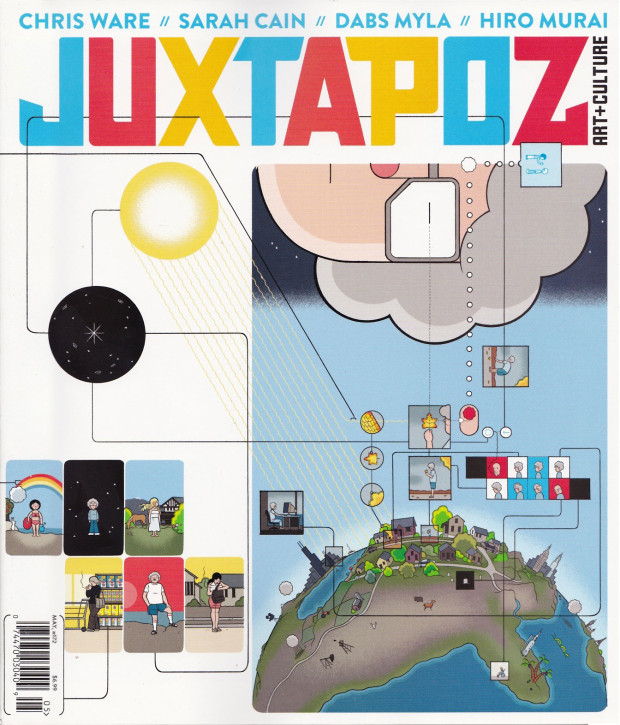
Juxtapoz contributing editor Kristin Farr talks to Chris Ware, the magazine’s May 2015 cover artist, for their Beyond the Cover site:
Beyond setting a very specific mood, tone or feeling of a time of day or era, color in my stuff sometimes acts as a separate, countervailing story, connecting elements and images in ways that I sometimes hadn’t even predicted when I was simply drawing the page, reflecting more the way we see the world than how we define it. At the same time, the page compositions are also an attempt to get a glimpse at the way we edit, remember, and clean up our own experiences into “stories”…
…Comics best approximate how I remember and think about the world and how I also think many other people do; I believe even Nabokov at some point expressed frustration at not being able to induce a non-verbal image-based sort of page-memory (but he still did it better than anyone, except Joyce). I find myself thinking about my stories at odd times during the day, almost as if they’re an alternate reality; I can’t liken the experience to anything other than the psychosis of false or self-induced memories. Then again, any memories are always going to have some falseness, all of which add up to a fairly unreliable sense of one’s life and experience.
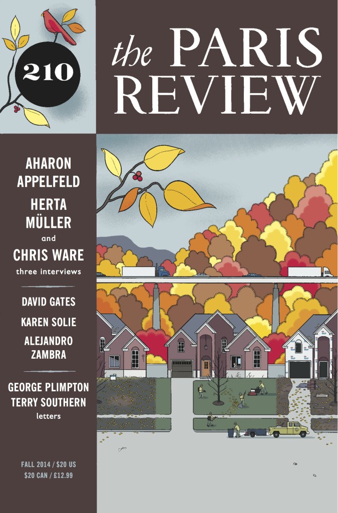
Cartoonist Chris Ware is interviewed by Canadian journalist Jeet Heer in the latest issue of The Paris Review as part of the magazine’s ongoing ‘The Art of Comics’ series. You can read a short excerpt online:
It was the Peanuts collections in my grandfather’s basement office that really stayed with me through childhood and into college. Charlie Brown, Linus, Snoopy, and Lucy all felt like real people to me… I’ve said it many times before, but Charles Schulz is the only writer I’ve continually been reading since I was a kid. And I know I’m not alone. He touched millions of people and introduced empathy to comics, an important step in their transition from a mass medium to an artistic and literary one.
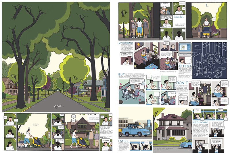
Following his appearance at the Edinburgh international book fair, Cartoonist Chris Ware spoke with Stuart Kelly of The Guardianabout his recent work Building Stories:
“As soon as a screen can produce something that can move, it becomes a passive medium, whereas I feel that comics are a very active medium. The appeal is they masquerade as a passive medium, but they’re not at all. It takes a lot of effort to read comics, even though it seems like they’re easy. It seems like they need to be fixed on paper to have a certain power – my wife always tells me never to use the word magic, but I can’t help it, there is no other word: there is a magic when you read an image that you know doesn’t move but you have a sense that something is moving, if not on the page then in your mind.”
The September/October issue ofIntelligent Life includes an extensive profile of cartoonist Chris Ware by Simon Willis:
As he worked on “Building Stories”, [Ware] decided he needed a form that allowed the past and the present to co-exist in a jumble, as in our own heads. “Like something you’d see in a dream.” A book wouldn’t do. The answer came to him: lots of little books, in a box.
Ware is not the first artist to use a box to explore memory. The writer B.S. Johnson, “the great lost British novelist of the 1960s” in Jonathan Coe’s view, published a novel, “The Unfortunates”, in 27 fragments of prose about the memories that assail a sports reporter at a football match. But the biggest influence on Ware was the American artist Joseph Cornell, who made artworks out of found objects arranged in small cabinets. Ware fell in love with his work in 1989, and when he got to Chicago he discovered the Bergman collection at the Art Institute, which has several of Cornell’s boxes. One of them, “Ann— In Memory” (1954), contains a few faded photographs and ads for hotels. The box is a physical and metaphorical container. “It’s certainly a good image of the way we recall things,” Ware says. “It has an organisation to it, but also a sort of chaos.”
Ware will be at the Brooklyn Comics and Graphics Festival tomorrow (November 10) and the Librairie D+Q fifth anniversary party with Charles Burns and Adrian Tomine in Montreal on Sunday (November 11).
After posting Chris Ware’s pandemic cover for The New Yorkerearlier this week, I remembered I had also meant to post Christoph Niemann’s “Critical Mass” cover from two weeks ago. It may not pull at your heart strings the way Ware’s cover does, but it’s a brilliant and prescient illustration of the pandemic.
I believe that the best concepts develop in the process of drawing. I don’t usually have ideas pop in my head fully formed when I’m not at my desk. Yet the genesis for this image, the idea of a sneezing domino standing on top of a globe packed with other domino pieces, came to me when I was lying in bed, trying to fall asleep… I got up again and sketched down the idea. Only the next day, when I sat down to turn the concept into a proper art work, did I realize that the globe and the pieces actually resemble a virus. In the end, it still proves my theory that all decent ideas come together when you actually draw them.