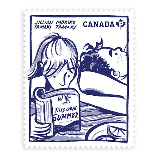
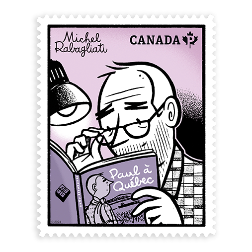
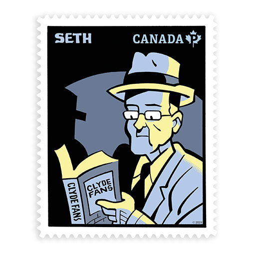
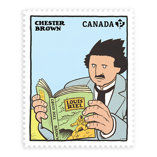
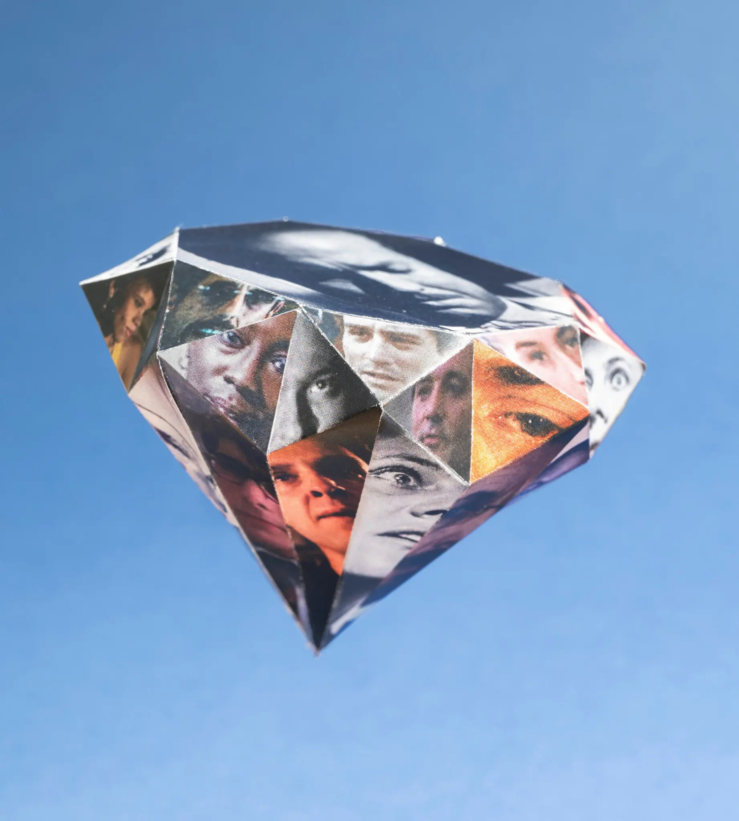
Canada Post is celebrating Canadian graphic novels with a set of stamps created by Chester Brown, Michel Rabagliati, Seth, and Jillian Tamaki and Mariko Tamaki.
While Canada Post has previously issued stamps featuring superheroes, it hasn’t specifically showcased the work of contemporary Canadian cartoonists before. These new stamps feature original drawings by each of the artists depicting their best known characters reading the books they’re in.
As a side note, I don’t know how well known Michel Rabagliati is outside of Canada (I’m actually not sure how well known he is in Anglo-Canada either come to that!), but his gentle semi-autobiographical graphic novels are all lovely. They’re beautiful drawn. Paul Moves Out, the first one I read, is a charming look at studying illustration and graphic design in Montreal the 1970s. It was published in English by Drawn & Quarterly back in the day, but it looks like it might be out of print, which would be a shame. Anyway, worth trying to find a copy if you can.
Hey, I hope you’re safe and well. I’m a little bit ahead of schedule because fall sales conference season is upon us, and I have to be in New York for work next week. I’m less ahead than I would’ve liked — PRINT has already beaten me to the punch! — but here we are, a couple of days earlier than usual, with another look at some new and recent book covers. April is National Poetry Month in the US so there are a few poetry covers in the mix, as well as a couple of covers from independent presses, an Australian cover, and all the usual suspects.
The Formula by Joshua Robinson and Jonathan Clegg; design by Pete Garceau (Mariner Books / March 2024)
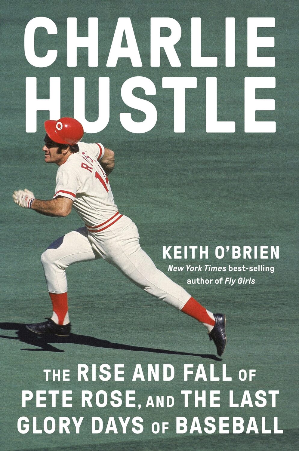
Two nonfiction sports books in one post! Does Formula One really count as a sport? Not for me, Clive. But the subtitle says it is, and a Canadian friend once told me that for something to qualify as a sport it has to endanger your life in some fundamental way, so I guess F1 qualifies under Quebec Rules for Teen Boys if nothing else.
Anyway, it might be fun to do a post of interesting sports books covers at some point if I can find the time (let me know if any great examples come to mind!).
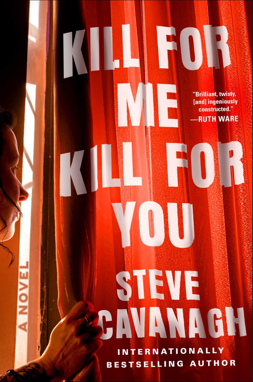
I feel like this is a bit different for a psychological thriller? I like the type a lot.
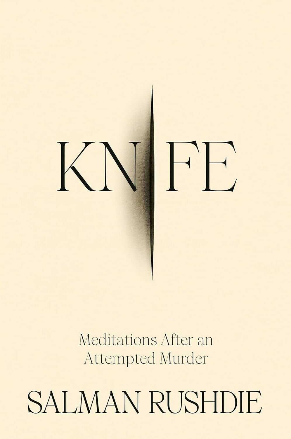
Knife by Salman Rushdie; design by Arsh Raziuddin (Random House / April 2024)
Interestingly, there is an “eye” motif on the spine with the Random House logo in the centre. Look for it next time you’re in a bookstore.
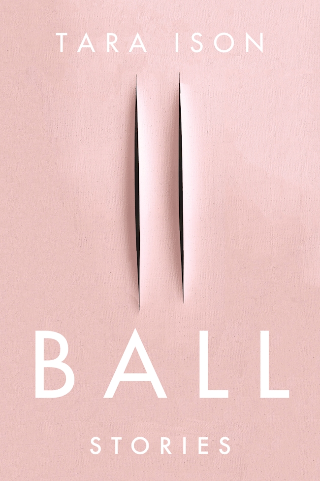
Also, this cover isn’t the first to riff, consciously or otherwise, on the cut canvases of Italian artist Lucio Fontana. The cover of Ball by Tara Ison, designed by Kelly Winton, comes to mind. I’m sure there are other examples (David Gee’s unpublished cover for Lolita. Are the more?).
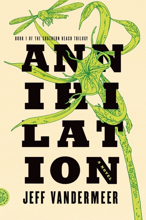
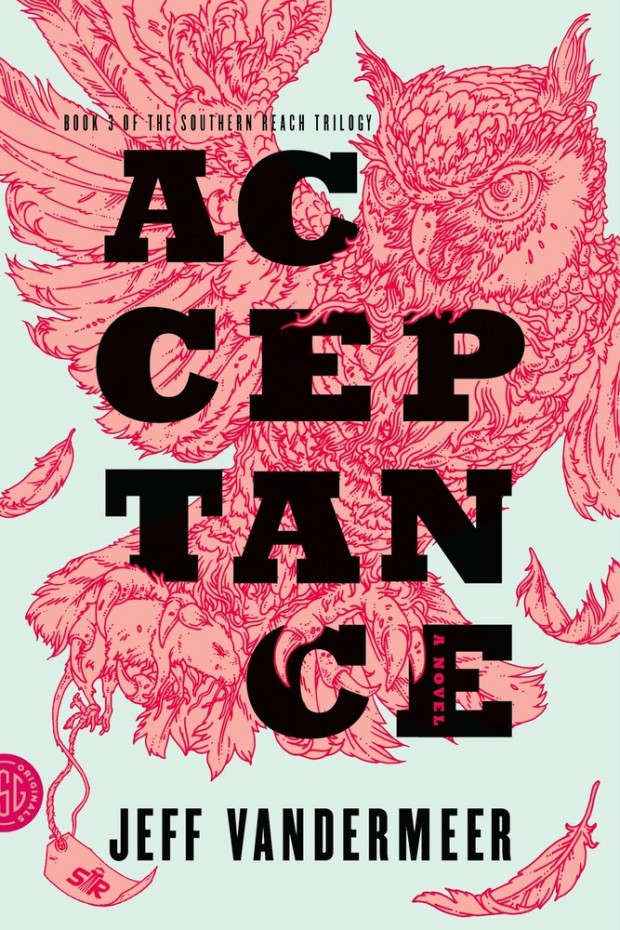
This reminded me of Eric’s illustrations for the covers of Jeff Vandermeer’s Southern Reach trilogy designed by Charlotte Strick.
Annihilation by Jeff VanderMeer (US); design by Charlotte Strick; Illustration by Eric Nyquist (FSG / 2014)Acceptance by Jeff VanderMeer (US); design by Charlotte Strick; Illustration by Eric Nyquist (FSG / 2014)
Melina Moe, curator of literature at Columbia University’s Rare Book & Manuscript Library, has written a lovely piece for the Los Angeles Review Books on the rejection letters Toni Morrison wrote while an editor at Random House:
Morrison’s rejections tend to be long, generous in their suggestions, and direct in their criticism. The letters themselves—generally one, two at most, exchanged with a given writer—constitute an asymmetrical archive. On one end of each communiqué is the ghost of a submitted manuscript … On the other is a rejection from Morrison, sometimes brusque yet typically offering something more than an expression of disinterest—notes on craft, character development, the need for more (or less) drama. But also: Autopsies of a changing, and in many ways diminishing, publishing industry; frustrations with the tastes of a reading public; and sympathies for poets, short story writers, and other authors drawn to commercially hopeless genres.
The observations on publishing are fascinating and a reminder that some things never change:
Morrison’s letters are unexpectedly forthcoming. Often, she supplements her rejections with diagnoses of an ailing publishing business, growing frustrations with unimaginative taste, the industry’s aversion to risk-taking, and her own sense of creative constraint working at a commercial press (especially in the late 1970s and early ’80s; Morrison left editorial work to be a full-time novelist in the early 1980s). They sketch a “road not taken” in mainstream publishing, as experimental volumes, poetry, and short story collections were increasingly treated as suspect investments of editorial time and publishing house resources. Current market conditions made for “a losing proposition for the publisher and a hopeless one for short story writers,” Morrison informed one author, and unless they were penned by famous novelists, short story collections were “almost like the publication of poetry”—that is, “practically impossible to make a profit from.” In another, lengthy letter from 1977, Morrison outlined how the economics of a book project depended on the mechanisms of distribution. It wasn’t just that casual readers didn’t buy short story collections, but that the major institutions responsible for generating widespread enthusiasm and name recognition were also uninterested: “Book clubs do not make offers for collections of short stories; mass paperback houses do not make offers for collections of short stories by single authors and so we are left with the hope that ten or fifteen thousand people will go into a bookstore and ask for a particular author by name.” The rejection concludes with Morrison’s admission that “[t]here is no point in my being other than honest with you, you should continue to publish in magazines and if you ever decide to write a novel, I’d be delighted to look at it.”
Hello! I hope you’re safe and well wherever you are.
Before we get to the covers, a couple of brief admin things. First up, there have been a couple of behind-the-scenes changes at the CO this past month. They’ve solved a few tech issues for me and hopefully no one else has noticed. Secondly, I’ve been tinkering with the RSS. I’m not sure that’s quite right yet, so apologies if it’s not been working as expected. Let me know if you’re experiencing any weirdness.
I also wanted quickly mention that the deadline for the DPI mentorship scheme has been extended to April 12th. I’m not involved with the DPI, but some really great people are so if you are a designer from an under represented background living in the UK or Ireland, you should think about applying!
Anyway, it’s a really big post this month! The are lots of great covers with the UK, Australia and Canada all represented, as well as the usual folks from US. There are some compare-and-contrasts, a couple of covers from indie presses, a couple of covers for translations, and a couple of poetry covers too. There’s even a meandering digression in the middle (sorry). Enjoy!
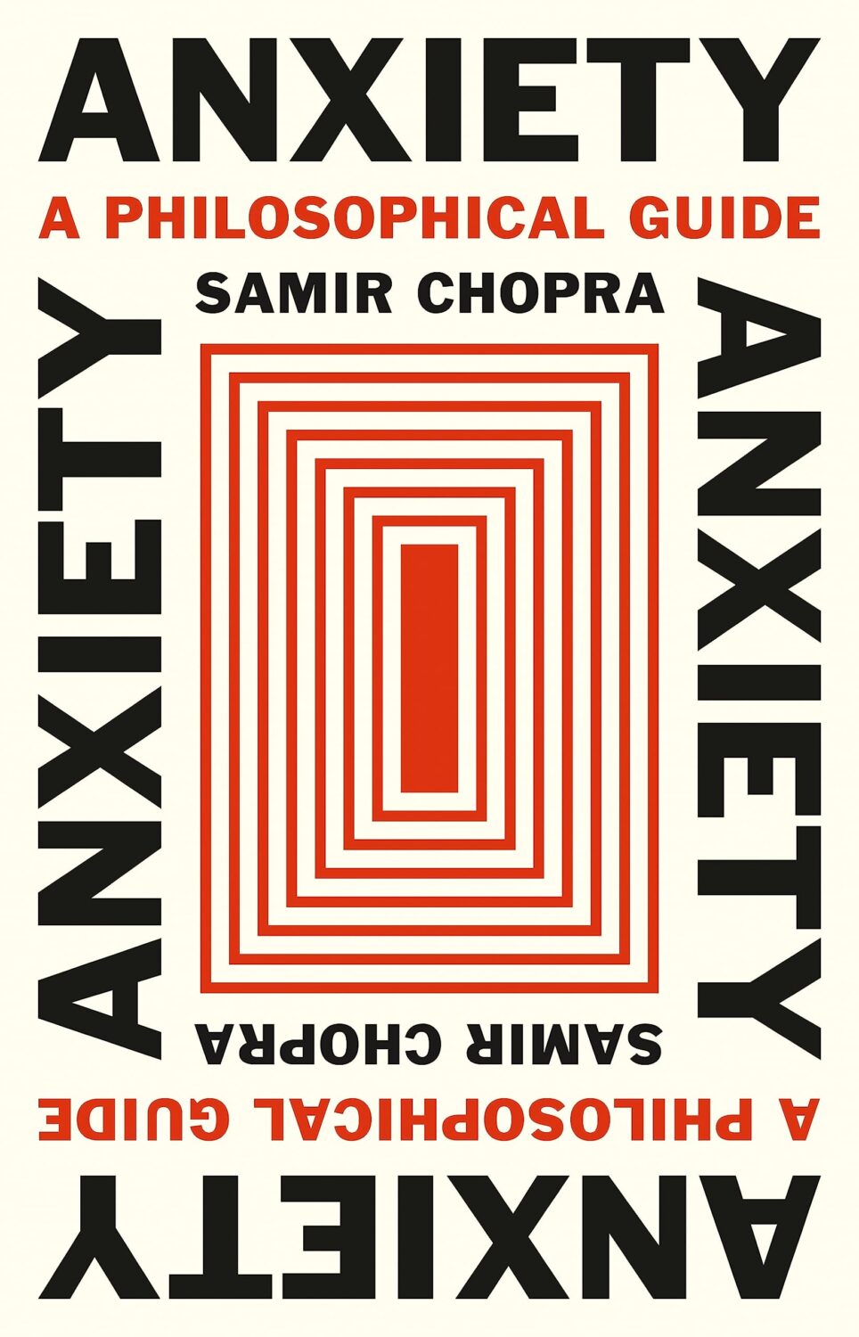
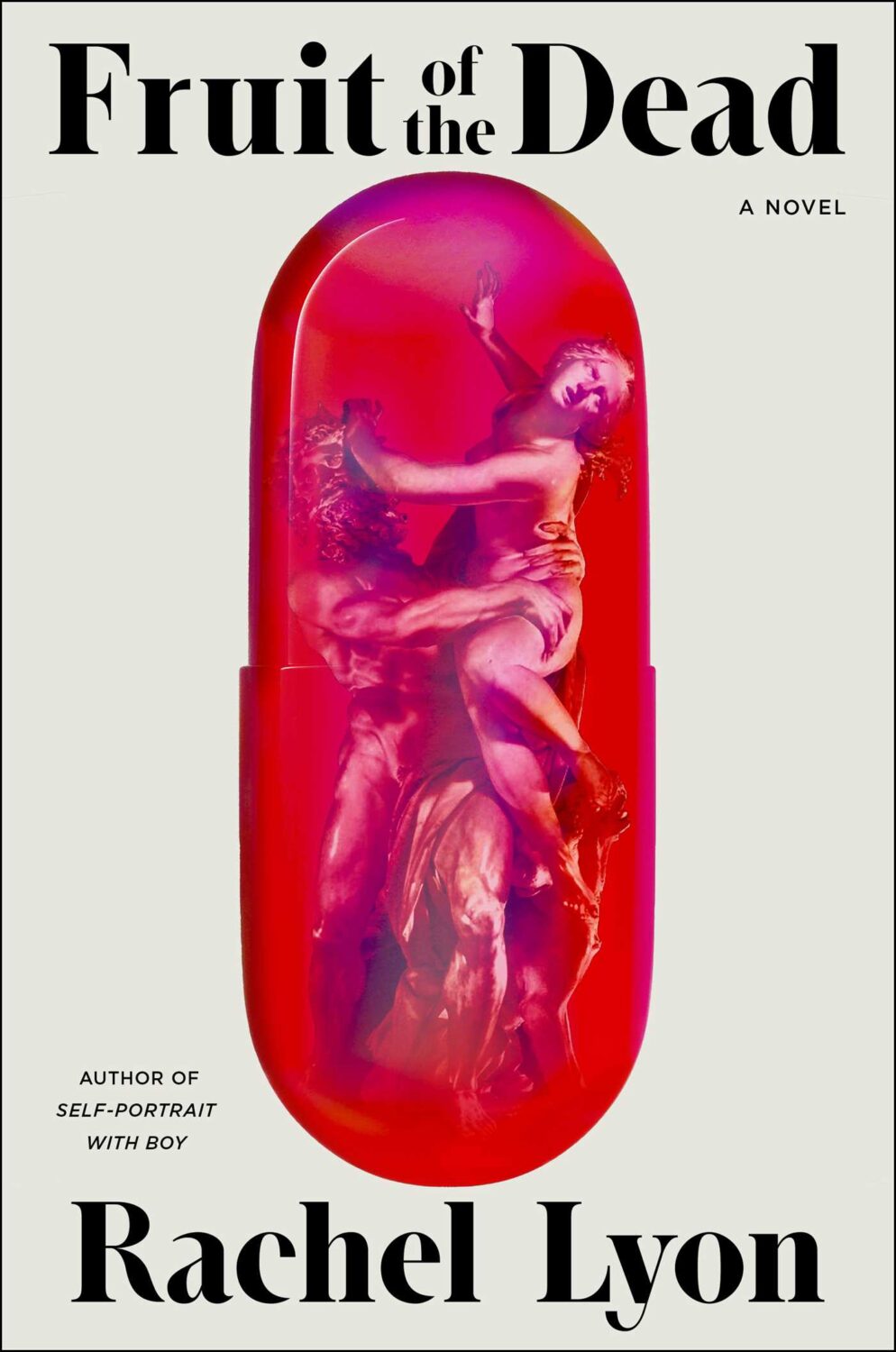
Anxiety by Samir Chopra; design by Karl Spurzem (Princeton University Press / March 2024)
So this cover sent me down a bit of a rabbit hole. It reminded me of a cover design from a few years ago. It didn’t really look the same but, in my mind at least, this other cover featured a blue-red capsule shape (possibly a stretched illustration of a planet and its core) centred on a white background with black Swiss-style sans serif type. It was not exactly minimalist, but clean and precise. I think I saw it on Twitter back in the day. I thought it was maybe literary sci-fi or pop science, and published by one of the big American imprints. I was also pretty convinced that it was designed by Alex Merto or possibly John Gall. One of the dudes.
This is not the first time I have thought about this cover, and I can, or at least could, picture it quite clearly. The problem is that I can find no evidence of this cover ever existing, and the more I think about, the more the details shift and doubt creeps in. I don’t seem to have posted it anywhere, and I can’t find it in the usual places. It’s possible that I am getting some of the crucial details wrong, mentally combining a couple of covers into one, or it was something other than an actual book cover. But maybe this is some kind of Visual Mandela Effect thing, and this design that I’ve believed existed for years is actually a figment of my imagination.
My search has felt a bit like the online equivalent of walking into a bookstore and asking for the book with the blue cover. It has made realise that we have very few tools to find cover designs in a systematic way, especially since the Book Cover Archive stopped being a going concern. You just kind of have to browse and I hope you eventually look in the right place (or risk slowly lose your sanity).
Anyway, if this mystery cover is ringing any bells with you, please let me know and put me out of my misery. I have been going slightly crazy. (This sort of thing happens more than I care to admit by the way, but it is particularly bad this time! And, no, I do not have much of a life. Why do you ask?)
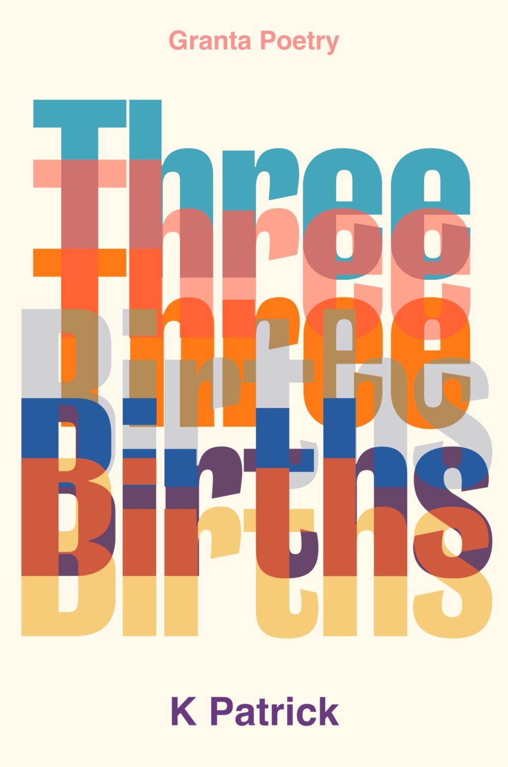
(Thanks to Jon Gray for helping me with the design credit for this and the other Granta title Three Births below. Publishers: post the design credits with your cover reveals!)
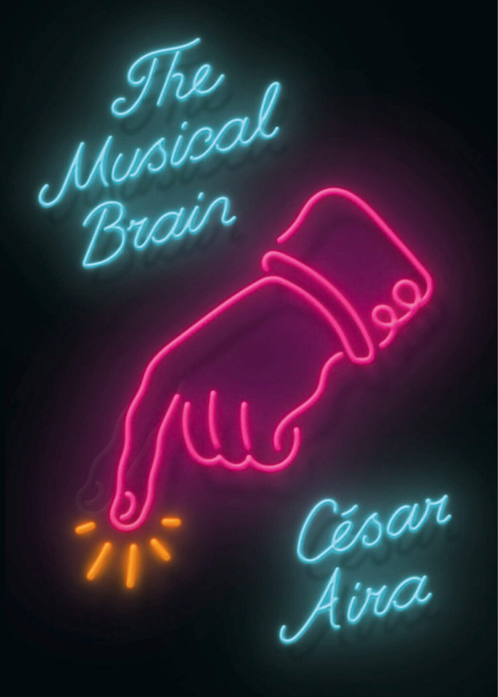
While looking for the other, possibly imaginary, book cover, I came across the cover for the New Directions edition of The Musical Brain by César Aira designed by Rodrigo Corral and Zak Tebbal a few times. It was on one or two best of 2015 lists, including mine.
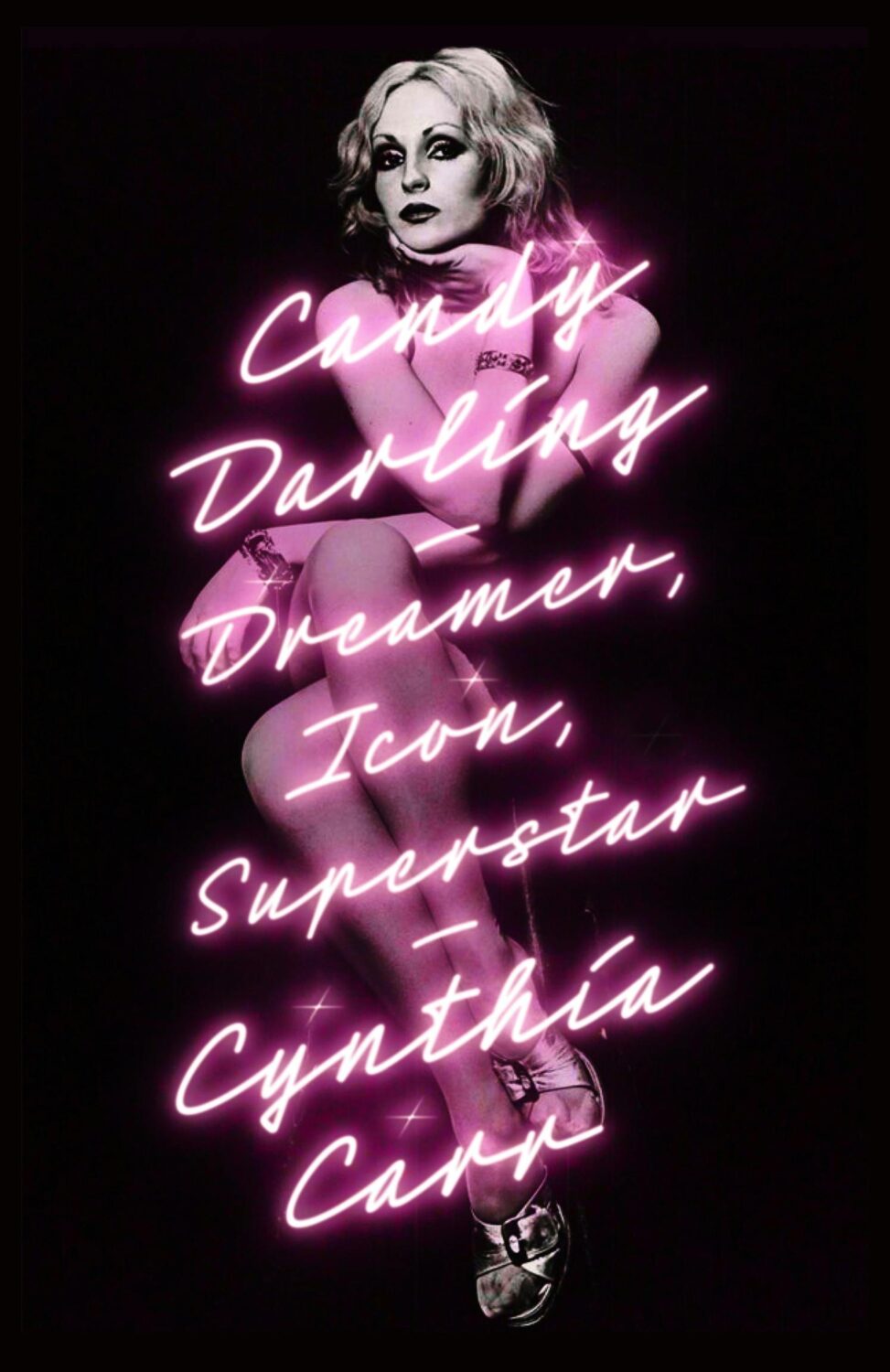
Is neon-style lettering on covers a bit of thing? (see also Candy Darling above)
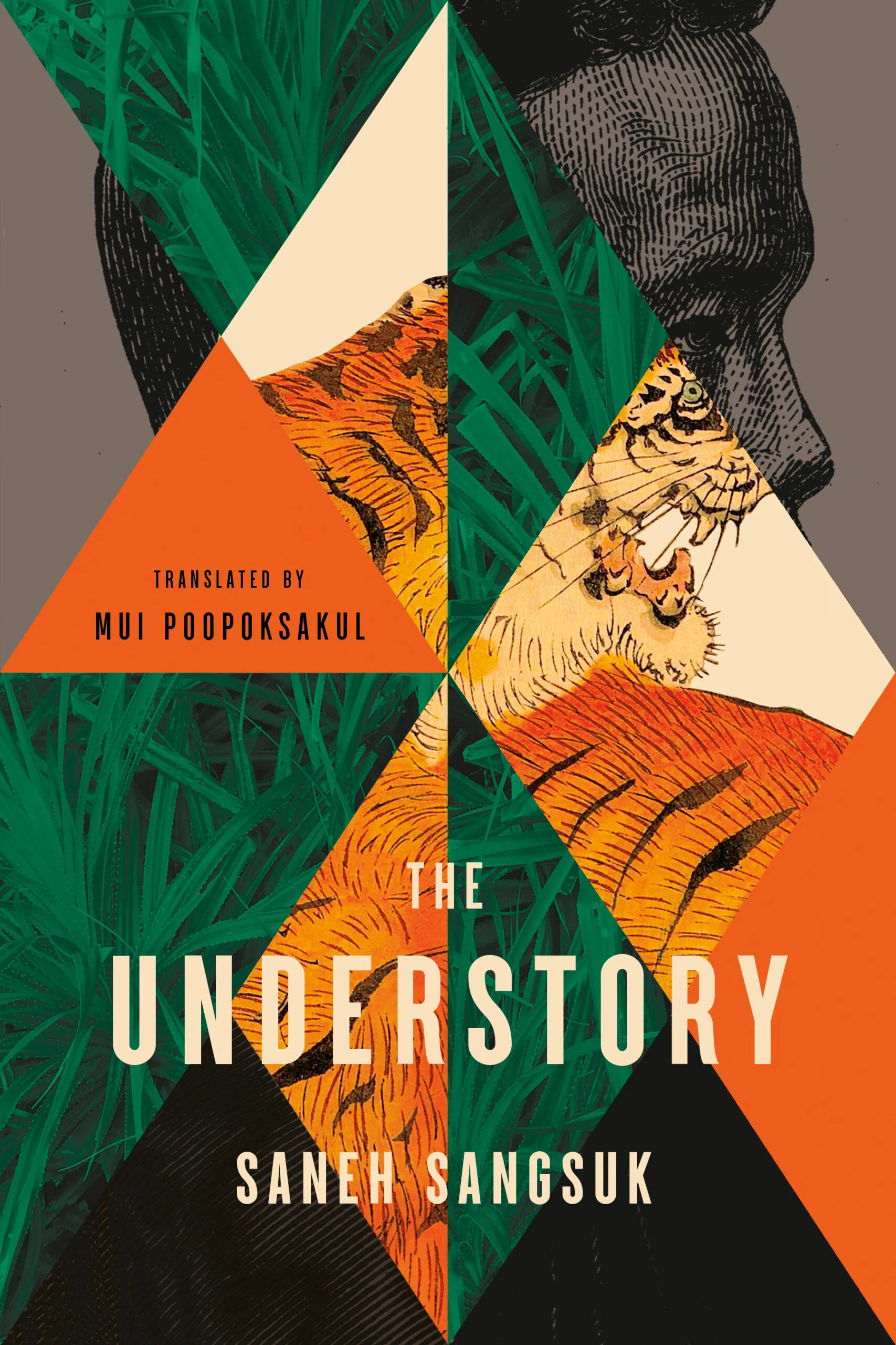
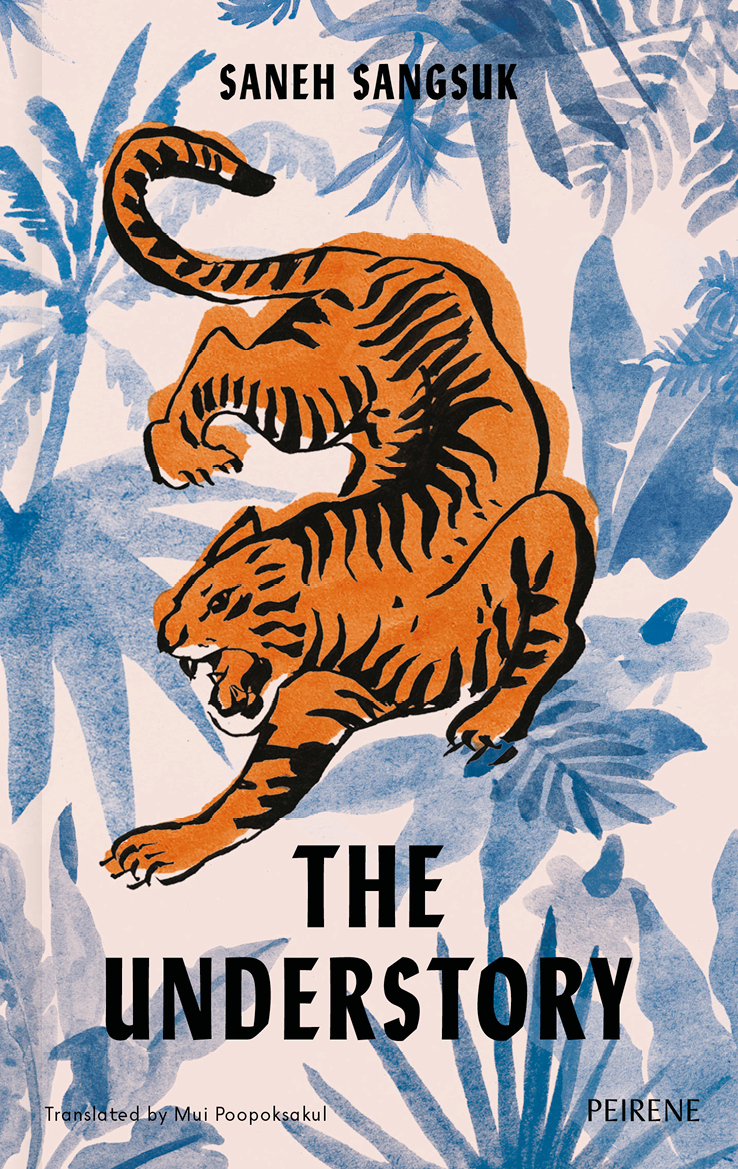
The cover of the UK edition of The Understory, published by Peirene Press in October last year, was designed by Orlando Lloyd. The illustration is by Miki Lowe.
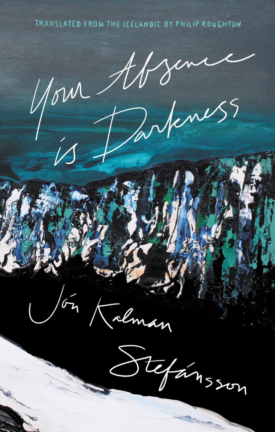
Your Absence is Darkness by Jón Kalman Stefánsson; design by Jason Arias (Biblioasis / March 2024)
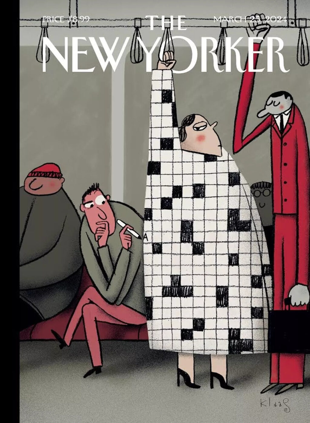
I love this illustration by Klaas Verplancke for the recent ‘Style Issue’ of the New Yorker (which has a fun animated version of the cover on its website).
It works on lots of levels, but it also feels like a bit of nostalgic throwback. People look at their phones these days (although I did see someone with a word search book on the Toronto subway this morning, so some people are keeping it old school at least).
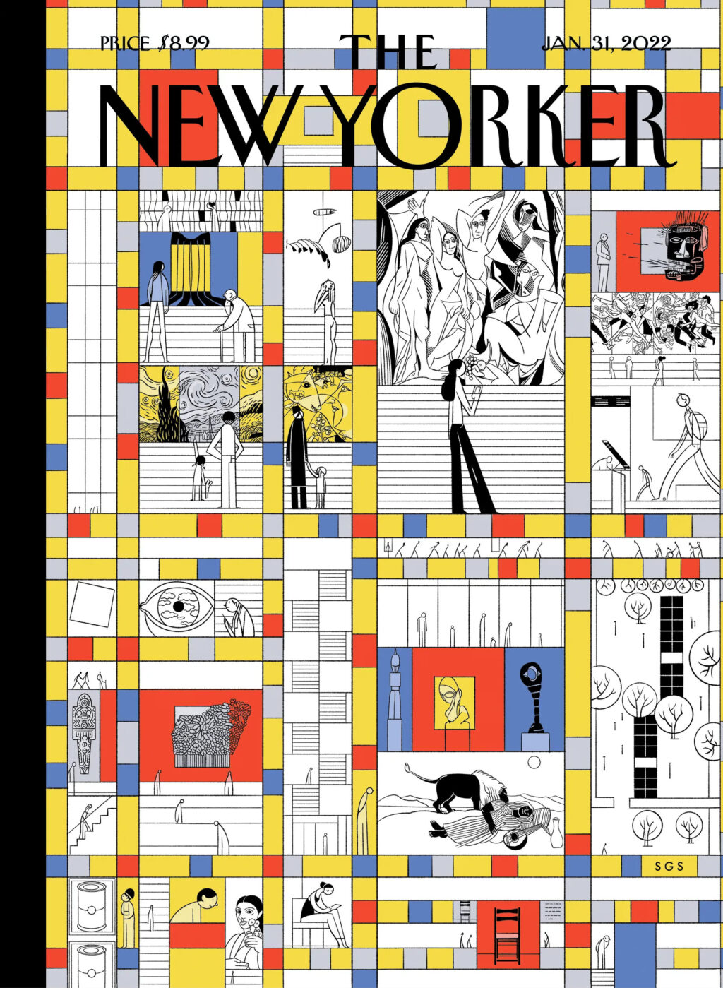
Drew Dernavich for the New Yorker. My to-read pile probably isn’t structurally important, but I wouldn’t pull a book out of the bottom of the stack that’s for sure.
Always in aweof auteurs but never in their thrall, Criterion producers have never been afraid to look beyond the biggest and most marketable names. When Criterion released “Peeping Tom,” a ’60s psychosexual thriller by the English director Michael Powell, the company chose not to ask Scorsese to record the audio commentary, though he would have been the obvious candidate, having done them for other Criterion editions of Powell films. The job instead went to a feminist scholar, Laura Mulvey, the author of the influential essay “Visual Pleasure and Narrative Cinema,” which brought forward the concept of “the male gaze.” Over the years, such decisions added up to an editorial voice that became influential, even authoritative, transforming a mere distributor of films into a creator of film culture.
There are also some nice details about the look of the collection:
Criterion’s distinctive visual language began to emerge in the early ’90s when [Rebekah] Audic, the former head of design, started building up its art staff with an aim “to really show the power of these films through the cover designs,” she told me. To do that it was sometimes necessary to go through every frame of film in search of the perfect image. Other times, images alone were not enough. “For the cover of ‘RoboCop,’ we had an actual aluminum-cast letterpress plate made and then photographed the plate with a 4-by-5 camera,” Audic says. It took days, she told me, but “using a physical piece of metal gave it a feeling of aesthetic truth.”
I don’t know if the Criterion Designs book, written and edited by Criterion art director Eric Skillman, is still available. It must be 10 years old now (dies) — I didn’t see it on the Criterion website — but there’s a nice piece about it on AIGA’s Eye on Design blog from around the time it came out. There is also a Criterion Designs blog, but it hasn’t been updated for a little while (am I imagining that Eric Skillman had a blog himself once upon a time?).
Oh and as an aside, the illustration for the NYT article is by Ben Denzer, who also designs book covers, and is the creator of Ice Cream Books should you ever need to pair great literature with frozen desserts (and who doesn’t?).
Alex Abramovich has a nice piece at London Review of Books on the late Tom Verlaine and the sale of his massive book collection:
Verlaine, who formed and fronted the band Television, died on 28 January 2023. Over the years he had acquired fifty thousand books – twenty tons or more – on any number of subjects: art, acoustics, astrological signs, UFOs. The sale of those books – a two-day affair in August, run out of adjacent garages in Brooklyn – was a serious draw. Arto Lindsay, the avant-pop musician, walked by. Tony Oursler made a short video and posted it on Instagram. Old friends, some of whom looked as if they hadn’t seen daylight in decades, found each other in the long line.
Dealing with that many books was quite an undertaking:
Verlaine had been a regular at the Strand, where he’d once worked in the shipping department – you’d see him on the sidewalk in front, where the dollar carts were. On tour, he used the space between soundcheck and showtime to visit local booksellers. In Brooklyn, he had packed his storage units so tightly that Patrick Derivaz, the friend charged with handling his estate, had to rent another unit just to have space to move boxes around. Jimmy Rip, a guitarist in Television’s most recent incarnation, had flown in from Argentina in January; seven months later he was still in New York, helping out. Dave Morse and Matty D’Angelo, of the Bushwick bookstore Better Read than Dead, had come aboard too.
‘Usually,’ Morse told me, ‘people call and say: “We have fifty thousand books.” You get there and it’s more like five hundred. In this case, we counted the boxes.
My books are not in storage units but having also helped some relatives downsize recently, this is a reminder that I need to take a long hard look at what I want to keep.
Hey. I hope you’re keeping safe and well wherever you are. I’m going to keep this very short as there’s lots going on, but there some great covers, and a couple of tenuous comparisons this month (hey, I can’t help how my brain works!) . Enjoy!
This reminded me of Akiko Stehrenberger‘s poster for the movie Funny Games. They don’t really look alike, and the tone is very different, but I think it was the close crop and the hair that brought it to mind.
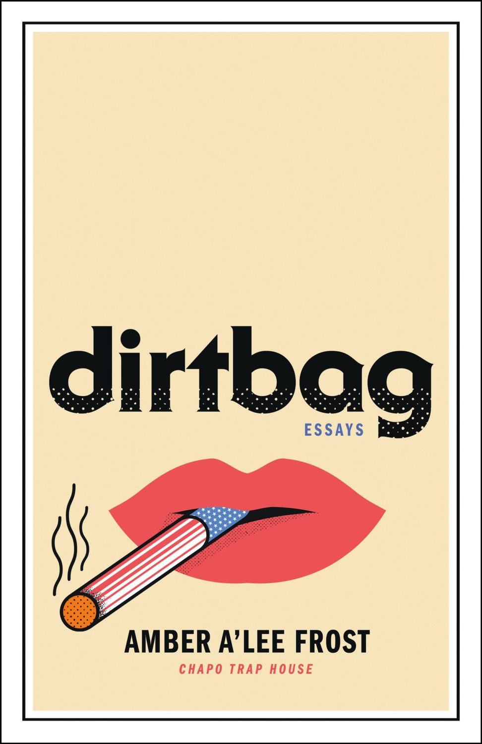
Dirtbag by Amber A’Lee Frost; design by Rob Grom (St. Martin’s Press / December 2023)
This brought to mind Peter Mendelsund’s cover for The Woman Destroyedby Simone Beauvoir, published by Pantheon, which in turn reminded me Gunter Rambow‘s Gitanes, Un Hommage à Max Ponty poster…
The image is taken from the 17th Century painting ‘The Torture of Prometheus’ by Giovacchino Assereto (thanks for letting me know, Jason!). The tight crop (which is great!), reminded me of Peter Hujar’s 1969 photograph ‘Orgasmic Man’, which was used on the cover of A Little Life by Hanya Yanagihara designed by Cardon Webb a few years ago. Art imitating art, kind of?
Jacket design by Cardon Webb; jacket photograph Orgasmic Man by Peter Hujar 1987
Splinters by Leslie Jamison; design by Gregg Kulick (Little, Brown & Co / February 2024)
The cover of the UK edition of Splinters, published this month by Granta, was designed by Jack Smyth. It’s interesting to see to a torn author photo in both…
I hope you’re staying healthy and optimistic about the new year. As this is the post about new 2024 covers, it inevitably includes a few from 2023 that I missed at the time. There are also a couple of indie covers, one from a university press, and, continuing a theme from last year, one from a Canadian publisher. Keep warm, friends.
Filterworld by Kyle Chayka; design by Oliver Munday (Doubleday / January 2024)
I mentioned Kyle Chayka in the introduction to my post looking back at 2023. I didn’t realize that he had book coming out. I guess I will have to read it now!
Font wizards correct me if I am wrong, but I *think* both of these covers use Manofa from Inhouse Type? (And I think saw it on the cover of a forthcoming book too recently. Maybe a typeface inspired by Lydian is becoming the new Lydian?)


