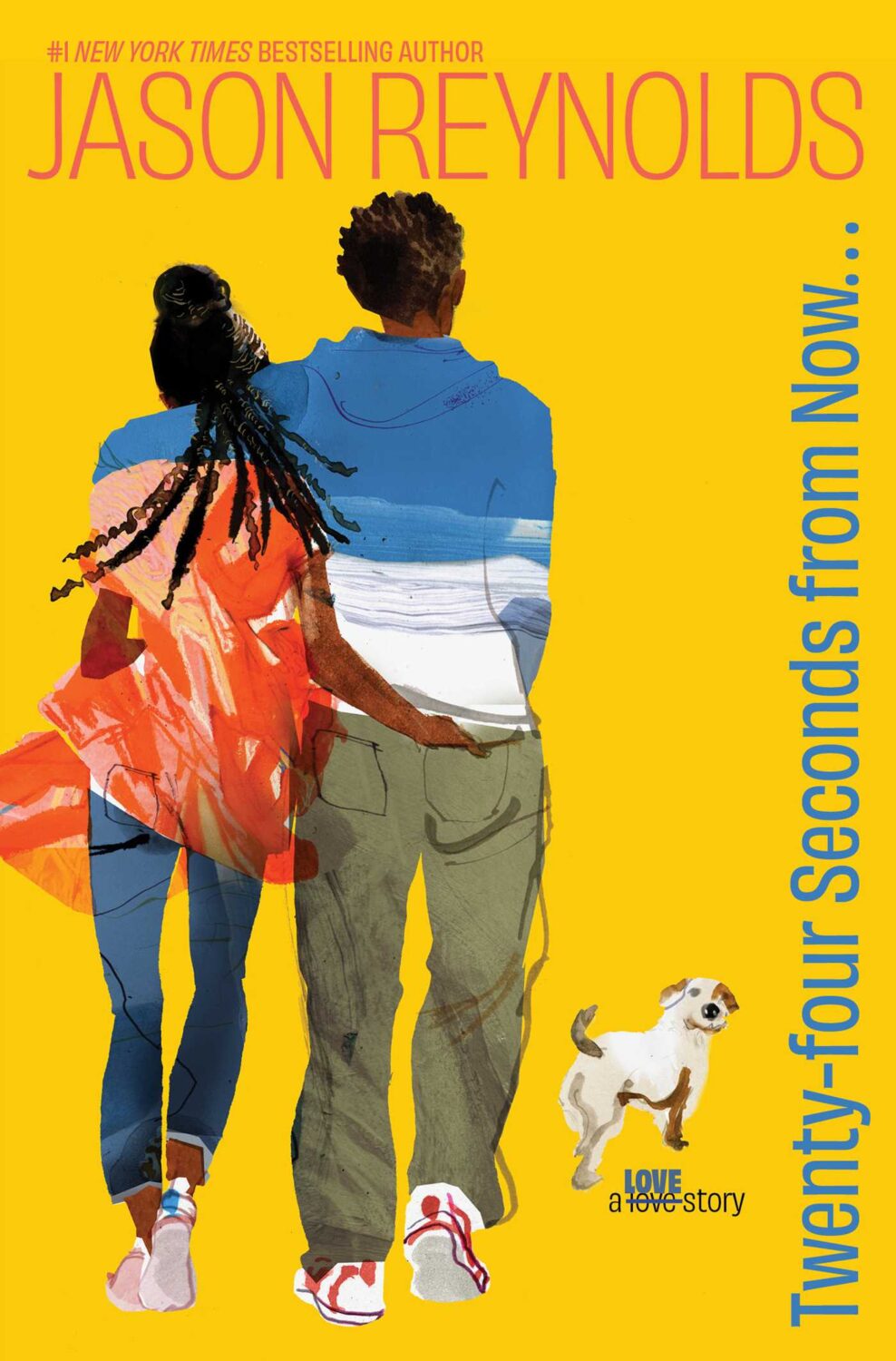
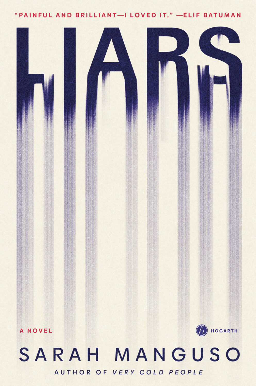
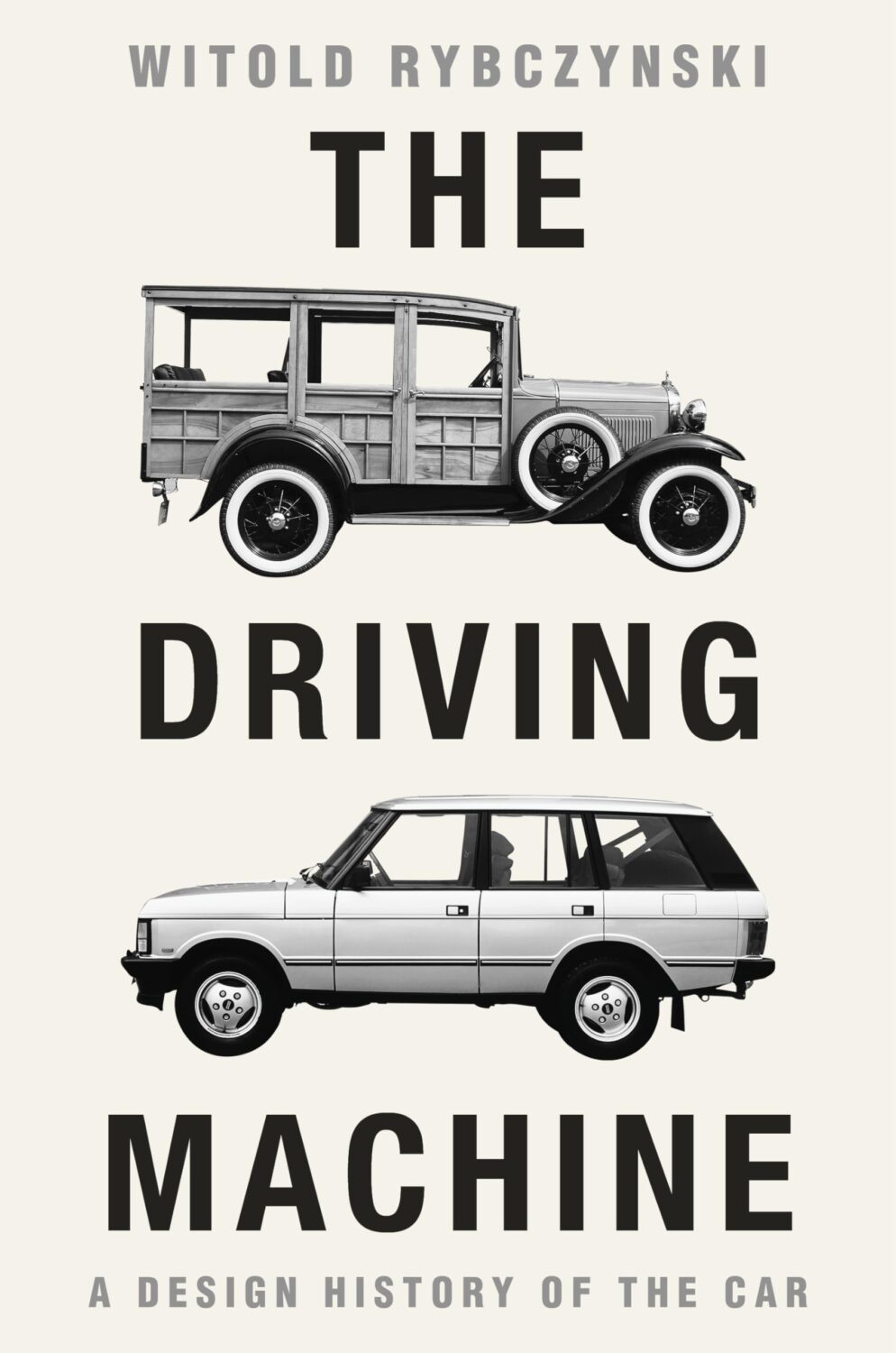
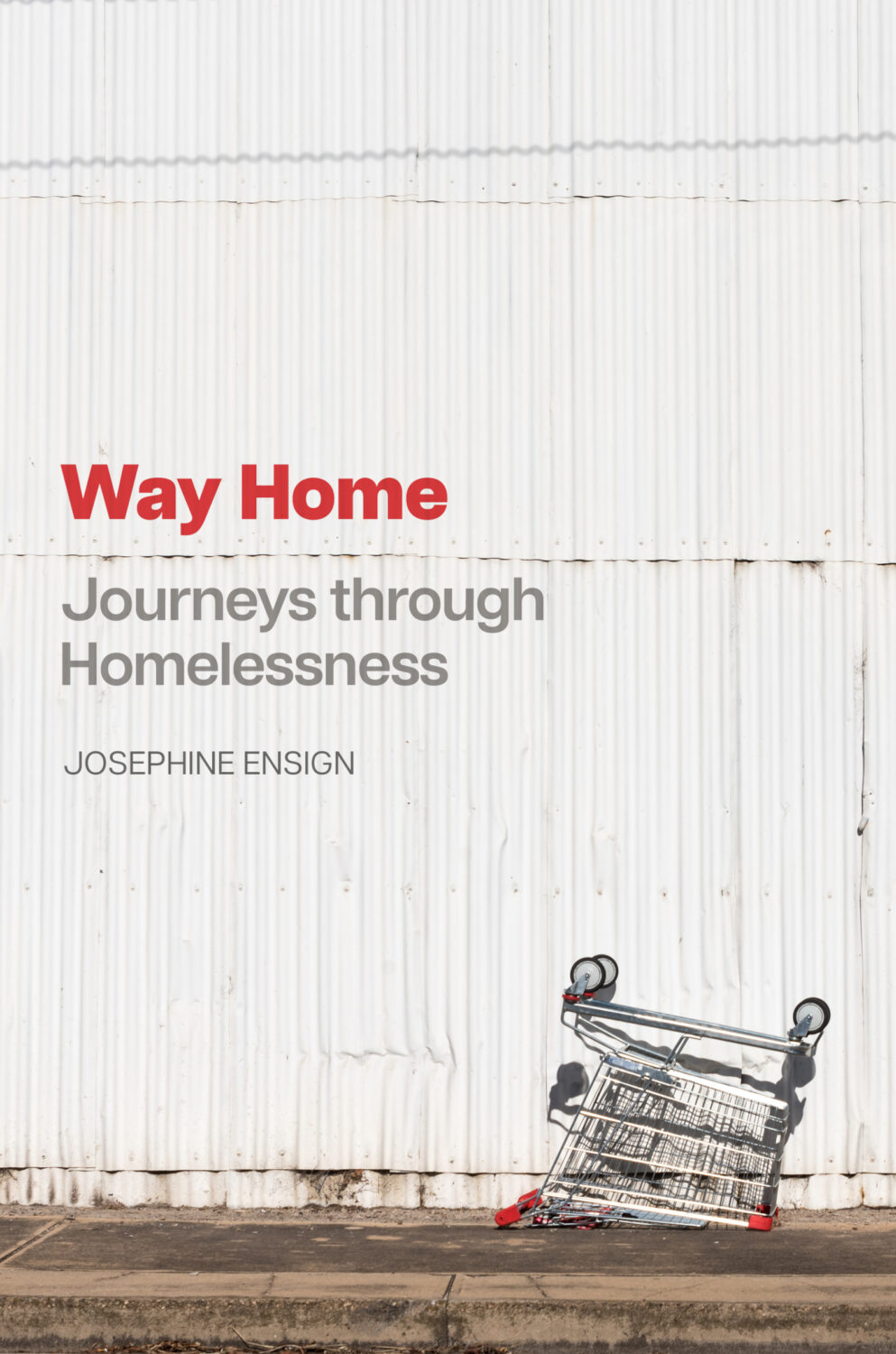
First episode of (the long-awaited) second season of Steve Leard‘s excellent book cover design podcast Cover Meeting is a conversation with Irish freelance designer Jack Smyth in which he discusses his work, the industry, building community, how he really feels about cover quotes, and more.
I’m a big fan of Jack’s work and it has regularly featured here over the years. He’s always helping with attributions and corrections, and generally supporting the blog, so I really appreciate the mention on the podcast. Cheers, mate.
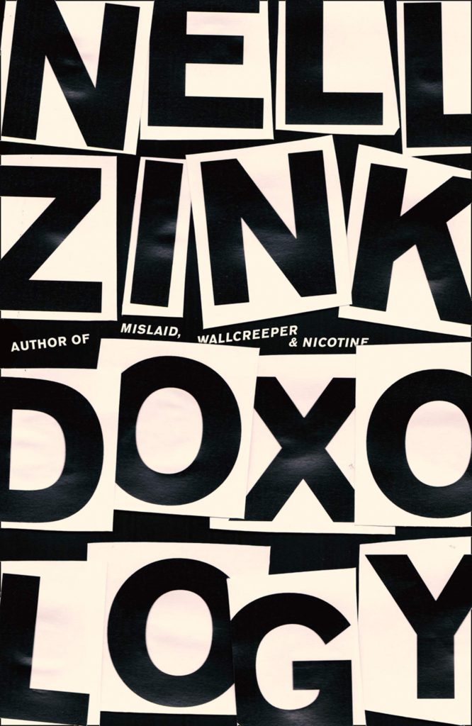
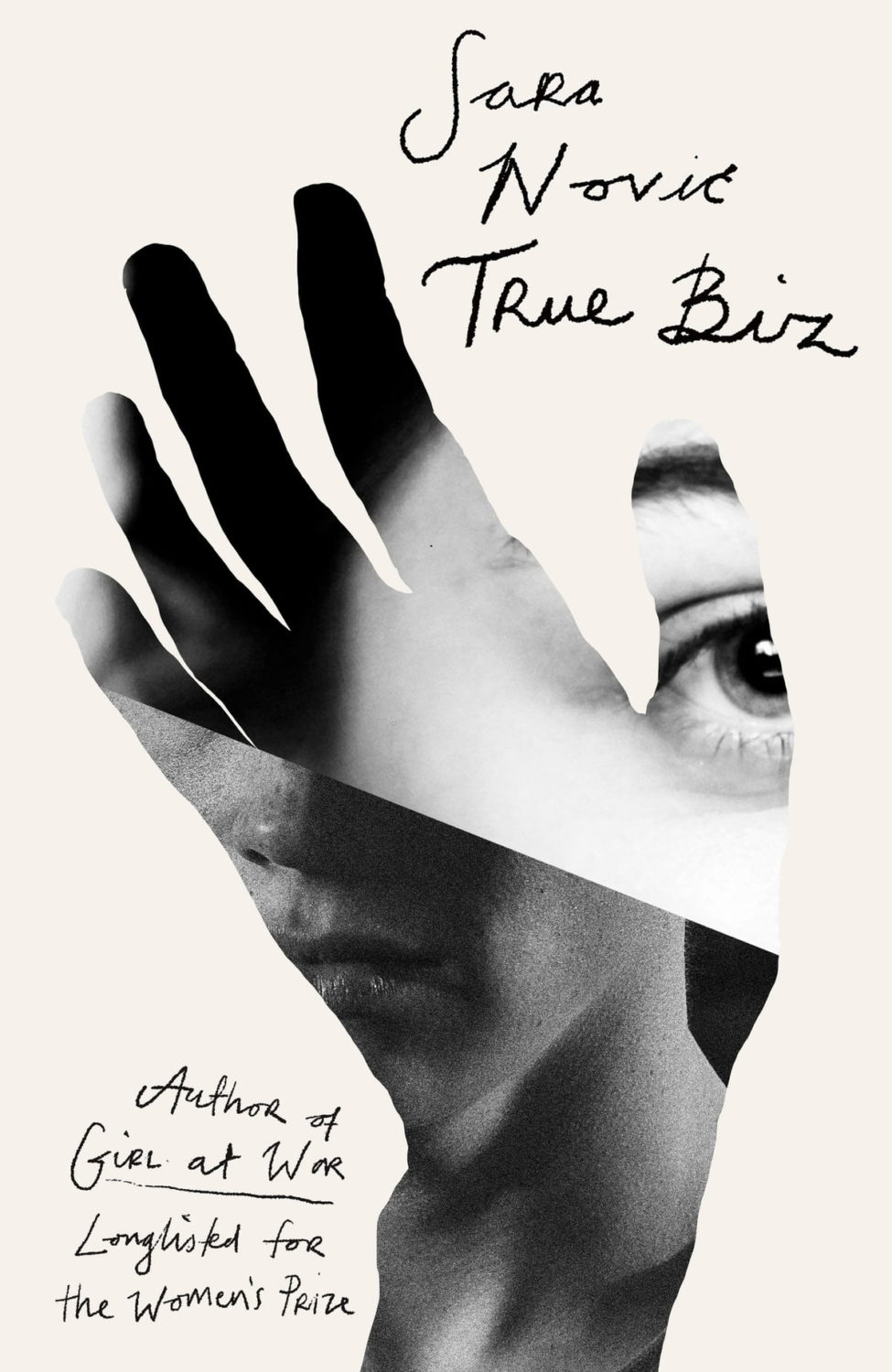
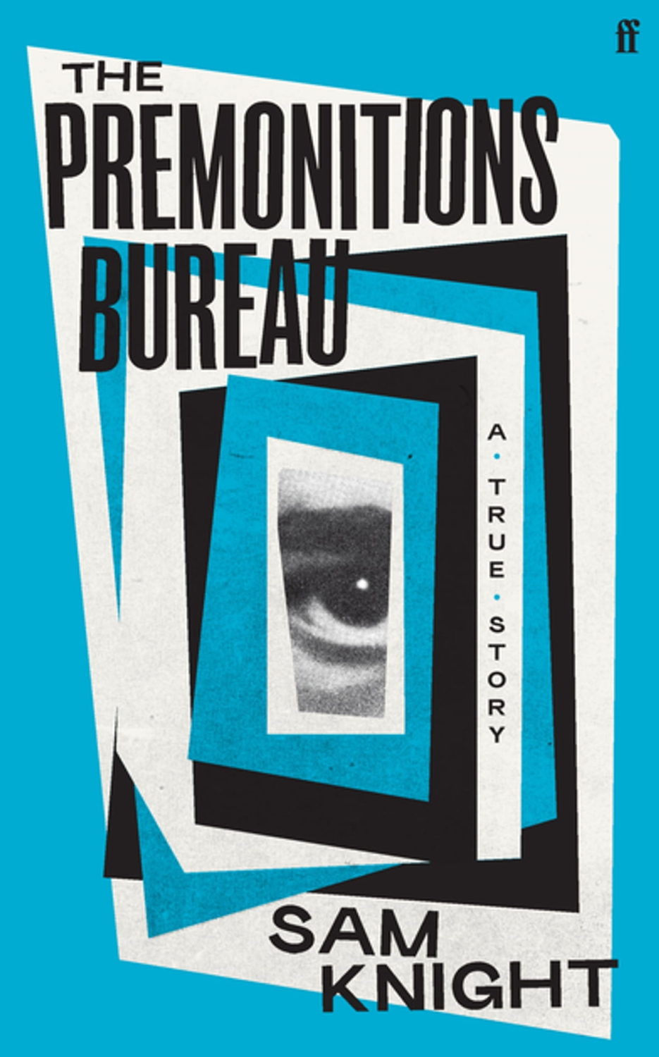
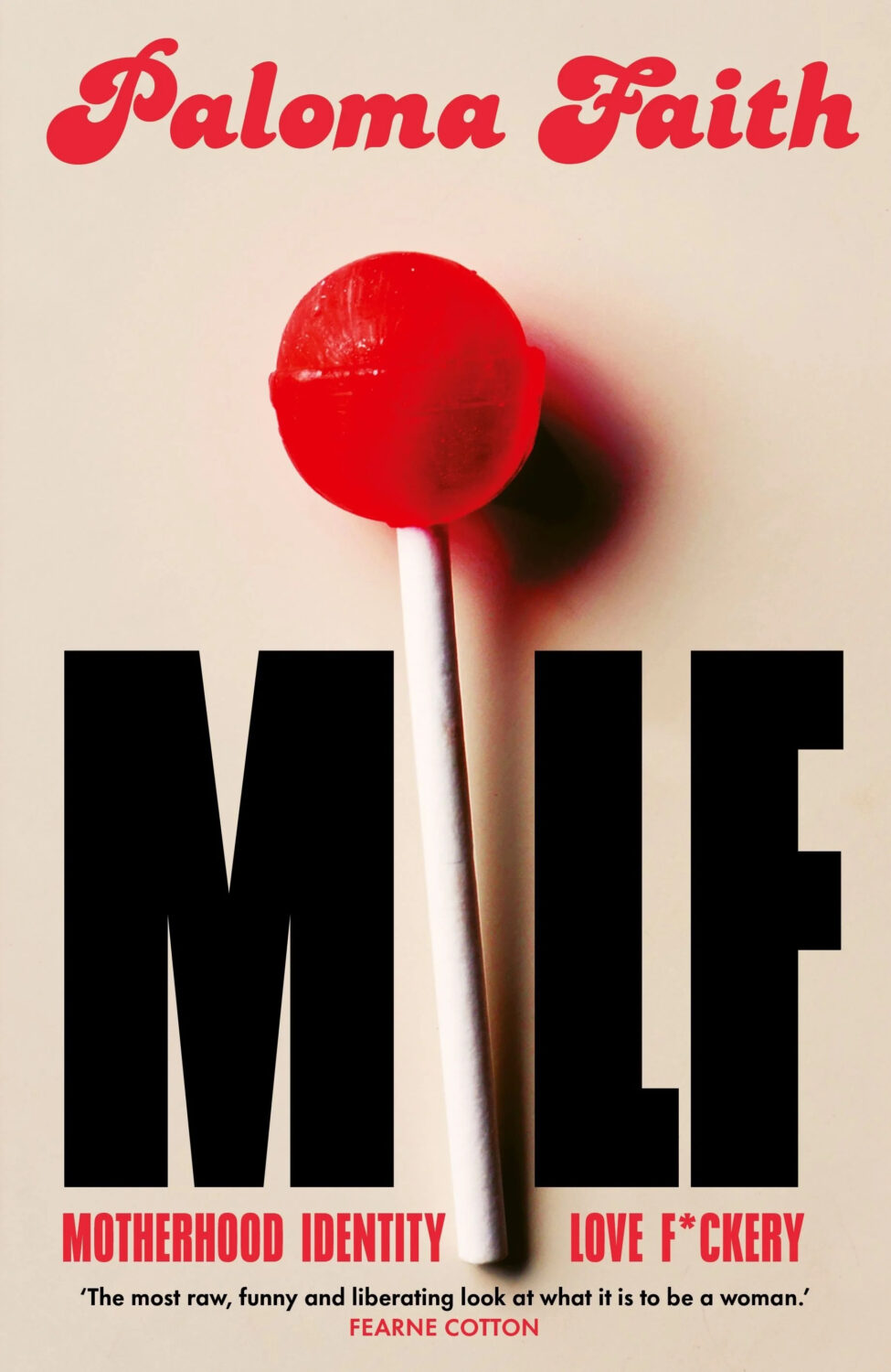
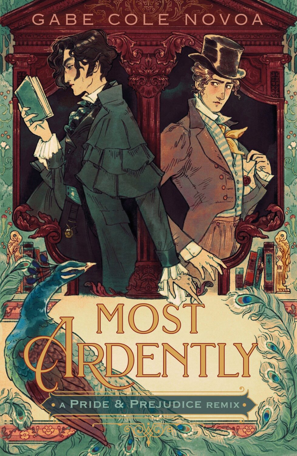
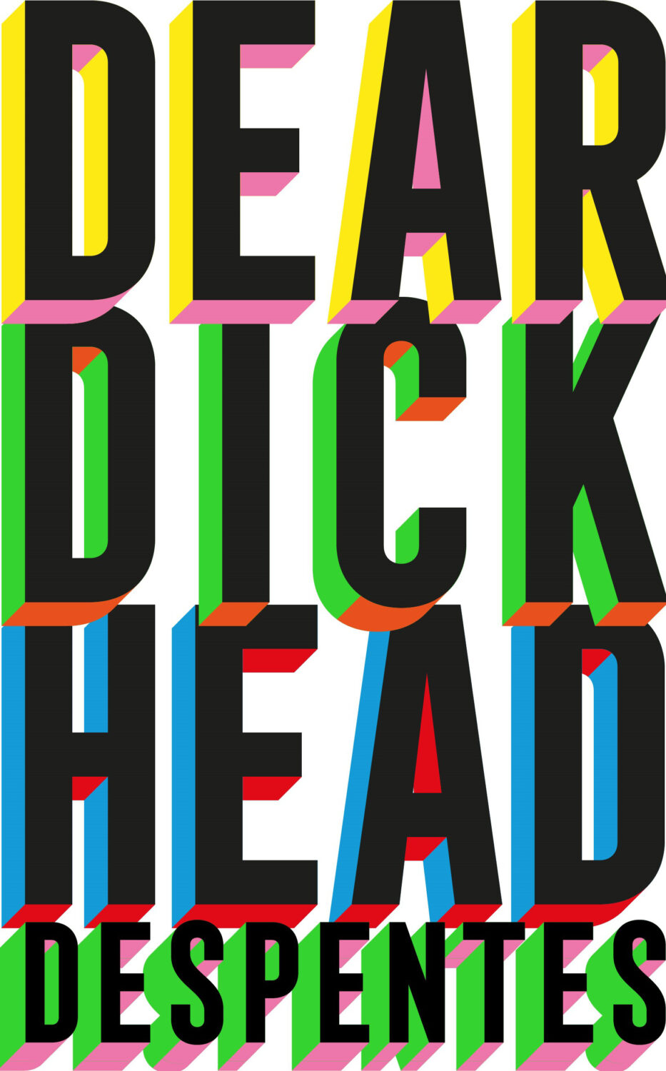
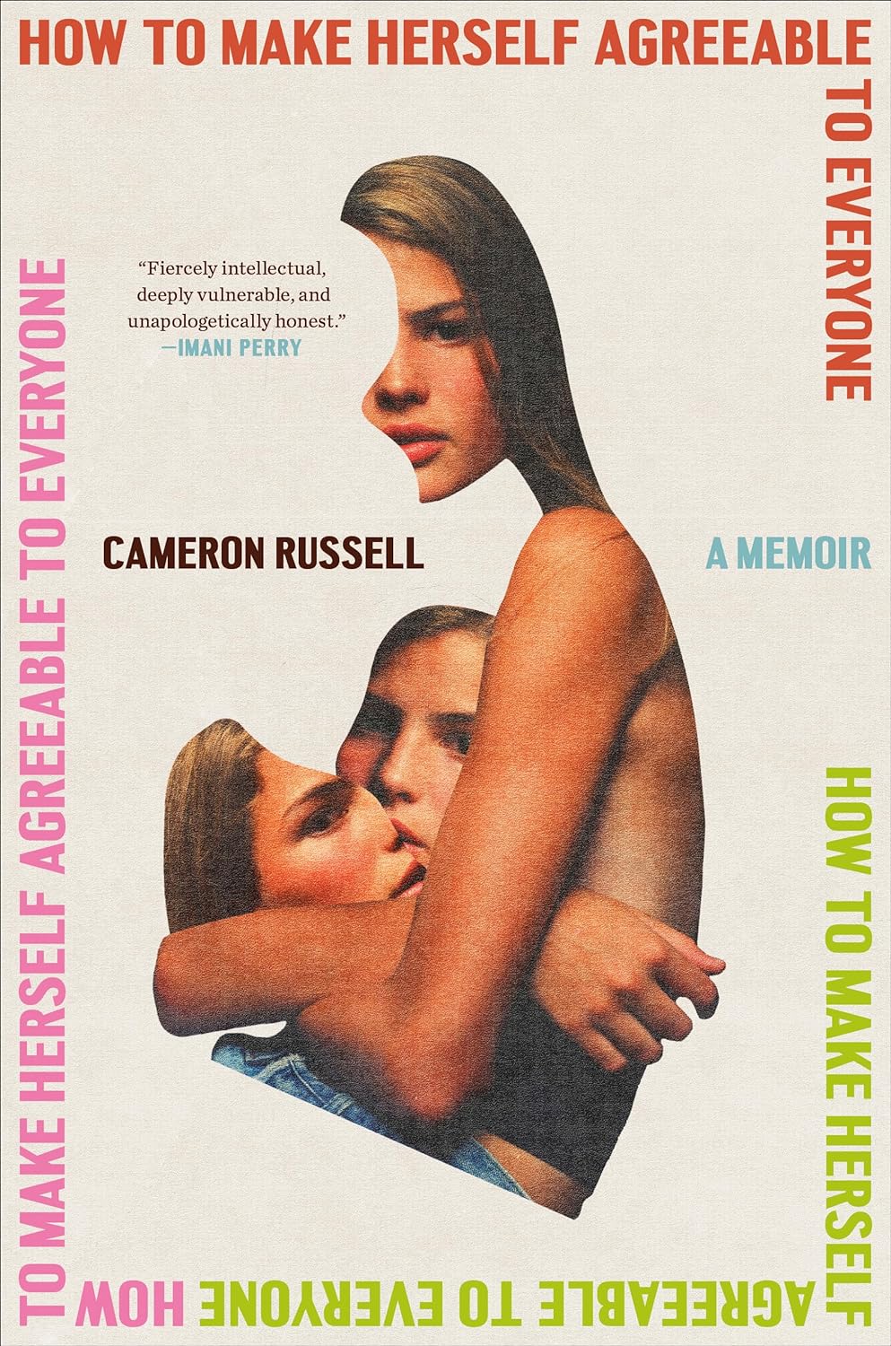
Doxology by Nell Zink; design Jack Smyth (Fourth Estate / August 2019)Antkind by Charlie Kaufman; design by Jack Smyth (Fourth Estate / July 2020)The Age of Skin by Dubravka Ugresic; design by Jack Smyth (Open Letter / November 2020)True Biz by Sara Novic; design by Jack Smyth (Little, Brown / April 2022)The Premonitions Bureau by Sam Knight; design Jack Smyth (Faber & Faber / May 2022)MILF by Paloma Faith; design by Jack Smyth (Ebury / June 2024)
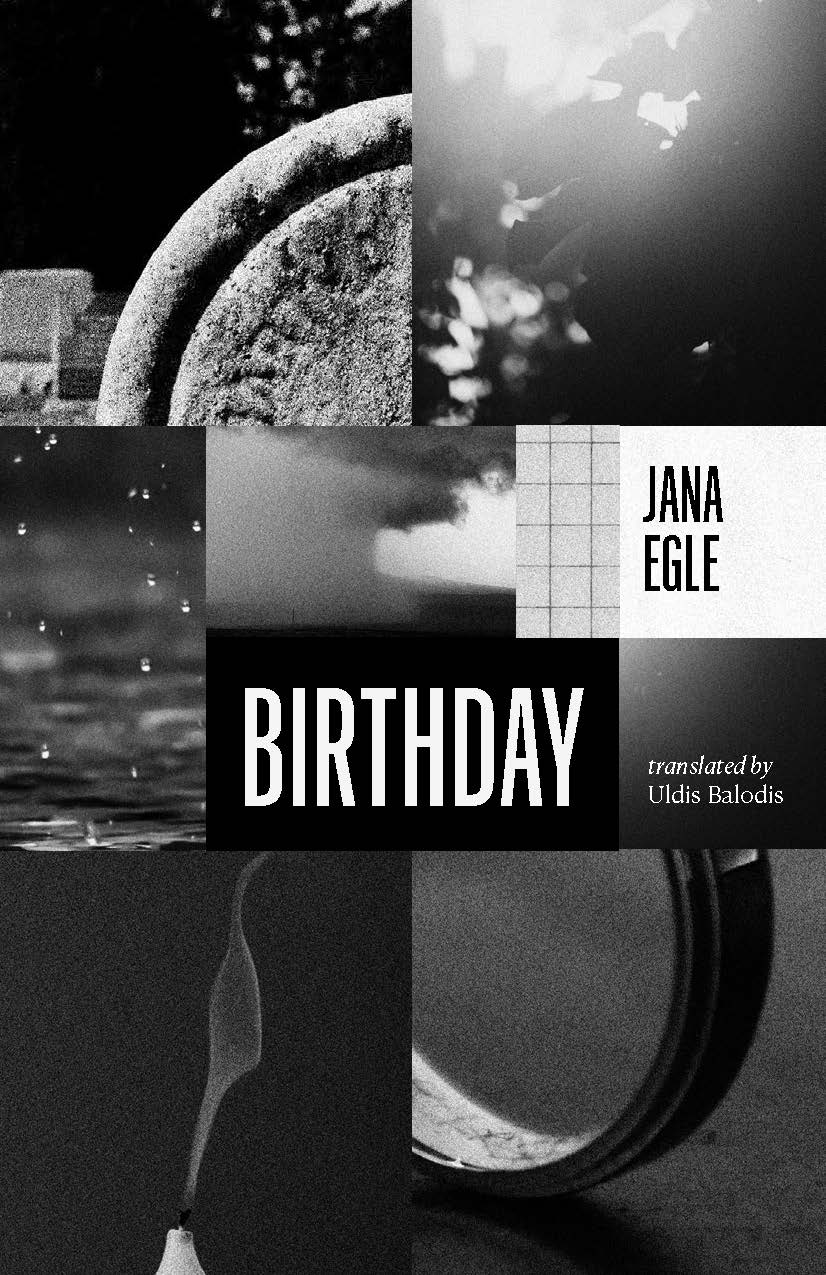
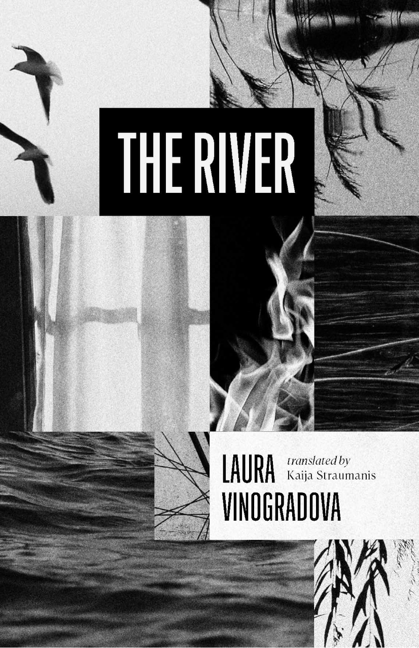
I like these elegant Jenny Volvovski cover designs for Open Letter‘s Latvian translator triptych of Berlin by Andris Kuprišs, translated by Ian Gwin, Birthday by Jana Egle, translated by Uldis Balodis, and The River by Laura Vinogradova, translated by Kaija Straumanis, all publishing this month. I think there’s something a bit early 2000’s Knopf about them.
And speaking of Jenny Volvovski, she has fun side project redesigning the covers of books she’s read, From Cover to Cover.
Hey, I hope you’re safe and well. This month’s post is a big one so I’m pretty much going to let you get on with it, but before I do, I just wanted to mention that I’ve included a gallery of all this month’s covers as the bottom of the post so you can click through them all. This is in response to a reader email about the size of the covers on screen. I think the gallery looks nice, but I am worried that it’s going to play absolute havoc with the RSS / email so apologies in advance if that’s case. Anyway, enjoy this month’s covers, and let me know what you think.
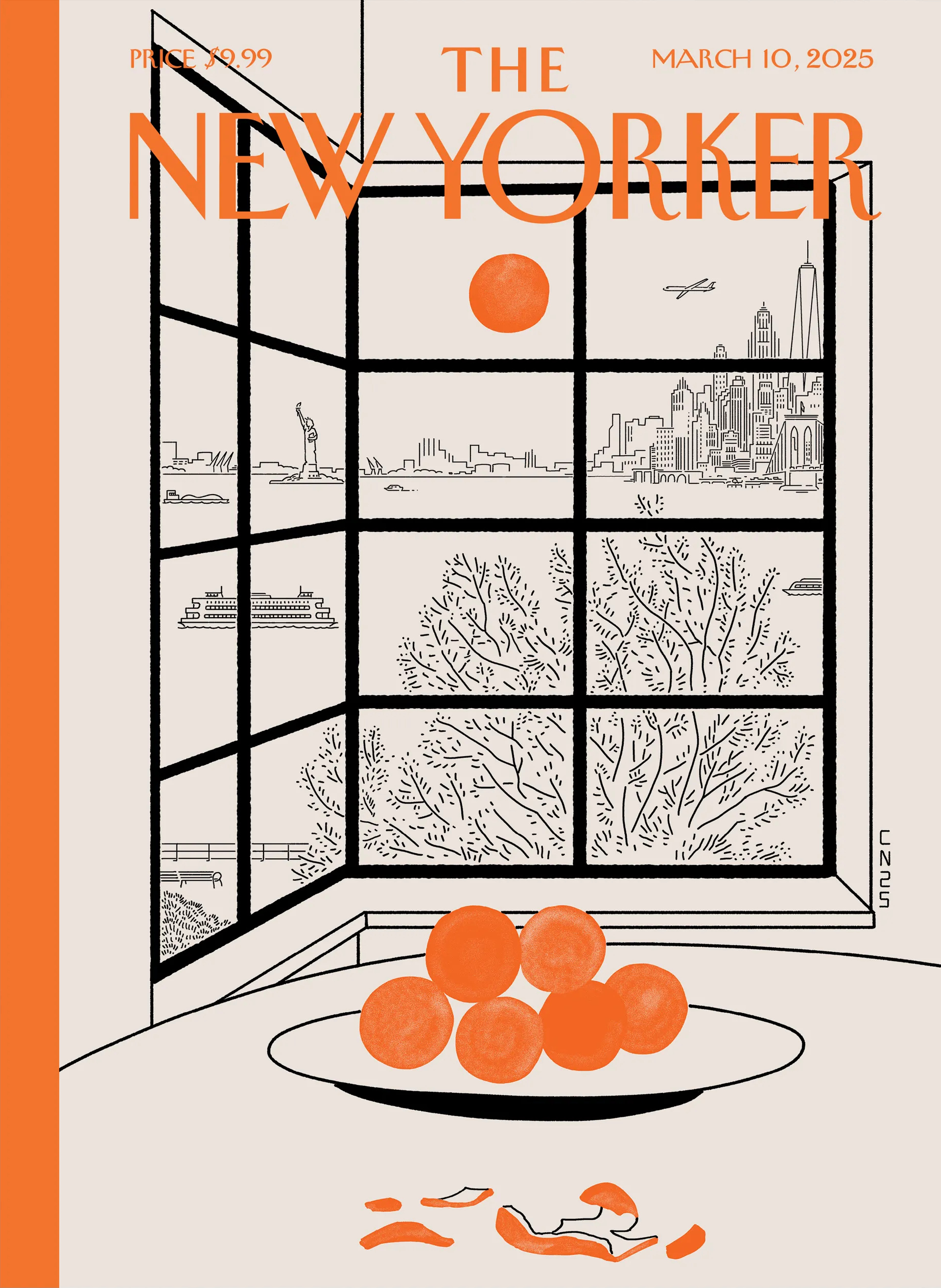
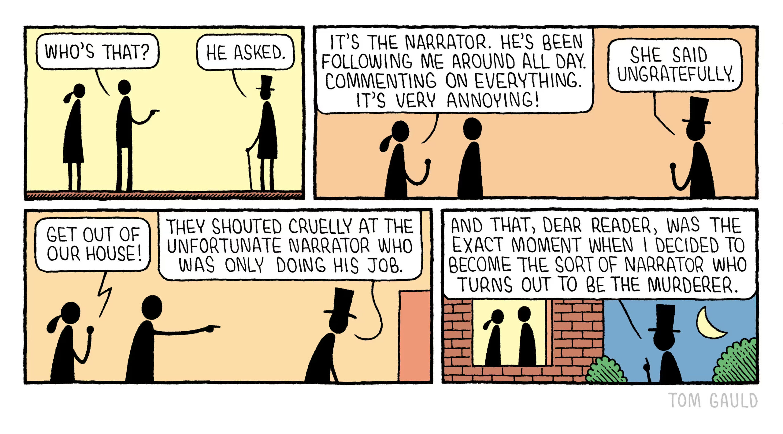
I love Tom Gauld‘s latest cover for the New Yorker so much. We just had sleet and freezing rain in Toronto so that part is accurate. But it’s not just the weather. Everything feels pretty bleak at the moment and, like many others, I have found myself seeking solace in art too.
(I also have a dog. I should post more dog cartoons)
Hey, I hope you’re keeping safe, well and warm (or cool!) wherever you are.
If you missed it, my first post of 2025 was a look back at some of last year’s YA covers. You can find my 2024 list of notable literary covers here. Both posts got me thinking more generally about these lists. Do I need to change things up? Or stop altogether? Several other sites are posting lists that do much the same thing mine, and they are all starting to feel too alike. I don’t have answer, and I don’t really know I would do differently. I’m struggling to post once a month as it is. For now at least I’ll keep posting the covers that interest me. It’s just something that’s on my mind, and I have other projects I’ve been neglecting, so I’m curious if you have opinions.
Anyway, this month’s post is a bit of a short (but good!) one, and includes a couple of covers that I missed in 2024 for one reason or another. Enjoy!
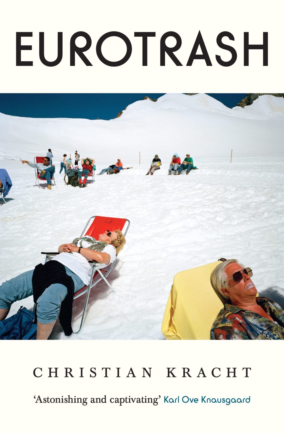
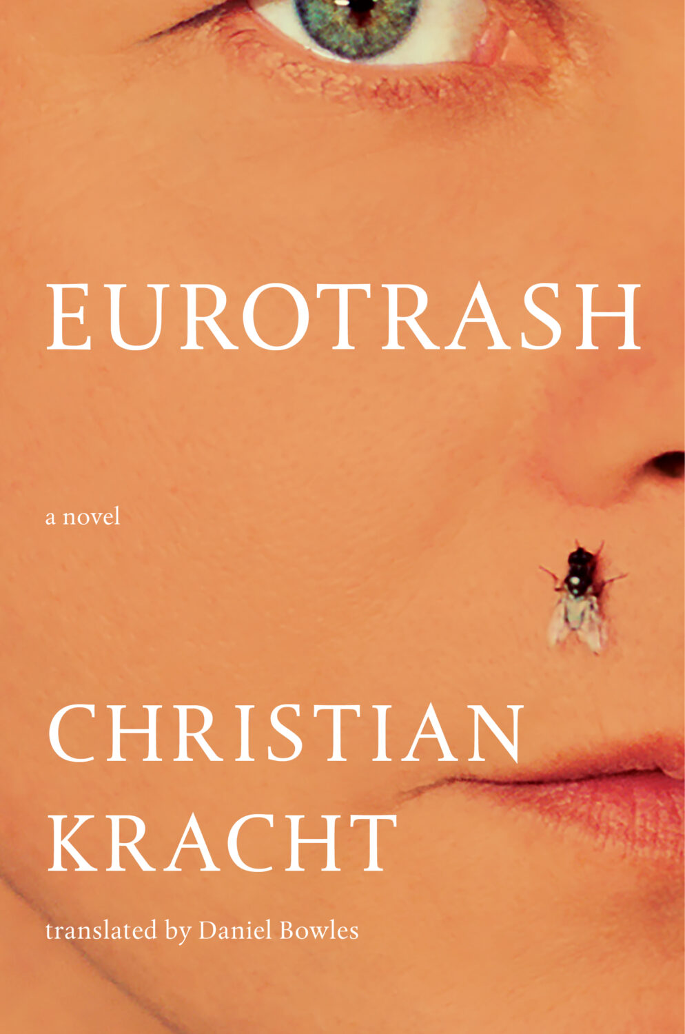
Eurotrash by Christian Kracht; design by Sinem Erkas (Profile Books / November 2024)
I do really like this cover. It looks great! But it also looks a lot like non-fiction, especially when compared to the cover of the US edition (Liveright, October 2024) designed by Jason Heuer. They look like completely different books!
And speaking of Jason Heuer, he’s made a series of fun videos talking about embarrassing moments from his early graphic design career. You can find them on YouTube and Instagram. In the second episode Jason talks about his first book design credit…
Happy New Year! I hope you’re keeping safe and well. The first post of the year is the now customary look back at the previous year’s Young Adult covers. All the covers on this year’s list are illustrated (which was almost, but not quite, the case last year too). I love illustration — it’s part of the reason why I still keep doing these posts! — so it’s possible that this just reflects my personal preferences, but almost all the YA covers I saw this year were illustrated. There were very few photographic or type/letter-only covers.
I compile this list a little differently to my adult list. It’s mostly done over a few weeks at the end of the year rather than compiled across the year as a whole. I’m sure this skews my selections too. I’m probably overly reliant on cover reveal posts and best of the year lists. I think this probably means that the big American publishers are over-represented, which is less than ideal. I suspect they’re dominant in the category anyway, but I’m sure I am missing some interesting covers from independent and international publishers all the same.
The Horror and Fantasy seem to be having a moment. The line between YA and adult covers seems very blurred in both genres. I had to double-check a number to titles to confirm where they belonged. It happened often enough for me to think it was intentional, which probably speaks to who is reading YA and what they are looking for. It is also possible that I am over-indexing both genres here because they seem more mature and they appeal to me personally. I am also less of a fan of the illustration styles popular for the romance genres at the moment, so I think it’s fair to say they are under-represented on the list. I am very aware that I am not the target audience, so I’m not sure it is something that should overly worry art directors (although apologies if you’re disappointed not to see more of your covers on the list!). Still, it might be nice to see some new / different approaches to Romance — and all genres, frankly — going forward.
And with that, I wish you all the best for 2025, and I hope you enjoy the post!
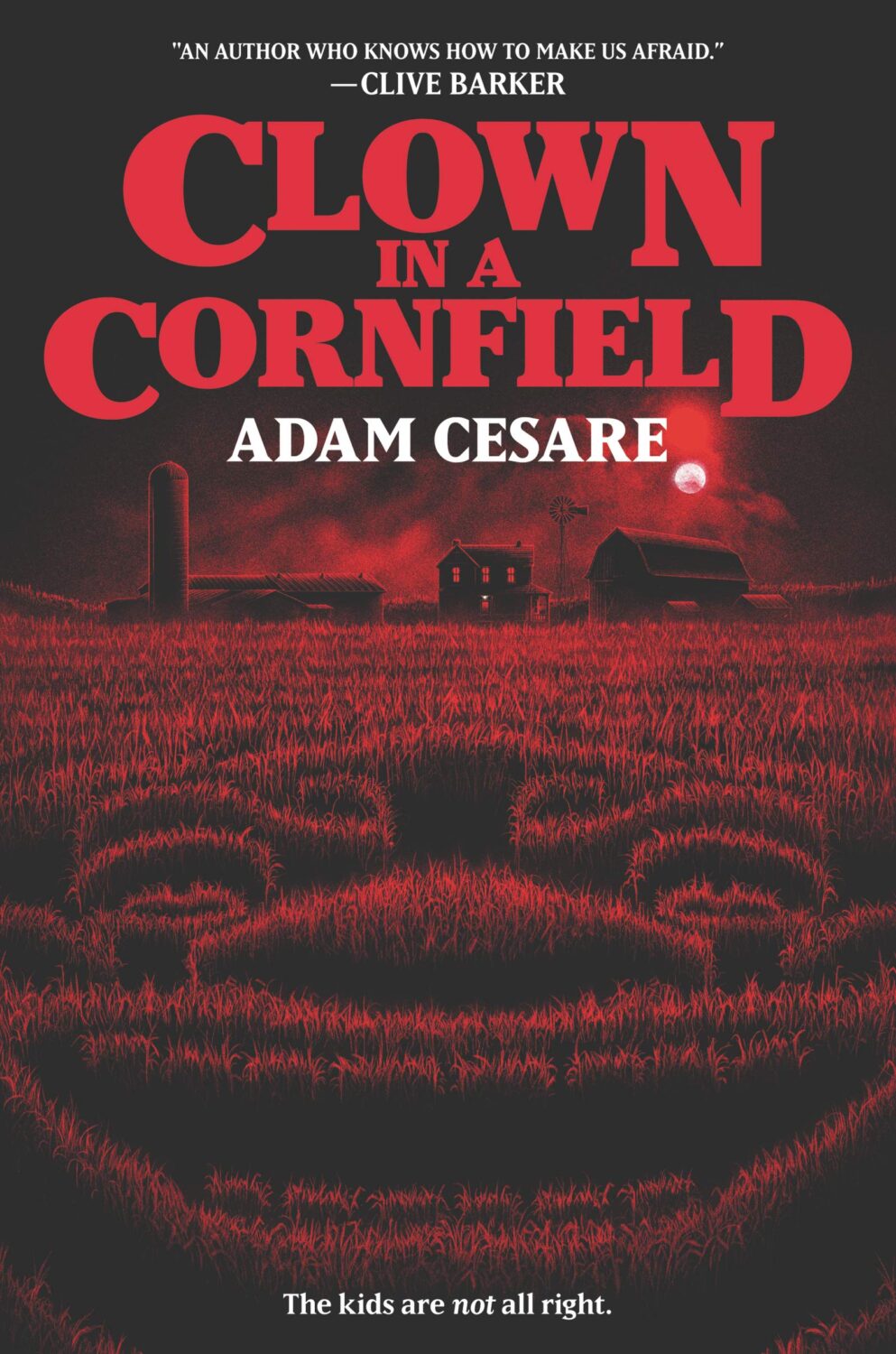
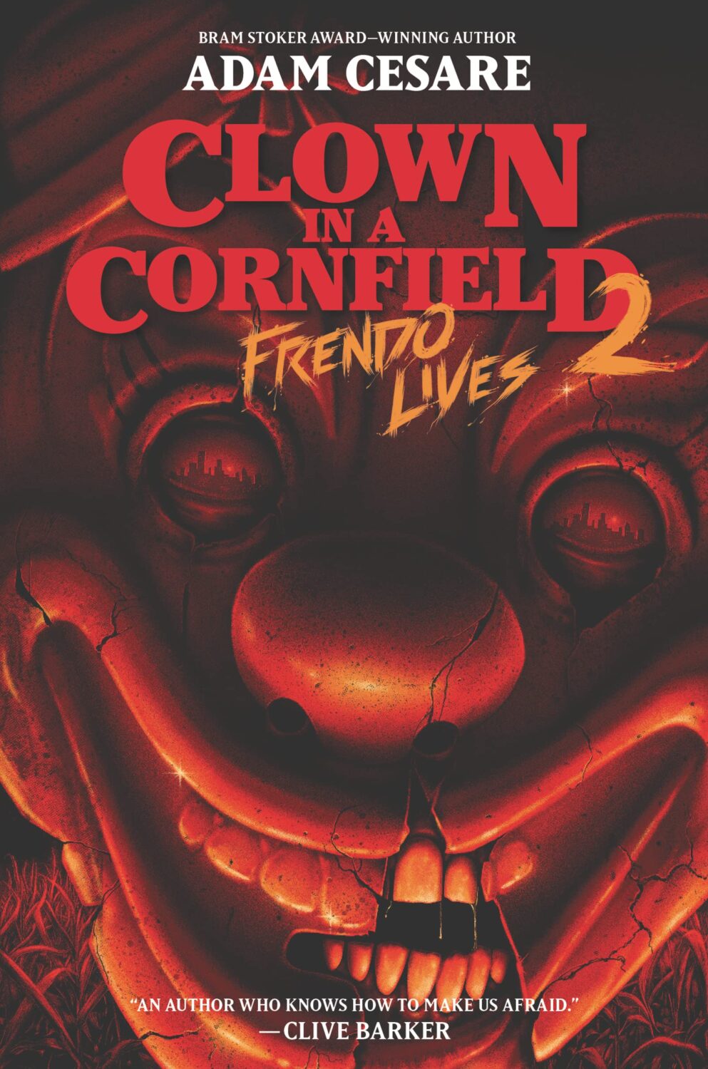
I think this is my favourite cover from the series thus far, but the covers of the original Clown in a Cornfield from 2020, and the second book Frendo Livesfrom 2022, are also very creepy.
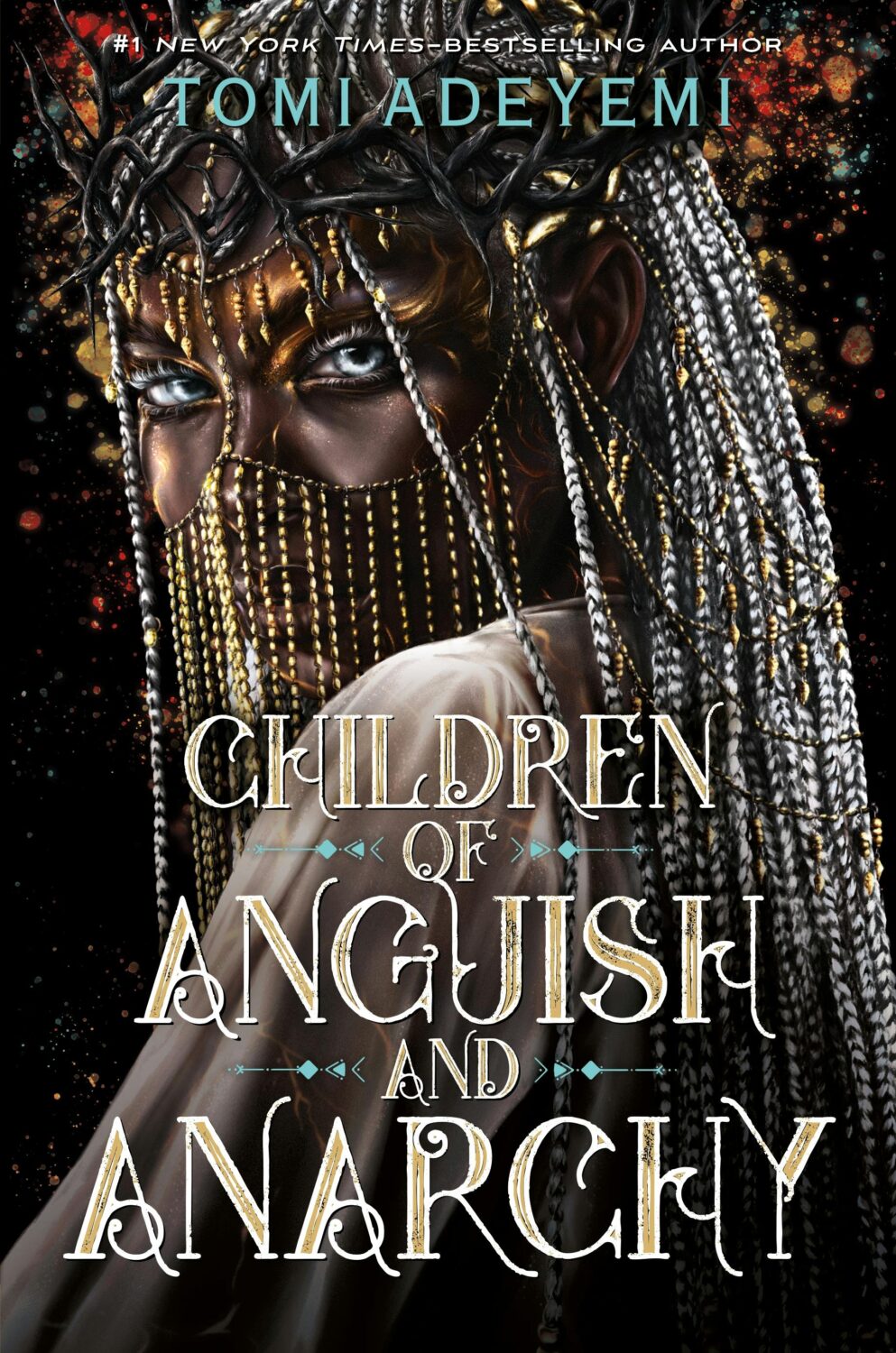
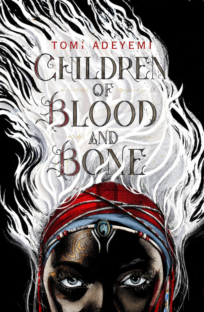
Children of Blood and Bone by Tomi Adeyemi; design Richard Deas (Henry Holt / March 2018)Children of Virtue and Vengeance by Tomi Adeyemi; design by Richard Deas, Mallory Grigg, and Kathleen Breitenfeld; art by Sarah Jones (Henry Holt / December 2019)
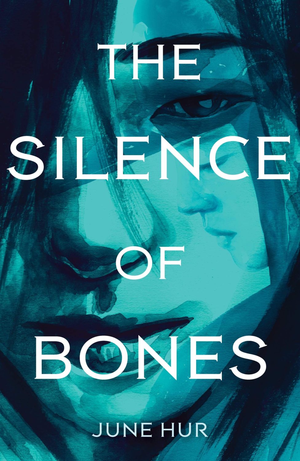
The Silence of Bones by June Hur; design by Katie Klimowicz; art by Kasiq Jungwoo (Feiwel & Friends / April 2020)The Forest of Stolen Girls by June Hur; illustration Pedro Tapa (Feiwel & Friends / April 2021)
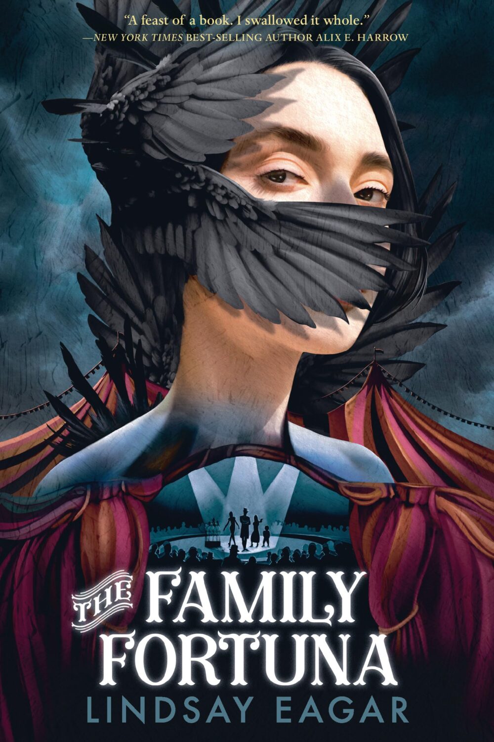
I missed the cover of The Family Fortuna by Lindsay Eagar last year, but it’s also delightfully creepy. The art is by Elena Masci, and I believe the designer is Matt Roeser.
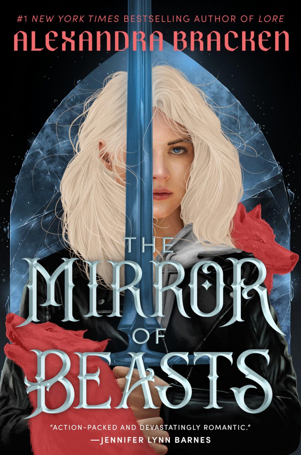
This is actually the paperback of the first title in series. The new cover matches the latest book, released in July, The Mirror of Beasts.
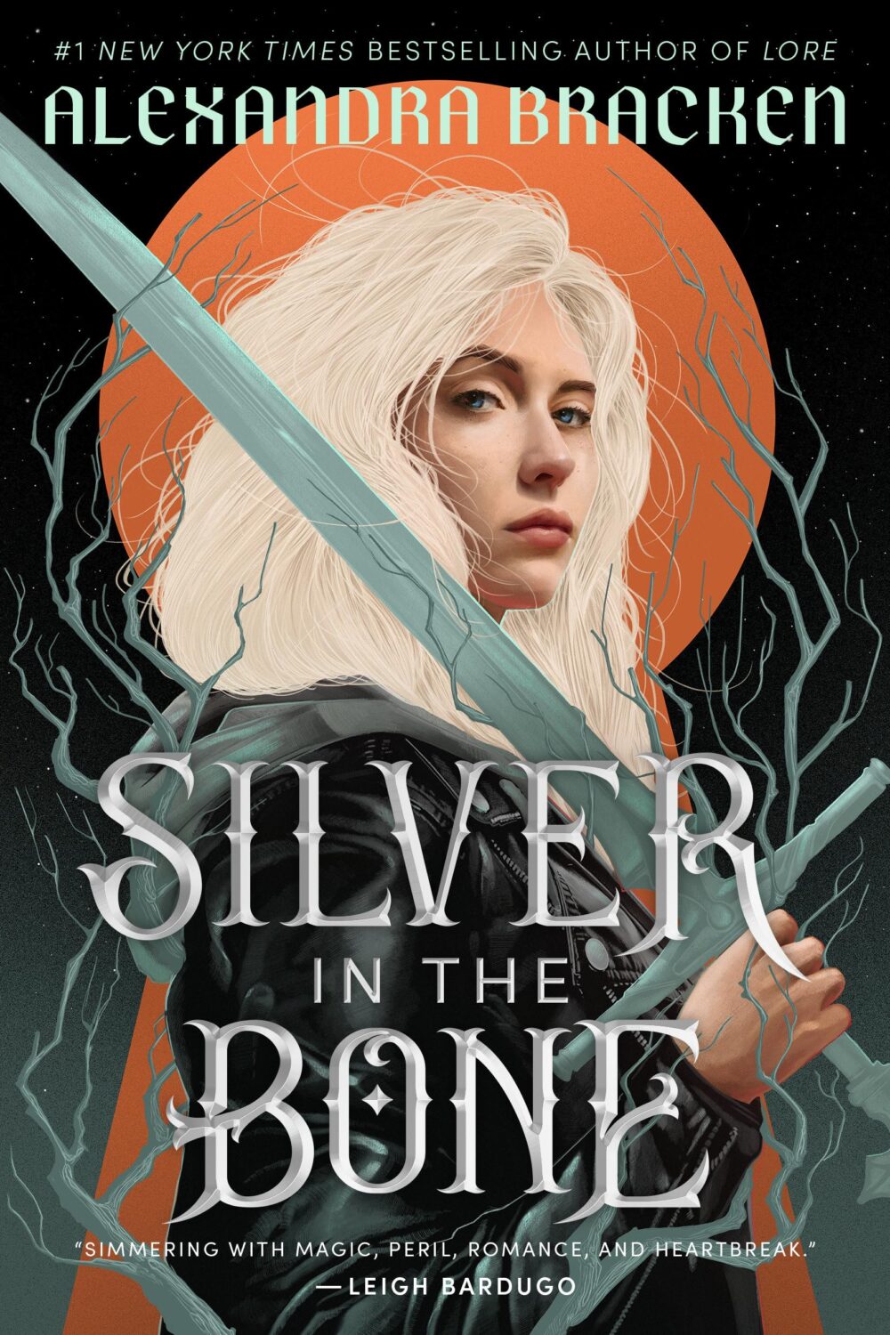
Silver in the Bone by Alexandra Bracken; design Liz Dresner; art Tomasz Majewski (Ember / May 2024)The Mirror of Beasts by Alexandra Bracken; design Liz Dresner; art Tomasz Majewski (Alfred A. Knopf BYR / July 2024)
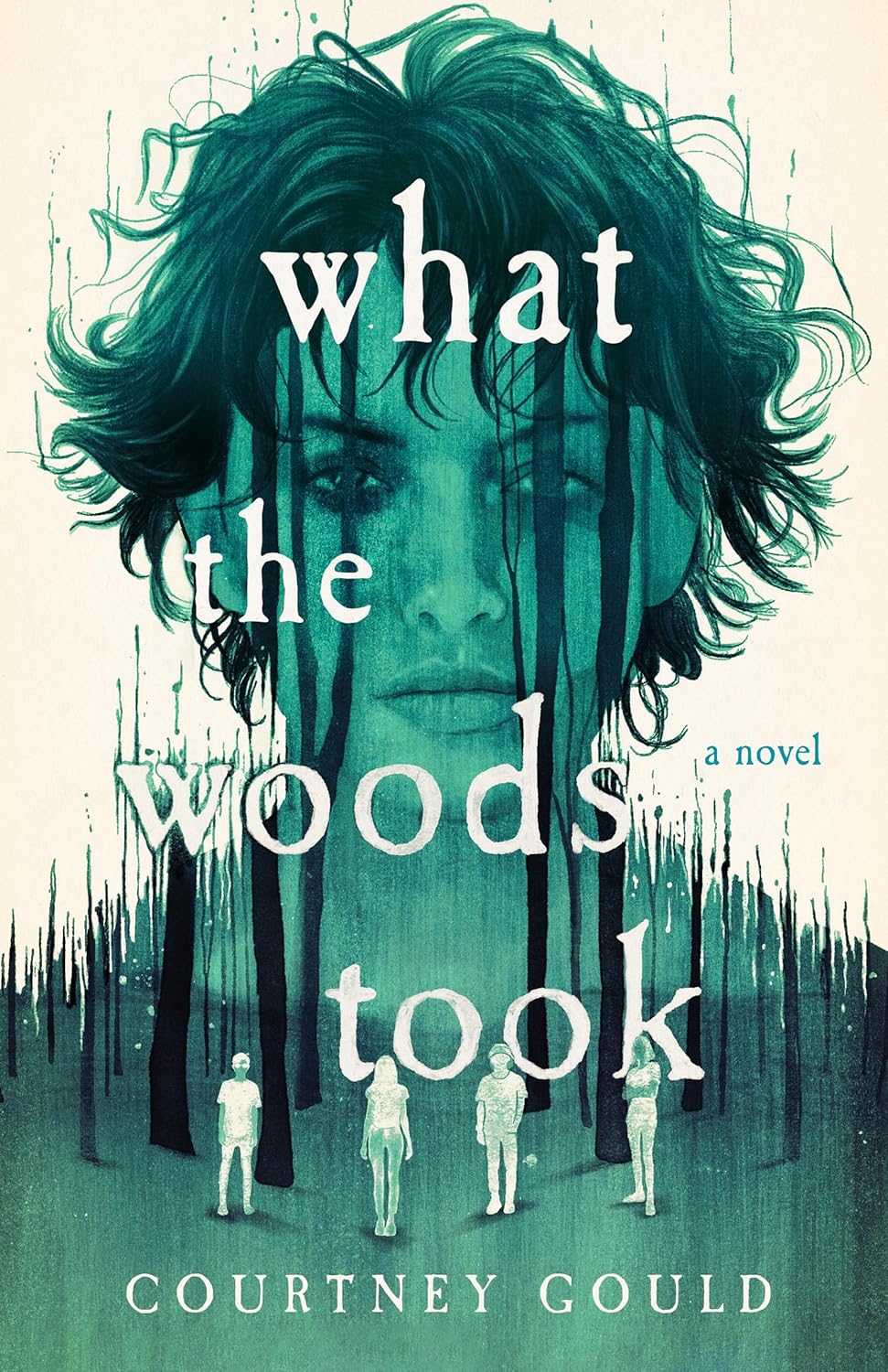
I was sure I had included the covers forThe Dead and the Dark and Where Echoes Die by Courtney Gould illustrated by Peter Strain in previous lists, but apparently I hadn’t. They’re really nice:
It is the time of year for lists and I should’ve been done weeks ago, but I am late and already well behind the pack. Apologies for that.
I admire Matt Dorfman‘s ability to whittle his list down to a dozen covers for the New York Times. I imagine it takes him a lot less time for one thing, but I’m sure Matt still agonizes over every cover. It requires a level of discipline and restraint that I do not possess to keep it that tight year after year.
PRINT’s list of best book covers of 2024, compiled by editor-at-large Zachary Petit, is also long. It’s a 100 covers. Last year it was 50.
I’m not trying to throw stones here. We are all seeing more covers than we used to. There are more books for one thing. But they’re not just something we just experience in print in anymore. You don’t have to go into a bookstore or read the newspaper or magazine to see them. They’ve become something we see and share all the time online. Designers are promoting their own work and (slowly) getting more credit for it (although there is a lot more to be done in that area. Publishers — credit your designers!). My monthly round-ups are now one of several you can choose from.
And it is not like my list is short. This year it features work by 48 designers — more than half of them women — and 86 covers (plus a couple of supplementary images).
The consensus seems to be that it was a decent year for covers, and it’s hard to argue with other people’s selections even if I don’t love them all.
It is telling though that 100 of LitHub’s selections were individual picks. There are covers on my list that are not on the anyone else’s despite their length. So while I think we agree there were lots of good covers, I’m less certain we entirely agree on which ones were actually the outstanding ones.
A recent article Spine argued that there is a battle between minimalism and maximalism going on (you can find Spine’s end of year list here by the way). I think that could be true. Different approaches work for different audiences. But I also think it’s messier than that. I get the sense that publishers are less sure of what they want and what sells (certain genres notwithstanding).
It has been a rough year for a lot of publishers, so there is undoubtedly a lot of uncertainty, and no small amount of anxiety. I could go on about why that it is (and the publishing’s self-inflicted wounds) but, in short, what I think we’re also seeing with book covers is more meddling and less direction.
Anyway, I don’t want to end this on a bleak note. This year was shit enough. Despite it all, there genuinely were a lot of good covers in 2024, and some that I did think we’re outstanding. A couple of them made me laugh, which was no small thing. It was a strong year for several individual designers in particular and, despite the pressures, many produced work that was recognizably theirs. I thought there were more interesting covers coming out of the UK and Ireland (that mercifully wasn’t just about the inks or the finishes!), and there were some fun Canadian covers too.
Thanks, as always, for reading, and I hope you’re all keeping safe and well. Happy Holidays!
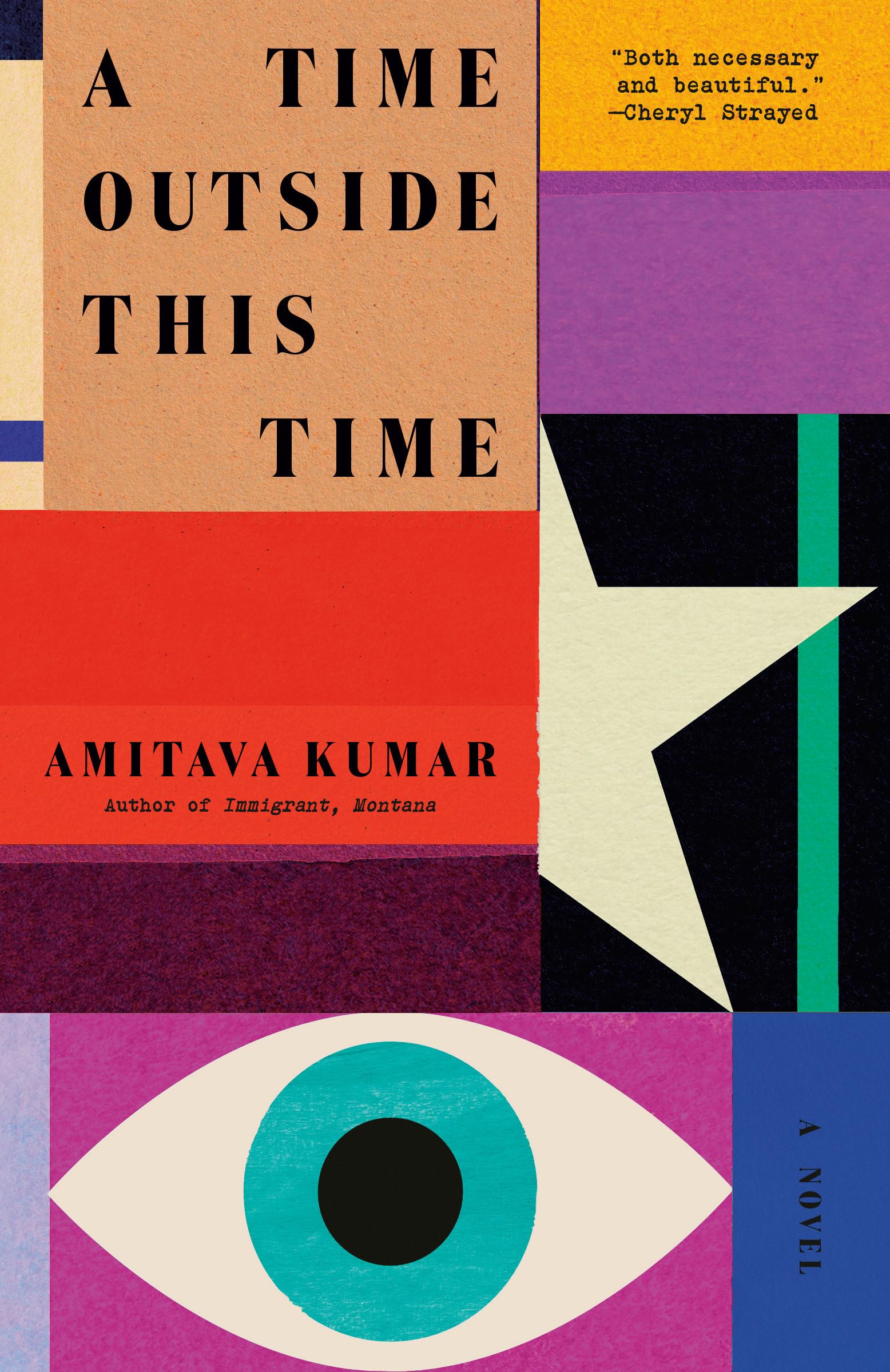
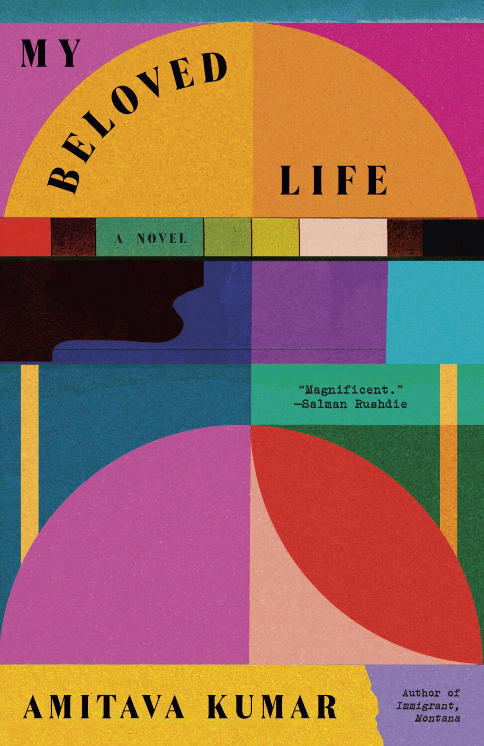
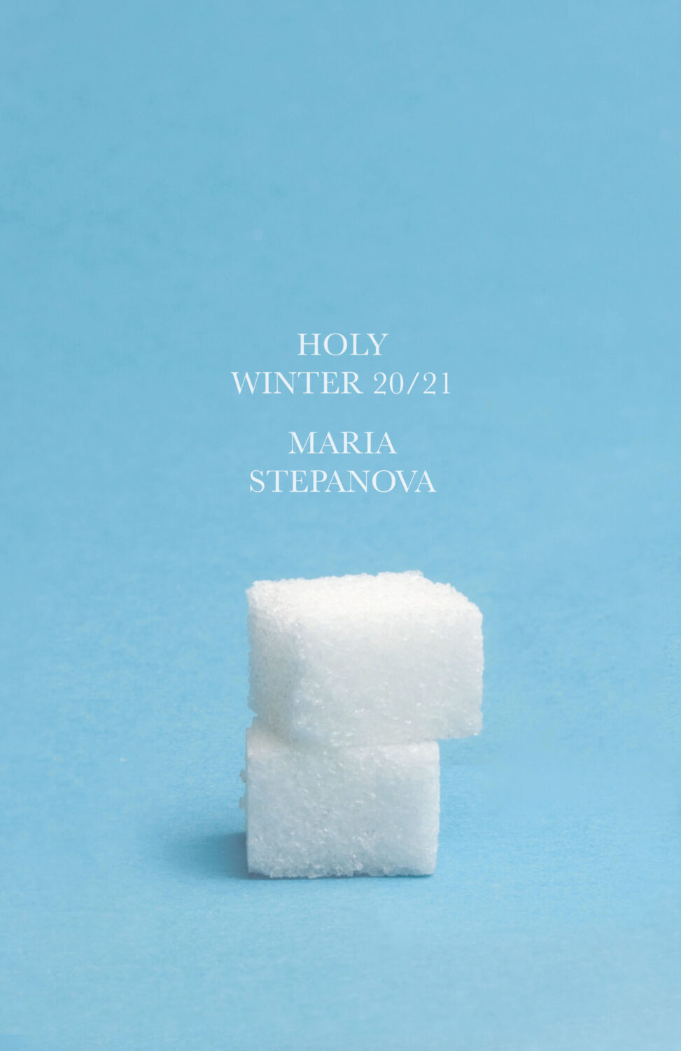
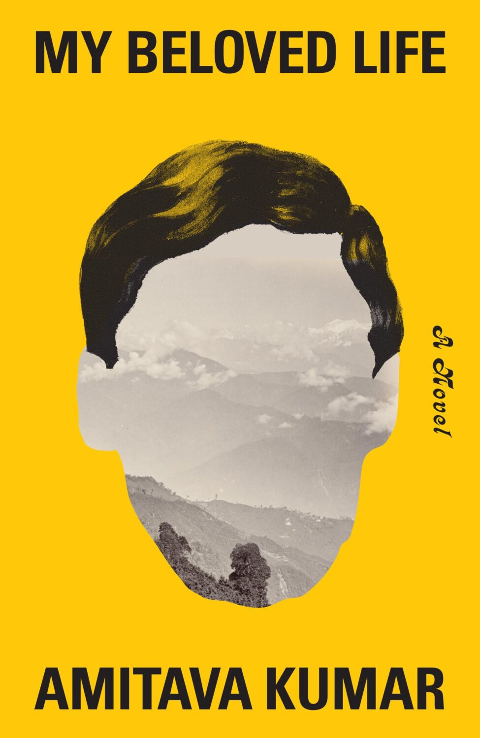
Holy Winter 20/21 by Maria Stepanova; design by Oliver Munday (New Directions / October 2024)My Beloved Life by Amitava Kumar; design by Oliver Munday (Knopf / February 2024)
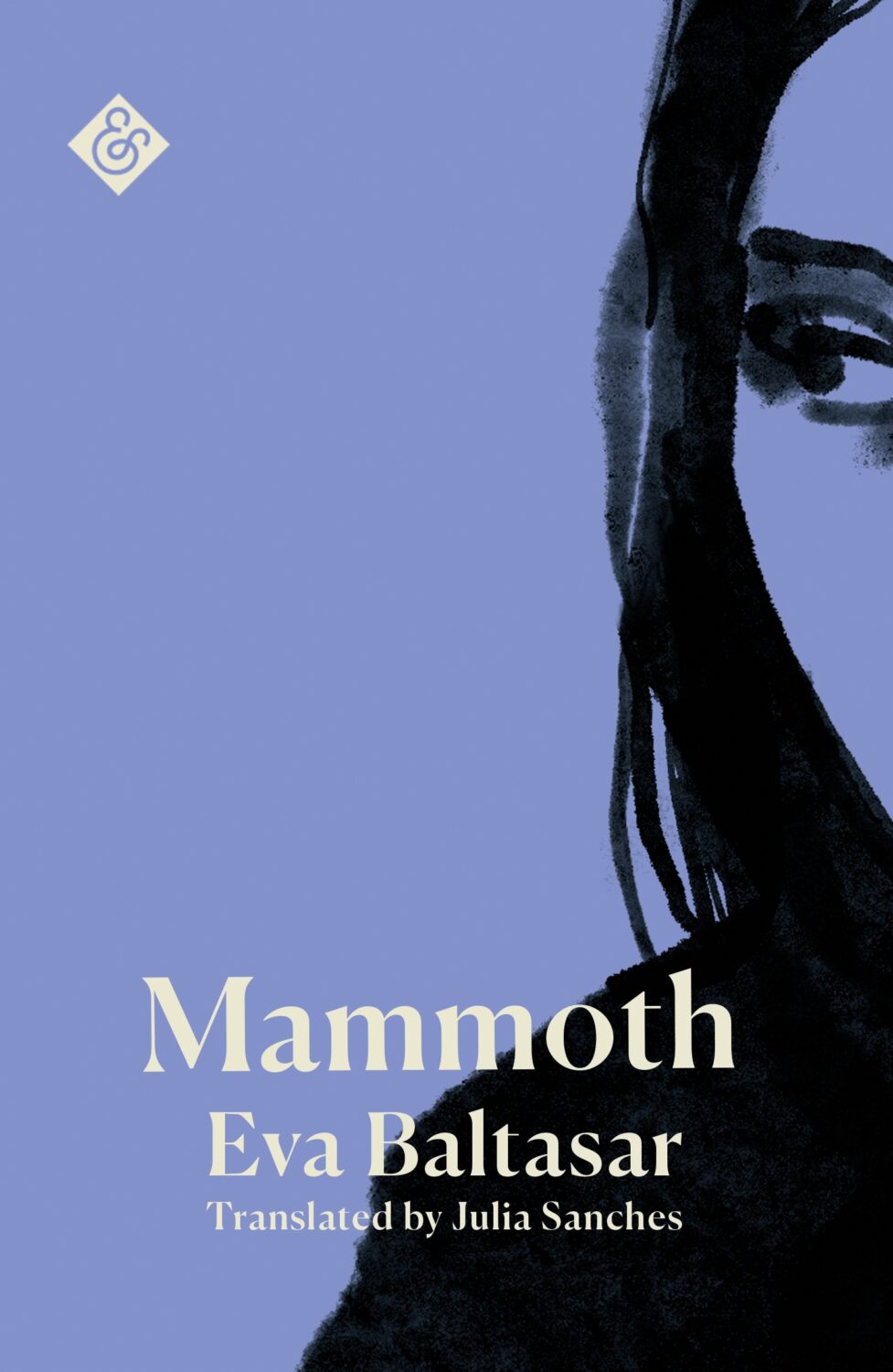
Mammoth by Eva Baltasar; design by Anna Morrison (And Other Stories / August 2025)
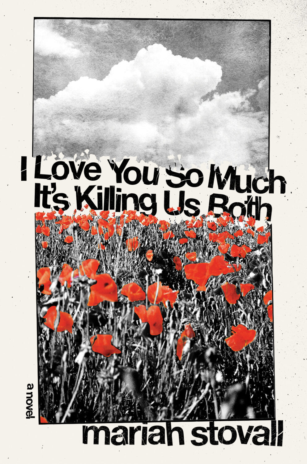
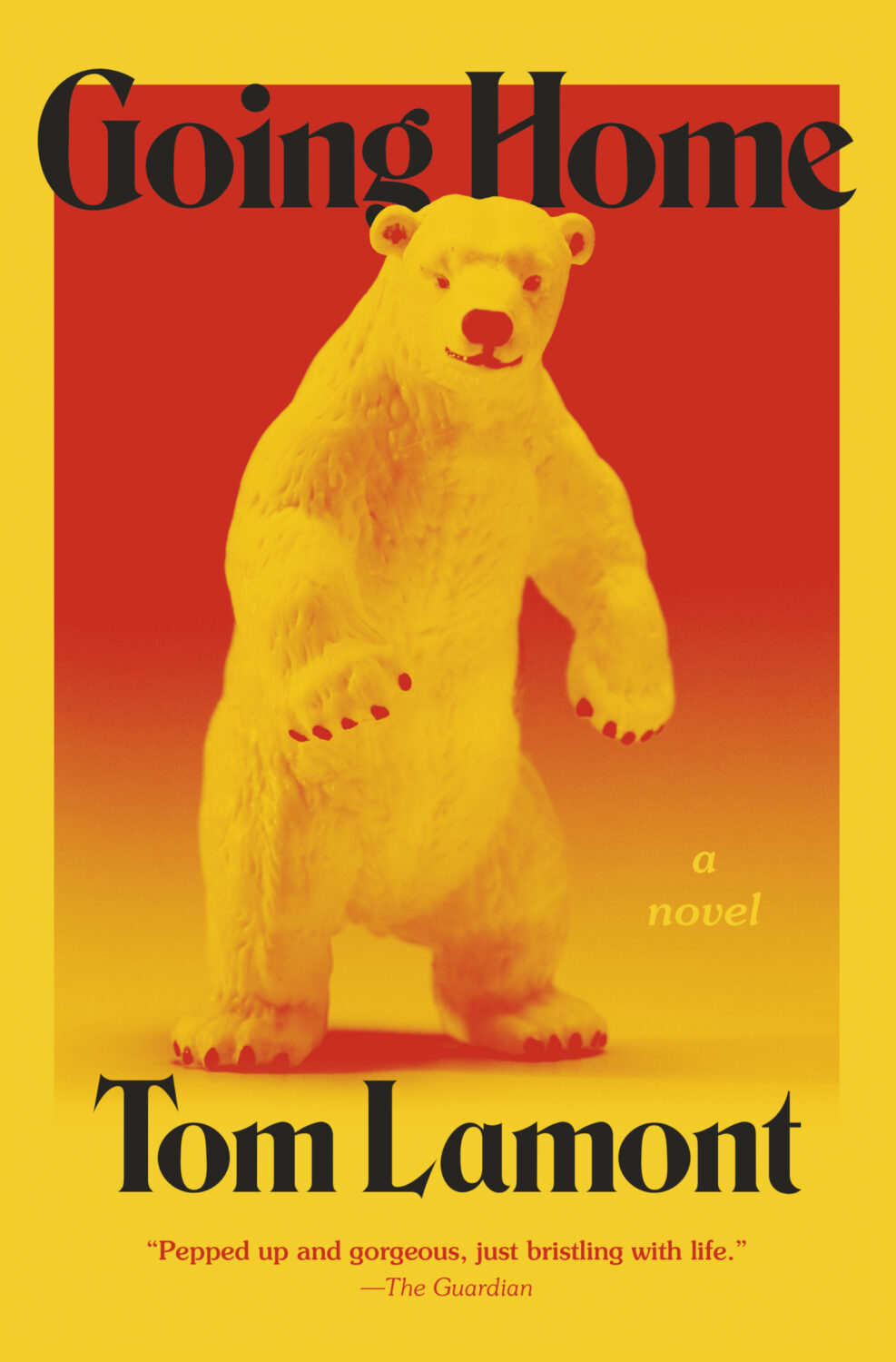
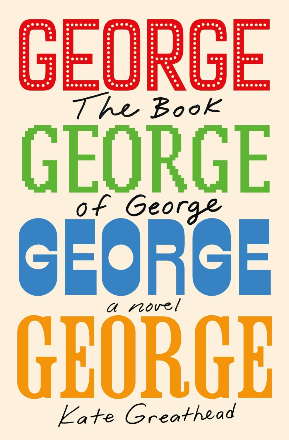
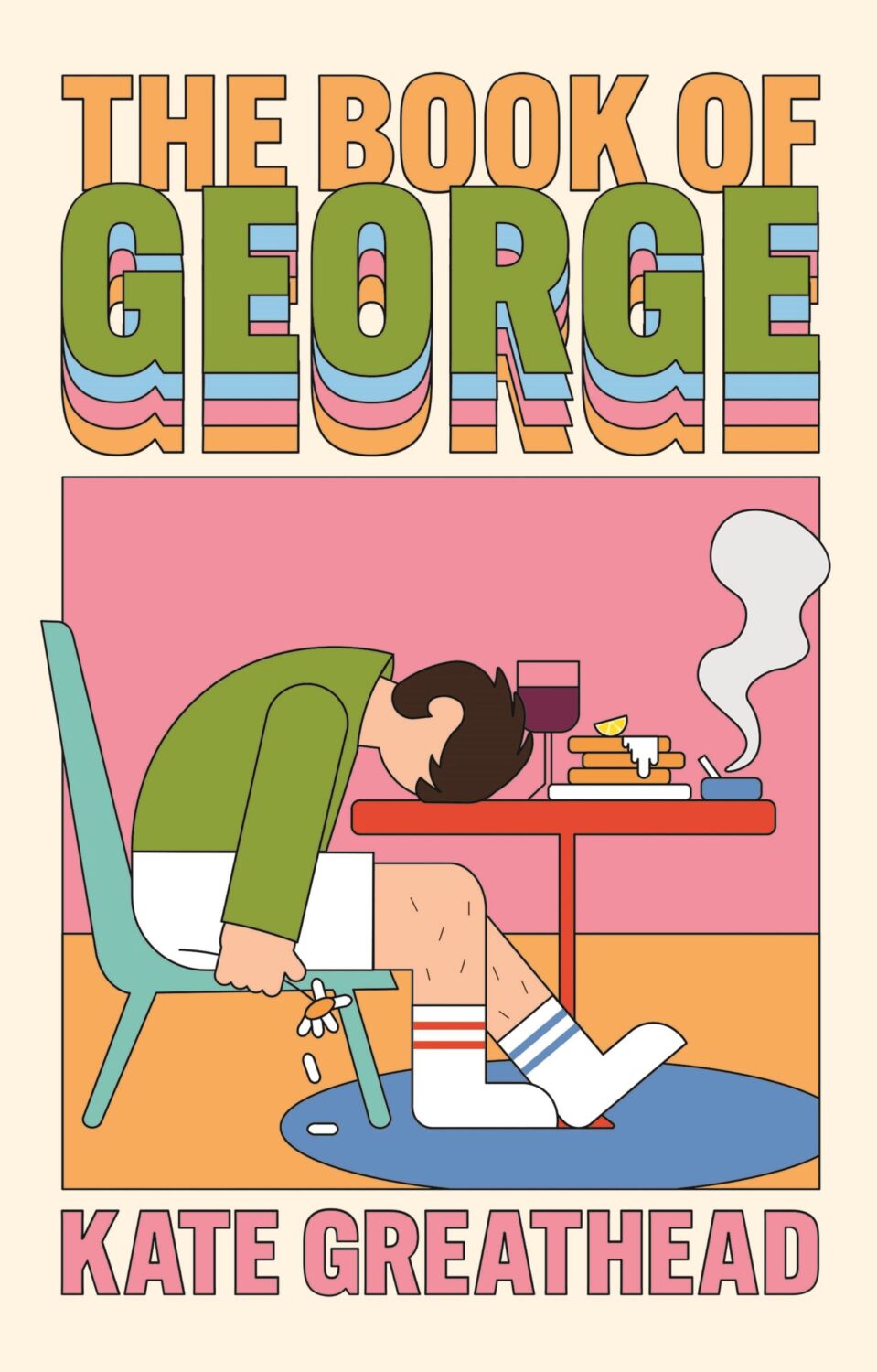
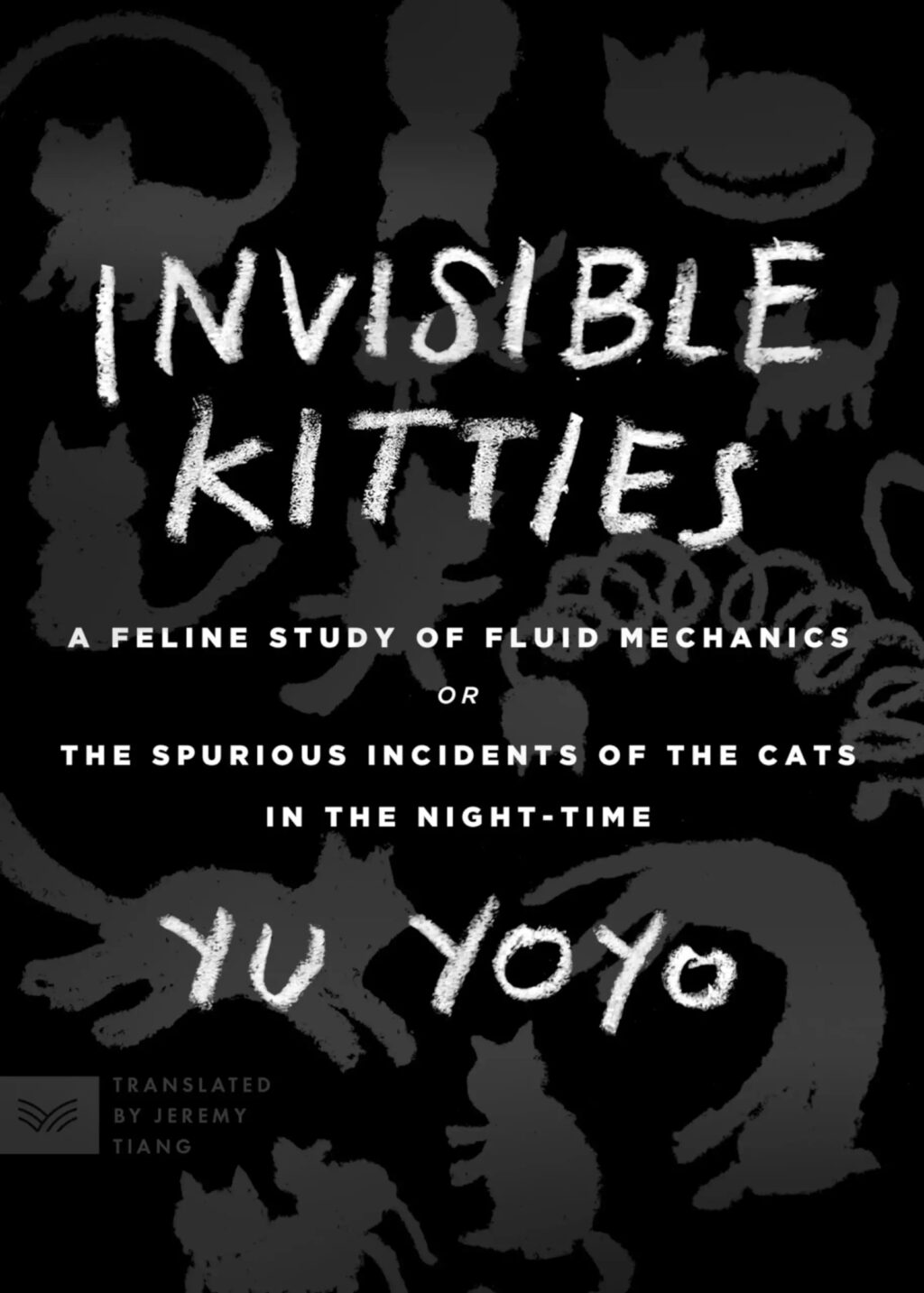
MILF by Paloma Faith; design by Jack Smyth (Ebury / June 2024)
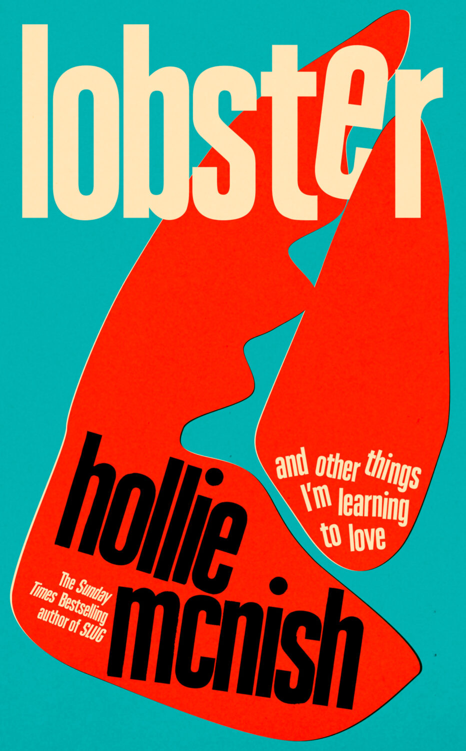
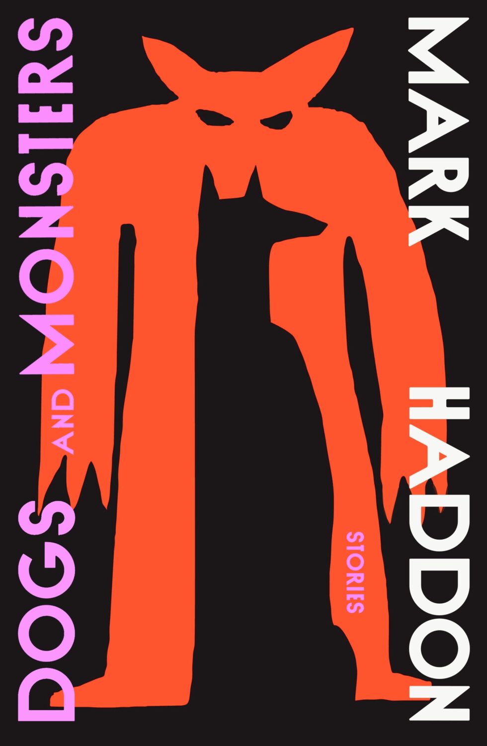
Also designed by Jack Smith:
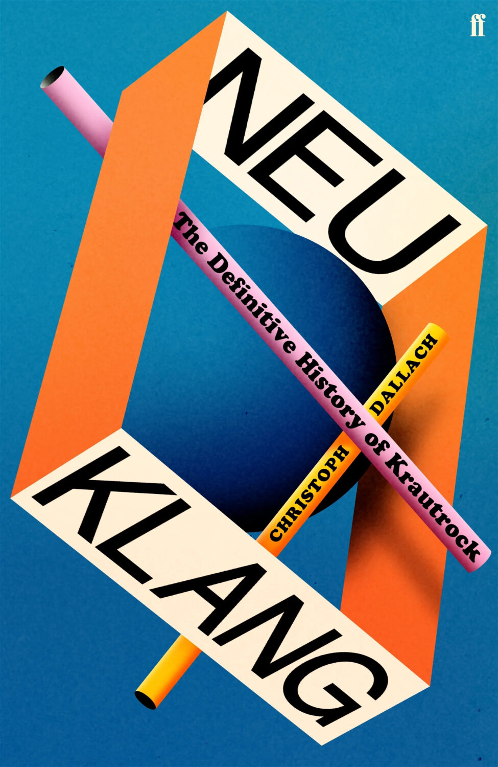
Lobster by Hollie McNish; design by Jack Smyth (Little, Brown / March 2024)Neu Klang by Christoph Dallach; design by Jack Smyth (Faber & Faber / May 2024)
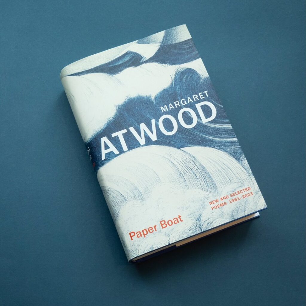
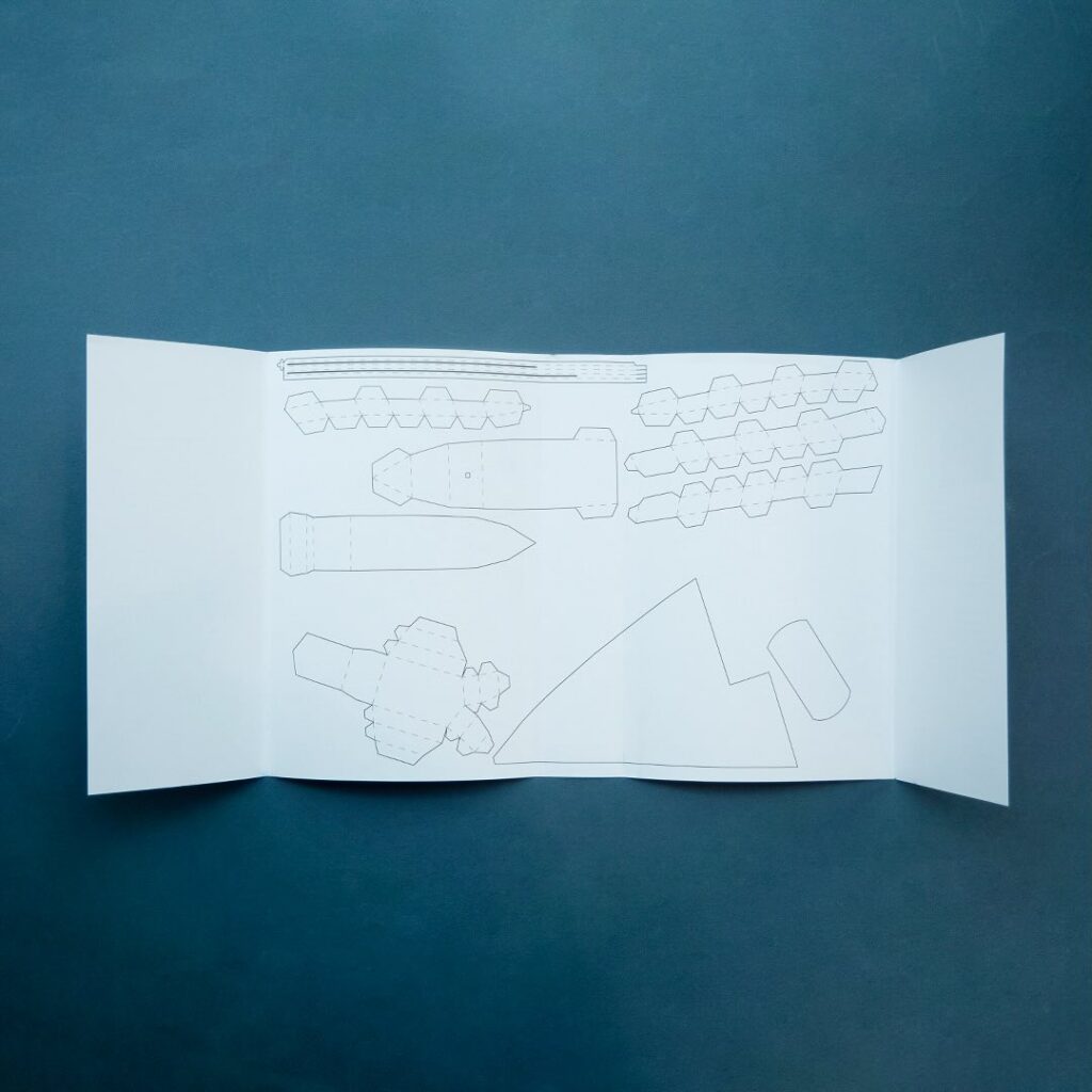
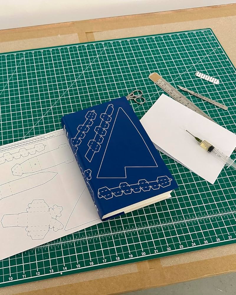
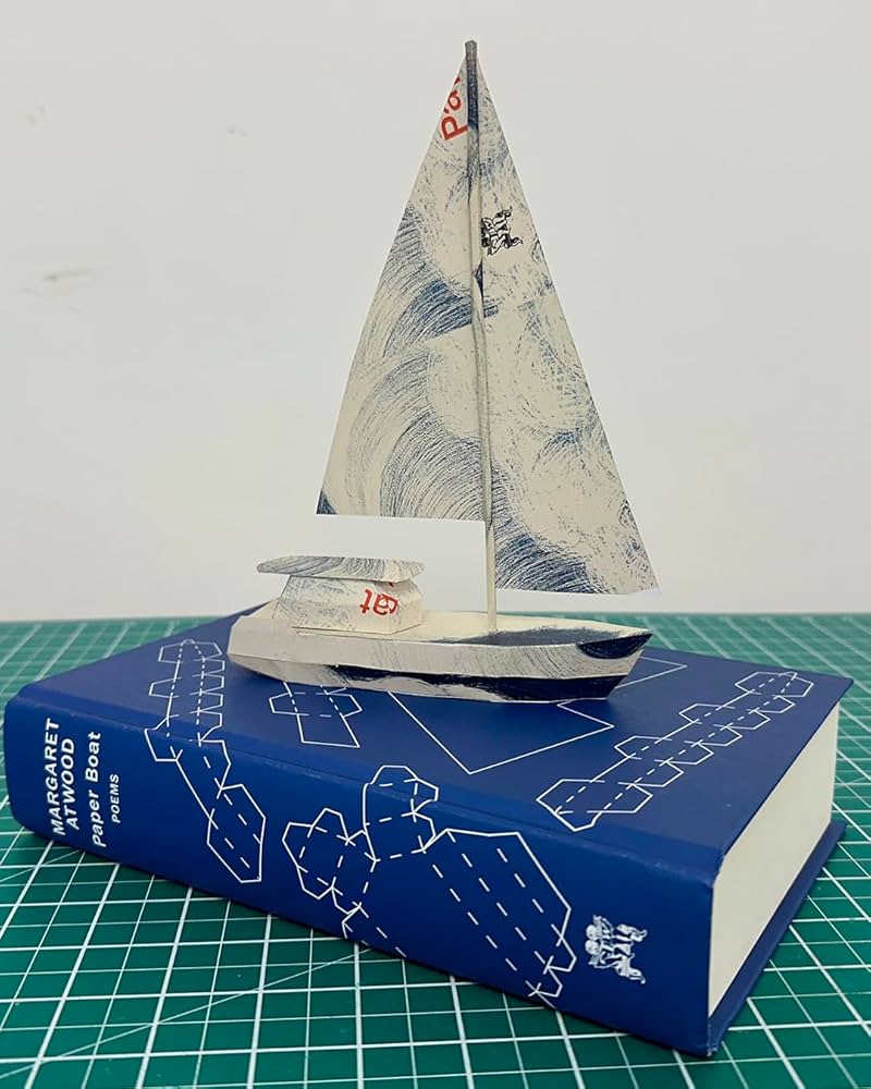
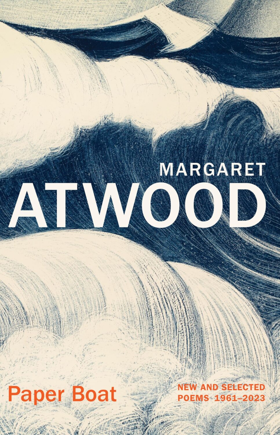
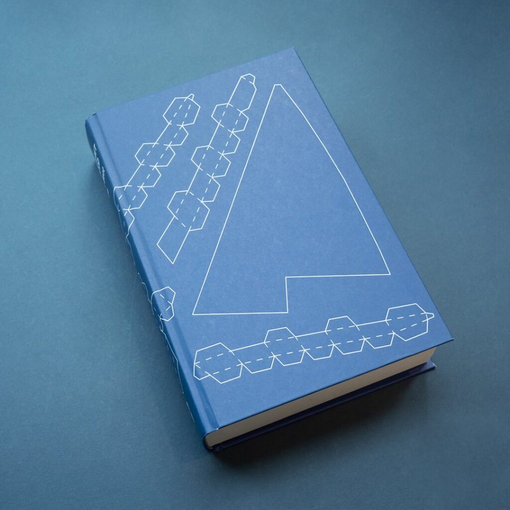
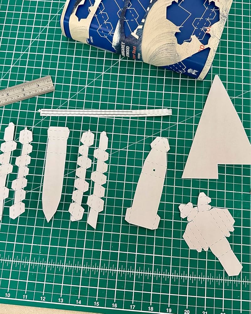
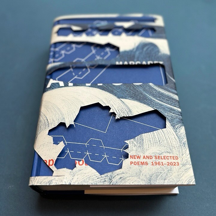
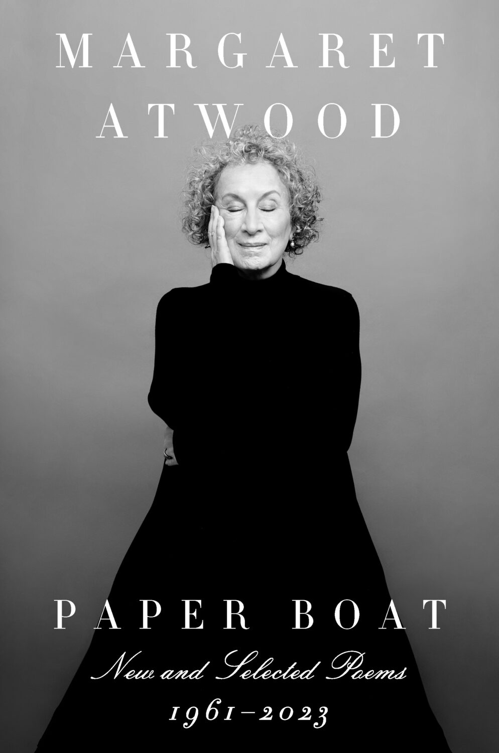
I also have to give a special shout out to the cover for Paper Boat by Margaret Atwood (Chatto & Windus / October 2024). Suzanne commissioned paper art by Nathan Ward to design a template for a paper boat that could be cut out from the dust jacket and stuck together.
Hey, I hope you are good. It’s a stressful time and everyone is super busy trying to hold it together, but here we are at the end of October with another post that is both rushed and yet wordier than ever! As usual, I won’t be doing a covers round-up in November. I have to start working on the massive end of year post so I can get it done in something resembling a timely and relevant manner. I am open to last minute submissions if you think I have missed a cover, or you have something coming out between now and December. I can’t promise to include everything, but it would be especially great to hear from you if you’ve done something cool for a university press or an independent publisher this year. The only requirement is that the book was published and on shelves in 2024. If it was published in a non-English speaking part of the world, be sure to include a link to where people can find out more about the book (and ideally buy it) that isn’t Amazon.
On a related note, I have compiled an annual post of YA covers for, I don’t know, years now (10 maybe?). I don’t read a lot of YA, and it’s not a category I am very involved in professionally, so the posts take quite a long time to compile and I usually end up publishing them early in the New Year, which is less than ideal. So I guess my question is: do you still want a YA round-up? Folks used to ask for them, and now they don’t, which just be general fatigue and the fragmented nature of things at the moment, but the posts don’t attract submissions or much feedback, and interest seems to be waning. Obviously I don’t think I do a great job (if that wasn’t abundantly clear already!), but I haven’t really seen anyone else do one either, so I’ve kept doing it. I don’t know… I’m not a big a believer in clicks or engagement metrics as a measurement of anything useful, so I happy to do it if even just a couple of you say it’s still valuable. Or maybe it is just time to call it quits? Let me know what you think…
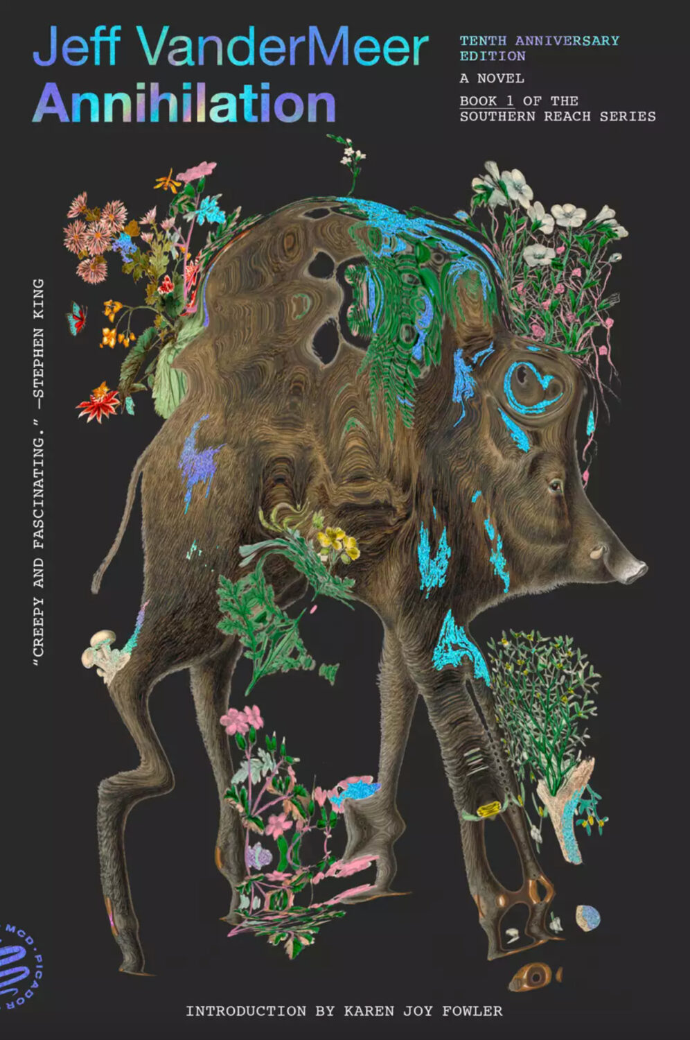
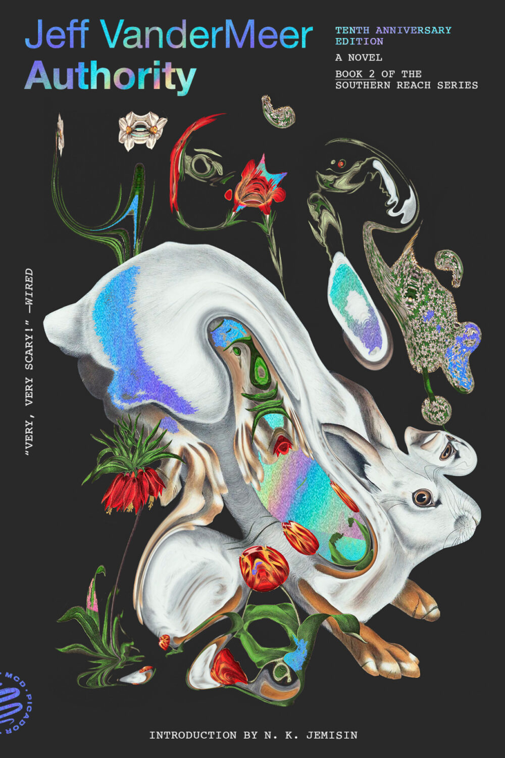
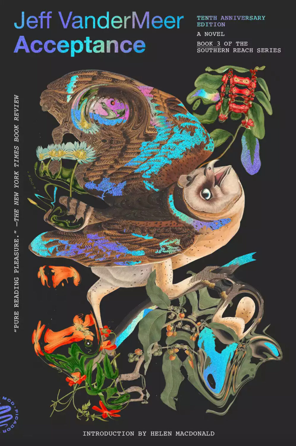
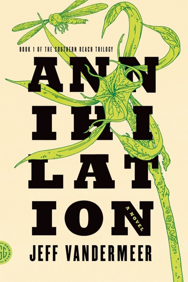
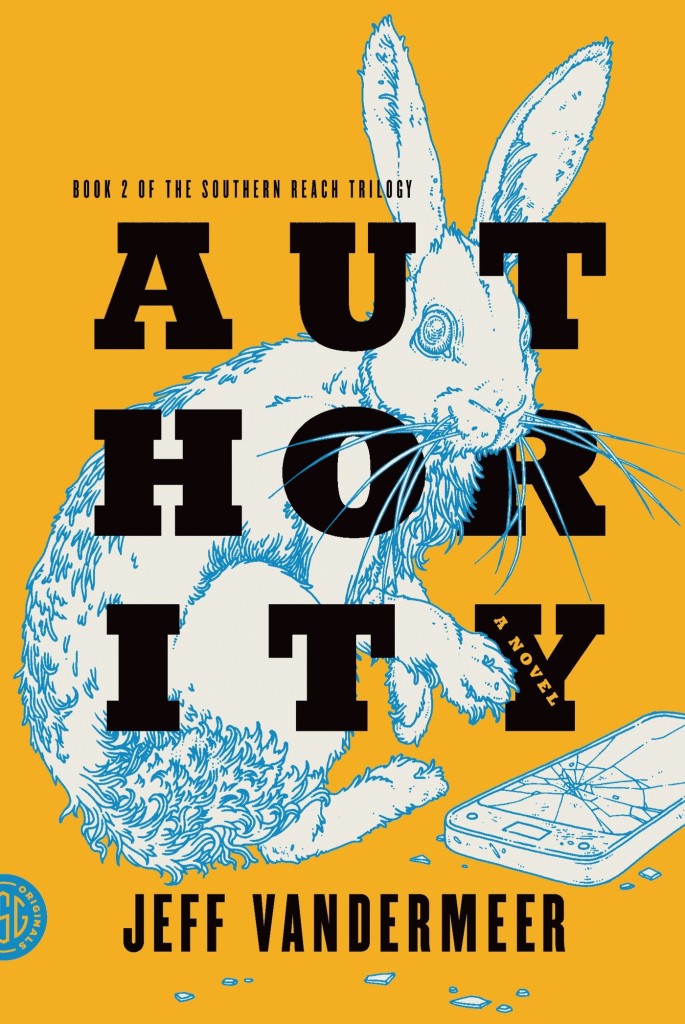
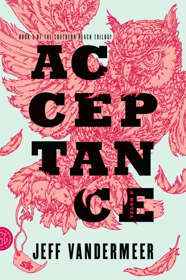
Pablo Delcan also designed the covers of the 10th anniversary editions of the previous books in the Southern Reach series, Annihilation, Authority, and Acceptance, published by Picador earlier this year.
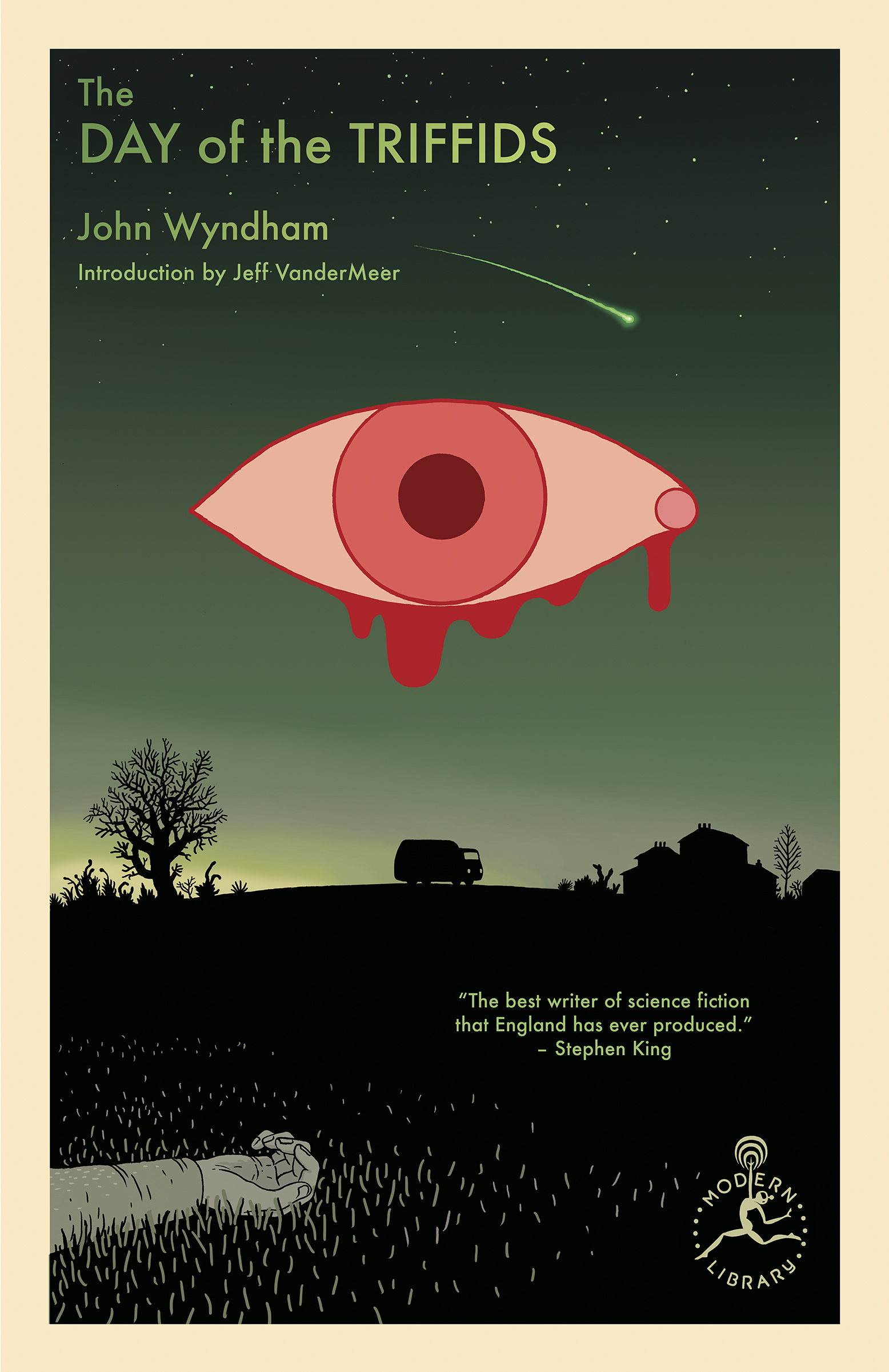
I’m still quite partial to the original US covers the trilogy (as was) designed by Charlotte Strick with illustrations by Eric Nyquist. The cover of Annihilation reminds me of The Day of the Triffids, which coincidentally has has an introduction by Jeff VanderMeer if you have the Modern Library edition. (The slightly bonkers cover of the Modern Library edition was designed by Cassie Gonzales with an illustration by comic book artist and illustrator Anders Nilson). Anyway, I’m a little sad that I can’t get the prequel to match the rest of my existing set.
Annihilation by Jeff VanderMeer (US); design by Charlotte Strick; Illustration by Eric Nyquist (FSG / 2014)Acceptance by Jeff VanderMeer (US); design by Charlotte Strick; Illustration by Eric Nyquist (FSG / 2014)
This feels very familiar, but I can’t put my finger on why. The best I’ve got is that it looks like a poster for a theatre production. It feels very European. The austerity of it gives late 1980s-90s vibes. I don’t know. I think it’s great.
Remarkably, the design incorporates a template for paper boat that can be cut from the dust jacket and stuck together.
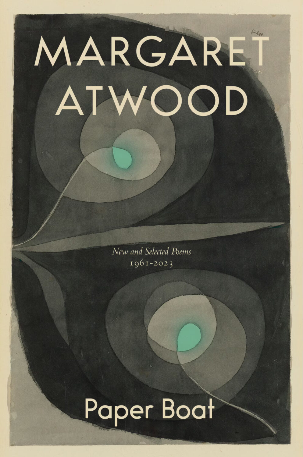
The cover of the Canadian edition of Paper Boat, published by McClelland & Stewart, was designed by Kelly Hill using art by Paul Klee. The cover for the US edition published by Knopf was designed by Janet Hansen. The photograph is by Ruven Afanador. It’s interesting to me that it was the US decided to use a portrait on the cover. I mean it’s a beautiful photograph and Margaret Atwood is very distinctive looking, but I would imagine she would be more recognizable to Canadians than to Americans? Anyway, it’s not often you see three entirely different approaches in the UK, US and Canada for a poetry collection.


