Skip to content

Tag: vintage

Q & A with James Paul Jones, Oneworld

The Good Immigrant design James Paul Jones

The work of Welsh designer James Paul Jones for has featured regularly here in the past few years. A versatile cover designer and one of the co-founders of Vintage UK’s design blog CMYK, James was recognised as a ‘Rising Star‘ by the Bookseller in 2014, and recently moved to independent publisher Oneworld Books in the role of art director. This Q & A  has been quite awhile in the making, but I’m very grateful to James for taking the time to answer my questions in such depth, and I’m glad for the opportunity to showcase his talents again.

You can find James on Twitter and Instagram, and you can see more of his work on his website. James and I corresponded over email (for years)…

Do you remember when you first became interested in design?

Growing up it was all about sport and design. From an early age I used to drive people mad (mainly my parents and teachers) spending hours perfecting my hand writing, and adorning basically everything I could with doodles, designs, and patterns. Which is ironic, as I can barely understand my own scribbles these days. I somehow knew back then that is was more the Design in Art & Design I was interested in, I think mainly because it took me so long to finish anything remotely ‘still life’. My art teacher Islwyn Williams can vouch for that, and he was one of the good ones. I remember him saying when he saw me walking down the corridor in full-on teenage mode to ‘Look up. Not enough people do and you don’t know what you’re missing’. That’s stuck with me ever since. Things progressed quickly once I got hold of my first bondi blue iMac. From there, I used to ‘borrow’ my Dads record covers, scan them and proceed to add my own finishing touches. My first ‘effort’ was giving Paul McCartney some shoes on the Abbey Road album. I’d then print out everything and plaster my walls with the output. I wish to this day I could do this in my new workplace.

Do you come from a creative family?

I used to think not. My Dad was a self-made business man running a wholesale food company in North Wales and my mother working alongside. But I realised over time that my Dad had a special way with words and he wrote poetry in his spare time. I was certainly the only one who was a bit obsessed with the visual side of things. My sister was definitely the words. I was proud to work alongside her whilst working at Vintage Books. As I’m sure was our Mum.

Were there a lot of books in your house growing up?

There were plenty. And they were all owned by my sister. I can’t pretend that I’ve been a book buff all my life, because when I was younger I didn’t read enough. But I did grow up on Roald Dahl and other children’s classics of my time. What I thoroughly enjoyed reading (and my mother still has a pile of these ready to give me back home) was the ‘how to’ guides. Cartooning, watercolours, different print processes. Cross hatching, you name it. I had a guide on it. A recent ‘Punch’ exhibition at the House of Illustration in London focused on the work of Shepard and it reminded me of my love of a good cross hatch shadow. Now my house consists of ‘why’ books. Why do people see and think in certain ways. Different triggers, autobiographies and non-fiction is what I devour outside the daily manuscripts. Plus I love a good quote I can draw inspiration from. It continues to amaze me how much you can learn from others.

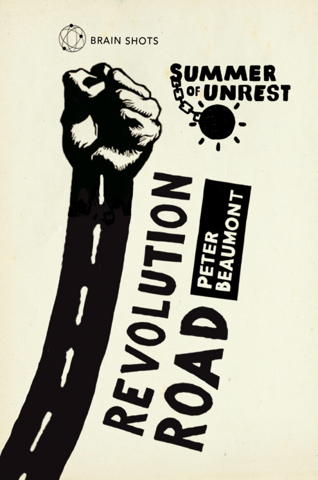
the-revolution-road_vintage

Did you study design at school?

I was lucky enough that when I got to secondary school there was a graphics GCSE course which I snapped up. There began my obsession with drawing rectangles using 4 points, which later in life has translated to all forms of typographic sketches. Earlier I studied Art, but grades wise I was let down by my inability to follow suit and show my workings. I always had the final idea in my head and wanted to cut out the middle man. Although now, one of my prized possessions is my A5 moleskin which doesn’t leave my side, which would amuse my Art teacher to no end. Later on, I did an Art Foundation course in North Wales, which was easily the most creative, fulfilling and enjoyable year of my life education wise. We worked on everything from woodworks to 3 dimensional life size sketches using charcoal. I thrived on the atmosphere there and at some point I’d love to go back and enjoy it for a second year. I was honoured to be invited back this year to showcase my work, helping to hopefully inspire the next generation. Anything I can give back there I will in abundance. Following foundation, I studied Graphic & Media Design at London College of Printing. It was a great college, and to be taught by one of my design heroes Hamish Muir was priceless.

I can’t pretend I did my best work there because that wasn’t the case. But what I did learn, and something I realised early on, was that I needed work contacts by the time I graduated. I started calling in favours, taking work experience here and there and this all helped to build up a roster of freelance clients. I started my own design company (Here & Now – my exercise book ‘tag’ from my teenage years) toward the end of the second year where I was doing websites, record covers and 1-day-a-week freelancing with the Orion Publishing Group.

Where did you start your career? 

I started my career at Orion through work experience in the marketing department. Working on posters, bookmarks and other promotional materials. Then one day I was asked to work on the back cover for a Harlan Coben novel. I was fresh out of 2nd year at University and still obsessed by Müller-Brockman, which meant I spent the rest of the day typesetting the copy on crazy angles. Vertical barcode. The works. I can still remember it to this day. I thought it looked bloody brilliant. The Art Director thought so too, but obviously it was a bit out there for a mass market crime novel… Although she asked me to come back the next week and that was that. Her name was Lucie Stericker and she is the brilliant Creative Director of Orion, and one of the key people in my career. She gave me the opportunity to show what I could do, at a time where I didn’t really know what I could. At one point I nearly quit to head down the big design company route, but I’m glad I stuck it out and I have Lucie to thank for that.

At Orion I learnt it all from the bottom up. Starting off as a freelancer, before joining the company on a 4-day a week basis. After that I started to get my own briefs to work on and from there I kicked on. I always wanted to try and push the boundaries of each genres, as I was young and I didn’t see any reason not to! You had to get noticed somehow. I worked my way up to a Junior Designer level, and then to Designer. My work started getting noticed after working on the Keith Richards autobiography Life and the award winning The Tiger’s Wife, before Vintage offered me an opportunity as a Senior Designer 4 ½ years in to my Orion career.

wiggo_vintage

Over at Vintage I began to hone my craft, and was soon art directing my own photo shoots for Bradley Wiggins fresh from his Tour De France and Olympic wins and working on titles such as Virginia Woolf, Sebastian Faulks and Chuck Palahniuk. I was in my element. The team pushed each other every day, some of the group projects we worked on such as the James Bond classics were a joy to be a part of. As was the creative atmosphere of the design department.

I spent 4 ½ very happy years at Vintage, working across all genres and imprints. Whilst there I was humbled to be voted as one of the industries rising stars, one of the only designers on the list. My work was also recognised with some awards, one of the highlights being my award winning collaboration with Pietari Posti on our Arthur Ransome series. Vintage and Penguin Random House were such an inspiration to me design wise, and I thank the whole design team, and the Creative Designer Suzanne Dean, for that.

When did you start at Oneworld?

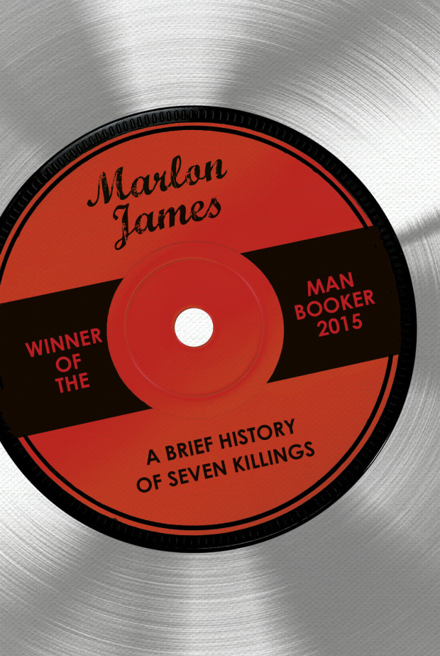
I started at Oneworld as their new Art Director just over a year ago, in September of 2015. I thoroughly enjoyed my time over at Vintage, but I was looking for a new challenge and really wanted to experience the life of an Art Director. Oneworld came about because of that ambition, and I was intrigued by the company as a whole. They had such fantastic books, yet I felt the covers could reflect that better. It was a big change for me, going from the biggest publisher in the world (Penguin Random House) to an independent, but I really wanted to get stuck into something that I could put my mark on. At Oneworld it’s just me heading up the design department, and while that can seem quite daunting at times I like to think that I thrive on that responsibility. I have instigated a design internship recently, and I’m thoroughly enjoying mentoring young designers at the start of their careers and giving something back to the design community. It’s a privilege, and design-wise my goal is to make Oneworld’s books known for their looks and production values, of which having a cracking production team by my side helps. Along with a company willing to try something different. Since I joined the company, we’ve won the Man Booker Prize, been voted Independent Publisher of the Year, had another one of our books shortlisted for this year’s Man Booker, and the company is going from strength to strength. It’s not easy, I don’t think any Art Director job is. But I really do love it. And I want that hard work and passion to come across in the work we put out there as a company. I’m also involved in the creative direction of the company as a whole. We recently re-designed our website, logo and branding. Which has all been a fantastic and invaluable experience.

design James Paul Jones

What have you found to be the main differences between being an art director and a designer so far?

That the bucks stops with me, which is both a good and a bad thing. What I have enjoyed most is working alongside artists, designers and illustrators that I admire. Pushing them as far as we can go with each design. We might not always see eye-to-eye but I enjoy working with other designers who want to make something great, and not just another cover to tick off their to do list. Our job is to represent the spirit of the book. To find out what makes that book unique, and communicate and celebrate it visually on the cover.

Are you also working on freelance projects?

I am. I was always rather envious of the US model of Art Directors who also freelance for other companies. It really appealed to me. So when the Oneworld position came up, it was a part time position and it suited my ambitions to explore freelancing. I took a leap of faith, and now I work 4-days-a-week in-house at Oneworld and do my freelance work on the fifth day. Although as every freelancer knows, my weekends are often taken up working, and one of the hardest aspects is trying to find that work/life balance. Having a young family has forced me to work that out from the get go. I’ve been lucky enough since I started freelancing last year to work with some great publishers around the world. I still love getting that first initial ‘making contact’ email from a new publisher who has seen my work and wants to know if I’m available. I thoroughly enjoy having the best of both worlds, even with the extra hours it can demand. But I’m really happy with the freelance side of my career, and I hope it keeps growing and growing.

What are your favourite projects to work on?

Ones that I can throw myself into. They’re both a blessing and a curse. I like to get really immersed and find it hard to switch off, but having a family has definitely helped me be more ruthless in that sense. I consider what we do such a privilege. I have to put my all into each cover. I’m a big believer in that if you leave nothing behind, your work will connect in the right way. I thank my Dad for that work ethic, and also my many different sport coaches along the way. Leave nothing behind. Design hard. But most of all have fun with it.

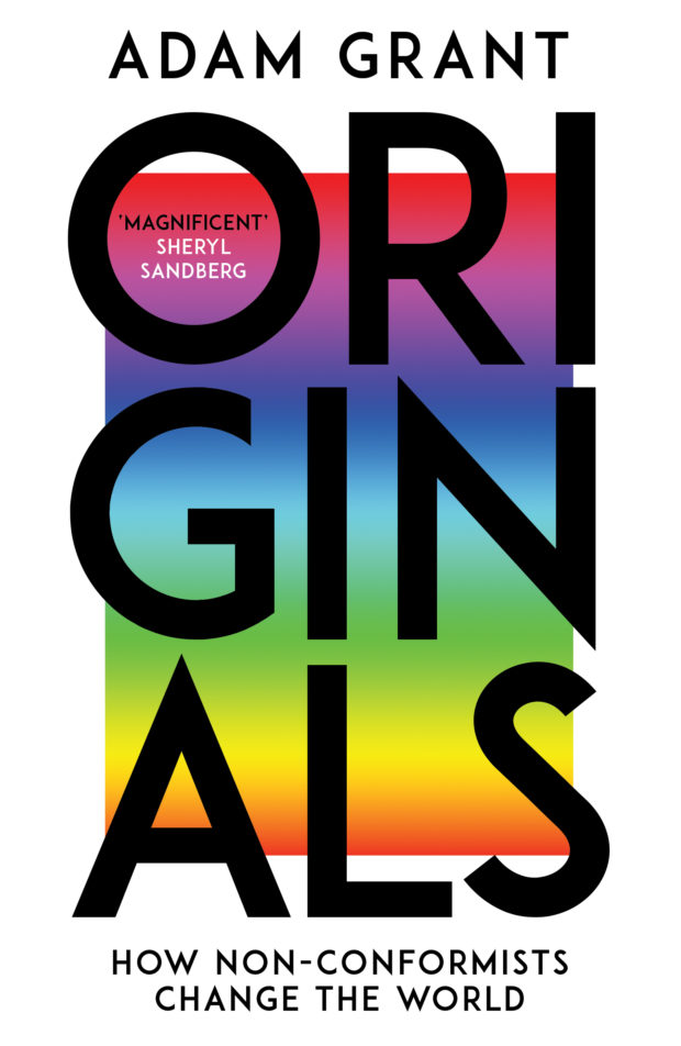
originals_ebury

Which ones present the greatest creative challenges?

Interesting question. I guess the briefs that ask for the norm for that genre. But you know there’s an opportunity to push the envelope a little… Then the challenge is executing the design in a way that will embrace that idea, rather than alienating people. Then getting the sales teams on board with the idea. I’m constantly pushing my editors to really think about their briefs. Look what’s out there, and how can we make our book original. I’ve just finished working on a cover for Ebury called Originals by the brilliant Adam Grant. As he mentions ‘Being original doesn’t require being first. It just means being different and better’. That’s what I’m aiming for in my work for Oneworld and in my freelance work.

What’s your ‘go to’ typeface for a book cover?

I think due to my design education I’m a big fan of the classics. They are that for a reason. Too gimmicky and it just looks lazy. I’ve actually been trying to experiment more with my typefaces. Altering more by hand and creating my own here and there to see what I can get away with. I’m a huge fan of typography, and boy do I still have a lot to learn. You have to know all the rules, so that you can then push them as far as possible, sometimes break them and really have some fun along the way. One of the most rewarding and memorable exercises our tutor at LCP Hamish Muir set us was to photocopy strips and individual pieces of typography, blow them up to different sizes, re-arrange them and produce our own grids to lay out the information for each poster. Hand laying and sticking each letter and word. I learnt more in that day then I did over the course of the following three years.

What do you look for in an illustrator’s portfolio?

Something I could never create or imagine myself. If I’m working with an illustrator it’s because I can’t create what I’m after and I think they would be perfect for expressing the authors words to the reader. Like most Art Directors, when commissioning I secretly want to see the routes I’ve asked for in my brief, along with a curve ball interpretation that throws a huge creature spanner in the works. If they can do that, then I’ll keep coming back for more.

What advice would you give a designer at the start of their career?

Get yourselves out there. And just keep designing. There is quite a lot of competition out there at the moment, but at the end of the day it comes down to the quality of your work. That will only improve as you work more and more. Get yourselves out there, because otherwise people will never see your work. And take risks with your work. The first thing I did was create my own Tumblr. I figured it was an easy program to use, one which would allow my work to reach a wider audience. There are so many blogs and social media accounts dedicated to book design now it’s hard to keep up. But the cream will always rise to the top.


You were very involved in the CMYK, the Vintage Books design Tumblr. Why did the Vintage design team decide to start blogging about their work? 

We wanted a platform where we could launch our designs to the world, to share the first words on our designs and communicate our influences and working methods directly. We wanted to share the back story to the designs, how they were created, what processes were used, and information about the illustrators, photographers and designers. At the time, there weren’t really any art departments doing anything similar, and so we decided to create something that we as an art department would be interested in reading. The reaction and success was huge, at one point we were one of the most viewed sites across all PRH platforms. It was a really big team effort, and one we needed to structure at the beginning of each week to keep on top of. I’m still proud of everything we did, and it’s great to see so many other art departments follow suit.

At Oneworld, I’m looking into Instagram and seeing what fun we could have on there. I’ve only just joined Instagram for my sins, and I’m aiming to show off all the good work we’ve been doing here at Bloomsbury Street in London. It’s also a great platform for spotting talent and keeping a close eye on the competition. I’ll also be showing my freelance work, and I thought it would be great to give people more of an insight into the day to day of an Art Director. Let’s see what happens.


Which illustrators and designers do you think are doing interesting work right now?

This changes every week. Along with my bookmarks. Being an Art Director now I’m constantly thinking ahead, and it’s hard to switch off. Meaning even when I’m at an exhibition in a church hall in Wales, I’m collecting information on a young illustrator from the area who’s tree paintings are so fresh I can’t wait for a suitable cover to crop up for her. I do try to use new illustrators and designers as much as possible. They come with a sense of freedom and a willingness to break the rules. Plus their work ethic is one I admire as they give their all for the outcome. The more experienced illustrators and designers out there, who are still at the top of their game after all these years, they know how to retain that quality.

Who are some of your design heroes?

So many. Hipgnosis. Peter Saville. Hamish Muir (8VO). Brody. Müller Brockman. Non-Format. Love Non-Format. All from my educational years. I still remember when Hamish bought in some original litho printed Hacienda posters from the 90’s which blew my mind and made me realised I massively needed to up my game. All created with their hands. No photoshop. NO Photoshop. Amazing. I never saw myself as a book designer until I worked in the industry. I always wanted to join the big design companies of the world. The ‘Mothers‘ and ‘Experiment Jetsets‘. Daniel Eatock. Bibliothèque. Accept & Proceed. Designs with concepts behind them was what inspired me then, and still does today. As for now and in the book design world, I’m inspired by work that really stands out and tries to be different. From a career point of view, David Pearson, Rodrigo Corral, Peter Mendelsund, Jim Stoddart and Suzanne Dean. They are leading the way for me in various different ways, and I’ve been lucky enough to work alongside some of them. Also I admire what Andy Pressman has done over at Verso, along with Melanie Patrick at Pluto Press.

Is there one particular author or a book you’d like to design a cover for?

Tough one. Because there are just so many. I’m also very lucky to have worked on quite a few over my short career. I did think a year or so back that for me, the Harry Potter series hadn’t quite hit the mark. But then Olly Moss came along and blew that out of the water…but perhaps there’s still a typographic option out there that could be explored. I missed out on a redesign of Terry Pratchett covers a while back, and I still think I was on to something there so I’d like to be able to revisit those in the future.

What‘s in your ‘to read’ pile?

It’s become a library. Currently finishing off Originals by Adam Grant (during the day for inspiration) and The Shepherds Life (in the evening to escape it all). Then at some point to follow: Designing Your Life, The Wisdom of Groundhog Day, Outliers, The Ego Trick. I’ve become much more of a thinker than I used to be. That’s something that I’ve had to change as my career has gone on. I spend much more time thinking about a cover now before actually working on it. I find that it helps the actual process go much smoother and adds clarity to the finished outcome.

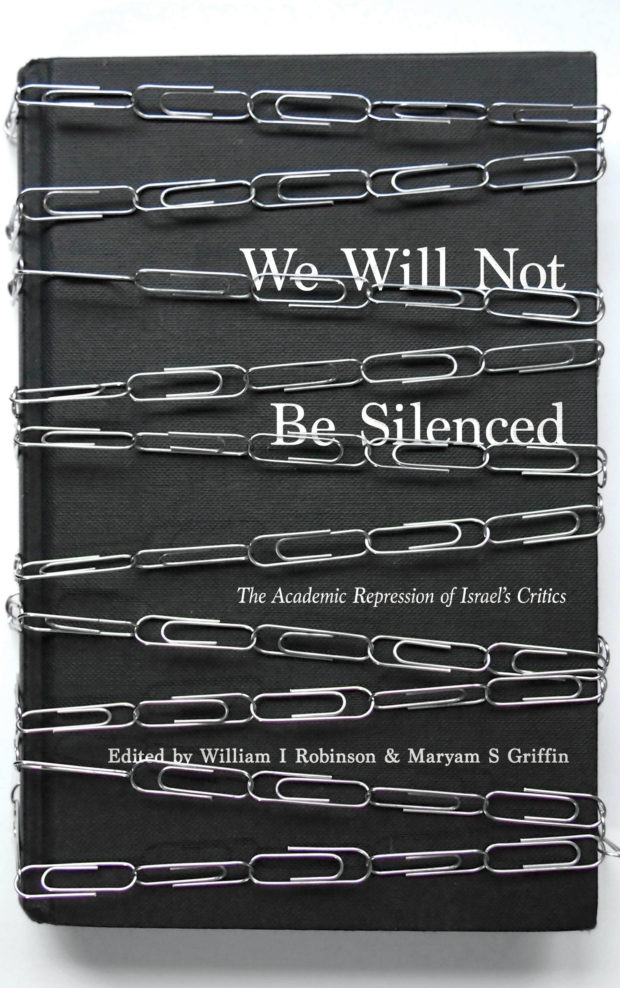
we-will-not-be-silenced_pluto-press

Do you have system for organizing your books?

It depends what part of my house you’re in. My home studio has everything organised by Company. As in, where I worked at the time as it’s mostly an archive of my work. With a separate space for freelance covers. The design books in there are organised by size, just to mix it up a little bit. My ‘to read’ pile by my bed is organised by what’s up next, or that’s the theory anyway. My wife’s books have no system to them at all…but the less said about that the better.

Do you have a favourite book?

I don’t really tend to re read anything as I have endless notes on my phone quoting all my favourite passages which I constantly come back to. As far as impact goes, I can remember being introduced to the classics from Paul Arden early on at art Foundation and really connecting with them. They seemed so different back then. The Art of Seeing is never far from my side, and as for Biographies it’s hard to beat David Maraniss’ A Life of Vince Lombardi. One of the heroes to one of mine and my Dad’s heroes, Sir Alex Ferguson.

What does the future hold for book cover design?

Whatever we want it to be. The whole death of print has come and gone (for now), allowing for a very exciting time. Everyone’s having to up their game, especially with social media. The ‘Cover reveal’ is really popular in publishing. Allowing designers all round the world to sigh after a hard days work, and seeing a moment of genius from someone in Peru and realising you’ve come nowhere near. I’m still waiting again for that ‘perfect’ cover moment. That marriage of the perfect designer, with the perfect idea, for the perfect book and the perfect publisher, like David Pearson’s cover for George Orwell’s 1984. I’m hoping I’ll be able to pull something out of the bag before I’m done.

Thanks James!

Save

Save

Save

Comments closed

Series Book Covers 2014

In the past, I’ve often included a few series designs in with my favourite covers of the year. This year, I saw so many great covers that were part of a series, I thought a they deserved a post of their own…

9781847493774
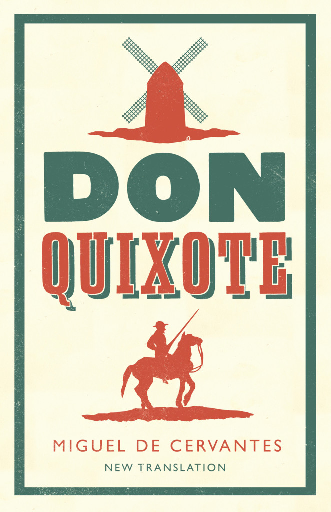
Don Quixote by Miguel de Cervantes; design by Nathan Burton (Alma / 2014)


Alma Classics; design by Nathan Burton (Alma / 2014)

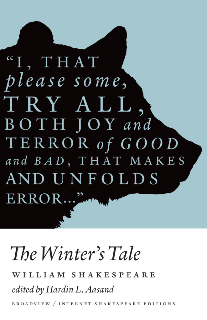
A Winter's Tale
A Winter’s Tale by William Shakespeare; design by Michel Vrana (Broadview / 2014)


Broadview Shakespeare; design by Michel Vrana (Broadview / 2014)

9780141396064
Nova Express by William Burroughs; cover art by Julian House (Penguin Classics 2014)


The Cut-Up Trilogy by William Burroughs; cover art by Julian House (Penguin Classics 2014)

LaSolutionEsquimauAW
Snapshots–Nouvelles voix du Caine Prize; design by David Pearson (Éditions Zulma / 2014)


Éditions Zulma; design by David Pearson (Éditions Zulma / 2014)


Wolf Haas; design by Christopher Brian King (Melville House / 2014)

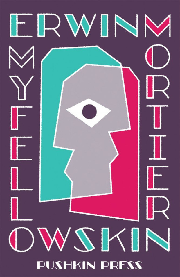
My Fellow Skin
My Fellow Skin by Erwin Mortier; design by David Pearson (Pushkin Press / 2014)

Erwin Mortier; design by David Pearson (Pushkin Press / 2014)

9780241970317
After You with the Pistol by Kyril Bonfiglioli; design by Richard Green; illustration by Luke Pearson (Penguin / 2014)


Charlie Mortdecai by Kyril Bonfiglioli; design by Richard Bravery illustration by Luke Pearson (Penguin / 2014)

Tim O’Brien; design by Cardon Webb (Broadway / 2014)

9780143569725
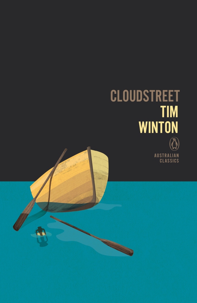
Cloudstreet by Tim Winton; design by Adam Laszczuk; illustration by Josh Durham (Penguin Australia / 2014)


Penguin Australian Classics; design by Adam Laszczuk; illustration by Josh Durham (Penguin Australia / 2014)

9780141976150
Greek and Roman Political Ideas by Melissa Lane; cover design by Matthew Young; logo design by Richard Green (Pelican 2014)


Pelican relaunch; cover design by Matthew Young; logo design by Richard Green (Pelican 2014)

Regeneration by Pat Barker; design by Mr Foxx
Regeneration by Pat Barker; design by Mr Foxx (Penguin / 2014)

Penguin Essentials; design various (Penguin / 2014)

9780141395852
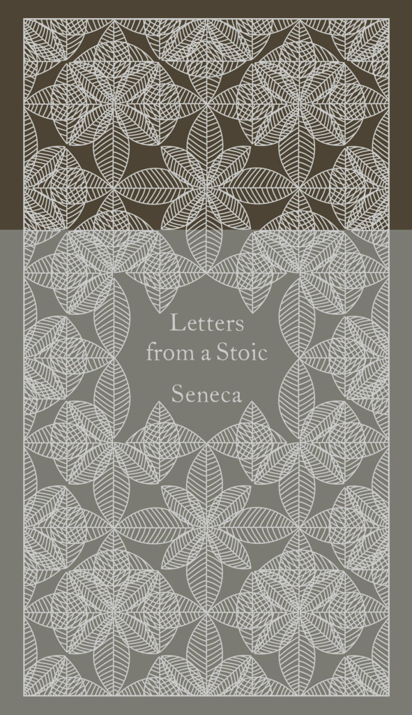
Letters from a Stoic by Seneca; design by Coralie Bickford-Smith (Penguin Classics 2014)


Penguin Pocket Hardbacks; design by Coralie Bickford-Smith (Penguin Classics 2014)

Les fantômes fument en cachette by Miléna Babin; design by David Drummond
Les fantômes fument en cachette by Miléna Babin; design by David Drummond (Les Éditions XYZ / 2014)


Quai No. 5; design by David Drummond (Les Éditions XYZ / 2014)

Sicilian Uncles
Sicilian Uncles by Leonardo Sciascia; design by Dan Mogford (Granta / 2014)


Leonardo Sciascia; design by Dan Mogford (Granta / 2014)1

9780374534691
August 1914 by Aleksandr Solzhenitsyn; design by Oliver Munday (FSG / 2014)


Aleksandr Solzhenitsyn; design by Oliver Munday (FSG / 2014)

authority
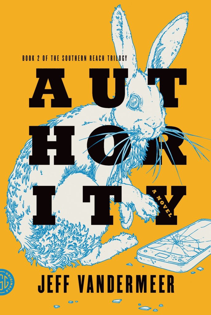
Authority by Jeff VanderMeer (US); design by Charlotte Strick; Illustration by Eric Nyquist (FSG / 2014)


The Southern Reach Trilogy by Jeff VanderMeer (US); design by Charlotte Strick; Illustration by Eric Nyquist (FSG /  2014)

Annihilation
Annihilation by Jeff VanderMeer (UK); design by Jo Walker; illustration by Kai and Sunny (Fourth Estate / 2014)


The Southern Reach Trilogy by Jeff VanderMeer (UK); design by Jo Walker; illustration by Kai and Sunny (Fourth Estate / 2014)

ukojenie_RBG2
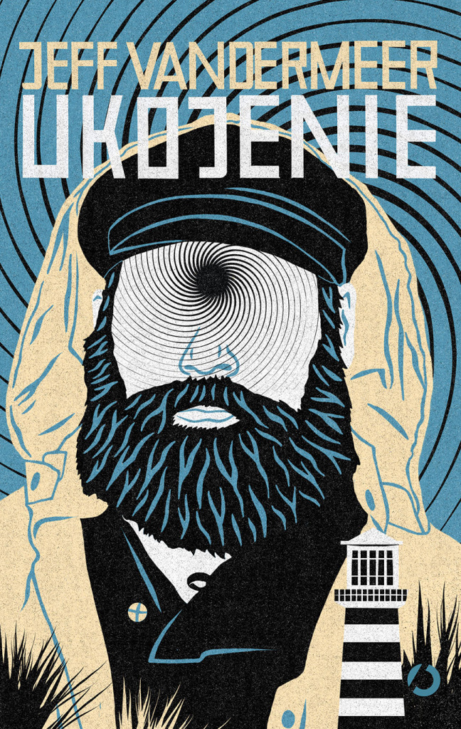
Ukojenie by Jeff VanderMeer (Poland); cover art by Patryk Mogilnicki (Otwarte / 2014)

The Southern Reach Trilogy by Jeff VanderMeer (Poland); cover art by Patryk Mogilnicki (Otwarte / 2014)

city-of-saints
City of Saints & Madmen by Jeff VanderMeer backlist; design by Crush Creative (Tor / 2014)

Jeff VanderMeer backlist; design by Crush Creative (Tor / 2014)

Verso Radical Thinkers; design by Rumors (Verso / 2014)

battle-of-ap-bac
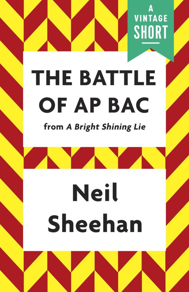
The Battle of AP Bac by Neil Sheehan; design by Joan Wong (Vintage / 2014)


Vintage Shorts; design by Joan Wong (Vintage / 2014)

9782896494927
Fleur de Cerisier by Aline Apostolska; design by David Drummond (VLB éditeur / 2014)


Vol 459; design by David Drummond (VLB éditeur / 2014)


M. D. Waters; design by Jaya Miceli (Plume / 2014)

9780099598282
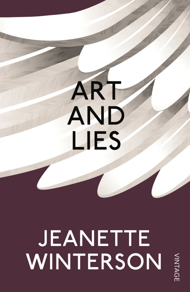
Art and Lies by Jeanette Winterson; design by James Paul Jones (Vintage / 2014)


Vintage Winterson; design by James Paul Jones (Vintage / 2014)

3 Comments

Aaron Draplin and the Art of the Side Hustle

draplin-hustle

I could listen to designer Aaron Draplin get all excited about stuff for hours. In these short films by Jared Eberhardt for Vans, Draplin talks about design, ephemera, Field Notes, and more:

Comments closed

Society is Nix: The Quotidian Chaos of the Urban Scene

J. Hoberman reviews the oversize comics collection Society is Nix: Gleeful Anarchy at the Dawn of the American Comic Strip, 1895–1915, edited by Peter Maresca and published by Sunday Press Books, for the New York Review of Books:

Society is Nix focuses on the depiction of then-contemporary metropolitan life. In addition to Hogan’s Alley and other metropolitan jungles, the comics reveled in the quotidian chaos of the urban scene: the pushcart madness of “Familiar Sights of a Great City—No. 1, The Cop is Coming” is rendered as a mock-classical frieze. Genuine monuments are regarded with derision; several strips in Society is Nix satirize the rapid transit system then under construction in New York. As the twentieth century approached, cartoonists extrapolated a city of the future, replete with snow-capped office buildings, floating real-estate agents, and colliding single-person dirigibles, or ponder “the possibilities of wireless telegraphy” which, save for predicting communication with Mars, seems much like the Internet…

…In his introduction, Maresca refers to these comic strips as “the birth of modern popular culture”—perhaps “mass media” would be a better term. These strips were not only all over the page, they were in big cities all over the country—the most successful supplements reached hundreds of thousands of readers in New York alone. Yet at the same time, they were wildly experimental… [The] first newspaper comic strips were not so much an extension of vaudeville as precursors of the equally déclassé and temperamentally anti-authoritarian motion picture. The early strips thrived on choreographed violence, including runaway horse carts, baroque streetcar collisions, and a panoply of what Hearst might have termed polychromous explosions.

Comments closed

You’ll Never Get Anywhere Like That

Or a Few Thoughts on the Cover Design of The Bell Jar (An Illustrated Essay of Sorts)

In his recent essay ‘Graphic Design Criticism as a Spectator Sport’ designer Michael Bierut (author of 79 Short Essays on Design) suggested that “at a time where more people than ever are engaged with design,” design criticism has been reduced to a “seemingly endless series of drive-by shootings punctuated by the occasional lynch mob, conducted by anonymous people with the depth of barroom philosophers and the attention span of fruit flies.”

Unsurprisingly, I thought of Mr. Bierut during the recent furore about the cover design of The Bell Jar.

When Faber and Faber published a 50th anniversary edition of Sylvia Plath’s novel last month with a brightly coloured new cover, they can hardly have expected a controversy. But the design, which features a photograph of a woman holding a compact and touching up her make-up, was, it turned out, nothing less than “a ‘fuck you’ to women everywhere.” It was so truly hideous, that if “Sylvia Plath hadn’t already killed herself, she probably would’ve” when she first saw it. It was “THE BELL JAR as chick lit” — “1990s chick lit“!

It wasn’t much better when the designers weighed in. If the diplomatic Jamie Keenan thought Faber hadn’t “got it quite right,” Barbara DeWilde was less equivocal: “it’s a travesty… I’m still almost speechless that it was published in this form.”

We are, of course, morbidly fascinated by Plath, who died tragically young — there are at least 3 new books about her life being published this year alone. That The Bell Jar is both semi-autobiographical and her only novel makes our opinions about it even more intense.

But just how much of the criticism was actually fair?

On the face of it, the image isn’t entirely inappropriate. Mirrors (and photographs) are a recurrent motif in the book (one of its working titles was The Girl in the Mirror). The novel even begins with Esther working for a fashion magazine in New York. She talks about her looks, her clothes and her make-up. She carries a compact in her bag. Esther is fixated with appearances even as she struggles against being defined by hers.

Nor is the new design some kind of “chick lit makeover” — that just seemed like a convenient, if inaccurate, headline. While defining what qualifies a ‘chick lit’ is notoriously difficult, the cover has none of whimsy usually associated with the genre. Furthermore the new design wasn’t a sudden attempt to make the book look more feminine. The beautiful Faber Firsts cover from 2009 designed by Mark Swan also uses a glamorous retro image (albeit a disturbingly cropped one).

In fact, the new cover, also designed by Swan, is much more jarring than the Faber Firsts’ almost romantic image. There’s an angular sickliness to it — an awkward, unpleasant toxicity. The bright colours are unnaturally heightened, the pose mannered, the jerky lettering like “loops of string lying on the paper” blown askew.

As Faber themselves would later would confirm, it was meant to unsettle. The intent “was that the image of the expressionless woman ‘putting on her mask’ and the discordant colour palette would suggest ambivalence and unease.”

Certainly the new cover, is harder to like. It is indisputably ugly, especially compared to Swan’s earlier design or the original Faber cover from 1967 (pictured above) designed by Shirley Tucker (if not more so than this Warholian shocker from 1998). But tasteful covers rarely stand out on the shelves and from a marketing perspective there isn’t anything necessarily wrong with something being dissonant. It can be startling effective as Peter Mendelsund’s covers for Simone de Beauvoir demonstrate. Disruptive designs can also provoke interest in new readers and there is even some anecdotal evidence this is precisely what has happened with The Bell Jar — it is, apparently, “doing the business.”

Still, the design of The Bell Jar fails, at least as an accurate representation of the book. The mirror’s reflection does nothing to imply the introspection or detachment of the novel — only a coquettish vanity and narcissism. The woman in the photograph is just too put-together, too worldly. The mannered glamour is reminiscent of the stifling fashion photography of the 1950’s. This isn’t a 19 year-old’s face, “bruised and puffy and all the wrong colours.” There is no ennui or anxiety on display. No hint of poverty or isolation. Nothing of the suicidal depression aor a person coming apart. There is none of the disappointment. It is just an icily cool model posing for a photograph — an image Esther herself denies:

The magazine photograph showed a girl in a strapless evening dress of fuzzy white stuff, grinning fit to split, with a whole lot of boys bending in around her. The girl was holding a glass full of a transparent drink and seemed to have her eyes fixed over my left shoulder on something that stood behind me, a little to my left. A faint breath fanned the back of my neck. I wheeled around.

The night nurse had come in, unnoticed, on her soft rubber soles.

“No kidding,” she said, “is that really you?”

“No, it’s not me. Joan’s quite mistaken. It’s somebody else.”

To make matters worse for Faber, they also revealed the new cover shortly after Penguin Classics reissued new editions of George Orwell with cover designs by David Pearson. The contrast is unfavourably stark. Where Pearson deftly combines wit and originality with respect for material (not to mention Penguin’s design heritage), the stock photography, anachronistic type and bright colours of The Bell Jar seem crass and gaudy.

Comparisons with similarly stylish new editions of Kafka and Joyce designed Peter Mendelsund, Truman Capote designed by Megan Wilson, and Ralph Ellison designed by Cardon Webb, are unequally unflattering. It’s not hard to see that Plath, like so many other women writers, has been decidedly short-changed.

As Fatema Ahmed, noted in her post ‘Silly Covers for Lady Novelists‘ for the London Review Books blog, “the anniversary edition fits into the depressing trend for treating fiction by women as a genre, which no man could be expected to read and which women will only know is meant for them if they can see a woman on the cover.”

In recent years, contemporary writers as diverse as Francine Prose, Jodi Picoult, Jennifer Weiner, Meg Wolitzer, Fay Weldon, and Lionel Shriver have all noted how fiction by women is marginalized. No matter that women buy the most books, women writers are less well-reviewed, win fewer literary awards, and all too often the covers of their books don’t accurately reflect nature of the work itself.

If books by Jonathan Franzen, Chad Harbach and Ben Marcus are designed to look different and stand out on the shelves, contemporary literary fiction written by women tends to look the same regardless of the book’s subject matter. All too often there is a photograph of woman on the cover — pretty, domesticated, inoffensive and wistful. The assumption is that women only want to read certain kinds of stories, and that men don’t want to read books by women at all. In discussing the treatment of her own work, Shriver dryly pointed out, “publishing’s notion of ‘what women want’ is dated and condescending.”

This isn’t always true, of course. Hilary Mantel’s Thomas Cromwell novels defy all expectations. See Now Then, Jamaica Kincaid’s first novel in 10 years, has a type-only cover. The Casual Vacancy by J. K. Rowling is notable for its hand-drawn lettering and calculated, corporate blandness. Both the American and the British editions of Zadie Smith’s NW — designed by Darren Haggar/Tal Goretsky and Gray318 respectively — are stunning. Alison Forner’s sinister canned cranberries for May We Be Forgiven by A. M. Homes is a neat inversion of domesticated happiness. The Penguin Modern Classics reissues of Carson McCullers designed by Jim Stoddart — with images selected by Penguin Press picture editor Samantha Johnson — also demonstrate that 20th century classics by women do not have to suffer from poor design or gender stereotypes.

There are surely other isolated examples too. But one can’t help thinking they are exceptions that prove the rule, and it is a particularly bitter irony that Plath’s novel about a young woman struggling with society’s expectations of her should, 50 years later, expose that woman writers are still stereotyped and treated poorly in comparison to their male counterparts. My sense is, however, that this latest controversy is a sign that the tide is turning. Women, both writers and readers, are being more outspoken about what is wrong with the way their books are handled by publishers and the media. They expect more and they expect better. This is the upside of design as a spectator sport. White middle-aged men are no longer the only voices being heard. Thankfully.


I was recently asked for my opinion on the new cover of The Bell Jar for an article in the Chicago Tribune. This an edited and expanded version of my comments to journalist Nara Schoenberg for that article. Thanks to everyone who gave feedback on an earlier draft of these remarks.


9 Comments

Midweek Miscellany

A fantastic new cover for the Vintage (UK) edition of Gravity’s Rainbow by Thomas Pynchon, designed by Matt Broughton (via the Vintage Books design Tumblr CMYK)

CTRL+C; CTRL+P — Music critic Simon Reynolds, author of Retromania, on remix culture and ‘recreativity’ at Slate:

Recreativity has many proponents and represents a wide spectrum of opinion. Still, it’s striking how easily some of these critics and theorists glide from relatively sensible talk about the role of appropriation and allusion in art to sweeping claims of an ontological or biological nature. They seem so confident. How they can be certain that nobody has ever just come up with some totally new idea, ex nihilo? The remixed nature of everything (not new) under the sun has become an article of faith. Impossible to prove, these assertions tell us way more about our current horizons of thought and our cultural predicament than they do about the nature of creativity or the history of art.

The A.V. Club list their 50 best films of the ’90s. (Their list of their most-hated movies is here).

Picture This — Cartoonist Adrian Tomine discusses his work and his new book New York Drawings with the The Paris Review:

If you were to go back in time and talk to the people who invented cartooning, and were doing it for newspapers, and told them that there were going to be guys who were going to do twenty-four-page long stories, they would think that was a strange use of the medium. And if you then said, they’re going to try and inject that with a singular vision and personal experience and do six-hundred-page long stories—I mean, their heads would have exploded.

See also: Adrian on his first cover for The New Yorker at the The Thought Fox, the blog of his UK publisher Faber & Faber.

And Finally…

Speaking of The Paris Review, an interview with editor Lorin Stein at the LA Review of Books:

The tradition of discovering new writers makes it easy to go out and find stuff that excites me, and at the same time feels of a piece with the history… To me it’s like that line in the great Italian novel, Lampedusa’s The Leopard. If you want things to stay the same, everything’s going to have to change. Nowadays we have to exist in the digital world if we don’t want to be strictly of the digital world.

2 Comments

Something for the Weekend

Project Thirty-Three, one of my favourite mid-century modern design blogs, is now using Blogger’s “Dynamic Views” template. It looks great using the new ‘Flipcard’ feature.

The Crash — Alan Hollinghurst talks about writing and his new novel The Stranger’s Child with the New York Times:

Mr. Hollinghurst said he modeled his work habits on another friend and novelist, Kazuo Ishiguro. “He has this thing he calls ‘the crash,’ ” Mr. Hollinghurst explained. “He takes a lot of time to prepare a novel, just thinking about it, and then he draws a line through his diary for three or four weeks. He just writes for 10 hours a day, and at the end he has a novel.”

He laughed and pointed out that for him the Ishiguro method was only partly successful: at the end of three or four nonstop weeks he is still years away from being done.

Also in the New York Times, author Adam Thirlwell (The Escape) on translation and David Bellos’ new book Is That a Fish in Your Ear?:

Google Translate, no doubt about it, is a device with an exuberant future. It’s already so successful because, unlike previous machine translators, but like other Google inventions, it’s a pattern recognition machine. It analyzes the corpus of existing translations, and finds statistical matches. The implications of this still haven’t, I think, been adequately explored: from world newspapers, to world novels. . . . And it made me imagine a second prospect — confined to a smaller, hypersubset of English speakers, the novelists. I am an English-speaking novelist, after all. There was no reason, I argued to myself, that translations of fiction couldn’t be made far more extensively in and out of languages that are not a work’s original.

Counter-Culture — Loren Glass on Barney Rosset and the history of Grove Press at the LA Review of Books:

Philip Larkin famously dated the beginning of sexual intercourse to the end of the Lady Chatterley ban and, more recently, Fred Kaplan has used Rosset’s campaign to situate 1959 at the crux of an epochal transformation. Whatever its larger historical significance, it surely marked a turning point in the fortunes of Grove Press. On the brink of a decade in which the geopolitical order would be transformed, flush with cash for the first time, and well connected to the international avant-garde, the West Coast scene, and the nascent counterculture in college towns across the country, Grove was positioned in the eye of the coming storm. At the nexus of an emergent international vanguard, Grove became a potent symbol of the counter-culture, increasingly drawing radical authors, readers, translators, professors, lawyers and activists into its expanding network.

Part two of Glass’ history Grove Press is here.

And finally…

A slightly weird  interview with the David Lynch in The Guardian:

Film is dead, Lynch tells me. It is too heavy, too much of a dinosaur, and its time has largely past. But digital is alive and well and pointing to the future. He admits he’ll miss shooting on celluloid (“because it’s so beautiful”), but is more than happy to shoot on digital instead – as and when the opportunity arrives.

Until then he’s happy pottering around his studio and slurping his coffee; painting his spooky black houses and singing his eerie songs of love gone sour. “I can understand why people might be frustrated with me: ‘Let’s give up on these side ventures and go make a film instead.'” He chuckles. “But all these other things feed into the future. And if the ideas aren’t there for cinema, and if the pressure is on, then you might pick a bad idea and find yourself forced to marry something you’re not totally in love with. So I’m happy to wait.”

Comments closed
Kazuo Ishiguro | Jamie Keenan

The super-talented Jamie Keenan has done a beautiful redesign for Vintage’s Kazuo Ishiguro backlist. You can see them in their full glory at Art Director John Gall’s blog Spine Out.

Comments closed

50 Watts

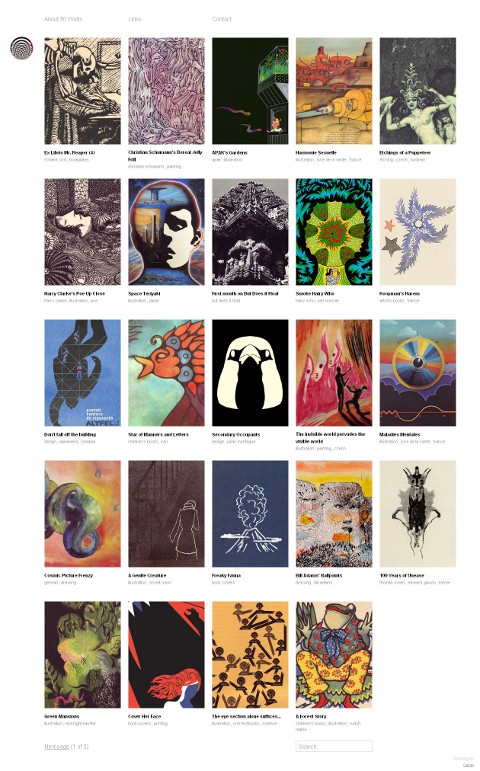
Will Schofield’s wonderful blog A Journal Round My Skull has been relaunched as 50 Watts using the Cargo platform:

The new name has something to do with Charlie Watts, Beckett’s Watt, Charles Wright & the Watts 103rd Street Rhythm Band, dim light bulbs, riots, cheap amps, chaos theory, and the friend who threatened violence if I didn’t drop my old moniker.

I didn’t threaten violence, but I certainly got the name wrong more times than I care to mention. 50 Watts looks great and I should be able to remember the name this time.

Make sure you update your bookmarks and RSS reader.

Comments closed

10+ Flickr Groups for Book Design and Inspiration

10 Websites for Vintage Books, Covers and Inspiration” is one of the most popular posts on The Casual Optimist, and here, at long last, is the promised follow-up: “10 Flickr Groups for Book Design and Inspiration.”

There are a lot of amazing photostreams with book sets — Covers etc, insect54, Kyle Katz, mjkghk, Montague, Paula Wirth, and Scott Lindberg to name just a few that I’ve come across — but I’ve decided to focus this post on my favourite group pools because they collate the best of these individual streams together.

I’ve also decided to highlight groups that are about specific subjects, genres, publishers, or designers, because I think these are more useful than the more general (but still interesting) book pools such as A+ Book Covers, Book Cover Club, and My Books

ABC Verlag Graphic Design books

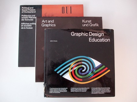
1. ABC Verlag, Zurich — A collection of scans and images from Zurich-based ABC Verlag who specialized in graphic design and fine art books between 1962 to 1989.
1627

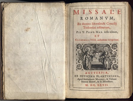
2. Antique Books — images of books, covers and illustrations that are a hundred years old or more.

Design and Paper: Number 13: Spread

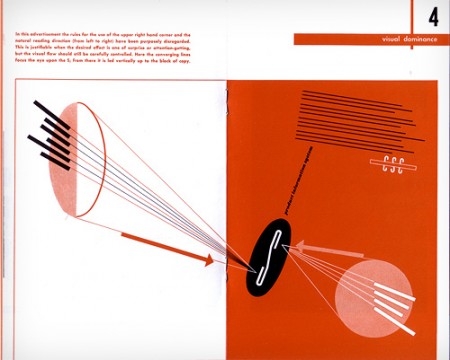
3. Designers’ Books — “what’s on the shelves of designers and other smart creatives.” Not to be confused with the also excellent designers-books.com pool or Book Design pool.

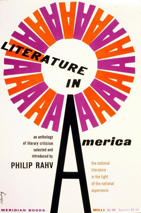
Literature in America

4. Alvin & Elaine Lustig Design — celebrates the work of Alvin and Elaine Lustig, both renowned for their incredible book cover designs.

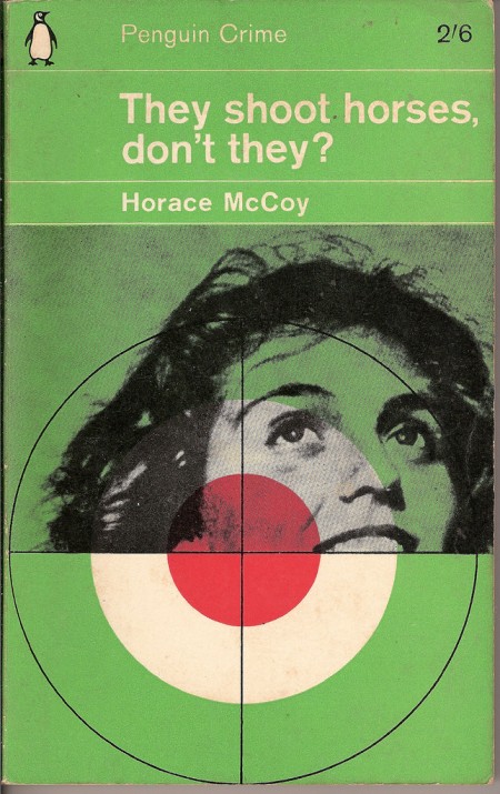
They Shoot Horses Don't They

5. The Penguin Paperback Spotters’ Guild — An astonishing collection of vintage Penguins, Pelicans, Peregrines, and Puffins. Also of interest: The Great Pan! Illustrated Pan Book Covers and Vintage Fontana Books.

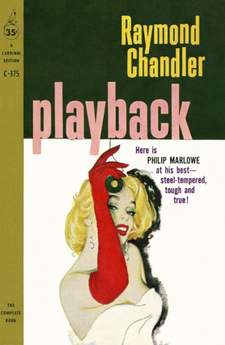
Playback by Raymond Chandler Cover art by William Rose

6. Pulp Fiction — As you would expect: detective novels, crime fiction, adventure comics, trashy romance, weird science, blaxploitation and more. See also: The Old-Timey Paperback Book Covers and The Crime & Mystery Book Covers.

Thoughts on Design by Paul Rand

7. The Paul Rand Modern Graphic Design Fan Club — Like the Lustig Design group, this is not just a book pool, but it does, however, include many of Paul Rand’s iconic book designs, making it essential to this list in my opinion.

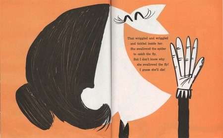
I Know an Old Lady, by Rose Bonne. Pictures by Abner Graboff.
8. The Retro Kid A collection of cool illustrated children’s books from the mid-1940’s through the mid-1960’s, curated by The Ward-O-Matic illustrator Ward Jenkins.

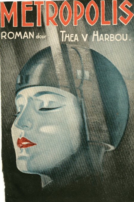
metropolis thea v marbou

9. The SciFi Books Pool Vintage science fiction covers from the 1940s, 50s, 60s and 70s.

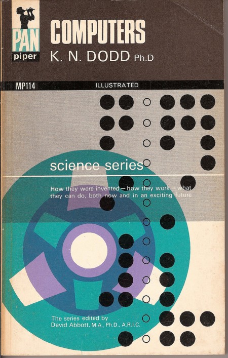
computers

10. Vintage Paperbacks — The place for amazing paperbacks that aren’t Penguins. Curated by graphic designer and art director Gregory Boerum, the focus is on quality stuff with design interest from the 1960’s and 70’s.

So there we have it: 10 of my favourites. What are yours?

10 Comments

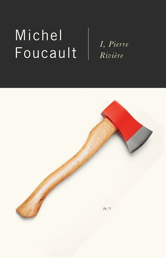
New Vintage Foucault

Peter Mendelsund’s faultless redesigns for the Vintage editions of Foucault

Stunning.

5 Comments

Midweek Miscellany

Eye, Eye! — The Creative Review looks at the vibrant work of printing studio/small press Nobrow.

It’s an Anagram! — Indigo’s e-book initiative Shortcovers has become ‘Kobo’. Much fuss has been made about the name (and the slightly iffy redesign), but what’s more interesting is that Kobo is being spun-off from its parent company in an attempt to expand its global reach… The intrepid Mark Bertils and PW have more on the international angle; Wired think Amazon should be worried; and The National Post have a good Q&A with Kobo CEO Michael Serbinis…

Collector’s Items — Vote for your favourite Nabokov cover from John Gall‘s set of individually commissioned redesigns for Vintage.

The Decade of Dirty DesignSteven Heller, author of Handwritten and New Vintage Type (to name just a couple) on the “anti-digital” Oughts (via Charles Brock):

With the increase of the D.I.Y. sensibility, with renewed emphasis on “making things from scratch,” designers were feeling a need to make physical (not virtual) contact with their materials and outcomes…

[Perhaps less “anti-digital” than “post-digital“? Any thoughts designers?]

And finally…

ryan-tym

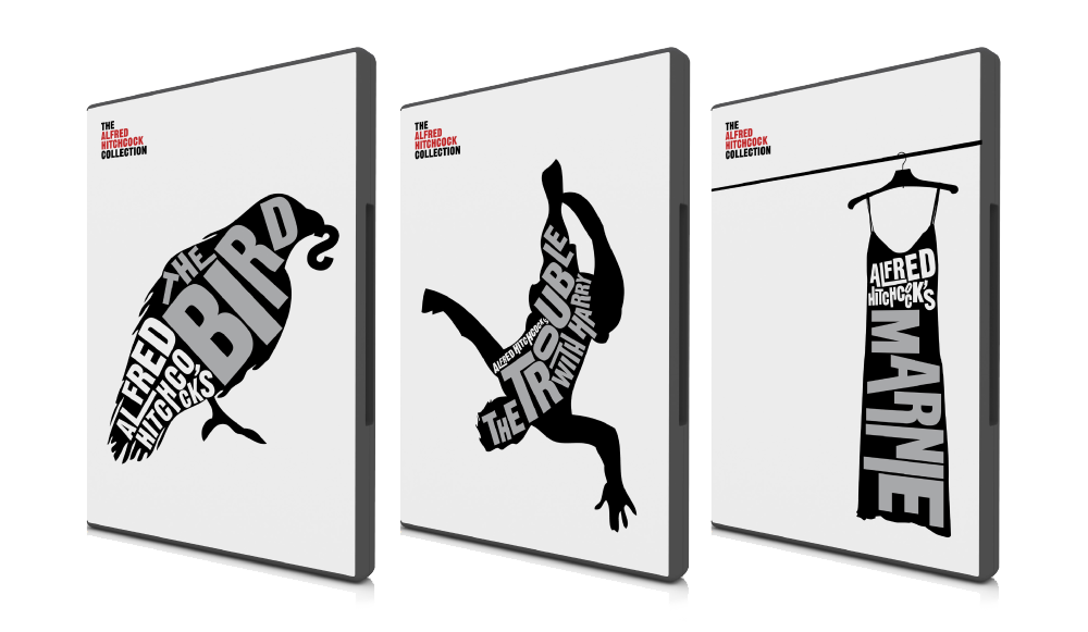
The Hitchcock Collection — a self-initiated project by London-based graphic designer Ryan Tym (via FormFiftyFive):

After recently purchasing a badly designed Alfred Hitchcock
DVD box set, I set to work on creating my own collection of
original covers. Each design features an iconic image related
to the film it represents and includes a bold typographic
title.

I would love to see Ryan design some book covers… Wouldn’t you?

3 Comments