Skip to content

Tag: style

David Carson: All For a Few Good Waves

david-carson-waves

If you’re not a fan of David Carson’s (in)famous design work, this video is unlikely to change your mind. It is hard, however, to shake the feeling that he’s having the last laugh…

Between this and William Finnegan’s Barbarian Days, the surf dad aesthetic is clearly having a moment.

(I have also just learnt that there is already a Canadian indie band — from landlocked Regina of course — called Surf Dads. Perfect.)

Comments closed

William Gibson on Authenticity

gibsonlabel

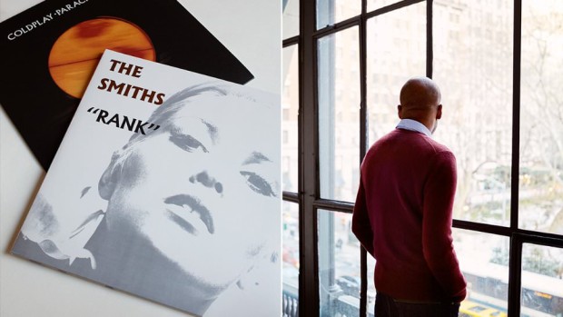
I’d be the first to admit that I didn’t really get on with William Gibson’s latest novel The Peripheral, but I really enjoyed his ‘Blue Ant’ trilogy — Pattern Recognition, Spook Country, and Zero History.

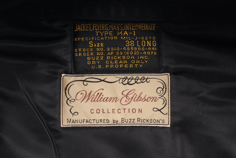
Interestingly, the (fictional) Buzz Rickson MA-1 flight jacket worn by Cayce Pollard, the protagonist in Pattern Recognition, led to the Japanese clothing company working with Gibson to manufacture a line of clothes (including the aforementioned black MA-1) inspired by the author. In this fascinating interview with Rawr Denim, the author discusses Buzz Rickson, Japanese pop culture, workwear, authenticity and more:

“Authenticity” doesn’t mean much to me. I just want “good”, in the sense of well-designed, well-constructed, long-lasting garments. My interest in military clothing stems from that. It’s not about macho, playing soldiers, anything militaristic. It’s the functionality, the design-solutions, the durability. Likewise workwear.

Military clothing is built to strict contract, but with the manufacturer cutting ever corner they can without violating the specifications. The finishing on a Rickson reproduction is exponentially superior to the finishing on most of the originals, and I’d much rather have a brand-new exact copy that’s more carefully assembled…

…[In] 1947 a lot of American workingmen wore shirts that were better made than most people’s shirts are today. Union-made, in the United States. Better fabric, better stitching. There were work shirts that retailed for fifty cents that were closer to today’s Prada than to today’s J.Crew. Fifty cents was an actual amount of money, though. We live in an age of seriously crap mass clothing. They’ve made a science of it.

Comments closed

Masters of Letters

albertus-opara

Sartorial site Mr Porter asks five designers — Mat Maitland, Eddie Opara, Sagi Haviv, Edwin Van Gelder, and Chip Kidd — about their favourite typeface. Here’s Eddie Opara of Pentagram on Berthold Wolpe’s Albertus, the typeface used for the street signs of the City of London:

I didn’t know what the font was until I got to design school. And I was so fascinated by it because of the way it’s cut. It’s based on metal engraving techniques, the effect being that it has is these acute angles, almost 45 degree angles in each letter. It’s also insanely hard to use. I’ve tried to use it and I’ve not been able to. Why is it my favourite font, then? I think that your favourite is always what you can’t have.

(via Theo Inglis)

Comments closed

Truth. Beauty. Bailey.

david-bailey

“Are you filming, or am I wasting my fucking time?”

A short film by Jamie Roberts about British fashion photographer David Bailey, who I will forever associate with David Hemmings propeller-purchasing photographer in Michelangelo Antonioni’s 1966 film Blow-Up:

The film was commissioned by Dazed & Confused.

1 Comment

Airline: Style at 30,000 Feet


In this short film, designer Keith Lovegrove discusses his book Airline: Style at 30,000 Feet and how the culture of air travel has developed from the 1920s:


(disclosure: Airline: Style at 30,000 Feet is published by Laurence King and distributed in Canada by my employer Raincoast Books)

Comments closed

Basquiat, Bowie, and British Tailoring

Michael Salu, artistic director of Granta, talks to Crane TV about his work, influences and personal style:

Comments closed