Skip to content

Tag: series design

Penguin Galaxy Series design by Alex Trochut

2001 design Alex Trochut

Following on from their horror classics series selected by Guillermo Del Toro, Penguin US is publishing six hardcover science fiction and fantasy classics this fall with introductions from Neil Gaiman, and (more importantly!) brilliant typographic covers by Brooklyn-based Spanish designer Alex Trochut. Available in October, the finished covers will be foil on uncoated paper over board.

dune design Alex Trochut Left Hand of Darkness design Alex Trochut neoromancer design Alex Trochut The Once and Future King design Alex Trochut Stranger in a Strange Land design Alex Trochut

Comments closed

David Pearson Found on the Shelves

on_corpulence-design_david_pearson_illus_joe_mclaren

At The Bookseller, designer David Pearson talks about his new cover designs for Pushkin Press’s ‘Found on the Shelves’ series celebrating 175 years of the London Library:

At the heart of successful series design is motif – be it colour, type, grid, imagery, or other visual touchpoints – yet Pearson’s latest covers for Pushkin are perhaps less obviously groupable. “The series identifier is a subtle one,” he says, “but it is present in the use of decorative borders. I had begun to explore this idea of active border-making with some of Pushkin’s Collection Covers; the idea being that a decorative border can provide a layer of meaning or a tension point within the cover, and not simply act as a framing device.

“For The London Library series, this takes the form of overlapping tyre treads in ‘Cycling: The Craze of the Hour’; snaking, northbound steam in ‘The Lure of the North. It’s a small thing to hang your ideas on – and it matters little if no one notices it – but it ensured that I didn’t flounder at the beginning of the design process, as I had something to kick against, an inbuilt challenge to wrestle with.”

Pearson attributes much of the covers’ liveliness to the illustration, which he is quick to credit: “I intend to broaden the illustrative scope [further titles are scheduled for November] but for this first selection I’m relying on tried, trusted and incredibly talented hands. Joe McLaren produced the illustrations for ‘On Corpulence’ and ‘Life in a Bustle’ – and as with all of Joe’s work, the result is joyous.” The additional images were sourced from illustrations within the texts themselves, giving some of the covers a distinctly vintage appearance.

Each of the covers will print using a spot colour – one outside the gamut of four-colour CMYK printing, as it cannot be created using a combination of cyan, magenta, yellow and black (“key”); as a consequence of this it is bolder, more vibrant and less ubiquitous (and therefore more striking) – and will feature black foil-blocking on uncoated paper stock.


On Reading design David Pearson

life_in_a_bustle_design_david_pearson_illus_joe_mclaren Cycling David Pearson

Save

Comments closed

J.G. Ballard Series by Stanley Donwood

jgballard-bookcover-4thestate-theatrocityexhibition-harikunzru

Some how I missed these when they were first published in 2014,1 but British publisher Fourth Estate has reissued 21 books by J.G. Ballard with covers designed Stanley Donwood. Donwood, who is perhaps best known for his artwork for Radiohead, talked about Ballard and the cover designs on the 4th Estate blog:

I have done many strange things in order to design these covers; I’ve visited underground laboratories, watched the huge sky under the Fens, ignited flammable liquids, fired guns, melted quantities of wax, poured liquid nitrogen across a table and taken deliveries of hypodermic needles.


(via Rhys Tranter)

2 Comments

The Cycling Anthology Jersey Designs by James Paul Jones

The Cycling Anthology_Killed Cover_1

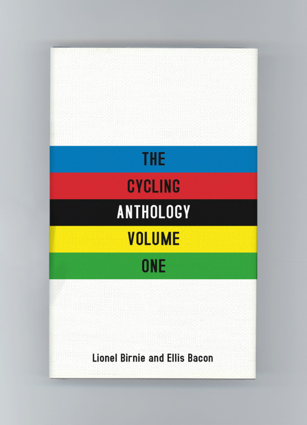
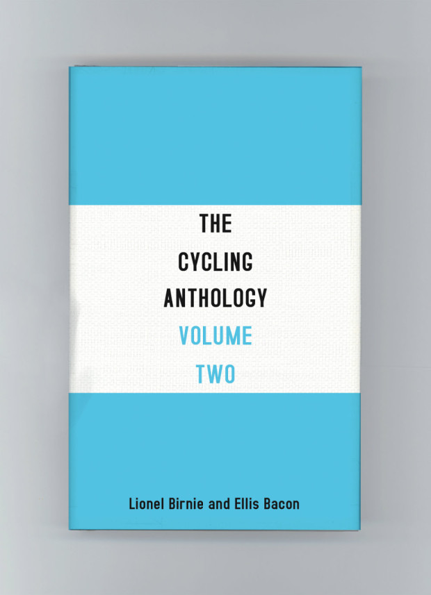
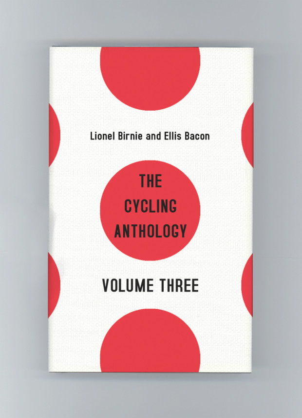
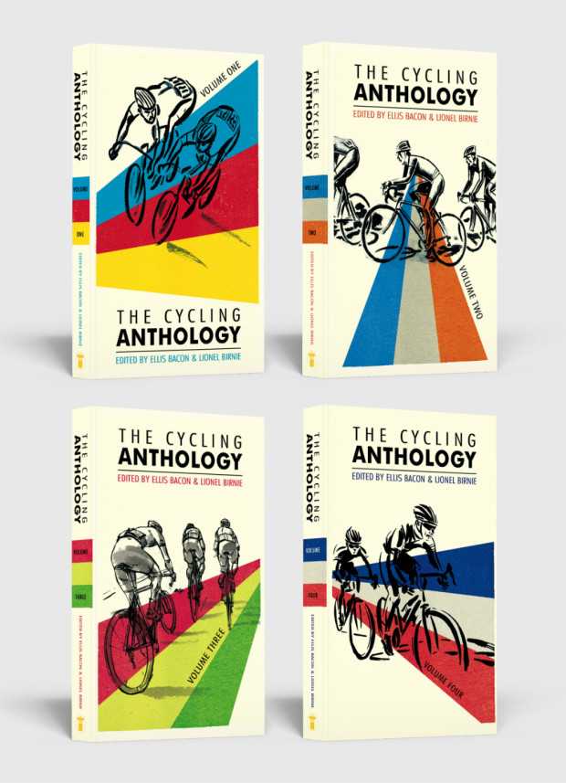
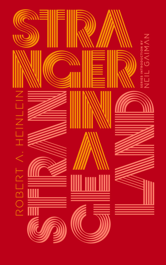
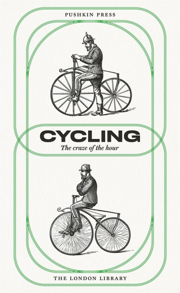
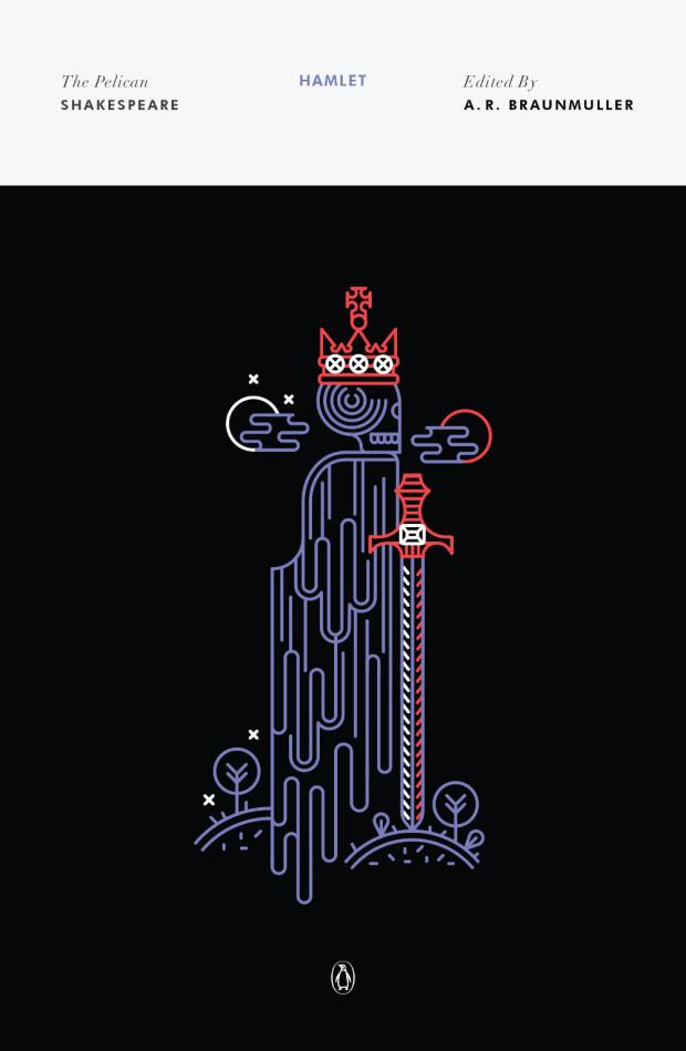
James Paul Jones‘s unused covers for The Cycling Anthology (pictured above) were some of my favourite designs from 2015. Based on famous cycling jerseys, I liked that they were a nod to insiders, but that you that didn’t need to be a cycling fan to appreciate the stylish minimalism of the designs.

When I learnt that they were passed over in favour of a more traditional, illustrative approach, I asked James about his work on cycling books, and why the jersey covers didn’t go to press.

The Cycling Anthology_Killed Cover_2

“I’ve always loved sports but I didn’t count myself a cycling enthusiast until my last year working at Orion Publishing where I was given the job of art directing the photo shoot for David Millar’s book Racing through the Dark,” he told me. “Working with David opened my eyes to the cycling world, and I was lucky enough to work on Sir Bradley Wiggins’ book a couple of years later.”

“Coincidentally David Millar writes beautifully about cycling and has a few essays as part of the Cycling Anthology,” James continued. “I also just finished designing his latest book, The Racer a few months back — all cycling enthusiasts should grab a copy! The contact sheet of ‘tour scars’ is one of my favourite plate sections we’ve ever done, and the back cover features one of the final jerseys he ever wore. Complete with rips, holes and bloody marks from one of his most brutal crashes. As soon as we saw it we knew it had to be featured somewhere, and the photographer captured it brilliantly.”

The Cycling Anthology_Killed Cover_3

The Cycling Anthology presented a different kind of challenge, howeverOriginally self-published, it collects original writing by some of the world’s best writers on the sport, as well as cyclists themselves. Now published by Yellow Jersey Press (an imprint of Penguin Random House), the new volumes of the anthology presented James with an opportunity to repackage the series as a whole, and to experiment with a new look for the covers.

“I wanted to present the editors and authors with two options. A more traditional route, and an option that would hopefully resonate with the cycling community. The jerseys were the latter, and one of the first things I researched. I really wanted to make that connection with the cycling community, and the target market is very design conscious which helps. They are so iconic in the cycling world it just seemed to make perfect sense.”

The Cycling Anthology_Killed Cover_4

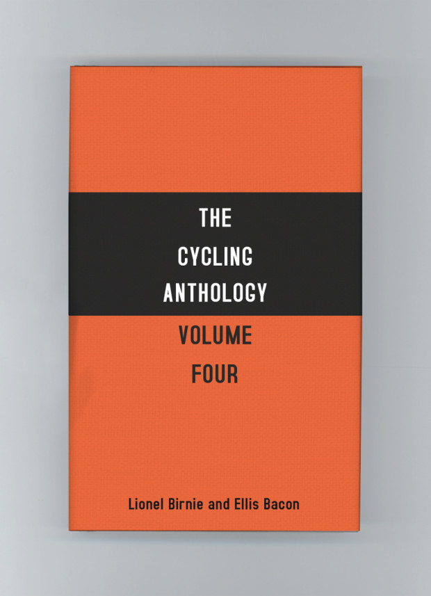
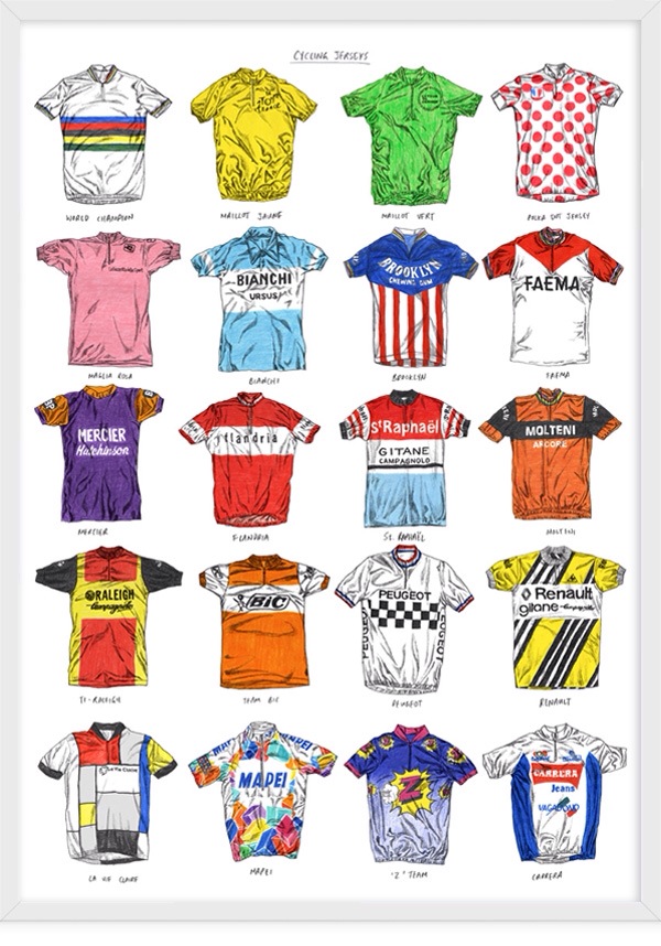
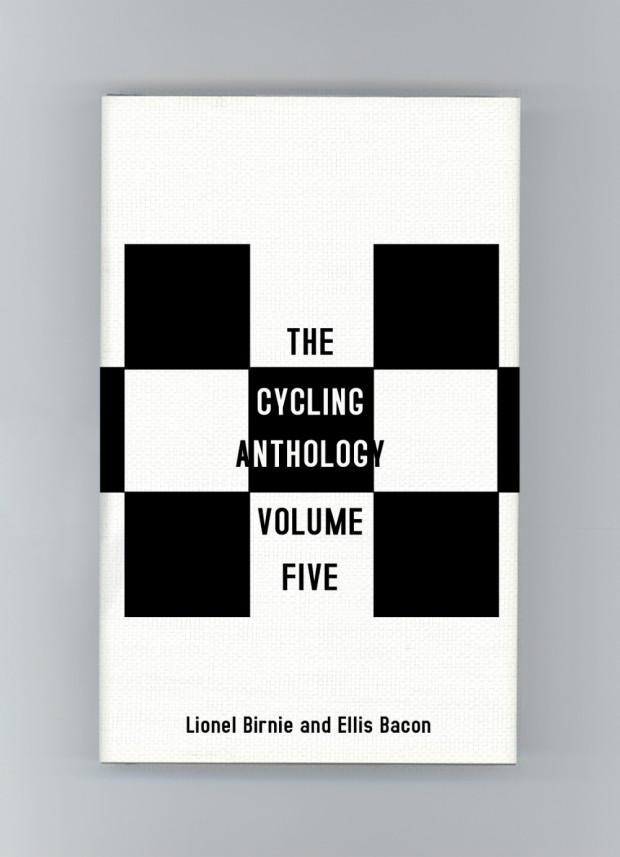
The design of the first volume was inspired by the world champion rainbow jersey. The second by the famous blue and white Bianchi jersey. Volume three was based on the ‘King of the Mountains’ polka dot jersey and the fourth on the Molteni jersey worn by the great Eddy Merckx. The fifth volume was inspired by the chequered shirt of the French cycling team Peugeot. “There were so many jerseys I wanted to include,” said James. “I also recommend David Sparshott’s poster of Cycling Jerseys for anyone wanting to admire the greats in his signature illustration style. Just gorgeous.”

Cycling Jerseys_David Sparshott

Despite the obvious appeal of these new designs, the publisher decided to stay with a familiar look to the series. “I think the authors wanted to retain some elements from the original designs, which we did on the final covers with the illustrations, and I’m happy with how they turned out,” James told me. “The illustrations are by the talented Simon Scarsbrook. Volumes 1-3 used the original artwork, and we commissioned Simon to come up with two more illustrations for volumes four and five. He was great to work with and they work really well as a series.”

The Cycling Anthology Series

James kept the stripes from the world champion jersey and used them across all the final covers to help unify the series. “The jersey covers will forever by one of my favourite ‘killed covers’ and I really wish they would have taken a chance on them as I’m sure they would have done the job and more.” Agreed.

The Cycling Anthology_Killed Cover_5

Comments closed

Series Design 2015

In my last post on the book covers of 2015, I thought I would take a look back at some of the series that caught my eye this this year…

origin

Stephen Baxter / Manifold; design by Mike Topping (Harper Voyager / 2015)

Stephen Baxter / The NASA Trilogy; design by Mike Topping (Harper Voyager / 2015)

9781784870751

Vintage Bronte; design by Suzanne Dean; lettering by Lily Jones; cover art Sarah Gillespie; picture research by Lily Richards (Vintage / 2015)

Noam Chomsky; design by David Pearson (Pushkin Press / 2015)

Rachel Cohn; design by Lizzy Bromley (Simon & Schuster / 2015)

Freemans design by Michael Salu
Freemans; design by Michael  Salu (Grove / 2015)

The very first Freeman’s anthology was published in fall this year, but hopefully this design will set the tone for the rest of the series. The second volume is scheduled for next year.

Vintage Feminism; design by Matthew Broughton (Vintage / 2015)

9780241252321

Little Black Classics; design by Jim Stoddart (Penguin / 2015)

(There are an awful lot of these!)

C. S. Lewis; design by Kimberly Glyder (HarperOne / 2015)

Media and Public Life design by David Gee
New Directions in Media History; design by David A. Gee (Polity Press / 2015)

New Modernisms; design by Daniel Benneworth-Gray (Bloomsbury / 2015)

The Things They Carried

Tim O’Brien; design by Jo Walker (Fourth Estate / 2015)

The Penguin Book of the British Short Story Volumes 1 & 2; design Matthew Young (Penguin /2015)

Jesus Son_rounded

Picador Modern Classics; design by Kelly Blair (Picador USA / 2015)

Pushkin Vertigo; design by Jamie Keenan (Pushkin Press / 2015)

Month-in-the-country-mech_670

Russian Plays in Translation; design John Gall (Theater Books / 2015)

Segal

Radical Thinkers Volume 9; design by Rumors (Verso / 2015)

This isn’t a new series of course, but this set marked a colourful change of direction. You can read about the design here.

Fatale design Steve Panton

Serpent’s Tail Classics; design by Steve Panton; series design Peter Dyer (Serpent’s Tail / 2015)

Lionel Shriver; design by Stuart Bache (HarperCollins / 2015)

Mark Twain; design by Isabel Urbina Peña (Vintage / 2015)

Wildcat Series; design by Jamie Keenan (Pluto Press / 2015)

3 Comments

Pluto Press Wildcat Series Design by Jamie Keenan

When I posted included the cover for The Southern Insurgency by Immanuel Ness in my round-up earlier this month, I hadn’t realised it is in fact part of a fantastic series of covers by Jamie Keenan for Pluto Press designed to look like hand-printed posters.

Pluto Press Spirit design by Jamie Keenan

Pluto Press Southern design by Jamie Keenan

Pluto Press Work design by Jamie Keenan

Comments closed

Picador Twentieth Anniversary Modern Classics

Virgin Suicides_rounded


Originally founded in 1995 as a publishing house for sophisticated hardcovers and reprint paperbacks, Picador USA is celebrating its twentieth anniversary this month with a set of four small limited edition modern classics with covers designed by Kelly Blair. Printed on pearlized cream stock, with rounded corners and colourful full-bleed imagery, the books look like exquisite pocket-sized treats.

According to creative director (and long-time friend of the blog) Henry Sene Yee, the books were the brainchild of Stefan von Holtzbrinck, head of Macmillan Publishing. “With Picador’s 20th Anniversary approaching, Stefan wanted us to celebrate it with some special printings. There were these tiny volumes in Europe that caught his eye, and he wanted us to do something like that.”

While still deciding which titles to include, and on the exact format and size, Henry worked out some early ideas in a notebook-sized format, using lines and shapes to represent the theme or narrative of each book. Facing a tight deadline however, Henry didn’t have time to finish the project by himself. He had a difficult decision to make. “Giving away a dream project is the hardest thing to do, but you have to be selfless and match up the best talent with the books.”

Henry, who has been at Picador from the very beginning, was determined to acknowledge the art department’s contribution to the publisher’s history. “One of my very first assistants was Kelly Blair. She is a brilliant designer and illustrator, and is now herself an Art Director at Pantheon / Knopf. If this project was going to celebrate the history of Picador and I couldn’t design it myself, I thought it should be someone who was there with me at the very beginning. Kelly made poetic sense, and made it feel better about letting go. A little.”

Kelly’s initial ideas included illustrations and some all-type solutions. “All were great,” says Henry, “but Kelly wanted to send me one more last-minute idea even though she wasn’t sure she liked it as much as her first ones. Of course that was the one we all loved and printed! Sometimes when a solution seems simple, we doubt its value.”

In addition to the new covers, Steven Seighman redesigned and re-typeset each book making them easy and inviting to read, even at the smaller size. “Even though they look great online,” says Henry, “it’s not until you have the actual wrapped and bound book in your hands that you appreciate its power and the beauty of print in the small format size.”

Steppenwolf_rounded

Housekeeping_rounded

Jesus Son_rounded

The Twentieth Anniversary Picador Modern Classics — Housekeeping by Marilynne Robinson, Jesus’ Son by Denis Johnson, Steppenwolf by Herman Hesse, and The Virgin Suicides by Jeffrey Eugenides — were published last week in the US. Thanks to art director Henry Sene Yee for talking to me about the project. 

Comments closed

The Pelican Shakespeare Series Design by Manuja Waldia

9780143128557

Continuing with the recent series design theme here on The Casual Optimist, creative director Paul Buckley let me know about new set of covers for the Pelican editions of Shakespeare. The covers were designed by newcomer Manuja Waldia, who studied Graphic Design at NIFT, New Delhi and the Milwaukee Institute of Art & Design. Waldia has been commissioned to design the entire series (which is a lot of book covers!), and as a Paul said, “she gives the last two male icon artists to do that (Milton Glaser and Riccardo Vecchio) a run for their money.”

9780143128540

Othello

4 Comments

Tim O’Brien Series Design by Jo Walker

Tim OBrien series

As I mentioned on Twitter yesterday, designer Jo Walker recently redesigned the covers of Tim O’Brien’s classic Vietnam war novels If I Die in a Combat Zone, Going After Cacciato, The Things they Carried, and Northern Lights for 4th Estate in the UK. The series uses a single, searing photograph of a burning Vietnam village taken in 1965 by photographer Dominique Berretty spread over the four covers. The effect is extraordinary, and the design is an interesting contrast to Cardon Webb‘s (also brilliant) typographic covers for the US editions, published by Broadway.

You can read more about Jo’s design process for the series on the 4th Estate blog.

Northern Lights
If I Die in a Combat Zone
The Things They Carried
Going After Cacciato

Comments closed

More Noam Chomsky Designs by David Pearson

Rethinking Camelot design David Pearson

I posted David Pearson‘s first four Noam Chomsky covers for Pluto Press back in January. Now, the next four books in the series have been released.

The typeface is apparently Druk, designed by Berton Hasebe for Commercial Type. At the Creative Review, David talks about his design of the series.

Propaganda design David Pearson

Comments closed

Pushkin Vertigo Crime Series Designed by Jamie Keenan

Vertigo Keenan

At the Creative Review blog, Jamie Keenan talks about his cover designs for Pushkin Press‘s new crime fiction imprint Pushkin Vertigo:

“From the beginning I wanted to come up with something that looked alien, as though someone had brought it back from a holiday in a country you’d never heard of”

They make for a stunning set.

Jamie also created that rather nice “PV” logo for the imprint. Nicely done Mr. Keenan.

I Was Jack Mortimer Keenan

Master of the Day of Judgment Keenan

She Who Was No More Keenan

The Disappearance of Signora Giulia Keenan

The Tokyo Zodiac Murders Keenan

Vertigo, The Tokyo Zodiac Murders, The Disappearance of Signora Giulia and Master of the Day of Judgment will be published by Pushkin Vertigo on next month; two more titles, I Was Jack Mortimer and She Who Was No More, will be published in November.

Comments closed

Virago Modern Classics Daphne du Maurier

JamaicaInn_YA

This summer UK publisher Virago is publishing two sets of Daphne du Maurier’s most famous titles with new and beautifully illustrated covers.

According to editorial director Donna Coonan, du Maurier’s reputation has flourished in recent years. She is also an author with cross-generational appeal. “The heroines of her best-known novels are young women at a turning point in their lives,” says Coonan. “These are beautifully written books that are exciting, suspenseful and brilliantly atmospheric. There is passion, danger, romance . . . and pirates!”

For over a decade Virago published du Maurier’s backlist with a uniform style. “They sat nicely together in a set, but were starting to look a little dated and lacked individuality,” says art director Nico Taylor. “I had never read du Maurier before, but once I got stuck in I realised just how diverse her writing is which led me to the idea that presenting each novel with a distinctive, individual look would be the best way to ensure du Maurier’s work continues to look fresh.”

Rebecca

For the first three titles in series (there are a staggering 17 or so more to come!), Taylor worked with illustrators Neil Gower (Jamaica Inn, Frenchman’s Creek) and Jordan Metcalf (Rebecca). “It became clear that it would be hard to avoid some of the obvious reference points from each title, but I was keen that they were used in an integrated or suggestive way… all credit has to go to the illustrators for imagining their respective covers in such distinctive ways.”

Rebecca_YA


Alongside this refreshed backlist, Virago is also planning to introduce these same three classics — French Man’s Creek, Jamaica Inn, and Rebecca, — to young adults with new covers by Iacopo Bruno. “This was a great opportunity to show that du Maurier is a big contribution to the gothic novels popular with this age group of readers,” says art director Sophie Burdess. “I wanted to create a set of covers primarily composed of evocative gothic typography that gave du Maurier the authority and appeal she deserves as well as giving a feel for the individual themes of each novel,” she continues. “[Iacopo] is a rare and exceptionally beautiful illustrator and hand lettering artist who knows just how to pitch the work for a younger audience… the task of creating a set of beautiful compositions of elegant hand lettering and vignette illustrations was very safe in his hands.”

Comments closed