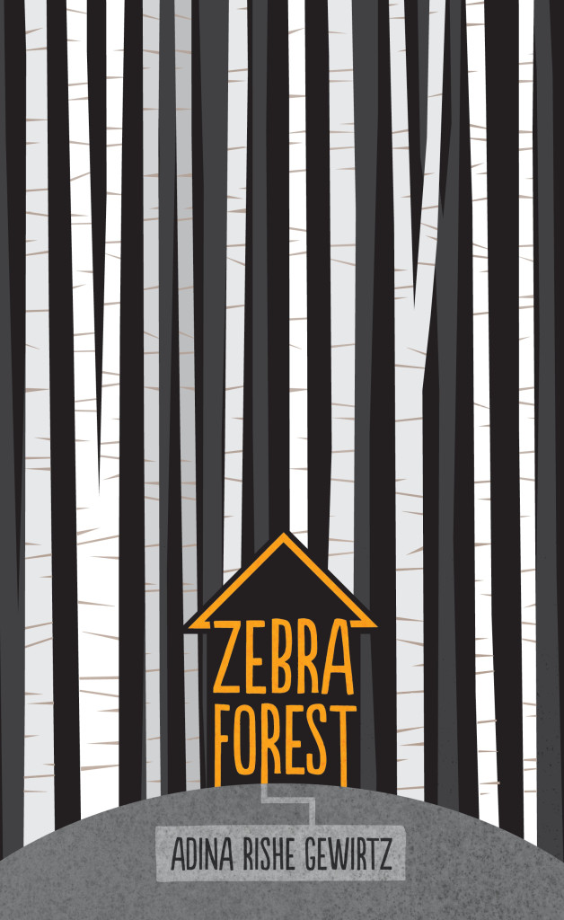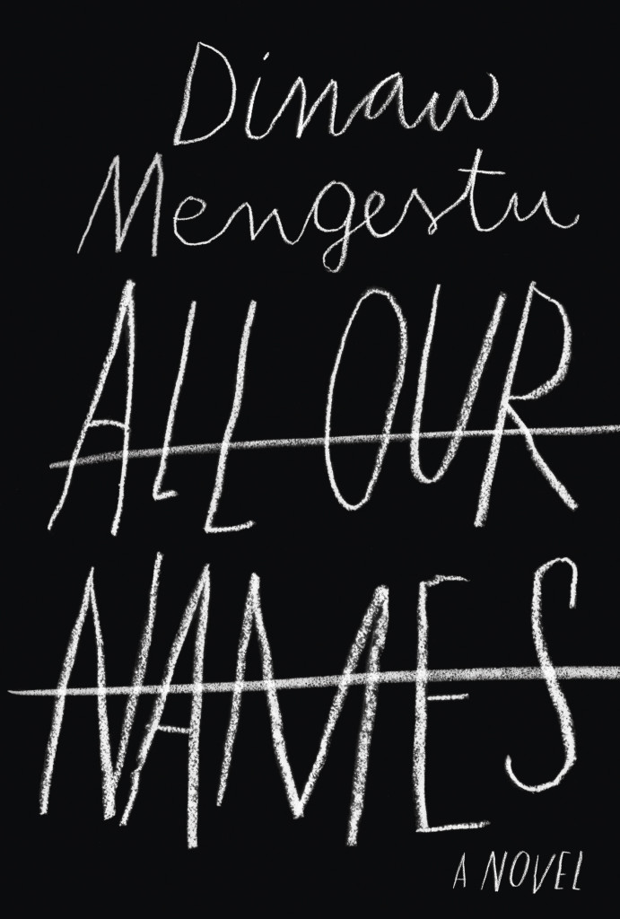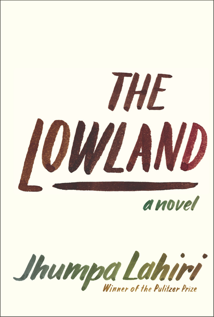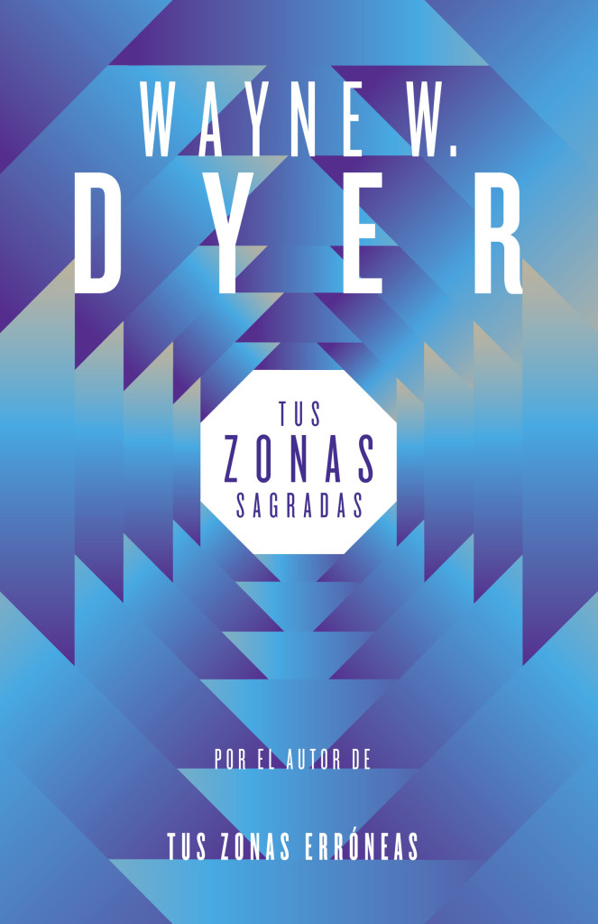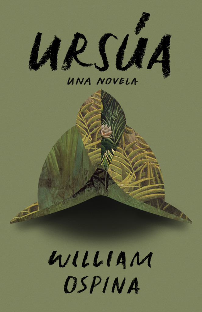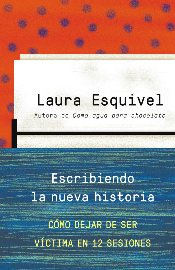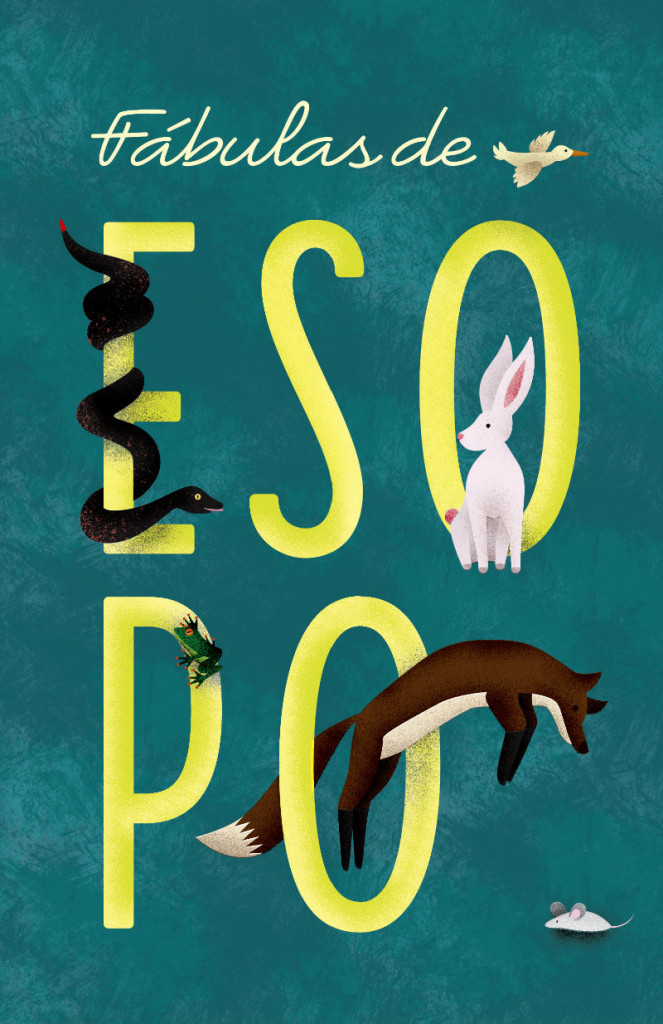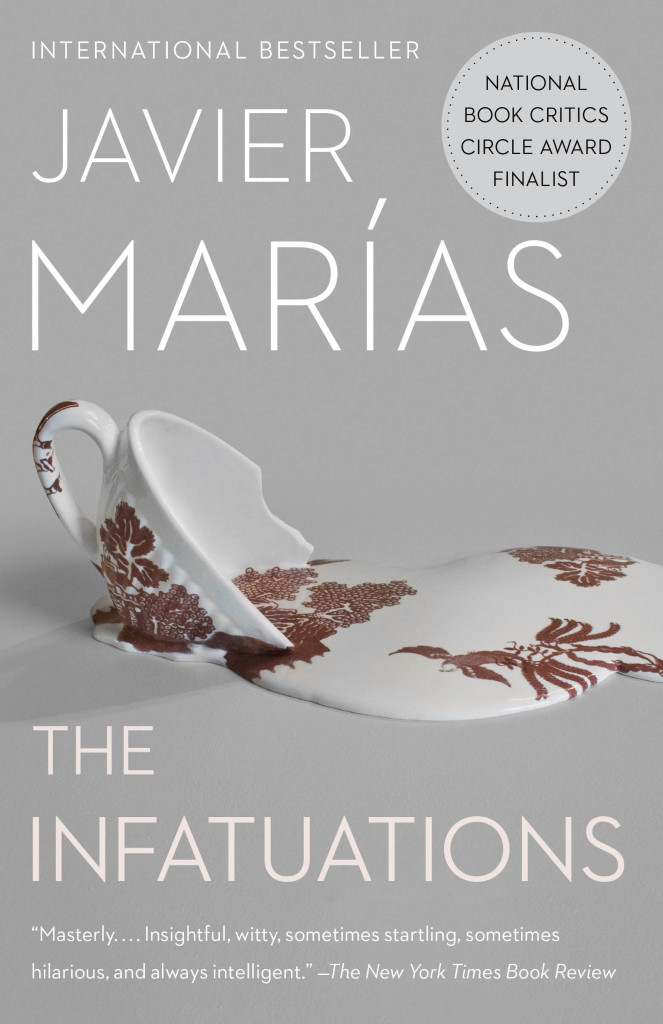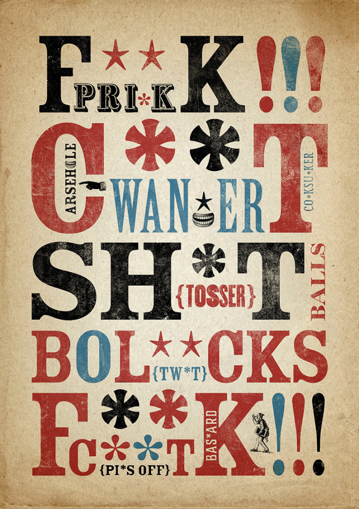
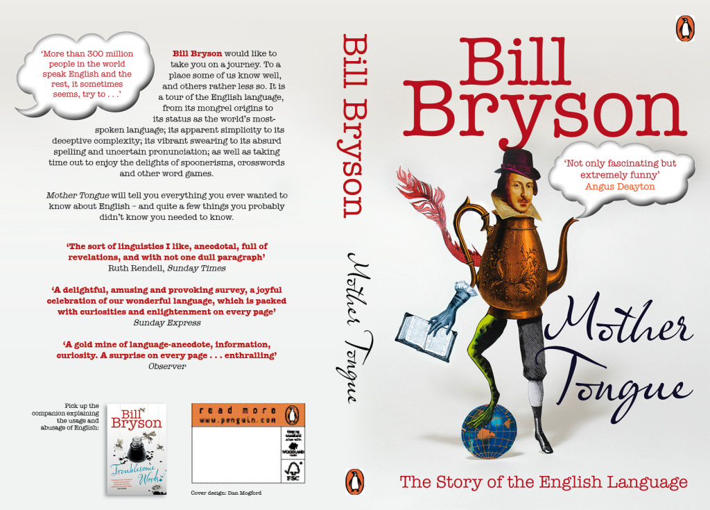
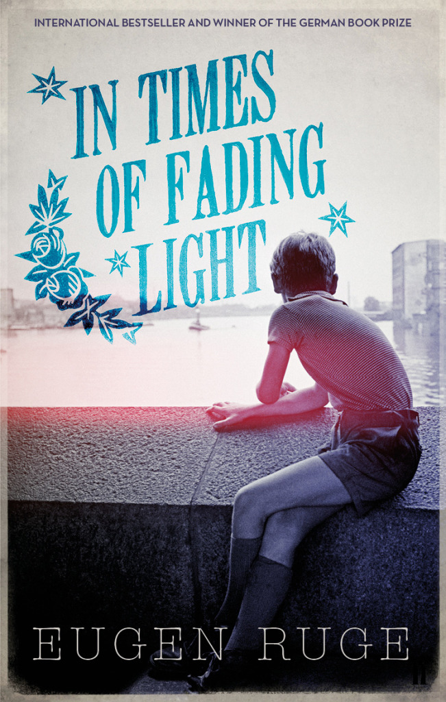
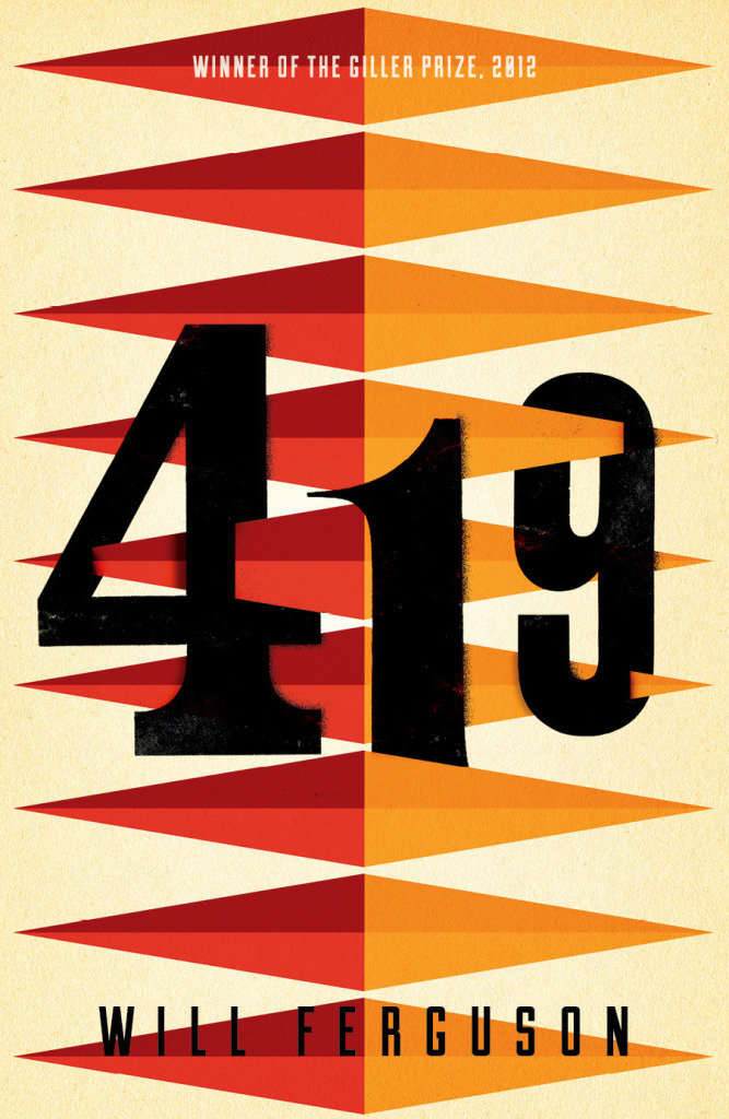
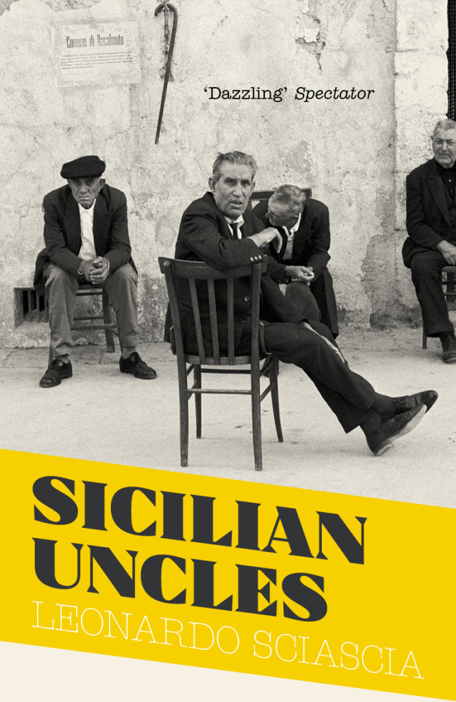
If you’ve followed this blog for a while, you will surely have a come across the work of London-based freelance designer Dan Mogford before. His work — including covers for 419 by Will Ferguson, All Over the Map by Michael Sorkin, and Filthy English by Peter Silverton (pictured above, and now available as a poster should need the swears on your wall) — has been featured here on numerous occasions over the years. A longer feature on Dan’s work has felt overdue for some time now, and so I’m very pleased to finally have Q & A with the designer himself on the blog today. Dan and I corresponded by email…
Do you remember when you first became interested in design?
Although I was exposed to design from a young age. I was always sure I would end up in a scientific career – I was all set on becoming an oceanographer or marine biologist, then around the age of 16 I was given a black and white darkroom kit by a friend of the family and was hooked on the whole process immediately. Within a year I’d applied and been accepted onto a foundation art course despite the fact I was doing science and maths A-levels. This was also around the time that Pixies came screaming onto the indie music scene and Vaughan Oliver and Simon Larbalestier’s bonkers, twisted, dark and sexy artwork for the albums struck a chord with my tortured 18-year-old psyche…
Was anyone else in your family creative?
My father was an engraver for The Royal Mint, first in London then later in Wales where we relocated when I was 4. He designed and engraved coins and commemorative medals for a variety of countries and organisations around the world so I spent a lot of time watching him hand-lettering then intricately carving type and images into these large plaster discs, which would later be somehow magically turned into little metal stamps for coin minting.
Did you study design at school?
When I finished secondary (high) school I went off to do a one year art foundation course with a fantastic array of tutors and access to screen printing, etching and some very clunky early Macs (1991!) which eventually lured me away from the darkrooms. From there I went to Central Saint Martins to study Graphic Design after I realised that type didn’t just belong on a label underneath photographs.
Are your kids interested in design?
My wife is a textile designer so their exposure to art & design has been a constant, whether it’s books at home or trips to galleries and visits to friends who work in similar fields. I’m secretly hoping one or all of them will rebel and go into law or marine biology though.
Where did you start your career?
During the second year of my degree course I wrote to the art departments of virtually every major publishing house in London asking for a summer holiday work placement/internship – only one of them replied! I did 3 seperate placements with the Pan Macmillan design crew thanks to the lovely Art Director Fiona Carpenter. When I left college Fiona put me in touch with a design studio called The Senate where I ended up working for 4 years on predominantly book related projects for the likes of Penguin, Random House and Macmillan – among many others.
Why did you decide to go freelance?
I went freelance in January 2000, bitten by millenium fever and the realisation that I’d gone about as far as I could in the small design studio I was at. I think being freelance was for me inevitable as I’ve never been very good at being told what to do by other people! I’m lucky it worked out for me, I’ve had certain clients since I went freelance fourteen (!) years ago and have worked with a huge variety of brilliant people in that time. Also some idiots.
What advice would you give a designer thinking about going out own on their own?
If you’re considering it then you’re halfway there. Don’t overthink it, don’t fret, go for it. What’s the worse that could happen?
What are your favourite kinds of projects?
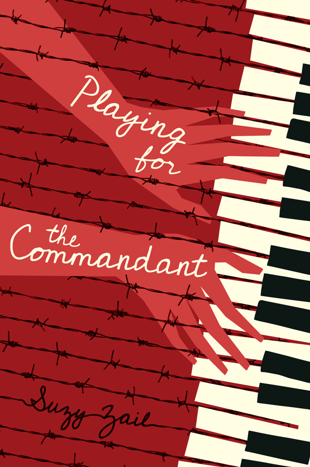
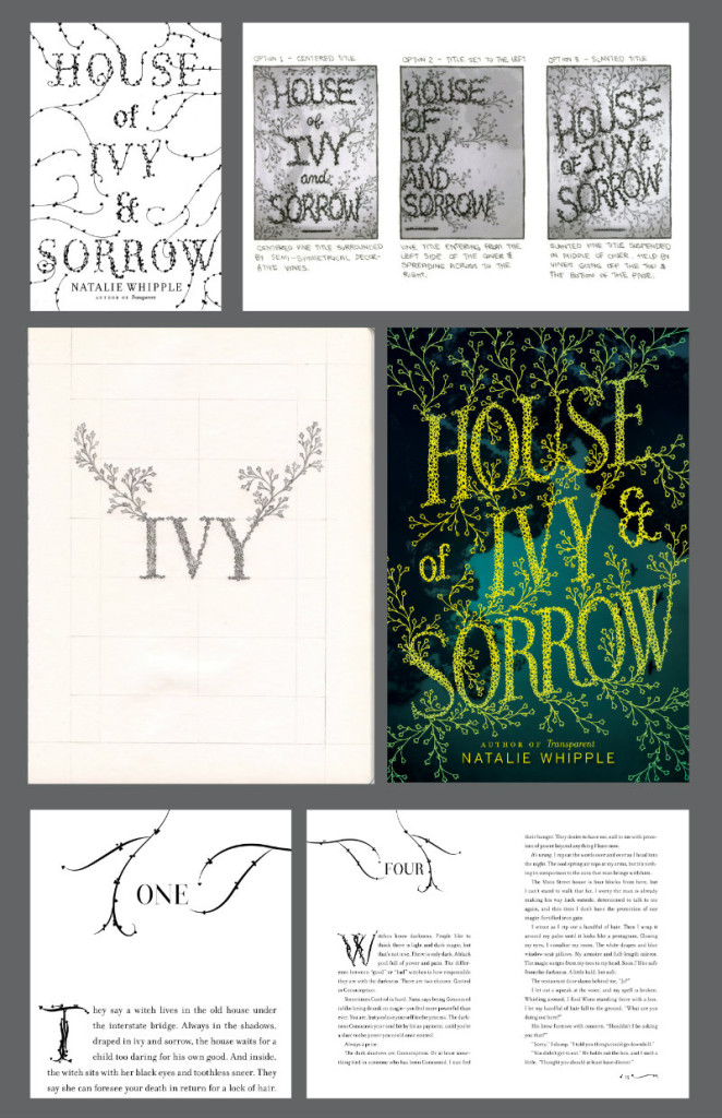
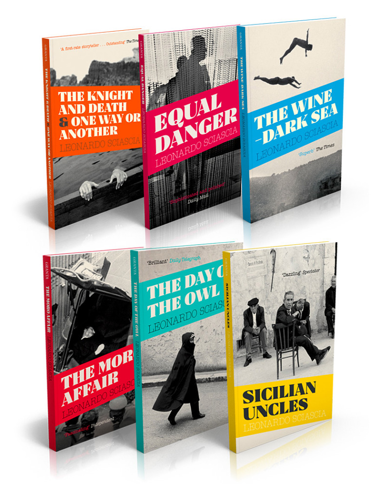
I seem to have worked on quite a few series designs in the last couple of years and have realised that I really enjoy the challenge and constraints that entails. I like solving the problem of branding a set of books that hang together while still letting each have their own distinct, individual voice – and it really appeals to the collector in me.
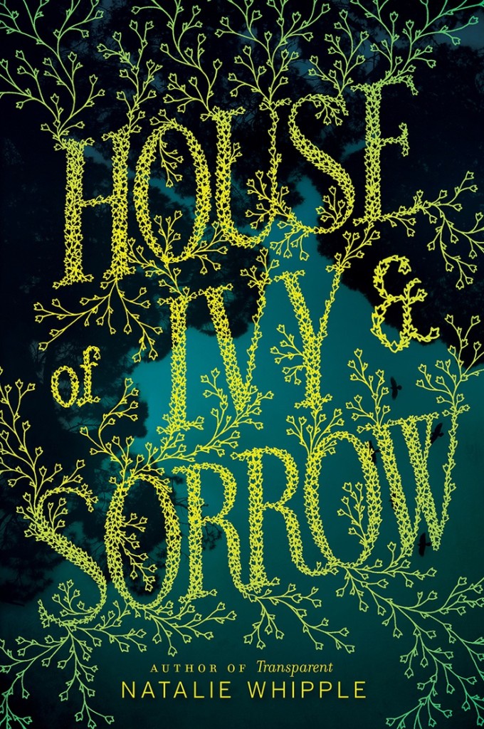
What kind of books present the greatest creative challenges?
Again a series design can be challenging but very rewarding if you crack it. I’m really not a fan of the hastily written brief with a scattering of Amazon thumbnails ‘for reference’ and a ‘do whatever’ undertone. You’d think that carte blanche was a gift to a designer but those jobs always end up rumbling on and becoming headaches as there’s been no thought about a clear direction or postioning for the book. Some constraints are a good thing to rub against and work with.
Can you describe your process for designing a book cover?
Sketching and doodling and hot shower meditation. I always draw lots of scrappy little thumbnails of ideas as they occur to me along with word lists and diagrams with arrows linking things. Lots of arrows for some reason… When I have a good feeling about an idea I’ll refine it to a more polished visual on the Mac to a point where it can go into a cover meeting by itself and face the scrutinity of the meeting without me there to defend or excuse it. Then of course comes the email requesting a few tweaks and so it goes on. Occasionally a great idea will survive the sales department waterboarding unscathed – that makes it all worthwhile.
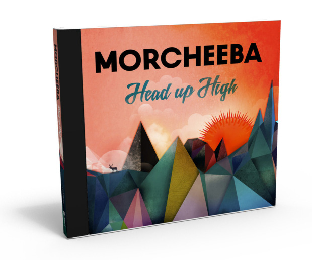
Do you approach music packaging differently from book covers?
I think they’re actually very similar disciplines in that you’re trying to distill the essence of the thing into a visual that will connect with people in some way while respecting the content that another person has poured a good chunk of their life into creating. I think as with great book designs the conent and the package can become inextricably linked but record design can only do so much – music can be quite resistant to visual interpretation, more so than the written word I think.
You were suddenly taken ill at the end of 2012. Have you fully recovered?
For anyone who hasn’t yet been bored to tears by my health history, I had a heart infection which came out of the blue and very nearly killed me. I had open-heart surgery followed by several months of hospitalisation and recovery but can safely say I’m 99% back to the stubborn, easily distracted muppet I was before my illness. Thanks for asking.
Did your illness change your approach to work? Do have a different perspective on it than before?
Absolutely. I’m a lot less tolerant of bad clients! I sacked a few within a couple of months of getting back to work properly and am much more picky about who I work with and what on. Life actually is too short. I’ve also started a little sideline business producing art prints from my collection of printed ephemera and packaging because it makes me happy and the marketing department consists of ME.
Who are some of your design heroes?
Vaughan Oliver is the main reason I got into this graphic design lark. He let me shadow him at 4AD for a day while I was doing my design degree which only confirmed his likeability and genius.
Also: Lustig, Sagmeister, Conran, Kidd.
Who do you think is doing interesting work right now?
In terms of book design, I’m not going to stroke/stoke the egos of the UK book design Mafia anymore, they know who they are and they’re all bloody fabulous people and constanly inspiring. Same goes for that lot over the pond. Bastards. Also more generally: Dan Cassaro, Elana Schlenker, Rob Lowe, Marcus Walters, Steven Wilson, Dan Matutina…
What‘s in your ‘to read’ pile?
I’m gradually working my way through a list of classics I feel I should really have read by this point in my life – I’ve just finished Jamaica Inn and made a start on Love in the Time of Cholera. I also have a few classic ghost stories lined up for the darkening autumn evenings…
Do you have system for organizing your books?
None whatsoever. I love having slippery piles of books all around my studio. They give off a barely discernible warmth and are good company now I work alone.
Do you have a favourite book?
Enid Blyton’s Faraway Tree series were the first books I remember my mum reading to me as a child. She carefully kept them in pristine condition and I’ve just finished reading them to my son Milo who adored them too.


What does the future hold for book cover design?
I think we’re at an interesting point in the story of books and their covers. I’m certainly being asked to consider the whole book package more frequently than I once was – things like cloth colours and foils on hardbacks as well as endpaper designs, varnishes and other little flourishes that make the physical book the covetable item an ebook can never be. Some design briefs demand that the cover works strongly as an Amazon thumbnail which is an interesting constraint akin to designing stamps or matchbox labels – a reductive process and simplification that isn’t necessarily a bad thing. I don’t think books as objects are going to vanish any time soon and whatever happens down the line – products physical or digital – will always be packaged.
Thanks Dan!
Comments closed