Skip to content

Tag: printing

Where Hollywood’s Printed Props Are Made

Special effects designer Adam Savage (Mythbusters) visits the warehouse of The Earl Hayes Press, a prop house that’s been making printed material for Hollywood movies for over hundred years. Fake newspapers, magazines, currency, and product labels all came from their printing presses. Historian and archivist Michael Corrie of YouTube channel Props To History walks Adam through some of the iconic props that originated by the press, including Blade Runner‘s ID badges and, incredibly, the passports and letters of transit from Casablanca. So good.

(via Waxy)

Comments closed

How a Book is Made

Moon Witch, Spider King cover design by Helen Yentus; illustration by Pablo Gerardo Camacho

The New York Times takes a look at how books are made, following Moon Witch, Spider King, the second novel in the Dark Star trilogy by Marlon James, through its printing process:

The book jacket was manufactured first. The cover of “Moon Witch, Spider King,” printed at Coral Graphics Services in Hicksville, N.Y., was unusually complicated, with a vivid mix of bright colors. James, who used to be a graphic designer, joked that his previous profession — and accompanying opinions — made him “the worst type of person” to consult on the cover.

Most covers are printed using black, cyan, magenta and yellow ink, but two additional colors were used to print this one: Day-Glo green and a special blue. The machine above is loaded with 8,000 sheets of paper at a time, which are then fed through the press. Each section of the machine contains a separate tank of ink, one for each color.

There are some lovely behind the scenes images if that is your kind of thing.

Comments closed

The Counterpress x Derwent

A lovely short film about The Counter Press, a design studio and letterpress workshop in east London: 

Comments closed

Alan Kitching: “I always try to have some logic to the job”

AK_FULL-BOOK-Dec-15-58

Related to my post earlier today, typographer Alan Kitching also talked to It’s Nice That this week about printing with letterpress, and a new monograph documenting his work:

Kitching started Omnific studio with Martin Lee and Derek Birdsall, who he had met through Anthony Froshaug, in the late 1970s. They worked from a studio in Covent Garden, then still surrounded by typesetters and other service people, until rents shot up and they moved out to a toy factory in Islington. By this time some foundries were starting to sell off their type, and Omnific bought up a press and installed it at their new studio: “All this type was selling off cheap, cheap-ish, and it was the last chance to get this stuff. So we bought it all and I continued printing there for around three years until I decided I wanted to leave. I didn’t really know what I was going to do but I wanted to buy the press and the type and go and print somewhere”, Kitching says. “I didn’t want to be a jobbing printer but I wanted to start out on my own. It was a very precarious thing to do because we were successful, well-established, and I was taking a backwards step, it was a bit of a leap in the dark.”

AK_FULL-BOOK-Dec-15-72

The new book, Alan Kitching: A Life in Letterpress, will be published Laurence King on April 7. A ‘Collectors Edition‘ of only 200 copies featuring a limited edition, numbered print by Kitching will also be available. Laurence King have produced four short teaser trailers for the book:

Comments closed

Aldus Manutius and the Roots of the Paperback

aldus

The New York Times visits ‘Aldus Manutius: A Legacy More Lasting Than Bronze‘, an exhibition of nearly 150 books from the press Aldus founded in Venice in 1494:

Gutenberg may have invented the movable-type printing press, used to create his monumental Bibles. But anyone who has ever sat in a cafe, or in the bath, with a paperback owes a debt to Aldus and the small, cleanly designed editions of the secular classics he called libelli portatiles, or portable little books.

“It’s become a cliché to call them the forerunners of the Penguin Classics,” G. Scott Clemons, the president of the Grolier Club, said during a recent tour of the installation in progress. “But the concept of personal reading is in some ways directly traceable to the innovations of Aldus’s portable library…”

…The Aldine Press, in its start-up phase, emphasized Greek and Latin lexicons and grammar manuals. In 1495, Aldus began publishing the first printed edition of Aristotle. In 1501, he released the first of his small octavo editions of the classics, books “that could be held in the hand and learned by heart (not to speak of being read) by everyone,” as he later wrote. The show includes 20 libelli portatiles, all bearing Aldus’s printer’s mark, a dolphin curled around an anchor. (The colophon is still used today by Doubleday.) Some of the books were treated as treasures, and customized with magnificent decoration that harked back to the tradition of illuminated manuscripts. Others were workaday volumes, filled with marginal scribbles….

…Aldus’s contributions to the art of printing [include the] first italic typeface, which he created with the type cutter Francesco Griffo, a shadowy fellow who broke with Aldus acrimoniously and then slugged a man to death with an iron bar before reputedly meeting his own demise at the end of a hangman’s rope. Italics, which were intended to mimic the humanist handwriting of the day, first appeared in a modest five words in a 1500 edition of the letters of St. Catherine and soon spread to other Aldines, and beyond.

And then there was the roman typeface devised for a 1496 book by the humanist scholar Pietro Bembo — the inspiration for the modern font Bembo, still treasured by book designers for its grace and readability.

“The book itself is almost frivolous,” Mr. Clemons said of the text, which recounts a trip to Mount Etna. “But it launched that very modern typeface.”

The exhibition runs until April 25, 2015.

Comments closed

Portrait of a Letterpress Printer

Portrait of a Letterpress Printer is a short documentary about William Amer, a letterpress printer and instructor based in Rockley NSW, Australia. I have serious shed envy…

Comments closed

Creative Characters: Erik Spiekermann

P98a-spiekermann

Type designer Erik Spiekermann recently spoke to MyFont’s Creative Characters newsletter about his career and his return to letterpress printing:

I think it’s very appropriate to discuss the new interest in analog technologies, and the ways that young people are now finding to combine the analog and the digital. In fact, the difference between the two is disappearing. As type specialist Indra Kupferschmidt also remarked recently — there’s no longer any reason to make things for the screen that look worse than designs made for print. Anybody who does layouts for the screen must know about type and typography just as well as someone who designs for paper. So what counts is, just like before, how to get the message across. We have the technology, there is no more excuse for a job badly done.

What I find very interesting is the movement of people who are savvy in digital design but are genuinely interested in analog techniques. It is now more than a passing trend; there must be a deeper motive why we are newly interested in the hand-made and the haptic, material and three-dimensional aspects of type and design.

Comments closed

Church of Type

church-of-type
Church of Type is the new letterpress studio in Santa Monica, California, of veteran designer and printmaker Kevin Bradley. In this lovely short film, Bradley talks about relocating to Los Angeles, typography, the printing press, and making things by hand:

Comments closed

Gerhard Steidl Interview — The Talks

Steidl_SS_14
The Talks has a nice new interview with German art book publisher Gerhard Steidl:

Most of the publishing houses in the world are owned by shareholder companies and their interest is to make profit. My publishing house is a private business. I founded it in 1968 and it is still owned by me. It is a family business. It is a Manufaktur and we don’t set any limits on cost. A Steidl book is always made in Germany, in Göttingen, in Düstere Straße 4 and there is a guy, Gerhard Steidl, who is hands on. So, believe it or not, I oversee every sheet that tumbles out of our press. This craftsmanship and this know-how we bring to every one of our babies, our books, makes a huge difference compared to the production processes of other companies.

plakat_steidl_lowres

Steidl was, of course, the subject of the 2010 documentary How to Make a Book with Steidl:

Comments closed

Typecaster For Life

“I thoroughly enjoy the sound of the machines turning, and seeing the type come out is a joy”

A really wonderful short film about 80 year-old Lewis Mitchell who has been maintaining Monotype casting machines for 62 years and continues to do so for Arion Press:


Comments closed

Something for the Weekend

Adrift in the World — Tim Parks on fiction and place for the NYRB Blog:

If there is a problem with the novel, and I’m agreed with [David] Shields that there is, it is not because it doesn’t participate in modern technology, can’t talk about it or isn’t involved with it; I can download in seconds on my Kindle a novel made up entirely of emails or text messages. Perhaps the problem is rather a slow weakening of our sense of being inside a society with related and competing visions of the world to which we make our own urgent narrative contributions; this being replaced by the author who takes courses to learn how to create a product with universal appeal, something that can float in the world mix, rather than feed into the immediate experience of people in his own culture.

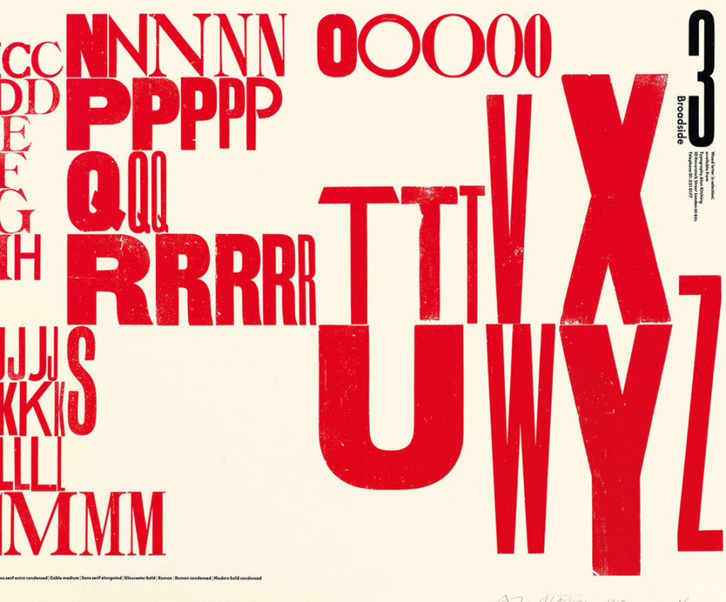
The Degree-Zero of Typeage — The “un-Google-able” Jenny Hendrix on Tintin for LA Review of Books:

Hergé himself described Tintin as the “degree-zero of typeage — a typographic vanishing point.” The formulation suggests Samuel Beckett, and there is indeed something Beckettian about Tintin. In French, appropriately, the phrase “faire tintin” means something approximating “to go without” or “to be frustrated.” Tintin may be a reporter, motivated, like any good journalist, by the hint of a good story, but only in his very first of his 24 adventures does he actually file copy. He was born 15, and supposedly stays that way, though it is hard to imagine he’s any age at all. He has no last name, no parentage and no past, no desires and no sexual identity. Even his appearance has little to say about him: his face is just a circle, with two black dots for eyes and a black, semi-circular wedge of mouth. He could be anyone, and frequently is…

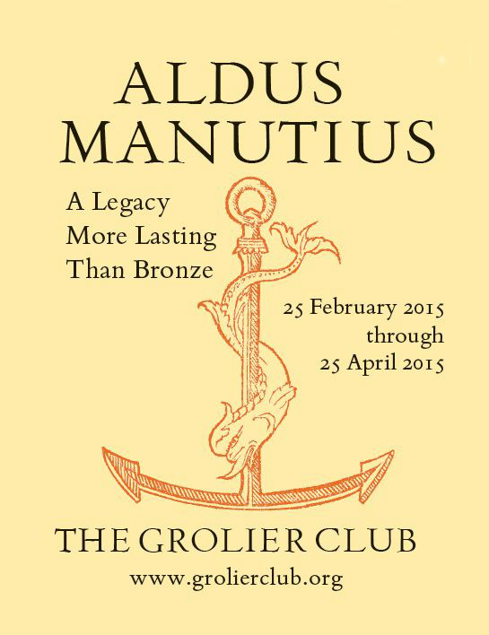
Super-Punch — The New York Times reviews ‘Printing for Kingdom, Empire & Republic: Treasures From the Archives of the Imprimerie Nationale’, an exhibition of historical steel punches, copper matrices, and typefonts at the Grolier Club in New York:

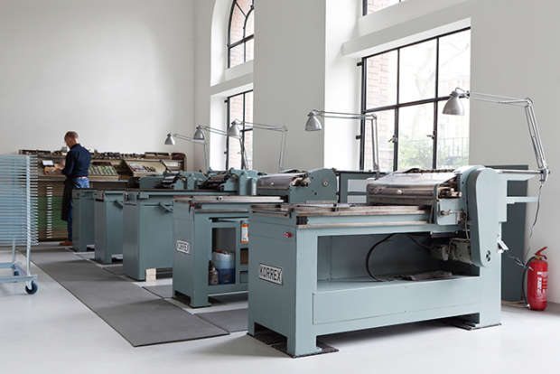
[T]hese exquisite artifacts… offer a reminder, in the ethereal era of bitmapping, that type was once the tangible province of engravers and metal casters who labored in unforgiving but enduring media. To make a C with a cedilla, for example, involved a lot more effort and thought than holding down the Option key on your Mac. A comma-shaped steel appendage had to be lashed with string to the bottom of the C punch to produce a new matrix.

“People are practically printing books with their smartphones,” Mr. Fletcher said, in a tone suggesting that he did not think this was such a good idea. “It’s much more gratifying to be able to touch something and find out it’s real, rather than a matter of bits and bytes.”

Comments closed

Letterpress | Naomie Ross

Here’s a nice short instructional video about printing with letterpress by New York-based designer Naomie Ross:

(via Nice Type)

Comments closed