Skip to content

Tag: princeton architectural press

Kodak: Bankrupted By Its Own Innovations

In an interesting piece on the decline of Kodak, Kenny Suleimanagich describes how it was not simply a reluctance to innovate that caused problems at the company, it was that they brought their innovations to market too early:

No matter what [Kodak] came up with, nothing digital would sell. To consumers, everything was too expensive, and to professionals, the quality was not yet good enough. “It was a difficult thing to market,” [computer engineer Peter] Sucy admits, “especially for people who didn’t have any kind of experience marketing this kind of product; people who didn’t really know what it did.”

In the end, being early did not help, because the market simply wasn’t ready. As obvious as the endgame was, Kodak’s leaders were faced with an unwinnable predicament: either keep investing in end-of-life products until the profits dried up — and die over the long run; or switch to stillborn product lines that produced mostly red ink in the ledgers — and die immediately.

In his book, The Disappearance of Darkness: Photography at the End of the Analog Era, published by Princeton Architectural Press, Toronto-based photographer Robert Burley documented the closure (and destruction) of the Kodak facilities in Rochester, Toronto, and Chalon-Sur-Saône. Pictured above are Burley’s photographs ‘View of Kodak Head Offices from the Smith Street Bridge, Rochester, New York 2008’ and ‘Implosions of Buildings 65 and 69, Kodak Park, Rochester, New York [#2] October 6, 2007.’

Burley talks about the project and the book in this short video:

A slightly longer 5- minute short about the project can be found here.

(On a related note–at least in my brain–the New York Times reported on the resurgence of vinyl over the weekend. The manufacturers are apparently having some difficulty meeting demand. The last new press was built in 1982. Perhaps analogue photography just isn’t out-of-date enough yet for some people?)

(And full disclosure etc: PA Press are distributed in Canada by my employers Raincoast Books)

Comments closed

Q & A with Nigel Peake

I first saw the work of Nigel Peake in his book In The Wilds, published by Princeton Architectural Press in 2011. Collecting Nigel’s beautiful and meditative drawings and watercolours of rural landscapes and buildings, the book reminded me of both of the work of Paul Klee (Highways and Byways, for example) and Rings of Saturn, W. G. Sebald’s discursive record of ambling through East Anglia.

I subsequently discovered, of course, that Nigel had already produced a significant body of work prior to In the Wilds, including illustrations for Ninja Tune, Hermes, the Royal Horticultural Society, Habitat, The Believer and Dwell magazine, as well as several books.

And in this shiny digital age, there is undoubtedly something wonderful in Nigel’s meticulous hand-drawn maps and tumbledown sheds. We corresponded by email.

Do you remember when you first become interested in art and illustration?

I feel like I have always drawn. Some of my earliest memories are associated with painting and the things that surround it, the plastic containers that held the primary colours and the smell from the cheap paint. When I was growing up I did not really think in terms of design or illustration I just had a wish to draw all the time. And that is still true now, I type this surrounded my paints, pens and paper… so maybe not much has changed. Drawing for me, is essentially a way of thinking through a thought or an idea, to document and try to understand what is around me.

What was your first job as illustrator?

When I was still studying and finishing my architecutural thesis I designed a snowboard graphic for a company in California. After that I worked on a project with Ninja Tune

And how did the project for Ninja Tune come about?

In truth I am not too sure, I remember leaving a zine for DJ Food when he was djing at Edinburgh, I was not even thinking of it in terms of work , I just wanted to share my work with those that I admired. One way or another I ended up drawing the artwork for the Coldcut ‘Sound Mirror’ LP and singles. They were really nice people to work with and I have made a few other things for them since.

You’re also an architect as well as an artist. How does that inform your work?

I am not a ‘complete’ architect – in that I have yet to finish it professionally. I did study it for 6 years. Studying architecture did not directly affect how I draw, but it did introduce me to a lot of different ways of thinking. I read a lot of interesting books and listened to some wonderful conversations. It was hard work, and the studio ethic of working all day is still engrained in me. I am interested in architecture and how it holds all these moments that occur every day. I recently made a book about the bridges of London, these fantastical structures that essentially have become invisible to those who live there. It is amazing to be in a city and look around, and you have all these forms and shapes that where designed and made by us. It is the combination of our efforts.

Why did you decide to move away from the city?

It was not intentional, it just happened. I was tutoring and drawing projects and then I seem to end up in the country, I probably got tired of being in a city. I had been living in Edinburgh for 8 years. At the moment I travel a lot with my work so it is nice to live somewhere that is quiet and simple, and a place that I want to return to.

What is it about the details of vernacular architecture that particularly interest you?

I am not sure, it is probably because it is what I have grown up around. I enjoy how things are put together, and vernacular architecture is very honest in that respect – you can see what holds what up.

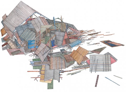
Also a lot of things fall apart because of the wind and the rain and old age, and I find this equally beautiful because when this happens you see all the parts that where previously hidden to the world.

It is an architecture determined by what is close to hand and so the materials and colours used are more interesting. Blue twine holds it together and plastic bags and old gates bridge the gaps.

Is there a tension between your love of the countryside and your fascination with built structures?

Not particulary, probably because I look at them with the same interest, when I look at a leaf I am still amazed by the detail and the wonder of it and then when I look at a skyscraper I can not believe that we can make such incredible structures. The only tension is that if I spend too long in a city I want to go to the places where there are no buildings, I particularly miss the sea if I have not seen it for a while.

Do you take a lot of photographs or do you rely more on sketchbooks?

I do take photographs, but not to draw from, but just to remember things that I see along the way. I also like how a camera allows you to frame what is around you – by taking a photo of something you edit everything else around you and that one moment is held. I keep sketchbooks and draw in them every day not because I think it is fashionable or because I think I should but because I will forget things – so I use them to hold those things that might turn into something someday. I think this idea of keeping a book comes from school because for years we sat at tables with books marked maths, geography, chemistry… so it seems normal to keep writing and drawing things into a book.

Apart from nature and buildings, where do you look for inspiration?

Nearly everything I see has an affect upon me, one of my favourite things is to sit and just look, not as a form of procrastination but as a way of observing what is around me. There is so much to see and hear in everything.

Beyond what I see, I know that music is probably my biggest influence. In the same way that I have early memories of drawing – these are entangled with memories of music. My mother played Gracelands on repeat in the house or the car. And my father always had Pet Sounds. On a Friday night we would have record night and each of us would get to choose one to play. I always listen to music when I am drawing or making things. It is such a beautiful thing to close your door for a while, sit at your table and put on a record and simply draw.

You publish some of your work with Analogue Books in Edinburgh. How did that come about?

I studied architecture in Edinburgh and Analogue opened a few years after I had arrived. I remember going in and liking the books they had and more importantly the people who owned it seemed kind. And so I started to bring some work in and got to know Russell and Julie through that. Since then we have published zines and books and exhibitions and probably eaten a lot of McVities biscuits. They are some of the best people I have met through my work. Hopefully in the next few months we are going to make some new things.

Your work does seem particularly well suited to the books. Are you interested in the juxtaposition of word and pictures?

Books are wonderful objects. There were a lot of books around me when I was growing up.

The possibilities are endless, in terms of what words and pictures can do. Making a book is as close as I will get to making an album. With this form, you can tell a story or not, but with each page you can explore an idea, knowing that it will be seen after what went before, so for me there is a beautiful rhythm to a book. The flicking of a page has great joy in it. For now I like making work as a series ( maps, sheds, bridges, birds, billboards, cameras…) and so books are perfect for this exploration.


Who are a few of your favourite writers?

To name a few who I can always return to, in no order.

John Steinbeck, Earnest Hemmingway, F Scott Fitzgerald, Seasmus Heaney, George Simenon, Maj Sjowall and Per Wahloo, Francis Ponge, Jorge luis Borges, Gaston Bacherlard, Walter Benjamin, Arthur Conan Doyle and John Cheever.

What are you reading currently?

At the moment I am living in Austria and have read all the books I packed so for now I am reading the newspaper.

Thanks Nigel!

Full Disclosure: In the Wilds by Nigel Peake is published by Princeton Architectural Press, and distributed in Canada by my employer Raincoast Books.

7 Comments

Minka

Minka is an award-winning documentary short based on John Roderick’s memoir about the traditional hand-built farmhouse he acquired 1967 while working for the Associated Press in Japan. Filmed just following Roderick’s death at 93, the film interviews architect Yoshihiro Takishita, Roderick’s adopted son who worked on the house, and explores themes of place, memory, architecture, and home. Beautiful:

Comments closed

In the Wilds | Nigel Peake

With the winter winds and driving rain, things naturally fall apart — twisted, gnarled, and eventually incapable of function. When something goes wrong, the solution is often improvised with whatever is available. This haphazard collage of old materials can make it feel as if the country is in a constant state of disrepair. The fences and gates, in particular, embody this with their bespoke supports. When one part collapses or a hole appears, the ubiquitous blue twine come out to bind everything together. Sometimes the original structure disappears altogether, and all that remains is the collection of parts propping it up. With this unspoken artistry, the unexpected is made.

From the introduction to In the Wilds by Nigel Peake

One of the joys of working at Raincoast Books is receiving books from New York-based publisher Princeton Architectural Press in the mail. This week, a beautiful  6″ by 8″ hardcover called In the Wilds by artist Nigel Peake arrived.

Peake who has worked with the likes of Ninja Tune, The Believer, Blueprint, and Dwell Magazine, lives and works in the Irish countryside (the self-described “middle of nowhere”). In The Wilds collects together his obsessively detailed drawings and watercolors of this rural life — the trees, fields, lakes, and rolling hills, but also farm houses, tractors, fences, and telegraph poles.

It is simply lovely.

Comments closed

Back from Vancouver

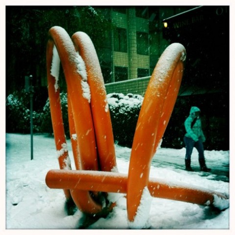
I was in Vancouver last week for the Raincoast Books Spring 2011 sales conference. It snowed (see above) and I heard about a lot of new titles I’m looking forward to seeing next year (I can’t wait to get my hands on a finished copy of Into the Wilds by illustrator Nigel Peake for example). I also caught up with some old friends, stayed up too late, and managed to get sick. Needless to say, I’m a bit behind with this internet thing. I will be trying to catch up this week, but things are likely to be a bit wonky around here for the next few days (and I apologise if I owe you an email). Thanks for your patience…

Comments closed

Turning Towards Our Shelves

Ellen Lupton, author of Thinking With Type (interviewed by me here), interviews graphic designer David Barringer about his new collection of essays There’s Nothing Funny About Design over at Design Observer today.

It’s a wide ranging interview — mostly about design unsurprisingly — but a couple of paragraphs about books caught my eye:

I do think that ebooks are a step backwards, however. It’s like the fax. It’s not flexible or useful enough. Handheld computers should have greater power, and the Kindle instead has less. You should be able to access encyclopedias, dictionaries, and other searchable resources, just like we can on the computer or the iPhone. That’s where the real benefit of portable handheld units are. Who cares about downloading Twilight? I care about having access to entire online libraries of reference works, maps, and encyclopedias.

I’ve sort of come to the same conclusion. If e-readers are less convenient than cell phones, less useful than laptops, and less durable than books, what’s the point?

Anyway, David Barringer goes on to discuss our enduring emotional connection with book-books:

I’ve seen many friends who are avid readers turn toward their shelves of books and regard them as they would a photo album of their own lives. We take the contents of books into our imaginations, and our personalities are influenced by them. Looking at the books on my shelves, I feel memories bloom, my own life come back to me. Books are triggers for remembering where we have been, and who we are. A book is like a body part, and when you die and your connection to the book is broken, the book dies a little, too.

I thought that was rather touching…

Link

(NB Full Disclosure: Thinking With Type and There’s Nothing Funny About Design are published by Princeton Architectural Press, who are distributed in Canada by my employer, Raincoast Books)

Comments closed

Q & A with Ellen Lupton

“Ellen Lupton makes this industry smarter. If graphic design has a sense of its own history, an understanding of the theory that drives it and a voice for its continuing discourse, it’s largely because Lupton wrote it, thought it or spoke it.” — Katherine Feo, AIGA

Dedicated to raising design awareness, Ellen Lupton is the Director of the Graphic Design MFA program at Maryland Institute College of Art (MICA) and curator of contemporary design at the Cooper-Hewitt National Design Museum.

A regular columnist  for ReadyMade Magazine, she has contributed to Print, Eye, I.D., and Metropolis, and writes regularly about design at both Design-Your-Life and her own website Design Writing Research.

Her books include the indispensable introduction to typography Thinking with Type, DIY: Design It Yourself, D.I.Y. Kids,  co-authored with her identical twin sister Julia Lupton, and Graphic Design: The New Basics, co-authored with Jennifer Cole Phillips.

Design Your Life: The Pleasures and Perils of Everyday Things , another collaboration with her sister Julia, will be published by St. Martin’s Press later this year.

But, not content with being an  author, curator, designer, and educator, Ellen recently became a publisher, founding  Slush Editions to independently publish the novel Sexy Librarian by artist Julia Weist.

Sexy Librarian also features as a case study in Ellen’s latest book  Indie Publishing— a guide for independent authors written, researched, and designed in collaboration with graduate students at MICA — published in December 2008 by Princeton Architectural Press.

Ellen kindly replied to my questions about design and indie publishing by email.

And for the sake of full disclosure, I should make absolutely clear that several of Ellen’s books are published by New York’s Princeton Architectural Press who are distributed by Raincoast Books in Canada. But, for the record, that only explains why I have her email in my address book, not why I chose to interview her.

I have also interviewed Ellen previously for the Pages bookstore in Toronto.

How would you define ‘indie publishing’?
Indie publishing is author-driven. The traditional publishing industry is controlled by publishing professionals — editors, marketing people, promotional staff, and the publishers in charge. These are all skilled people. In our book, we use the term broadly, to encompass everything from handmade zines to print-on-demand books to offset publications distributed by the authors to small imprints created by design firms who wanted to get into the content business.

How is it different from the traditional publishing industry?
Because it’s author-initiated, indie publishing side-steps the traditional barriers of the publishing industry. It gets beyond the gatekeepers. Now, those gatekeepers act as guardians of quality to some degree, but they also contribute to a homogeneous and profit-driven publishing industry that many authors find hostile and hard to penetrate. Indie publishing often serves niche or local markets that can’t be addressed by mainstream publishing.

What are the benefits of publishing yourself?
If you have had difficulty breaking into the mainstream publishing world, going independent is liberating. If you end up producing a successful book, the profits can be substantial, but this shouldn’t be the main motive to get into publishing. Few authors make substantial bucks on their books — regardless of who publishes them. For most of us, writing and producing books is a labor of love.

What are the risks?
Most forms of indie publishing cost money, and that’s a risk. When you work with a commercial publisher, they foot the printing bill. Publishers also provide essential services like editing, proofreading, design, distribution, and marketing. The indie publisher has to take on all these tasks alone (or find friends to help out). It’s not easy, especially the distribution part. Self-published books are still viewed as less legitimate than commercially published books, although this is starting to change.

Do you see indie publishing as part of a wider D.I.Y. movement?
We are seeing more independent production in all creative fields — music, art, theater, design, etc. Younger creative people are interested in creating new institutions and networks outside the official art world or music/literature establishments. They are comfortable using technology to disseminate their ideas.

How has the internet affected the development of indie publishing?
The internet allows indie publishers to reach potential readers outside the bookstore system. Today, anyone can set up an Amazon Marketplace account or sell publications directly from their web sites. Print-on-demand publishers like Lulu and Blurb produce books when someone buys them, sending the finished book directly to the customer. These technologies are creating new possibilities for authors, especially those whose work is directed at narrower, smaller audiences.

What advice would you give someone publishing their first book?
Love your book. Get advice from lots of people in order to have the best possible content. Consider the different avenues that exist for publishing your work, including mainstream publishing as well as independent ventures.

Think about your audience and the best way to reach them. And think about your own primary goals for publishing a book. For example, an artist having a gallery exhibition might use a print-on-demand book as a tool for building his or her career via grant applications, networking with galleries and curators, securing lecturing and teaching opportunities, and more. A well-designed, carefully authored book has many functions. Selling copies to lots of people is just one of them. You might use a book as professional portfolio for landing a job or attracting clients — maybe all you need is a few copies.

What are some of the common mistakes people make designing books?
It’s important to use good software. The industry standard today is Adobe InDesign, which is available for both Mac and PC and can be easily learned via software manuals or technical workshops. Programs like Microsoft Word or Publisher are extremely cumbersome and will ultimately be frustrating to a person trying to design a refined and elegant book. Choosing a good typeface is also important. Avoid Times Roman, which was originally designed for newspapers and is so widely used as to be banal. Beautiful, high-quality typefaces such as  Garamond often come bundled with layout software and computer operating systems. Keeping your design simple and consistent from page to page is a rule of thumb for any book design. You also need to “unlearn” some habits from high school, such as leaving two spaces between sentences — this is not done in formal typesetting, and it will make your book look amateurish.

What do you look for in good book design?
Beautiful type, elegant margins, consistent pages.

Have you ever bought a book just for its cover?
Of course! Cover design is extremely important. A cover is not only a billboard advertising your book on a shelf, it’s also an online logo for your book that needs to look great at 100 pixels high. Getting help from a good graphic designer on your book cover is a worthwhile investment.

What will be the impact of e-books on publishing?
I believe that e-books are going to be very, very good for authors. By lowering the cost of publishing, e-books will make it easier for more authors to get their work published and to reach specific audiences who want their content. What I’m less sure about is how e-books will affect graphic designers!

Are we finally seeing the ‘End of Print’?
I do believe there is a sea change going on. After decades of unsuccessful attempts at creating electronic book readers, suddenly the time seems right. I don’t think print will disappear, but I think we will see less of it. It remains a tactile, permanent, stable medium that users can feel a personal attachment to.

What role do you think print-on-demand will play in the future?
Print-on-demand is where digital media and print meet. I think we will see a lot more of this as prices go down in the future. Ultimately, it is a more sustainable way to publish and involves less financial risk, but right now, it is too expensive for large-scale endeavors.

How will e-books and print co-exist?
E-books are great for disposable reading — magazines, casual fiction, newspapers. Perhaps every physical book in the future will come with an e-book supplement. I often want to quickly reference a book I read, and e-books would be great for that. Personally, I collect books, but I don’t need to keep the latest Richard Price book on my shelf forever.

As a designer, do you feel an attachment to print?
I am very attached to print. I don’t want to see it disappear in my own lifetime, that’s for sure. I love the tactility, permanence, and scale. But I do find myself reading more and more online.

Thanks very much Ellen!

4 Comments