Skip to content

Tag: pentagram

The Helmet of Horror | Angus Hyland

As a follow up to yesterday’s Design Matters post, I just wanted to share Angus Hyland’s extraordinary design for The Helmet of Horror by Victor  Pelevin, published as part Canongate’s Myths series a few years ago:

The illustration is by Sara Fanelli.

2 Comments

Design Matters with Angus Hyland

Pentagram partner Angus Hyland has designed book covers for CanongatePenguin and others. On the latest Design Matters podcast, Hyland discusses childhood brand recognition, Tintin, music, dyslexia, book design and his new book Symbol, co-authored with Steven Bateman, with host Debbie Millman:

DESIGN MATTERS: Angus Hyland

Disclosure: Symbol is published by Laurence King and distributed in Canada by my employer Raincoast Books. 

Comments closed

Something for the Weekend

A Sense of What’s Possible — Ramona Koval talks to Edith Grossman about her book Why Translation Matters and her translation of Don Quixote for The Book Show on ABC Radio National. From the transcript:

What I mean by ‘deep reading’…and it comes after a couple or three readings…what I mean is capturing the subtleties of what the original author is doing. Because artful language has both the stated and the unstated in it, and the stated is fairly obvious, the unstated is really what differentiates one writer’s style from another. And those unstated, unspoken elements are what I try to bring over in analogous fashion into English. That kind of reading, analysing the way parts of the sentence relate to one another and how the sentences in a paragraph relate to one another and so forth, how the paragraphs connect within the chapter, this is more intensive than an ordinary reading of a book. But to my mind it’s what I have to do in order to create something in English that feels to the English-speaking reader the way the original feels, in my case, to the Spanish speaker.

MyFonts’ Top Fonts of 2010, which includes the charming Lady René by Argentinian foundry Sudtipos:

See Also: DesignWorkLife’s favourite typefaces of 2010.

Legendary design consultancy Pentagram have launched a new website to showcase their work, including  some great book design (via FormFiftyFive).

And finally…

The New York Times looks at the work of Thatcher Wine and other designers who assemble and create custom book collections for clients (one can only hope the above was for The White Stripes).

Comments closed

Midweek Miscellany

The portfolio of Julia Hastings, Art Director of Phaidon Press (via It’s Nice That).

Rarefied Content — Alan Rapp on the future of photography books at Imprint:

[A]rguably the independently published photo book is flourishing. You can see this from the increasing popularity of on-demand printing services such as Blurb, Lulu, and MagCloud , as well as the number of successful and well-published photographers who have launched their own publishing ventures, such as Alec Soth, Richard Renaldi, and Shane Lavalette (a practice which itself has a long pedigree, from Alfred Stieglitz to Ralph Gibson). Yet this kind of kaleidoscopic output creates another issue—who but the most ardent follower can keep abreast of this vast dispersion of small-scale publishing?

The Illustrated History of Time designed by Luke Hayman at Pentagram:

And finally…

The trailer for the animated adaptation of Shaun Tan‘s The Lost Thing (via The Art Department | Irene Gallo):

I’ve posted this before, but here’s a short documentary about making the film:

The Lost Thing website.

Comments closed

Midweek Miscellany

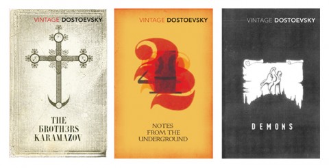
Vintage Dostoevsky, design by Michael Salu

Precisely and Concisely — The Caustic Cover Critic interviews designer and Artistic Director of Granta magazine Michael Salu:

Bizarrely, designers looking for employment are often judged by what software they’re able to use. Intellect, cultural awareness and often creativity don’t seem to be values worthy of a resume. There is no substitute for good ideas, the rest are just supportive tools. I have always been quite a craft-led designer, but I am of the generation that studied with a mac in front of them and I think its good to understand the importance of both.

The Honest Bookseller — Erin Balser of Books in 140 profiles Toronto independent bookstore Ben McNally Books for The Torontoist:

“I’d rather have a book that sells one copy that no one else will sell than to stock several best sellers you can get anywhere,” McNally says. “That’s what makes this store. That’s why people come… My first responsibility is my customer. When I think a book should be cut by a third or if there’s a subplot that goes nowhere, I have to tell you that… I’m often a very critical reader. When people come and ask me ‘Is this any good?’ I have to be honest.”

William Kentridge: Five Themes — Beautiful book design from Abbott Miller and Kristen Spilman at Pentagram.

Speaking of Pentagram… Pentagram partner Paula Scher has some blunt stuff to say about design in a interview with Pr*tty Sh*tty.

The Rules — Inspired by Elmore Leonard’s 10 Rules of Writing, The Guardian asked authors — including Diana Athill, Margaret Atwood, Richard Ford, Jonathan Franzen, Neil Gaiman, and PD James, Hilary Mantel, Michael Moorcock, Philip Pullman, Ian Rankin, Will Self, Sarah Waters, and Jeannette Winterson — for their personal dos and don’ts. (Part two is here).

On the subject of writing, the wonderful BBC radio series The History of the World in a 100 Objects has recently touched on the history of writing, literature, and mathematics in episodes about the Early Writing Tablet, the Flood Tablet and the Rhind Mathematical Papyrus. The series is a collaboration with The British Museum. Great stuff.

Diana Athill, Margaret Atwood, Roddy Doyle, Helen Dunmore, Geoff Dyer, Anne Enright, Richard Ford, Jonathan Franzen, Esther Freud, Neil Gaiman, David Hare, PD James, AL Kennedy
1 Comment

Rime

Jimmy Turrell‘s book cover illustration for Beat IV: The Rime of the Ancient Mariner, a fully illustrated edition of the Samuel Taylor Coleridge poem published by the Heart Agency to showcase the work of their illustrators. The book, designed by Pentagram, won a D&AD Award for illustration and book design.

(via We Made This)

Comments closed

Midweek Miscellany (Paul Auster Edition), November 25th, 2009

The award-winning Folio Society edition of The New York Trilogy by Paul Auster and illustrated by Tom Burns has just about blown my mind. MUST. HAVE.

James Wood on the novels of Paul Auster in the The New Yorker:

Auster is a compelling storyteller, but his stories are assertions rather than persuasions. They declare themselves; they hound the next revelation. Because nothing is persuasively assembled, the inevitable postmodern disassembly leaves one largely untouched. (The disassembly is also grindingly explicit, spelled out in billboard-size type.) Presence fails to turn into significant absence, because presence was not present enough. This is the crevasse that divides Auster from novelists like José Saramago, or the Philip Roth of “The Ghost Writer.”

(Personally speaking I think I prefer Auster’s interesting awkward failures over the portentous bludgeon prose of Philip Roth, but that’s just me…)

And, if you haven’t had enough Auster for one post, he’s also interviewed in New York Magazine.

The Making of Fantastic Mr. Fox designed by Angus Hyland — New work from Pentagram for Rizzoli.

Covers from Cleethorpes — A brief, but funny, interview with designer David Pearson at It’s Nice That.

“We Like Lists Because We Don’t Want to Die” — Umberto Eco interviewed in Der Spiegel:

The list is the origin of culture. It’s part of the history of art and literature. What does culture want? To make infinity comprehensible. It also wants to create order — not always, but often. And how, as a human being, does one face infinity? How does one attempt to grasp the incomprehensible? Through lists, through catalogs, through collections in museums and through encyclopedias and dictionaries.

An Innocent Abroad — Journalist and cartoonist Joe Sacco (Palestine, Safe Area Gorazde) interviewed about his new book Footnotes in Gaza in The Observer:

I’m a nondescript figure; on some level, I’m a cipher. The thing is: I don’t want to emote too much when I draw myself. The stories are about other people, not me. I’d rather emphasise their feelings. If I do show mine – let’s say I’m shaking [with fear] more than the people I’m with – it’s only ever to throw their situation into starker relief.

And on the speaking of comics…

Paul Gravett, author of multiple books on the art form, interviewed by Dazed & Confused:

I like the control I have when reading a comic. I’ve grown impatient and disenchanted with the tropes of a lot of movies and TV, their conventional angles and cuts, their manipulation through music, lighting, special effects and above all, the efforts of acting to make me emote. Comics struggle to make us feel anything at all… They often don’t work that brilliantly, but when they do, the impact of fixed, unephemeral, often hand-drawn images can really surprise me. It’s a primal, even primitive medium, as old as our first cave paintings, and it is still being invented and discovered.

2 Comments

5 Secrets from 86 Notebooks

“If you do what you love and you find other people who do what they love, you’ll be successful, you’ll do great work, [and] chances are you’ll actually make money miraculously enough. If you combine that with a bit of egotism and a taste for the spotlight you could also become famous, but definitely I promise you’ll be happy.”

Michael Bierut, partner at Pentagram and author of the truly excellent 79 Short Essays About Design (yes, yes, full disclosure: distributed by Raincoast Books in Canada), shares five simple secrets for doing great creative work at the 99% Conference in New York earlier this year:

.

And what does this have to do with books specifically? Well, the final thing Michael talks about is a really cool school libraries project…

2 Comments