The tale of rediscovering Sherman, a typeface designed by American type designer Frederic Goudy in 1910 and revived by Chester Jenkins for Pentagram in 2016 for Syracuse University:
Comments closed
Published February 9, 2017
Books, Design and Culture
The tale of rediscovering Sherman, a typeface designed by American type designer Frederic Goudy in 1910 and revived by Chester Jenkins for Pentagram in 2016 for Syracuse University:
Comments closed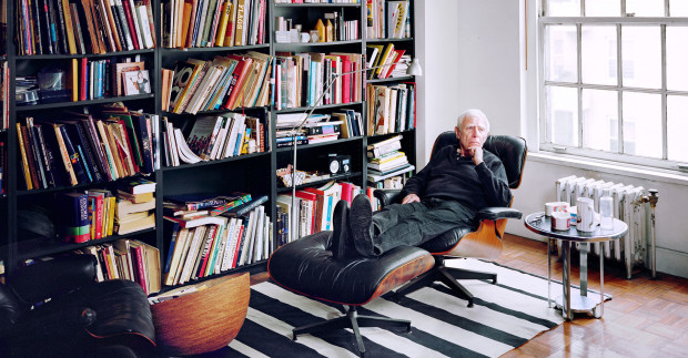
In another great profile for It’s Nice That, Rob Alderson talks designer, illustrator, and writer Bob Gill:
“I don’t know what people talk about when they talk about a golden age because of a million designers in 1950 or 1960 or 1970, 13 did anything that was worth ten cents. They can call that a golden age but the gold has been tarnished I think.”
What has changed of course is technology and the way it’s altered the design process…. In fact now that the craft side of design has become demystified and democratised, he thinks designers should be able to come into their own.
“Now for a designer to make a living, they have to do more than just know how to set some type because the client can do that. So what’s left? Well the most wonderful part is left, which is to discover how you say new things. I often talk about design as idea; I am not interested in design as layout – obviously I have to lay things out in order for them to be read – but it’s very low down on my priorities. I spend the majority of my time having an opinion and trying to invent an image that says that opinion like nobody’s ever said it before. That’s the fun of it.”
This is wonderful stuff: designer Paula Scher discusses the different kinds of ink she has used throughout her career at Creative Mornings New York:
Comments closed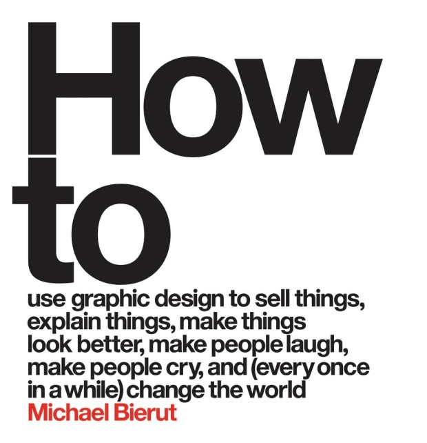
More wisdom from designer Michael Bierut, this time in an interview with Dave Benton for Behance’s 99U:
Comments closedI have to admit I don’t like working on projects where I sense that the cosmetic side of design is meant to be the main differentiator. My design work isn’t interesting enough to differentiate something that’s not interesting otherwise. I look for things that are full of interest and that I am interested in, where I can really see the raison d’etre and the need that they are fulfilling in the world. If you really get all that, then you can calibrate what the appropriate response is design-wise.
I am not one of those designers who are eager to expand the role of a graphic designer. I’m a graphic designer. I know I’m good at that. I’m not an expert about customer service. I’m not an expert about coming up with the valuation of an IPO. If someone comes to me and has a shitty product, I will say tell them upfront that I don’t know why people would use this and that, to me, it doesn’t make sense, and I’m not sure a logo is what they need right now. But I’m not someone who is dying to have a seat at the table and have input earlier in the process; I’m surrounded by people who have goddamn opinions about things they don’t know anything about, and I don’t want to be one of those people.
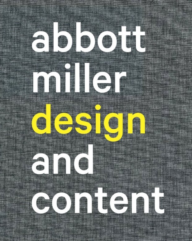
The first in a new series of video interviews with people making books, Pentagram partner Abbott Miller talks to Design Observer about his recent monograph Abbott Miller: Design & Content:
And this is just a reminder to myself as much as anything: the fantastic typeface on the book’s cover is Calibre from Klim Type Foundry.
Comments closed
The Great Discontent has a really interesting (and long) interview with Michael Bierut about his career in graphic design:
Comments closedThe reason I love graphic design is because it’s a way to get paid to learn new things. For example, let’s say someone asks if you’d like to design a book. It’s not about being interested in pagination, covers, binding, typography, or paper. Those are all important, but what really makes designing a book fun is being interested in whatever the book is about. Sometimes it’s a great and exciting book that you’re really into: that’s like someone asking, “Would you like to sit and eat ice cream with me?” But sometimes it’s a book whose subject you don’t know about at all, so you get to talk to people who may be the world’s foremost experts on that subject. Even better!
When I brief interns about a project, I don’t say, “It’s this big and it has x amount of words and pictures.” I say, “These people are trying to do this, they’re trying to get this message across, and their big challenge is that.” Those pieces of information put the project into a larger context. That’s how I learned when I was starting out. I was a pretty good designer in college, and I’m not sure I’m a better craftsperson as I was then. However, I’m a much better designer now because I made people pay me to go from dumb to smart over and over and over again.
Sartorial site Mr Porter asks five designers — Mat Maitland, Eddie Opara, Sagi Haviv, Edwin Van Gelder, and Chip Kidd — about their favourite typeface. Here’s Eddie Opara of Pentagram on Berthold Wolpe’s Albertus, the typeface used for the street signs of the City of London:
I didn’t know what the font was until I got to design school. And I was so fascinated by it because of the way it’s cut. It’s based on metal engraving techniques, the effect being that it has is these acute angles, almost 45 degree angles in each letter. It’s also insanely hard to use. I’ve tried to use it and I’ve not been able to. Why is it my favourite font, then? I think that your favourite is always what you can’t have.
(via Theo Inglis)
Comments closed
In a new video for Gestalten.tv designer Paula Scher discusses her creative process and her vision of branding and identity design:
Comments closed
Interviewed at the AGI Open London 2013, Michael Bierut discusses his work, living in New York, and shares some advice for aspiring designers:

The Great Discontent interview designer Paula Scher:
Comments closedI think graphic design is an important profession because it’s part of what we put out into the world, and it’s what people see and perceive. It’s not just about doing design for the “public good.” The design community currently thinks that if you design something to help the victims of Hurricane Sandy, then that’s good, but if you design something for a bank, then that’s bad. I disagree. I think all design matters and all design deserves to be intelligent.
Obviously, we don’t want to advertise products that are horrible for people because that’s immoral. But if we can raise the expectation of what something can be, then we’ve done a huge service for our community. For example, consider the way most strip malls and shopping centers think they have to appear and behave: it’s horrible. Why can’t there be a different kind of experience? Why can’t we see them as something potentially terrific? There’s an architect named James Wines, whose Structure In the Environment architecture firm designed facades for a chain of BEST stores in the 1970s. He took big box stores and turned them into fantastic outdoor sculptures. He raised the expectation of what those experiences could be.
To me, that’s the most responsible design there is: taking something “bad” and making it terrific by raising the expectation. That’s what we do.

Massimo Vignelli discusses his approach to book design:
[vimeo http://vimeo.com/64811872 w=500]The video was produced by Pentagram’s Michael Bierut and Aron Fay for Mohawk’s “What Will You Make Today?” campaign, and is accompanied by a limited edition journal that reproduces Vignelli’s grid from the film.
Comments closedThe latest episode of the PBS Arts series Off Book is all about graphic design. Contributors include Debbie Millman, Emily Oberman, Drew Freeman, and Ecco book designer Steve Attardo:
Comments closed