Skip to content

Tag: Paul Buckley

Something for the Weekend

Psycho Cover — Penguin art director Paul Buckley discusses his new book Penguin 75 with Imprint:

I am very aware of how much product gets put out there that is completely unnecessary, be it music, movies, books, whatever—it seems that for every good piece of culture we experience, we are bombarded with 99 pieces of redundant crap. I’ve been in the industry for awhile, and of course want to show off the great work we do here, but was not going to put out yet another design book and take your money—you can get that in any annual. To me, often more interesting than the covers are the stories, the psychology that created all the variables that led to this cover over the 20 other proposed covers.

Paul has recently updated his Flickr with new covers from the Penguin Ink series, which utilizes art by tattoo artists, as well as the latest additions to the excellent Penguin Graphic Classics series, which have art by contemporary cartoonists.

My interview with Paul and Penguin 75 designer Christopher Brand is here.

Also at Imprint Thurston Moore of Sonic Youth and book editor Eva Prinz (formerly of Abrams and Rizzoli)  talk about their new publishing venture Ecstatic Peace Library.

Writing on the Wall — Andrew Franklin, publisher and managing director of Profile Books,  offers an overview of the current state of the book business in the UK (via Dan Mogford):

Bookshops enliven high streets, create communities of readers and stage author events, while good booksellers encourage reading and shape taste. For most readers, browsing is a key part of deciding what to read, and publishers put huge effort into packaging and presenting their books. Of course many of these activities can migrate online with Facebook groups, online forums, feeds and websites helping to steer readers to the books they will most enjoy. For some online shoppers bookshops are part of this process: they browse in bookshops, write shopping lists and then buy (perhaps more cheaply) online. But no bookshop can be in business as a shop window for other retailers. You don’t have to be hopelessly nostalgic or sentimental to believe something very precious is lost with every bookshop that closes.

And at the other of the spectrum…

Another Reading Revolution — Historian Andrew Pettegree talks about his new book The Book in the Renaissance with The Atlantic (via Shelf Awareness):

The situation really is that the first generation of printers, encouraged by scholars, naturally produced the sort of books these people wanted. But it’s hard to apply this sort of commercial model—this small, bespoke model used for manuscripts—to a new process that produces 300 or more identical items. The irony is that there were plenty of other readers out there. The first printers ignored the groups that we might call pragmatic readers. Literacy was already widely-disseminated in the fifteenth century. There were lots of people who could read but did not habitually buy books, so the trick was to discover how to reach them.

Comments closed

Penguin 75: Q & A with Paul Buckley and Christopher Brand

Launched with 10 titles by Allen Lane in 1935, Penguin Books turns 75 this year. To commemorate the anniversary, Executive VP Creative Director Paul Buckley has compiled Penguin 75, a collection of 75 book covers from the Penguin US archive.

Penguin 75 is an inside look at the Penguin design process with candid and irreverent commentary from authors, designers, editors and artists as well as Penguin Art Directors Darren Haggar and Roseanne Serra and Buckley himself. Filled with the kind of distinctive illustrative covers that are now associated with Penguin US, the book is wonderful slice of American book cover design. As Karen Horton recently noted in her interview with Buckley for design:related:

Penguin 75… is less about the history of the old orange-spined paperbacks and more about the relationships Creative Director Paul Buckley helped to facilitate in the last decade between publisher, editor, author, and designer.”

I was lucky enough to talk to Paul and the book’s designer Christopher Brand about Penguin 75 last week.

How did Penguin 75 come about?

PB: I’ve always had a mix of fascination, disdain, and understanding, for what my staff and I go through in trying to get our work approved, as well as what the editors and publishers are dealing with on their end. Of course all people whose work is subjective go through some sort of approval process — and it’s not easy for the folks on the other end of the situation either; the ones saying “this is just not right”. As it’s something we do not hear much about (other than at some industry function), I thought it would be interesting to put some of these stories together in book form.

And how did you get involved in the project, Chris?

CB: I was working on staff at Penguin at the time. I let Paul know that I would be interested in working on it when he first mentioned the project to everyone. I mostly work on covers but I’ve had the chance to work on a few interiors before this one.

What criteria did you use to choose the covers?

PB: There were different sets of criteria; the most obvious being that they had to be Penguin paperbacks, as we had decided to use this project in conjunction with our 75th Penguin imprint anniversary. Another criteria was that I wanted to show recent Penguin work, so nothing older than 10 years or so. Then it came down to a combination of which covers look great and also have an interesting story associated with them, as well as trying to get a mix of intriguing authors and designers in there — not just your obvious fiction darlings, but a true microcosm of the publishing world and art world.

The covers are very different from the iconic Penguin paperback covers. Do you think the book shows a different side to Penguin’s design history?

PB: Of course. Penguin UK does a gorgeous job of tapping into the Penguin archive and history, and while I like to go there from time to time, I’m very interested in Penguin’s future in a different sort of way. The beautiful Penguin by Design is just not who I am, and if I tried to do a version of that, two things would happen — I’d fail as my heart would not be in it, and no one would buy it as it’s already out there in a few books. This is not to say that I’m not a huge fan of Penguin’s design history — I am, but I see it as a place to tap into occasionally, while still moving the brand forward — as nothing creative can remain as it was, nor should it if it wants to stat vital in it’s own day. But we do maintain Penguin’s age old love of illustrated and well crafted covers.

Do you have a sense that Penguin US has a design sensibility that is separate from the Penguin UK tradition?

PB: Whether you’re UK or US, it’s still Penguin tradition, so I don’t define it as you do. Both sides are very proud of Penguin, it’s history, it’s cache, it’s values — and both sides have built Penguin into what it is today, and what it stands for. So while we are separate entities that bring different things to the table, the overall strive to keep the quality bar set very high is paramount to either side.

Was it hard to choose just 75 covers?

PB: Unbelievably hard. That ate up the first month or so, just getting it down to 75, who was left in, who was left out, who on staff has five covers in, while another has only one or two, is it a good mix visually and editorially of this and that, etc etc.

Chris, did you have a say in any of the selections?

CB: Paul did an initial edit and went through tons of the books. Once he narrowed it down I helped a little bit with figuring out what we should put in, but mostly I would come to Paul later on when were trying to lay out the book. If we couldn’t get enough content for one of the books then we would have to find another one to put in. Or, if Paul wanted to add more books toward the end then we had to figure out what to subtract. I was more involved when it affected the design.

Were there any covers or comps that you wanted to include but couldn’t?

PB: By the nature of only utilizing 75 covers / series, things have to be left out. So yes, but only for that reason.

Penguin 75 includes contributions from authors and editors as well as designers, but I notice you left out Sales & Marketing!

PB: I did not leave out sales and marketing any more than I left out elves and leprechauns… I simply did not have any real sales and marketing stories. The Penguin marketing director, John Fagan, is hands down the best marketing director in the universe — we all know the horror stereotype stories of the marketing director killing this and that just to hear their own voices in the room, but John is so much an integral part of our team and loves what we are doing with our packaging; so unless he really thinks we’re missing something, he’s incredibly supportive; and when he does have something to say, he still manages to do it in a kind and intelligent way. Our sales team also leaves that stereotype behind. Trust me, you see in the book that I’m not pulling any punches and I made sure no one else in the book did either — so if I had great Penguin sales and marketing stories, you’d be reading them.

As a designer, were you surprised by any of the  comments from authors and editors about the cover designs, Chris?

CB: The range of comments from the authors was pretty surprising. Some were very thoughtful and you could tell they appreciate and understand book cover design. Other authors weren’t very happy with their covers and they made that pretty clear.

Was it fun to design a book about book design?

CB: More than anything, it was just fun for me to be working on the interior of a book instead of just the cover. It was a nice change.

Were there any unique challenges?

CB: The biggest challenge was that Paul and I were working on this book, but at the same time we both had full time jobs at Penguin. Paul tried to clear my plate for me a bit, but we both still had a lot of other responsibilities to deal with. Another thing that was hard was that we were sort of doing this whole thing on the fly. We were responsible for not just designing the book but gathering all of the content and all of the things that we needed to design the book (the comments, the hi-res art, etc.). We had to get everything together as we went and this stuff trickled in throughout the process.

On a design level, there was a lot of information to organize. It was challenging to come up with a system for everything. We had comments from that authors and designers, then there were comments from the art directors that we created another system for, all of the credit information for each book, we were showing alternative designs for some covers. There was a lot to think about.

Did you try to take account of Penguin’s design history while working on your design?

CB: I did take Penguin’s history into account at the beginning when we were figuring out what the layout should look like. I used Gill Sans throughout the book, but it’s pretty small and doesn’t feel overwhelmingly “Penguin”. I tried some things that were more in the style of older Penguin covers, but in the end we went with something more modern.

Was it strange to design a book that includes some of your own work?

CB: It was a little strange at first, but many of the covers in the book were designed by my co-workers so a lot of the work was very familiar to me.

So, did the book make you reconsider any of your own designs, or your design process?

PB: I’d love to sound thoughtful and say “yes” and expound on some brilliant new design wisdom — but the answer is “no”. All of the entries in this book are well known to me, and most have been for years. Putting them all down in one place just made me feel proud of what my department does — but I’ve always been incredibly proud of my team. If anything, it made me reconsider what it takes to put a book together, and see editors and authors in a more favorable light.

And, Chris, I have to ask… How does it feel to be immortalized on the cover of The Shadow of the Wind by Carlos Ruiz Zafón?

CB: It was an amazing opportunity. I think this only the beginning of my modeling career.

Thanks Paul and Chris!

Images:

  1. Penguin 75 cover, design by Paul Buckley
  2. Penguin “Graphic Classics”:
    The Dharma Bums | Art Director: Paul Buckley |  Illustrator/Designer: Jason
    The Portable Dorothy Parker | Art Director: Paul Buckley | Illustrator/Designer: Seth
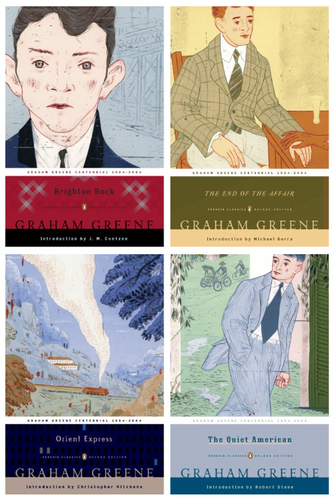
  3. Graham Greene Backlist | Designer/Art Director: Paul Buckley | Illustrator Brian Cronin
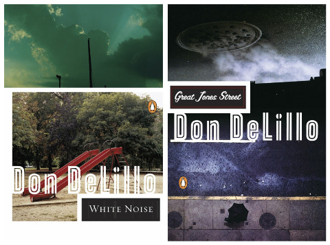
  4. Don Delillo Backlist:
    Americana
    | Designer/Art Director: Paul Buckley | Photos: Jeff Brouws
    White Noise | Designer/Art Director: Paul Buckley | Photos: Jason Fulford
    Great Jones Street | Designer/Art Director: Paul Buckley | Photos: Hugues Colson (top), Tom Zimberzoff (bottom)
  5. Emporium and unused image | Designer/Art Director: Paul Buckley | Illustrator: Viktor Koen
  6. Special Topics in Calamity Physics | Designer/Art Director: Paul Buckley
  7. Pages 220 – 223  Penguin 75 | Designer: Christopher Brand
  8. Pages 244 – 247 Penguin 75 | Designer: Christopher Brand
  9. There Once Lived a Woman Who Tried To Kill Her Neighbor’s Baby | Designer: Christopher Brand | Illustrator: Sam Weber | Art Director: Roseanne Serra
  10. The Jewish Messiah | Designer: Christopher Brand art Rodrigo Corral Design | Art Director: Darren Haggar
  11. The Shadow of the Wind | Designer: Tal Goretsky | Art Directors: Darren Haggar and Paul Buckley
4 Comments

Midweek Miscellany

The Good, The Bad…design:related‘s Karen Horton (also Art Director at Little, Brown and Co.) interviews Paul Buckley, Creative Director of Penguin US, about his new book Penguin 75: Designers, Authors, Commentary (The Good, The Bad…):

Everyone was asked to keep their comments to 100 words or less, and though there are a few exceptions that I let run long, my own included, most contributors stuck to my request. As to the sarcasm, there are plenty of good natured jabs throughout the book as I was very clear with the participants that this was a true opportunity to let it all out – if you hate your cover, please by all means tell us about it; that is the point of this book.

You can read my interview with Paul from September last year here, and I’m hoping to chat with him and designer Christopher Brand about Penguin 75 soon. Fingers crossed.

Rewound and Remixed — Tom McCarthy, author of Remainder and C, interviewed in The Times:

If McCarthy… presents a radically fresh prospect for the future of the novel, it is probably, paradoxically, because he has instinctively ignored contemporary literature almost completely. He would argue, in fact, that it is only by immersing oneself in all that has gone before that any contemporary novelist has even the faintest chance of coming up with something new. “I don’t think most writers, most commercial middlebrow writers, are doing that,” he says. “I think they’ve become too aligned with mainstream media culture and its underlying aesthetic of ‘self-expression’. I see what I’m doing as simply plugging literature into other literature. For me, that’s what literature’s always done. If Shakespeare finds a good speech in an older version of Macbeth or Pliny, he just rips it and mixes it.”

See also: My Q & A with Peter Mendelsund and Tom McCarthy about the cover design of C.

Paywalls vs. Potential — Clay Shirky interviewed in The Guardian. This has been much linked to elsewhere because of Shirky’s comments about the online “paywall” at the aforementioned The Times, but I actually Michael Wolff’s Vanity Fair article on Rupert Murdoch from October last year is more interesting on this point. See also: John Gapper’s op-ed “Murdoch must become an elitist” in the Financial Times (registration required).

Necessary Agent — Jofie Ferrari-Adler, senior editor at Grove/Atlantic, on literary agents and their relationship with book editors in Poets & Writers Magazine. It’s an interesting article, although — just for the record — not everything that goes pear-shaped in the publishing process is the fault of the Sales & Marketing department…

And finally…

Cats Without Dogs — At some point I will shut up about Jason… Until then, you might be interested to know he has just started a blog…

Comments closed

Jason, The Dharma Bums

As you may have noticed, I’m on something of Jason kick right now. I’m also preparing to interview Paul Buckley, Creative Director at Penguin US, about his new book Penguin 75, so I thought I would take the opportunity to post Jason’s beautiful contribution the Penguin Graphic Classics series that Paul art directed:

4 Comments

Monday Miscellany

Kitsune Noir Poster Club — Artists Frank Chimero, Mark Weaver, Jez Burrows, Cody Hoyt and Garrett Vander Leun reinterpret their favourite books as prints for Kitsune Noir . (Frank Chimero’s Slaughterhouse Five is pictured above).

And on the subject of posters…

Penguin US have made the jacket art from Graphic Classic Editions of Moby Dick and White Noise, designed by Tony Millionaire and Michael Cho respectively, available as posters.

From Trolls to Truth — Author Ursula K Le Guin reviews Tove Jansson’s The True Deceivers (available in the US from NYRB Books) for The Guardian:

On the patronising assumption that books for children are nice, ie morally bland and stylistically infantile, critics, reviewers and prize juries often dismiss those who write them as incapable of writing seriously for adults… Anyone familiar with Jansson knows it would be unwise to dismiss her or patronise her work on any grounds. Her books for children are complex, subtle, psychologically tricky, funny and unnerving; their morality, though never compromised, is never simple. Thus her transition to adult fiction involved no great change. Her everyday Swedes are quite as strange as trolls…

Quote/Unquote Bookends designed by Eric Janssen (via SwissMiss).

And lastly…

In my total blogging tardiness, Bookslut (inevitably) beat to the punch on this, but Simon Reynolds column on the music of the decade for The Guardian has so much resonance for books and the book industry:

“The fragmentation of rock/pop has been going on as long as I can remember, but it seemed to cross a threshold this decade. There was just so much music to be into and check out. No genres faded away, they all just carried on, pumping out product, proliferating offshoot sounds. Nor did musicians, seemingly, cease and desist as they grew older; those that didn’t die kept churning stuff out, jostling alongside younger artists thrusting forward to the light. It’s tempting to compare noughties music to a garden choked with weeds. Except it’s more like a flower bed choked with too many flowers, because so much of the output was good. The problem wasn’t just quantity, it was quantity x quality. Then there was the past too, available like never before, competing for our attention and affection. The cheapness of home studio and digital audio workstation recording, combined with the wealth of history that musicians can draw on and recombine, fuelled a mushrooming of quality music-making. But the result of all this overproduction was that “we” were spread thin across a vast terrain of sound.”

(Update: links to Tove Jansson’s The True Deceiver added)

Comments closed

Q & A with Paul Buckley, Penguin US

Photo by Erika Larsen. Design by Paul Buckley

It is not every day that I get an email from the Vice President Executive Creative Director of Penguin US, so it was something of a surprise when Paul Buckley sent me a note a few weeks ago about a book cover design mentioned in my interview with his wife Ingsu Liu.

I had been conspicuously unable to locate the image online and Paul was able to help. But it seemed like too good an opportunity to miss, so I asked the Brooklyn-based designer if he would be willing to do a Q & A about his work as well. Again, much to my surprise, not only did Paul say yes, he managed get his answers back to me in record time (with annotations and links included!)…

Of Mice and Men

How did you come to book design?

I went to SVA on an illustration scholarship, and was very intent on becoming an illustrator. While other parents were giving their kids children’s books, my father was giving me illustration annuals. But I supported myself during my college years working for various NYC design studios as a designer, learning through those around me… and at the same time pursuing freelance illustration assignments as well – basically learning both crafts simultaneously through different venues. Right after graduation I took a 3 month road trip spending my savings, and thus came home to Greenpoint needing an income. A studio manager at one of the studios I worked in during my early college years suggested me to her sister who was working at NAL/Plume/Dutton, as they needed a Junior Designer… I landed the position with a portfolio that was equal parts design and illustration. Though in the beginning I was very hardcore about becoming the best painter I could be, I quickly fell in love with designing book covers and never looked back… within two years we merged with Penguin. Though I’ve become far too busy (and lazy!) to pull out the oils and actually paint something, I did manage to get a few simple ink drawings in the Society of Illustrators this year. I realize these will pale in comparison to 99% of everything else done by the true working pros in the annual, but it was still a kick and an honor to have my work chosen for inclusion.
The World According to Garp

Can you describe your role at Penguin?

I act as a Creative Director overseeing a sizeable staff and many many projects. My Penguin publishing team is very open to me and my guys pitching ideas and we nicely act as an overall creative team, in a way that editorial and art together collaborate to create nice projects — most recently I’m directing a cover design book where we have the authors commenting on their covers, and a new series named Penguin Ink, where the world’s leading tattoo artist’s do covers for me. Recently in the stores is the gorgeous collaboration of Roseanne Serra with Ruben Toledo… this was all Roseanne’s brilliant art direction, and I had nothing to do with it — but it is gorgeous Penguin project that is very much worth checking out.
Art by Duke Riley
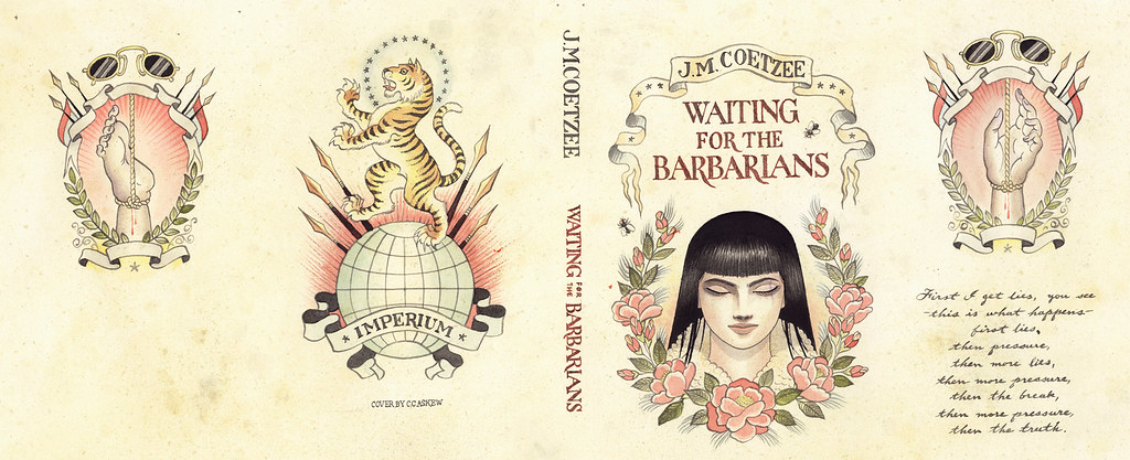
Waiting for the BarbariansArt by Chris Conn

How many imprints do you oversee?

Six

Does each imprint have a particular design style?

Yes, each imprint is very unique unto itself, as each Publisher/Editorial team brings their own style, as does each Art Director. In my group, Roseanne Serra and I collaborate on Penguin paperbacks, and to a lesser degree, with the Viking imprint as well. Roseanne art directs Pam Dorman books. Joe Perez smartly art directs Portfolio and Sentinel, which are brilliant business and political imprints. Darren Haggar art directs Penguin Press overseeing the packaging for literary giants like Thomas Pynchon and Zadie Smith… and while not it’s own imprint per se, Maggie Payette Art Directs our gorgeous poetry series.

The Jan Tschichold Penguin paperbacks are design icons in the UK. Is there a sense of that legacy within Penguin Group USA?

Very much so. We all have quite a few Tschichold books on our shelves. The UK Penguin art department, under the Art Direction of Jim Stoddart and John Hamilton, does an incredibly beautiful job of keeping that legacy alive.

How is American book cover design different from the UK?

I don’t know that it is all that different. In fact, Art Directors over here, and Art Directors over there, are hiring the same art and design talents on each side of the Atlantic.

Do you discern any current trends in American book cover design? Yes… very nicely a resurgence of designers and illustrators who do both the design and illustration; the whole package. Jaya Miceli, Chris Brand, Jon Gray, Gregg Kulick, Jamie Keenan, Rodrigo Corral, Ben Wiseman, Jennifer Wang, Tal Goretsky, etc – these are the folks creating the personally unique covers of today that will be the design icons of tomorrow.
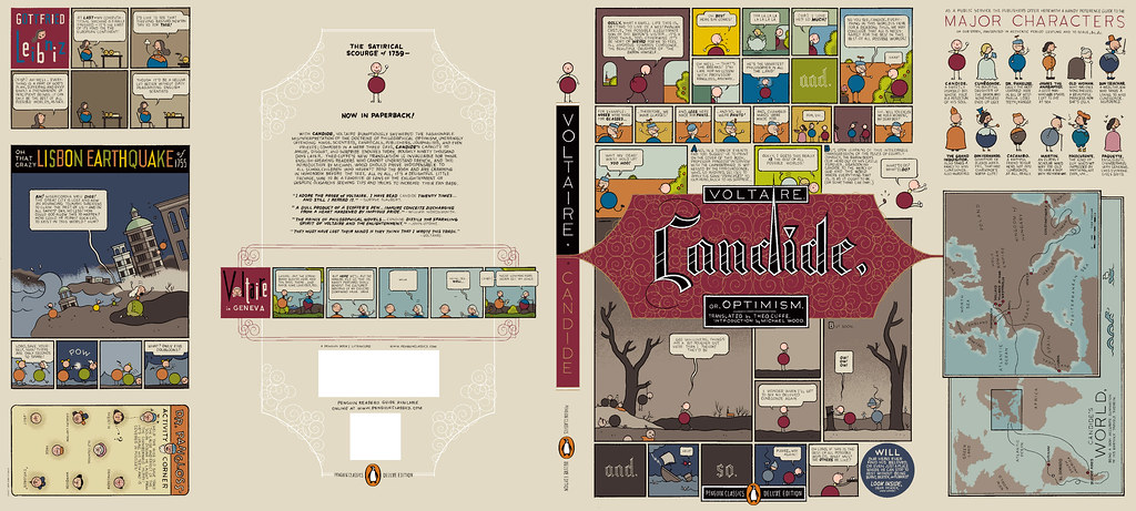
Art by Chris Ware

How did the Penguin Graphic Classics come about?

We do a handful of what we call Penguin Graphic Classics Deluxe packages every list, and when it was time do one for Voltaire’s Candide, I handed it off to Helen Yentus who was in my group at the time. Helen wanted to work with Chris Ware on it, and off it went with us all happy that he accepted the assignment. When Chris’s sketch came in, it just sort of blew everyone away… Up to that point we’d never had anyone grab editorial control of a cover that way… Chris had gone hog wild and wrote all his own copy and illustrated and designed the living hell out of every square inch of this cover from flap to flap. It took forever to make its way around the packaging meeting table with everyone grabbing hold of it, reading it and laughing out loud. A short time later, our Penguin Publisher Kathryn Court declared that we needed to do more of these. Kathryn really nurtures good art and design and is one of the reasons I’ve been here so long.
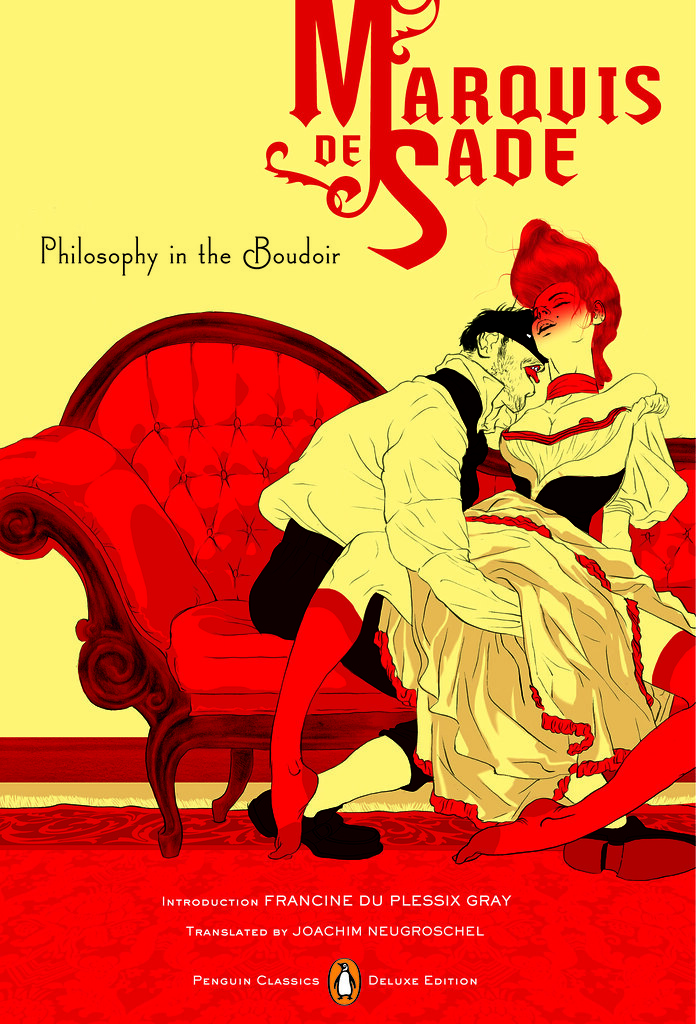
Cover by Tomer Hanuka with design by Paul Buckley and Tomer Hanuka
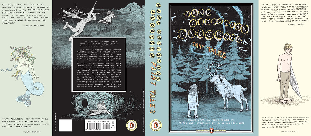

Art by Anders Nilsen
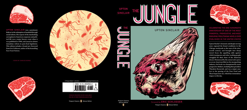
Art by Charles Burns
Art by Roz Chast

How did you match the artists with the titles?

The titles were given to us by the Penguin Classics editorial team, and Helen and I would sit in my office surrounded by comic books and simply have fun matching this artist with that title.
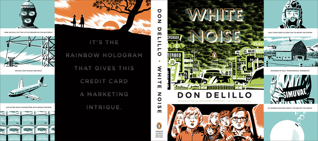
Art by Michael Cho. Design by Paul Buckley

Are their plans to expand the series? What new covers can we look forward to in the future?

We do about 6 a year and I think we are all comfortable with that number at the moment. I just finished White Noise with Michael ChoMoby Dick by Tony Millionaire just came out, as did Huck Finn by Lilli Carré, and Ethan Frome by Jeffrey Brown. In the near future, I’d really love to do something with Jim Rugg, Jeff Lemire, Mike Mignola, David Small, and I still hold out hope that one day Crumb will actually say to me “damnit you pesky bastard… ok, ok, I’ll do it”.
Art by Tony Millionaire


Art by Lilli Carre. Design by Paul Buckley

Do you still design yourself?

All the time… mostly in the evenings after everyone has gone home and I can focus without the constant distractions of the work day. My greatest hits are posted on my website.

 
Art by David Byrne. Design by Paul Buckley. 
Pigmented foil stamped on linen cloth
Art by Will Eisner. Design by Paul Buckley. 
Art direction by Ingsu Liu & Albert Tang
 Photo by Fredrik Broden. Design by Paul Buckley

Could you describe your design process?

I start each project with the hope that I’m going to do something unusual; and then I try my best to do just that — read the material and find a visually unique way to interpret it. I tend to go either very loud, or very subdued and moody. I do a ton of comps for every cover I work on — sometimes, 20 or more to explore what I’m thinking and all the tangents that come along during the process — I get nuts when freelancers send me two or three comps. I’ll show 3-5 of what I think are the best and receive comments and direction on those from editorial… when discussing why a designer did this or that, I think what people commenting on book covers seem to gloss over is that the publishers and editors have far more at stake than the cover designer — they have committed sums of money and must answer to the house and the author to make this book a success — so they are very strong about what they think the cover should be and nothing is being printed without their full consent.

Here are a few rejects from the pile… I’m not saying these covers are better for the individual book, than what got printed… maybe the books would have tanked with these covers… but they do illustrate how in-house visions do not always sync:
Upper left: art by Paul Buckley. Upper right: various stock.
Lower Left: art by Amy Bennett with descending placards by Paul Buckley.
Lower Right: painting by Keniche Hoshine with added stock image.
(see final cover here)
Various antique endpapers combined with altered ebay images
and antique portrait of feral child.
(see final cover here)

Do you approach fiction and non-fiction differently?

Often, yes. Fiction needs a more peripheral approach where I’m looking to capture a mood to reflect the book’s tone, whereas non-fiction often needs you to stare it directly face on and state precisely what the topic is.

What are your favourite books to work on?

Any title where the Editor and Publisher are open.

What are the most challenging?

Any title where the Editor and Publisher are nervous.

Where do you look for inspiration?

Everywhere. My staff blows me away daily. My wife shows me beautiful work constantly. Editors show me stuff. Blogs like yours so nicely showcase how much great work is out there. Friends deluge my inbox with artist links. Illustrators. Photographers. Fine Artists. Music. Furniture. All talent is inspiring. Cruising Flickr and the web in general has me bookmarking new people daily, and I can spend hours google imaging the most absurd things that always tangent me to the greatest places. I found and purchased an image for a difficult book cover project recently just because I decided to google “leucistic squirrel” after I noticed a few in Prospect Park. I have no idea how we all existed before the internet.

What do you look for in a designer’s portfolio?

A unique talent. Distinction.

Front cover art by Frank Miller. Design by Paul Buckley

What does the future hold for book cover design?

There will be a market that just wants/needs to download the material for reading purposes, and there will be a market that is looking for an object. What Penguin does with the Graphic Classics is a great example– some student will download Gravity’s Rainbow cheaply, while an older Thomas Pynchon or Frank Miller fan with a little more cash in their pocket will want the beautiful book/object. So I believe the cover design market will shrink in that way. Textbooks and travel guides will go digital first as there is no real reason to carry all that in your backpack or pay for all that book production. For digital readers, big budget fiction and non fiction titles will have moving covers, more like mini movie trailers. If Grisham were still with us, his future digital reader cover would be something akin to us looking at a murky black screen… the reader would hear running footsteps and ragged breathing… then a loud shot rings out, and a big red splotch hits your screen and drips to form the title type. Then one blurb after another flies across the screen and after a moment Grisham himself pops up in the corner thanking you for purchasing his new book and asking if you’d like to peruse his backlist titles… and click this link if you’d like to pay an extra dollar to help our troops in North Korea, Iran, Afghanistan or Iraq. Interior-wise, there will be tons of product placement… not necessarily for gratuitous reasons; but because people, places and things are mentioned on every page in every book be it fiction or non fiction; and if folks desire a more interactive read that really helps them get into the book in a different way, then it’s possible there will be quick jump links to everything – for instance… if in this book, the character is having lunch in Balthazar and then running off to the Standard Hotel for an ongoing affair… then why not have Balthazar and The Standard pay a small fee to the publisher to provide these links; this seemingly free advertising? Big money to had there. I reserve judgement as to whether any of this is a good thing or a bad thing… but as publishing goes more digital, I think it’s naive to think these things wont happen to books just as they happen everywhere else.

Thank you very much!

You bet.

9 Comments