Skip to content

Tag: mid-century modern

Midweek Miscellany

An interview with award-winning Toronto-based illustrator Gary Taxali at GrainEdit.

How Disappointing — Book designer Peter Mendelsund on what we picture in our minds when we read literary works:

“Call me Ishmael.” What happens when you read this line? You are being addressed, but by whom? Chances are you hear the line (in your mind’s ear) before you picture the speaker. I can hear Ishmael’s words more clearly than I can see his face. (Audition requires different neurological processes than vision, or smell. And I would submit that we hear more when we read than we see). Picturing Ishmael requires a strong resolve.

But if you indeed took the trouble to summon an image of Ishmael what did you come up with? A sea-faring man of some sort? Is this a picture or a category? Do you picture Richard Basehart, the actor in the John Huston adaptation? How disappointing.

(All I can say is that the follow-up essay had better be about comic books, Peter!)

The Secret Detectives — An interview with Patti Smith in The Telegraph:

“When I was young I knew William Burroughs really well. And William’s secret desire, which he never quite did, was to write a straightforward detective novel. How good would that have been! And I used to say, ‘you have to do it William!’ And he’d say” – Smith gives a passable impersonation of the Burroughsian growl – “‘Oh, I don’t know, one of these days.’ William was like the embodiment of a detective, I just loved him so much.”

Our Greatest Creation — Jonathan Glancey, The Guardian‘s former architecture and design correspondent, reviews City: A Guidebook for the Urban Age by P.D. Smith:

The stuff of lofty intentions and grubby backstreet life, the city represents much of our restless and contradictory natures. “In this dynamic, cosmopolitan space,” Smith writes, “lies the wellspring of our creativity as a species. The greatest cities nurture and stimulate ideas in science and the arts that are the very heart of human civilisation. For this reason, sustainable, humane and well-governed cities are our best hope for the future.”

Amen.

Hiding in Plain Sight — Type designer Ramiro Espinoza on ‘Amsterdamse Krulletter’, the curly lettering painted on the windows of traditional pubs in Amsterdam, and his only typographic revival Krul:

The fact that such gorgeous and original letters have largely been ignored in a country with such a rich type- and letter-making tradition reminds me of the plot of Edgar Allan Poe’s famous story “The Purloined Letter”. In the story, an important document cannot be found because it is lying in plain sight. Sometimes things can become invisible to us because of their very familiarity.

Avant Garde — Adrian Shaughnessy on life and work of designer Herb Lubalin at Imprint:

I have a pet theory about why Lubalin is currently popular: In the eyes of many designers, he offers a way of designing—and of communicating—that doesn’t require expensive art direction, over-manicured photography, or grandiose presentation. Lubalin proved that to be effective, all you need is a typeface and a good idea. In other words, he is a designer for the age of austerity.

Unit Editions’ forthcoming limited edition monograph, Herb Lubalin: American Graphic Designer, 1918–81, will be available in August.

And finally (and also at Imprint)…

An interview with designer and collage artist Graham Moore, who incorporates mid-century modern ephemera and fragments from billboard posters into his work.

Comments closed

Montreal in the 60’s

Montreal in the 60’s is a short film by assembled by Jim Dayshine from archival images from the National Film Board of Canada.

I posted this at the other place earlier today, but I’m re-posting it here because it is beautiful and more people need to see it.

(Thanks Derek)

Comments closed

The Design Genius of Charles and Ray Eames

While looking for Charles and Ray Eames film Tops earlier this week, I came across this interesting TED talk from a few years ago by their grandson Eames Demetrios (who is also interviewed in the documentary EAMES: The Architect and The Painter):

Comments closed

Tops

I finally saw  EAMES: The Architect and The Painter at the weekend. One of the many things that grabbed my attention watching it was a clip of mesmerizing short film called Tops made by the Eames studio in 1969. In the film, all manner of spinning tops and toys are wound and released. It is beautiful and hypnotic (thanks partially at least to the score by Elmer Bernstein). But there is also a moment about halfway through when a thumb tack is spun across an architectural drawing. It is a wonderfully understated metaphor for the creative process and it changes the whole tone of what you are watching. Lovely.

Here Tops in its entirety:

Comments closed

AGDA: Conversations with Designers

“I just say that everything that is around you has either been designed or it’s an accident. I mean if you’re walking upstairs and you see a bit of bird shit on the staircase, I mean the bird shit is an accident but the staircase has been designed…”

Max Robinson

I recently came across the Australian Graphic Design Association video series Conversations with Designers. I can’t claim to know very much about Australian design history — I know next to nothing in fact — but it’s always interesting to hear designers talk about the discipline of design and their work in the field.

The latest video in the series features designer Max Robinson, who worked extensively in London in the 1960’s and would later design the Australian $10 note:

A PDF transcript of the full interview is available, and you can watch the other videos in the series on Vimeo.

I should also mention that I discovered the interviews thanks to the wonderful blog Re:collection, an online archive of Australian graphic design from 1960-1980. Definitely worth a look.

2 Comments

The Story of Eames Furniture

Marilyn Neuhart, author of The Story of Eames Furniture, and her husband John both worked in close proximity to Charles and Ray Eames and key members of the Eames Office for almost 30 years. In this fascinating video interview with GestaltenTV, the couple talk about the people behind the iconic Eames designs:

The Story of Eames Furniture is published by Gestalten.

Comments closed

Hi-Fi

Drawing inspiration from the iconic Blue Note LP covers from the 1950’s and 60’s designed by American modernist designer Reid MilesHi-Fi is an amazing  music video directed by Bante for last year’s concert season at the Bellavista Social Pub, in Sienna, Italy (how great does that sound?).

It’s beautifully done. In fact, the whole video just made me smile…

(Discovered via the excellent The Font Feed who also point to this great article The Jazzy Blue Notes of Reid Miles)

3 Comments

Midweek Miscellany

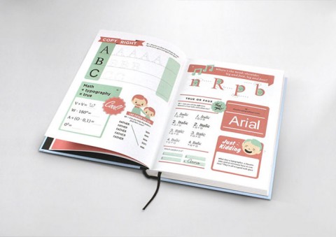
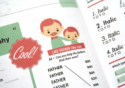
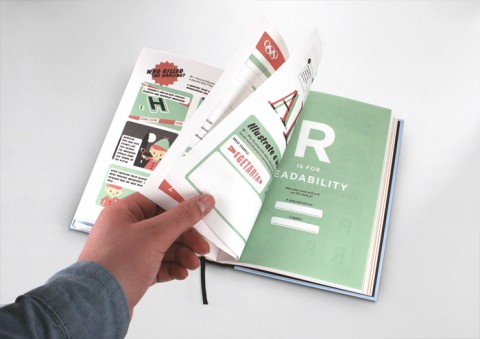
Hyperactivitypography from A to Z — An activity book for typographers (in a lovely retro style) by Norwegian design agency Studio 3. You can flip through the book here.

Life As Lived — Author Sarah Bakewell (How To Live) kicks off a 7-part series on Montaigne in The Guardian:

What is it to be a human being, he wondered? Why do other people behave as they do? Why do I behave as I do? He watched his neighbours, his colleagues, even his cat and dog, and looked deeply into himself as well. He tried to record what it felt like to be angry, or exhilarated, or vain, or bad-tempered, or embarrassed, or lustful. Or to drift in and out of consciousness, in a half-dream. Or to feel bored with your responsibilities. Or to love someone. Or to have a brilliant idea… but forget it before you can get back to write it down…

And also in The Guardian

Alternatives — Tom Lamont asks designers why book covers look different from territory to territory:

Why don’t publishers, then, replicate covers that have been a success abroad? “It does happen but it’s quite rare,” says [Julian] Humphries [art director, Fourth Estate]. Megan Wilson, an art director at Knopf Doubleday in New York, says that American designers are sometimes asked to look at British jackets, “as an example of something that works or doesn’t, but we are rarely asked to use them directly”. [Nathan] Burton tries to avoid looking at alternative covers if he’s working on a book that’s already been published. “It can take you off on odd tangents. It’s always best to work from fresh.”

Great. But, please, can we declare a journalistic moratorium on  “judge a book by its cover” headlines?

“We are your platform”Richard Nash, formerly of Soft Skull, talks about his new start-up Cursor at The Literary Platform. There’s something about this that reminds me of Factory Records in good ways and bad…

A Question of Audience — With Julie Bosman taking over the publishing beat at the NY Times from Motoko Rich, Sarah Weinman breaks down what kinds of book and publishing stories appear in North American newspapers:

I’ve become increasingly aware the longer I’ve written about publishing for a business news site that some stories that are big news within the industry carry little relevance outside of publishing circles. That means certain news items I pay attention to and analyze to death via Twitter… won’t merit larger stories. It also means that certain topics that are discussed endlessly in the publishing bubble (especially the digerati-populated one), while relevant to the outside world, have to be written about in a way that might come off as eye-rolling rehash.

I think Sarah’s being charitable here. Many of the topics discussed endlessly in the publishing bubble and the Twittercosm have absolutely no relevance to, or perceivable impact on, the outside world…

Undercover Icon — A New York Times profile of Irving Harper, the man behind many of George Nelson Associates‘ iconic designs (via The Scout):

“I don’t have a complex mind,” Harper said, and if this assertion seems disarming coming from a designer of his sophistication, the thought is sincere… “With a computer there are too many choices, and I always liked working within limits,” he said. “You know, if you look at Mozart, who had this strict classical framework — an allegro, an andante, a scherzo and a finale — you see that within that formula, he got results he might never have gotten if he had all the options in the world.”

There is more on Harper in a Metropolis Magazine profile from 2001, and a monograph of his paper sculptures by Michael Maharam is apparently on the way (if anyone has details please let me know).

Comments closed

Naïve: Modernism and Folklore in Contemporary Graphic Design

Published this month by Gestalten (thanks Siobhan!):

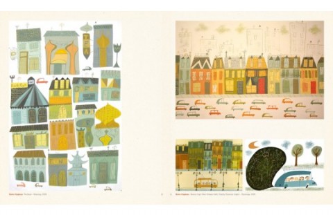
A minimalist design vocabulary is currently being reinvented by a troop of young graphic designers who are rediscovering the stylistic elements reminiscent of classic graphic design such as silkscreen printing, classical typography, hand lettering, woodcutting and folk art and integrating them into their work. Naïve documents this extraordinary renaissance of Classic Modernism, from the 1940s to 1960s, in contemporary graphic design.

1 Comment

Book Design Links, Dec. 1st, 2008

It is very cold, wet and wintry in Toronto today, so here’s some book design related eye-candy to cheer you (me!) up…

Company of Liars by Karen Maitland

Favourite Book Covers of 2008: Joseph Sullivan has published his annual list at the excellent The Book Design Review (BDR). If your new to the BDR make sure you also check out his archived favourites for 2007, 2006, and 2005!

Funnily enough, Fwis’ Covers website has just posted The Microscope and the Eye (pictured) designed by Isaac Tobin who also did the amazing cover for Obsession which is in the BDR list for 2008.

Jacket Mechanical: A nice design blog featuring great book cover designs. Lots of super-cool modernism if you like that sort of thing (which I do).

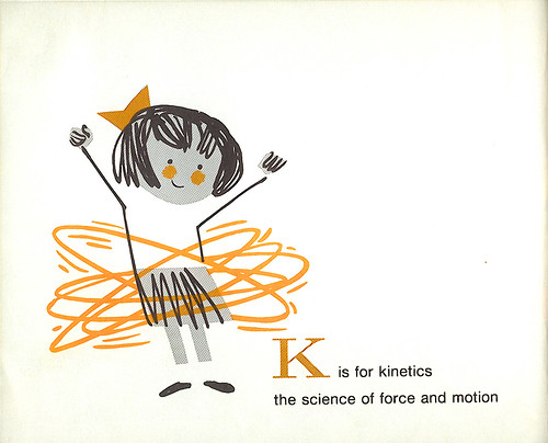
Speaking of modernism, take a look at Mid-Century Children’s Books a gorgeous retro Flickr set by The Ward-O-Matic (AKA Ward Jenkins).

1 Comment