The tale of rediscovering Sherman, a typeface designed by American type designer Frederic Goudy in 1910 and revived by Chester Jenkins for Pentagram in 2016 for Syracuse University:
Comments closed
Published February 9, 2017
Books, Design and Culture
The tale of rediscovering Sherman, a typeface designed by American type designer Frederic Goudy in 1910 and revived by Chester Jenkins for Pentagram in 2016 for Syracuse University:
Comments closed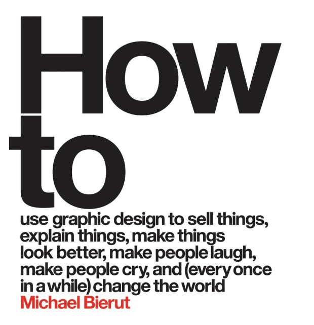
More wisdom from designer Michael Bierut, this time in an interview with Dave Benton for Behance’s 99U:
Comments closedI have to admit I don’t like working on projects where I sense that the cosmetic side of design is meant to be the main differentiator. My design work isn’t interesting enough to differentiate something that’s not interesting otherwise. I look for things that are full of interest and that I am interested in, where I can really see the raison d’etre and the need that they are fulfilling in the world. If you really get all that, then you can calibrate what the appropriate response is design-wise.
I am not one of those designers who are eager to expand the role of a graphic designer. I’m a graphic designer. I know I’m good at that. I’m not an expert about customer service. I’m not an expert about coming up with the valuation of an IPO. If someone comes to me and has a shitty product, I will say tell them upfront that I don’t know why people would use this and that, to me, it doesn’t make sense, and I’m not sure a logo is what they need right now. But I’m not someone who is dying to have a seat at the table and have input earlier in the process; I’m surrounded by people who have goddamn opinions about things they don’t know anything about, and I don’t want to be one of those people.

The Great Discontent has a really interesting (and long) interview with Michael Bierut about his career in graphic design:
Comments closedThe reason I love graphic design is because it’s a way to get paid to learn new things. For example, let’s say someone asks if you’d like to design a book. It’s not about being interested in pagination, covers, binding, typography, or paper. Those are all important, but what really makes designing a book fun is being interested in whatever the book is about. Sometimes it’s a great and exciting book that you’re really into: that’s like someone asking, “Would you like to sit and eat ice cream with me?” But sometimes it’s a book whose subject you don’t know about at all, so you get to talk to people who may be the world’s foremost experts on that subject. Even better!
When I brief interns about a project, I don’t say, “It’s this big and it has x amount of words and pictures.” I say, “These people are trying to do this, they’re trying to get this message across, and their big challenge is that.” Those pieces of information put the project into a larger context. That’s how I learned when I was starting out. I was a pretty good designer in college, and I’m not sure I’m a better craftsperson as I was then. However, I’m a much better designer now because I made people pay me to go from dumb to smart over and over and over again.
In a great interview with Design Indaba, designer Michael Bierut talks about a new book about his work, How to: Use graphic design to sell things, explain things, make things look better, and (every once in a while) change the world, to be published later this year by Thames and Hudson:
In the second part of the interview he talks about the loneliness of design, and (inevitably!) designing logos:
Comments closed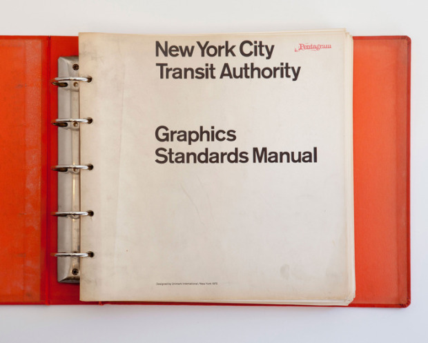
If you’ve been on Twitter for past couple of days you’ll have no doubt noticed that the design community (or the sizeable type-obsessed segment of it) is very excited that designers Jesse Reed and Hamish Smyth, founders of thestandardsmanual.com, have started a Kickstarter project to reissue the 1970 NYC Transit Authority Graphics Standards Manual by Unimark’s Massimo Vignelli and Bob Noorda as a full-size, limited edition book:
Every single day, millions of New Yorkers rely on the subway to get around the city, and you can’t use the subway without encountering the signage designed by Unimark. Over the years many changes have taken place (such as the switch from Standard Medium to Helvetica), but it is a testament to the quality of the work that, 44 years later, the signage holds up.
And perhaps on a deeper level, the signage has given the subway a voice. When a lot of people think of New York City, these signs pop into their head. We feel a tremendous responsibility to publish not only an important piece of design history, but an important part of New York City’s history.
Even if you can’t afford the book itself — it starts at $133USD if you live in Canada, more if you are in the EU — you can back the project for as little as $3, and the project’s video featuring Pentagram‘s Michael Bierut on the graphic standards manual is well worth watching:
You can also see scans from a copy of the manual discovered the basement of design firm Pentagram in 2012 on thestandardsmanual.com.
Comments closed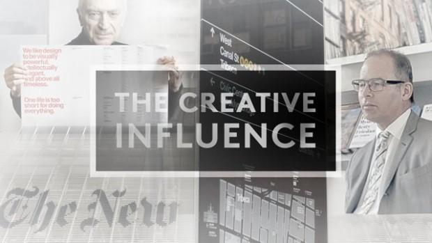
In this new short film for The Creative Influence documentary series, designer Michael Bierut talks about his mentor Massimo Vignelli, what makes an enduring logo, and how the internet has changed the way we work:
Comments closed
This made a couple of people in my Twitter feed very, very happy today — author Nicholson Baker talking about writing, design and the influence of his parents, who both studied at Parsons School of Design in New York, at Lingua Franca: The 2014 D-Crit Conference at the School of Visual Arts last week:
As Michael Bierut noted on Twitter, Nicholson Baker’s father was a graphic designer who worked for the great Erik Nitsche! Who knew?
(via @acejet170)
Comments closed
Interviewed at the AGI Open London 2013, Michael Bierut discusses his work, living in New York, and shares some advice for aspiring designers:

Massimo Vignelli discusses his approach to book design:
[vimeo http://vimeo.com/64811872 w=500]The video was produced by Pentagram’s Michael Bierut and Aron Fay for Mohawk’s “What Will You Make Today?” campaign, and is accompanied by a limited edition journal that reproduces Vignelli’s grid from the film.
Comments closed
A stunning jacket design by the great Isaac Tobin for After Freud Left, published by University of Chicago Press.
You can read my interview with Isaac from 2009 here.
Bauhütte to Bauhaus — A fascinating overview of the Bauhaus by Frank Whitford, author of the Thames & Hudson ‘World of Art’ book Bauhaus, for the TLS:
The structure of the Bauhaus… followed, as Gropius thought, medieval principles. He coined the school’s name so as to echo the word Bauhütte, in the Middle Ages the German for a guild of masons, builders and decorators. And the teaching was based on specialist workshops where you learned your trade by carrying out actual projects, graduating from apprentice to journeyman and master. The teachers were at first called Masters and not Professors, a revolution in a country where academic snobbery was the norm.

Calligraphica — A new tumblr devoted to calligraphy and hand drawn type (pictured above: ‘One Hope One Quest’, by Greg Papagrigoriou).
Persuasion — Michael Bierut talks to Designers & Books about his collection 79 Short Essays on Design:
Even the best designers have to persuade people all the time. They have to persuade people to hire them; then they have to persuade people to go with the recommended solution; then they have to persuade people to realize that solution in the best possible way. Simply showing someone a nice design is almost never enough. This constant effort—and all the rejection that inevitably ensues—obviously requires healthy confidence and nerves of steel, if not a strong ego.
And finally…

Critic James Lasdun reviews The Flame Alphabet by Ben Marcus for The Guardian:
Comments closedLanguage, the debasement, banality and ultimate toxicity thereof, is his subject. It’s a staple topic of avant garde literature, from the Prenzlauer Berg writers of the former East Germany to the Language poets of the American academy. All proceed, more or less, on the basis that verbal communication has been fatally corrupted by political or literary abuse and can be rescued only by a total dismantling and reassembly. Results vary (I’ve yet to read a Language poem that didn’t make me want to dissolve it in acid), but Marcus’s own, especially in The Age of Wire and String, have been haunting and inventive.
In this video for Designers and Books, graphic designer and Pentagram partner Michael Bierut chats with architect James Biber about the books he selected for the site. The setting is the Rachel Whiteread-like library, or “book cube”, in Biber’s architectural office, located on the 2oth floor of Cass Gilbert’s Woolworth Building in downtown Manhattan:
The full, unabridged, 30-minute conversation can be seen here.
1 Comment
A Swiss Typeface + 2 Italian Designers = New York City — Michael Bierut reviews Helvetica and the New York City Subway System by Paul Shaw for the WSJ:
Mr. Shaw is irritated with the widespread belief that the modern New York subway system has always been associated with the Swiss typeface Helvetica. This misperception was fueled by the attention the typeface received in 2007 on the 50th anniversary of its introduction, especially in Gary Hustwit’s “Helvetica,” a documentary survey of the astonishing ubiquity of a lettering style that appears over the entrances of American Apparel and Staples, on Lufthansa airplanes and New York City garbage trucks, on Comme des Garçons bags, and, yes, on New York subway signs. But the last, as Mr. Shaw shows, was not always so.
The Habit of Reading — Harvard professor Marjorie Garber talks about her new book, The Use and Abuse of Literature, with The Atlantic:
I don’t believe there’s a necessary divide between highbrow and lowbrow or whatever. I think that the habit of reading is intensely pleasurable and it’s also hard. The pleasure of it is partly the pleasure of detection, the pleasure of recognition, the pleasure of response… I’m very optimistic actually about the future of literature and literary reading—I’m far from despairing and I don’t actually feel that there’s a crisis. What we need is to continue to show the power of reading, the pleasure of reading—and, again, more people experience that than we are sometimes aware of.
Jessa Crispin, editor-in-chief of Bookslut, reviews the book for NPR:
In fact, it’s proof of literature’s strength and lasting value that a 19th century writer like Jane Austen can still speak to the contemporary love lives of her readers, and that a book like the Diary of Anne Frank can still cause a ruckus among protective parents. That fight over comic books? The same arguments were made about Shakespeare, because, it was suggested, Elizabethan drama wasn’t real literature. (Early debates also routinely happened over novels, ballads and books written by women.) People have been trying to ban books for ages, from the 18th century’s Fanny Hill and the court cases against Lady Chatterley’s Lover and Ulysses, all the way to Harry Potter. “[Literature’s] greatness… is enhanced rather than undercut” by these challenges, Garber argues. There will always be stubborn, scandalized readers trying to define what literature is, but the greats will endure.
From Head to Hand — A lovely essay by ceramic artist Edmund de Waal, author of The Hare With Amber Eyes, on Primo Levi’s The Wrench and being a maker, in Slate:
Here, at last, was a book structured round structure. It was a conversation about how you took one part of learning and took it to another job. This made sense of how deeply connected the hand and the head really are. It articulated for me the way that I would throw a dozen porcelain pots and look at them, affectionately perhaps but also with a dispassionate eye, and plan the next dozen. It understood how I knew when dipping a pot into a bucket of glaze or listening to the sound of the flames when firing my kiln that there is something out of balance.
And, above all, there was a feeling that Levi was not speaking for people who make things. He doesn’t explicate or translate technical terms. In The Wrench, Faussone’s voice is clear and unhurried, paced in response to the real complexities and real pleasures that he encounters. Alongside him is Levi with his “specific challenge: I have a double experience—a chemist in the world’s eyes, and feeling, on the contrary a writer’s blood in my veins.”
People Like Us — A profile of Coudal Partners on Signal vs. Noise, the 37 Signals blog:
Despite the varied efforts, one consistent theme for the firm is a sense of curiosity and playfulness… That attitude attracts kindred spirits. “In our experimental films, in our contests, in our blog postings, and the products we make, we are trying to satiate our own curiosity and interest,” he says. “And we just take it on faith that there are a lot of people who share those curiosities and those interests with us. And if so, they will buy our products and they’ll watch our movies. Maybe you don’t have to sell to everybody. Maybe there’s enough people like us.”
And finally…

Bass is Best — Steven Heller on the movie posters of Saul Bass, for The Atlantic:
Comments closedBass’s work is appealing for its nuance, and his keen ability for making subtle, abstract symbols speak louder than literal photographs. What makes the new Hollywood versions so unappealing is the inability to allow the viewer to fill in the blanks. When Bass worked for Hollywood studios he created a consistent identity for films, from main and credit titles to posters and ads.