Skip to content

Tag: metal type

Farewell – etaoin shrdlu

Farewell – etaoin shrdlu is a half-hour documentary about the last day of hot metal typesetting at The New York Times.

The 1978 film by Carl Schlesinger and David Loeb Weiss shows the remarkable nightly production process for a daily newspaper and the changes to come with the transition computers.

The title ‘etaoin shrdlu’ refers the words made by the letters of the first two columns of a type-casting machine keyboard. If I understand this correctly, the phrase was used by operators to create an ‘obvious’ mistake in a line of type to be discarded.

And if this sort of thing is your bag, the video was posted to Vimeo by Linotype: The Film along with number of other archive films about typesetting that are worth checking out.

via PressPad Apps / Open Culture

Comments closed
The Last Punchcutter

last punchcutter

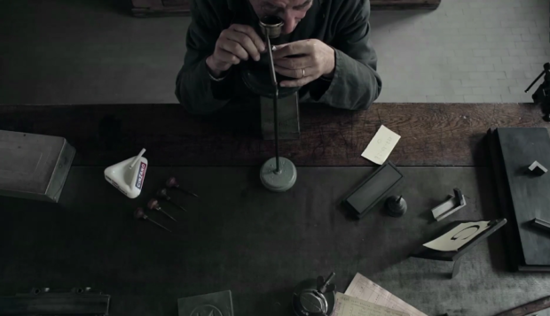
One for the letterpress obsessives and tool aficionados, The Last Punchcutter is a beautiful, wordless film capturing Giuseppe Brachino — who was the head of the engraving department of the Nebiolo Company from Turin — hand-cut a punch for metal type:

(via Coudal)

Comments closed

Creative Characters: Erik Spiekermann

P98a-spiekermann

Type designer Erik Spiekermann recently spoke to MyFont’s Creative Characters newsletter about his career and his return to letterpress printing:

I think it’s very appropriate to discuss the new interest in analog technologies, and the ways that young people are now finding to combine the analog and the digital. In fact, the difference between the two is disappearing. As type specialist Indra Kupferschmidt also remarked recently — there’s no longer any reason to make things for the screen that look worse than designs made for print. Anybody who does layouts for the screen must know about type and typography just as well as someone who designs for paper. So what counts is, just like before, how to get the message across. We have the technology, there is no more excuse for a job badly done.

What I find very interesting is the movement of people who are savvy in digital design but are genuinely interested in analog techniques. It is now more than a passing trend; there must be a deeper motive why we are newly interested in the hand-made and the haptic, material and three-dimensional aspects of type and design.

Comments closed

Making Faces: Metal Type in the 21st Century

On the New York Times website Steven Heller reviews Making Faces: Metal Type in the 21st Century, a documentary film by Richard Kegler, founder of the P22 Foundry. The film features the work of the late Jim Rimmer, a prolific Canadian typeface designer, who died last year:

Rimmer had a fruitful career, producing a huge number of fonts, but for Kegler, the most exciting part of making this film was discovering Rimmer’s “unabashed joy in doing what he was meant to do,” he says. “He was multitalented, and he was able to do what he loved most in ‘retirement,’ which may have been the most prolific period of his life. He was generous with his time in way that I could never be.”

Rimmer was made a fellow of the Society of Graphic Designers of Canada in 2007.


Comments closed