Skip to content

Tag: LRB

The Last London

The London Review of Books has a brilliant, sprawling, melancholy essay by author and psychogeographer Iain Sinclair titled ‘The Last London’. It’s difficult to know what to quote from the essay as it touches on so many interesting, diverse things, but this passage about London in science fiction is perhaps most appropriate for here: 

In 1909 [Ford Madox] Ford published an essay titled ‘The Future in London’, a provocative vision of a planned last city, a London circumscribed by the sixty-mile sweep of a compass point set in Threadneedle Street. He anticipated the urban planner Sir Patrick Abercrombie in reading London as a series of orbital hoops, ring roads and parkland. Brought to life on the edge of the river, this port settlement has always been a magnet for outsiders. It was constructed that way, developed to draw in the scattered tribes, the hut dwellers, to establish the importance of a river crossing. A satellite of Colchester, it was 100 AD before Londinium became a significant entity. And then it was lost, abolished, pulled apart, before it grew again.

Ford Madox Ford’s Edwardian pipedream is ahead of its time. He sees that Oxford and Cambridge and the south coast are all part of the London microclimate. He sees the river coming into its own as an avenue for transport. He envisages escalators and moving pavements, and a population enriched and civilised by incomers. He presents himself as so much the English gentleman that he is doomed to spend most of his career in chaotic exile, in France and the US. Ford is self-condemned, like Wyndham Lewis. His London is as fantastic now as the Magnetic City, protected by river and man-made canals, in Lewis’s The Human Age trilogy: ‘The blank-gated prodigious city was isolated by its riverine moat.’

The compulsion to imagine and describe a final city runs from Richard Jefferies, with his After London; or, Wild England (1885), through Ford and Lewis, to the drowned worlds of J.G. Ballard and Will Self, the dystopian multiverses of Michael Moorcock and China Miéville. Fredric Jameson, considering postmodernism, talks about the ‘hysterical sublime’: a sort of Gothic rapture in contemplation of lastness, the voluntary abdication of power to superior aliens. This was heady stuff for my own compulsive beating of the bounds, an exploration of neural paths and autopilot drifts through the City into Whitechapel and Mile End. One of these haunted dérives brought me to the window of a bookshop in Brushfield Street, alongside Spitalfields Market. The shop, of course, is gone now and the proprietor dead. I zoomed in on an item with a striking riverside skyline on the dust-jacket: Last Men in London by W. Olaf Stapledon, published in 1932. Here was a more intimate coda to the better-known Last and First Men (1930). I had to carry the book home.

Comments closed

Mad Men: The Shock of the Pretty

mad-men-season-7

Another overdue link from my ‘longreads’ bookmarks, The Hollywood Reporter talks to the cast and crew of Mad Men about the early days of the show now that it is about to come an end:

Christina Wayne (former senior vp scripted programming, AMC) Years earlier, I’d wanted to option Revolutionary Road [Richard Yates’ novel about suburbia in the 1960s]. But I was a nobody screenwriter, and [Yates’ estate] held out for bigger fish, which they got with Sam Mendes. So when I read [the Mad Men script], it resonated with me. This was a way to do Revolutionary Road, week in, week out. When we had lunch with Matt for the first time, I gave him the book. He called me after and said, “Thank God I’d never read this because I never would have written Mad Men.”

Perhaps more interesting, however, is James Meek’s lengthy article for the London Review of Books on the show’s superficiality, and its curious relationship with advertising:

Sterling Cooper, the fictional advertising agency around which Mad Men is built, is a caricature of the commercial TV system that produced the series: a pool of creative people in bitter thrall to the accountants and deal-makers they rely on for money. Although we learn in parenthesis that the agency gets most of its income from commission on the ads it places, for dramatic purposes the agency is divided into two departments: Creative, which comes up with campaign slogans, artwork and copy for ads, and Accounts, which persuades, charms, fawns, bribes and pimps its way to getting and keeping corporate clients. Mad Men is a show about writers dependent on advertising, written by writers dependent on advertising, the difference being that the fictional writers of Creative write the ads on which they depend.

Comments closed

Saul Leiter: No Project, Only Pictures


I missed this when it was posted last month: Brian Dillon on New York photographer Saul Leiter, who died on November 26th, for the London Review of Books blog:

Leiter used cheap film that gave his images a muted quality, and the slowness of the stock made it harder to capture the momentary dramas of the street that Klein or Cartier-Bresson could freeze in fast black and white. Technical constraints cannot, however, quite explain what Leiter did with colour and composition. Time and again in the 1950s he depicts New York under snow, with just a red umbrella or a pair of temporary stop lights to punctuate the dirty white. He used the whitewashed windows of defunct stores to silhouette the odd scurrying figure, little more than a smudge of overcoat, shopping bags or another umbrella – always umbrellas. He was a connoisseur of the effects of condensation.
Comments closed

Julian Barnes on Lucian Freud

Julian Barnes reviews two recent books about the painter Lucian Freud — Man with a Blue Scarf by Martin Gayford and Breakfast with Lucian by Geordie Greig — for The London Review of Books:

Freud was always a painter of the Great Indoors. Even his horses are painted at home in their stables; and though he curated a great Constable show in Paris in 2003, the greenery he depicted himself lived either in pots or was visible from a studio window. His subject matter was ‘entirely autobiographical’. Verdi once said that ‘to copy the truth can be a good thing, but to invent the truth is better, much better.’ Freud didn’t invent, nor did he do allegory; he was never generalising or generic; he painted the here and now. He thought of himself as a biologist – just as he thought of his grandfather Sigmund as an eminent zoologist, rather than a psychoanalyst. He disliked ‘art that looks too much like art’, paintings which were suave, or which ‘rhymed’, or sought to flatter either the subject or the viewer, or displayed ‘false feeling’. He ‘never wanted beautiful colours’ in his work, and cultivated an ‘aggressive anti-sentimentality’. When there is more than one figure in a picture, each is separate, isolated: whether one is reading Flaubert and the other is breastfeeding, or whether both are naked on a bed together. There is only contiguity, never interaction.

An interesting painter, but not a pleasant man, unfortunately.

1 Comment

Holy Sh*t, Batman

Colin Burrows reviews Holy Shit: A Brief History of Swearing by Melissa Mohr for the London Review of Books:

Really good swearing relies on formulaic elements, but needs to be precisely adapted to the moment. In this respect dear old Robin in the 1960s Batman TV series was one of the best swearers, though his lips were never soiled with a common-or-garden profanity. He could combine ‘Holy’ with more or less anything in order to create his trademark ejaculations, which were always to the point. Number two in my list of all-time favourites is ‘Holy chocolate éclair!’ Number one has to be ‘Holy uncanny photographic mental processes!’…

…The chances are that even the young audiences of the 1960s Batman TV series knew that there was something Robin was not saying every time he uttered a variant of his catchphrase. (I was there. It felt naughty.) A formula for generating euphemisms can be as creative as a formula for generating swear words: ‘frog’s knickers’ was my mother’s favoured way of flirting with the ‘f’ word, but we also have ‘effing’ and ‘frigging’ and (on Battlestar Galactica) ‘frakking’ too, though that particular euphemism may have had its day now that ‘fracking’ means frakking up the landscape in order to squirt gas out of it. One thing Robin never dared say, bless his little golden rayon cape, was ‘Holy Shit’, the uttering of which would certainly have KAPOWED him right off prime-time TV in those tender-eared days.

The book cover was designed by Lisa Force.

(Yes, it is quite possible that any review in which repeatedly references the Batman TV show  in a somewhat relevant way will be linked to on this blog)

Comments closed

Monday Miscellany, November 2nd, 2009

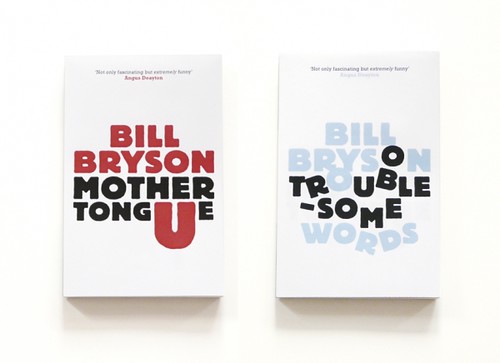
Unpublished concept jacket designs by London-based print designer Allan Sommerville for the Penguin’s Bill Bryson books (via Cosas Visuales).

Fonts — This is AWESOME: Wisconsin Public Radio’s To The Best of Our Knowledge talk fonts with Jonathan Hoefler and Tobias Frere-Jones, designers of Gotham, Matthew Carter, designer of Verdana, author Nicholson Baker, Tracy Honn, director of the Silver Buckle Press, and Kitty Burns Florey, author of Script and Scribble: The Rise and Fall of Handwriting. Listen NOW.

Many Happy Returns — Author, academic and newspaper columnist John Sutherland (The Boy Who Loved Books) on 30 years of The London Review of Books for The Financial Times:

The LRB front cover logo was “THE LONDON REVIEW of Books” – the last two words being smaller. As the typography signalled, it was the review that mattered as much as the book under review. Articles in the LRB were, and are, long: anything between 2,000 and 5,000 words. On special occasions they can run into the tens of thousands. Rates of pay seemed to me startlingly high: three or four times, in the early years at least, what the TLS paid. Miller personally appeared austerely indifferent to money. I suspect he worked for little or nothing. Nor did rises or falls in circulation appear to trouble him overmuch. Quality was all.

(There’s also a rather lovely addendum about the LRB’s personal columns, so read to the end!).

Somewhere Towards The End — A wonderful essay on editor and author Diana Athill by Ian Jack,former editor of Granta, in The Guardian:

[W]hat held me about the writing was its candour. The quality has since become an Athill trademark, though in itself candour is no guarantee of literary pleasure or interest: frank books aren’t always good books and can often be tedious by boasting of their frankness. Athill’s way of being candid is more subtle and its effect more persuasive… Part of this comes from her considerable gift as a maker of sentences, which are so lucid and direct; some of it is owed to the breaking of taboos that then surrounded female sexual behaviour; most of it, though, stems from her triumphant struggle to “get it right”, a lesson she learned from two of the writers she edited. Rhys told her that the trick of good writing was “to get it as it was, as it really was”. Naipaul said that “provided you really get it right, the reader will understand”.

The Internationalist — An all too short interview with Penguin Canada’s David Davidar, who was recently appointed CEO of Penguin’s new division Penguin International, in the Globe and Mail.

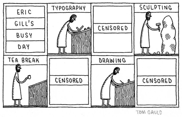
And finally… I do love Tom Gauld:

eric gills busy day

(More on Eric Gill)

Comments closed

Monday Miscellany, October 26th, 2009

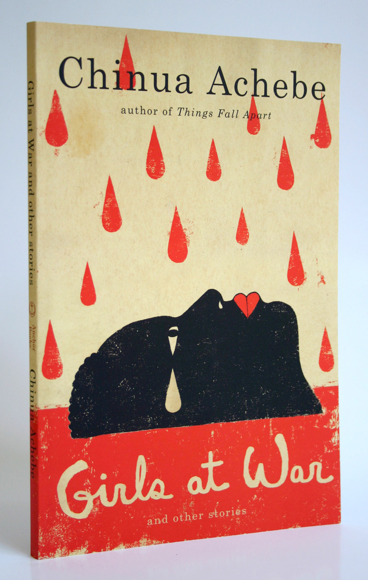
The brilliant Helen Yentus has redesigned the covers of Chinua Achebe’s books for Anchor with illustrations and hand lettering by Edel Rodriguez who has some amazing sketches of her work on the series at her portfolio site.  (Covers first seen at wonderful Caustic Cover Critic blog, with additional details and links from estimable John Gall.)

Pixellated Penguin — Anna Rafferty, Managing Director of Penguin Digital (UK), profiled in The Marketer Magazine:

Although volume sales of books has dropped 9.2 per cent this year… and the onset of digital publishing means a reassessment of how content is provided, Rafferty says the recession has not affected the way she markets Penguin. “We’ve always been against paying for things. We are a content company with access to the words and opinions of the funniest, most intelligent and entertaining authors in the world.”

Difficult Women — Mary-Kay Wilmers, editor of the London Review of Books (which celebrates it’s 30th anniversary this year), profiled by Nicholas Wroe for The Guardian.

Anti-Ironic — Product designer Joey Roth (designer of the beautiful Sorapot teapot) interviewed at Boing Boing:

I see designers and companies whose work represents a disposable, ironic, trend-driven view of product design as my ideological enemies. Irony was the dominant approach a few years ago, and it’s still popular. I think it has no place in design, since physical resources are consumed when something is mass-produced, and a joke is only witty for so long. My desire to design objects that represent a more thoughtful, sustainable view grew partially from the ironic, anti-design trend I encountered as I was getting into design.

I sort of feel the same way about books…

All Cover Archive — Ben Pieratt has posted some of his early design’s for the Book Cover Archive logo at his new General Projects Blog.

Ben also had a nice post about books and logos at the BCA blog last week…

And speaking of the BCA blog, Ben recently posted about James Le Beau-Morley‘s cover design and layout concepts for 1984:

3 Comments