Skip to content

Tag: louise fili

Q & A with Steven Heller, Shadow Type

“Dimensional typefaces toy with human perception, challenging the limits of cognition. Whether framed by a subtle tint or a bold silhouette, in color or in black and white, a shadow adds bulk, enabling the words to rise voluminously from otherwise flat and unmonumental surfaces. Shadow faces are typographic trompes l’œil, fascimiles of real three-dimensional letters and inscriptions in sculpture and architecture… This sculptural essence of shadow type adds not only to the letters’ visibility, but also to their continuing allure.”

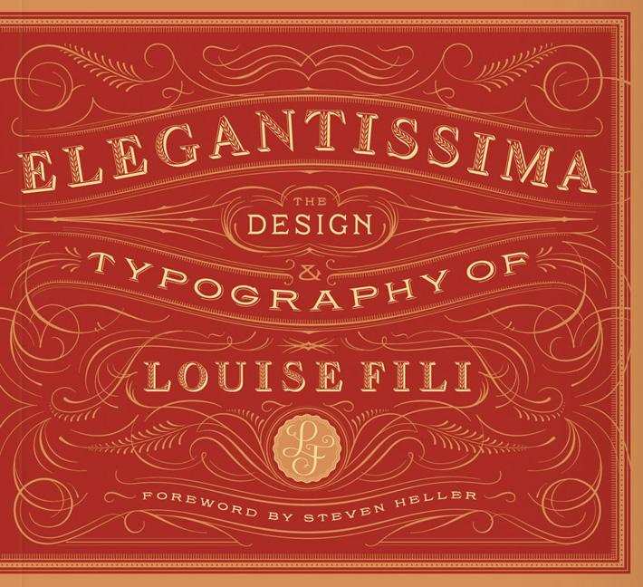
Just thinking about how much Steven Heller writes makes me a little giddy. The renowned art director, educator, design historian, and critic provides a steady stream of design commentary in newspaper, magazine and journal articles (not to mention his blog for Print magazine, The Daily Heller). He has authored, co-authored, or edited over 100 books on design, illustration and typography, including the recent Shadow Type: Classic Three-Dimensional Lettering, co-authored with his partner Louise Fili.

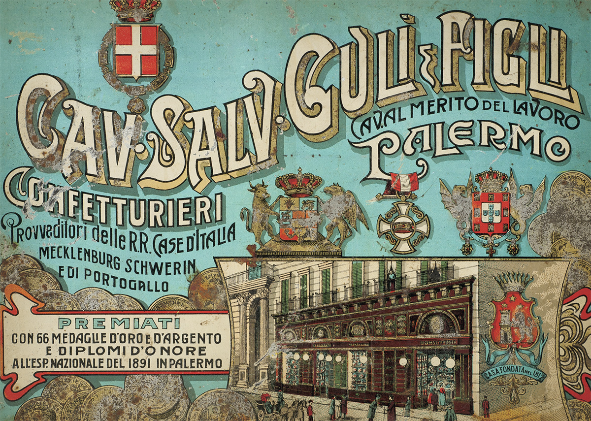
Shadow letters started to make an appearance on merchants’ signs in the 18th-century, and were introduced as metal typefaces as early as 1815, but they did not become common in printed text until later in the 19th-century. After a surge in popularity among printers and their clients, type foundries began to provide a wide selection of styles and sizes, and by the late 19th-century shadow wood type was also in demand, coming in extra-large sizes so it could be used outdoors. “Whether custom drawn, or as metal or wood type, shadow letters animated newspaper and magazine mastheads, product labels, and, indeed, all kinds of signs and posters.”

Published in September last year by Princeton Architectural Press, and distributed in Canada by Raincoast Books, I had the opportunity to ask Steven about Shadow Type, his interest in design ephemera, and how he finds time to write.

Do you remember when you first became interested in design?

I was interested in pictures at an early age. I wanted to be like Jules Feiffer, a comics artist. Design came later. I was studying the work of some German satirists, who were also designers.

Did you grow up in a creative household?
Not especially.

Where did you begin your design career?
At 14 I worked for an ad agency doing RussssTogs. Didn’t go well. It took another 3 years before I was hired by an underground paper to do layouts.

When did you first start writing about design history?

When I was at the NY Times as OpEd art director, I did a little bit of writing on those Germans I mentioned. Then it accelerated to writing about publications and other historical themes.

How do you find the time write?

There’s always time.

Do you still get excited when you hold one of your own books in your hands for the first time?
Yes, the thrill is still there. But the high lasts shorter. An addict gets used to the fix and needs another and another. These days, I don’t rip the envelope right open. I let it sit for hours, so I have something to look forward to. Weird, I guess.

Why did you and Louise decide to write a book on classic three-dimensional lettering?

We did the first one on Scripts. We’ve done series before, they didn’t start out that way, but evolved. This evolved into Shadow Type. I have long loved the dimensional, colourful, sculptural letters.

When was the heyday of ‘shadow type’?
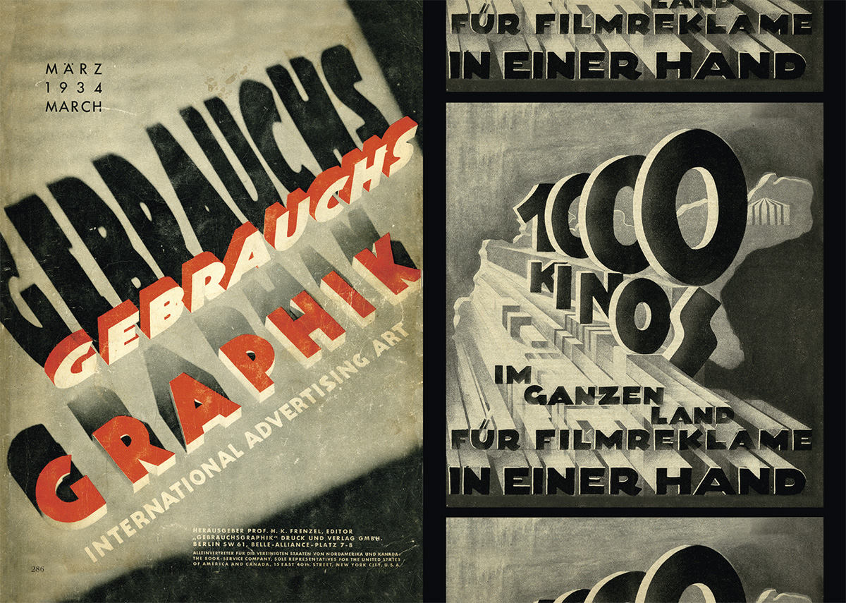
19th, 20th and 21st centuries. Its never gone out of style. But the golden age was late 1880s to 1940s.

Why did it become popular?
Dimensionality on flat surface. Our eyes love to be fooled.

Why do you think there is a renewed interest in ornate typography and lettering?
It comes and goes. I see a shift away again. But it has to do with the joy we get from ornament and I think it parallels what goes on in clothing.

Has Louise’s work contributed the revival of decorative type?
Possibly. But she’s not decorative per se. Her type choices are elegant. She’s about precision and aesthetic pleasure.


Do all the examples in the book come from your own collection?

For Scripts and Shadow yes. And for the next one too, that’s Stencil Type.


Why does design ephemera hold such a fascination for you?
I’ve come up with all sorts of reasons, but the all seem bogus. I feel the stuff somehow represents who I am. But I also love being a repository of history. More than that, I cannot say.

Your son, Nicolas Heller, recently made a film about your den called “The Cave.” What was that experience like?
He’s a great talent. I just set him loose. And he made his film. The stuff in that place should be interpreted by others. The juxtapositions of objects and books are at times wonderful.

What’s Nicolas working on now? 
He’s doing a series of documentaries on eccentric New Yorkers called NO YOUR CITY, he’s also filming designers for documentaries produced by Brian Collins.

Do you have a favourite book?
Of my own? I’ve done over 165, but I love Iron Fists. Of other people? There are too many to say.

What books are in your ‘to read’ pile?
I just finished Deborah Solomon’s biography of Norman Rockwell – smartly done. And I finished Year Zero by Ian Buruma about the year 1945, makes the blood chill and boil. On the pile is a thick book about the Beatles. Not sure I’ll get to that.

Is there one book you think all designers should read?

I love Ben Shahn’s The Shape of Content. I also love The Hare with Amber Eyes, but for me, nothing is so essential that I’d stand on the mount and scream that they should read the tablets.

Thank you, Steven!

1 Comment

Shadow Type and The Designers & Books Online Book Fair


Steven Heller and Louise Fili talk about their beautiful new book Shadow Type in a new video for Designers & Books:

The video is part of the Designers & Books Online Book Fair, a wonderful directory of design books that you can browse in all sorts of interesting ways.

(Shadow Type is published by Princeton Architectural Press in the United States, and distributed by my employer Raincoast Books in Canada)

1 Comment

Midweek Miscellany

Work / Life — An interview with the brilliant Louise Fili, designer and former art director of Pantheon Books, at The Great Discontent:

Everybody wanted to use standard fonts, but I just wasn’t satisfied doing that. I didn’t realize this until years later, but what I was really doing was developing type treatments for the title of the book and approaching it more like a logo. I wanted each book to have its own personality and that couldn’t be achieved with standard fonts. Again, I was lucky because it was appropriate to do that for the types of books I was working on. The other thing to note is that I was collaborating with a lot of really talented illustrators and made a concerted effort to combine the type and image together. I also tried to encourage illustrators to create their own type. I would sketch it out for them and then ask them to actually draw it so it would become part of the illustration, which makes for a stronger design, whether it’s a book cover or logo.

Colour and Intention — Claire Cameron interviews Sam Garrett about his translation of The Dinner by Herman Koch, for the LA Review of Books:

The words a writer uses not only have a dictionary definition, but also a color and an intention. To pin those down, the translator has to sniff around. From the first to the final word of a translation, you’re leading the reader along a path to a destination. The color is what keeps the reader hopping; the intention is the scent that keeps the translator on the right path.


Negotiations — Jim Tierney explains his design process for the cover of Ruth Ozeki’s A Tale for the Time Being:

I decided to run with the first concept that popped into my head: a very simple and tactile facsimile of the red Proust notebook, embossed with an illustration of Nao, floating spectrally above the rocky coast of British Columbia. I think this design is all about questions: How did this book get here? Was it lost intentionally, or by accident? Is Nao alive or dead? Is she even real?

Minimal designs like this is always a hard sell in cover meetings, and it was immediately rejected as too quiet and precious-looking. Loud, colorful, and commercial are popular adjectives in modern book marketing, but it’s always fun to start off negotiations with something a little more obscure.

And finally…

Welcome back from near-death Dan Mogford. Please don’t do that again.

Comments closed

Design Matters with Louise Fili

Designer, and former art director of Pantheon, Louise Fili discusses her work with Debbie Millman on Design Matters:

Design Matters With Debbie Millman: Louise Fili Interview mp3

Elegantissima, the first monograph of Fili’s work, was published earlier this year by Princeton Architectural Press (who are, for the record, are distributed in Canada by my employers, Raincoast Books)

Comments closed

Midweek Miscellany

An interview with the talented Allison Colpoys, book designer at Penguin Books Australia, at The Design Files.

Particular Beasts — A brief interview with art director John Gall about teaching book design:

Each book is its own particular beast that has to be designed from the ground up. Every designer has their own way of looking at the problem and coming up with a solution. It can’t help but be personal on some level.

A Twist, Flourish or Quirk — Louise Fili and Steven Heller, authors of Scripts: Elegant Lettering from Design’s Golden Age, on script typefaces at Design Observer:

During the letterpress era [script typefaces] were in such great demand that many people “invented” them, and many others copied them. In some commercial printing shops, composing cases filled with scripts were stacked floor to ceiling to the exclusion of other type. Printers routinely amassed multiple styles of the heavy metal type fonts, each possessing a distinct twist, flourish or quirk, used to inject the hint of personality or dash of character to quotidian printed pieces… Scripts signaled propriety, suggested authority yet also exuded status and a bourgeois aesthetic. The wealthy classes couldn’t get enough fashionable scripts in their diet.

The Pilot Fish and The Whale — David Carr, media columnist at the New York Times, talks about the documentary Page One: Inside The New York Times with screenwriter Aaron Sorkin  for Interview Magazine:

I think one of the things that Page One does an amazing job of demonstrating is the importance of editors. You can see our editor, Bruce Headlam, shaping, arguing, pushing back. Of course, that’s what you don’t have a lot of in the blogosphere. There is nobody pushing people to support what they’re saying, nobody arguing against the assumptions that are brought to the table…

Slow Journalism — An interview with cartoonist and journalist Joe Sacco (Footnotes in Gaza) for the A.V. Club:

[I]t’s one of the slowest art forms or media there is. You know, there’s fast food and there’s the slow food movement; I guess this is slow journalism. It just forces you into it. It’s difficult for me because I love being in the field, so to speak. I love that day-to-day thrill of being in places, and the great privilege of meeting people and going into their homes and seeing what their lives are like. I love that. But when you compare how much time is spent reporting to how much time is spent at a desk just writing and drawing, the reporting is a fraction. That’s just the way it is.

And finally…

Sing Out — Dorian Lynskey, author of 33 Revolutions per Minute, recommends five books about protest songs. The cover of 33 Revolutions per Minute was designed by Jacob Covey.

http://www.bookdepository.com/Footnotes-Gaza-Joe-Sacco/9780805092776/?a_aid=optimist
Comments closed

Midweek Miscellany

Scripts: Elegant Lettering from Design’s Golden Age — new from Steven Heller and Louise Fili, published by Thames & Hudson.

50/50 — Designer Andrew Henderson, curator of Lovely Book Covers, is going to spend 50 days designing 50 covers based on the 50 most influential books of the last 50 years.

See also: Matt Roeser’s New Cover project.

Why She Fell — An interesting article by Daniel Mendelsohn on Spider-Man and Julie Taymor’s ill-fated musical Spider-Man: Turn Off the Dark, in the NYRB:

What made Spider-Man unusual among superheroes when he debuted wasn’t so much the arachnid powers he derived from the radioactive spider…, but his very ordinariness. Bullied at school, worried about girls and money, fussing at and fussed at by his foster parents, the kindly Aunt May and Uncle Ben, Peter Parker is a regular lower-middle-class Joe with pretty average teenager problems… It’s not hard to see how all this made Spider-Man popular among teenaged comic book readers in the 1960s, that decade of the teenager. Indeed, the series marked the beginning of what one historian of the genre called a “revolution” — a newfound interest on the part of comic book creators in emphasizing the protagonist’s “everyday problems” rather than the glamour of being a superhero… The emphasis on Spidey’s ordinary humanness explains why this series, as opposed to a number of other superhero comics, is laden with “heavy doses of soap-opera and elements of melodrama.”

Sheep — Philosopher Simon Blackwell reviews How to Write a Sentence: And How to Read One by Stanley Fish for The New Republic:

It is wrong to think that the sentence is a mere slave, whose function is to bear content, which, while being the really important thing, is also something that could equally have been borne by another. Change the shape and ring, and you change everything. The balance, the alliterations, the variation, the melody, the lights glimmering in the words, can work together to transform even an ugly thought into something iridescent, as when Eli Wallach in The Magnificent Seven expressed his character’s indifference to the suffering he brings the peasants in one perfect, albeit perfectly brutal, sentence: “If God didn’t want them sheared, he would not have made them sheep.” As Fish says in his analysis of this example, here the “air of finality and certainty” is clinched by “the parallelism of clauses that also feature the patterned repetition of consonants and vowels” and then, of course the inevitability of that last dismissive word. If the devil has the best tunes, sometimes the bandits have the best sentences.

And finally…

The aforementioned Steven Heller on the paintings of Paul Rand at Design Observer:

[He] proceeded to tell me how he liked working in all media, including photography and painting and how it influences what he does and how rarely these “other things” are seen in print or elsewhere. Actually, he used excellent judgment insofar as the paintings and watercolors were appealing for their humor and craft, but they were paeans to Klee (and even Cezanne). They were not his true métier (pardon my French). They showed his interests and represented his eye, but painting was not his signature work…

What is there to say about these paintings and watercolors? Are they building blocks or respites from the rigors of graphic design? When I said, “Paul, one of the things I like about you, is that you don’t pretend to be a painter” he had a knowing look. I don’t think he wanted to be a painter, but he wanted to integrate art into graphic design, which he did so very well.

Comments closed