Skip to content

Tag: london underground

Johnston100 for Transport for London

A short film about Monotype’s update to Transport for London’s Johnston typeface:

Originally designed by Edward Johnston in 1916, the ‘remastered’ Johnston100 typeface, attempts to restore the idiosyncrasies of the Johnston’s design while expanding it to embrace contemporary typographic trends and meet new digital requirements. Johnston100 includes five weights of the design, including two brand new weights, hairline and thin, and will start appearing across the TfL network later this year.

(via Alistair Hall)

Comments closed

Edward Johnston: Modest Typographic Purist

Edward Johnston

At The Guardian, Oliver Wainwright considers the work of Edward Johnson, and visits a new exhibition marking the centenary of his famous typeface for London Underground:

Although sans-serif typefaces (letters without the little flicks at the end of their strokes) date back to the 18th century, Johnston’s Underground typeface can be credited with popularising the style. Indeed, it was so influential that it became the typeface from which every 20th-century sans-serif typeface would be measured. As Gill later wrote in admiration, Johnston “redeemed the whole business of sans-serif from its 19th-century corruption”.

His former student was perhaps driven by the guilt of seeing the success of his own typeface, Gill Sans, which he admitted had been heavily based on Johnston’s work. Promoted and licensed by Monotype, and preloaded into computers, it has become much more widespread than Johnston, which is owned by Transport for London.

“I hope you realise that I take every opportunity of proclaiming the fact that what the Monotype people call Gill Sans owes all its goodness to your Underground letter,” Gill wrote in a letter to Johnston later in life. “It is not altogether my fault that the exaggerated publicity value of my name makes the advertising world keen to call it by the name of Gill.”

Little did it bother Johnston, accidental creator of one of the world’s longest-lasting corporate identities, who was never one for the limelight. When asked to submit a biography for Who’s Who, he was characteristically to the point, listing only three achievements: “Studied pen shapes of letters in early MSS, British Museum, 1898-99. Teacher of the first classes in formal penmanship and lettering, LCC Central School, 1899-1912. Designed block letters based on classical Roman capital proportions (for London Electric Railways), 1916.” But what influential letters they would turn out to be.

The exhibition Underground: 100 Years of Edward Johnston’s Lettering for London opens at Ditchling Museum of Art and Craft in Sussex March 12 and runs until September 11.

johnston roundels


Comments closed

The Retiring Type: Intelligent Life on Edward Johnson

3679629462_bc4885b1ef_o

At Intelligent Life, Catherine Nixey tells the story of Edward Johnson, creator of the London Underground’s typeface:

The Underground didn’t commission a font to look different from commercial ones simply to sell it straight back to the commercial world. But that world wanted the font nevertheless. And so Johnston’s pupil Eric Gill obliged, creating Gill Sans, which would go on to be used on everything from the classic Penguin Books design to the BBC logo (since 1997)—and, later, many a Word document.

There is some suggestion that even Gill, not a man to be easily abashed, may have felt uneasy about this. He sent Johnston a letter that manages to turn, in a moment, from humility to boastful defiance. “I hope you realise”, he wrote, “that I take every opportunity of proclaiming the fact that what the Monotype people call ‘Gill’ Sans owes all its goodness to your Underground letter. It is not altogether my fault that the exaggerated publicity value of my name makes the advertising world keen to call it by the name of Gill.”

Did Johnston mind? We don’t know exactly. “I don’t think there was bitterness,” says his grandson. Though there was no money, either. “He was so lacking in business sense, he never charged a going rate for his work and so couldn’t make ends meet.” For the Underground font, Johnston was paid 50 guineas—about £4,000 in today’s money (he handed 10% of it on to Gill). By the time he died in 1944, “the finances were in a terrible state,” Andrew Johnston adds. “There had been a fund started by calligraphers in America to help this destitute master craftsman.”

(image via Mikey Ashworth on Flickr)

Comments closed

Something (Late) for the Weekend

Enjoy Your Cigarette — Tom Cox reviews Penguin’s Underground Lines boxed set for The Guardian:

Underground Lines often matches its writers to its tracks very well, in terms of temperament as well as personal history. The Jubilee line, so often associated with capitalism and the Docklands development, is a good match for John O’Farrell, a writer whose wit was marinated in the political 1980s. The nervy prose of William Leith could not be more apt for the rather fraught Northern line, and his manic, anxious account of being evacuated from a train that was filling with smoke is probably the most addictively readable thing here. “People never tell you to have a pleasant journey on the underground, just as people will say, ‘Enjoy your meal,’ but never ‘Enjoy your cigarette,'” he writes.

Dirty Lit — Edward Jay Epstein at the NYRB Blog on being taught literature by Nabokov:

He made it clear from the first lecture that he had little interest in fraternizing with students, who would be known not by their name but by their seat number. Mine was 121. He said his only rule was that we could not leave his lecture, even to use the bathroom, without a doctor’s note.

He then described his requisites for reading the assigned books. He said we did not need to know anything about their historical context, and that we should under no circumstance identify with any of the characters in them, since novels are works of pure invention. The authors, he continued, had one and only one purpose: to enchant the reader. So all we needed to appreciate them, aside from a pocket dictionary and a good memory, was our own spines. He assured us that the authors he had selected—Leo Tolstoy, Nikolai Gogol, Marcel Proust, James Joyce, Jane Austen, Franz Kafka, Gustave Flaubert, and Robert Louis Stevenson—would produce tingling we could detect in our spines.

Exploded Hearts — Melville House’s Christopher King on his cover design for How to Keep Your Volkswagen Alive by Christopher Boucher, at Talking Covers:

In the end, I did what I usually do, which is to steal an idea for the cover directly from the manuscript. In this case, the narrator’s son—who, again, is a car—has a heart in place of an engine, so I printed off an image I found online and showed it to our publishers:

“It’ll be like this exploded diagram of a car, but with a heart in place of the engine.”

“OK!”

And finally…

The Wall Street Journal looks at ‘The Improbable Rise of NPR Music‘ which, for all of the WSJ’s obvious churlishness, manages to be fascinating despite itself:

NPR Music’s breadth, depth and ability to break new material are its main strengths. The site offers music that appeals to rock, jazz and classical lovers—all under one roof. Still another advantage is NPR Music’s ties to “All Things Considered” and “Morning Edition,” which, even if Washington-centric, have music woven into their fabric and provide news for the site as well as a familiar storytelling style.

NPR Music in its present form just turned five. “It’s the closest thing we have to a pure startup inside what is now a 40-plus-year-old institution,” says Kinsey Wilson, NPR’s executive vice president and chief content officer. “This group of now roughly 20 people has had an opportunity to invent something from scratch.”

(via Largehearted Boy)

Comments closed

Something for the Weekend

Typgraphica’s favourite typefaces of 2012. There’s a lot to love about Balkan Sans by Nikola Djurek and Marija Juza. But check out the ligatures on Levato by Felix Bonge:


Chasing the White Rabbit — Francine Prose on dreams and literature, at the New York Review of Books blog:

Literature is full of dreams that we remember more clearly than our own. Jacob’s ladder of angels. Joseph saving Egypt and himself by interpreting the Pharoah’s vision of the seven fat and lean cows. The dreams in Shakespeare’s plays range as widely as our own, and the evil are often punished in their sleep before they pay for their crimes in life. Kafka never tells us what Gregor Samsa was dreaming when he awakens as a giant insect, except that the dreams were “uneasy.” Likely they were not as uneasy as the morning he wakes into. By the end of the first paragraph of “The Metamorphosis,” Gregor has noticed his arched, dome-like brown belly, his numerous waving legs. “What has happened to me? he thought. It was no dream.”

Krautrock on the Underground — An excerpt from Earthbound by Paul Morley, part of the Penguin Lines series for the 50th anniversary of the London Underground, at The New Statesman:

“Krautrock” was the convenient collective name given in a slightly jokey, slightly wary and affectionately patronising way to an eclectic collection of radicalised German groups from very different parts of the country that contained musicians who were born in the few years before, during or just after the Second World War. Another collective name for these groups, still frivolous but more descriptive of their mission to create sound never heard before on our planet and invent music that could make you feel you were leaving the earth behind, was “kosmische”. As well as Can, these groups included Kraftwerk, Tangerine Dream, Amon Düül II, Cluster, Popol Vuh, Harmonia, Neu! and Faust, and they were looking for ways to repair their traumatic recent history, remove the crippling infection of fascism, break free of totalitarian artistic repression, negotiate turbulent social and emotional currents, and radically, romantically reinstate the positive, progressive elements of their mortified national psyche.

See also: Jonathan Gibbs looks at the design of the Penguin Lines series at The Independent.

And finally…

Fact-Checking at the New Yorker, an excerpt from a new book called The Art of Making Magazines:

When the new, remade The New Yorker of the last decade was gearing up and we started getting all these late-breaking stories, issues such as logic and fairness and balance—which previously had been the responsibility of the editors—began to fall on the checkers. This wasn’t by anybody’s design. It was because the editors were really busy putting these stories together and they wanted us to look at things from the outside and see how they were framed, and look at them from the inside and look at the logic and the way they were reported and the way quotes were used and many other such things.

That responsibility came to us not in the way of anybody saying suddenly, “You’re doing that.” It just became that when a problem arose, they would come to us and say, “Why didn’t you warn us?” And so it just became clear that there was this gap between editing and checking that had opened up under the pressure of later-breaking stories, and it just seemed logical that we should fill it. It made our job more challenging, and more fun.

(via Kottke)

1 Comment

Something for the Weekend

Rubbish — Rachel Cooke on the artist Kurt Schwitters at The Guardian:

Merz doesn’t mean anything: it is a nonsense word (it comes from Commerzbank, an ad for which appears in one of his earliest collages). But after 1918 everything Schwitters made was Merz, whether it was periodical, painting or poem. He was a one-man movement. “The word denotes essentially the combination of all conceivable materials for artistic purposes,” he said. “And technically the principle of equal evaluation of the individual materials… A perambulator wheel, wire-netting, string and cotton wool are factors having equal rights with paint.” In other words, art could be made from the things most people regarded as rubbish. Almost overnight, he became a collagist.

There is a slide-show of Schwitters’ collages here.

Also: Merzman: The Art of Kurt Schwitters, is a fascinating 30-minute BBC Radio 4 documentary about the artist and his work in Britain.

The exhibition Kurt Schwitters in Britain opens at the Tate January 30, 2013.

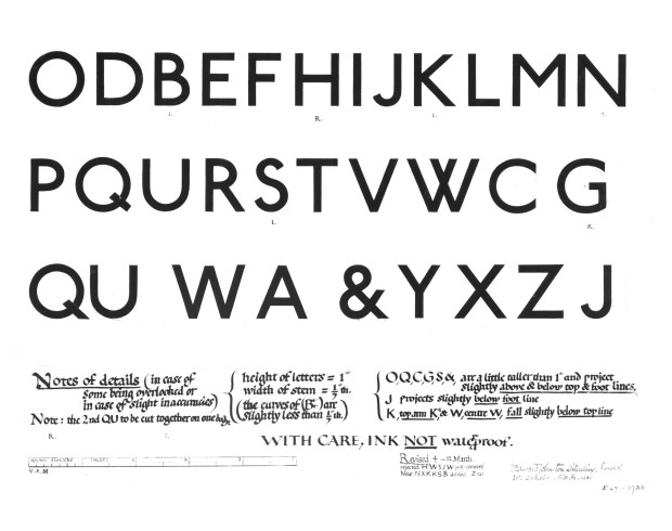
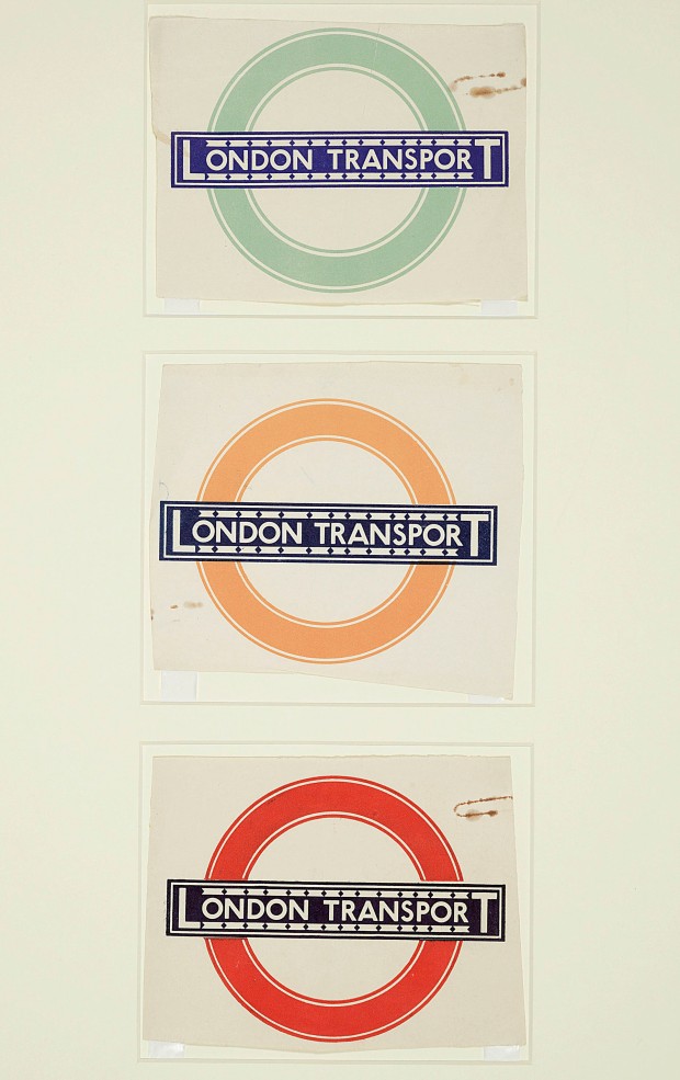
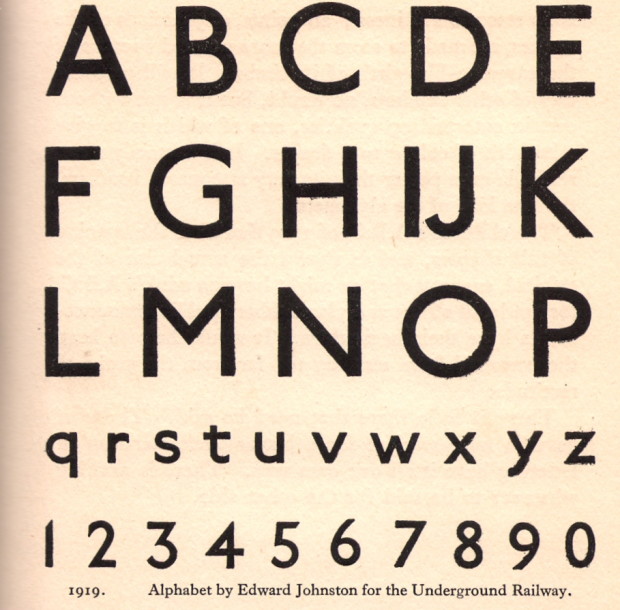
Going Underground — The iconic London Underground typeface, designed by Edward Johnston in 1913, turns 100:

“Underground” — later known as “Johnston” — was circulated as a lettering guide for sign-painters and also made into wood and metal type for posters, signs, and other publicity materials used throughout London’s transport network.

Johnston himself only drew one weight of the typeface. He based its weight and proportions on seven diamond-shaped strokes of a pen stacked in a row. This gesture even shows up in the typeface itself, with the characteristic diamond used as the tittle of the “i” and “j”. He felt so strongly about the weight of the design that when another student of his agreed to create an accompanying set of bold capitals, Johnston wouldn’t speak to him for decades afterward.

And finally…

Fire Hose — James Gleick on the Library of Congress collecting and storage of Twitter messages, for the New York Review of Books:

This is an ocean of ephemera. A library of Babel. No one is under any illusions about the likely quality—seriousness, veracity, originality, wisdom—of any one tweet. The library will take the bad with the good: the rumors and lies, the prattle, puns, hoots, jeers, bluster, invective, bawdy probes, vile gossip, epigrams, anagrams, quips and jibes, hearsay and tittle-tattle, pleading, chicanery, jabbering, quibbling, block writing and ASCII art, self-promotion and humblebragging, grandiloquence and stultiloquence. New news every millisecond. A vast confusion of vows, wishes, actions, edicts, petitions, lawsuits, pleas, laws, proclamations, complaints, grievances. Now comical then tragical matters.

Call it what you will, the Twitter corpus now forms a piece of “the creative record of America” and therefore falls squarely within the library’s mission…


Comments closed