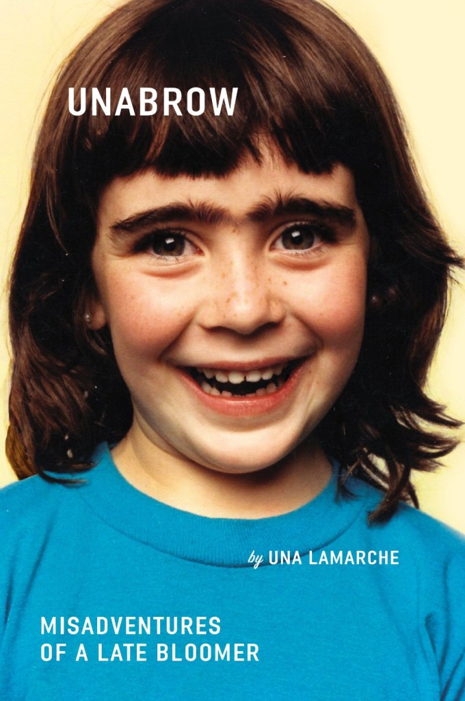
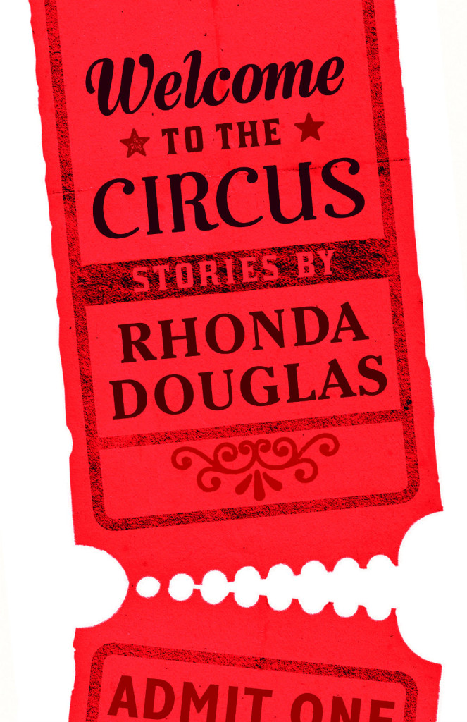
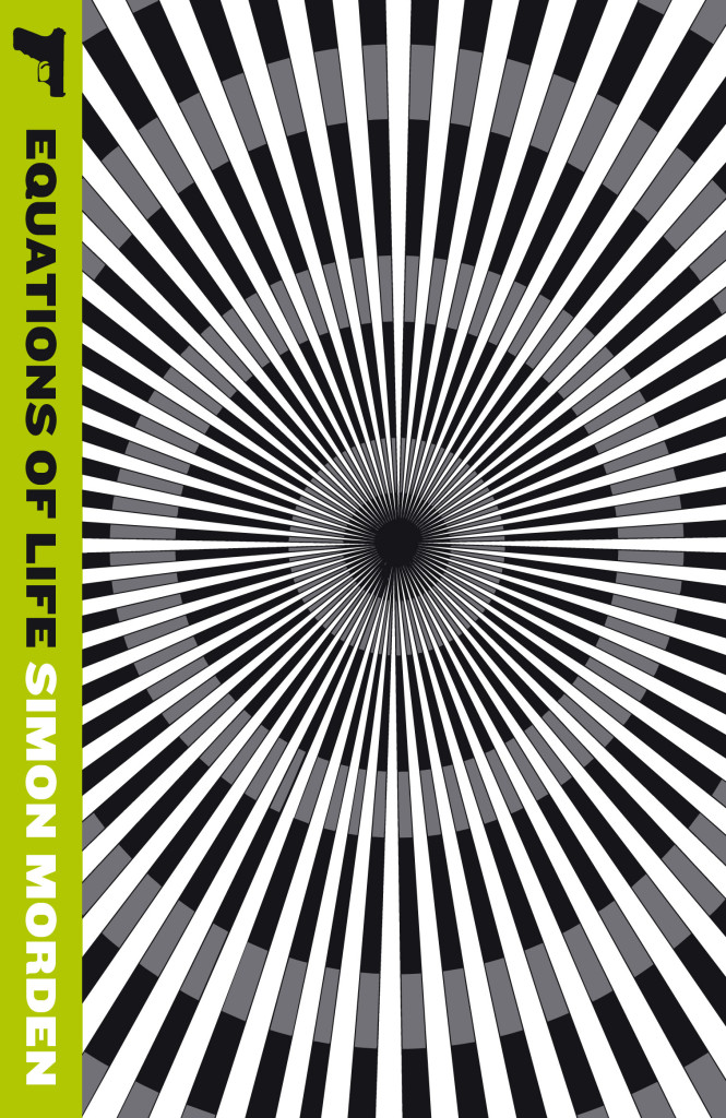
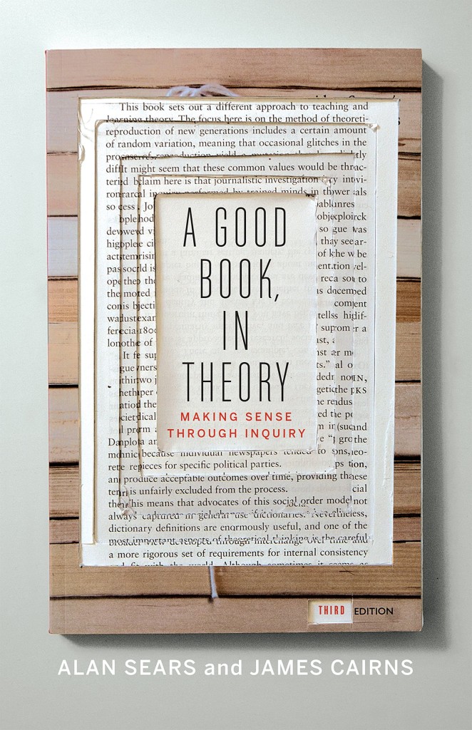
Hey. I hope you’re keeping safe and well wherever you are. I’m going to keep this very short as there’s lots going on, but there some great covers, and a couple of tenuous comparisons this month (hey, I can’t help how my brain works!) . Enjoy!
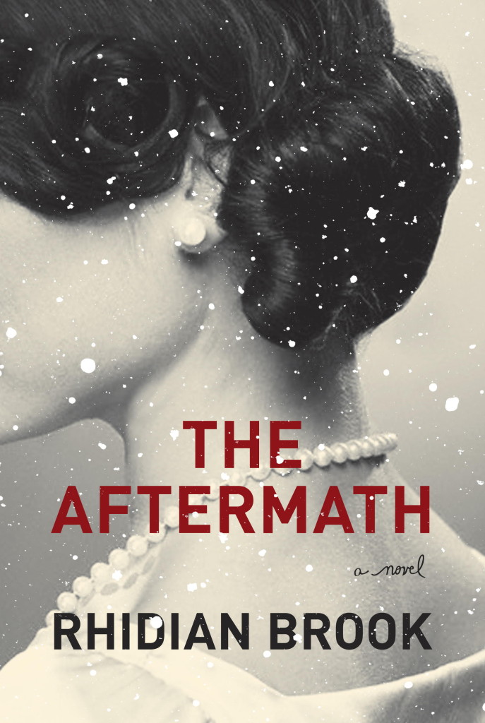
This reminded me of Akiko Stehrenberger‘s poster for the movie Funny Games. They don’t really look alike, and the tone is very different, but I think it was the close crop and the hair that brought it to mind.
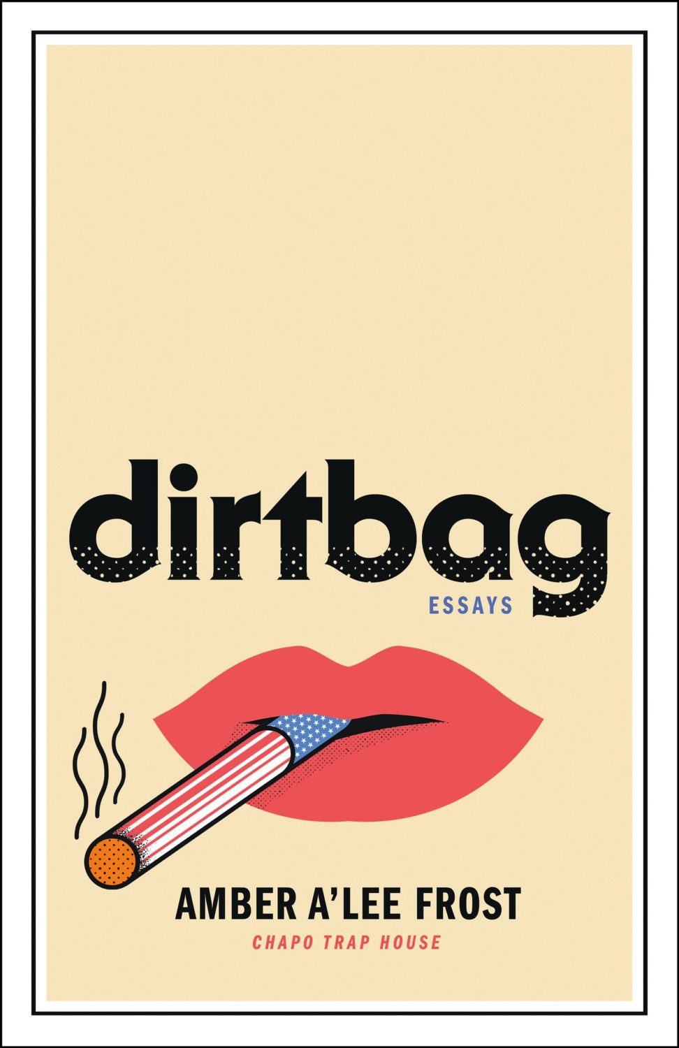
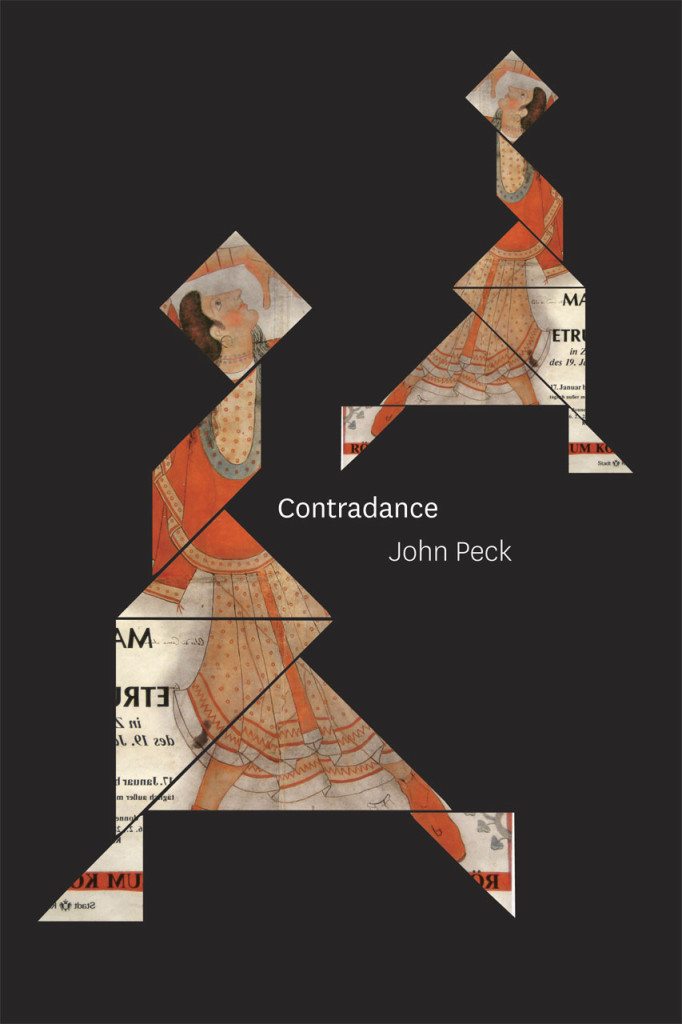
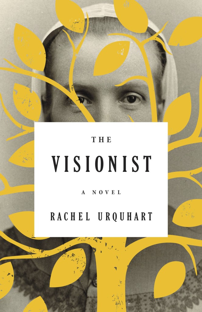
Dirtbag by Amber A’Lee Frost; design by Rob Grom (St. Martin’s Press / December 2023)
This brought to mind Peter Mendelsund’s cover for The Woman Destroyedby Simone Beauvoir, published by Pantheon, which in turn reminded me Gunter Rambow‘s Gitanes, Un Hommage à Max Ponty poster…
The image is taken from the 17th Century painting ‘The Torture of Prometheus’ by Giovacchino Assereto (thanks for letting me know, Jason!). The tight crop (which is great!), reminded me of Peter Hujar’s 1969 photograph ‘Orgasmic Man’, which was used on the cover of A Little Life by Hanya Yanagihara designed by Cardon Webb a few years ago. Art imitating art, kind of?
Jacket design by Cardon Webb; jacket photograph Orgasmic Man by Peter Hujar 1987
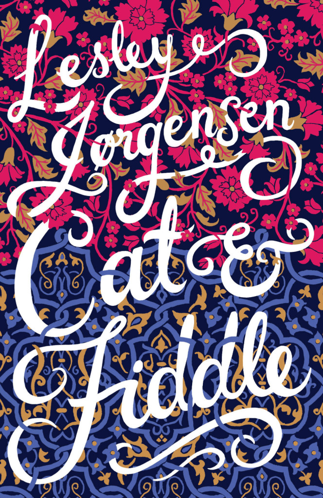
Splinters by Leslie Jamison; design by Gregg Kulick (Little, Brown & Co / February 2024)
The cover of the UK edition of Splinters, published this month by Granta, was designed by Jack Smyth. It’s interesting to see to a torn author photo in both…
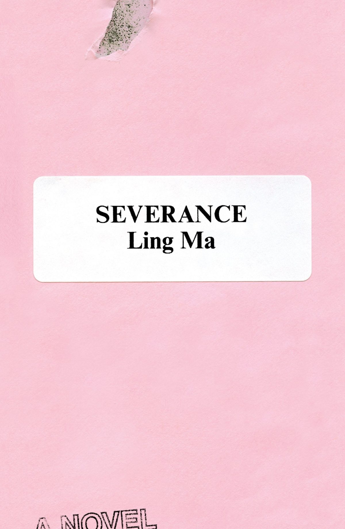
Rodrigo Corral also designed the cover of Ling Ma’s previous novel Severance.
Canción by Eduardo Halfon; design by Alban Fischer (Bellevue Literary Press / September 2022)
Drive by James Sallis; design by David Litman (Poisoned Pen Press / September 2022)
I was just talking about this book — how it is a near perfect thriller, but also great for dudes who don’t read a lot of fiction — so I was happy to see it’s been given a new lick of paint. And pink covers are, as I keep saying ad nauseam, a thing…
I’m including this because of the beautiful photo (with a colour palette remarkably on trend in 2022) and my inevitable teenage crush on indie style icon Miki from Lush.
Sacrificio by Ernesto Mestre-Reed; design by Dana Li (SoHo Press / September 2022)
This reminded me Peter Mendelsund‘s Amerika cover for Schocken back in the day. But, as is the norm around here, the two covers do not actually look that much alike side by side…
A big, messy post this month as I catch up on the new releases and some of the covers I missed over the summer. I expect the next couple of month’s might be a bit like this as I work towards my round-up of the year, so feel free to let me know about stuff that you think I’ve overlooked in 2021.
For some reason, I was reminded of this saucy Jacob Covey cover, which I thought was killed in favour of something more (ahem) traditional, but it still exists on Amazon, so who knows? (Jacob probably knows; I do not).
I was immediately reminded of the cover of Department of Speculation by Jenny Offill, also designed designed by Linda Huang:
The cover of the UK paperback of Weather, published by Granta this month, was designed by Jo Walker. She wrote about her design process for Spine Magazine.
Interesting that both paperback designs are so different from each other and their respective hardcovers (which were quite different to each other too)…
This cover immediately reminded me of Helen Crawford-White’s cover A Half-Baked Ideaby Olivia Potts published last year…
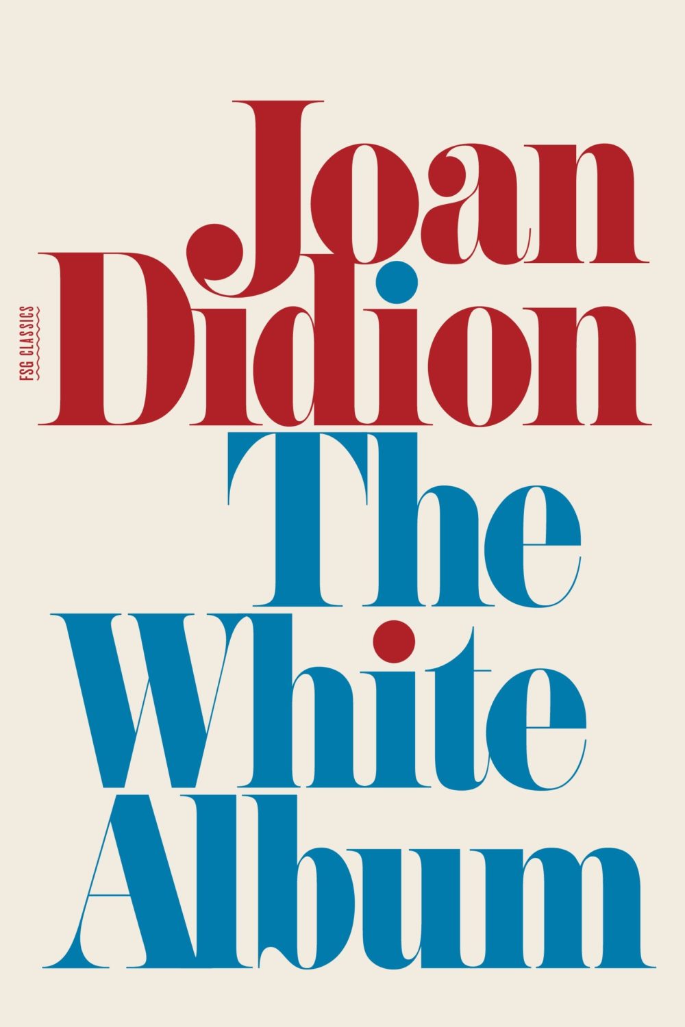
And then I thought maybe it was a nod to the cover of The White Album by Joan Didion, published in 1979 (the reissue below uses the original cover), and which Fonts in Use informs me uses the typeface Pistilli Roman. But maybe I am over thinking it…?
I was also reminded of these two recent covers, so maybe it is just a thing…?
I believe this is only available as an ebook, which seems a bit of shame. It would be nice to see in print. The cover does remind me of something else though. I can’t think what exactly. The best I could come up with was Tyler Comrie‘s cover for The Unwanted by Michael Dobbs. But I feel like there is cover that does something similar with a painting as a background? Possibly I’m just imagining it.
Oh and for those of you who are interested, the design team at Penguin Random House Canada have started posting their work to Instagram as one_last_tweak.
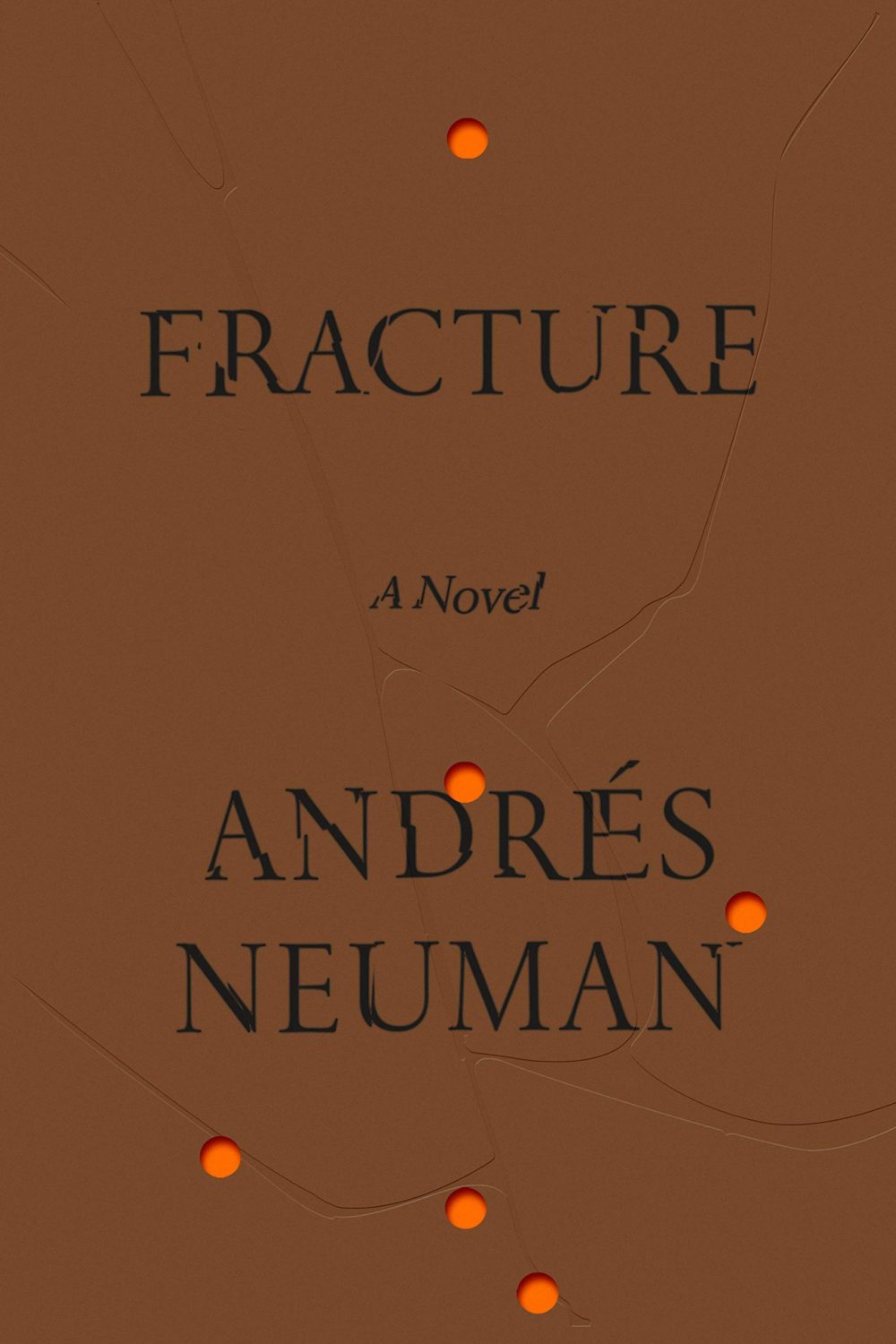
Fracture by André Neuman; design by June Park (Farrar Straus & Giroux / May 2020)
Hey. Here are the book covers that have caught my eye online this month. I hope that they bring a little joy in this very grim time.
If you have the means to buy books at the moment (and I appreciate that is not going to be the case for everyone), please consider supporting your local bookstore. I know a lot of stores are taking orders by email even if they are not answering the phone, and many are offering local delivery if curbside pick-up is not currently an option. The situation seems to be changing daily, so if a store wasn’t accepting orders yesterday, they might be today. We are all figuring this out on the fly.
If you are in the US and don’t have access to a local bookstore, there is Bookshop.org who are trying to provide some financial support to independents. If there are similar initiatives elsewhere, let me know — I’m happy to share the link.
Afterlife by Julia Alvarez; design by Jaya Miceli (Algonquin Books / April 2020)
I wonder where the eye — particularly the combination of the colour red and the eye — as a symbol of Orwell and Nineteen Eighty-Four originated? Does it go back to the 1960s and the Penguin paperback designed by Germano Facetti?
I understand that the eye is a short-hand for the surveillance state. But it is almost as if that is now considered the only element of the book worth visualizing (David Pearson’s cover is in an interesting exception in that it cleverly focuses on censorship rather than surveillance).
I haven’t read Nineteen Eighty-Four in years, but my memory is that the infamous “Big Brother is Watching You” poster is a face whose eyes seem to follow you when you move — something I think Matt’s cover above captures quite nicely — not an all-seeing, omniscient eye. The first time I read the novel, I imagined Big Brother looked something like Lord Kitchener / Uncle Sam in the recruitment posters. I was more traumatized by Room 101 to be honest… Has anyone put rats on the cover of Nineteen Eighty-Four?
I actually read Godshot in manuscript form last year and liked it a lot. It is set in drought-stricken California, but I had Ry Cooder’s soundtrack to Paris, Texas playing in my head the whole time I was reading it.
I also wanted to give a quick shout-out to Nicole who was diagnosed with breast cancer at the end of last year and bravely shared her story on social media recently. Stay safe, and get well soon, Nicole. :-)
Griefby Svend Brinkmann; design by David A. Gee (Polity Press / April 2020)
David has designed the covers for a number of books by Svend Brinkmann, including Standpoints, which featured on the blog back in March 2018.
The cover of the UK edition of A Luminous Republic, which Granta is publishing in a couple of months, was designed by Luke Bird. It’s a really interesting contrast!
2019 has felt interminable. It has also felt like there are never enough hours in the day to keep up. You can’t talk to me about TV shows or movies. I haven’t seen any.
When it comes to books, I’m fortunate enough to work in the industry. But what hope do casual readers have of finding the good stuff when the same few titles dominate the conversation and there is so much else competing for their attention?
Daisy Jones and The Six by Taylor Jenkins Reid; design by Caroline Teagle Johnson (Ballantine / March 2019)
Daisy Jones and The Six by Taylor Jenkins Reid; design by Lauren Wakefield (Hutchinson / March 2019)
Daisy Jones and the Six had a glamorous, louche 1970s look. The US and UK editions, designed by Caroline Teagle Johnson and Lauren Wakefield respectively, took slightly different directions with the type, but the photograph (a stock image apparently) felt ideally suited to social media.
The Testaments by Margaret Atwood; design by Noma Bar (Chatto & Windus / September 2019)
The Handmaid’s Tale by Margaret Atwood; art direction by Christopher Moisan; illustration by Patrik Svensson (Houghton Mifflin Harcourt / April 2017)
The Testaments was everywhere and, like the recent Vintage Classics reissue of The Handmaid’s Tale, the cover illustration was unmistakably by Noma Bar. We live in an age where every cult movie and TV show gets a ‘minimalist’ poster now, and I found that The Testaments looked too familiar for me to find it engaging. It didn’t help that the cover of the 2017 US reissue of the The Handmaid’s Tale by Swedish illustrator by Patrik Svenson had already featured a similar 3/4s silhouette. Nevertheless, it was perhaps a bolder cover choice than I’m giving it credit for. If nothing else, it showed that bright green on book covers — once cursed and reviled — is suddenly all the rage!
In terms of trends, 2019 felt more like a continuation of previous years rather than a break with the past. There was a kind of conservatism to a lot of the covers I saw. My sense was that highly polished designs that looked comfortingly familiar were being approved over riskier ones that stood out from the crowd. The most interesting covers often came from small publishers, especially New Directions who seem to be giving a bit more creative license to the designers they work with (some of whom have 9-5s at much bigger publishers!).
Big centred blocks of utilitarian white type over elaborate backgrounds continued to be a mainstay. It’s the book cover as poster, and it works at any size, so I don’t think it’s going away any time soon.
Handwriting and hand-lettering remained popular too, although my sense is that enthusiasm is starting to wane as publishers are opting for greater legibility and designers are turning back to vintage type styles to give a sense of authenticity and craft. (I’m willing to admit the evidence might not back me up on this, however!)
Fun, swishy 1970s-inspired serifs like Benguiat Caslon revival Cabernet are back. People keep trying to make ITC Avant Garde — another iconic 1970s typeface — happen again too. I don’t think it works for the most part, but I can see why designers think it’s cool in a coked-up New York way. Warren Chappell’s earnest calligraphic sans serif Lydian, originally released in 1938, continued its unlikely rise as a go-to literary typeface. It even got an explainer at Vox.
Lie With Me by Philippe Besson; design by Na Kim (Scribner / April 2019) 19)
Black and white portrait photography has been the staple of biographies and classics for years, so it was interesting to see closely cropped black and white photographs used on the covers of a couple of new literary novels this year. This isn’t entirely new obviously. Black and white photography has long been used to signify that something is “art” (as opposed to, say, “pornography”). But I think the latest iteration of trend was started by Cardon Webb‘s 2015 cover for A Little Life by Hanya Yanagihara which used a black and white photograph by the late Peter Hujar.
Coincidentally the cover of the US edition of Garth Greenwell’s new novel Cleanness, publishing early 2020, was designed by Thomas Colligan and uses contemporary black and white photograph by Jack Davison. (The UK edition, designed by Ami Smithson fits this trend a little less neatly, but features black and white photograph by Mark McKnight)
Something that I didn’t anticipate was the use of contemporary landscape and figure painting on the covers of some the big literary releases of the year. Like black and white photography, it felt almost pre-digital — a grasp at traditional values of craft. I don’t know if I would go as far as to say it is a rejection of post-modernism. But maybe it is? I don’t know. Discuss amongst yourselves.
The Innocents by Michael Crummey; design by Emily Mahon; art by Diana Dabinett (Doubleday / August 2019)
The World Doesn’t Require You by Rion Amilcar Scott; design by Laywan Kwan; art by Fahamu Pecou (Liveright / August 2019)
Thank you to all the designers and art directors who’ve been in touch and helped me identify covers for my posts. I’m sorry if I haven’t replied to your message. It’s been a year.
If you follow the Casual Optimist on Twitter, you will know that a couple of weeks ago design studio Aishima asked people to tweet about inspiring women graphic designers using the hashtag #celebratewomen. As today is International Women’s Day, I thought I would follow up my #celebratewomen tweets with a visual list of 52 inspiring women book cover designers (one for every week of the year!) — from influential veterans whose work I’ve admired for years to junior designers that have just appeared on my radar.
The names of all 52 designers can be found at the end of the post. With a few more hours in a day the list could easily have been many times longer, so apologies to anyone I have overlooked. Please let me know who you would’ve included in the comments or on Twitter.
All This Has Nothing To Do With Me; design by Justine Anweiler; illustration Daphne van den Heuvel
Souffles-Anfas edited by Olivia C. Harrison and Teresa Villa-Ignacio; design Anne Jordan and Mitch Goldstein (Stanford University Press / November 2015)
Capitalism in the Web of Life by Jason W. Moore; design by Anne Jordan and Mitch Goldstein (Verso / August 2015)
The Woman Who Read Too Much design Anne Jordan & Mitch Goldstein
It used to be enough for a book to idly stand out in a bookstore. Nowadays, however, new books must jostle for attention with everything. Thousands of distractions are just a click away. Is it any wonder that book-cover design is more important than ever?
In today’s Globe and Mail, I talks about recent trends in book cover design and pick a few of my favourite covers from the year so far. If you live in Canada you can find a lovely-looking print version of the article in the Arts pages.
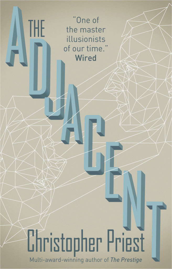
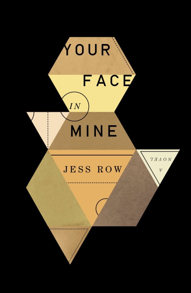
This is my last post on book covers and triangles — for the time being at least. I hope you’ve enjoyed this three-sided, three-post design diversion (you can see the previous posts here and here):
The Adjacent by Christopher Priest; design by Martin Stiff, Amazing15 (Titan Books April 2014) 1
It’s almost March and I’ve just realised that I haven’t posted very many book covers this year. To make up for this lapse, here are ten of my favourite covers from the last few months:


