Skip to content

Tag: letterpress

The Collection

The Collection is a short documentary about two friends and their discovery of a unique collection of movie memorabilia, comprised of over 40,000 printer blocks and 20,000 printer plates used to create the original newspaper advertisements for movies released in the US from the silent era through to the 1980s:

(via Coudal)

Comments closed

The Counterpress x Derwent

A lovely short film about The Counter Press, a design studio and letterpress workshop in east London: 

Comments closed

The Last Punchcutter

last punchcutter

One for the letterpress obsessives and tool aficionados, The Last Punchcutter is a beautiful, wordless film capturing Giuseppe Brachino — who was the head of the engraving department of the Nebiolo Company from Turin — hand-cut a punch for metal type:

(via Coudal)

Comments closed

Alan Kitching: “I always try to have some logic to the job”

AK_FULL-BOOK-Dec-15-58

Related to my post earlier today, typographer Alan Kitching also talked to It’s Nice That this week about printing with letterpress, and a new monograph documenting his work:

Kitching started Omnific studio with Martin Lee and Derek Birdsall, who he had met through Anthony Froshaug, in the late 1970s. They worked from a studio in Covent Garden, then still surrounded by typesetters and other service people, until rents shot up and they moved out to a toy factory in Islington. By this time some foundries were starting to sell off their type, and Omnific bought up a press and installed it at their new studio: “All this type was selling off cheap, cheap-ish, and it was the last chance to get this stuff. So we bought it all and I continued printing there for around three years until I decided I wanted to leave. I didn’t really know what I was going to do but I wanted to buy the press and the type and go and print somewhere”, Kitching says. “I didn’t want to be a jobbing printer but I wanted to start out on my own. It was a very precarious thing to do because we were successful, well-established, and I was taking a backwards step, it was a bit of a leap in the dark.”

AK_FULL-BOOK-Dec-15-72

The new book, Alan Kitching: A Life in Letterpress, will be published Laurence King on April 7. A ‘Collectors Edition‘ of only 200 copies featuring a limited edition, numbered print by Kitching will also be available. Laurence King have produced four short teaser trailers for the book:

Comments closed

Freunde von Freunden: Erik Spiekermann Interview

Freunde von Freunden visit the apartment and studio of designer and typographer Erik Spiekermann:

A look around his tidy, if eclectic, home offers an eye pleasing sampler of the designer’s interests. One of his home’s main attractions is his two-story bookshelf, mostly filled with titles pertinent to his profession and only accessible by the seated pulley system Spiekermann developed for one of his favorite leisure activities – browsing his massive library and getting lost in his passion for words and images. “It’s almost like a safety net having all my books here. I have a lot of cool stuff that other people don’t have, and I love browsing and discovering books I’ve had 50 years. I’d love to spend time just browsing through my bookshelves. Every time I go to look for something I find something else, you get totally stuck. There’s nothing better than getting stuck on a Sunday afternoon with books you’ve forgotten about.”

MG_9983

And on a related note, Madeleine Morley spends a day at Spiekermann’s print workshop, p98a for Port magazine:

The process of printing is repetitive, slow, and surgical, but also very peaceful and contemplative – like knitting or carpentry. We insert pieces of paper into the letterpress, rotate the handle, stack the print on a drying rack, re-ink the font, then start again. By this point, we begin to develop a consistent and robot-like rhythm, but we’re a clunky, less graceful team in comparison to  guild of typographers.

I ask [Alexander] Nagel why he prefers this method of design: “It has more… sinne,” he replies, using a German word that is difficult to translate. The term means ‘touch’ or ‘sense’. It refers to the haptic, but also means ‘significance’. This is something people say a lot about the printed page and its physical tangibility, but it’s something you don’t quite appreciate until you’re actually building one of these templates from metal, wood and paint.

Comments closed

Alan Kitching’s A-Z of Letterpress

9781780674810

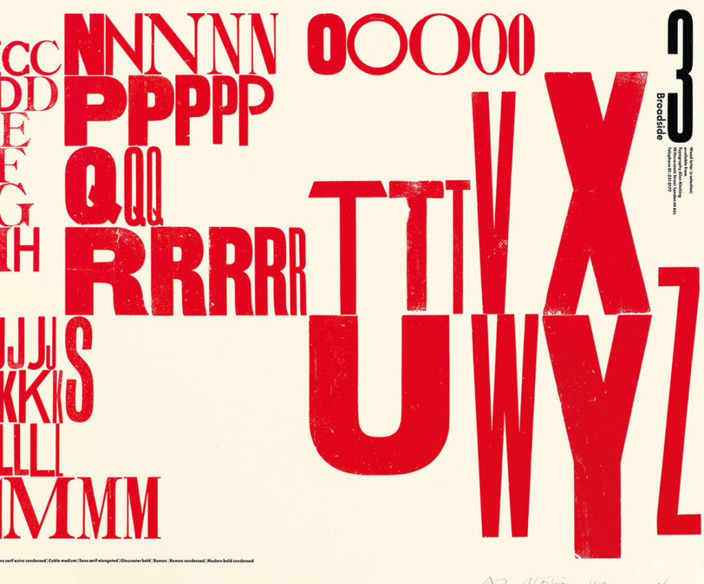
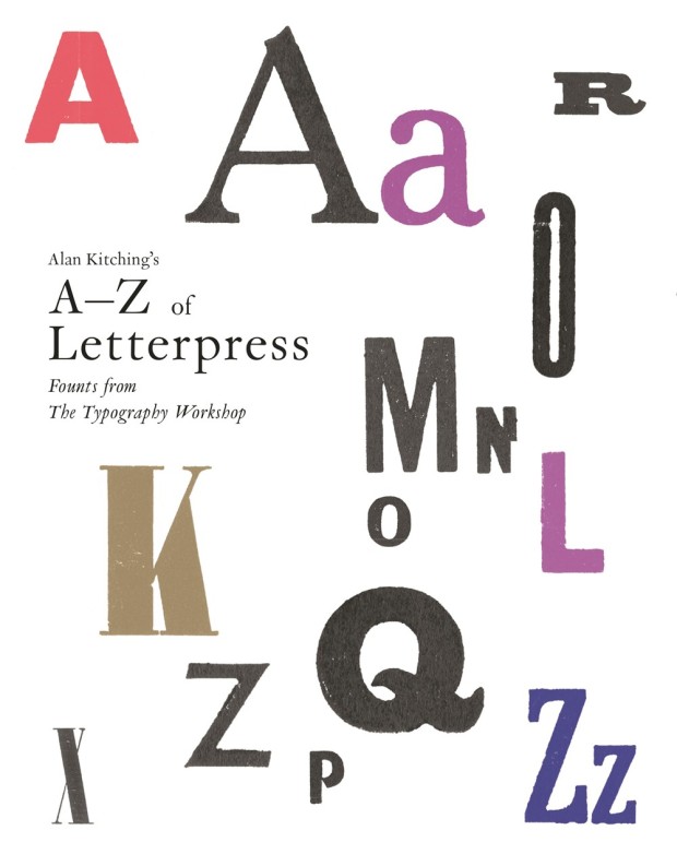
I just received an advance copy of Alan Kitching’s A-Z of Letterpress from UK publisher Laurence King, and it really is a lovely little book for type and letterpress enthusiasts.1

The accordion-playing Kitching has featured on the blog before of course, but over the course of his career he has worked as a compositor, typographer, graphic designer, teacher, and poster artist. He founded the Typography Workshop in 1989 and, according to designer Derek Birdsall (renowned for his cover designs at Penguin amongst other things), Kitching single-handedly “breathed new life into the dying embers of letterpress” by teaching a new generation of designers how to compose type by hand.

a-z_of_letterpress_spread_01

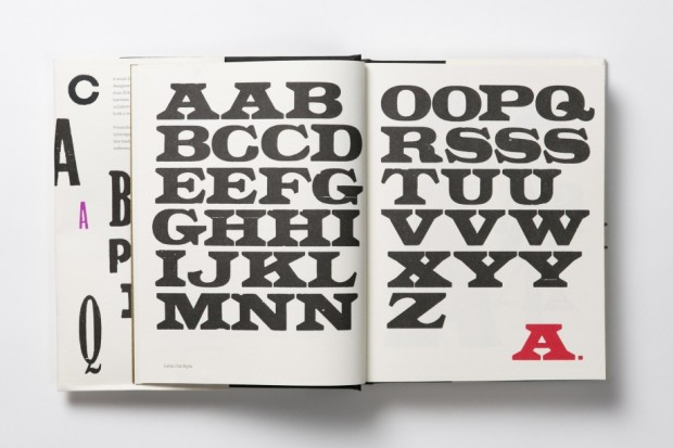
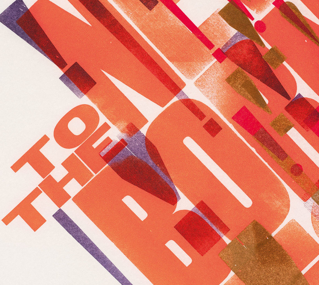
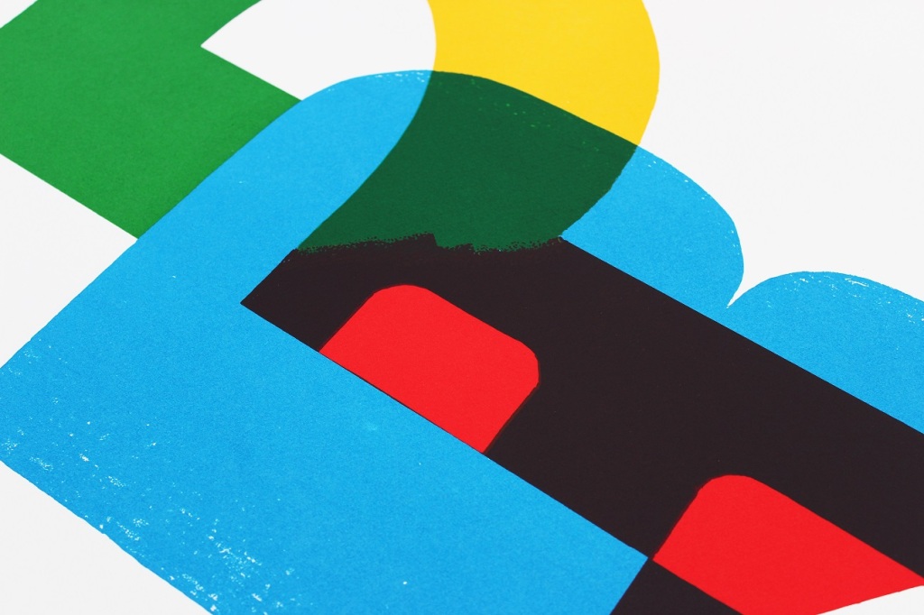
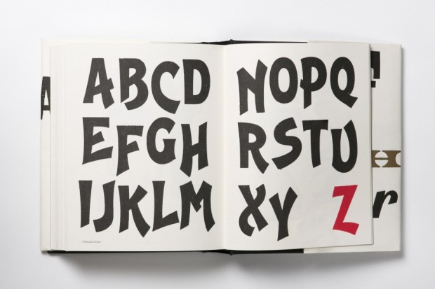
A collaboration with Pentagram partner Angus Hyland, and designed in-house by Alexandre Coco, the book itself contains 39 alphabets shown letter by letter, presented from A to Z. All the founts are wood letter founts from Kitching’s collection, and every image in the book was printed by hand on a Vandercook no. 3 proof press.

a-z_of_letterpress_spread_03

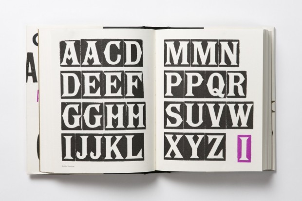
It really is a thing of beauty. Printed on thick, creamy paper, the letter forms and page layouts are quirky and charming. The colours and metallic ink are vibrant and surprising. Even better, it is also a teaser of sort — Laurence King recently announced it will be publishing a monograph of Kitching’s work in 2016. Can’t wait.

a-z_of_letterpress_spread_08

Comments closed

Recovering a Lost Typeface

In this short video for the BBC, designer Robert Green talks about his reconstruction of the lost Doves Press typeface:

Comments closed

Portrait of a Letterpress Printer

Portrait of a Letterpress Printer is a short documentary about William Amer, a letterpress printer and instructor based in Rockley NSW, Australia. I have serious shed envy…

Comments closed

Creative Characters: Erik Spiekermann

P98a-spiekermann

Type designer Erik Spiekermann recently spoke to MyFont’s Creative Characters newsletter about his career and his return to letterpress printing:

I think it’s very appropriate to discuss the new interest in analog technologies, and the ways that young people are now finding to combine the analog and the digital. In fact, the difference between the two is disappearing. As type specialist Indra Kupferschmidt also remarked recently — there’s no longer any reason to make things for the screen that look worse than designs made for print. Anybody who does layouts for the screen must know about type and typography just as well as someone who designs for paper. So what counts is, just like before, how to get the message across. We have the technology, there is no more excuse for a job badly done.

What I find very interesting is the movement of people who are savvy in digital design but are genuinely interested in analog techniques. It is now more than a passing trend; there must be a deeper motive why we are newly interested in the hand-made and the haptic, material and three-dimensional aspects of type and design.

Comments closed

Alan Kitching and Monotype

AK_PR

Well, this is absolutely lovely — a short film about letterpress typographer, designer, artist (and accordion player) Alan Kitching, and a set of posters he created with Monotype to celebrate the centenary of five influential designers born in 1914: Tom Eckersley, Paul Rand, FHK Henrion, Josef Müller-Brockmann and Abram Games:

(via David Pearson)

1 Comment

Church of Type

church-of-type
Church of Type is the new letterpress studio in Santa Monica, California, of veteran designer and printmaker Kevin Bradley. In this lovely short film, Bradley talks about relocating to Los Angeles, typography, the printing press, and making things by hand:

Comments closed

New York Types

‘New York Types’ is a short film about New York, letterpress, and the art exhibition of the same name at the Art Directors Club last year. Inspired by the ʻThe Scriptʼ at  New York Writes Itself, the exhibition illuminated the sights and sounds of New York City:

Comments closed