Comma Queen Mary Norris takes a quick look at the origins of the beloved ampersand for The New Yorker:
Comments closedTag: language
“Awesome” is the New “Massive”
The New Yorker‘s ‘Comma Queen’ Mary Norris considers (mis)use of the words “massive” and “awesome”:
Comments closedHoly Sh*t, Batman
Colin Burrows reviews Holy Shit: A Brief History of Swearing by Melissa Mohr for the London Review of Books:
Really good swearing relies on formulaic elements, but needs to be precisely adapted to the moment. In this respect dear old Robin in the 1960s Batman TV series was one of the best swearers, though his lips were never soiled with a common-or-garden profanity. He could combine ‘Holy’ with more or less anything in order to create his trademark ejaculations, which were always to the point. Number two in my list of all-time favourites is ‘Holy chocolate éclair!’ Number one has to be ‘Holy uncanny photographic mental processes!’…
…The chances are that even the young audiences of the 1960s Batman TV series knew that there was something Robin was not saying every time he uttered a variant of his catchphrase. (I was there. It felt naughty.) A formula for generating euphemisms can be as creative as a formula for generating swear words: ‘frog’s knickers’ was my mother’s favoured way of flirting with the ‘f’ word, but we also have ‘effing’ and ‘frigging’ and (on Battlestar Galactica) ‘frakking’ too, though that particular euphemism may have had its day now that ‘fracking’ means frakking up the landscape in order to squirt gas out of it. One thing Robin never dared say, bless his little golden rayon cape, was ‘Holy Shit’, the uttering of which would certainly have KAPOWED him right off prime-time TV in those tender-eared days.
The book cover was designed by Lisa Force.
(Yes, it is quite possible that any review in which repeatedly references the Batman TV show in a somewhat relevant way will be linked to on this blog)
Comments closedSomething for the Weekend

A stunning jacket design by the great Isaac Tobin for After Freud Left, published by University of Chicago Press.
You can read my interview with Isaac from 2009 here.
Bauhütte to Bauhaus — A fascinating overview of the Bauhaus by Frank Whitford, author of the Thames & Hudson ‘World of Art’ book Bauhaus, for the TLS:
The structure of the Bauhaus… followed, as Gropius thought, medieval principles. He coined the school’s name so as to echo the word Bauhütte, in the Middle Ages the German for a guild of masons, builders and decorators. And the teaching was based on specialist workshops where you learned your trade by carrying out actual projects, graduating from apprentice to journeyman and master. The teachers were at first called Masters and not Professors, a revolution in a country where academic snobbery was the norm.

Calligraphica — A new tumblr devoted to calligraphy and hand drawn type (pictured above: ‘One Hope One Quest’, by Greg Papagrigoriou).
Persuasion — Michael Bierut talks to Designers & Books about his collection 79 Short Essays on Design:
Even the best designers have to persuade people all the time. They have to persuade people to hire them; then they have to persuade people to go with the recommended solution; then they have to persuade people to realize that solution in the best possible way. Simply showing someone a nice design is almost never enough. This constant effort—and all the rejection that inevitably ensues—obviously requires healthy confidence and nerves of steel, if not a strong ego.
And finally…
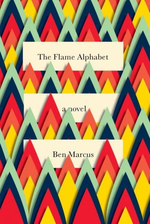
Critic James Lasdun reviews The Flame Alphabet by Ben Marcus for The Guardian:
Comments closedLanguage, the debasement, banality and ultimate toxicity thereof, is his subject. It’s a staple topic of avant garde literature, from the Prenzlauer Berg writers of the former East Germany to the Language poets of the American academy. All proceed, more or less, on the basis that verbal communication has been fatally corrupted by political or literary abuse and can be rescued only by a total dismantling and reassembly. Results vary (I’ve yet to read a Language poem that didn’t make me want to dissolve it in acid), but Marcus’s own, especially in The Age of Wire and String, have been haunting and inventive.
TED Talks: Neil MacGregor
Neil MacGregor, Director of the British Museum and author of A History of the World in 100 Objects, traces 2600 years of Middle Eastern history through a single object:
Comments closedMidweek Miscellany
Lumps of Language — John Sutherland reviews The Words of Others: From Quotations to Culture by Gary Saul Morson for Literary Review:
We think of our use of language as ‘fluency’. There are, however, congealed lumps floating in it and, if we look beneath the surface, often more lumps than liquidity. Put another way, most language is pre-owned. The previous owners are, as Gary Morson instructs us, often worth knowing about.
 Hard — Cartoonist James Sturm finds out just how hard it is to get a cartoon in The New Yorker:
I don’t normally draw gag cartoons; I’m what’s now called a “graphic novelist.” I’m not really considering a career change, but I was dealing with the mid-career blahs and wanted to try something new. It takes me several years to write and draw a book. The book’s subject determines and limits what I can and can’t draw. I enjoy the process, but it’s a slog. I wanted more spontaneity in my creative life. So in March I decided to fill a sketchbook, 90 pages, with New Yorker-style cartoons—one cartoon a day for three months. No excuses.
Much linked to elsewhere: A sad (and slightly bonkers) interview with Grant Morrison about his book Supergods in Rolling Stone.
Dan Nadel at The Comics Journal responds.
And finally… While were on the subject of comics…
 Here’s an neat primer on comics journalism, in the form of comics journalism, by Dan Archer (via The Ephemerist).
Is That a Fish in Your Ear?
In this lovely animated book trailer by Matt Young for Penguin UK, author David Bellos talks about words, language and his new book Is That a Fish in Your Ear? Translation and the Meaning of Everything:
(via @alantrotter who produced the video, clever chap).
Comments closedMidweek Miscellany
Designer Catherine Casalino discusses her cover design for Darren Shan’s Procession of the Dead at Faceout Books.
50 / 50 — An interesting Design Observer piece by Ernest Beck on the controversy around AIGA’s 50 Books/50 Covers and the changing roles of book designers:
“The design aspect hasn’t changed, but it will,” notes [Chris] Sergio, who like other book designers believes that books and covers will endure in both print and electronic versions. “Digital versus print is a zero-sum argument,” he says. “These roads are not mutually exclusive. If anything, we want to see more competition and more critical exploration [of book design]. That’s why it would have been a shame to blend it all down into one big thing.”
Paula Scher, a partner at Pentagram Design, agrees that book design — in whatever form — is important because people still relate to visual imagery. “It’s the emotional connection,” she says. “People still remember record covers although nobody has records anymore.” Book jackets matter, whether they are on a piece of paper or in an electronic version, she continues “because when none of it matters because it’s digital or nobody does it or it doesn’t save the planet, then we murder our own craft and give excuses to be mediocre and lower standards bit by bit.”
Indelible Replicas — Author Philip Ball (Unnatural: The Heretical Idea of Making People) reviews The Information by James Gleick for The Observer:
Robert Burton, the Oxford anatomist of melancholy, confessed in 1621 that he was drowning in books, pamphlets, news and opinions. All the twittering and tweeting today, the blogs and wikis and apparent determination to archive even the most ephemeral and trivial thought has, as James Gleick observes in this magisterial survey, something of the Borgesian about it. Nothing is forgotten; the world imprints itself on the informatosphere at a scale approaching 1:1, each moment of reality creating an indelible replica.
Also in The Observer…
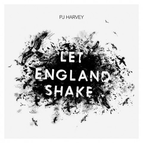 P. J. Harvey on writing and her new album Let England Shake (via A Piece of Monologue):
“I certainly feel like I’m getting somewhere that I wanted to get to as a writer of words. I wanted to get better, I wanted to be more coherent, I wanted there to be a greater strength and depth emotionally, and all these things require work – to hone something, to get rid of any superfluous language. I’m inspired by the other great writers I go back to and read again and again, and think how did they do that?”
Such as? She indicates a volume of Harold Pinter’s poetry that she has brought with her. “Pinter leaves me speechless. Just unbelievable. A poem like ‘American Football’ or ‘The Disappeared’. TS Eliot of course. Ted Hughes. WB Yeats. James Joyce.” She leans forward, freshly excited. “Just that feeling of reading something profound and having your breath quite literally taken away by the end of a piece. I’m reading John Burnside’s poems at the moment. Do you know his work? I’m getting that feeling – just reaching the end of every poem, going ‘Oh my God!'” She clutches her chest and laughs. “And all of these writers offer me a greater understanding of what it is to be alive, and that is such an incredible thing art can do for other people. It made me want to try and get close to this strange, mysterious thing that people can do with words.”
And finally…
The Local Grammar Nazi — Robert Lane Greene, author of You Are What You Speak, on the fluidity of language:
Comments closedIt’s certainly easier to know one set of rigid rules than to develop a fingertip-feel for the nuances of syntax, word choice and mechanics. This is why the book “Elements of Style” is such a hit. William Strunk and E.B. White’s canonised system for language use is short and sharply worded. Read, memorise and you need never think again… Readers are taught any number of things, such as when to use “that” instead of “which” and how one should never begin a sentence with “However, …”. But such guidelines should be understood as the authors’ preferences, not grammatical commandments.
Writing in English offers far more room for manoeuvre than some may realise… A lot of people don’t like this fluidity. Life is tricky in a world without rules. Fortunately, language does have rules, but they are more like bedrock principles than a detailed set of by-laws covering every do and don’t. A good usage dictionary should explain the principles, not simply command.
English
In spite of the hardcover’s beautiful jacket design (by Paola Ecchavaria), it was a citation in Nicholas Carr’s recent book The Shallows that finally got me to read Proust and The Squid by Maryanne Wolfe.
It is a fascinating if, at times, academic book that examines the history of written language and the corresponding development of our ‘reading brain’. In a chapter on reading development, Wolfe includes a charming, witty poem on the vagaries of English pronunciation that I wanted to share. Wolfe says the poem is anonymous, but I have subsequently seen it attributed to T.S. Watt. Please let me know if you have any further details…
I take it you already know
Of tough and bough and cough and dough.
Others may stumble but not you,
On hiccough, through, lough and through.
Well done! And now you wish, perhaps,
To learn of less familiar traps.
Beware of heard, a dreadful word
That looks like beard and sounds like bird,
And dead; it’s said like bed, not bead;
For goodness’s sake, don’t call it deed!
Watch out for meat and great and threat,
(They rhyme with suite and straight and debt).
A moth is not a moth in mother,
Nor both in bother, broth in brother,
And here is not a match for there,
Nor dear and fear for bear and pear,
And then there’s dose and rose and lose–
Just look them up–and goose and choose,
And cork and work and card and ward,
And font and front and word and sword,
And do and go and thwart and cart.
Come, come, I’ve hardly made a start.
A dreadful language? Man alive,
I’d mastered it when I was five.
And yet to read it, the more I tried,
I hadn’t learned it at fifty-five.
TELEPHONEME
Inspired by The Alphabet Conspiracy and other educational films from the 1950’s and 1960’s, TELEPHONEME is a hybrid live-action and animated short created by design collective MK12 about the science of the alphabet and sinister hidden messages carried by language:
MK12 also developed a special typeface for the film that can be downloaded from the TELEPHONEME website.
Comments closedQ & A with Nick Asbury, Corpoetics
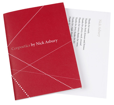
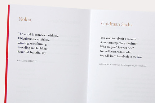
I was quite taken with the lovely design and gentle subversion of Corpoetics — a chapbook collection of ‘found’ poetry taken from the ‘Corporate Overviews’ of well-known brands and corporations — when I first saw it at Ace Jet 170 in February.
Author Nick Asbury was kind enough to get in touch after I mentioned the project here, so when Corpoetics recently won a Yellow Pencil for Writing for Design at the 2009 D&AD Awards, it seemed like a perfect excuse to talk to Nick a bit more about the project, the corporate use of language, and interesting not-for-profit work…
What inspired Corpoetics?
My day job is as a writer for businesses and brands, so I’ve long been immersed in the corporate world. I’ve often sought refuge in reading and occasionally writing poetry, so I guess it was inevitable that the two would cross over at some point.
How would you describe ‘found’ poetry?
I came across a good quote by Annie Dillard, talking about the ‘doubling effect’ you get in found poems. ‘The original meaning remains intact, but now it swings between two poles.’ I think that’s about right. You get an interplay between the original meaning and where you’ve taken it — and there’s a lot of potential for humour and subversion, particularly when the source material is from the corporate world.
The language of several of the poems is almost Orwellian. Do you have a sense that corporations (deliberately or otherwise) dehumanise language?
Yes, dehumanise is exactly the word. A lot of corporate language is designed to erase any sense of individual responsibility. It’s much safer to talk about how ‘a decision was taken’ rather than saying ‘I took a decision’. So you get this very passive, depersonalised way of talking. Then there’s the widespread tendency to hide behind jargon and non-committal abstractions. In some cases, it’s deliberately intended to conceal or exclude. But a lot of businesses drift into it without realising — it just becomes the norm for writing in a business context.
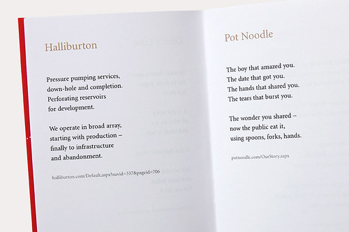
The poem I wrote about Halliburton is probably the most Orwellian in tone. It takes their words and lets their emptiness ring out in this very eerie way. But it didn’t take a lot of rearranging — it’s more like a condensed version of the original.
As a copywriter and consultant, do you feel a certain irony in the subversion of corporate language in Corpoetics?
Definitely. When I first had the idea, I was very aware of biting the hand that feeds me. But then the aim is not just to subvert corporate language and hold it up to ridicule (although some poems do). I also wanted to pick brands that I liked. People like Greggs The Baker — a fixture on British high streets — or Pot Noodle, a famously throwaway junk food here in the UK. It was interesting taking their words and seeing where they went. Pot Noodle became a story of a relationship that begins in furtive excitement and ends in squalor, much like the experience of the product itself.
Is it possible for business writing to have warmth and wit, or is it inherently evil?
That depends whether you think all businesses are inherently evil. I don’t. We all need to earn money and make a living — and work is a noble and necessary thing. Whether it’s the local bakery or a multinational giant, plenty of businesses make an honest living and do good things. Those businesses have a good story to tell — and there’s room for warmth and wit in the telling. Of course, the unfortunate truth is that a lot of ‘good’ business writing is a matter of spin — making companies seem better than they are. But the very best writing will always be for good companies with something truthful to say.
Have you had any response from the companies featured in Corpoetics?
Yes, KPMG got in touch. I took a deep breath when the email arrived, expecting a stern ultimatum from the legal team. But it was very positive. They said they wanted to feature it in their internal company newsletter and run a competition to get people to send in their own poems. I’d like to have seen the results, but still haven’t managed to track them down.
Why did you decide to publish Corpoetics as a book rather than make it a web-based project?
It seemed a very natural thing to do. Poetry just feels more satisfying when it’s in print. I work as one of a partnership (Asbury & Asbury) alongside my wife Sue, who is a graphic designer. So we thought about turning it into a design project as well as a writing project — taking graphic elements from the companies featured and rearranging them in some way. But we decided it was overkill. It’s ultimately a project about language and we wanted to let the words do the work.
Is the visual presentation of written language important to your work?
Yes — ever since I started out in business writing (about 12 years ago), I’ve worked closely alongside graphic designers. In fact, most of my work is commissioned by design and branding companies, so it’s a natural fact of life. I’d find it hard to write anything without having some sense of the way it will be presented visually. It’s never just about the words or the design, but the overall act of communication.
So good writing and good design go hand-in-hand?
Yes, ideally. I find a lot of the best designers are pretty good with words. Both professions have the same base skills. You need to analyse a brief, empathise with an audience, spot lateral connections, tell a story, make an imaginative leap. The disciplines only separate out right at the end, when the designer goes off to do the pictures and the writer gets typing.
What other projects are you currently working on?
I usually have three or four paying projects at any one time. At the moment, I’m writing an annual review for a British charity, some marketing literature for a hotel operator, and an advertising campaign for an Austrian law firm. Alongside all that, as Asbury & Asbury, we continue to work on our own projects. The latest is a collection of children’s poetry called ‘Songs For Animals‘, but it may not see the light of day for a while yet.
Can you tell me about 26?
It’s a not-for-profit collective of writers, editors, journalists, designers, publishers — anyone with an interest in language, both in a business context and more generally. As you might have guessed, the name comes from the letters of the alphabet, the DNA of language — and naturally, it costs £26 a year to be a member. I got involved shortly after it started up in 2002 and am now one of the directors responsible for running the whole thing — or trying to. It’s operated entirely on voluntary time and can be quite chaotic, but they have produced some really interesting collaborations, resulting in books, exhibitions and a whole series of public talks and events. It’s principally UK-based, but there are chapters springing up in South Africa, Sweden and elsewhere. I’d urge anyone with an interest in the subject to join. You’ve got nothing to lose. Except maybe £26.
Thanks Nick. Corpoetics is available for £5 plus p&p from Asbury & Asbury , with proceeds going to the National Literacy Trust, a UK charity dedicated to changing lives through literacy.
1 Comment


