
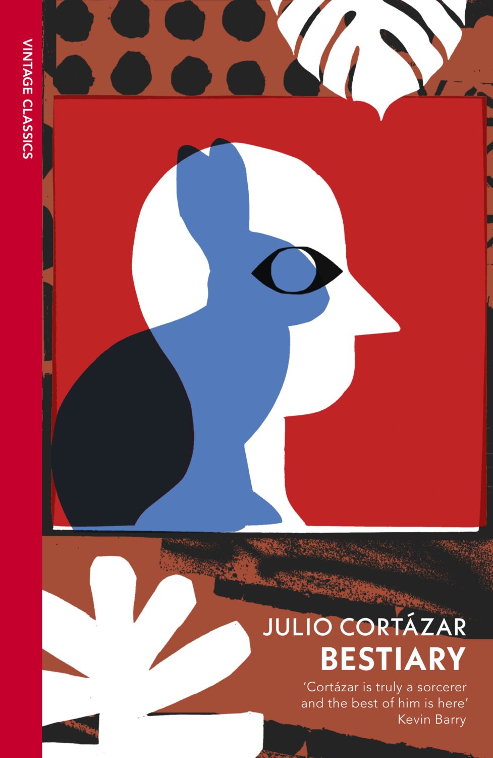
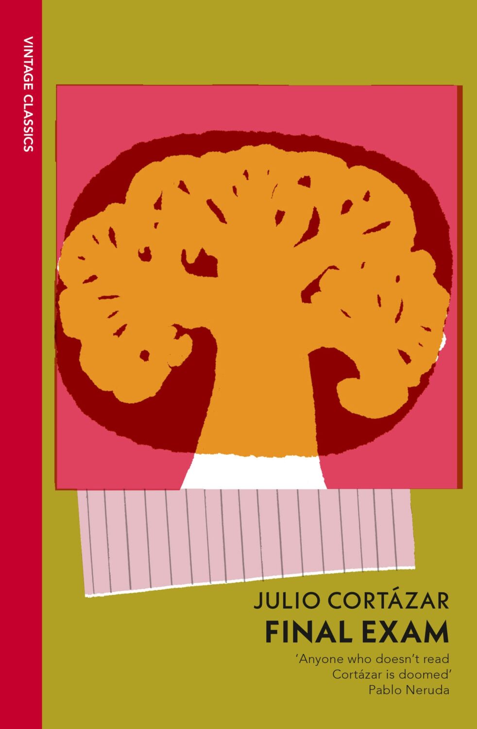
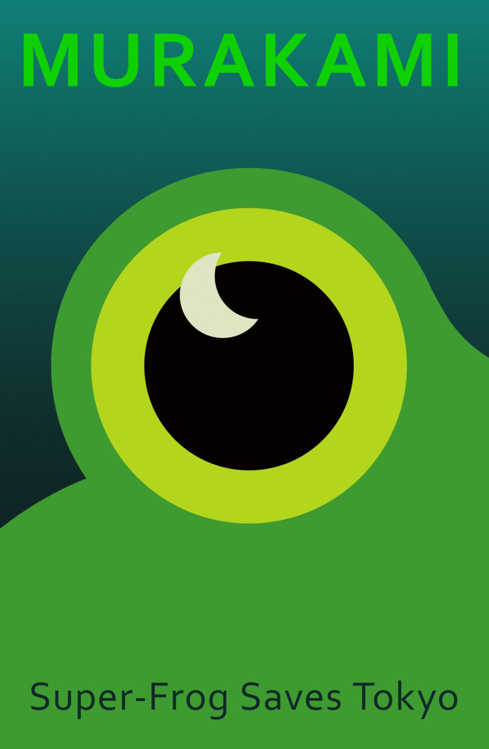
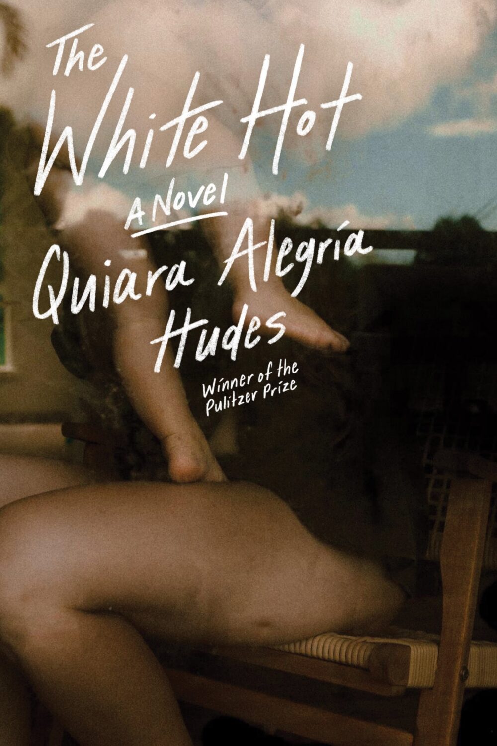
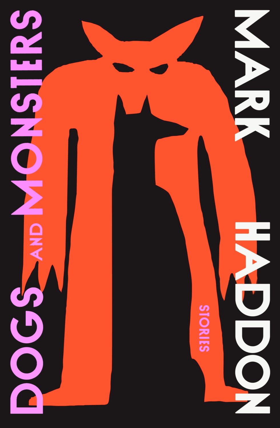
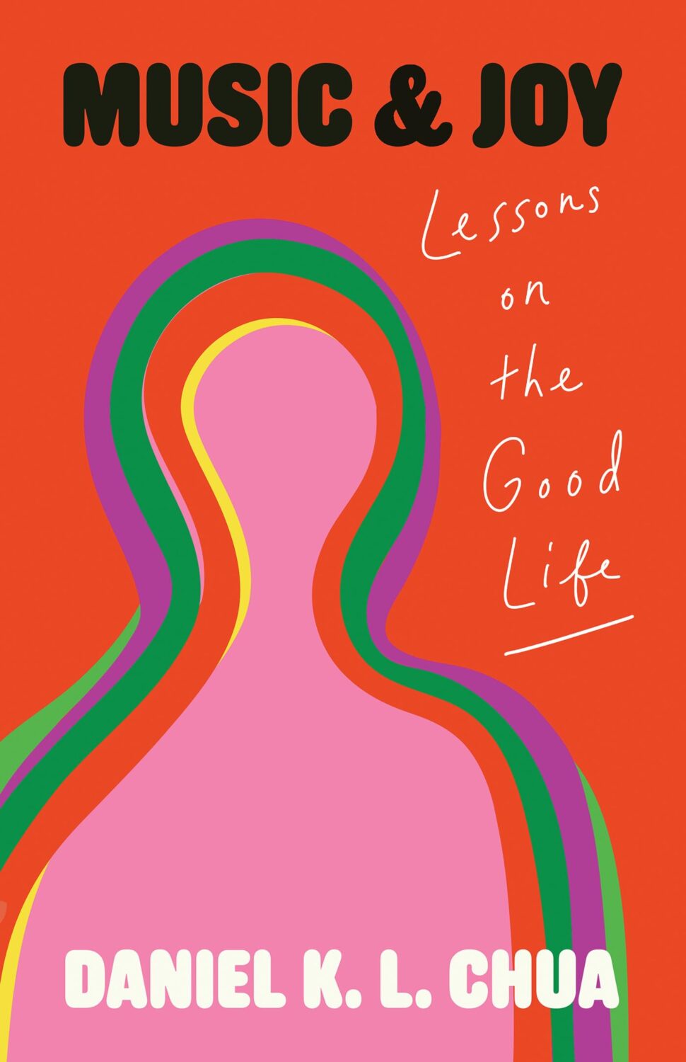
Some of my favourite covers this year were series designs. I loved the Julio Cortázar Vintage Classics editions with covers illustrated by Stephen Smith, AKA Neasden Control Centre. I was lucky enough to meet art director Suzanne Dean for coffee when she visited Toronto this summer, which was lovely. Her Haruki Murakami designs for Vintage Classics and Harvill are always a delight too.
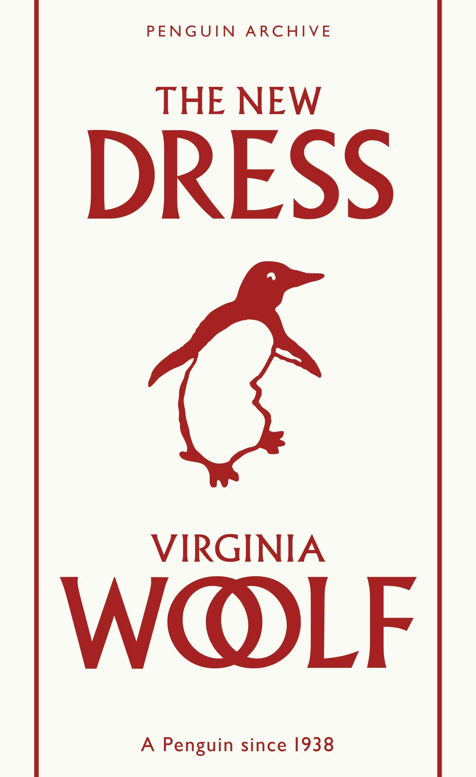
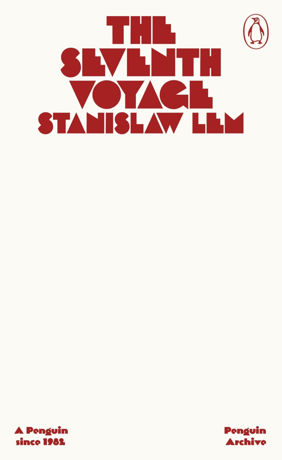
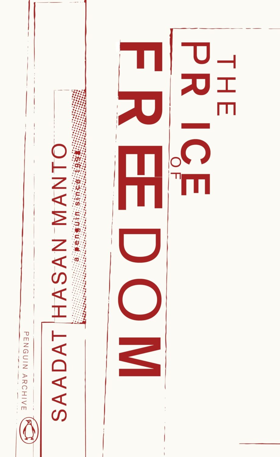
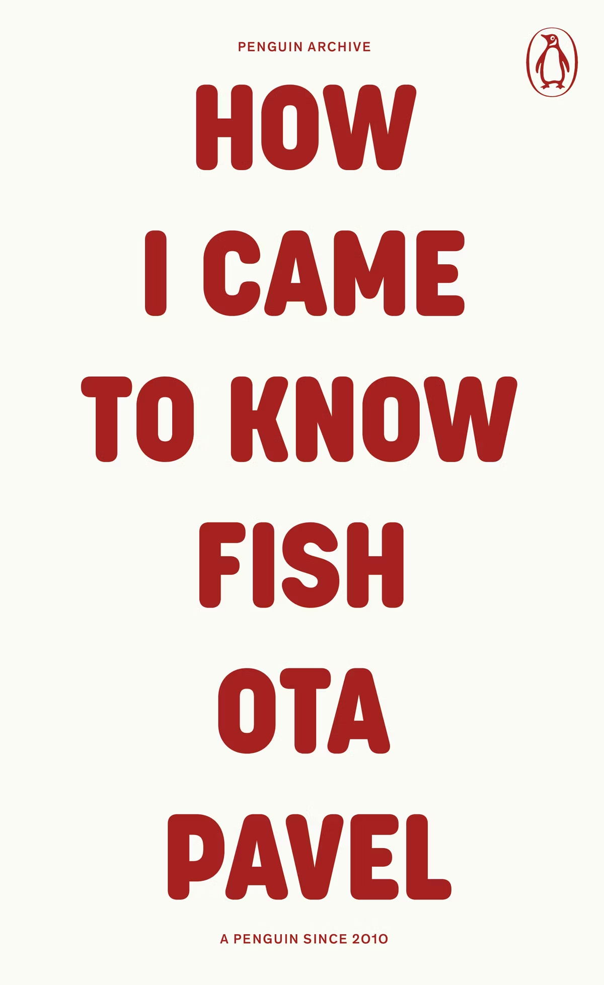
The typographic covers for the ‘Penguin Archive’ designed by Jim Stoddart triggered my curiosity. Published in April to celebrate 90 years of Penguin Books, the designs use typography to evoke the different eras of the publisher. You can read more about the series and the design process at Creative Review. But which historic Penguin covers inspired type choices in the first place?
There was some really nice series design from independent publishers this year too. I really liked Luísa Dias‘s covers for Wild Hunt Books’ Northern Weird Project. I wanted to feature them here when the final book of the series, Turbine 34 by Katherine Clements, came out last month, but time was not on my side. Fortunately, Zachary Petit talked to Luísa about the series for PRINT in April.
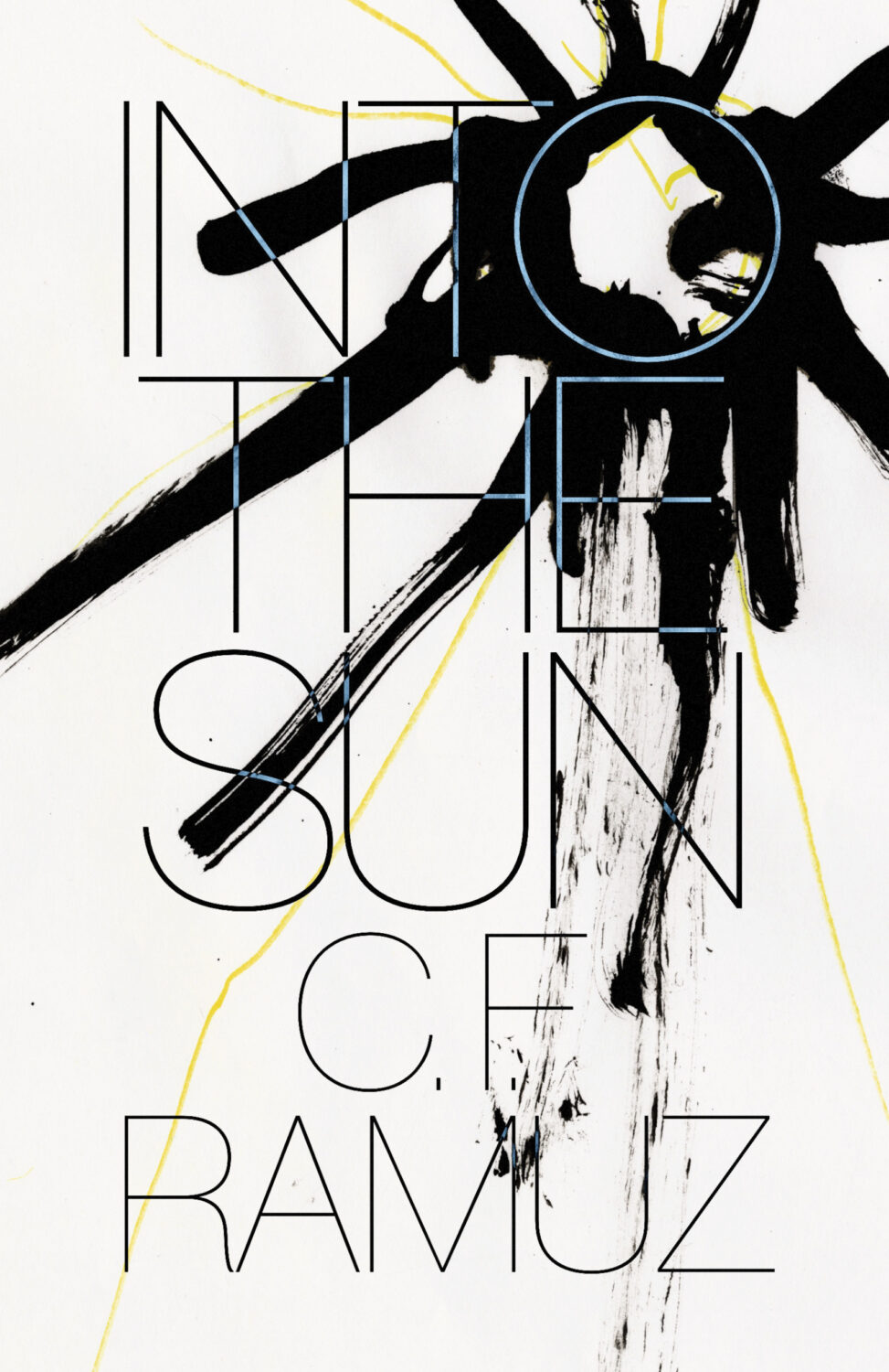
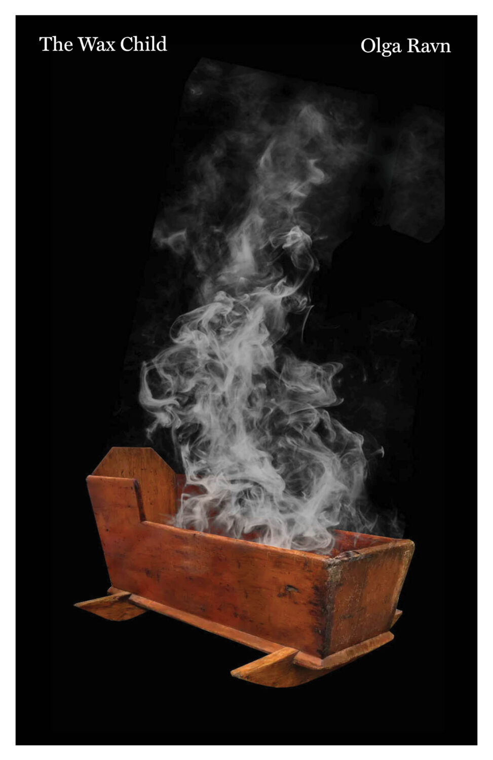
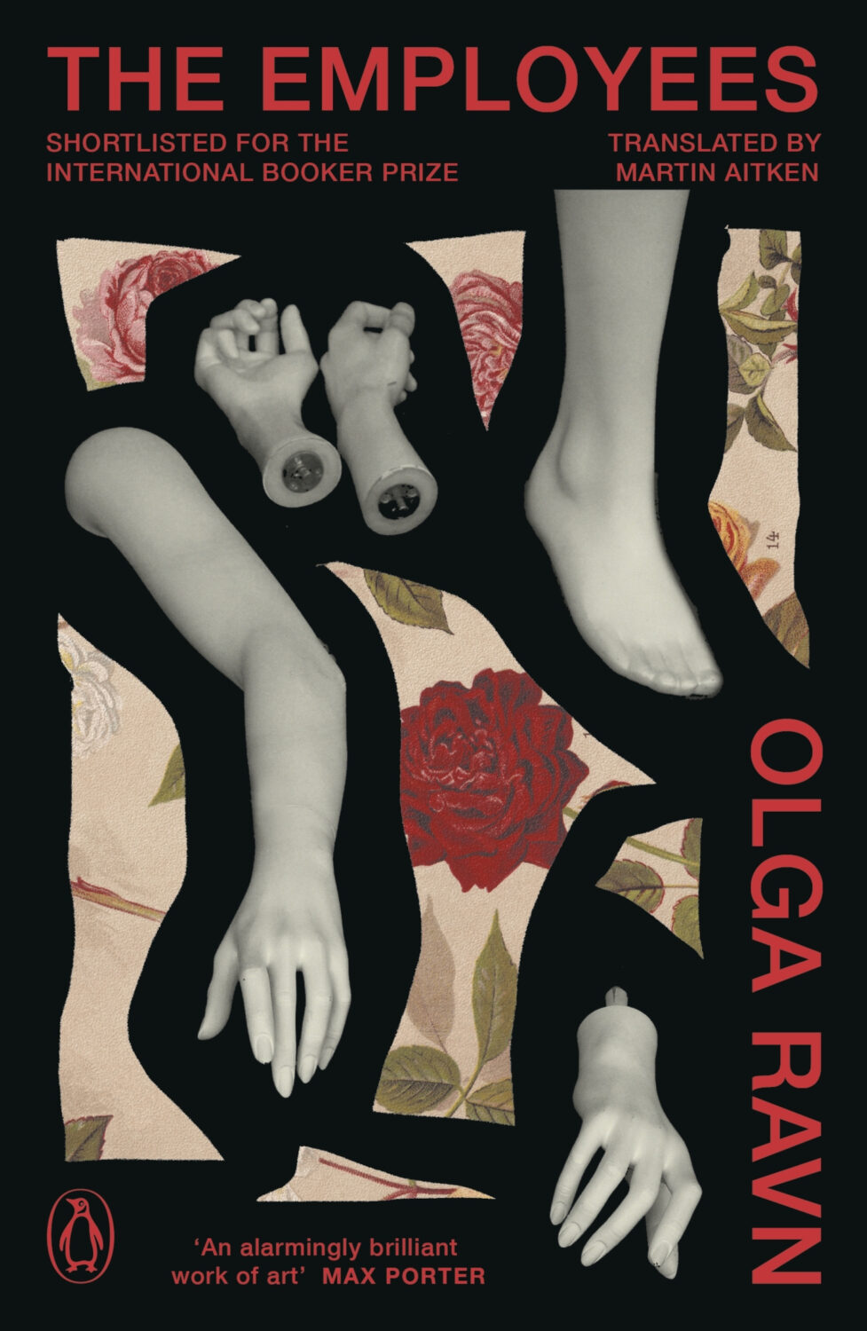
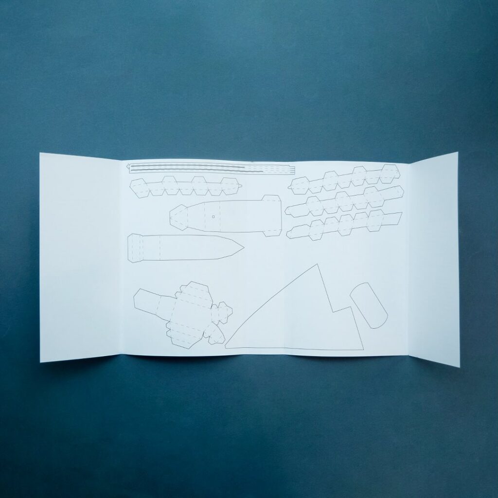
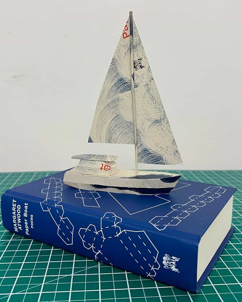
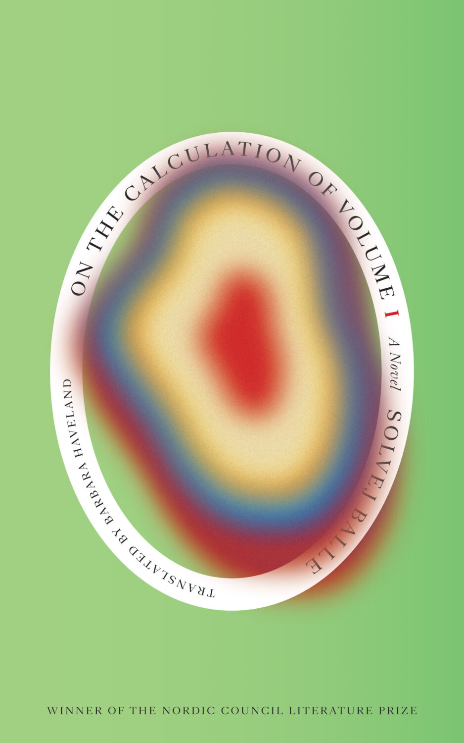
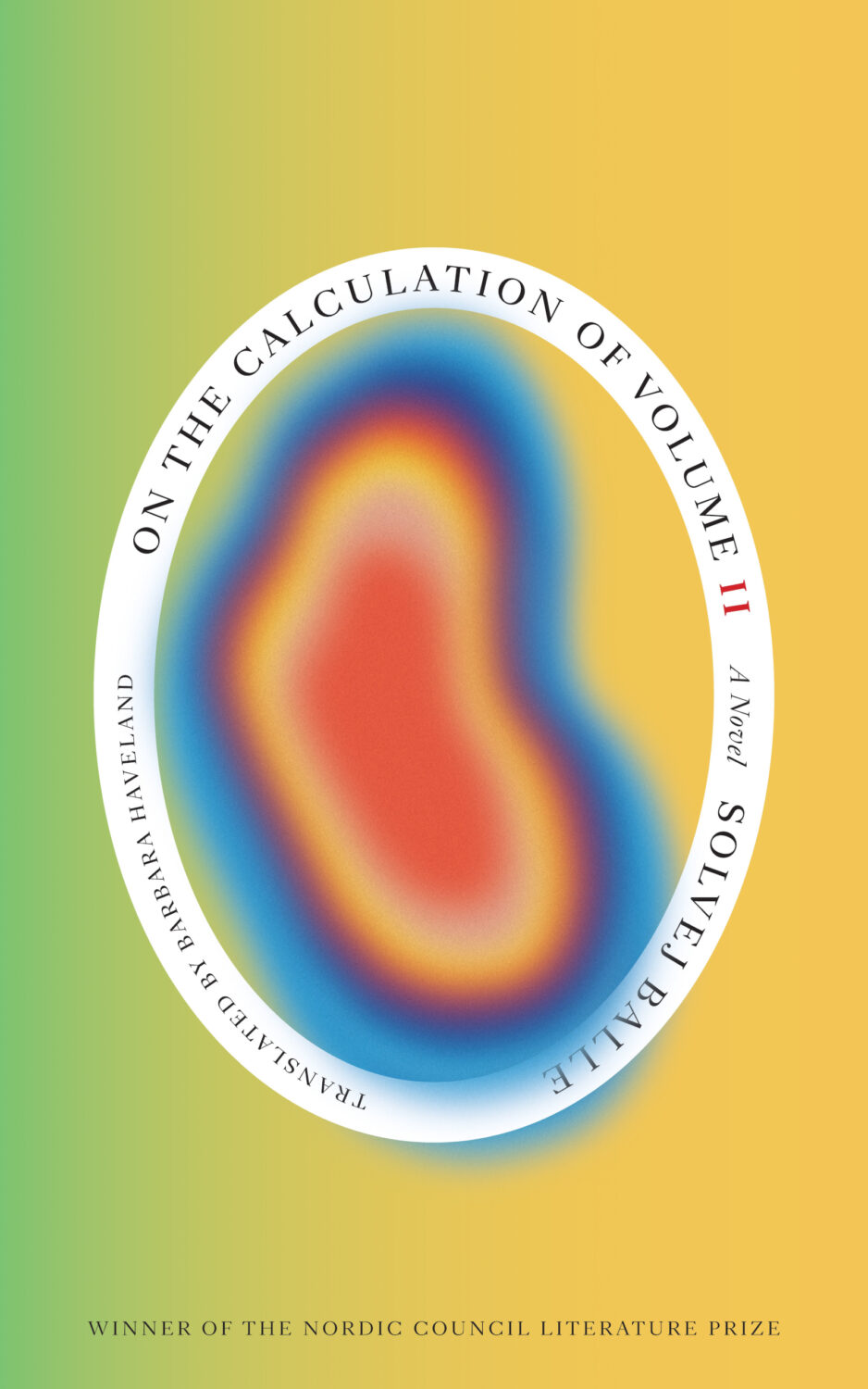
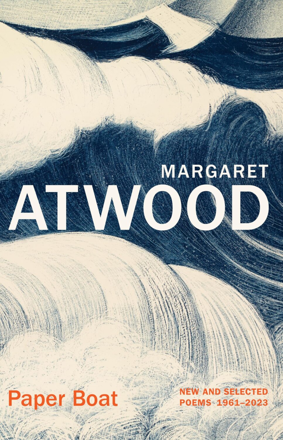
In Solvej Balle’s On the Calculation of Volume septology a women repeats the same day over and over again, and Matt Dorfman‘s covers for the New Direction editions are a really creative take on loops and repetition. The first two books came out last year and were featured in my October 2024 post so they’re not on this year’s list even though the third book was published in November. There are, however, two covers from a different Danish septology included below.
Anna Morrison‘s illustrations for Transit’s Undelivered Lectures series continue to be bold and inventive. The colour palettes always catch my eye. I like Jaya Nicely traditional-with-a-twist covers for Smith & Taylor Classics too. I thought Jenny Volvovski‘s designs for Open Letter’s Latvian translators titles did a lot with a little.
I’m sure I’m missing some others.
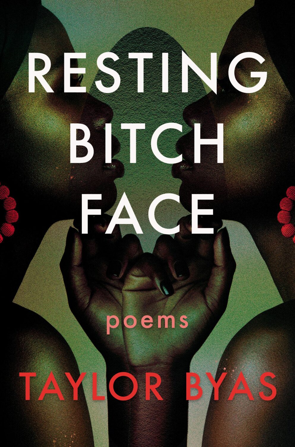
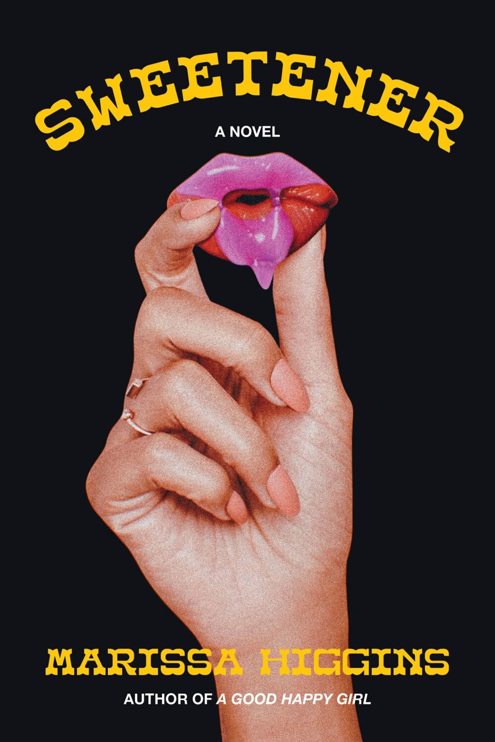
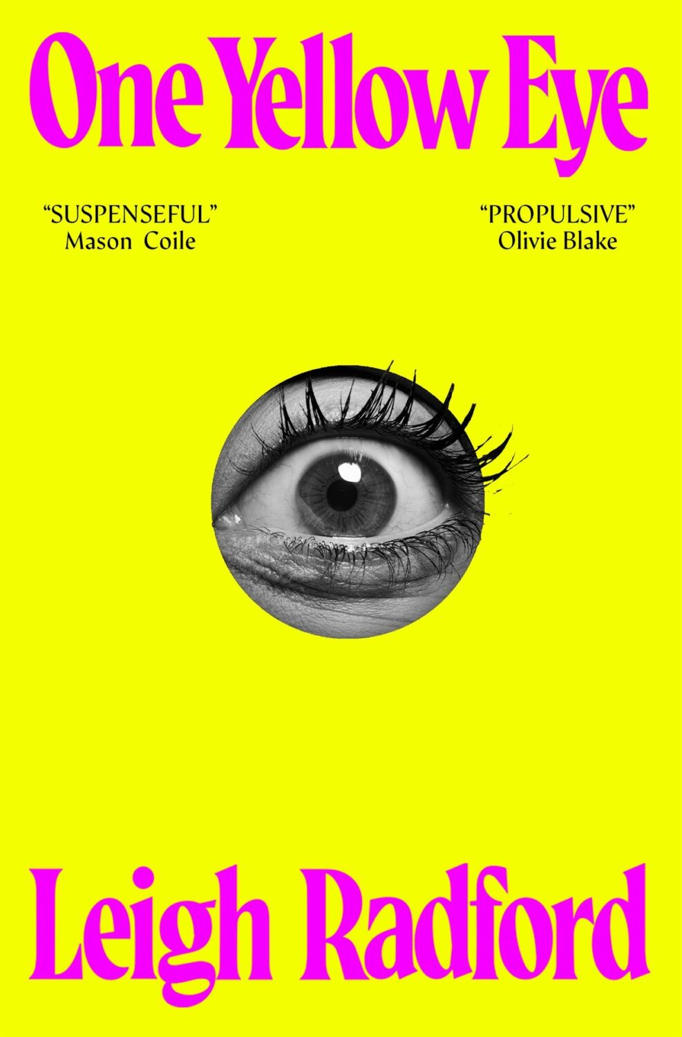
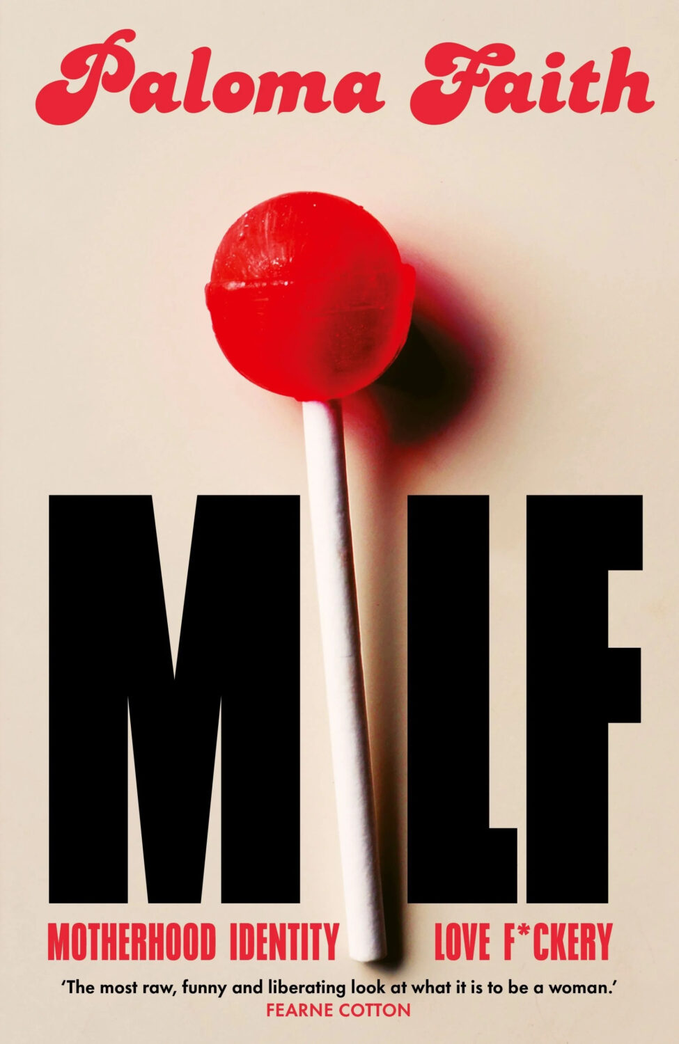
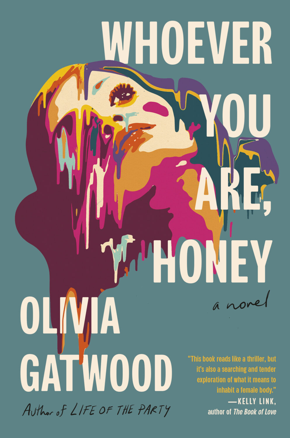
In terms of trends, Alban Fischer noticed that there have been a lot of close-ups of lips recently, something which I Need A Book Cover also picked up on.
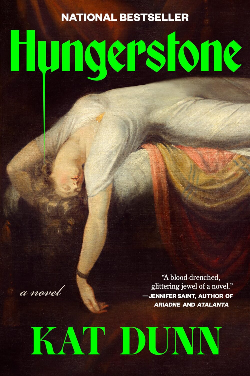
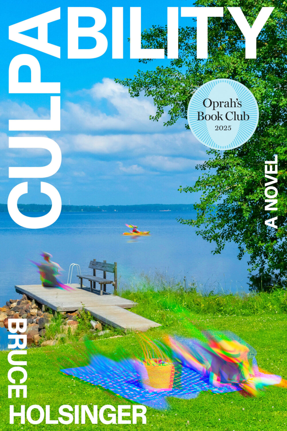
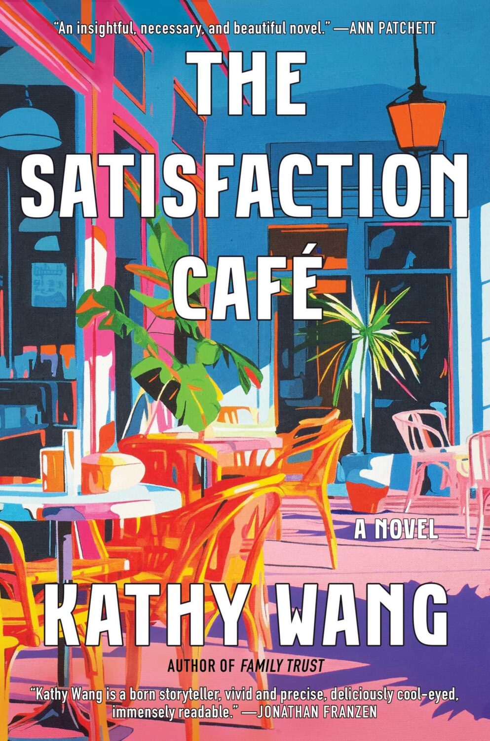
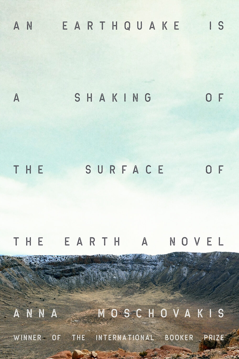
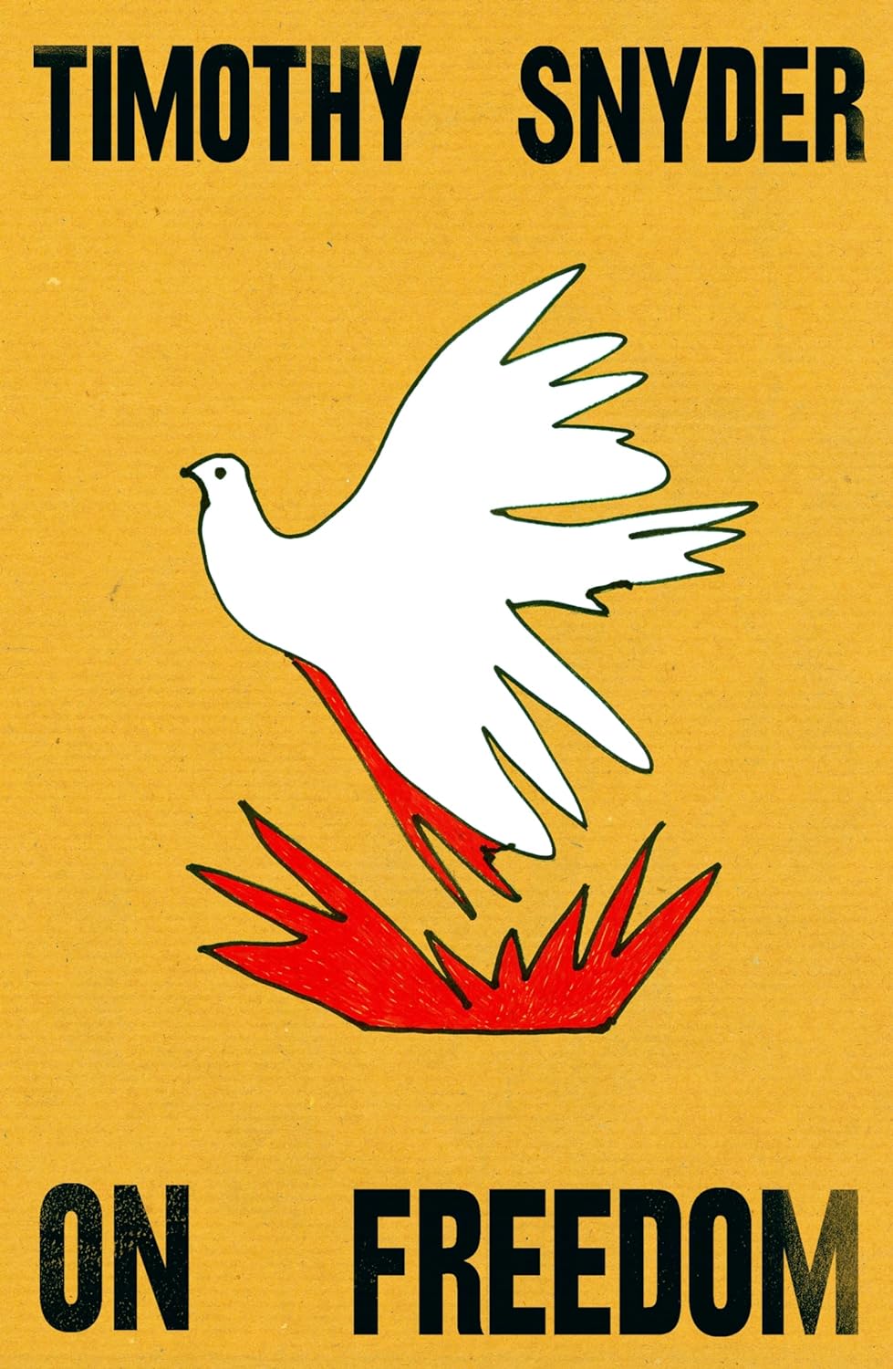
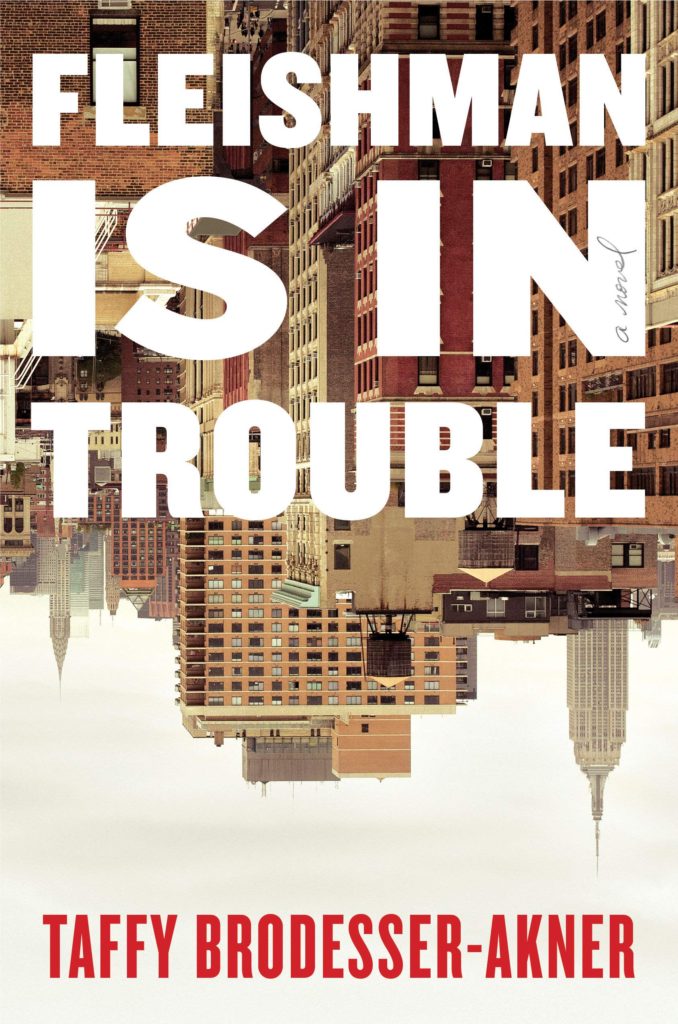
Elizabeth Egan wrote about ‘The Book Cover Trend You’re Seeing Everywhere‘ for the New York Times. Epitomized by “blaringly bright type in a sans-serif font atop a painting,” Egan traces it back to Darren Haggar’s 2018 cover design for My Year of Rest and Relaxation by Ottessa Moshfegh, and it feels like part of the wider “Instagram-friendly” approach that folks have been writing about for a while.
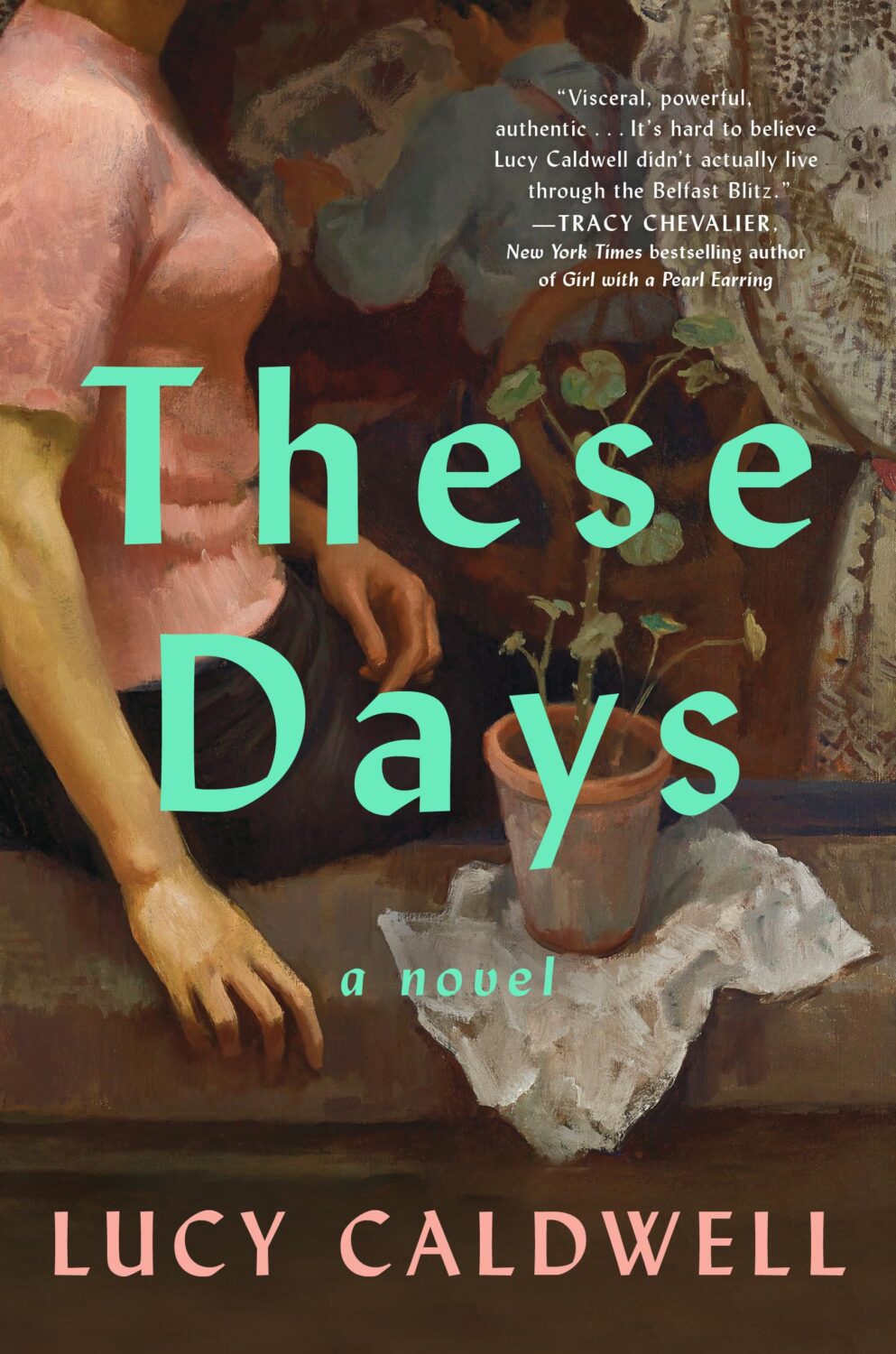
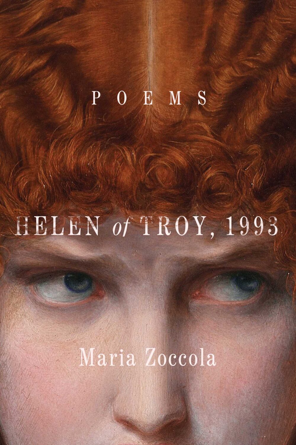
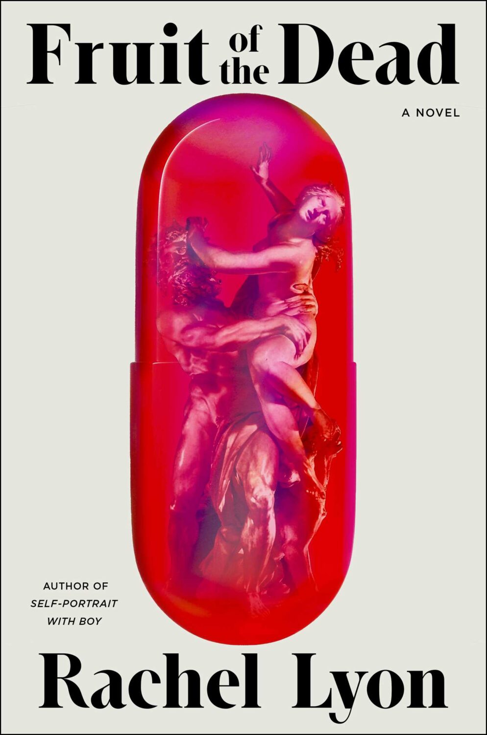
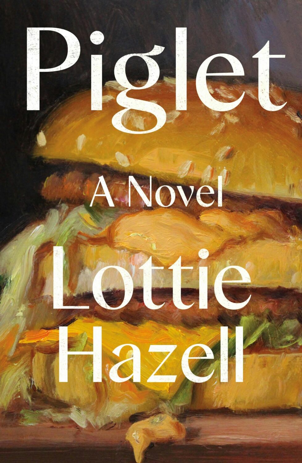
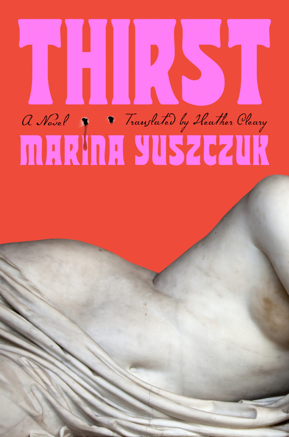
One strand of the ‘trend you’re seeing everywhere’ was paintings of women in various states of repose. There was a lot of elegant ennui and it almost felt like an art school version of well-dressed and distressed covers at times.

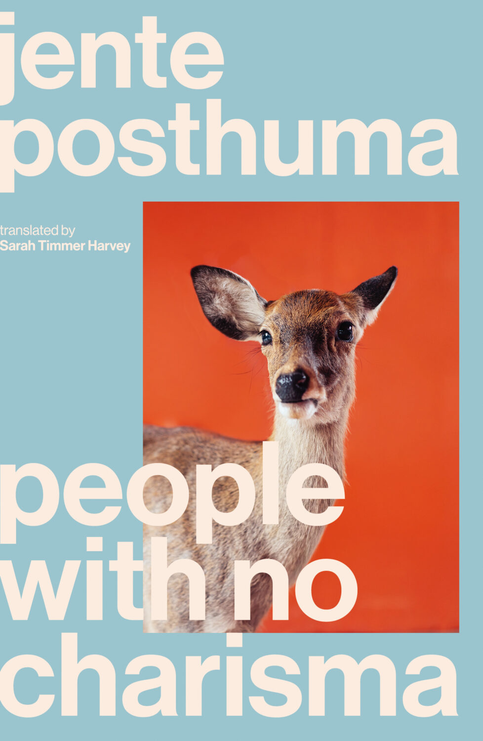
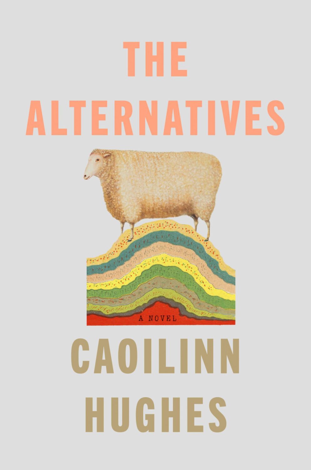
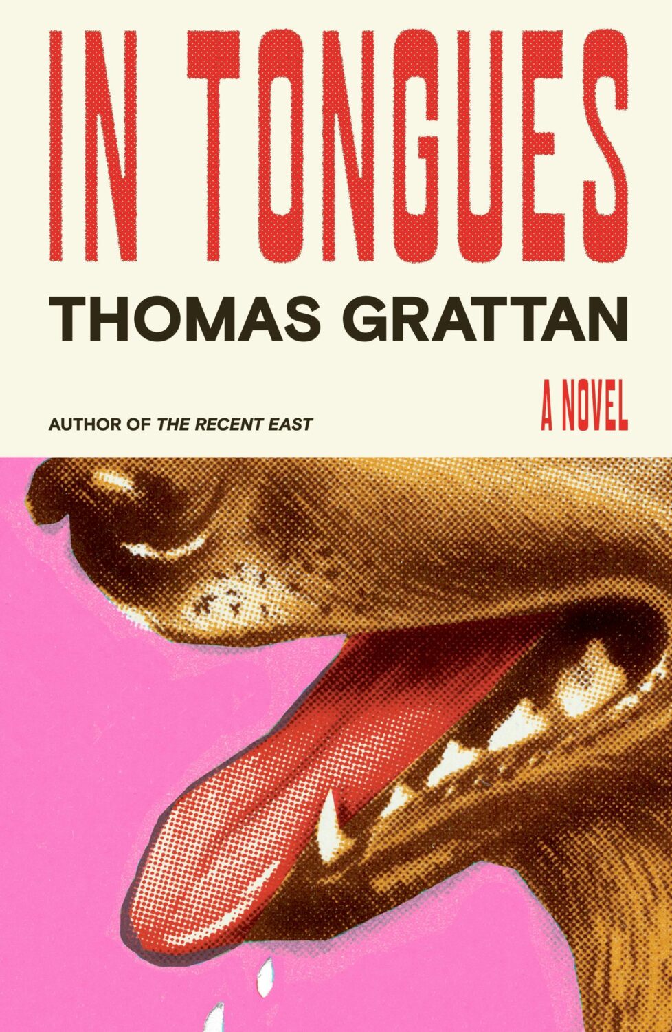
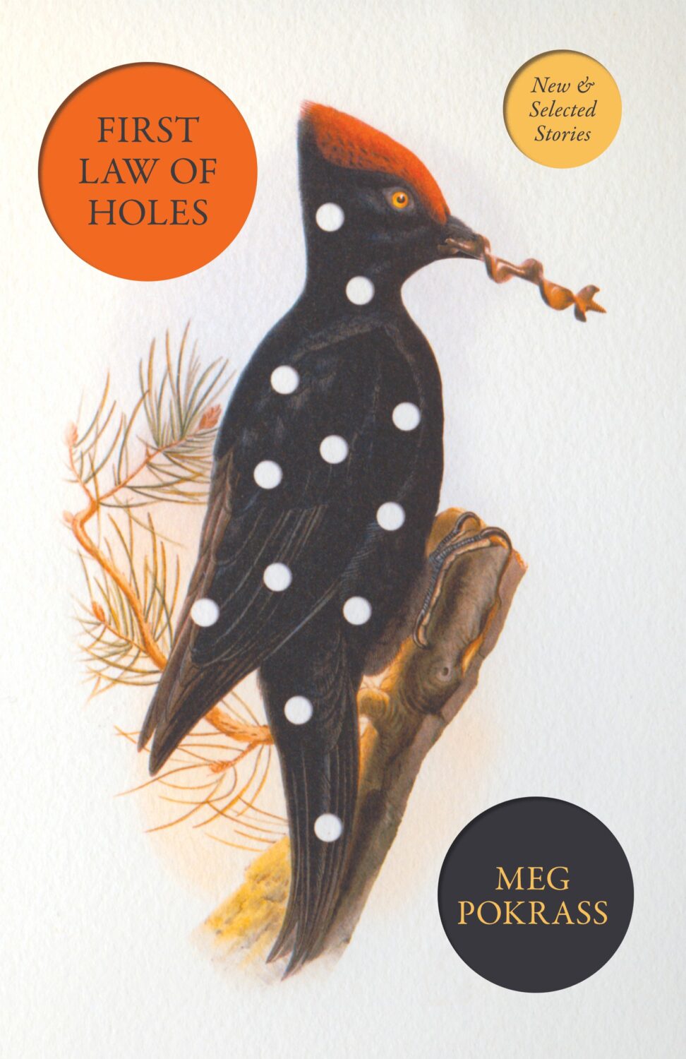
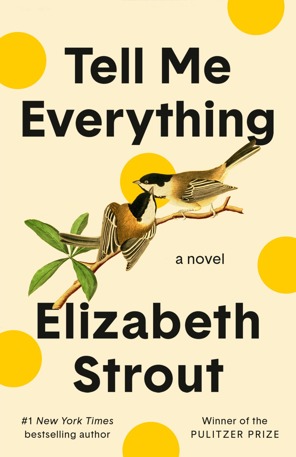
Another strand was historical paintings of animals, which fits with the “old-timey animals” covers Patrick Redford wrote about for Defector last year.
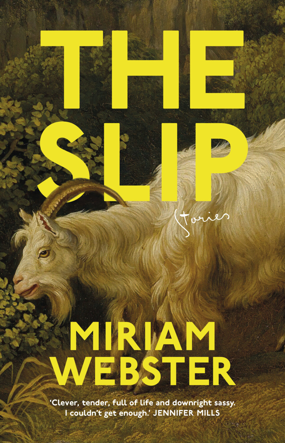
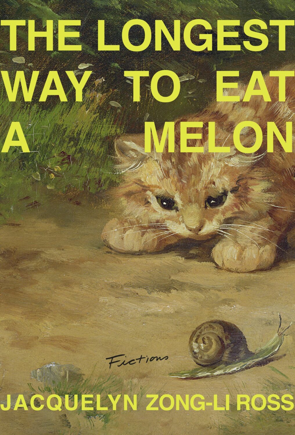
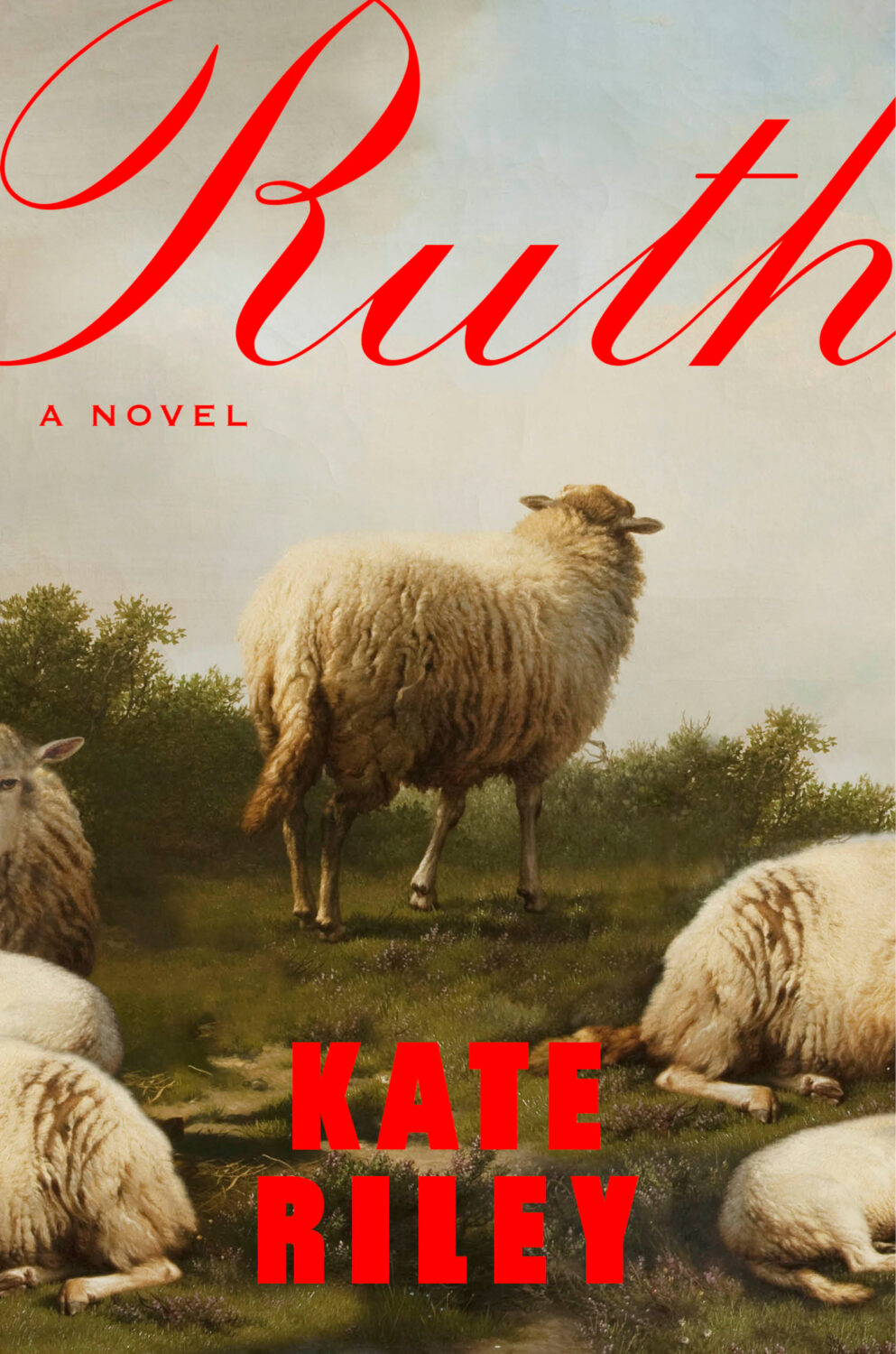
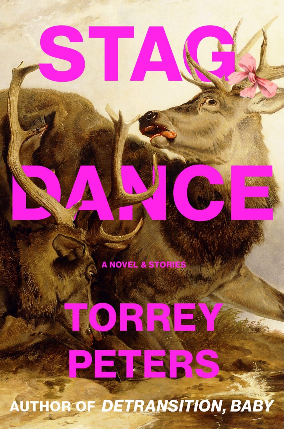
There was also a variation of old-timey animals that used white serif type for contrast.
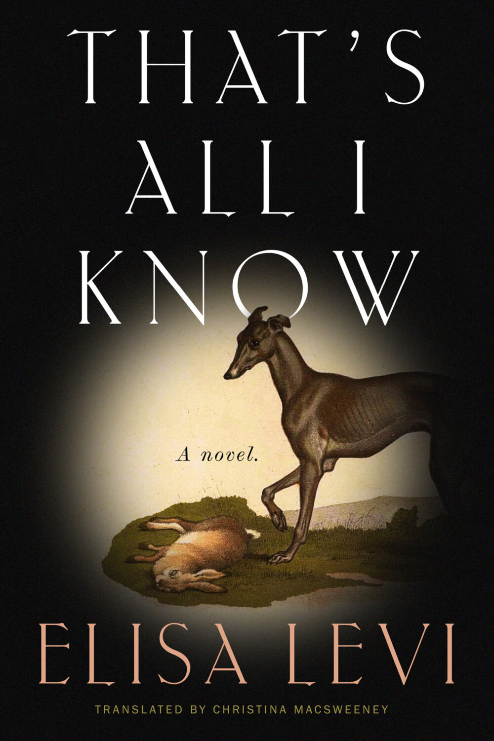
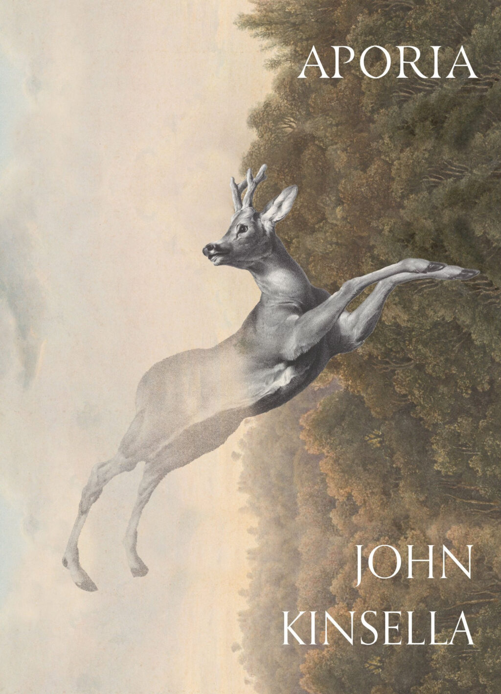
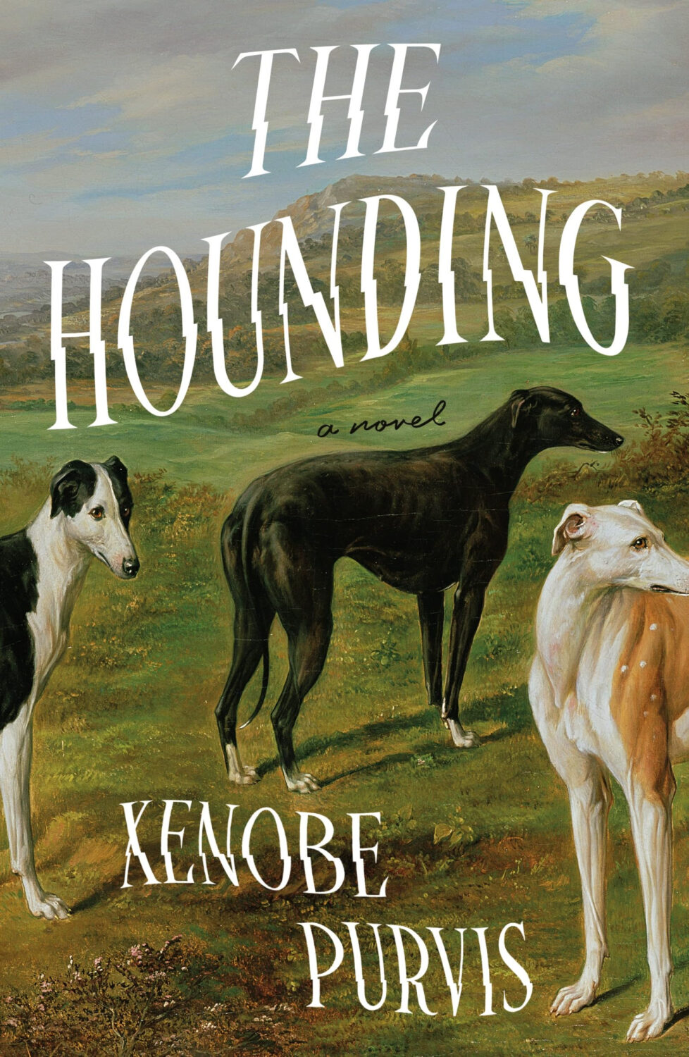
I think the success of these covers largely depends on the image selection and the cleverness of the crop. I’m sure we will see more of them going forward, but doing it well is probably harder than it looks.
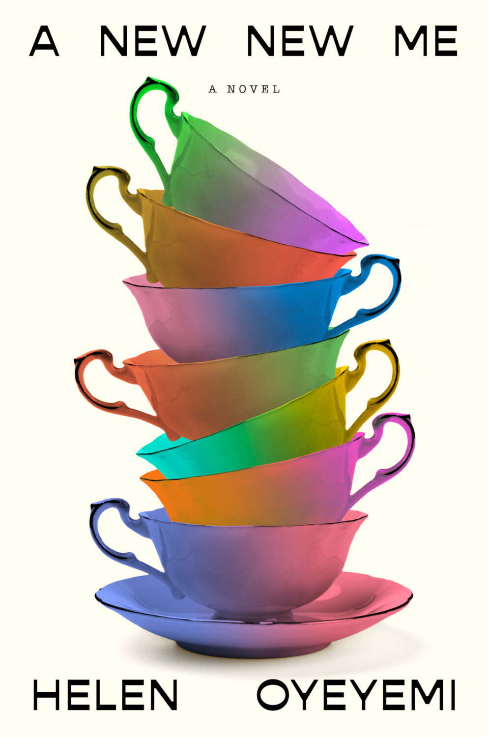
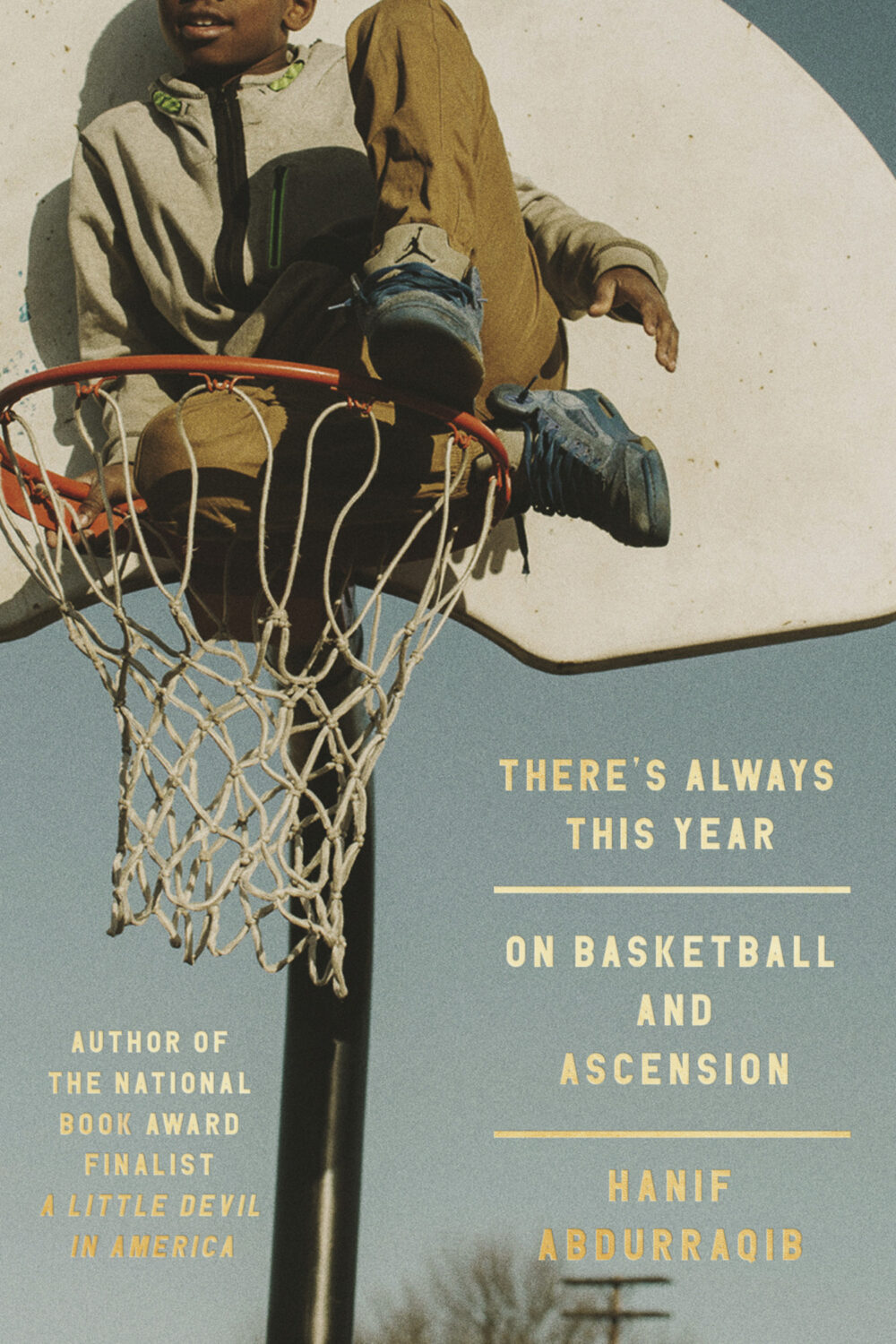
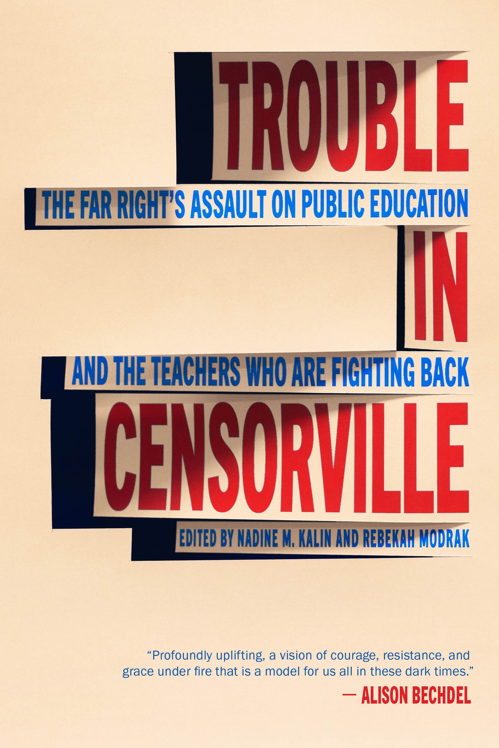
I don’t have a good name for this next trend, but in my mind I’ve been referring to this as “corner type” because of the way the text seems to turn the corners the cover. I guess what it is really doing is framing the central image. I don’t know if this is new, but I noticed it a lot this year.
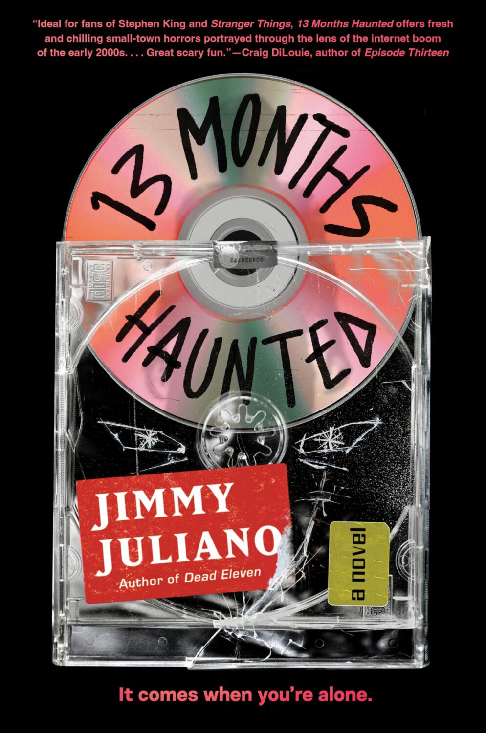
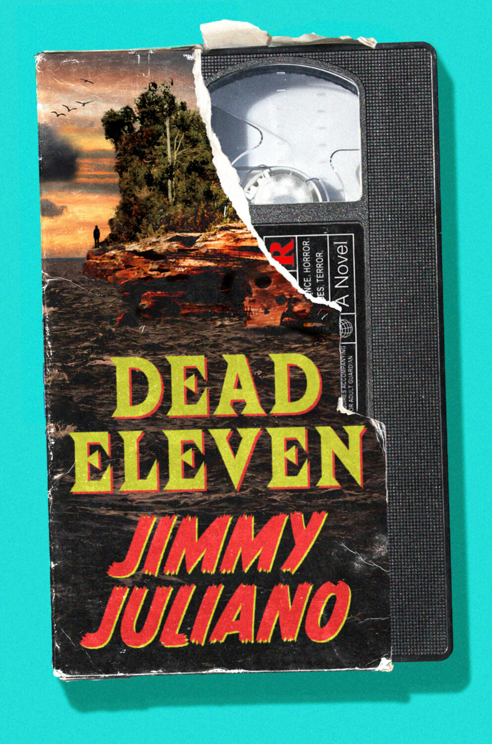
I mentioned a wave of retro-nostalgic horror and suspense covers back in 2023 (I could’ve sworn it was last year until I checked!), but it feels like designers are still having fun with it as the genre as a whole gets more mainstream attention.
And speaking of nostalgia, I feel like covers inspired by 1980s advertising and airbrush art are suddenly a thing. There are a few examples from 2025, but it might be something we see more of next year as well.
Lastly, I just wanted to say thank you to everyone who supported the blog this year, especially the folks that helped out with cover images, credits, and corrections. I really appreciate you taking the time to reach out, and I’m sorry if you sent me a note and didn’t hear back. I try my best to read and reply to everything, but this is a one man show and sometimes life has other plans.
Happy Holidays!
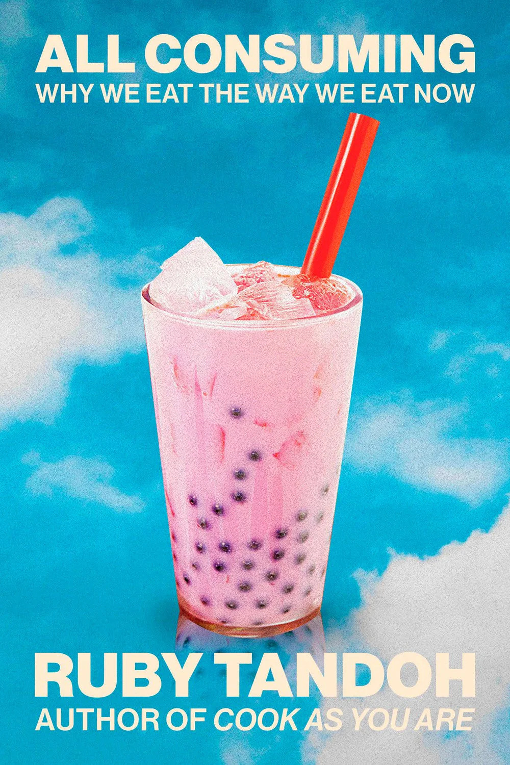
All Consuming by Ruby Tandoh; design by Jared Bartman (Knopf / September 2025)
Also designed by Jared Bartman:
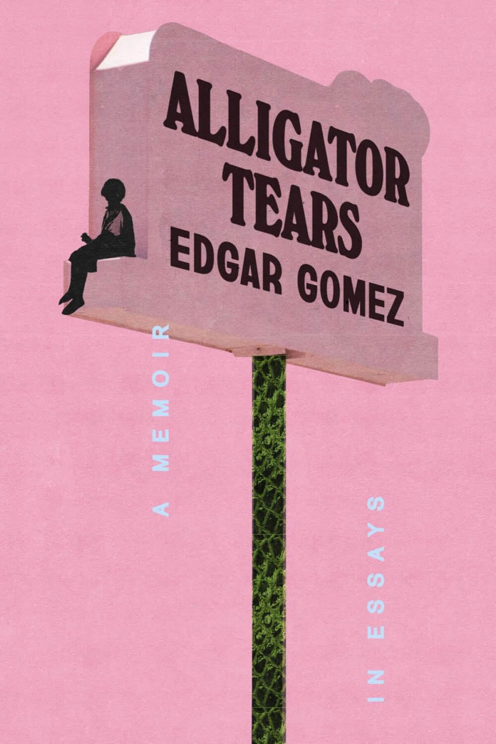
Alligator Tears by Edgar Gomez; design by Arsh Raziuddin (Crown / February 2025)
Also designed by Arsh Raziuddin:
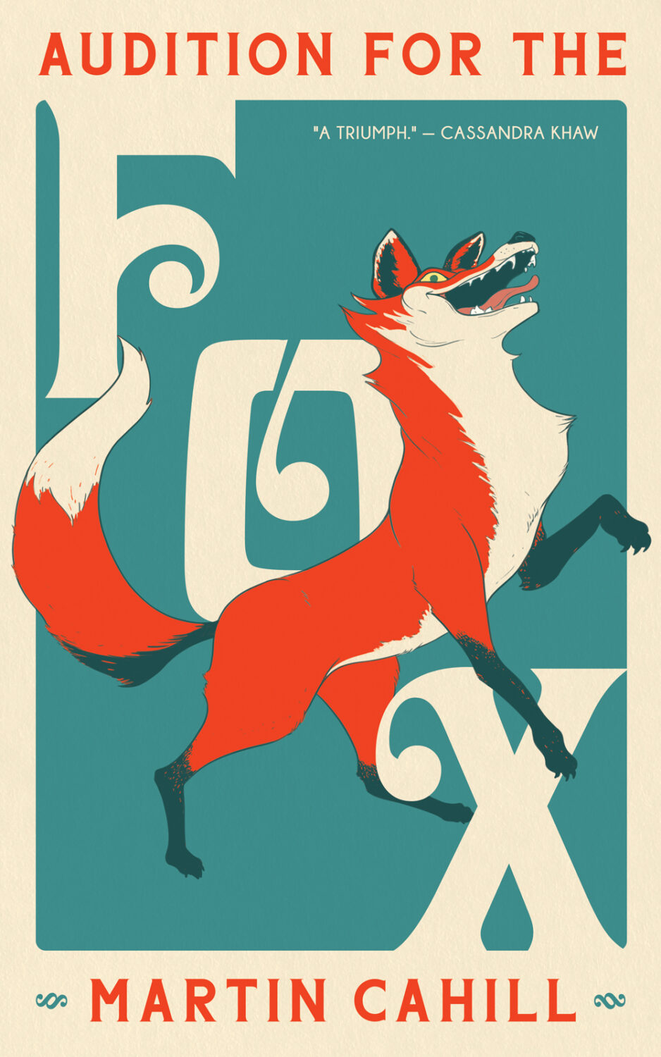
Audition for the Fox by Martin Cahill; design and illustration by Elizabeth Story (Tachyon Books / September 2025)
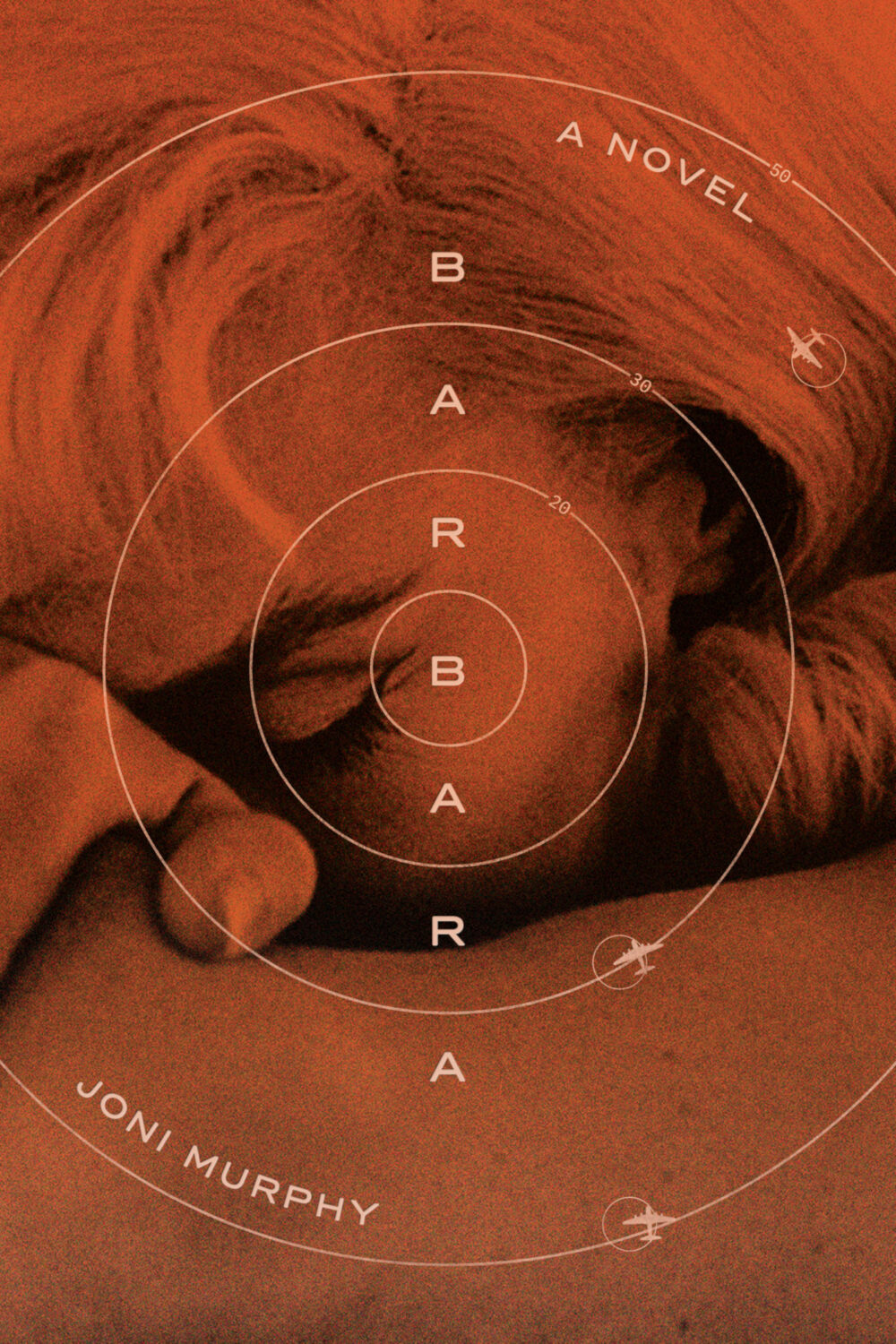
Barbara by Joni Murphy; design by Frances DiGiovanni and Rodrigo Corral (Astra House / March 2025)

Beasts by Ingvild Bjerkeland, translated by Rosie Hedger; design by John Gall (Levine Querido / April 2025)
Also designed by John Gall:
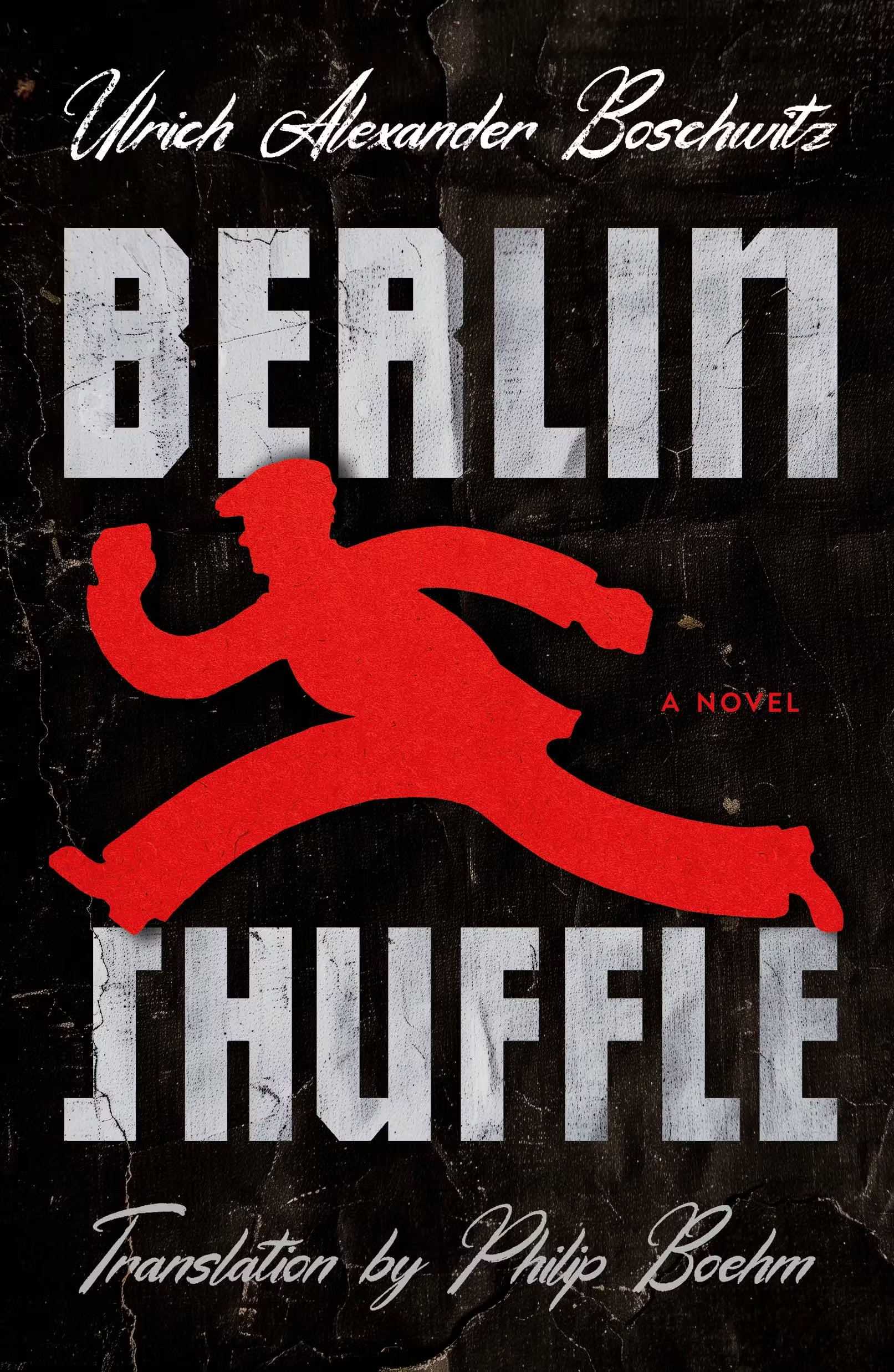
Berlin Shuffle by Ulrich Alexander Boschwitz; translated by Philip Boehm; design by Emily Mahar (Henry Holt & Co. / December 2025)

Beta Vulgaris by Margie Sarsfield; design by Joanne O’Neill (W. W. Norton / February 2025)
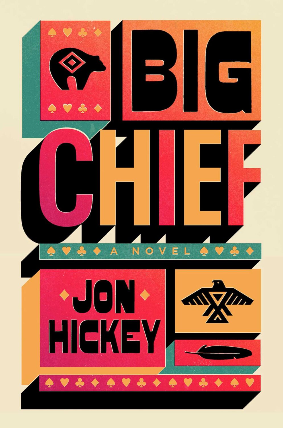
Big Chief by Jon Hickey; design by David Litman (Simon & Schuster / April 2025)
Also designed by David Litman:

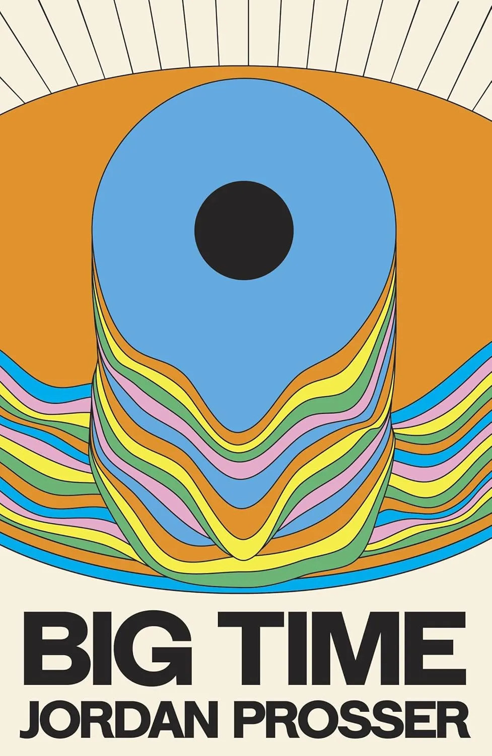
Big Time by Jordan Prosser; design by Luke Bird (Dead Ink Books / September 2025)
Also designed by Luke Bird:

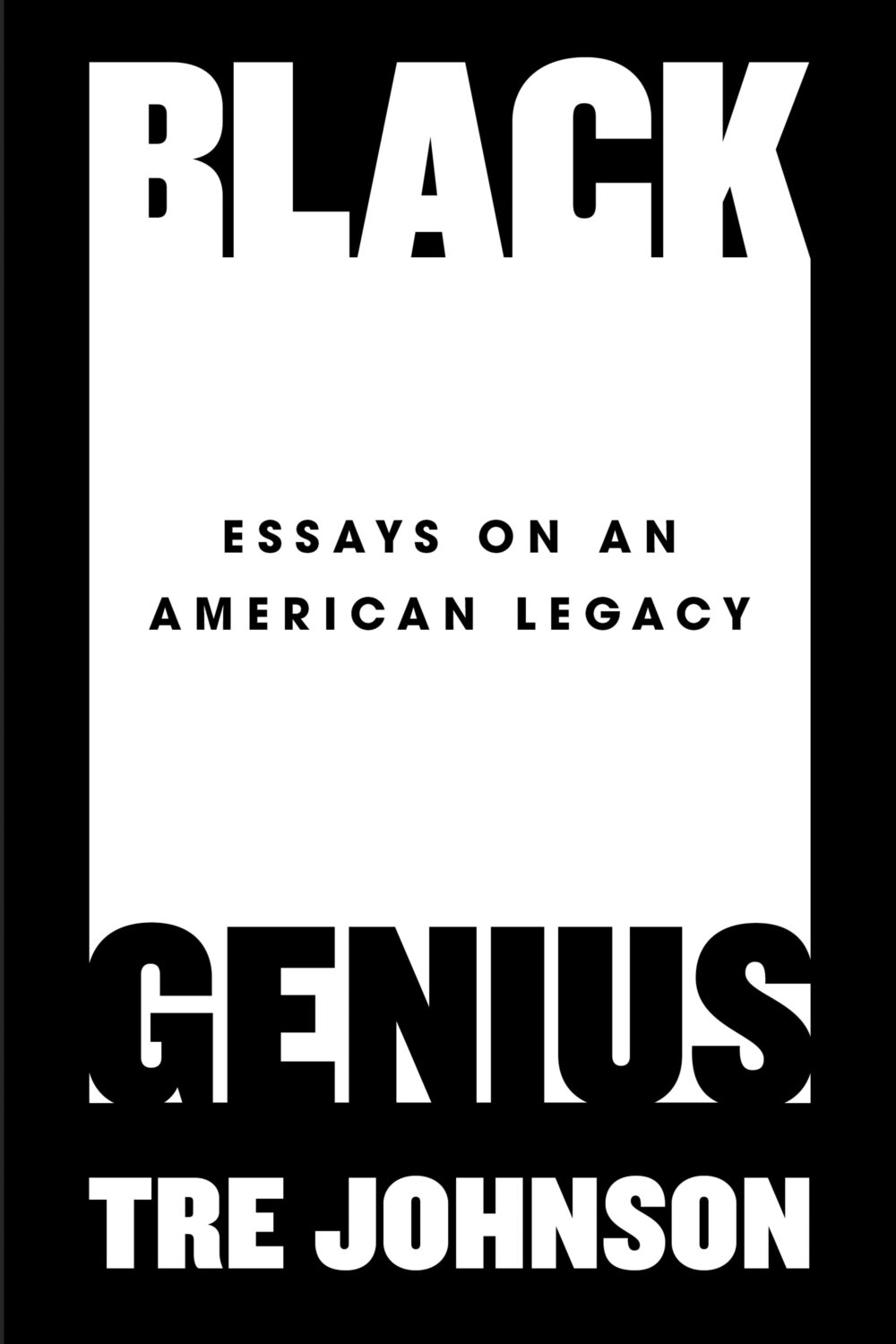
Black Genius by Tre Johnson; design by Dominique Jones (Dutton / July 2025)
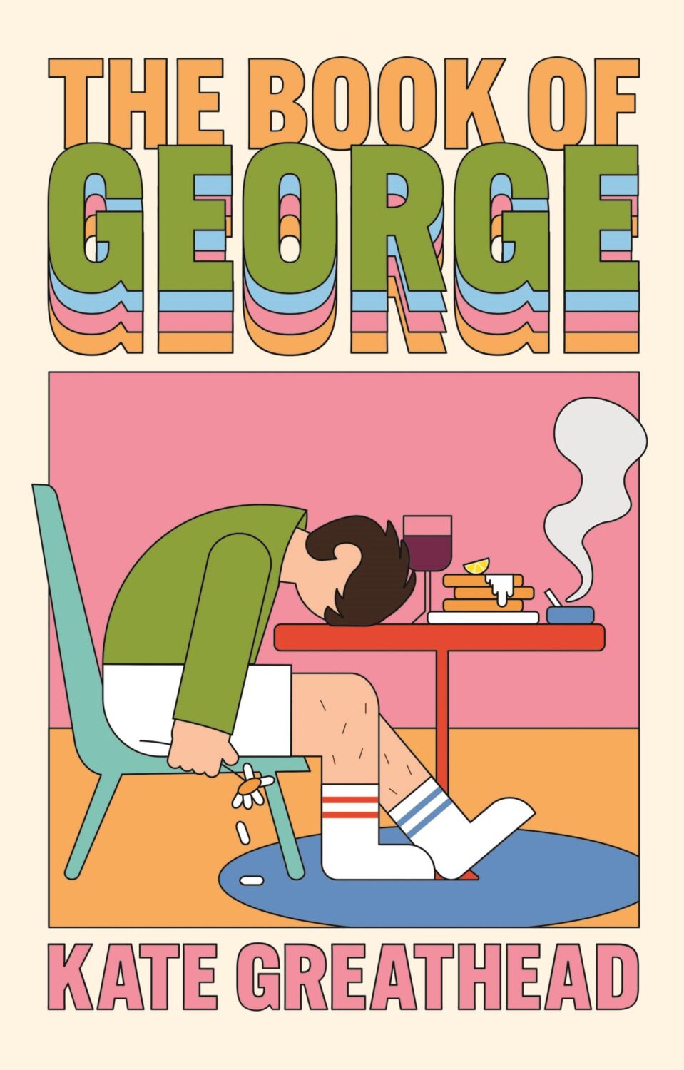
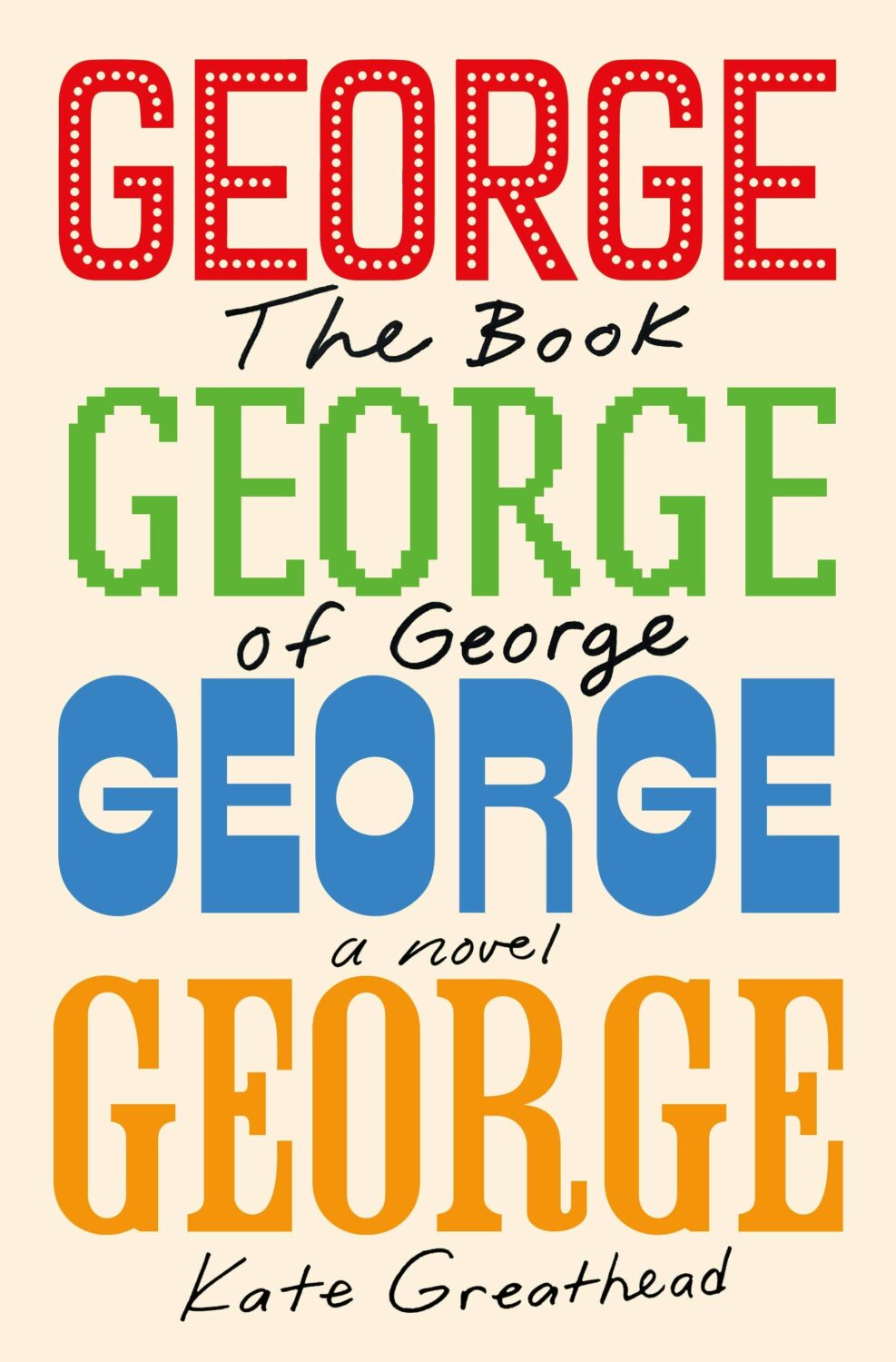
The Book of George by Kate Greathead; design by Holly Battle (Atlantic Books / January 2025)
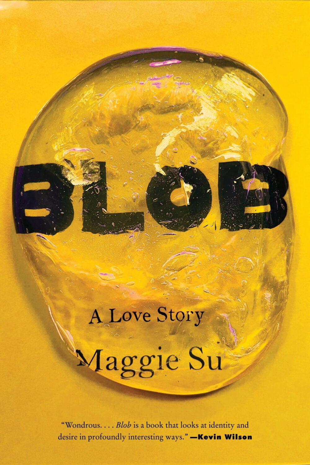
Blob by Maggie Su; design by Robin Bilardello (Harper / January 2025)

The Bridegroom Was a Dog by Yoko Tawada; cover illustration by David Plunkert (New Directions / November 2025)

Casanova 20 by Davey Davis; design by Victoria Maxfield (Catapult / December 2025)
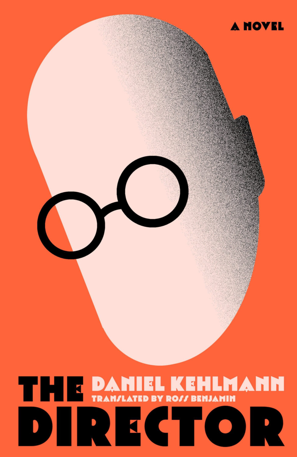
The Director by Daniel Kehlmann, translated by Ross Benjamin; design by Andrew Smith (Riverrun / May 2025)
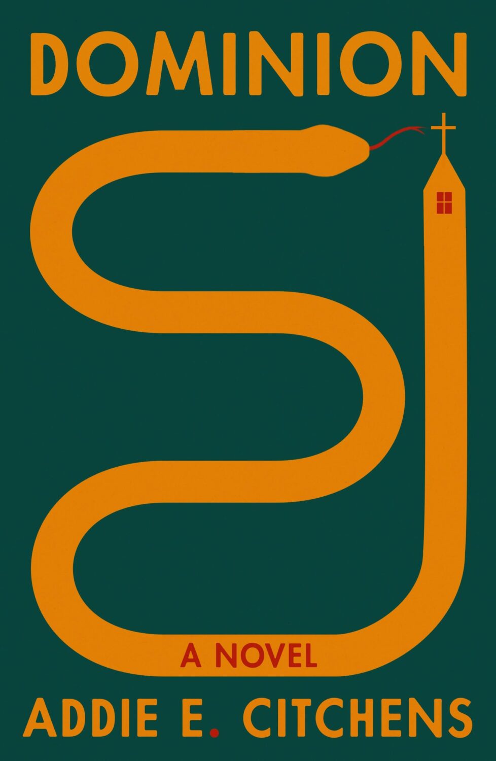
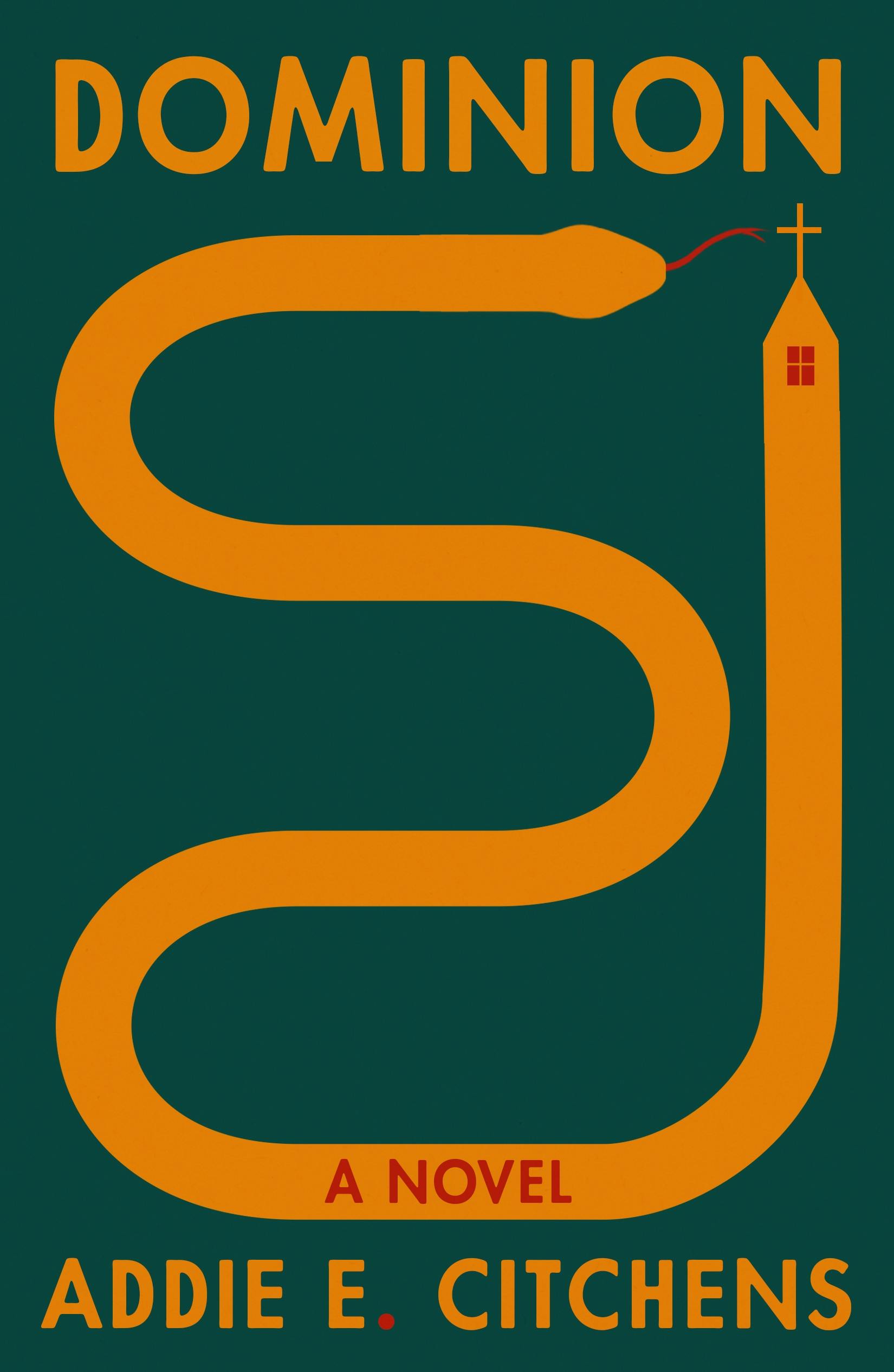
Dominion by Addie E. Citchens; design by Na Kim (Farrar, Straus & Giroux / August 2025)

The Eternal Dice by César Vallejo; design by Pablo Delcan (New Directions / April 2025)
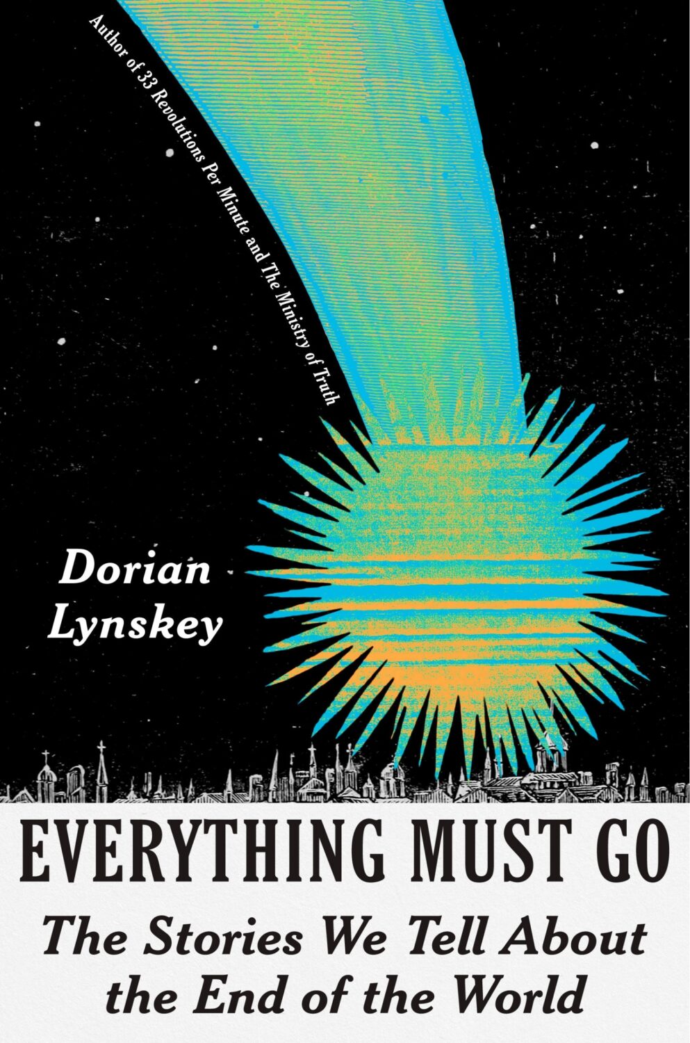
Everything Must Go by Dorian Lynskey; design by Eli Mock (Pantheon / January 2025)
Also designed by Eli Mock:
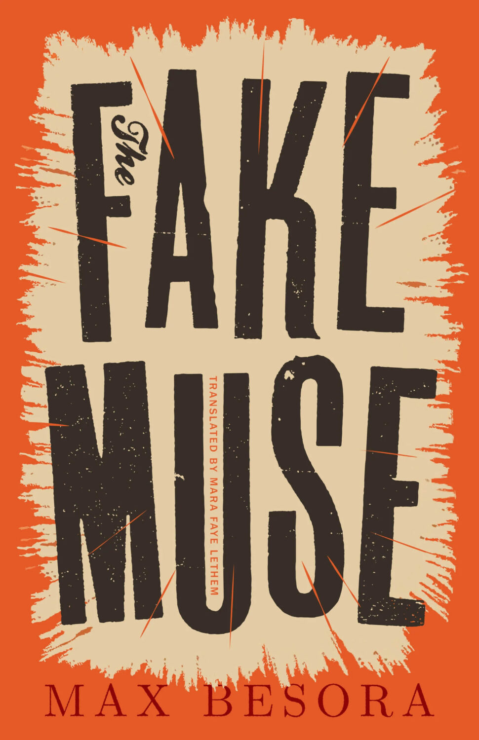
Fake Muse by Max Besora; design by Alban Fischer (Open Letter / February 2025)

Flat Earth by Jade Levy; design by Nicole Caputo (Catapult / November 2025)
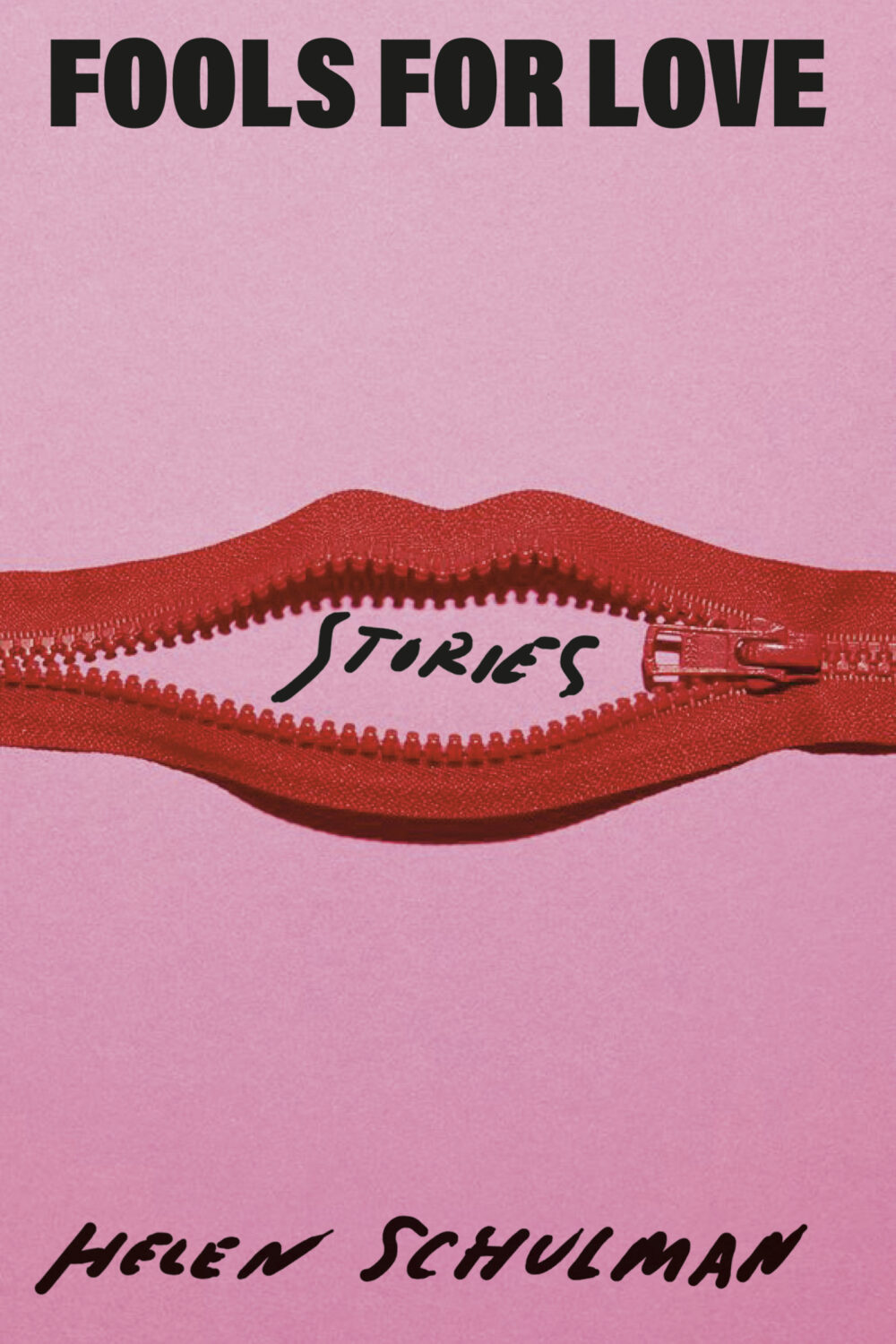
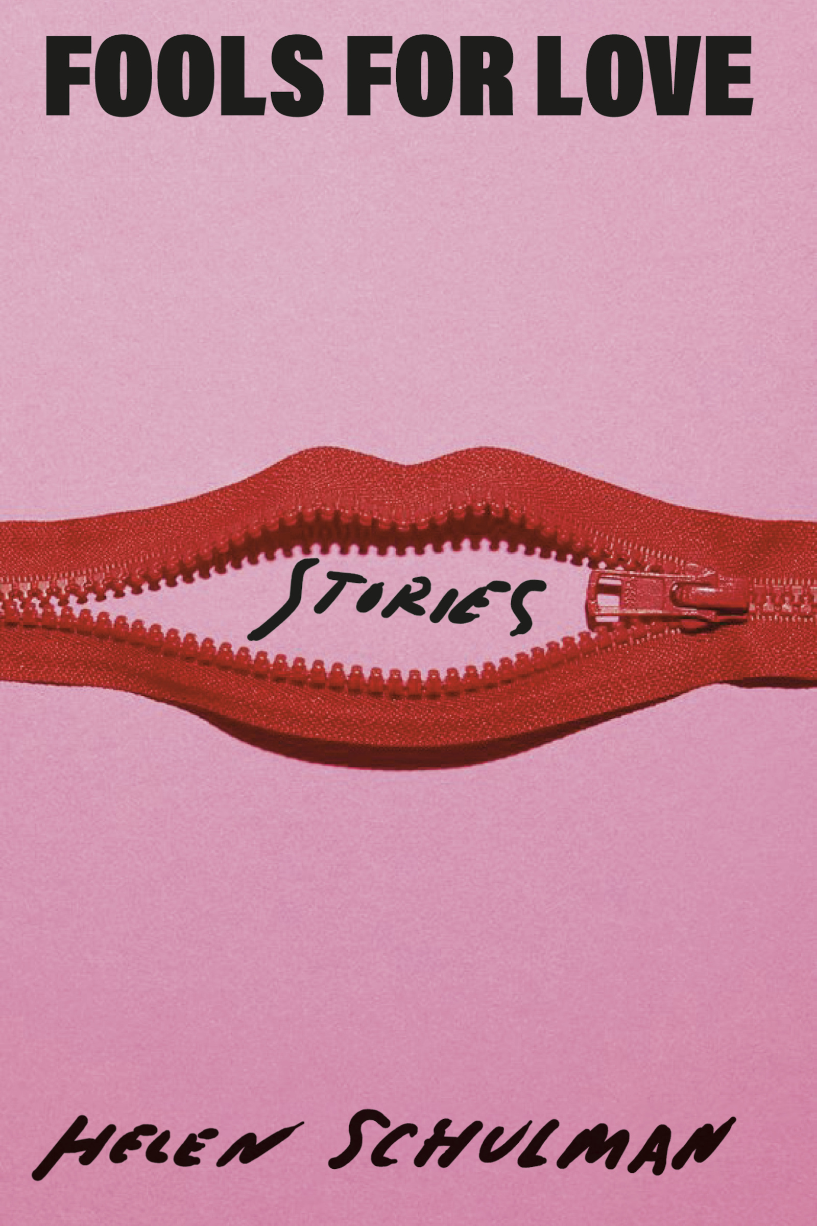
Fools for Love by Helen Schulman; design by Janet Hansen (Knopf / July 2025)
Also designed by Janet Hansen:
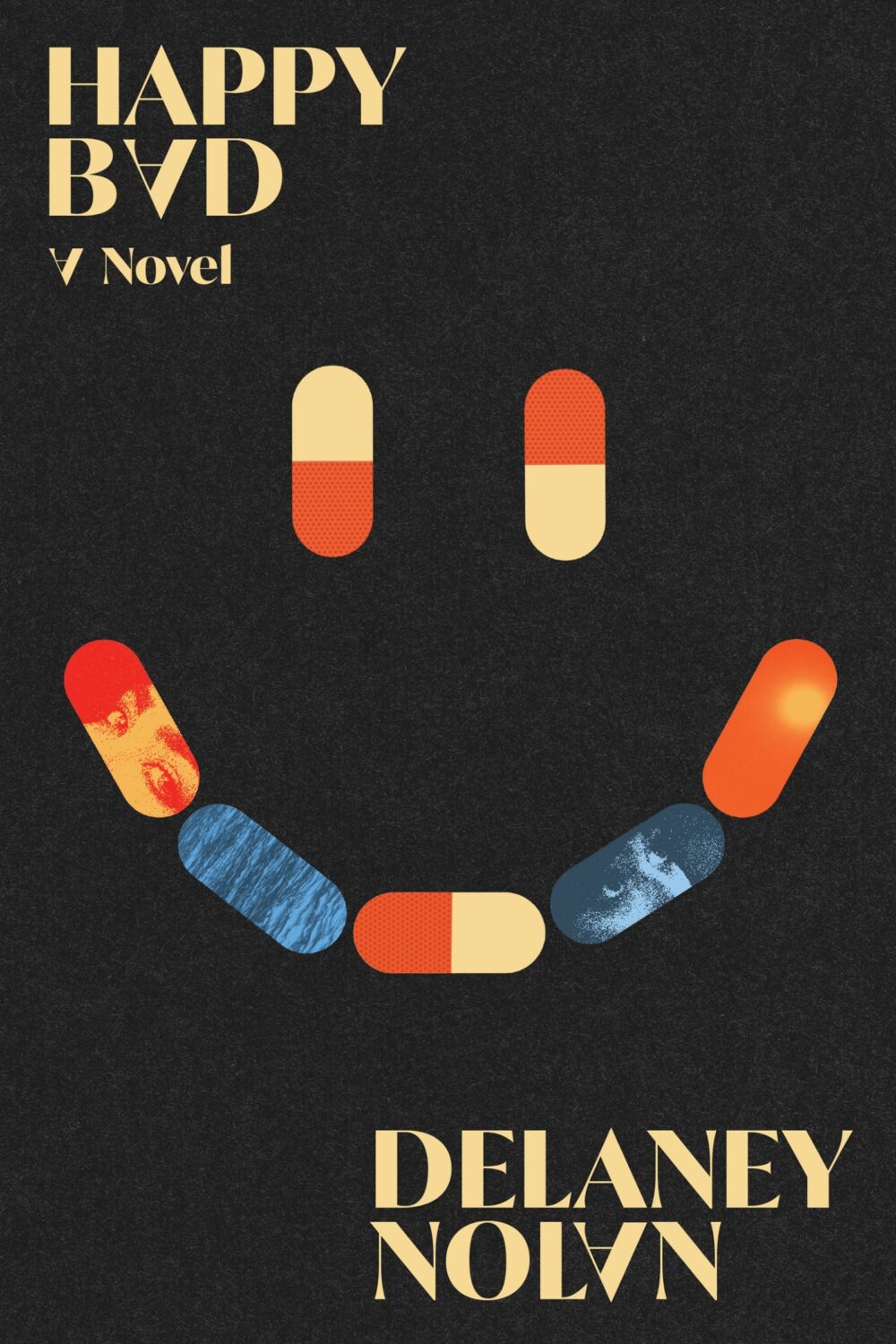
Happy Bad by Delaney Nolan; design by Adriana Tonello (Astra House / October 2025)
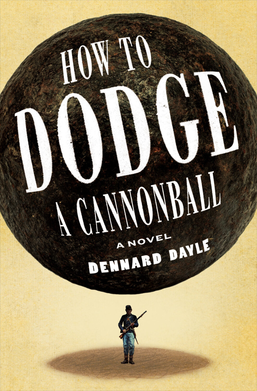
How to Dodge a Cannonball by Dennard Dayle; design by Christopher Sergio (Henry Holt & Co. / June 2025)
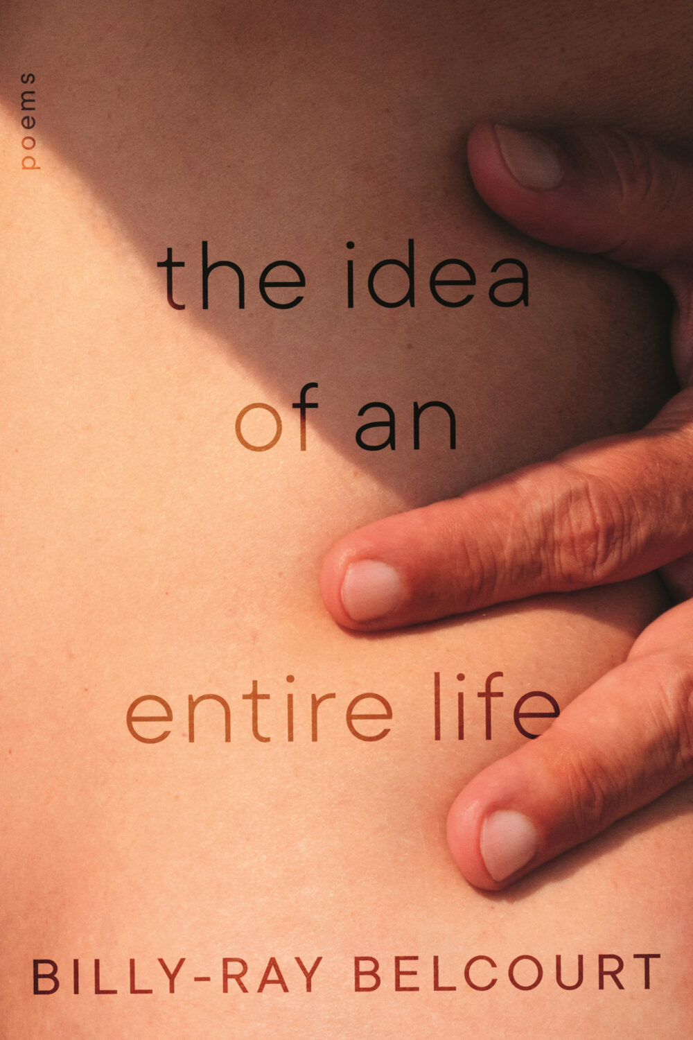
The Idea of an Entire Life by Billy-Ray Belcourt; design by Kate Sinclair (McClelland & Stewart / September 2025)

I Deliver Parcels in Beijing by Hu Anyan, translated by Jack Hargreaves; design by Rodrigo Corral; illustration by Klaus Kremmerz (Astra House / October 2025)

In Defence of Barbarism by Louisa Yousfi; design by Chantal Jahchan (Verso / January 2025)
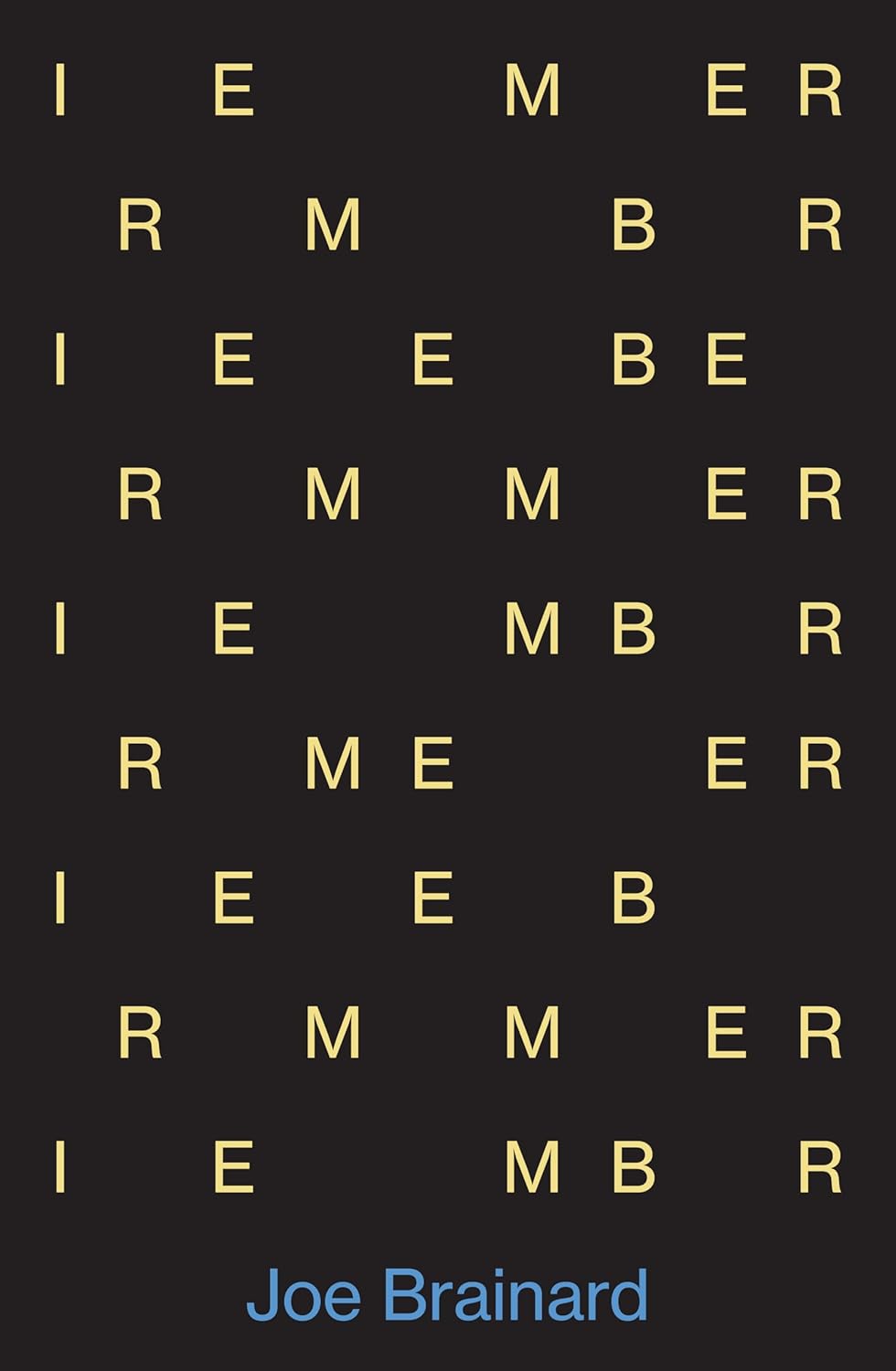
I Remember by Joe Brainard; design by David Pearson (Daunt Books / July 2025)
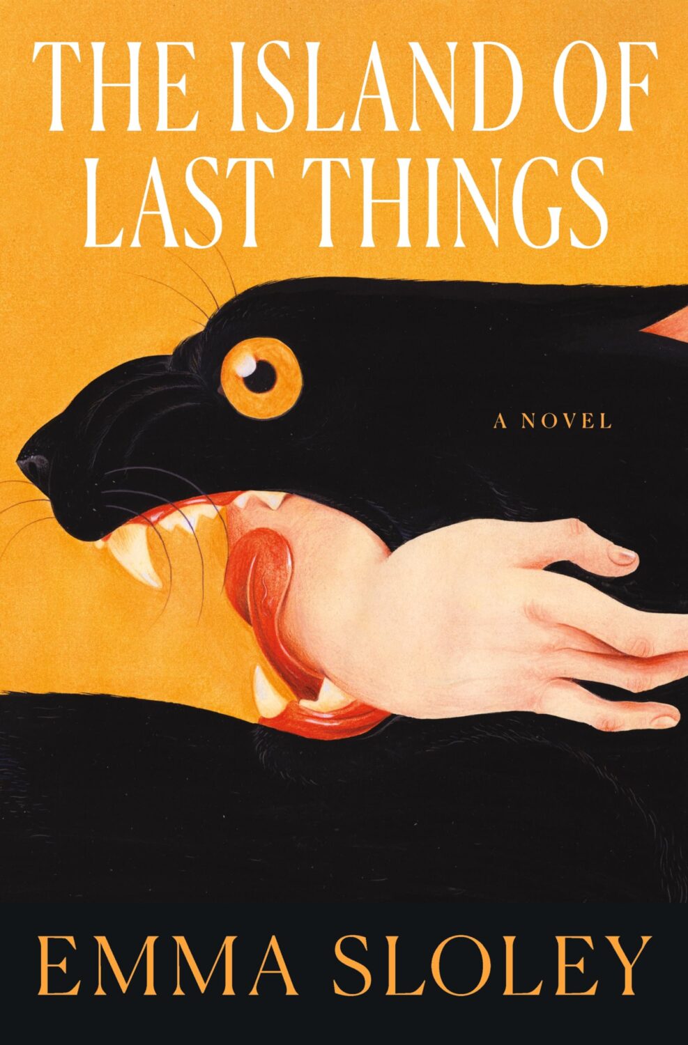
The Island of Last Things by Emma Sloley; design by Keith Hayes; art by Jose David Morales (Flatiron Books / September 2025)
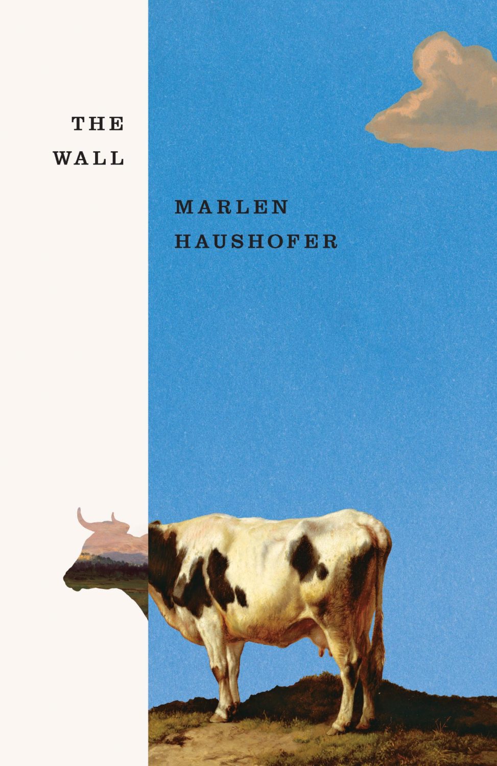
Killing Stella by Marlen Haushofer; design by Matt Dorfman (New Directions / July 2025)
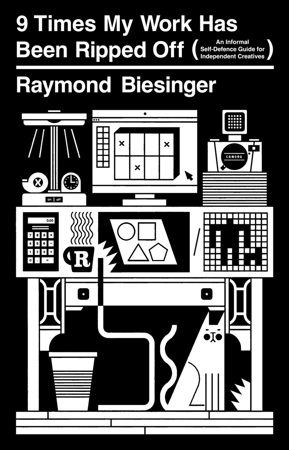
Also designed by Matt Dorfman:

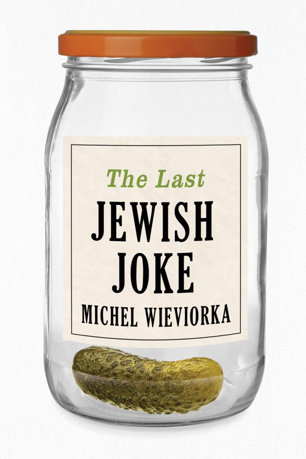
The Last Jewish Joke by Michel Wieviorka; design by David Drummond (Polity Press / September 2025)
Maggie, Or a Man and Woman Walk Into a Bar by Katie Yee; design by Grace Han (Summit Books / July 2025)
Also designed by Grace Han:
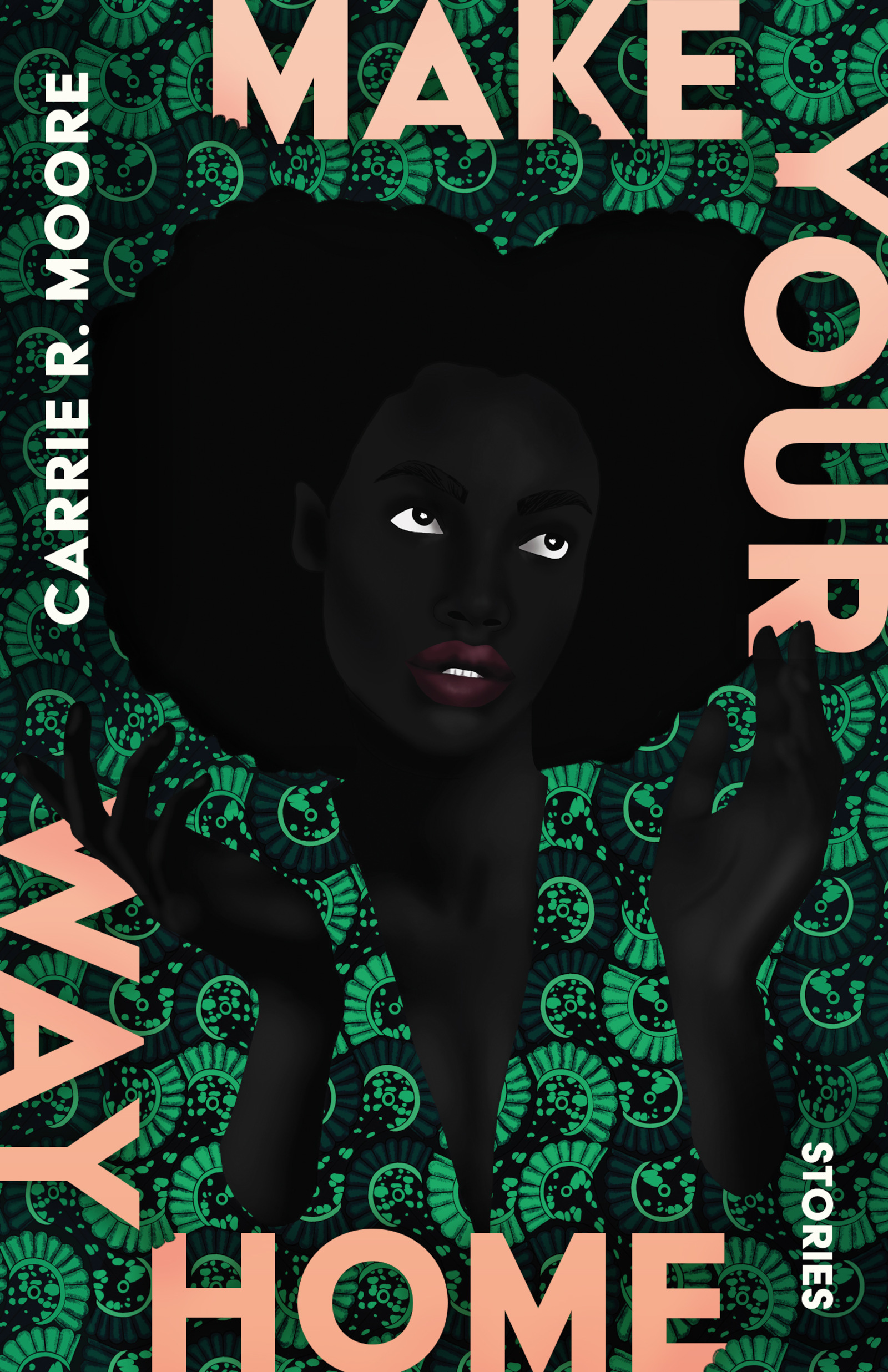
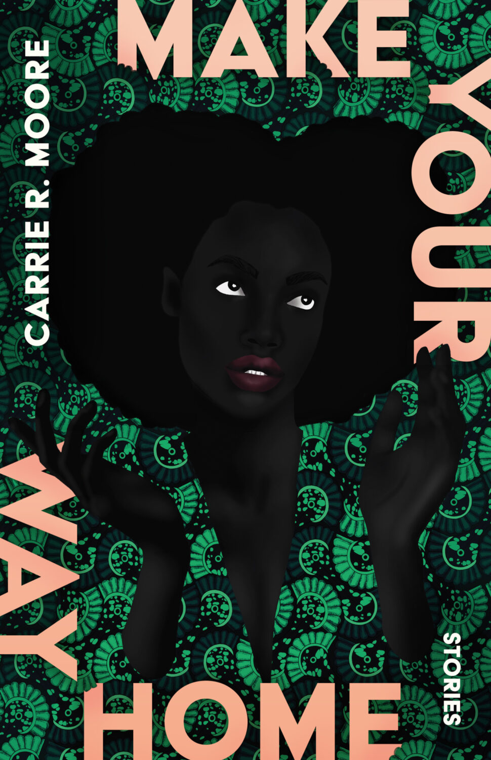
Make Your Way Home by Carrie R. Moore; design by Beth Steidle; art by Uzu Njoku (Tin House / July 2025)
Also designed by Beth Steidle:
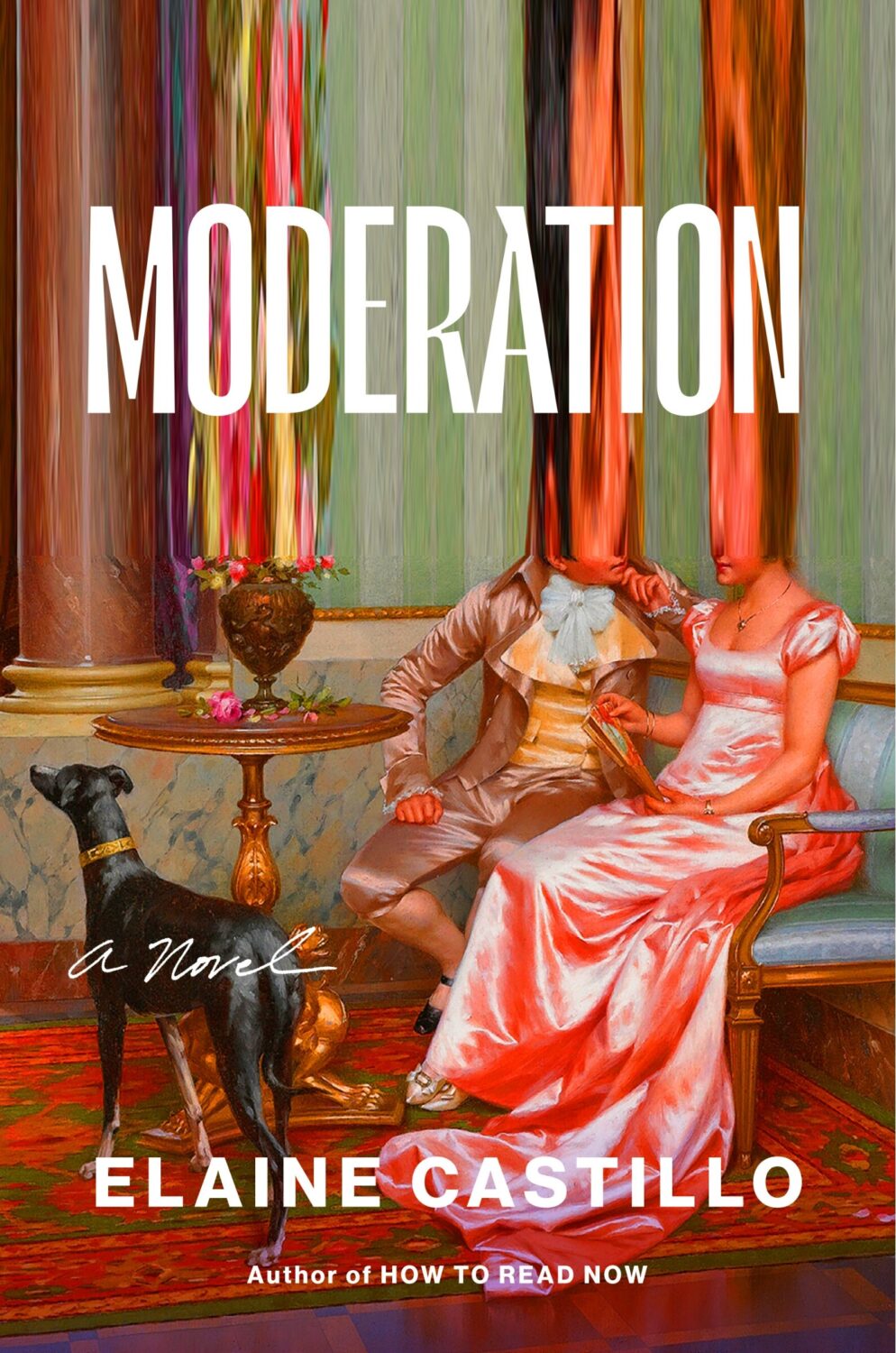
Moderation by Elaine Castillo; design by Lynn Buckley (Viking / August 2025)
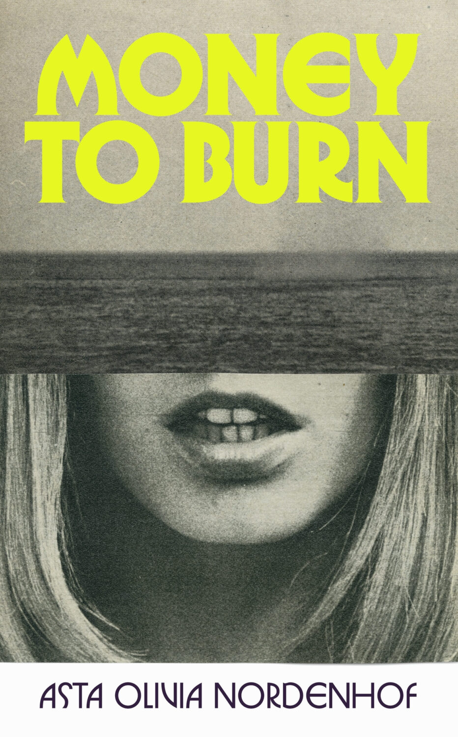
Money To Burn by Asta Olivia Nordenhof; design by Matt Broughton; art Katrien de Blauwer (Jonathan Cape / February 2025)
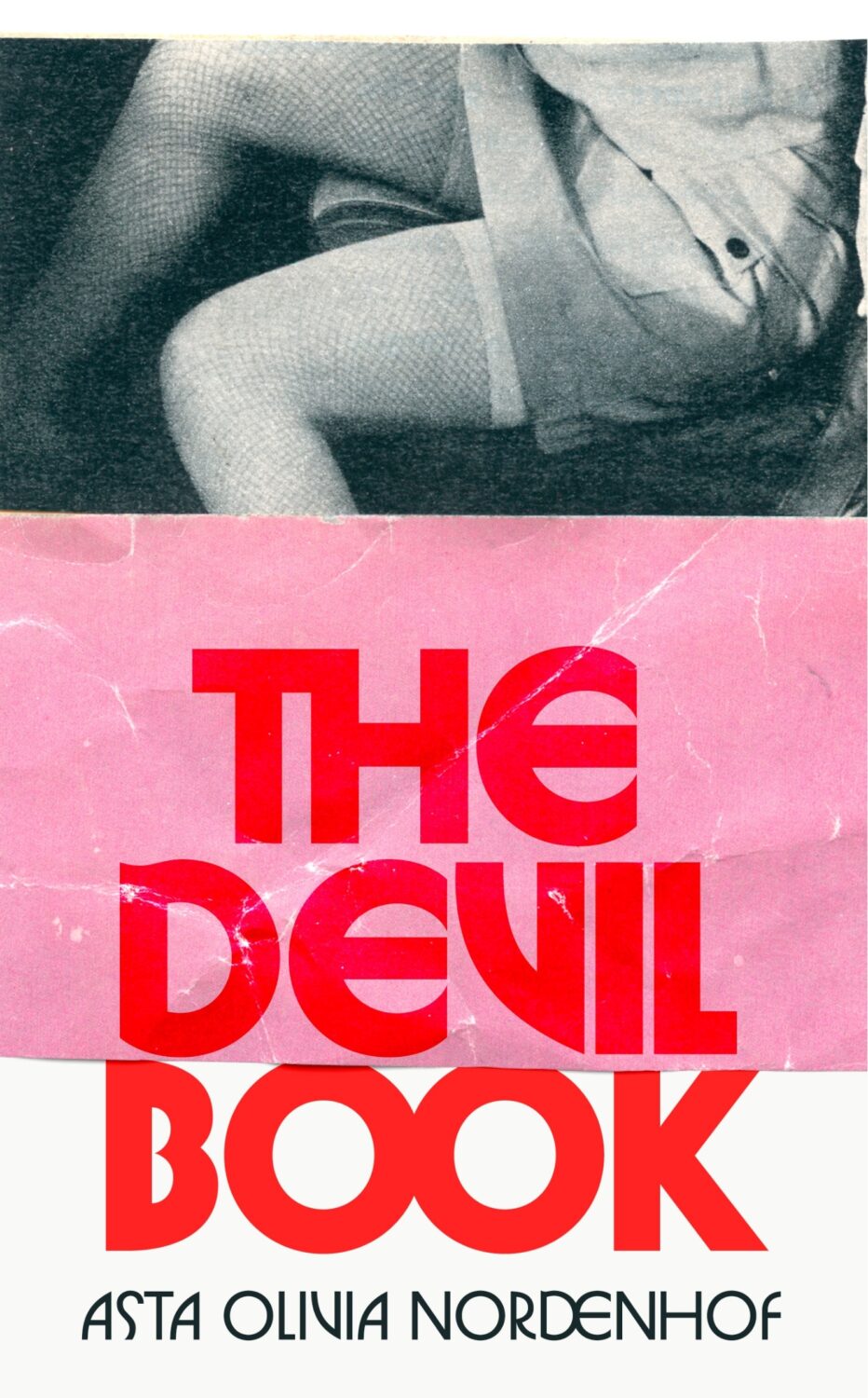
Also designed by Matt Broughton:
The Novel and the Blank by Matthew P. Brown; design by Jenny Volvovski (Johns Hopkins University Press / August 2025)
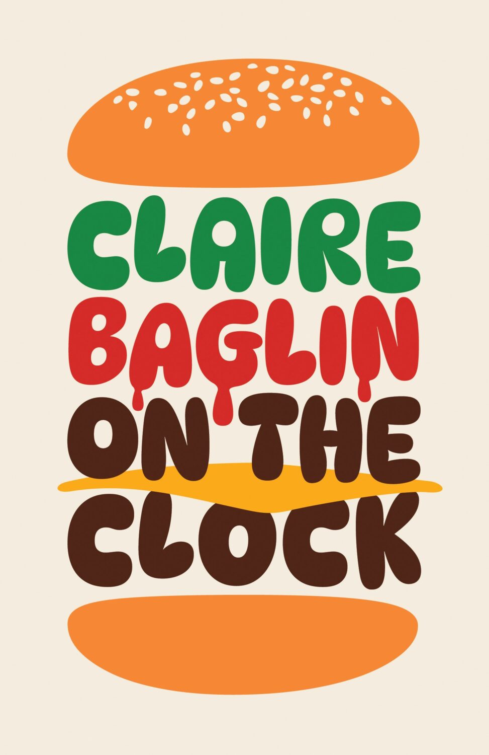
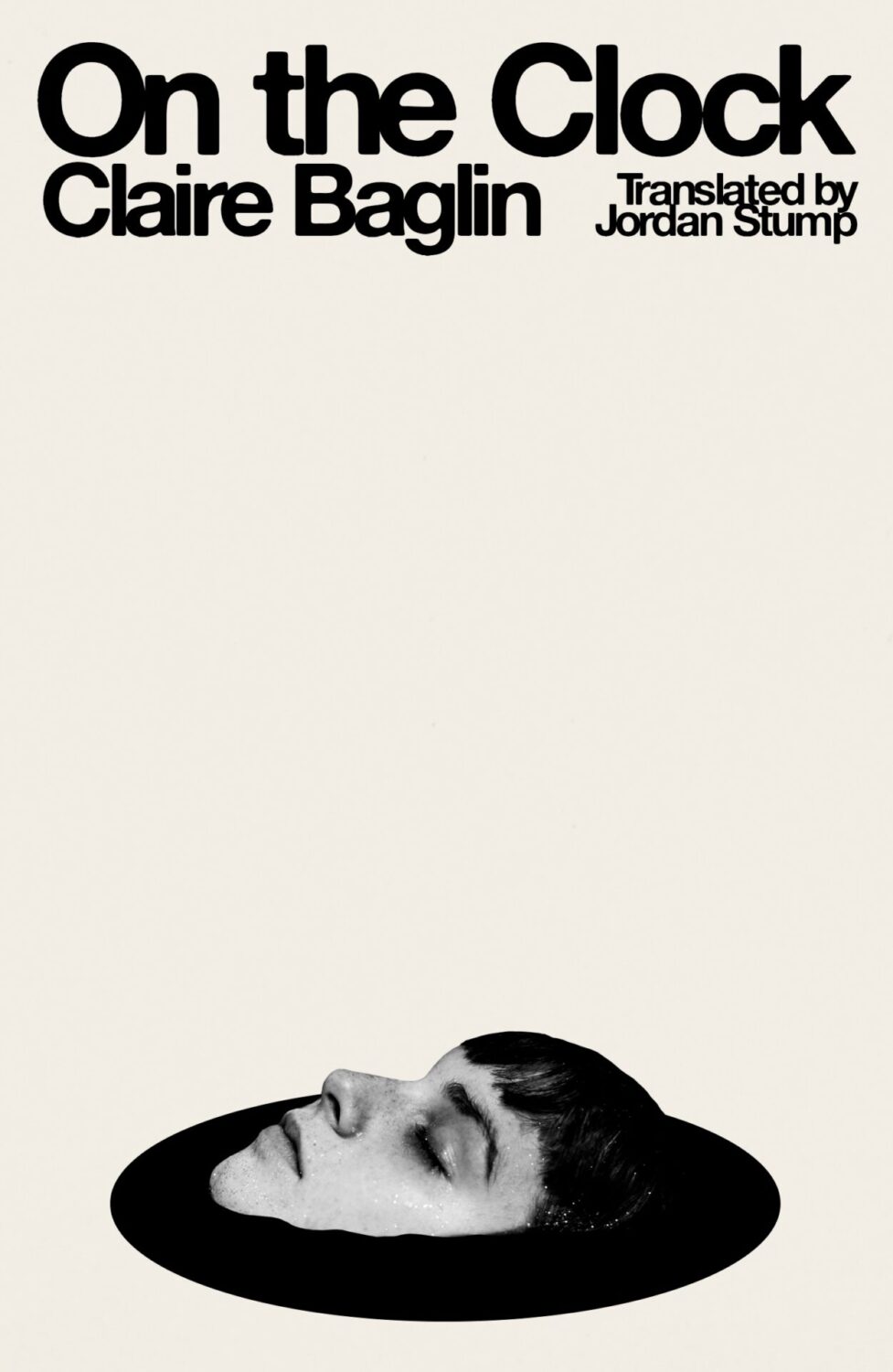
On the Clock by Claire Baglin; design by Erik Carter (New Directions / March 2025)
Also designed by Erik Carter:
Emma Ramadan; design by Erik Carter (New Directions / August 2025)
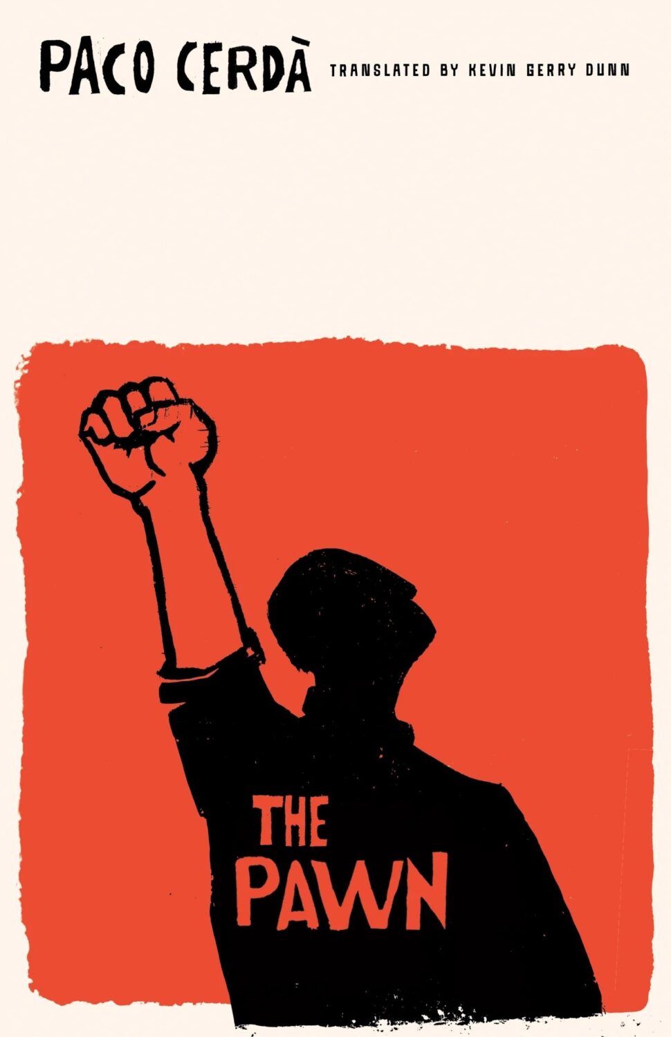
The Pawn by Paco Cerdà; design by Emily Mahon (Deep Vellum / June 2025)

Portalmania by Debbie Urbanski; deisgn by Math Monahan (Simon & Schuster / May 2025)
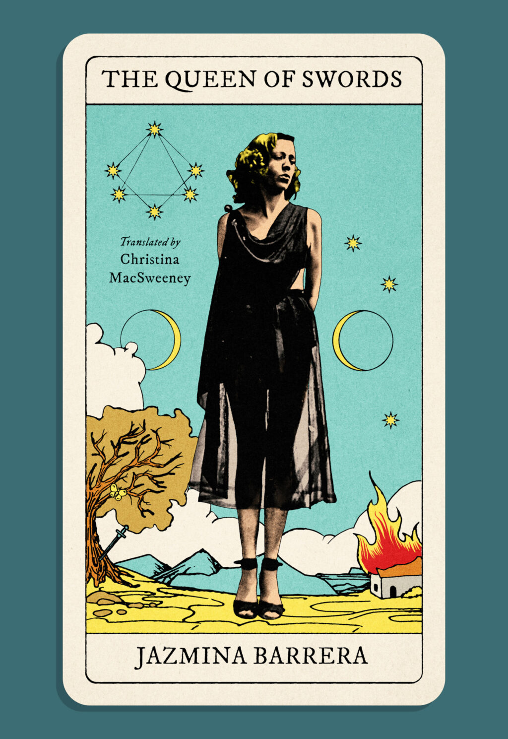
Queen of Swords by Jazmina Barrera, translated by Christina MacSweeney; design by Jonathan Pelham (Two Lines Press / November 2025)
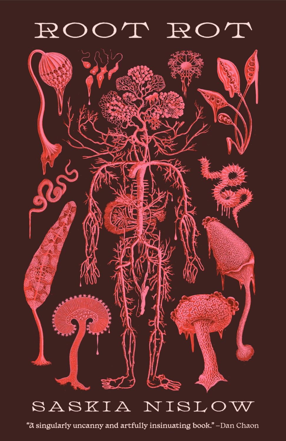
Root Rot by Saskia Nislow; design by Luísa Dias (Creature Publishing / March 2025)
Also designed by Luísa Dias:

Seduction Theory by Emily Adrian; design by Julianna Lee (Little Brown and Company / August 2025)

The Slip by Lucas Schaeffer; design by Jack Smyth (Simon & Schuster / June 2025)
Also designed by Jack Smyth:
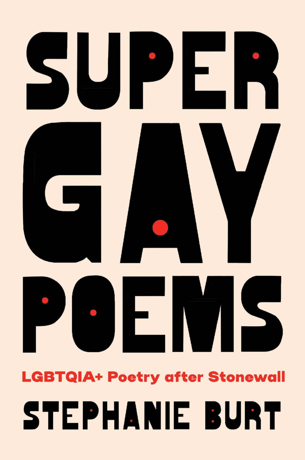
Super Gay Poems by Stephanie Burt; design by Jaya Miceli (Harvard University Press / April 2025)
Also designed by Jaya Miceli:
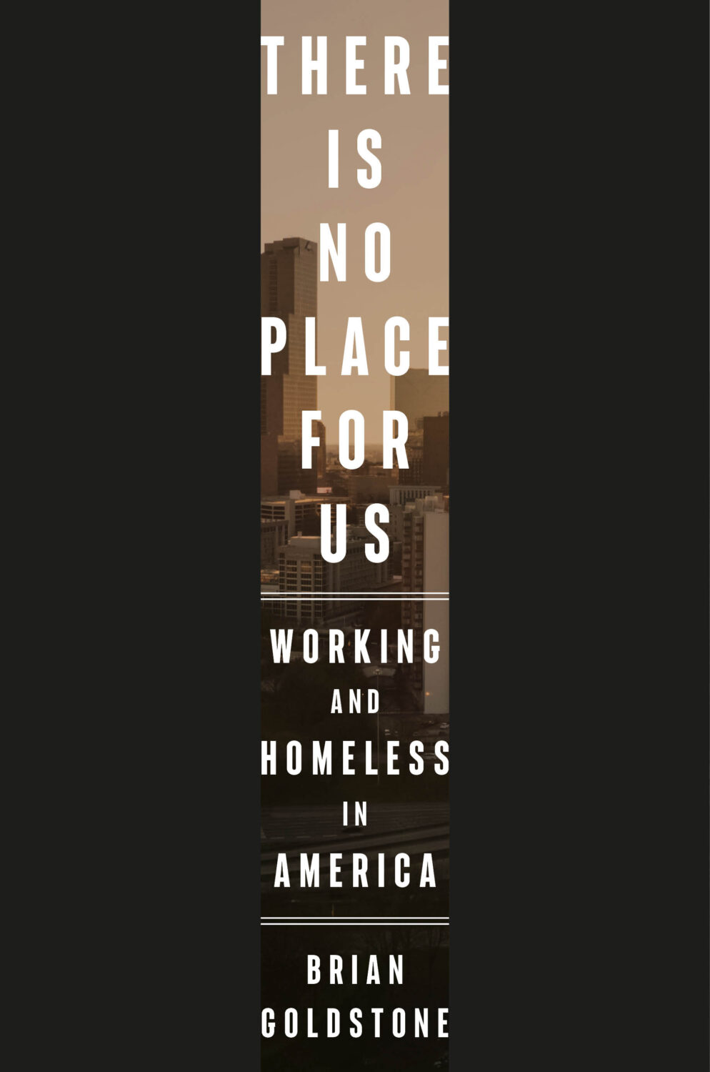
There Is No Place For Us by Brian Goldstone; design by Anna Kochman (Crown / March 2025)
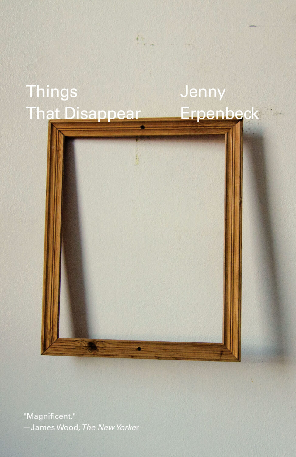
Things That Disappear by Jenny Erpenbeck; design by Oliver Munday (New Directions / October 2025)
Also designed by Oliver Munday:

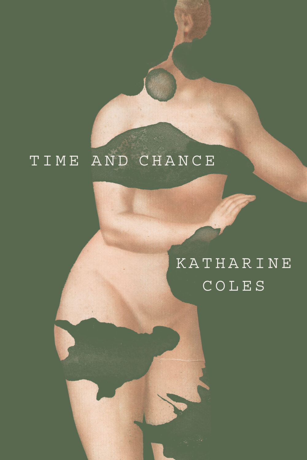
Time and Chance by Katharine Coles; design by Joan Wong (Turtle Point Press / April 2025)
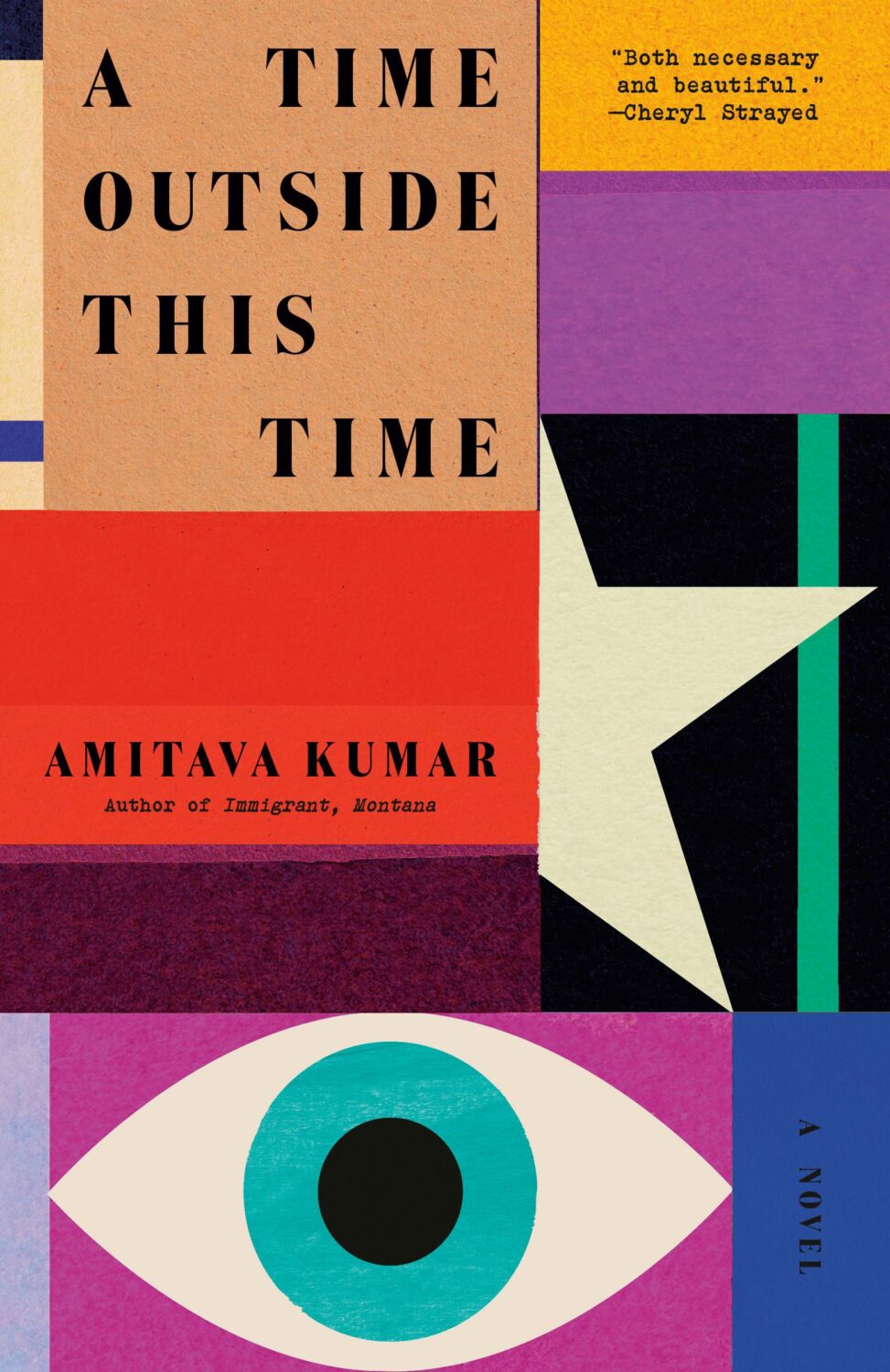
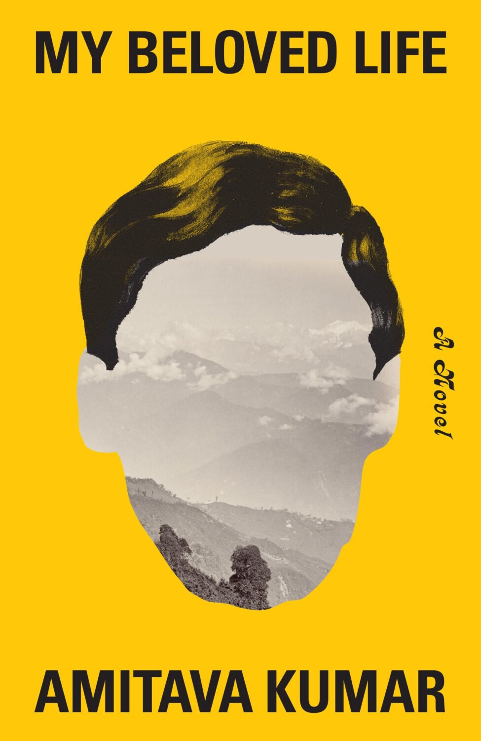
A Time Outside This Time by Amitava Kumar; design by Tom Etherington (Vintage / February 2025)
Also designed by Tom Etherington:

Too Soon by Betty Shamieh; design by Kimberly Glyder (Avid Reader Press / January 2025)
Also designed by Kimberly Glyder:

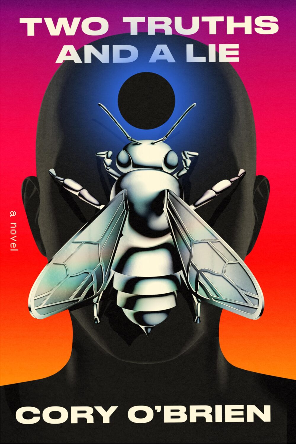
Two Truths and a Lie by Cory O’Brien; design by Tyler Comrie (Pantheon / March 2025)
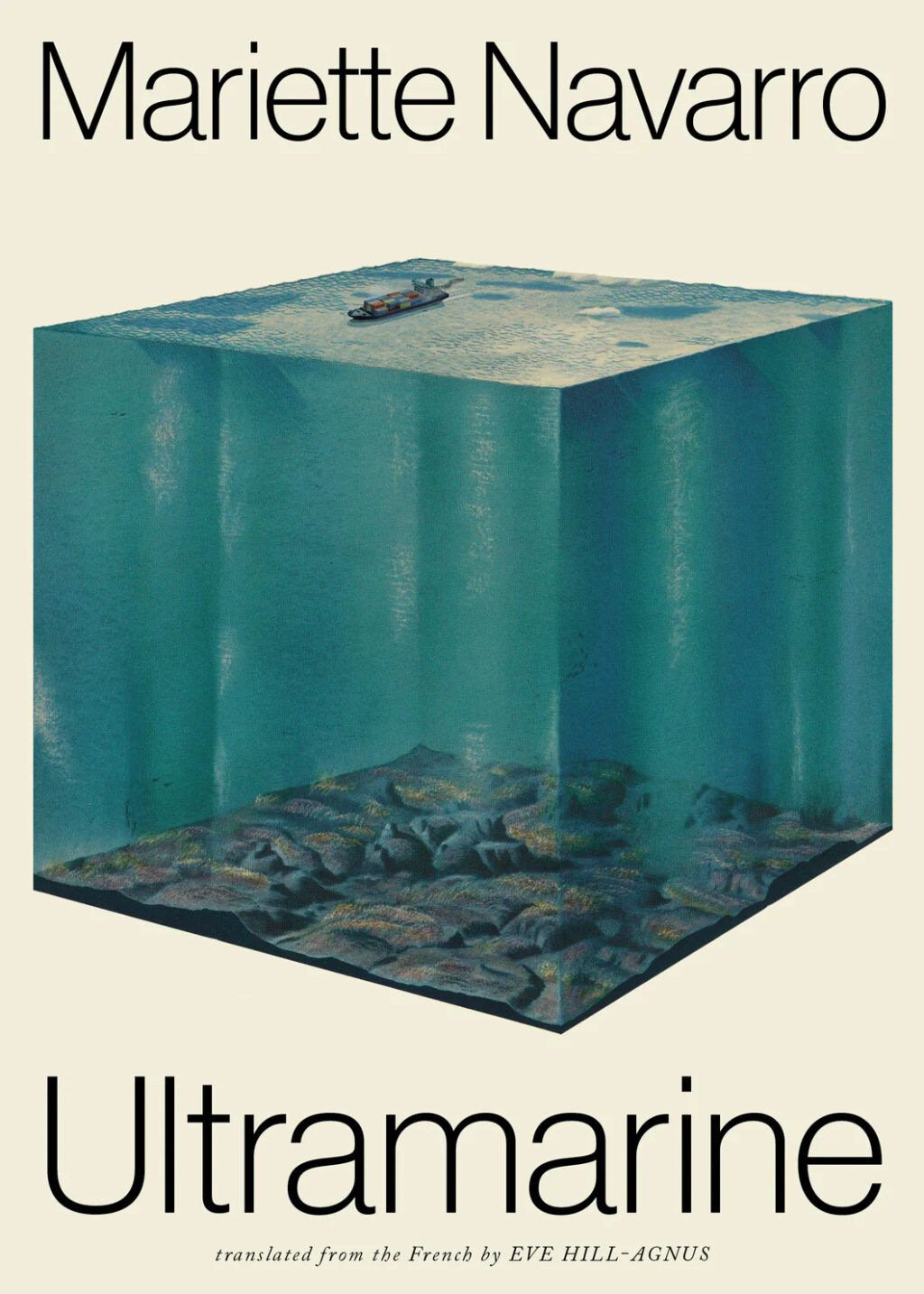
Ultramarine by Mariette Navarro; design by Daniel Benneworth Gray (Deep Vellum / March 2025)
Also designed by Daniel Benneworth Gray:

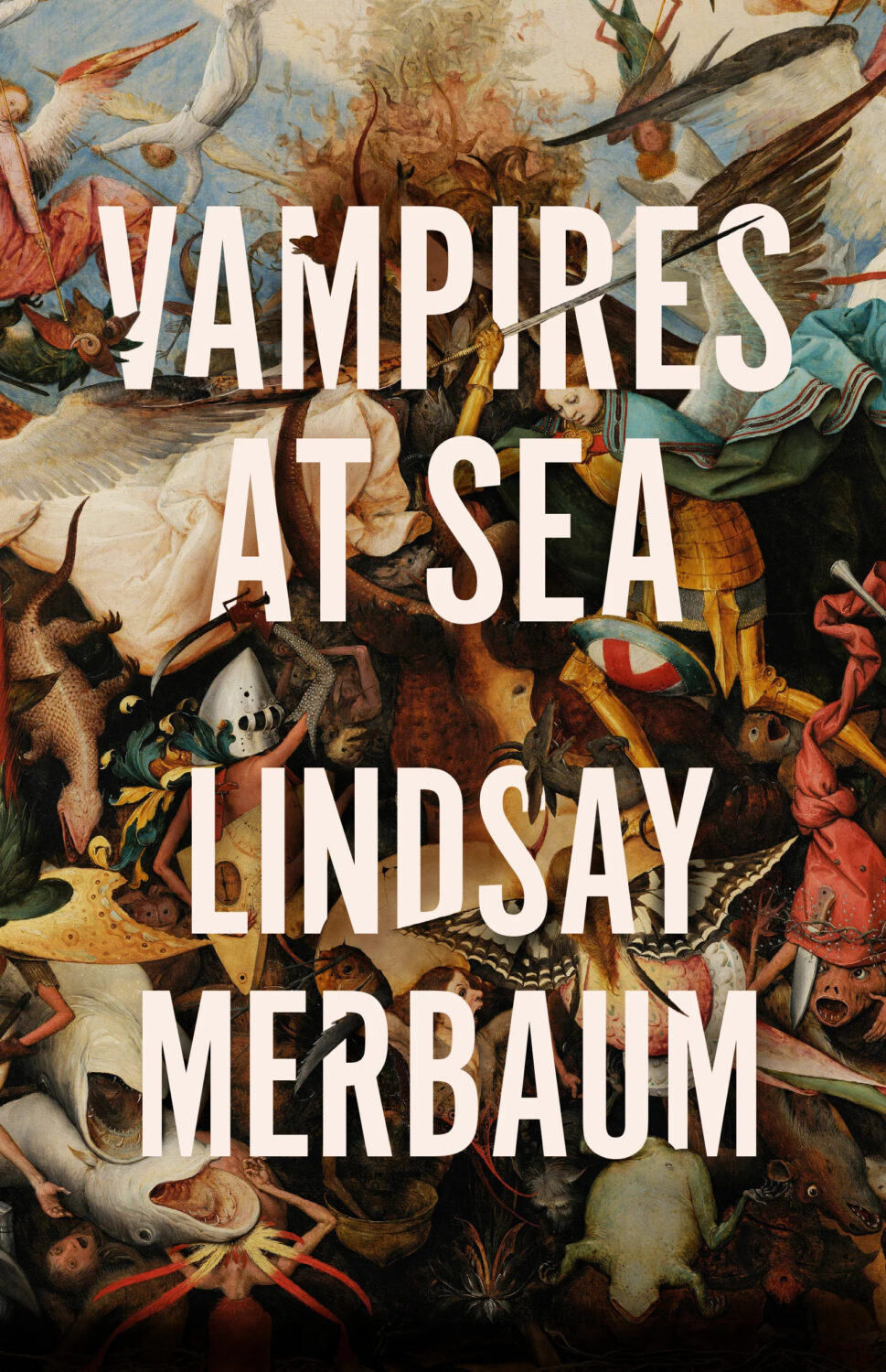
Vampires at Sea by Lindsay Merbaum; design by Jaya Nicely (Creature / October 2025)
Also designed by Jaya Nicely:
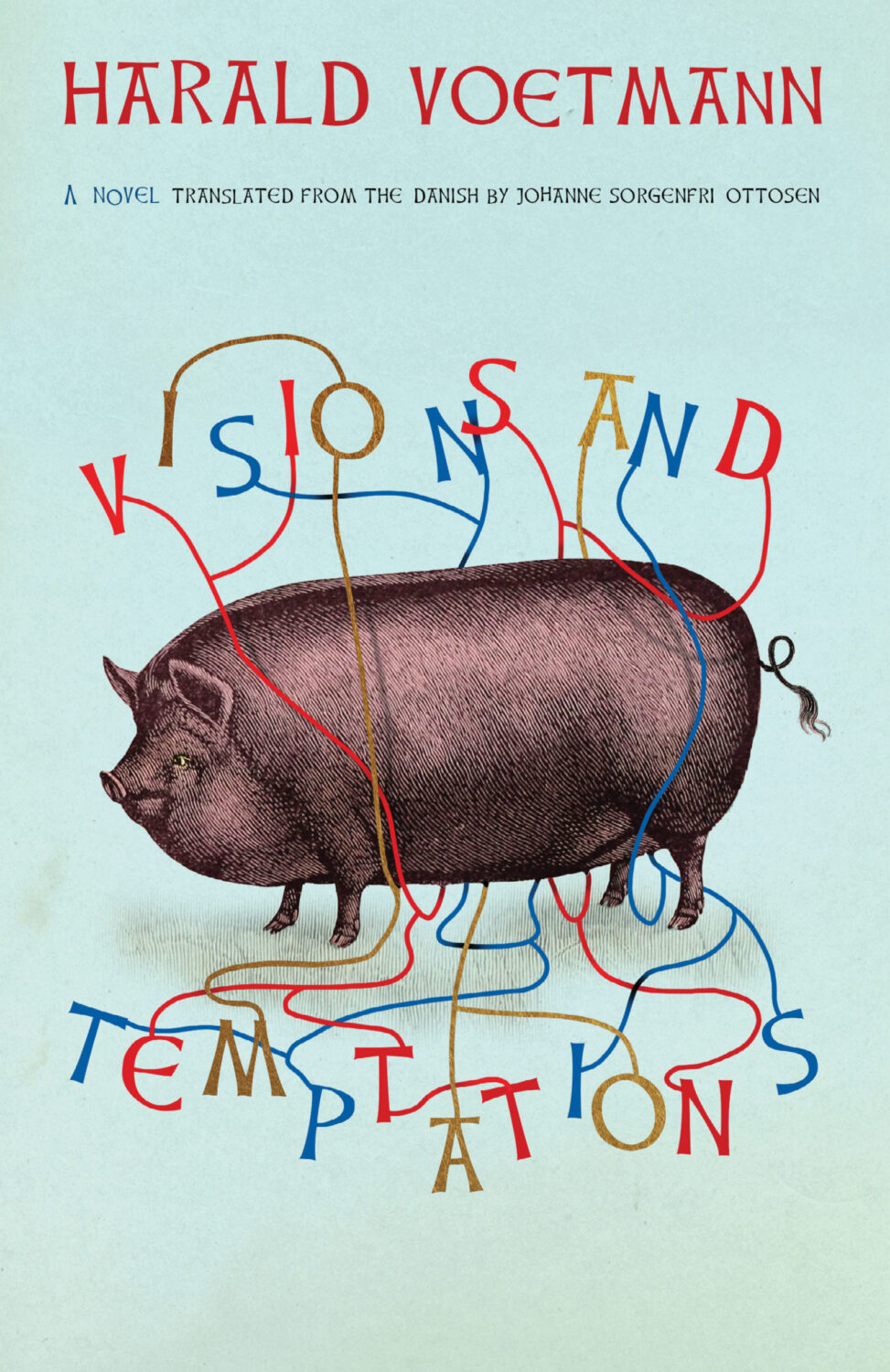
Visions and Temptations by Harald Voetmann; design by Jamie Keenan (New Directions / August 2025)
Also designed by Jamie Keenan:
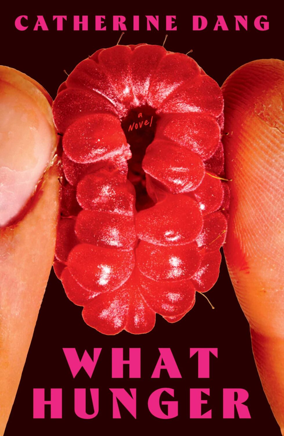
What Hunger by Catherine Dang; design by Maddy Angstreich; photograph by Bobby Doherty (Simon & Schuster / August 2025)
Also designed by Maddy Angstreich:

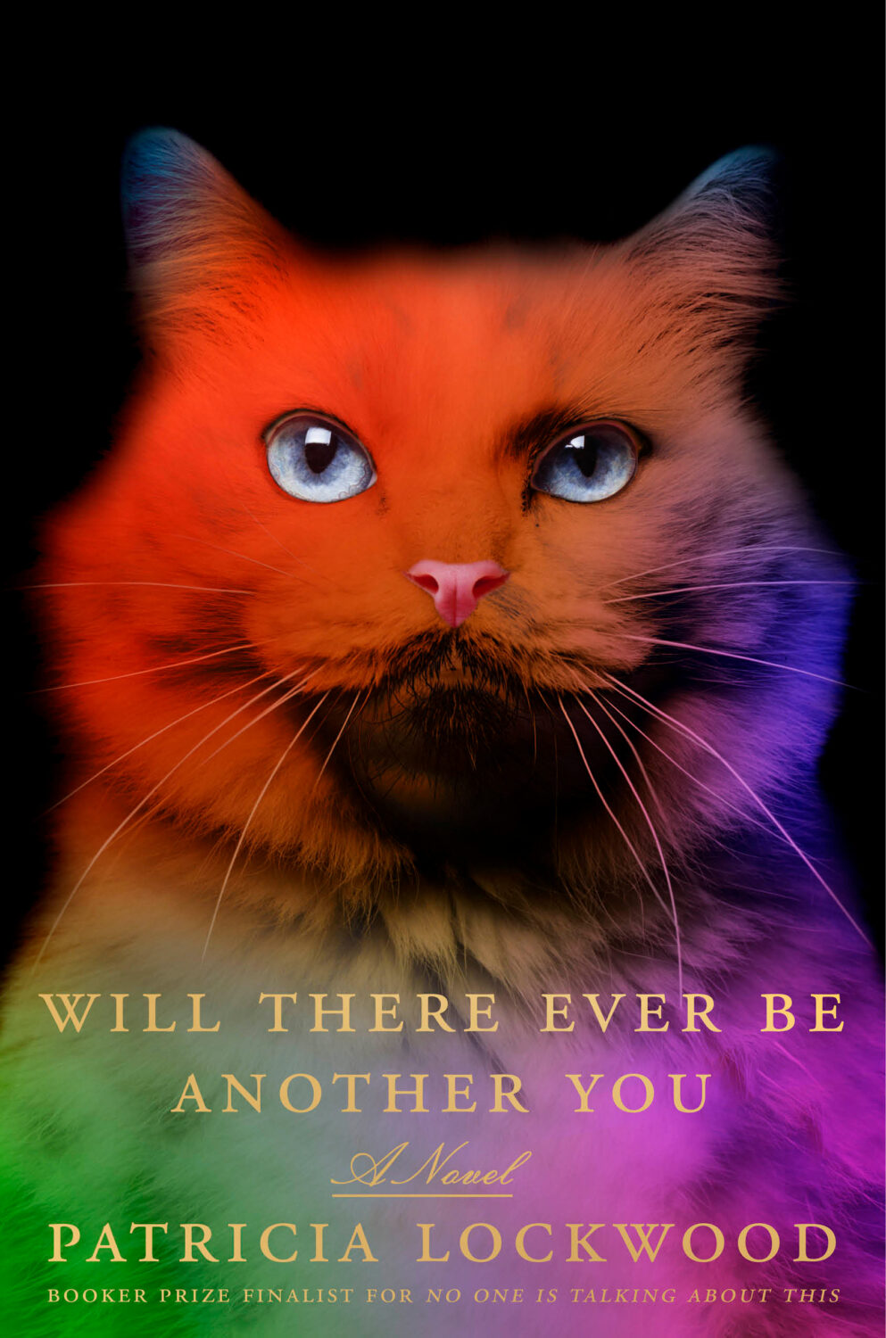
Will There Ever Be Another You by Patricia Lockwood; design by Lauren Peters-Collaer (Riverhead Books / September 2025)
Also designed by Lauren Peters-Collaer:


