Skip to content

Tag: h&fj

Midweek Miscellany


Flaunt it — Designer Armin Vit discusses the UnderConsideration book Flaunt: Designing Effective, Compelling and Memorable Portfolios of Creative Work at For Print Only.

How Art Became the Media — Lewis Lapham, editor of Lapham’s Quarterly (formerly editor of Harper’s Magazine), at Guernica magazine (via Bookslut on Twitter):

It isn’t that the country now lacks for painters painting pictures or poets writing poems, nor is it to say that stores of human energy and hope aren’t to be found in the novels of Elmore Leonard or the songs of Bruce Springsteen. It is to say that with the dawn of Reagan’s bright new morning in America, the notion of art as the way into a redemptive future had withered on the vine. Once again, as had been customary throughout most of the country’s history, art was seen as an embodiment of the good, the true, and the beautiful only to the extent that it could be exchanged for money.

George Lois on the iPad in the New York Observer (no, I’m not entirely sure how I missed this last week either):

“magazines will never die because there is a visceral feeling of having that thing in your hands and turning the pages. It’s so different on the screen. It’s the difference between looking at a woman and having sex with her.”

Flying the Coop — Another interesting installment of the National Post‘s ‘Ecology of Books’ series, this time on authors moving from small presses to big publishing. And there’s an interesting follow up from Daniel Wells, the publisher of Biblioasis one of the aforementioned Canadian small/independent presses (via Steven Beattie).

Microdistribution — This is fascinating… The Boulder Bookstore (Colorado) is experimenting with charging self-published authors for shelf-space and promotion (via Sarah Weinman on Twitter):

“Most people will come in at one of the higher fee amounts,” Arsen Kashkashian, the store’s head buyer and the architect of the program, told me. “That surprised us.” In fact, when the store first began charging its consignment authors back in 2007 (the fee-structure idea emerged when the store’s employees found themselves “inundated with self-published books, and there was a lot of work involved and not much reward”), its staff “thought people would grumble and complain” about the charges. But authors, Kashkashian says, have been generally grateful for the opportunity to sell and promote work that might otherwise be seen and appreciated only by their friends/spouses/moms: “‘I want the marketing, I want the exposure. I worked so hard on this project, and you guys are the only ones who could help me with it.’”

And finally…

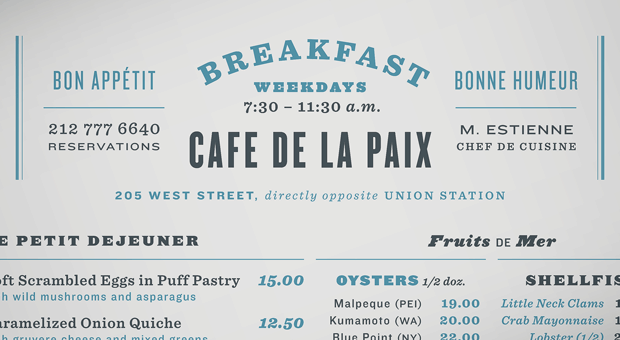
Four Ways to Combines Fonts by H&FJ, built around a beautifully simple principle: “keep one thing consistent, and let one thing vary.”

2 Comments

Something for the Weekend

Salu, Bonjour! — The Caustic Cover Critic features the awesome work of designer Michael Salu. The typography is great.

And speaking of typography…

KnockoutThe New York Times profile type jedis Hoefler & Frere-Jones:

Sitting in their New York studio in the charmingly ramshackle Cable Building, designed in 1892 by the flamboyant Beaux-Arts architect Stanford White, Mr. Hoefler and Mr. Frere-Jones are engaging advocates for their craft. They met in 1989, when they were working independently and found themselves hunting for the same antique typography books. “We’ve given up now because the prices have gone crazy,” said Mr. Frere-Jones. “Between us we own so many that if there’s something we don’t have, it’s either an uninteresting variation or there’s only one in the world and it costs $20,000.”

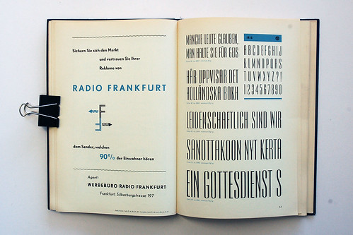
Schriftenkatalog — Beautiful pages from a 1960’s Dutch type catalogue on Flickr (via Inspire Me)

And… The history of the ampersand at the Webdesigner Depot (thanks Nic).

A Guide to Online Publicity (For Dummies) — Freelance writer, editor and blogger Lindsay Robertson’s common sense — but on the money — “do’s and don’ts” for flacks like me approaching bloggers like er… me (via Kottke).

And finally…

Two lovely posts at The Silver Lining featuring the work of Elaine Lustig Cohen: Part 1 and Part 2. There are more Elaine Lustig Cohen book covers at ephemera assemblyman and there is an amazing Flickr pool devoted to the design work of Alvin and Elaine Lustig here.

1 Comment

Monday Miscellany, November 2nd, 2009

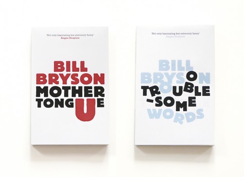
Unpublished concept jacket designs by London-based print designer Allan Sommerville for the Penguin’s Bill Bryson books (via Cosas Visuales).

Fonts — This is AWESOME: Wisconsin Public Radio’s To The Best of Our Knowledge talk fonts with Jonathan Hoefler and Tobias Frere-Jones, designers of Gotham, Matthew Carter, designer of Verdana, author Nicholson Baker, Tracy Honn, director of the Silver Buckle Press, and Kitty Burns Florey, author of Script and Scribble: The Rise and Fall of Handwriting. Listen NOW.

Many Happy Returns — Author, academic and newspaper columnist John Sutherland (The Boy Who Loved Books) on 30 years of The London Review of Books for The Financial Times:

The LRB front cover logo was “THE LONDON REVIEW of Books” – the last two words being smaller. As the typography signalled, it was the review that mattered as much as the book under review. Articles in the LRB were, and are, long: anything between 2,000 and 5,000 words. On special occasions they can run into the tens of thousands. Rates of pay seemed to me startlingly high: three or four times, in the early years at least, what the TLS paid. Miller personally appeared austerely indifferent to money. I suspect he worked for little or nothing. Nor did rises or falls in circulation appear to trouble him overmuch. Quality was all.

(There’s also a rather lovely addendum about the LRB’s personal columns, so read to the end!).

Somewhere Towards The End — A wonderful essay on editor and author Diana Athill by Ian Jack,former editor of Granta, in The Guardian:

[W]hat held me about the writing was its candour. The quality has since become an Athill trademark, though in itself candour is no guarantee of literary pleasure or interest: frank books aren’t always good books and can often be tedious by boasting of their frankness. Athill’s way of being candid is more subtle and its effect more persuasive… Part of this comes from her considerable gift as a maker of sentences, which are so lucid and direct; some of it is owed to the breaking of taboos that then surrounded female sexual behaviour; most of it, though, stems from her triumphant struggle to “get it right”, a lesson she learned from two of the writers she edited. Rhys told her that the trick of good writing was “to get it as it was, as it really was”. Naipaul said that “provided you really get it right, the reader will understand”.

The Internationalist — An all too short interview with Penguin Canada’s David Davidar, who was recently appointed CEO of Penguin’s new division Penguin International, in the Globe and Mail.

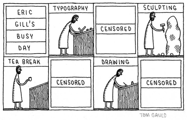
And finally… I do love Tom Gauld:

eric gills busy day

(More on Eric Gill)

Comments closed