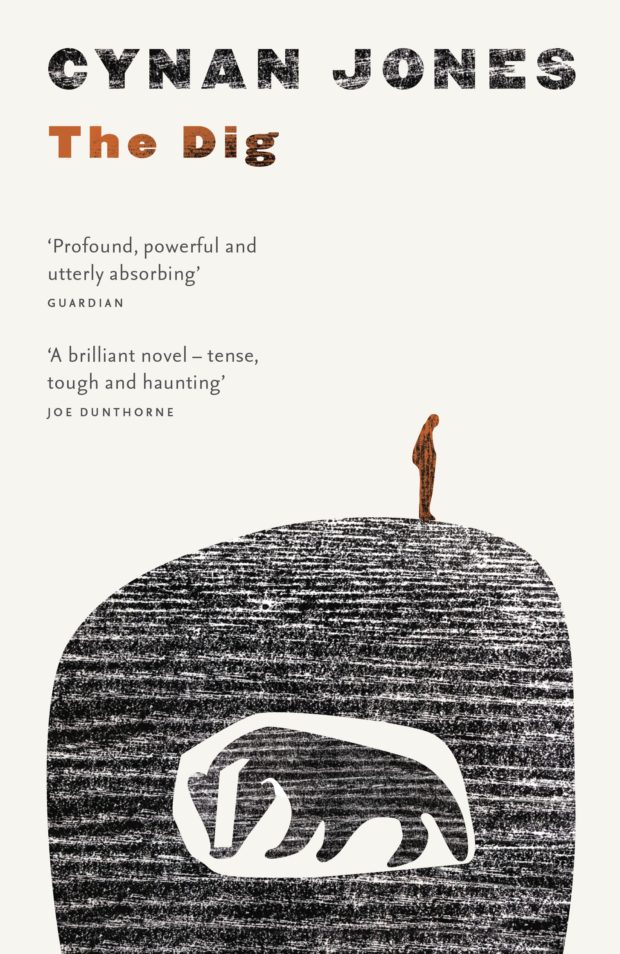
I’m a little late to work of Welsh novelist Cynan Jones, but I recently finished reading his award-winning 2014 novel The Dig, and it’s not hard to see what all the fuss is about. The writing is beautifully spare and intimate, and the story is devastating.1
The stark, illustrated cover of The Dig and Jones’s earlier books, recently republished by Granta, also caught my eye. The striking designs are, it turns out, by the brilliant Australian designer Jenny Grigg, which seems obvious once you know. Her previous covers for Peter Carey and Ernest Hemingway have similarly bold simplicity and tone.
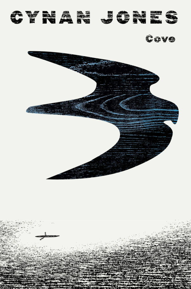
Grigg has also designed the cover of Jones’s new novel, The Cove, which will be published by Granta in November.
The Dig by Cynan Jones; design Jenny Grigg
Everything I Found on the Beach by Cynan Jones; design Jenny Grigg
On the latest Monocle 24 Culture show, host Robert Bound discusses the recent rise in translated fiction with Anne Meadows, commissioning editor at Portobello and Granta, and Lisette Verhagen, foreign-rights agent at David Godwin Associates, while Andrew Mueller talks to Deborah Smith, Man Booker International Prize-winning translator of The Vegetarian by Han Kang, and Lyndsay Knecht visits Deep Vellum in Dallas:1
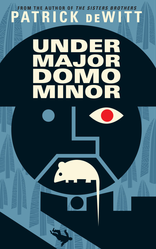
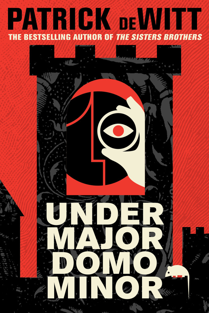
Next month sees the publication ofUndermajordomo Minor, the new novel by award-winning Canadian author Patrick deWitt.
An “ink-black comedy of manners”, itapparently involves an Alpine castle, a mysterious Baron Von Aux, and a lot of bad behaviour — including, if the Quill and Quire‘s Steven W. Beattie is to be believed, “an extravagant act of Hieronymus Bosch-like grotesqueness… perpetrated upon a large rat.”
It sounds a little like a horror movie directed by Wes Anderson. Or Terence Fisher doing something nasty to Gilbert and Sullivan.
While the cover for the US edition (published by Ecco) was designed by the talented Sara Wood, the UK and Canadian editions of Undermajordomo Minor feature the distinctive artwork of Dan Stiles, the American illustrator and designer who designed the covers of deWitt’s previous novels The Sisters Brothers and (the reissued) Ablutions.
Granta (UK)
House of Anansi (Canada)
Although Stiles has created different designs for Granta, and House of Anansi, the UK and Canadian covers (both featuring that unfortunate rat) have strong echoes of those previous books. According to the Canadian art director Alysia Shewchuk, this was a deliberate decision. “Dan Stiles created a very a distinctive look for The Sisters Brothers — highly stylized, dark yet playful — and we wanted to pick up these threads in our cover for Undermajordomo Minor.”
This is most apparent in the Anansi cover. Its bold geometric design is similar to Stiles’s theatrical cover for Granta, but its colour palette and texture bring it back to the The Sisters Brothers.
Interestingly, the focus of the Canadian cover is different too. “We’d seen early versions of the covers for both the US and the UK editions, and while we liked the different directions they’d each gone in, for our edition we thought it was important to feature the main character (Lucy Minor) and the castle where he lives and works,” says Shewchuk. “Dan understood exactly what we were looking for and he nailed it on the first go-around.”
Undermajordomo Minor will be published on September 3rd in the UK, September 5th in Canada, and September 15th in the US.
In the meantime, watch the slightly Monty Python-esque trailer made by artist Joanna Neborsky, with music by deWitt’s brother Nick deWitt, released today:
Correction: When first posted, I stated incorrectly that the US cover was also designed by Dan Stiles. The final design and illustration for the Ecco edition of Undermajordomo Minor is by Sara Wood. The post has been amended and updated to credit Sara for her work.
Gaby Wood interviews journalist Janet Malcolm for The Telegraph:
How Malcolm goes about her journalistic business is clear from her person. Her gaze is remarkably unflinching; unnervous, but not stern. She concentrates on looking at all times. She is difficult to interview, but for reasons much more prosaic than the dramatic ones I had conjured. She simply finds herself uninteresting, and so gives away little. You feel there is much more to know, and that the failure must lie in your ability to ask about it. Because when you listen back to the recording you find that she has not been especially evasive, merely – politely – private. ‘Have a macaroon,’ she says.
Malcolm’s most recent collection of essays, Forty-One False Starts, has just been published in the UK by Granta. The US edition is available from FSG, (and is, for sake of disclosure etc., distributed in Canada by my employer Raincoast Books).
Ruined… For Life — Yuka Igarashi on the consequences of copy-editing at Granta:
There is a danger to copy-editing. You start to read in a different way. You start to see the sentence as machinery. You focus on the gears and levers that connect words to one another; you hunt for the wayward semicolon, the unintentionally ambiguous phrase, the clunky repeated word. You even hope they appear, so you can kill them. You see them when they’re not even there, because you relish slashing your pen across the paper. It gets a little twisted.
As with any kind of technical knowledge or specialization, it is possible to take copy-editing too far, to be ruled by it, to not quite be able to shut it off when it ought to be shut off.
(As if to prove the point, the article itself is copy-edited in the comments)
Looking back on the period, playwright Carl Zuckmayer… who lived in Berlin from 1924 to 1933, wrote: “The arts blossomed like a meadow just before being mowed. This explains the tragic yet brilliant charm that is associated with this era, often seen in the images of poets and artists who died prematurely.”
The realization that this euphoria could not last undercoats the best works of art of these years with the metallic tone that soon became the trademark of artistic modernity. This applied, quite literally, to the refined simplicity of the anti-plush, steel-tube furniture of Bauhaus designer Marcel Breuer and the architecture of the same movement, fashioned from strictly functional steel skeletons… Metaphorically speaking, the tendency toward metallic, unadorned expression also applied to the literature of the period, and certainly to the objectivist collage technique employed by Alfred Döblin in his novel “Berlin Alexanderplatz” (1929). Döblin blends together the sound of wind, the rhythmic thud of the steam pile-driver, quotations from newspaper advertisements, stock market reports, soldiers’ songs, nursery rhymes and prostitutes’ patois with expressive, poetic flights of fancy, and injects all of these noises and fragments of language into the protagonist’s stream of consciousness… This first important big-city novel in the German language was also the first great 20th-century novel about the working classes.
And finally…
Purpose in the Wreckage — Simon Hattenstone’s endlessly quotable interview of media-shy musician Scott Walker, for The Guardian:
When [Walker] returned in 1995, it was as a fully fledged modernist composer. On the surface, there couldn’t have been a more unlikely transformation – imagine Andy Williams reinventing himself as Stockhausen. Yet in a way it was all of a piece. His latest album, Bish Bosch, is only his third in 17 years, all of them elaborate, epic and inaccessible. It is a post-apocalyptic opera of sorts, with blasts of rams’ horn, dog barks, scraping swords, machetes. The music nods at Gregorian chant, doffs its cap to Shostakovich, gives a thumbs up to industrial metal, and is uniquely Scott Walker. The lyrics reference sexual disease, brown dwarf stars, court jesters and dictators, all delivered in a strangulated baritone, as if Walker’s testicles were being squeezed. At times there’s a terrible beauty to his poetry (“Earth’s hoary/fontanelle/weeps softly/for a/thumb thrust”) while at others there’s a bloodthirstiness that could be straight out of Jacobean tragedy (“I’ve severed my reeking gonads, fed them to your shrunken face”). It’s brilliant and bonkers. The opposite of a guilty pleasure: a guilty torture.
Do It Yourself — John Self, of the excellent Asylum blog, on the power of independent readers, at The Guardian:
if publishers and authors are limited in what they can do for a book online, who is left? They want to harness word of mouth, and power lies collectively in the independent readers – you and me. Can we make a difference when the bookselling world is full of outlets, online and off, which primarily sell what already sells, or can be related to a proven success (“It’s Fifty Shades of Grey meets Harry Potter!”)? If social media has inspired a new age of grassroots political activism, why not literary activism, too?
I picked up Keith Ridgway’s new book Hawthorn & Child almost entirely on the basis of John’s recommendation (I also read Colony by Hugo Wilcken, one of my favourite books of recent years, as a result of John’s review). The astonishing cover (pictured above) is by Tom Darracott by the way.
(Semi) Colonoscopy — Mary Norris on how to use the semicolon, at The New Yorker:
So the semicolon is exactly what it looks like: a subtle hybrid of colon and comma. Actually, in ancient Greek, the same symbol was used to indicate a question.
And it still seems to have a vestigial interrogative quality to it, a cue to the reader that the writer is not finished yet; she is holding her breath.
And finally…
Imaginary Buildings — Jimmy Stamp on the locations of 221B Baker Street, for The Smithsonian:
The mystery of 221B Baker Street is not one of secret passages or hidden symbols. Rather, it could be described as a sort of existential spatial riddle: how can a space that is not a space be where it is not? According to Arthur Conan Doyle’s stories, Sherlock Holmes and John Watson lived at 221B Baker Street from 1881 to 1904. But 221B Baker street did not exist in 1881, nor did it exist in 1887 when A Study in Scarlet was published and Baker Street house numbers only extended into the 100s. It was a purely fictional address – emphasis on was. Time marches on, Baker Streets are renumbered, and 221Bs are revealed…
Insufficiently Bored — An essay by author Toby Litt on technology and reading (and writing) at Granta:
Proposition: ‘The human race is no longer sufficiently bored with life to be distracted by an art form as boring as the novel.’
Perhaps novels will continue, but instead of the machine it will be the connectivity that stops, or becomes secondary.
What we’re going to see more and more of is the pseudo-contemporary novel – in which characters are, for some reason, cut off from one another, technologically cut off. Already, many contemporary novels avoid the truly contemporary (which is hyperconnectivity).
[If] rereading… teaches us anything, it is that the conjunctions between readerly and textual lives will always be unpredictable and promiscuous ones. “What did you make of that book?”, runs the conventional phrase. As we revisit the objects of our reading, like recognizable but weathered landmarks, there can be no full going back, because we are not exactly the same people we were; but the consolation of rereading is the knowledge that we are these different people in part because of what those books have made of us.
Artwork Confidential — An interview with Daniel Clowes about the first retrospective museum exhibition of his work, “Modern Cartoonist: The Art of Daniel Clowes, and the accompanying monograph at Publishers Weekly:
[T]he work wasn’t created to be seen on a wall. The final artwork is the book. But I collect original artwork. It has a meaning to me that goes beyond the printed page. It’s the only [kind of] artwork you can see on a wall that you may already have a personal relationship with. If you read the story that that artwork comes from, you have a connection to it in a way you don’t have with a painting or something that’s only intended to be seen in that context. That made it interesting to me. There’s something about that final piece as an artifact of the printed work that gives it a certain value and magic. My goal with both [the exhibition and the book] is to get people interested in the work and then to read the books. If that is achieved, then both of these will have been a success.
Huffington Post, they understood, was not an enterprise whose core purpose was the creation of works of journalism—as significant or mundane as that can be. It was in the content business, which created all sorts of possibilities of what it could gather and, with a new headline and assorted tags, send back out, HuffPost’s logo affixed. Content would come to mean original reporting by Sam Stein or Ryan Grim from Washington, as well as Alec Baldwin’s blog, Robert Reich’s rants about the forsaking of the American worker, a “Best Retro Bathing Suits” slide show, “Why Women Gladly Date Ugly Men,” David Wood’s Pulitzer Prize-winning 10-part series on wounded veterans, “Nine Year Old Girl’s Twin Found Inside Her Stomach,” campaign dispatches from the Off The Bus citizen journalists, “Angelina and Brad Wow at Cannes,” and “Multitasking Wilts Your Results and Relationships”—as well as Nico Pitney’s blogging on the violence after the disputed 2009 Iranian presidential elections and the 111,000 comments it generated. Because comment was content, too.
Designed by the brilliant Michael Salu, the cover for Diana Athill’s forthcoming collection of letters, Instead of a Book, features a stunning portrait of the author by acclaimed British photographer Rankin (co-founder of Dazed & Confused in case you were wondering).
To coincide with the release of the new book in October, Granta are also reissuing paperback editions of Athill’s books Stet, Yesterday Morning and Instead of a Letter with cover designs incorporating Rankin’s photographs.
I don’t think I have made any secret of my love of Stet, Athill’s book about her time as an editor at Andre Deutsch. But I have always been disappointed by the discouraging cover on the tatty copy on my bookshelf, and it makes me incredibly happy to finally see an edition that seems to capture something of Athill’s personality.
Athill’s writing is unflinching and it is remarkable to see that reflected in Rankin’s stark portraits. According to Michael, who art directed series and designed all the covers, “the idea was to not to shy away from age and experience, but to celebrate it and Diana’s distinct personality.” Certainly, it is hard not to be taken by the keenness of Athill’s eyes. One gets the sense she does not suffer fools gladly. There is something of a retired headmistress about her. But I love how in the photograph for Instead of a Letter, Rankin captures Athill’s thumb hooked under her necklace. The author doesn’t appear to be particularly aware that she’s doing it, but it is beautiful and poignant touch.
Going Back — Artistic Director Michael Salu on the creating the cover of the new issue of Granta magazine:
For this concept to work, we needed to strive for authenticity – to create the physical object ourselves. The typefaces would need to be sourced, traditionally hand-set and photographed to give the cover the depth that the issue deserves. For this I approached St Bride Printing Library, which has long been a place of fascination and wonder for me. My first visit to the library – with its oil, wood and metal, its smell of history – made a huge impression on me.
The Connoisseurs — Peter and Charlotte Fiell, who recently ended their 15-year tenure as heads of the design branch of Taschen, talk about their new publishing venture Fiell at More Intelligent Life:
What is design? It’s the forethought that goes into the making of man-made things. It’s films, pharmaceuticals, airplanes, chairs, tape recorders … it’s the world of stuff. It’s huge, so everybody should have a big interest. It’s not some avant-garde, highly expensive niche. We want to make money by publishing books that sell, but we’re in the business of promoting ideas, culture, taste, connoisseurship. If you want to make a difference you want to get into as many people’s heads as you can and change their opinion. The secret is to strike this balance between making your books appealing to learned type readers, while at the same time, making them useful and interesting to novice readers. Our aim is to make books as appealing to teenagers in Tokyo as architects in Amsterdam.
Book designers, you should know, have to be ready to create something new, exciting, and original almost every day in order to eat, and a certain degree of burnout smokes out the weaker specimens; I can’t imagine coming up with cover after cover without at some point resorting to an out-of-breath take, intentional or not, on someone else’s great idea. This urge toward ever-freshness brings the profession perilously close to that of fashion, and the worst examples of such greet us at the grocery store checkout among the tabloids, gum, and ring pops. But the best of it, those that last, have recently been appearing from Penguin (yes, Penguin, not just the bearer of boring spring break assignments anymore!), following a path led by designer Paul Buckley into beautiful new ways of graphically proffering the written word.
The excerpt is accompanied by a slideshow of covers from the book. My interview with Paul Buckley and designer Christopher Brand about Penguin 75 will be up early next week.
Bizarrely, designers looking for employment are often judged by what software they’re able to use. Intellect, cultural awareness and often creativity don’t seem to be values worthy of a resume. There is no substitute for good ideas, the rest are just supportive tools. I have always been quite a craft-led designer, but I am of the generation that studied with a mac in front of them and I think its good to understand the importance of both.
The Honest Bookseller — Erin Balser of Books in 140 profiles Toronto independent bookstore Ben McNally Books for The Torontoist:
“I’d rather have a book that sells one copy that no one else will sell than to stock several best sellers you can get anywhere,” McNally says. “That’s what makes this store. That’s why people come… My first responsibility is my customer. When I think a book should be cut by a third or if there’s a subplot that goes nowhere, I have to tell you that… I’m often a very critical reader. When people come and ask me ‘Is this any good?’ I have to be honest.”
Speaking of Pentagram… Pentagram partner Paula Scher has some blunt stuff to say about design in a interview with Pr*tty Sh*tty.
The Rules — Inspired by Elmore Leonard’s 10 Rules of Writing, The Guardian asked authors — including Diana Athill, Margaret Atwood, Richard Ford, Jonathan Franzen, Neil Gaiman, and PD James, Hilary Mantel, Michael Moorcock, Philip Pullman, Ian Rankin, Will Self, Sarah Waters, and Jeannette Winterson — for their personal dos and don’ts. (Part two is here).
Diana Athill, Margaret Atwood, Roddy Doyle, Helen Dunmore, Geoff Dyer, Anne Enright, Richard Ford, Jonathan Franzen, Esther Freud, Neil Gaiman, David Hare, PD James, AL Kennedy


