Skip to content

Tag: Fiction

Matt Taylor’s le Carré Illustrations

I’m obviously on a bit of a John le Carré kick at the moment as I am currently reading his latest book Agent Running in the Field1. The cover features art by Matt Taylor who has illustrated a quite number of le Carré covers for Penguin Random House and art director Paul Buckley over years. I’ve shared a few of them here before, but since I posted David Pearson’s recent redesign of the George Smiley novels, I thought it would be nice to pull Matt’s versions together too. I believe Gregg Kulick had a hand in the design and type.  

Matt has also illustrated the covers for le Carré’s non-Smiley novels too. There’s quite a lot of them!

(Matt’s also did an illustration for The Russia House, but only the audio edition of the book appears to be available from Penguin Random House in the US. In the UK, Penguin uses the same illustration for their cover, although the type is in line with their other Modern Classic editions)

Comments closed

Obama and Books

The New York Times has published a transcript of Michiko Kakutani’s recent conversation with US President Barak Obama about books:

Some of the craft of writing a good speech is identical to any other good writing: Is that word necessary? Is it the right word? Is there a rhythm to it that feels good? How does it sound aloud?

I actually think that one of the useful things about speechwriting is reminding yourself that the original words are spoken, and that there is a sound, a feel to words that, even if you’re reading silently, transmits itself.

So in that sense, I think there will be some consistency.

But this is part of why it was important to pick up the occasional novel during the presidency, because most of my reading every day was briefing books and memos and proposals. And so working that very analytical side of the brain all the time sometimes meant you lost track of not just the poetry of fiction, but also the depth of fiction.

Fiction was useful as a reminder of the truths under the surface of what we argue about every day and was a way of seeing and hearing the voices, the multitudes of this country.

You can read the article that resulted from this conversation here.

Surely there are few other politicians — let alone world leaders — who could speak so intelligently and at such length about contemporary literature. 

And, on a somewhat related note, I just wanted to mention the Women’s March on Washington on January 21. The official logo for march — reminiscent (in a good way) of Saul Bass’s 1978 logo for the Girl Scouts of America (revamped in 2010 by Original Champions of Design) — was designed by Nicole LaRue. There are sister marches around the world — find your local event here — and you can download typographic posters for occasion from Counter Type.


Resist.


Comments closed

The Fantastic Ursula K. Le Guin

illustration Essy May

Julie Phillips long profile of author Ursula K. Le Guin for The New Yorker is wonderful:

Starting in the nineteen-eighties, [Le Guin] published some of her most accomplished work—fiction that was realist, magic realist, postmodernist, and sui generis. She wrote the Borgesian feminist parable “She Unnames Them,” and in 1985 an experimental tour de force of a novel, “Always Coming Home.” She produced “Sur,” the epic tale of an all-female Antarctic exploring party that may be her greatest and funniest feminist statement. Her short stories began appearing in The New Yorker, where her editor, Charles McGrath, saw in her an ability to “transform genre fiction into something higher.”

In fact, it was the mainstream that ended up transformed. By breaking down the walls of genre, Le Guin handed new tools to twenty-first-century writers working in what Chabon calls the “borderlands,” the place where the fantastic enters literature. A group of writers as unlike as Chabon, Molly Gloss, Kelly Link, Karen Joy Fowler, Junot Díaz, Jonathan Lethem, Victor LaValle, Zadie Smith, and David Mitchell began to explore what’s possible when they combine elements of realism and fantasy. The fantasy and science-fiction scholar Brian Attebery has noted that “every writer I know who talks about Ursula talks about a sense of having been invited or empowered to do something.” Given that many of Le Guin’s protagonists have dark skin, the science-fiction writer N. K. Jemisin speaks of the importance to her and others of encountering in fantasy someone who looked like them. Karen Joy Fowler, a friend of Le Guin’s whose novel “We Are All Completely Beside Ourselves” questions the nature of the human-animal bond, says that Le Guin offered her alternatives to realism by bringing the fantastic out of its “underdog position.” For writers, she says, Le Guin “makes you think many things are possible that you maybe didn’t think were possible.”

Comments closed

Simenon’s Island of Bad Dreams

mahe circle

At the NYRB Blog, John Banville reviews Georges Simenon’s novel The Mahé Circle, translated into English for the first time and now available from Penguin Classics:

Simenon was a driven creature, who in his lifetime wrote more than four hundred books, drank and womanized incessantly, and, in his younger days, roamed the world in frantic search of he knew not what. His mother despised him; his long-suffering wife wrote a roman à clef in which she portrayed him as a rampaging egotist—“His voice rang through the house from morning to night, and when he was out it was as though the silence was awaiting his return.” Most calamitous of all, his daughter Marie-Jo, who adored and idolized him—as a child she asked him one day to buy her a gold wedding ring—killed herself at the age of twenty-five. He was, all his life, a spirit in flight from others and from himself, and he is present, often lightly disguised, in every one of his books.

Penguin are reissuing Simenon at an astonishing clip. Along side his ‘romans durs’ like The Mahé Circle, they are publishing new translations of all 75 Maigret novels with covers featuring specially commissioned photographs by Magnum photographer Harry Gruyaert:

shadow-puppet

Earlier this year, Scott Bradfield also wrote about the Belgian author for the New York Times:

In many ways, the Maigrets were a sort of comfort food — the books that Simenon wrote to recover from the physical and psychological stress of writing his better, and far less comforting, novels. In these non-Maigret “thrillers,” often referred to as the romans durs (but to most aficionados known simply as the “Simenons”), the central, usually male character is lured from the stultifying cocoon of himself — and his suburban, oppressively Francophile (and often mother-dominated) life — into a wider, vertiginous world of sexual and philosophical peril, where violence, whether it occurs or only threatens to occur, feels like too much freedom coming at a guy far more quickly than he can handle.

Comments closed

There’s no one saying, “You can’t do this in a book for children.”

The New York Times profiles Julie Strauss-Gabel, the publisher of Dutton Children’s Books:

She became publisher of Dutton in 2011, and right away, it was clear this was going to be a different sort of imprint. She whittled down the list from about 50 titles a year for children of all ages, to about 10 books, with a focus on high-quality young adult fiction.

“There was nobody doing just what I do now 20 years ago,” she said. “It would have been unheard-of for a children’s publisher not to do picture books”…

…For such a small list — this year, Dutton will publish a mere eight titles — Ms. Strauss-Gabel’s books are strikingly diverse, covering science fiction and dystopian worlds, psychological suspense and works of social realism. She favors realistic, contemporary fiction, though lately she has been acquiring more memoirs and nonfiction.

“We’re in an era where the definition of a young adult book is completely up for grabs, and people are willing to reinvent it,” she said. “There’s no one saying, ‘You can’t do this in a book for children.’ ”

Comments closed

50 YA Covers for 2014

Like all the best things on The Casual Optimist, this post started life as a conversation on Twitter. The topic this time was the under-representation of YA book designers in all these end of the year cover lists. YA covers are becoming more and more sophisticated, yet my posts this year have rarely featured them, so feel that I am unquestionably at fault here. To make some kind of amends, I thought I would post a selection of 50 YA covers from 2014. Many, many thanks to all the book designers and publishing folk (including my colleagues Alisha, Brooke, and Megan at Raincoast) for their suggestions and assistance. And special thanks to Serah-Marie and Derek at Type Books for letting me browse their shelves with my notebook in hand…

belzhar
Belzhar by Meg Wolitzer; design by Kristin Smith (Dutton / September 2014)

beauty-of-the-broken-9781481407090_hr
Beauty of the Broken by Tawni Waters; design by Regina Flath (Simon Pulse / October 2014)

DorothyMustDie
Dorothy Must Die by Danielle Paige; design by Ray Shapell (HarperCollins / April 2014)

EggandSpoon
Egg and Spoon by Gregory Maguire; design by Matt Roeser (Candlewick / September 2014)

everything-leads-to-you
Everything Leads to You by Nina LaCour; design by Theresa Evangelista (Dutton / May 2014)

falling-into-place
Falling into Place by Amy Zhang; design by Paul Zakris (Greenwillow Books / September 2014)

far-from-you
Far From You by Tess Sharpe; design by Whitney Manger; cover photograph by Yojik (Disney-Hyperion / April 2014)

firecracker
Firecracker by David Iserson; design by Emily Osborne (Razorbill / October 2014)

forever
Forever by Judy Blune (Reissue Edition); design by Lizzy Bromley (Atheneum Books for Young Readers / April 29, 2014)

girl-defective
Girl Defective by Simmone Howell; design by Debra Sfetsios-Conover; illustration Jeffrey Everett (Atheneum Books for Young Readers / September 2014)

girl-on-a-wire
Girl on a Wire by Gwenda Bond; design and illustration by Neil Swaab ( Skyscape / October 2014)

9780670016785B
Half Bad by Sally Green; design by Tim Green / Faceout Studio (Viking Juvenile / March 2014)

The Here And Now
The Here and Now by Ann Brashares; design by Natalie Sousa (Delacorte Press, April 2014)

high-and-dry
High and Dry by Sarah Skilton; design by The Heads of State (Amulet Books / April 2014)

House of Ivy and Sorrow
House of Ivy and Sorrow by Natalie Whipple; design by Erin Fitzsimmons (Turtleback Books / April 2014)

if-you-find-me
If You Find Me by Emily Murdoch; design by Sinem Erkas (Indigo / January 2014)

ill-give-you-the-sun
I’ll Give You the Sun by Jandy Nelson; design by Theresa Evangelista  ( Dial / 2014)

into-the-grey
Into the Grey by Celine Kiernan; design by Matt Roeser (Candlewick / August 2014)

Jackaby
Jackaby by William Ritter; design by Joel Tippie / Jdrift (Algonquin Young Readers / September 2014)

lets-get-lost
Let’s Get Lost by Adi Alsaid; design by Natalie Sousa (Harlequin Teen / July 2014)

like no other
Like No Other by Una LaMarche; design by Emily Osborne; cover illustration by Michael Kirkham (Razorbill / September 2014)

9780374346676
Love Letters to the Dead by Ava Dellaira; design by Andrew Arnold (FSG Books for Young Readers / March 2014)

9781452110219
The Meaning of Maggie by Megan Jean Sovern; design by Amelia May Mack (Chronicle Books / June 2014)

My-True-Love-Gave-to-Me
My True Love Gave to Me edited by Stephanie Perkins; design & illustration by Jim Tierney (St. Martin’s Griffin / October 2014)

no-one-else-can-have-you
No One Else Can Have You by Kathleen Hale; design by ​​Michelle Taormina (HarperTeen / January 2014)

100-sideways-miles-9781442444959_hr
100 Sideways Miles by Andrew Smith; design by Lucy Ruth Cummins (Simon & Schuster for Young Readers / September 2014)

paper-airplanes
Paper Airplanes by Dawn O’Porter; design by Maria T. Middleton (Amulet / September 2014)

PlayForTheCommandant
Playing for the Commandant by Suzy Zail; design by Matt Roeser (Candlewick / October 2014)

promise-of-shadows
Promise of Shadows by Justina Ireland; design by Lucy Ruth Cummins; cover art by Luke Lucas (Simon & Schuster Books for Young Readers / March 2014)

ring-and-the-crown
The Ring and the Crown by Melissa de la Cruz; design by Tanya Ross-Hughes; model photo by Ali Smith; title type by Mario Hugo (Hyperion / April 2014)

ruin-and-rising
Ruin & Rising by Leigh Bardugo; design by Jen Wang (Henry Holt & Co. / June 2014)

The previous two books in the series, also designed by Jen Wang:

Salvage
Salvage by Keren David; design by Sophie Burdess (Atom / July 2014)

say-what-you-will
Say What You Will by Cammie McGovern; cover art by Ann Shen; design by Alison Klapthor (HarperTeen / June 2014)

schizo
Schizo by Nic Sheff; design by Kristin Smith (Philomel /September 30, 2014)

since-youve-been-gone
Since You’ve Been Gone by Megan Matson; design by Lucy Ruth Cummins; photography by Meredith Jenks (Simon & Schuster Books for Young Readers / July 2014)

Smart
Smart by Kim Slater; cover illustration by Helen Crawford-White / Studio Helen (Macmillan Children’s Books / June 2014)

AvaLavender
The Strange and Beautiful Sorrows of Ava Lavender by Leslye Walton; design by Matt Roeser (Candlewick Press / March 2014 )

side-effects-may-vary
Side Effects May Vary by Julie Murphy; design and illustration by Annemieke Beemster Leverenz (Balzer + Bray / 2014)

this-side-of-salvation
This Side of Salvation by Jeri Smith-Ready; design by Karina Granda (Simon Pulse / April 2014)

Tape
Tape by Steven Camden; cover art by Keri Smith (HarperCollins Children’s Books / January 2014)

tease
Tease by Amanda Maciel; design by Erin Fitzsimmons (Balzer + Bray / April 2014)

9781596437746
This One Summer by Mariko Tamaki & Jillian Tamaki; design by Jillian Tamaki & Colleen AF Venable; cover art Jillian Tamaki (First Second / May 2014)

To_all_the_boys
To All the Boys I’ve Loved Before by Jenny Han; design by Lucy Ruth Cummins; photographer Anna Wolf (Simon & Schuster Books for Young Readers / April 2014)

trouble-9781442497726_hr
Trouble by Non Pratt; design by Lucy Ruth Cummins; illustration by Dermot Flynn (Simon & Schuster Books for Young Readers / June 2014)

truth-about-alice
The Truth About Alice by Jennifer Mathieu; design by Elizabeth H Clark (Roaring Brook Press / June 2014)

two-girls-staring
Two Girls Staring at the Ceiling by Lucy Frank; design by Rachael Cole; cover art Elinor Hills (Schwartz & Wade / August 2014)

we-were-liars
We Were Liars by E. Lockhart; design by Angela Carlino (Delacorte Press / May 2014)

9780374384678
The Winner’s Curse by Marie Rutkoski; design by Elizabeth H Clark; photography by Ali Smith (FSG Books for Young Readers / March 2014)

9781419712357
Winterkill by Kate A. Boorman; design by Maria T. Middleton; illustration by Shane Rebebschied (Harry N. Abrams / September 2014)

year-of-the-rat
The Year of the Rat by Clare Furniss; design by Matt Johnson (Simon & Schuster Childrens Books / April 2014)

Thanks all


3 Comments

Hilary Mantel: Speaking with the Dead

I’m finally, finally reading Wolf Hall (I know, I know…). It is excellent of course, and I’m looking forward to reading Hilary Mantel’s new collection of stories The Assassination of Margaret Thatcher just as soon as I’ve finished it (and Bring Up the Bodies). Mantel was recently profiled by Olivia Laing, author of A Trip to Echo Spring (one of my favourite books of the year), for the November issue of Elle magazine:

there’s an unmistakably eerie element to what Mantel does: a summoning of and speaking with the dead. Although she insists that she has “a very constrained imagination” and is happiest working within a scaffolding of fact, she is nonetheless adept at the act of mediumship that fiction requires. More than any other historical novelist I can think of, she also has a knack for conveying the slipperiness of time, the way it sloshes backward and forward, changing even as you watch. “History and memory is the theme,” she agrees, “how experience is transmuted into history, and how memory goes to work and works it over. It’s the impurity, the flawed nature of history, its transience—that’s really what fascinates me.”

Comments closed

Q & A with Matt Roeser, Candlewick Press

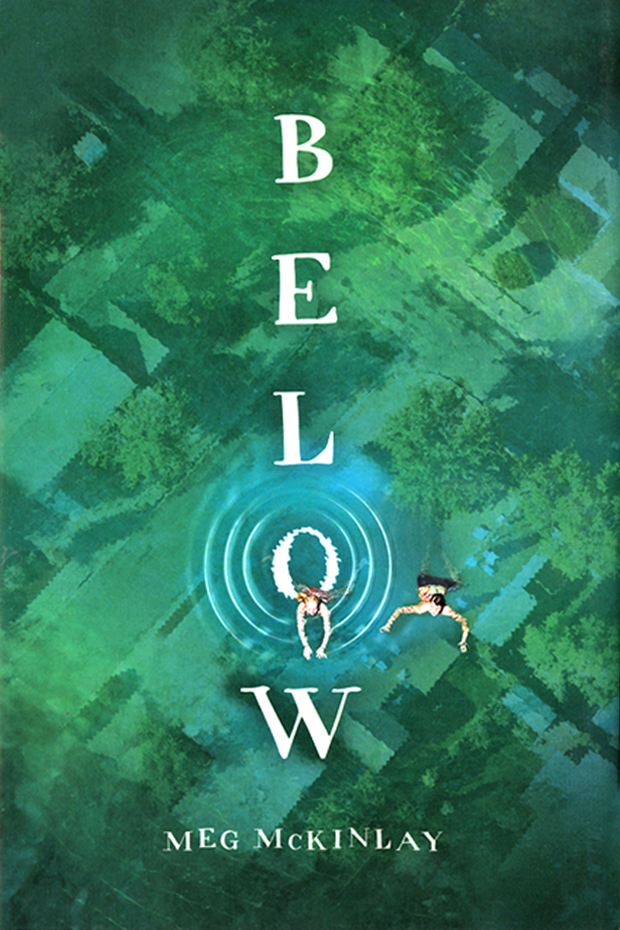
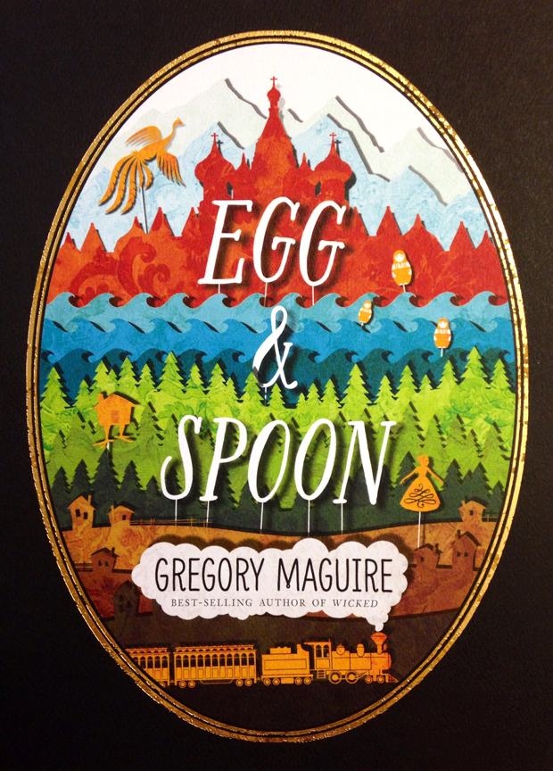
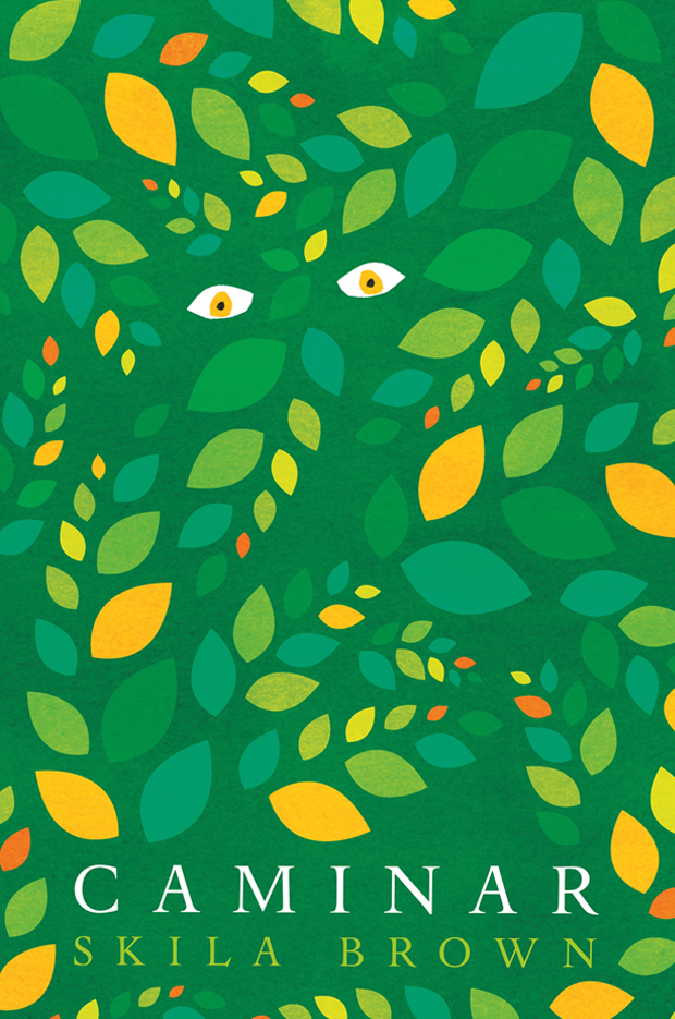
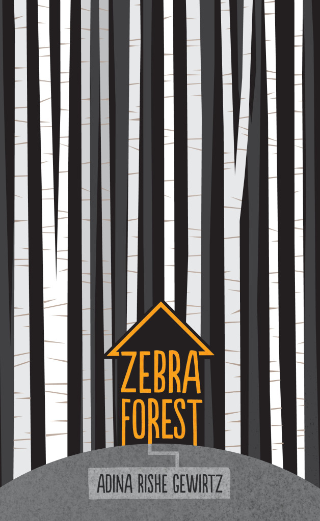
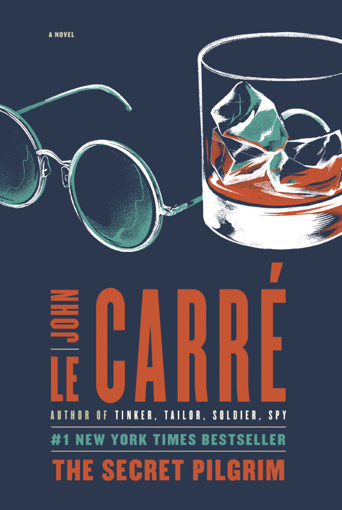
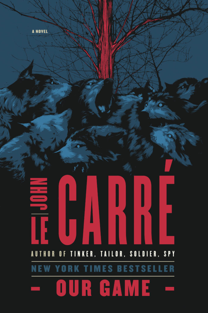
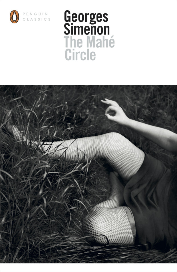
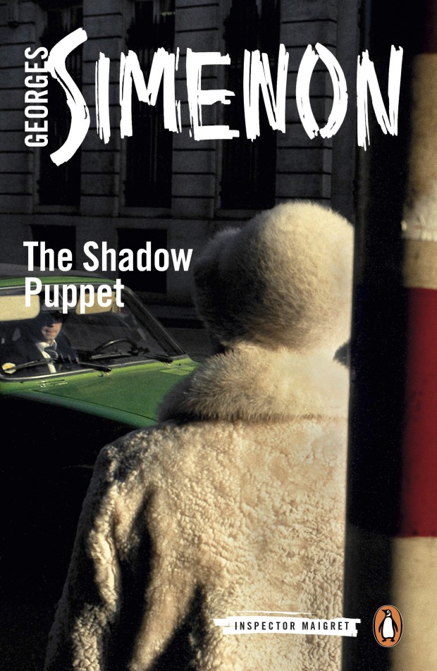
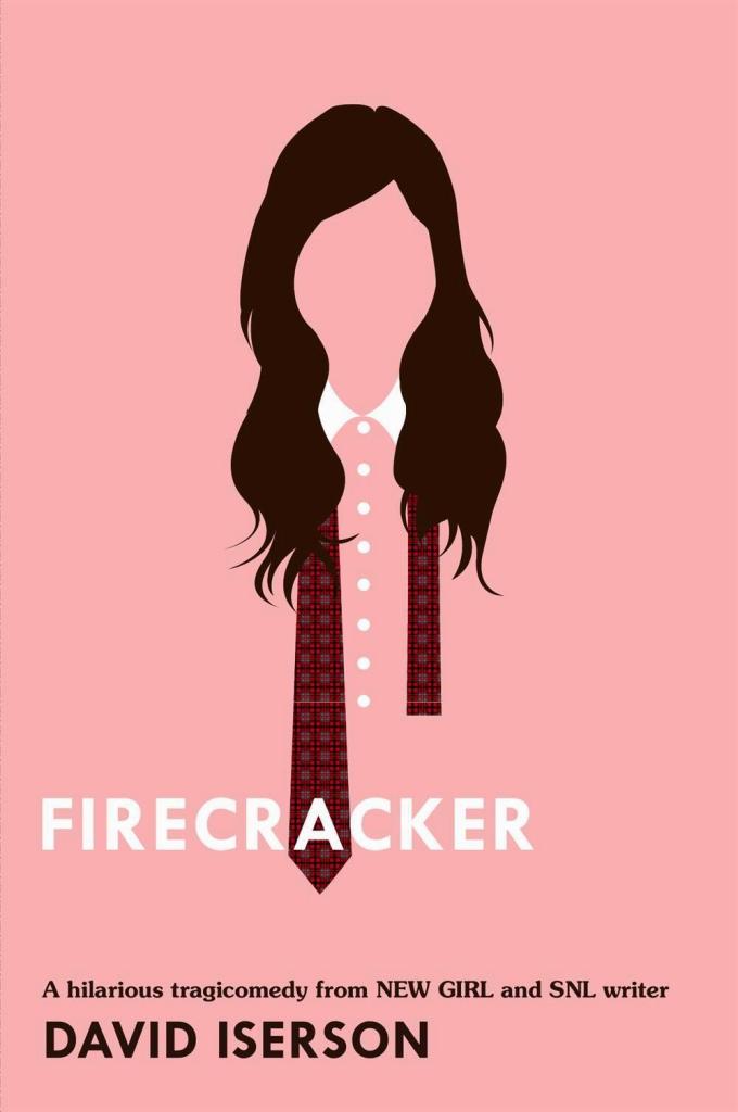
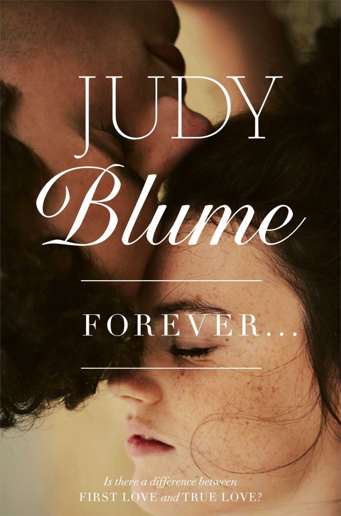
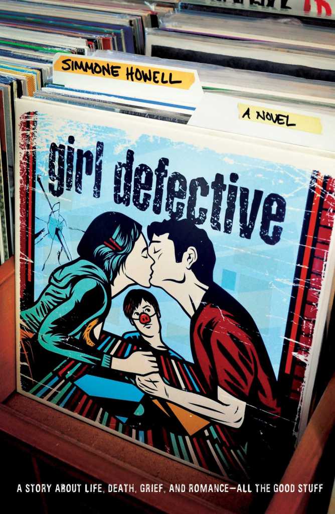
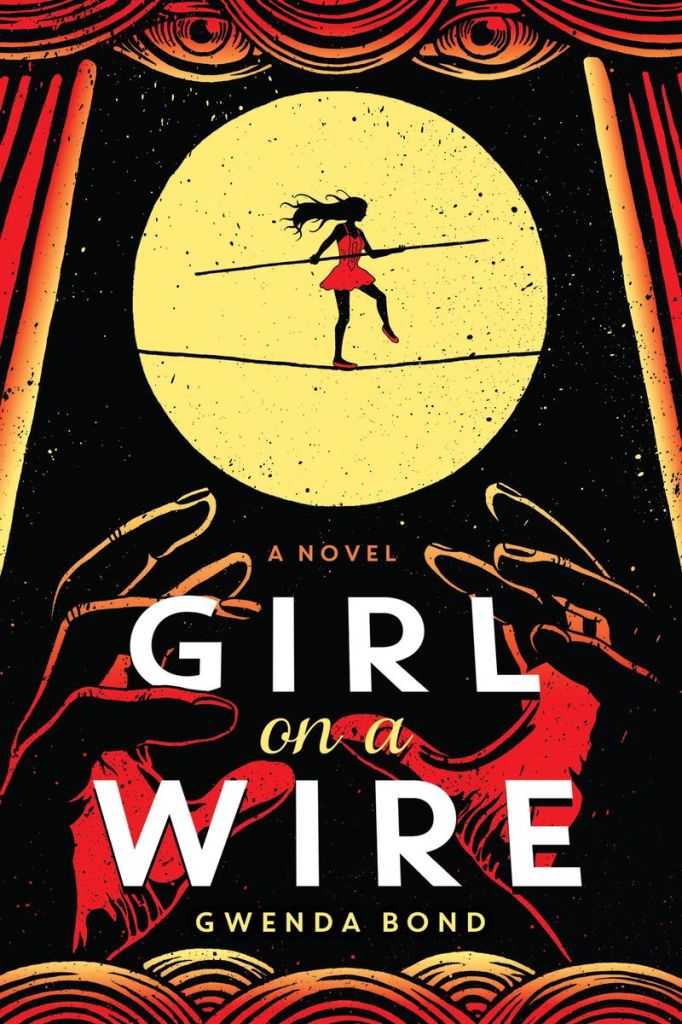
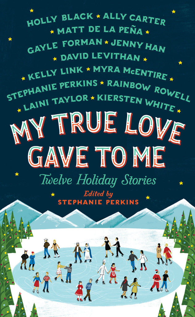
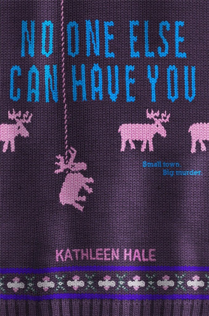
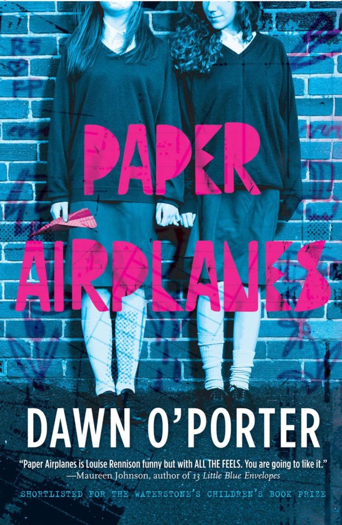
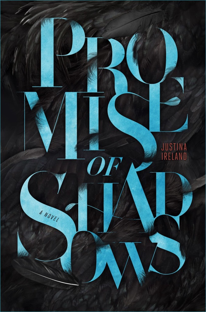
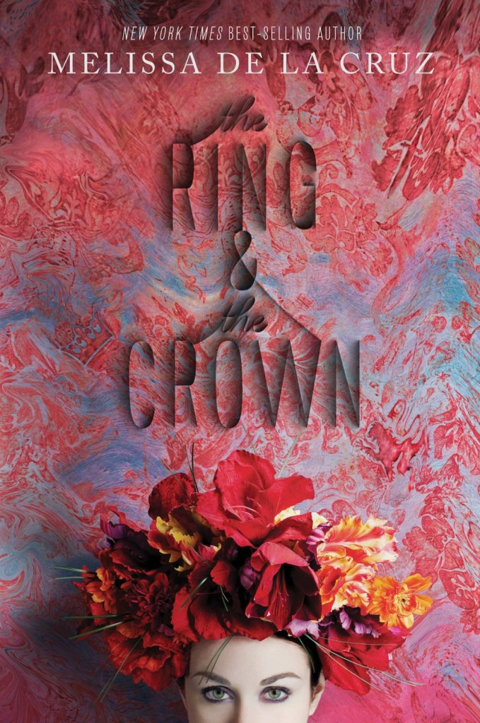
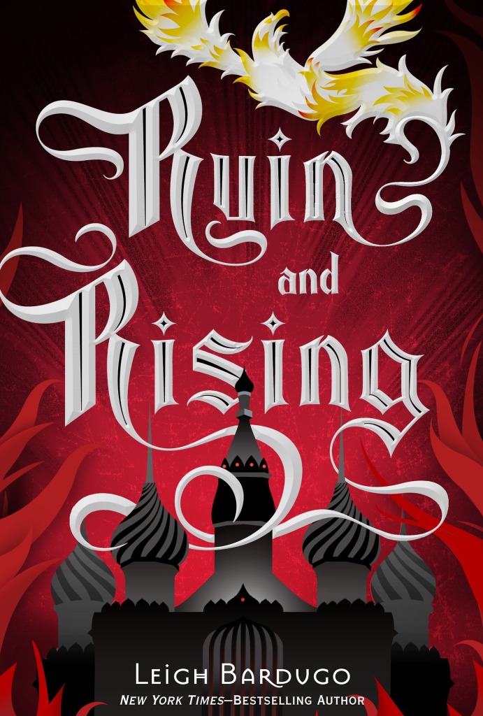
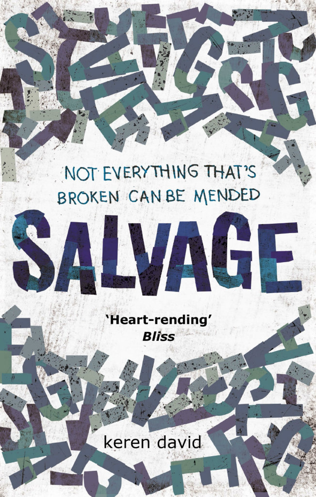
If you follow book design on social media at all, chances are you’ve come already across Matt Roeser‘s  funny, if somewhat dinosaur-fixated, Twitter feed. But over the past couple of years as senior designer at independent children’s publisher Candlewick Press in Massachusetts, Matt has been quietly producing some bright, brilliant, and original covers for their line of young adult titles.

I first came across Matt’s work about 4 years ago when he first started a Tumblr project called New Cover, and was working outside publishing in St. Louis. Now he is designing books full-time, it only seemed appropriate to ask him a few questions about his interests and influences, his work, and his career. We corresponded by email.

Below

Were there a lot of books in your house growing up?

Absolutely. We lived two blocks away from our library, so my parents were always taking my brother and I there and letting me bring home as much as I could carry. That, paired with the book order forms our teachers would pass out every month (of which I had an unhealthy level of excitement for) meant there was always a constant stream of books in our house.

Did you have a favourite book as a kid?

I had three, and to this day, still can’t decide which one I like the most because they’re each fabulous in their own way: From the Mixed-Up Files of Mrs. Basil E. Frankweiler because the kids run away and live in a museum (I’m still hoping to do this one day!), The Westing Game, because it’s an epic murder mystery, and The Phantom Tollbooth, because it’s so imaginative and full of wordplay, which I have a soft-spot for.

EggandSpoon

Do you remember when you first became interested in design?

Yes, and it was paired with reading in a way. The movie Jurassic Park came out when I was 10 and I went with my brother to see it at least 5 or 6 times and was just completely enthralled. Then my brother bought the book with the now-classic Chip Kidd design on the front. I read it and, being my first “big-person” book that I had read, it really stuck with me. I remember thinking it was so cool that the design of the jacket was used for the logo for the park in the movie. And it was on t-shirts, lunchboxes, everything. The fact that a new Jurassic Park movie is coming out next year, and they’re still using Chip Kidd’s design just makes me so happy. So while I don’t think I completely realized it at the time, that’s the moment that I became aware and interested in design. And since I’ve never actually grown up, all of the things I loved as a child (dinosaurs, space, time travel) still excite me to this day (thus why a majority of my tweets revolve around dinosaurs). I even had a Jurassic Park themed 30th birthday party which was simultaneously my most proud and most embarrassing moment in life.

Is anyone else in your family creative?

Yeah, my immediate and extended family is full of carpenters and woodworkers, interior designers and painters and people that just generally like to create and build with their hands.

Did you study design at school?

Initially, when I started college, I dove deep into marketing. However, I quickly found out, after taking macro-economics and a plethora of other numbers-based courses, that the business side of marketing was not at all interesting to me. I then started taking a bunch of creative communication classes that included various advertising and graphic design courses, and quickly felt much more at home. Ultimately, a lot of my design education was self-taught, but at school I learned the basic process of working on creative projects that really stuck with me.

What were you doing before you joined Candlewick?

I worked with the creative team at Atomicdust, a branding and marketing agency in St. Louis, Missouri. I definitely learned the ins and outs of the creative process while there. We had a great array of clients that allowed us to flex our creative muscles in a variety of ways as we came up with messaging and then decided the best ways to get that message out. Learning how to boil down a company’s entire purpose/goals/soul into a clear message was great experience for what I do now: communicating an entire book’s essence through its jacket.

Caminar

Before you were designing books professionally, you started New Cover, a self-initiated project redesigning the covers of some of your favourite books. Was your goal to get a job in publishing?

Ultimately. It was really driven from the fact that I love to read and I love design, and it had always been a secret “dream-job” ambition of mine to make of career of combining the two. Part of my job at Atomicdust was hiring designers, and as a result, I was sent tons of resumes and portfolios. Every once in a while, there would be someone who didn’t have any work to show but was still looking for a job, but you can’t really hire a designer without seeing any of their work. And then it hit me; if I wanted publishers to hire me to design book covers, they weren’t just going to do it because they saw that I could design websites and brochures. They would need to see book covers. So I picked a few of my favorite books and started creating new covers for them. The project was featured on a couple of design blogs and then spiralled from there into real work from publishers.

Can you tell me a little bit about Candlewick Press and what it’s like to work there?

Candlewick has all of the best elements of a smaller company mixed with the structure of a larger corporate company. There are about 95 employees in total and we’re all on one huge floor of a building in Davis Square, a sort of hipster-y area right outside of Boston. It’s a really open and encouraging environment that gives me the freedom to fully visualize the design ideas I have for titles. We’re the companion company to Walker Books in the UK as well as Walker Australia, so occasionally we’ll take on some of their titles and vice versa, or we’ll coordinate a global launch for a title that we will all be simultaneously publishing. It also means we have an almost never-ending source of imported chocolates and cookies coming to the office via visitors from our other branches.

How many designers work in your office?

The art department has about 15 designers, a majority of who work primarily on picture books. I mostly work on young adult and middle grade fiction and a non-fiction title every now and then.

AvaLavender

Did you ever think you would make a career of designing kids’ books?

Looking back at previous jobs, you can definitely see all of the stepping stones that got me here. In high school, I worked in the children’s room of my town’s library. Then, during college, I worked at a preschool. So I’ve always sort of been surrounded by kids’ books. That, paired with graphic design in college and at Atomicdust, and it makes sense.

Can you describe your process for designing a book cover?

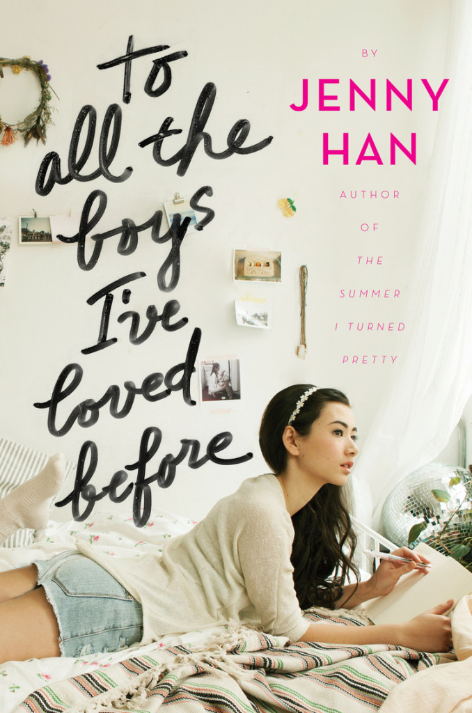
First, I read the book. I like to think that the jacket idea is already there in the text somewhere and I just have to find it and bring it to fruition. Once I’ve read the manuscript, I start sketching out ideas both on paper and on my computer. Sometimes I have a really clear initial vision of what the cover should look like and the final cover ends up looking pretty similar. Other times, I won’t have as clean-cut of an initial idea, so I’ll do really broad image searches based on a few keywords I’ve written down while reading just to get the wheels turning. It’s hard to say where ideas come from. The ultimate goal is to make a finished product that would catch someone’s eye, regardless of who the specific audience is. If I can make it interesting enough for anyone to pick up, I’ve done my job.

MoreThanThis

What are your favourite kinds of projects to work on?

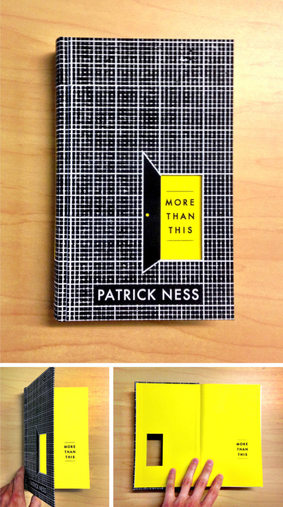
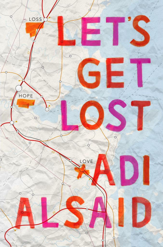
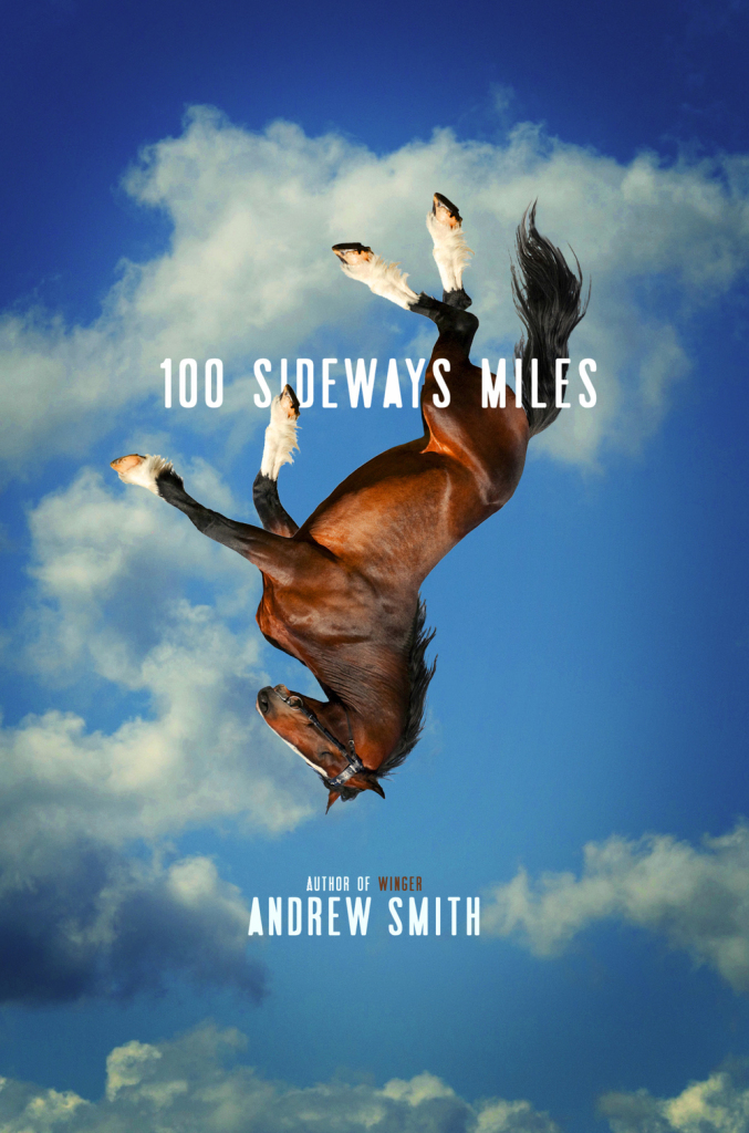
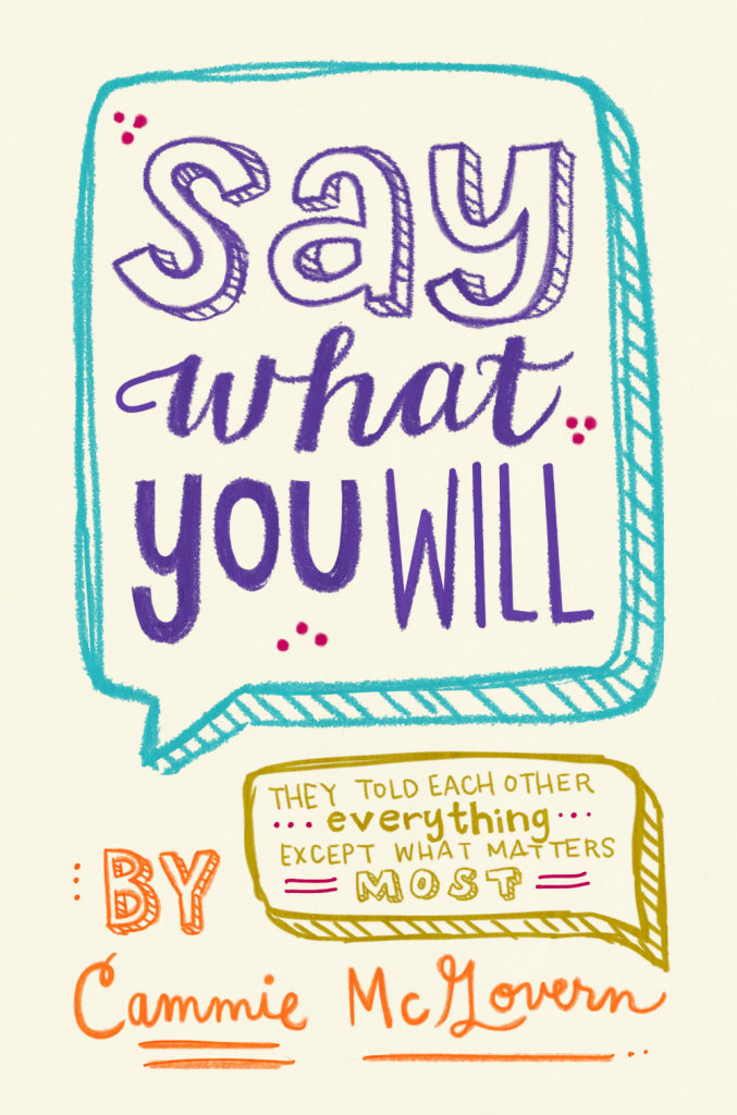
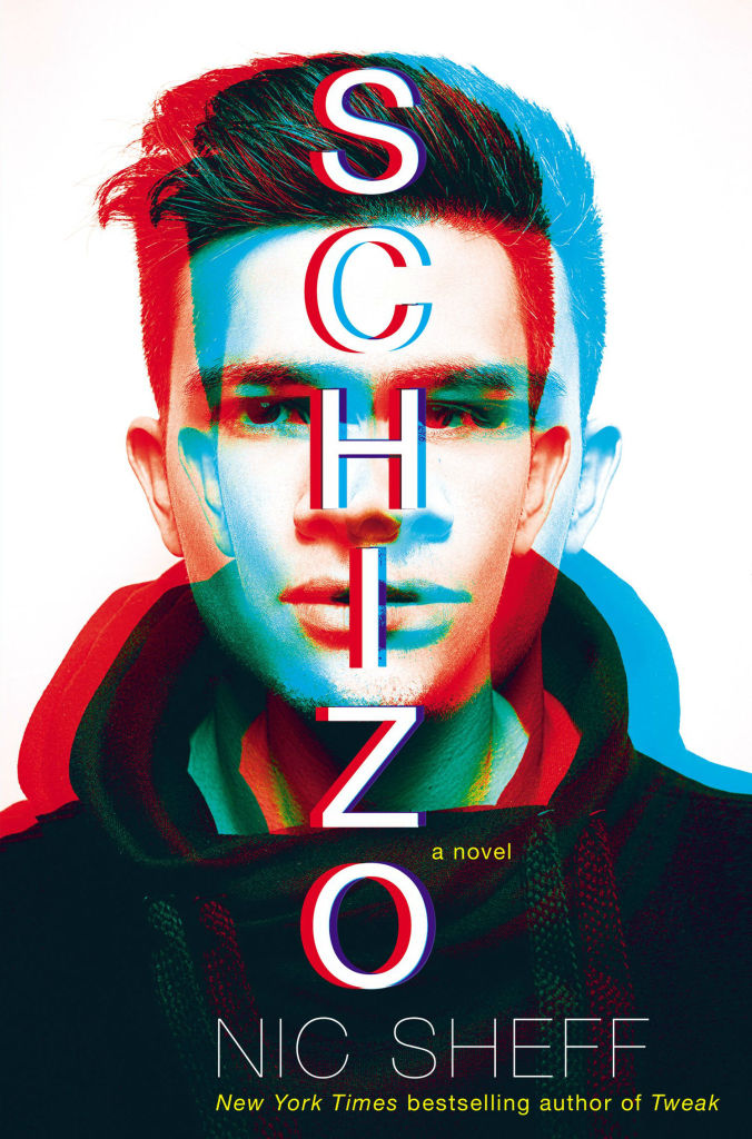
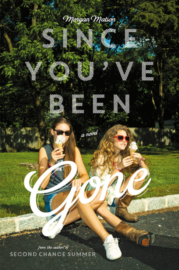
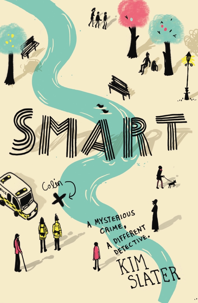
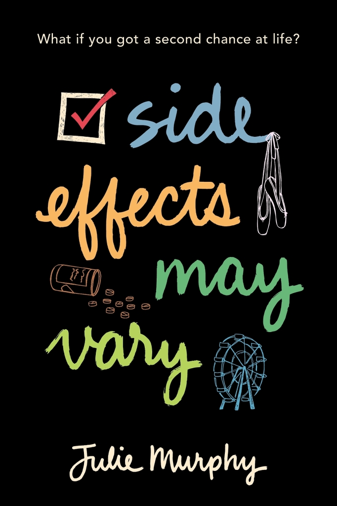
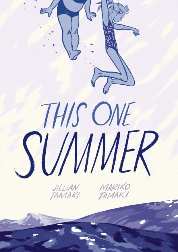
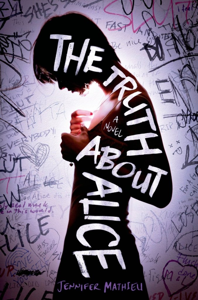
Anything that’s a little off. As a reader, I like stories where about 75% of what’s going on seems normal and then there’s this gray space remaining where something unexpected/bizarre/weird is happening. It’s why I like books like The Prestige, Jonathan Strange and Mr. Norrell, A Tale for the Time Being, and the TV show LOST. So story-wise, those are projects I get the most excited about. Also, anytime a book is part of Launch (the titles that the publisher is really pumped about) because that ultimately means they’re willing to try different things to set the book apart. Whether it’s a die-cut through the case for More Than This, or a ¾ jacket wrapped around a printed case, or stamping the entire design in foil, I enjoy playing with the materials in new ways.

Who are some of your design heroes?

Chip Kidd, Jonathan Gray, Peter Mendelsund. Their designs are always interesting, unique and more often than not, little works of art.

zebra-forest

Who else do you think is doing interesting work right now?

Will Staehle and Oliver Munday. They are two people that whenever I see their name on a book jacket, I’m simultaneously super excited to see a great cover and also maddeningly jealous of their innate talent that makes it look so easy. I haven’t seen a cover of theirs that I don’t like.

Is there a particular author or a book you’d like to design (or redesign!) a cover for?

Hmm, this is tough. I feel like a lot of them I did as part of New Cover back in the day, although I should revisit some of those and the questionable design decisions I made at the time. Some of those author names are in such a tiny point size that I just laugh thinking about it now. I would love to take on a series redesign as it’s something I haven’t gotten the chance to do professionally.

What’s in your ‘to read’ pile?

The Bone Clocks by David Mitchell! I’ve been anticipating this book for a while after reading and falling in love with his novel Cloud Atlas. A coworker was able to grab an ARC of the The Bone Clocks at BEA, so I’m currently immersed in it. I’m also looking forward to the new Murakami book coming out in a few months. And, after numerous people have told me that they can’t believe I haven’t read it yet, The Lost City of Z is the next book I’m reading.

FloatingShelves

Do you have a system for organizing your books?

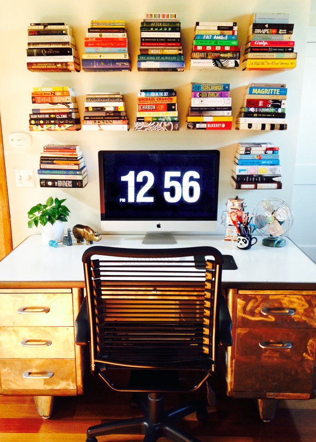
A few years back, I saw a floating pile of books on a wall in a design store and thought it was genius. Then, like I do with most things, I went overboard and bought 15 of them to hang over my desk. (See photo) They’re perfect for displaying some of my books in a way that’s a little different than normal. I try and fill them with a good mix of books I love and books that are visually amazing, and then put the majority of my other books in these three huge old steel lockers I have. One day, I will have a room with shelves going up every wall and a rolling ladder that I can ride around on like Belle does in the beginning of Beauty and the Beast and then I will truly be happy.

What’s the one book you recommend to everyone?

Cloud Atlas. It’s one where I would pause after reading a sentence and look out the window and contemplate life and just wonder how anyone could possibly be this good at writing. If you only saw the movie and hated it, go read the book. Before that, A Confederacy of Dunces. The dialogue is hysterical and I don’t remember laughing more at a book in my entire life.

PlayForTheCommandant

What does the future hold for book cover design?

I think regardless of how popular ebook readers become, there’s always going to be those titles that people want to buy a physical copy of. Maybe this means, as an industry, we make fewer (but more special) physical versions of books, which I don’t necessarily see as a bad thing. I’m a big believer in quality over quantity and if we want people to buy physical books, they need to be everything that they can’t get in an ebook: the materials should be exceptional, the design should be a work of art, the interior should have (gasp!) well thought out margins. It should be something they want to display. On the flip side, there’s always going to be an audience that only cares about the content. They don’t want stacks of books everywhere, don’t want to lug them around, don’t care (gasp!) about margins. I can understand all of that. But there will still be a need for associating some sort of image with the book. I can’t/don’t want to imagine a future where there’s just a long text list of titles that people choose from with no accompanying visual. When that day comes, you can find me barricaded in my own personal library, muttering to myself as I zoom around on my rolling ladder.

Thanks Matt!

Comments closed

Joost Swarte’s Summer Love Stories

2014_06_09_Swarte_Love_Stories

Dutch cartoonist and designer Joost Swarte has drawn the cover for The New Yorker‘s new Summer Fiction issue.

1 Comment